


The Boehringer Ingelheim logo is one of those marks in pharma that most people have seen but few actually think about. It shows a stylized version of the Heidesheimer Tor, the central gate of Charlemagne’s imperial palace in Ingelheim am Rhein, Germany. The company has used some version of this image since 1908, which makes it one of the longest-running pharmaceutical logos still active today.
Albert Boehringer founded the company in 1885. The logo has gone through five major versions since then. The current iteration, refreshed in 2023 by Interbrand, kept the familiar palace symbol but shifted the entire color scheme from blue to green. That was a big move for a family-owned business with over 140 years of history.
Pharma branding tends to be conservative. Most companies in this space stick to blue or red. Boehringer broke from that pattern, and the result is a mark that actually stands out in a crowded field of similar-looking corporate identities.
What Is the Boehringer Ingelheim Logo?
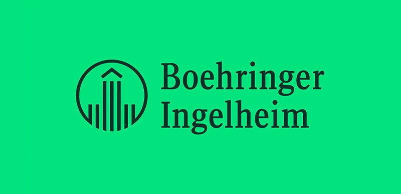
The Boehringer Ingelheim logo is a combination mark featuring a stylized depiction of the Heidesheimer Tor (the main gate of Charlemagne’s Imperial Palace) alongside the company wordmark. Originally designed in 1924 and last restructured by MetaDesign in 1997, the logo was refreshed in 2023 by Interbrand with a new green color palette. The palace symbol represents the company’s deep roots in its hometown of Ingelheim am Rhein.
Here are the key attributes of the current Boehringer Ingelheim logo:
- Design Type: Combination mark (symbol plus wordmark)
- Primary Elements: Stylized Heidesheimer Tor palace gate enclosed in an open circle, paired with the “Boehringer Ingelheim” wordmark to the right
- Original Introduction Date: 1924 (current structure established 1997, color refresh 2023)
- Designer/Agency: MetaDesign (1997 restructure, Ole Schafer), Interbrand Cologne/Berlin (2023 refresh)
- Trademark Status: Registered trademark of C.H. Boehringer Sohn AG & Co. KG
- Color Palette: Dark Green (#08312A) and Accent Green (#00E47C), replacing the former blue scheme
- Usage Context: Prescription pharmaceuticals, animal health products, corporate communications, digital platforms, research publications, and the “Life Forward” brand campaign
How Has the Boehringer Ingelheim Logo Evolved Over Time?

The Boehringer Ingelheim logo has been modified five times since the company’s founding in 1885. The mark shifted from simple monogram letters to a detailed palace illustration, then to the simplified geometric palace symbol used today. Each redesign refined the core image while keeping its connection to Ingelheim’s history.
The Monogram Era (1893-1908)
- Years Active: 1893 to 1908
- Design Description: A vertical oval shape containing the intertwined letters “CHBS,” which stood for C.H. Boehringer and Sohn (Son). Simple, text-based, no pictorial element.
- Color Scheme: Black on white
- Context: Albert Boehringer needed a trademark for his growing tartar acid and alkaloid business. The initials referenced the parent entity, C.H. Boehringer Sohn.
- Cultural Significance: This was purely functional. It identified the company on packaging and correspondence, nothing more.
The Palace Illustration (1908-1924)
- Years Active: 1908 to 1924
- Design Description: A detailed illustration of the Ingelheim Imperial Palace, inspired by Sebastian Munster’s woodcut from his Cosmographie. The image was ornate and realistic.
- Color Scheme: Black ink on white
- Context: Albert Boehringer had begun producing alkaloids, putting him in direct competition with C.F. Boehringer & Sohne in Mannheim. The two companies had confusingly similar monograms. Switching to a palace image solved that problem while also tying the brand to Ingelheim’s heritage. Albert was a member of the local Historical Society, and that likely influenced the choice.
- Key Changes from Previous: Complete departure from letter-based design to pictorial representation
- Cultural Significance: Established the connection between the company and Charlemagne’s palace that persists to this day
The Simplified Circle Mark (1924-1962)
- Years Active: 1924 to 1962
- Design Description: The realistic palace illustration was stripped down to a geometric, stylized form of the Heidesheimer Tor. Seven vertical lines (two short, three tall, two short) represented the palace columns, topped with a chevron suggesting the roof. All of this sat inside a circular border that also contained the company name.
- Color Scheme: Black and white
- Context: The Bauhaus design movement was reshaping German visual culture. The Bauhaus school in Weimar had opened just five years earlier. The simplification of the palace into clean geometric forms reflected that broader trend.
- Key Changes from Previous: Realistic illustration replaced by abstract geometric representation
- Cultural Significance: This version introduced the basic visual language that still defines the logo over a century later
The Refined Emblem (1962-1997)
- Years Active: 1962 to 1997
- Design Description: The 1924 concept was updated with cleaner lines and better proportions. The palace symbol and circular border were refined for improved reproduction across different media.
- Color Scheme: Transitioned to blue and white
- Key Changes from Previous: More precise geometry, introduction of the blue color that would define the brand for decades
- Cultural Significance: This was the version that accompanied Boehringer Ingelheim’s expansion into a global pharmaceutical company
The MetaDesign Restructure (1997-2023)
- Years Active: 1997 to 2023
- Design Description: Designer Ole Schafer at MetaDesign made a key structural change. The palace figure was merged with the circular border at the bottom, creating an open shape. The company name was pulled out of the circle and placed as a separate wordmark to the right. A custom font called BI Sans was created for the wordmark.
- Color Scheme: Deep blue (#002F62) and white
- Designer: Ole Schafer, MetaDesign (Erik Spiekermann’s agency)
- Key Changes from Previous: The palace bleeds out of the circle. The wordmark becomes a separate element. Generous negative space gives the symbol room to breathe.
- Cultural Significance: This restructuring created the layout that remains the foundation of the current logo. It modernized the mark without losing its historical DNA.
The Interbrand Refresh (2023-Present)
- Years Active: 2023 to present
- Design Description: The logo structure from 1997 was kept intact. The big change was color. Decades of blue were dropped in favor of a Dark Green and Accent Green palette. A new custom typeface called Boehringer Forward replaced BI Sans. The brand also introduced its first-ever slogan: “Life Forward.”
- Color Scheme: Dark Green (#08312A) and Accent Green (#00E47C)
- Designer: Interbrand (Cologne/Berlin), with BBDO New York handling the launch campaign
- Key Changes from Previous: Complete color shift from blue to green. New custom typeface. New brand slogan. Sound branding added for the first time.
- Cultural Significance: Boehringer deliberately chose green to stand apart from an industry dominated by blue logos. The refresh signals “unwavering optimism” and a forward-looking posture for a company that is still family-owned after 140 years.
What Do the Design Elements of the Boehringer Ingelheim Logo Mean?
Every part of the Boehringer Ingelheim logo traces back to the company’s hometown and history. The palace symbol connects the brand to Charlemagne and Ingelheim am Rhein. The open circle suggests accessibility and forward motion. The green palette, introduced in 2023, signals health and optimism rather than the clinical trust that blue conveyed.
What Does the Palace Symbol Represent?
The stylized building in the logo is the Heidesheimer Tor, the central gate of Charlemagne’s Imperial Palace in Ingelheim. Charlemagne stayed there in the late 8th century, around 774 AD.
Seven vertical lines represent the palace’s column structure. The chevron on top suggests the roof. This isn’t a random architectural choice. It roots the company in a specific place and a long historical lineage.
The open circle wrapping around the palace was a 1997 addition. By letting the vertical lines extend below the circle’s boundary, designer Ole Schafer gave the mark a feeling of openness. It stopped being a sealed emblem and became something more inviting.
Why Did Boehringer Ingelheim Choose These Specific Colors?

Before 2023, the Boehringer Ingelheim logo used a deep blue (#002F62). Blue is a safe choice in pharma. It signals trust, reliability, and professionalism. Think about the Pfizer logo or the Novo Nordisk logo. They all lean into blue.
But that’s exactly why Boehringer moved away from it.
The current palette uses Dark Green (Hex: #08312A, RGB: 8, 49, 42, CMYK: 100, 0, 60, 70, Pantone 3302 C) as the primary background color. Accent Green (Hex: #00E47C, RGB: 0, 228, 124, CMYK: 70, 0, 65, 0, Pantone 7479 C) is used for the logo mark and highlights.
Green connects to health, growth, and sustainability. From a color psychology standpoint, it conveys vitality without the clinical coldness of blue. The dark-on-bright green combination is unusual in pharma, which is the point. Boehringer wanted visibility in a field where everyone else looks the same.
What Typography Style Is Used in the Boehringer Ingelheim Logo?
The current wordmark uses Boehringer Forward, a custom sans-serif font introduced with the 2023 rebrand. It replaced BI Sans, which Ole Schafer had designed in the late 1990s as part of the MetaDesign project.
Boehringer Forward has clean, rounded letter shapes. It reads well at small sizes on digital screens and on large-format print materials alike. The tracking is generous, giving each letter enough room.
The choice of a custom typeface (rather than licensing something off the shelf) matters. It means no other company can use the same letterforms. That kind of typographic ownership is rare outside of the biggest brands. Erik Spiekermann and Ole Schafer also designed the earlier BI Sans and BI Serif families in 1997, so Boehringer has a long history of investing in custom type.
What Are the Hidden Meanings in the Boehringer Ingelheim Logo?
The open bottom of the circle is the most interesting detail. Most viewers don’t notice it consciously, but it changes the feel of the mark entirely. A closed circle would feel contained, finished. The open version feels like the symbol is stepping forward.
Look at the seven vertical lines closely. Their spacing and height differences create a sense of rhythm. Two short, three tall, two short. It’s a pattern that mirrors classical architectural balance.
The chevron at the top isn’t just decorative. It creates a focal point that draws the eye upward. Your gaze hits the peak of the roof shape first, then follows the vertical lines down and out through the open base. That’s deliberate visual direction.
How Does the Boehringer Ingelheim Logo Compare to Competitor Logos?

Most top pharmaceutical companies use either blue-based palettes or red accents. The Roche logo is a geometric blue wordmark. Novartis uses a clean sans-serif logotype. The Sanofi logo recently moved to a simplified purple-tinged wordmark. Merck leans into a vibrant teal. Boehringer’s green palette is distinct from all of them.
What really separates the Boehringer Ingelheim logo from competitors is the pictorial element. Most big pharma logos are wordmarks or abstract shapes. Boehringer has an actual building in its mark. The Bayer logo with its cross pattern is probably the closest comparison in terms of having a recognizable, non-text symbol.
The AstraZeneca logo uses a stylized flame shape. The Eli Lilly logo is a straightforward red wordmark. AbbVie goes with a lowercase approach. None of them carry the kind of historical weight that Boehringer’s palace symbol does.
Among green logos specifically, Boehringer’s dark-on-bright combo is uncommon. Most brands using green go with lighter, friendlier shades. The dark green base gives Boehringer a more serious, premium feel.
What Are the Technical Specifications of the Boehringer Ingelheim Logo?
Official Color Codes
- Dark Green (Primary): Hex: #08312A | RGB: (8, 49, 42) | CMYK: (100, 0, 60, 70) | Pantone: 3302 C
- Accent Green (Secondary): Hex: #00E47C | RGB: (0, 228, 124) | CMYK: (70, 0, 65, 0) | Pantone: 7479 C
Dimensions and Proportions
The logo is a horizontal combination mark. The palace symbol sits to the left with the wordmark to the right. The symbol and wordmark are proportionally locked, meaning you shouldn’t resize one independently of the other.
Clear space around the logo should equal at least the height of the “B” in the wordmark on all sides. Minimum size requirements exist for both print and digital to make sure the palace detail remains legible.
The logo is available in vector graphics formats (SVG, EPS) for scalable use and raster formats (PNG, JPEG) for fixed-size applications. For print design, vector is always preferred to avoid resolution issues at large sizes.
All brand assets, templates, and guidelines live on Boehringer’s dedicated brand hub at brand.boehringer-ingelheim.com, which was launched alongside the 2023 rebrand on the Frontify platform.
What Cultural Impact Has the Boehringer Ingelheim Logo Had?

The Boehringer Ingelheim logo has been circling the globe for over a century. It’s carried the image of Charlemagne’s palace from a small town on the Rhine to 150+ countries. That’s a pretty remarkable thing when you think about it.
For people in Ingelheim am Rhein, the logo is a source of local pride. The company has funded historical research and preservation of the actual palace ruins for decades.
The 2023 color shift from blue to green made waves in the branding community. Most pharma companies play it safe. Boehringer didn’t. The move was covered extensively in design media and became a case study in how legacy brands can refresh without losing their identity.
Inside the company, the rebrand launch was reportedly the biggest event in Boehringer’s 140-year history. The fact that a family-owned business went that big on a visual identity change says something about how seriously they take the role of design in business.
How Does the Boehringer Ingelheim Logo Fit Into the Overall Brand Identity?
The logo is one piece of a much larger system. Boehringer’s brand identity includes the custom Boehringer Forward typeface, the Dark Green and Accent Green color system, a dedicated illustration style, photography guidelines, motion principles, icon sets, and even sound branding. Few pharma companies go that deep.
The “Life Forward” brand slogan ties directly into the visual system. The optimistic Accent Green color, the open circle in the logo, the forward-looking typeface name. It all points the same direction.
Boehringer’s brand guidelines cover everything from digital applications to physical merchandise. Accessibility was a stated priority during the redesign. The color system was tested for color-blind safety, which is (well, it should be standard but) still uncommon in pharma branding.
The brand hub at brand.boehringer-ingelheim.com serves as the central resource for employees and partners. It contains all approved logos, templates, and rules. This kind of centralized brand style guide helps a company with 53,000+ employees across 150 countries maintain visual unity.
How Should the Boehringer Ingelheim Logo Be Used?
The Boehringer Ingelheim logo is a registered trademark. You can’t just grab it off Google Images and throw it on your presentation. Here’s what you need to know:
- Official assets: Access approved logo files through brand.boehringer-ingelheim.com. The brand hub has vector and raster formats in all color variations.
- Do not alter the proportions, colors, or arrangement of the logo elements. The symbol and wordmark must stay in their fixed relationship.
- Do not place the logo on busy backgrounds that make the palace symbol hard to read. Maintain the required clear space.
- Do not recreate the logo using different fonts or redraw the palace symbol.
- Approved color versions include Accent Green on Dark Green (primary), Dark Green on white, and single-color versions for specific production needs.
- Licensing: Use of the Boehringer Ingelheim logo by external parties requires written authorization from the company. Unauthorized use of the trademark is subject to legal action.
- Co-branding: When the logo appears alongside partner logos, specific spacing and sizing rules apply as outlined in the brand guidelines.
If you’re a journalist, researcher, or conference organizer who needs the logo for editorial or event purposes, contact Boehringer Ingelheim’s corporate communications team. They typically provide approved media assets for legitimate use.
FAQ on The Boehringer Ingelheim Logo
What does the Boehringer Ingelheim logo represent?
The logo shows a stylized version of the Heidesheimer Tor, the central gate of Charlemagne’s Imperial Palace in Ingelheim am Rhein, Germany. It connects the pharmaceutical company to its hometown’s history, dating back to the 8th century.
When was the Boehringer Ingelheim logo first created?
The earliest trademark appeared in 1893 as a monogram. The palace symbol was introduced in 1908.
The version most people recognize today took shape in 1924 and was restructured by MetaDesign in 1997. Interbrand refreshed the colors in 2023.
What colors are used in the current Boehringer Ingelheim logo?
The current palette uses Dark Green (#08312A) and Accent Green (#00E47C). Before 2023, the logo was blue. The shift to green was a deliberate move to stand apart from other blue logos dominating the pharmaceutical industry.
Who designed the Boehringer Ingelheim logo?
Ole Schafer at MetaDesign created the 1997 structural redesign. He also designed the custom BI Sans typeface for the wordmark.
The 2023 color and type refresh was handled by Interbrand in Cologne and Berlin, introducing the Boehringer Forward font.
Why did Boehringer Ingelheim change its logo color from blue to green?
Most pharma companies use blue. The Johnson & Johnson logo, Amgen logo, and others all lean that way.
Boehringer wanted more visibility and a fresher identity. Green signals health and optimism, which fits their “Life Forward” brand slogan.
Can I download the Boehringer Ingelheim logo for free?
Official logo files are available through Boehringer’s brand hub at brand.boehringer-ingelheim.com. The trademark is protected, so any commercial use requires written authorization from the company. Editorial use typically needs a media request.
What font does the Boehringer Ingelheim logo use?
The current wordmark uses Boehringer Forward, a custom sans-serif typeface introduced in 2023. It replaced BI Sans, which Ole Schafer had drawn in the late 1990s. Both were exclusive to Boehringer, not available for public font licensing.
How many times has the Boehringer Ingelheim logo been redesigned?
Five times total. The logo changed in 1893, 1908, 1924, 1962, and 1997. The 2023 update was a color and type refresh, not a structural redesign.
The palace symbol has been the central element since 1908. That’s over a century of the same core idea.
What is the meaning behind the open circle in the Boehringer Ingelheim logo?
Ole Schafer merged the palace figure with the circular border in 1997, opening it at the bottom. The vertical lines extend past the circle’s edge.
This creates a sense of forward movement and openness. A closed circle would have felt static. The open version feels like the company is reaching outward.
Is the Boehringer Ingelheim logo trademarked?
Yes. The logo is a registered trademark of C.H. Boehringer Sohn AG & Co. KG. It’s protected intellectual property. Unauthorized reproduction, modification, or commercial use can result in legal action from the company.
Conclusion
The Boehringer Ingelheim logo has carried the image of Charlemagne’s palace gate across 150 countries for over a century. That kind of brand recognition doesn’t happen by accident. It takes consistent investment in corporate visual identity and a willingness to evolve without abandoning what works.
The 2023 shift from blue to green was a bold call for a family-owned biopharmaceutical company. But it paid off. Boehringer now looks nothing like its competitors, and the “Life Forward” positioning gives the entire brand system a clear direction.
Few tech company logos or pharma marks can claim five redesigns across 130 years while keeping the same core symbol intact. That’s the real story here. Heritage and modern design working together, not fighting each other.

Renowned for his expertise in logo design and visual branding, Bogdan has developed a multitude of logos for various clients.
His skills extend to creating posters, vector illustrations, business cards, and brochures. Additionally, Bogdan's UI kits were featured on marketplaces like Visual Hierarchy and UI8.
He also wrote in the past years on sites like Design Your Way, WebDesignerDepot, WPDean, Designmodo, Speckyboy, Slider Revolution, and more.
- Canva vs PowerPoint: Which Is Better for Presentations? - 22 September 2026
- How to Install Fonts on Mac (Step-by-Step Guide) - 20 September 2026
- From Mockup to Code: How AI-Augmented Development Speeds Up the Design Handoff - 19 September 2026

Bogdan Sandu is a seasoned designer who has been designing websites since 2008. Renowned for his expertise in logo design and visual branding, Bogdan has developed a multitude of logos for various clients. His skills extend to creating posters, vector illustrations, business cards, and brochures. Additionally, Bogdan's UI kits were featured on marketplaces like Visual Hierarchy and UI8. He also wrote in the past years on sites like Design Your Way, WebDesignerDepot, WPDean, Designmodo, Speckyboy, Slider Revolution, and more.
You Might Also Like


