


The Novo Nordisk logo is one of the most recognized marks in the pharmaceutical industry. Built around a stylized Egyptian Apis Bull, it carries nearly a century of history and meaning that most people never stop to think about. The company, headquartered in Bagsvaerd, Denmark, has used variations of this bull symbol since 1926, just one year after Novo Terapeutisk Laboratorium was founded.
As a logo, it does something unusual. It connects ancient mythology to modern healthcare. And that connection has held up for about a hundred years now, which is pretty rare for any corporate mark. Within the broader world of pharmaceutical logos, Novo Nordisk stands apart because it chose a figurative symbol when most competitors were leaning toward abstract shapes or simple wordmarks.
The current version pairs the Apis Bull emblem with a lowercase wordmark set in the company’s custom Apis typeface. Two shades of blue dominate the color palette. The logo has been through several refinements since its first appearance, though the core identity (that bull) has never left.
What Is the Novo Nordisk Logo?
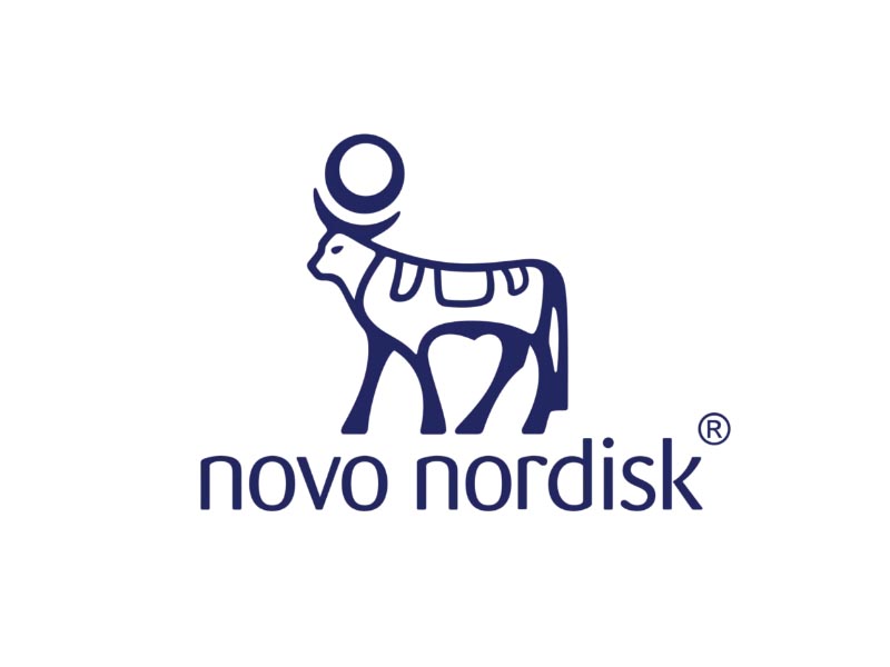
The Novo Nordisk logo is a combination mark featuring a stylized Apis Bull emblem placed above a lowercase wordmark. It was first introduced in 1926 for Novo Terapeutisk Laboratorium and carried forward through the 1989 merger that created Novo Nordisk A/S. The bull draws from an ancient Egyptian statuette dating to approximately 664-323 BC, symbolizing strength, health, and the cycle of life.
Here is a breakdown of the logo’s key attributes:
- Design Type: Combination mark (emblem plus wordmark)
- Primary Elements: Stylized Apis Bull with sun disc, lowercase “novo nordisk” wordmark
- Official Introduction Date: 1926 (original Apis Bull for Novo Terapeutisk Laboratorium), updated in 1989 after the merger
- Designer/Agency: Internal Novo Nordisk design team. The choice of the Apis Bull followed a European chemist tradition of identifying pharmacies through animal symbols
- Trademark Status: Registered trademark of Novo Nordisk A/S, protected globally
- Color Palette: “True Blue” (#001965) as the primary color, “Snow White” (#FFFFFF) as the background color, with secondary tints allowed from the corporate palette
- Usage Context: Pharmaceutical products and packaging, insulin pens and delivery devices, corporate communications, annual reports, digital platforms, marketing materials, and employee branding
How Has the Novo Nordisk Logo Evolved Over Time?

The Novo Nordisk logo has been remarkably consistent since 1926, which is honestly unusual for a company this size. Most major corporations go through dramatic visual overhauls every decade or two. Novo Nordisk didn’t do that.
The bull stayed. The refinements were more about cleaning up details and adjusting the accompanying text. The biggest structural change came in 1989 when two separate companies merged and the wordmark had to reflect a new combined name.
Original Novo Terapeutisk Laboratorium Logo (1926-1989)
- Years Active: 1926-1989
- Design Description: The original logo featured the Apis Bull as the central element, adopted one year after the founding of Novo Terapeutisk Laboratorium in 1925. The bull was depicted in a more detailed, illustrative style compared to later versions. It followed a European chemist tradition where pharmacies were identified through animal symbols.
- Color Scheme: Dark blue and white
- Context: August Krogh and his wife Marie, both Danish scientists, founded the company’s predecessor after learning about the Canadian discovery of insulin in 1922. The Apis Bull was chosen because of its ancient associations with healing, strength, and the god Ptah, who was the patron deity of craftsmen and the creator of the universe in Egyptian mythology.
- Cultural Significance: The logo connected pharmaceutical science to ancient traditions of healing and wellness. During this period, Novo and Nordisk operated as separate competing companies, each with their own branding, though the Apis Bull belonged specifically to the Novo side.
Post-Merger Novo Nordisk Logo (1989-2000s)
- Years Active: 1989-early 2000s
- Design Description: When Novo Industri A/S and Nordisk Gentofte A/S merged in 1989, the logo needed to reflect the new combined entity. The Apis Bull was retained, but the wordmark was updated to read “novo nordisk” in lowercase lettering. The overall composition was refined to feel more corporate and unified.
- Color Scheme: Blue tones with white background
- Key Changes from Previous: The wordmark changed from “Novo” to “novo nordisk.” The bull emblem was slightly simplified and better integrated with the new text. The typography was updated to a cleaner sans-serif style.
- Context: The merger created the world’s largest insulin producer. Combining two competing Danish pharmaceutical companies into one brand required a visual identity that honored both legacies while signaling a new chapter.
Modern Novo Nordisk Logo (2000s-Present)
- Years Active: Early 2000s-present
- Design Description: The current version features a further refined Apis Bull rendered in two shades of blue. The bull stands on four legs with a large sun disc on its back containing a smaller circle inside. Below sits the “novo nordisk” wordmark in the company’s custom Apis font, which is based on the open-license Noto Sans typeface commissioned by Google.
- Color Scheme: “True Blue” (#001965) and “Snow White” (#FFFFFF)
- Key Changes from Previous: The illustration was further cleaned up for better digital scaling. The custom Apis typeface replaced earlier font choices. The corporate design manual now strictly governs usage, prohibiting gradients, color overlays, and font substitutions.
- Cultural Significance: The logo now represents one of the most valuable pharmaceutical companies globally. As Novo Nordisk’s market capitalization surpassed Denmark’s GDP in 2023, the Apis Bull became even more widely recognized thanks to the popularity of products like Ozempic and Wegovy.
What Do the Design Elements of the Novo Nordisk Logo Mean?
Every part of the Novo Nordisk logo carries intentional meaning. The Apis Bull is a reproduction of an Egyptian statuette from the Late Period (circa 664-323 BC), and the ornamental details on the bull’s body represent dualities: day and night, life and death.
According to Novo Nordisk’s own description, the Apis Bull was worshipped as the incarnation of Ptah, creator of the universe, city god of Memphis, and the patron deity of craftsmen. That’s a lot of symbolic weight for one logo.
The choice also came from a specific European tradition. Pharmacies and chemists historically used animal symbols to identify themselves. So the bull wasn’t random. It was both culturally grounded and industry-appropriate. The psychology behind the shape matters here too, because rounded, organic forms tend to communicate care and approachability, while the bull’s solid stance suggests stability.
Why Did Novo Nordisk Choose These Specific Colors?

The primary brand color is called “True Blue,” and its hex code is #001965. The RGB values are (0, 25, 101). The closest Pantone match is 2758 C, and the approximate CMYK values are (100, 75, 0, 60).
Blue was not an accidental pick. In color psychology, dark blue signals trust, professionalism, and security. For a company that deals with insulin and chronic disease management, those associations matter more than you’d think.
The secondary color is “Snow White” (#FFFFFF), which keeps the overall impression clean and clinical, fitting for healthcare. The corporate design manual also includes a secondary palette with Light Blue, Sea Blue, Ocean Green, Rose Pink, Granite Grey, Sand Grey, and accent colors like Lava Red, Golden Yellow, and Forest Green. But True Blue and Snow White dominate everything.
The manual is strict about this: no gradients, no colored overlays on images, and colors should never be mixed or layered in transparency. That kind of rigidity is actually pretty common among brands that use blue logos.
What Typography Style Is Used in the Novo Nordisk Logo?

Novo Nordisk uses a custom typeface called “Apis” for its logo and all corporate materials. The Apis font is based on Noto Sans, an open-license typeface commissioned by Google. It resembles FF Signa Round Pro, which was created by Danish designer Ole Berntsen Sondergaard.
The wordmark is set entirely in lowercase, which gives it a modern, approachable feel. The letterforms are clean, with consistent stroke widths and rounded terminals. According to the corporate design manual, Apis should never be paired with other fonts or modified in any way.
For office applications, a variant called “Apis for Office” is used, with Arial serving as the fallback. Text should primarily appear in True Blue or Snow White. The manual even specifies leading values (12 pt for 8.5 pt body text) and tracking ranges (0 to -10).
What Are the Hidden Meanings in the Novo Nordisk Logo?
The Apis Bull carries layered symbolism that goes deeper than most people realize. The sun disc on the bull’s back, containing a smaller circle within it, represents the cycle of creation and renewal. In ancient Egyptian belief, the Apis Bull was said to give birth to gods, which tied directly to concepts of new life.
The dualities carved into the original statuette (day/night, life/death) translate into the pharmaceutical context as treatment and prevention, sickness and health. Whether that was the original intention in 1926 or a happy accident, it works remarkably well for a healthcare company.
The name itself carries meaning. “Novo” comes from the Latin “Novus,” meaning “new.” “Nordisk” references the company’s Scandinavian origins. Together, the name and the bull tell a story of constant renewal rooted in Nordic heritage.
How Does the Novo Nordisk Logo Compare to Competitor Logos?
The pharmaceutical industry tends to play it safe with logo design. Lots of abstract shapes, clean wordmarks, and clinical blue palettes. Novo Nordisk breaks from that pattern with its figurative Apis Bull, which gives it a distinctive edge in brand recognition.
Look at the major competitors. The Pfizer logo went through a major redesign, moving from its classic pill-shaped oval to a simplified double-helix inspired mark. The Eli Lilly logo uses a stylized script wordmark with a red accent, leaning into heritage but keeping things typographic. The Sanofi logo opts for a modern purple wordmark with a minimalist approach.
Then you have the Roche logo with its simple blue wordmark, the Bayer logo with its famous cross emblem, and the Novartis logo with its clean, typographic identity. The AstraZeneca logo uses an abstract flame-like shape. Merck keeps things corporate and straightforward.
Among its closest competitors in the GLP-1 space, Eli Lilly’s branding feels more traditional American pharma, while Novo Nordisk’s Scandinavian roots show through in the clean lines and restrained color usage. The Apis Bull is genuinely unique in this space. No other major pharmaceutical company uses an ancient mythological figure as its primary symbol.
That choice has paid off. When you see the bull, you know it’s Novo Nordisk. Can’t say the same for every pharma logo out there.
What Are the Technical Specifications of the Novo Nordisk Logo?
Official Color Codes
- Primary Color – True Blue
- Hex: #001965
- RGB: (0, 25, 101)
- CMYK: (100, 75, 0, 60)
- Pantone: 2758 C
- Secondary Color – Snow White
- Hex: #FFFFFF
- RGB: (255, 255, 255)
- CMYK: (0, 0, 0, 0)
Note: CMYK and Pantone values are approximate equivalents, as the official brand guidelines do not explicitly state these values.*
Dimensions and Proportions
The logo has strict usage rules outlined in Novo Nordisk’s corporate design manual. The Apis Bull emblem sits above the “novo nordisk” wordmark, and the two elements should always appear together in official contexts. Clear space around the logo must be maintained to prevent visual clutter.
The design manual specifies that the logo should never be redrawn, recolored beyond approved options, or placed on busy backgrounds that reduce legibility. No graphic elements or symbols should be added to the wordmark. Only the Apis font family may be used, and only in True Blue or Snow White.
For digital use, the logo scales well because the Apis Bull’s simple geometric shapes and clean wordmark maintain clarity at small sizes. The company provides official assets in vector formats for high-resolution applications and pixel-based formats for screen use.
What Cultural Impact Has the Novo Nordisk Logo Had?

The Novo Nordisk logo has become one of the most recognized pharmaceutical brand marks globally, especially since the rise of Ozempic and Wegovy brought the company into mainstream conversations around 2023-2024.
For decades, the Apis Bull was mostly familiar to healthcare professionals and people with diabetes. That changed fast. When Novo Nordisk became the most valuable company in Europe and its market cap surpassed Denmark’s entire GDP, suddenly the bull was everywhere.
The logo carries cultural weight beyond pure brand recognition. It represents a bridge between ancient healing traditions and modern pharmaceutical science. The fact that a Danish company chose an Egyptian sacred animal as its symbol in 1926, and has kept it ever since, says something about how branding can transcend time and geography.
Within Denmark specifically, the Apis Bull is a point of national pride. Novo Nordisk employs more than 48,000 people globally and is the country’s largest company. The logo has become synonymous with Danish pharmaceutical achievement.
How Does the Novo Nordisk Logo Fit Into the Overall Brand Identity?
The logo is just one piece of a larger visual identity system that Novo Nordisk maintains through a detailed corporate design manual. The system is built around three brand experience drivers: being authentic, simple, and distinct.
The Apis Bull anchors everything. It appears on product packaging for drugs like Ozempic, Wegovy, Saxenda, and NovoPen devices. It shows up in corporate communications, investor presentations, and employee materials. The company’s brand guidelines cover every detail, from how icons and illustrations should be drawn (in True Blue line art on white backgrounds) to how photography should feel (real images, not stock photos).
The Apis typeface ties the wordmark to all other text across the company’s touchpoints. Typographic hierarchy is clearly defined, with specific weights and sizes for titles, subtitles, and body text. Colors are tightly controlled. The whole thing functions as a closed system where every element reinforces the others.
And look, it works. The visual identity feels consistent whether you see it on an insulin pen, a website header, or a billboard. That kind of consistency across hundreds of markets in 168 countries is not easy to pull off. Most companies struggle with it. Novo Nordisk’s design manual is strict for a reason.
How Should the Novo Nordisk Logo Be Used?
Official Usage Guidelines
Novo Nordisk’s corporate design manual lays out clear rules. Here is what you should know:
- Do: Use the logo in its approved color combinations (True Blue on Snow White, or reversed). Maintain required clear space around the logo. Use official logo files downloaded from the corporate brand portal.
- Don’t: Redraw or recreate the logo manually. Apply shadows, glows, or other effects. Place the logo on busy or dark-colored backgrounds without using the approved reversed version. Pair the Apis font with other typefaces. Use gradients on or near the logo. Modify the relationship between the bull emblem and the wordmark.
Where to Access Official Logo Files
Official logo assets are available through Novo Nordisk’s corporate brand portal at brandportal.novonordisk.com. The corporate design manual at corporatedesignmanual.novonordisk.com provides detailed guidance on all visual identity elements, including logo placement, color specifications, and typography rules.
Licensing and Trademark Information
The Novo Nordisk logo, including the Apis Bull emblem and the “novo nordisk” wordmark, is a registered trademark of Novo Nordisk A/S (CVR-no. 24256790), headquartered at Novo Alle 1, 2880 Bagsvaerd, Denmark. Unauthorized use, reproduction, or modification of the logo is prohibited. Third-party use requires explicit written permission from the company.
The trademark is fiercely protected across all markets where the company operates. Given Novo Nordisk’s position as one of the world’s largest pharmaceutical companies, with products sold in approximately 200 countries, the legal team actively monitors and enforces trademark protections globally.
FAQ on The Novo Nordisk Logo
What does the Novo Nordisk logo represent?
The Novo Nordisk logo features a stylized Apis Bull from ancient Egyptian culture, symbolizing strength, fertility, and renewal. The bull is based on a statuette dating to 664-323 BC.
It was worshipped as the incarnation of Ptah, creator of the universe. That connection to healing and creation makes it fitting for a global healthcare company focused on color theory aside, the deeper meaning ties directly to the company’s diabetes care mission.
When was the Novo Nordisk logo first introduced?
The Apis Bull first appeared in 1926, one year after the founding of Novo Terapeutisk Laboratorium in Copenhagen, Denmark. It followed a European chemist tradition of using animal symbols to identify pharmacies.
The current combined “novo nordisk” version came after the 1989 merger between Novo Industri A/S and Nordisk Gentofte A/S. The bull has stayed through every change since.
What colors are used in the Novo Nordisk logo?
The primary brand color is called “True Blue” with hex code #001965. The secondary color is “Snow White” (#FFFFFF). These two dominate the entire corporate visual identity.
The corporate design manual also includes secondary tones like Light Blue, Sea Blue, Ocean Green, and Rose Pink. But True Blue and Snow White are the default for almost everything. Understanding saturation helps explain why that deep blue feels so authoritative on screen and in print.
What font does Novo Nordisk use in its logo?
Novo Nordisk uses a custom typeface called Apis, based on the open-license Noto Sans commissioned by Google. The wordmark appears entirely in lowercase letters with clean, consistent stroke widths.
The font should never be paired with other typefaces or modified. Arial serves as the fallback for situations where Apis is unavailable. Good font spacing is built into the Apis family by default.
Has the Novo Nordisk logo changed over the years?
The core symbol has remained the same since 1926. That’s almost a hundred years of the same bull. What changed were the details around it.
The biggest shift happened in 1989 when the wordmark switched from “Novo” to “novo nordisk” after the merger. Later updates simplified the illustration for better digital scaling and introduced the custom Apis typeface. The principles behind good logo design suggest this kind of consistency builds long-term brand trust.
What is the Apis Bull in the Novo Nordisk logo?
The Apis Bull was a sacred animal in ancient Egypt. It was richly ornamented with symbols representing the dualities of life, including day and night, life and death.
Novo Nordisk’s version is a stylized reproduction of an Egyptian statuette. The bull carries a sun disc on its back containing a smaller circle, representing creation and renewal. For a company making insulin and GLP-1 drugs like Ozempic and Wegovy, that symbolism works on multiple levels.
Can I download the official Novo Nordisk logo?
Official logo files are available through Novo Nordisk’s corporate brand portal. The company provides assets in multiple formats for different use cases.
Unauthorized reproduction or modification is prohibited. The Novo Nordisk trademark is registered under Novo Nordisk A/S (CVR-no. 24256790) and actively enforced across all markets. You need written permission for any third-party use. The logo works well in baseline grid layouts when incorporated into design projects with proper licensing.
Why did Novo Nordisk choose blue for its logo?
Blue communicates trust, security, and professionalism. For a pharmaceutical company handling chronic disease treatments, those associations directly support patient confidence.
The specific shade, True Blue (#001965), is a deep, dark blue that feels serious without being cold. It works across print and digital applications. Most major pharma companies lean toward blue for similar reasons, but Novo Nordisk’s particular shade sits darker than many competitors.
How does the Novo Nordisk logo compare to other pharma logos?
Most pharmaceutical companies use abstract shapes or straightforward wordmarks. Novo Nordisk is unusual because it uses a figurative, mythological symbol. That makes it immediately recognizable.
Competitors like Johnson & Johnson rely on script wordmarks, while others like AbbVie go with modern typographic approaches. The Apis Bull gives Novo Nordisk a distinct edge in brand recognition across the global healthcare sector.
What are the trademark rules for using the Novo Nordisk logo?
The logo is strictly protected. You cannot redraw it, change its colors, apply effects, or separate the bull from the wordmark without permission.
The corporate design manual prohibits gradients, shadows, and color overlays. Only approved color combinations are allowed. The brand style guide details every rule, and the legal team monitors compliance worldwide. Breaking these rules can result in trademark enforcement action from Novo Nordisk A/S in Bagsvaerd, Denmark.
Conclusion
The Novo Nordisk logo has held its ground for nearly a century. That Apis Bull, pulled from an Egyptian statuette dating back to 664-323 BC, still works as a pharmaceutical brand identity in 2025. Not many corporate marks can say that.
From the founding of Novo Terapeutisk Laboratorium in 1925 through the 1989 merger and the Ozempic-driven global spotlight, the logo’s core has never changed. The True Blue palette, the custom Apis typeface, the lowercase wordmark. All of it supports a clear point of emphasis that separates Novo Nordisk from every other name in the diabetes care and obesity treatment space.
Sometimes the best design decision is knowing what not to change. Novo Nordisk figured that out early, and the bull keeps running.

Renowned for his expertise in logo design and visual branding, Bogdan has developed a multitude of logos for various clients.
His skills extend to creating posters, vector illustrations, business cards, and brochures. Additionally, Bogdan's UI kits were featured on marketplaces like Visual Hierarchy and UI8.
He also wrote in the past years on sites like Design Your Way, WebDesignerDepot, WPDean, Designmodo, Speckyboy, Slider Revolution, and more.
- The Windsurf Logo History, Colors, Font, And Meaning - 10 October 2026
- How to Remove Background From Product Photos (No Photoshop) - 10 October 2026
- How Designers can Build a Stronger Online Creative Identity - 9 October 2026

Bogdan Sandu is a seasoned designer who has been designing websites since 2008. Renowned for his expertise in logo design and visual branding, Bogdan has developed a multitude of logos for various clients. His skills extend to creating posters, vector illustrations, business cards, and brochures. Additionally, Bogdan's UI kits were featured on marketplaces like Visual Hierarchy and UI8. He also wrote in the past years on sites like Design Your Way, WebDesignerDepot, WPDean, Designmodo, Speckyboy, Slider Revolution, and more.
You Might Also Like


