Purple sits between red‘s energy and blue‘s calm, making it tricky to use well. Too much feels heavy, too little gets lost. But when you…
Orange dominates when brands need energy without red’s aggression or yellow’s caution. It’s the color of sunsets, citrus, autumn leaves, and every “buy now” button…
Pink is one of the most versatile colors in design, and yet most people pick the wrong shade for their project. The right pink color…
Brown gets dismissed as boring, but that’s lazy thinking. The right brown color palettes ground your designs with warmth that blues and grays can’t touch.…
Red dominates where other colors hesitate. It stops traffic, sparks appetite, signals danger, and seals luxury deals with equal conviction. Choosing the right red color…
Green is the most common color in nature – and somehow still one of the hardest to get right in design. The wrong shade turns…
Your wedding color palette shapes every detail, from bridesmaid dresses to table settings to floral arrangements. Pick the wrong combination and your photos look disjointed,…
Brown tones dominate design palettes for one simple reason: they ground everything. Coffee color palettes take this principle further by offering warm neutrals that feel…
Cream sits in that perfect spot between stark white and warm beige, which is why cream color palettes show up everywhere from luxury brand packaging…
Getting foundation shade wrong costs you time and confidence. Skin color palettes solve that problem by mapping the full spectrum of human complexion from fair…
Colors determine whether someone’s mouth waters or scrolls past your menu. Food color palettes do more than make dishes look appetizing. They trigger psychological responses,…
Your child’s bedroom walls are staring at you again. That generic beige isn’t sparking any creativity, and those mismatched toys scattered everywhere aren’t helping the…
Ocean tones aren’t just beautiful. They’re strategic. Sea color palettes pull from coastal depths, tropical shallows, and reef ecosystems to create schemes that feel both…
The sky changes color every hour – and that’s exactly what makes it one of the most reliable sources of design inspiration available. From soft…
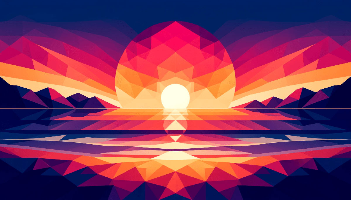
The sky catches fire every evening, painting clouds in shades most designers spend hours trying to replicate. Sunset color palettes capture this natural phenomenon in…
Color transitions can make or break a design. The right gradient color palette adds depth, emotion, and visual flow that flat colors simply can’t match.…
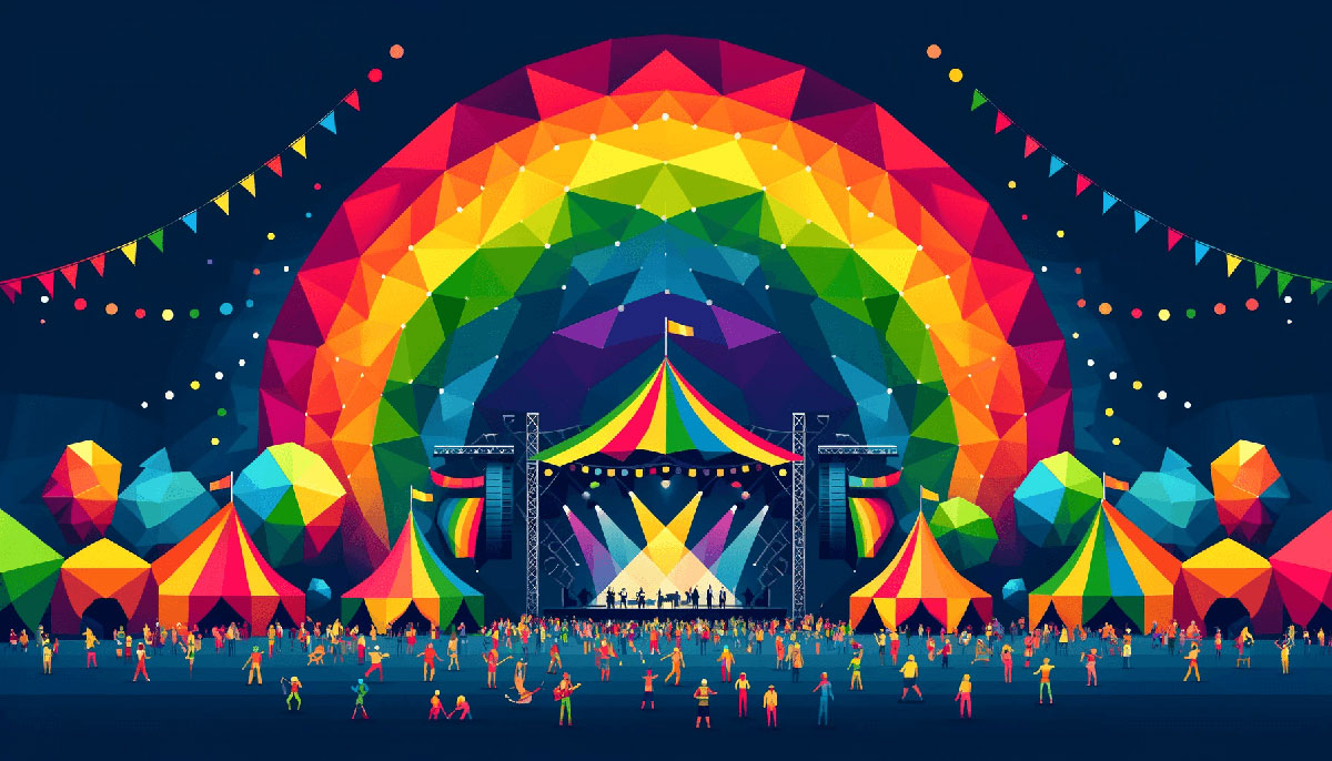
Rainbow color palettes turn single-hue strategies into full-spectrum statements. Whether you’re building a kids’ app, festival poster, or dashboard that needs instant visual separation, these…
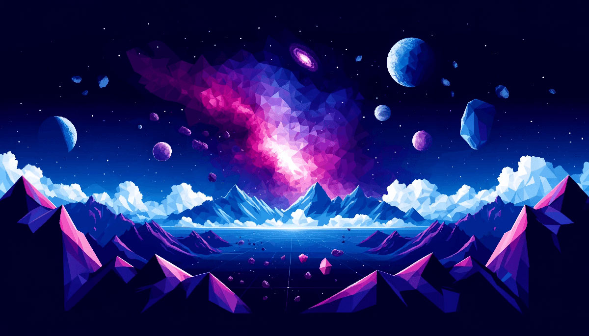
Pull up any telescope image from the James Webb or Hubble archives and you’ll find space color palettes that no designer could invent. Deep purples…
Dark backgrounds don’t just look moody. They reduce eye strain, improve readability in low light, and make accent colors pop with surgical precision. Night color…
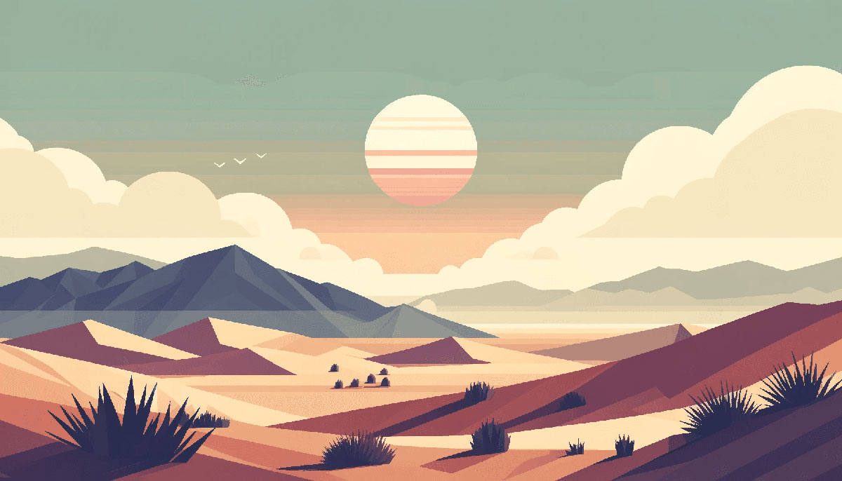
Some colors just feel right. Earth color palettes – built from terracotta, raw umber, sand, clay, and warm neutrals – have that quality. They’re grounded…
Looking at a forest canopy or ocean wave reveals something designers have known for centuries: nature already solved color harmony. Nature color palettes pull from…
Happy color palettes transform designs from forgettable to magnetic in seconds. The right combination of cheerful hues triggers dopamine, grabs attention, and makes your brand…
Color sets the mood before anything else loads, renders, or gets read. The right summer color palette can make a design feel like cold lemonade…
Cool tones suggest calm, trust, and precision. That’s why cold color palettes dominate healthcare apps, financial dashboards, and corporate interfaces where credibility beats excitement. But…
Your brand feels cold. Visitors scroll past without stopping, and conversions stay flat despite solid copy. The problem isn’t your messaging. It’s your warm color…
Dark color palettes do what bright ones can’t: they create depth, drama, and sophistication without shouting for attention. Most designers reach for light, vibrant schemes…
Color sets the tone before a single word is read. Light color palettes are the go-to choice for designers who want clean, open, and approachable…
Gold transforms ordinary designs into something people actually remember. Whether you’re designing a wedding invitation, building a brand identity, or refreshing your portfolio, gold color…
Neon color palettes transform ordinary designs into electric visual experiences that demand attention. These high-saturation, fluorescent-inspired schemes create instant impact whether you’re building a cyberpunk…
Vintage color palettes carry the weight of decades in their muted tones and faded hues. They’re not just collections of hex codes pulled from old…