


Few figures have shaped modern visual communication like Milton Glaser. With a single sketch on a scrap envelope, he created what became perhaps the most recognized logo in history, “I ♥ NY”, transforming how we express affection for places worldwide. But Glaser’s influence extends far beyond this iconic mark.
As a founding figure in American graphic design movements, Glaser revolutionized commercial art through his unique fusion of fine art techniques with pragmatic communication goals. His prolific six-decade career produced defining works that shaped our visual landscape: the psychedelic Bob Dylan poster, New York Magazine’s editorial design, and corporate identities for institutions from Brooklyn Brewery to DC Comics.
This article explores the life, methodology, and enduring legacy of this design legend whose work continues influencing contemporary visual culture and web design practices long after his 2020 passing. Through Glaser’s story, we’ll discover how one creative mind transformed ordinary communication into extraordinary cultural artifacts.
Who is Milton Glaser?
Milton Glaser was a renowned American graphic designer, best known for creating the iconic “I ♥ NY” logo in 1977. He co-founded Push Pin Studios and New York magazine, significantly influencing visual culture with works like the psychedelic Bob Dylan poster. Glaser’s designs blended art history with pop sensibility, shaping modern graphic design.
Early Life and Education
Born in 1929 to Hungarian Jewish immigrants in the Bronx, New York, Milton Glaser showed artistic talent from an early age. His parents recognized this gift and supported his creative development-a decision that would eventually lead him to become one of the most influential graphic designers of the 20th century.
His formal education began at the High School of Music and Art in Manhattan, where he first encountered structured design principles. This foundation proved crucial for his development as a visual artist. The school’s emphasis on both technical skills and creative expression shaped his early understanding of visual communication.
In 1948, Glaser enrolled at Cooper Union College, an institution known for its rigorous art and design program. Here, he studied under influential instructors who taught him the fundamentals of:
- Typography
- Drawing techniques
- Color theory
- Composition
The Cooper Union experience immersed him in modernist design thinking while encouraging him to develop his distinct visual language. During this formative period, he began to explore the difference between art and design, a philosophical inquiry that would influence his career approach.
After graduation, Glaser received a Fulbright Scholarship to study with the renowned painter Giorgio Morandi in Bologna, Italy. This European sojourn profoundly influenced his aesthetic sensibilities. Studying classical art provided him with historical perspective while exposing him to traditional techniques.
The Italian Renaissance traditions he encountered contrasted with American commercial design practices. This tension between classical art forms and contemporary design needs became a creative resource throughout his career. European art movements, particularly Italian Renaissance composition and Art Deco motifs, influenced his approach to visual hierarchy and symmetry.
Career Beginnings
Returning to New York in 1954, Glaser co-founded Push Pin Studios with Seymour Chwast, Reynold Ruffins, and Edward Sorel-fellow Cooper Union graduates. Their partnership revolutionized American illustration and design through their distinct approach to visual communication. Push Pin Studios quickly gained recognition for rejecting sterile Swiss design trends and embracing eclectic historical references.
Push Pin’s revolutionary style combined:
- Victorian illustration techniques
- Art Nouveau decorative elements
- Influences from Islamic patterns
- References to Japanese woodblock prints
- Pictorial modernism concepts
Their work featured vibrant colors, intricate details, and playful compositions that challenged prevailing minimalist design sensibilities. The studio’s monthly publication, the Push Pin Graphic, showcased their innovative visual language and served as a laboratory for experimental design approaches.
Glaser’s early commercial projects included book covers, record sleeves, and magazine illustrations that displayed his evolving style. His ability to create work with strong focal points and distinctive typography elements quickly attracted high-profile clients. Major corporations sought his unique blend of historical reference and contemporary sensibility.
While building his commercial practice, Glaser began teaching at the School of Visual Arts in New York. This dual identity as practitioner and educator became central to his career. His teaching philosophy emphasized drawing as fundamental to design thinking. Through his educational work, he influenced generations of graphic designers while articulating his design philosophy.
The combination of studio practice, commercial projects, and teaching established Glaser as a leading figure in American design. His early work reflected social consciousness and cultural awareness that would characterize his entire career. Each project, whether commercial or experimental, demonstrated his commitment to design as both cultural practice and communication tool.
Iconic Works Analysis
“I ♥ NY” Logo (1977)

The “I ♥ NY” logo remains Milton Glaser’s most recognized work. Created during New York City’s financial crisis, this symbol transcended its original tourism campaign purpose. The design emerged from a simple brief: create a mark to promote New York state tourism.
Working with traditional materials, Glaser sketched the concept in red crayon on a scrap envelope during a taxi ride. This spontaneous creation demonstrates his belief that design often begins with intuitive gestures rather than elaborate planning.
The logo’s elements showcase Glaser’s genius for simplicity:
- American Typewriter font creating warmth and nostalgia
- Heart symbol replacing the word “love”
- Stacked format creating visual tension and memorability
What makes this vector graphics icon so powerful is its perfect balance between legibility and emotion. The heart serves as both literal symbol and emotional trigger. Using negative space in logo design principles, he created breathing room that enhances recognition.
The cultural impact exceeded all expectations. What began as a tourism promotion evolved into a universal declaration of urban affection. The mark became synonymous with New York’s identity, appearing on merchandise worldwide. After 9/11, Glaser modified it to “I ♥ NY More Than Ever,” demonstrating its emotional resonance and adaptability.
Bob Dylan Poster (1966)

Glaser’s 1966 poster for Bob Dylan’s Greatest Hits album represents his psychedelic art period. The profile silhouette with vibrant, swirling hair captures 1960s counterculture energy while referencing art history. This poster design demonstrates Glaser’s ability to merge contemporary culture with historical references.
The poster’s color choices reflect psychological intent. The rainbow hair uses varying hue and saturation to suggest expanding consciousness-a perfect visual metaphor for Dylan’s music. The dramatic contrast between black silhouette and colorful hair creates a powerful emphasis highlighting Dylan’s creative mind.
Technically, the poster combined:
- Flat black silhouette
- Hand-rendered flowing lines
- Complementary color scheme for maximum vibrancy
The poster’s technique influenced countless designers and became a defining image of 1960s visual culture. Its rhythm in design reflects musical quality through visual pattern.
New York Magazine Co-founding (1968)
In 1968, Glaser and editor Clay Felker created New York Magazine, revolutionizing publication design. As founding art director, Glaser established a visual language that balanced journalistic credibility with visual excitement.
His editorial design innovations included:
- Integration of illustration and typography
- Consistent grid systems allowing flexibility
- Strategic use of white space in design for readability
The magazine’s architecture respected margin in design principles-creating breathing room while maintaining content density. This balance became a hallmark of Glaser’s approach to page layout. His work influenced countless publication designers who adopted his structural yet expressive approach.
DC Comics and Bullet Logo (1976)

In 1976, Glaser redesigned DC Comics’ corporate identity, creating the “DC Bullet” logo. This project showcased his approach to brand guidelines for large organizations.
The logo featured:
- Circular format suggesting completeness
- Star element creating visual interest
- Typography maintaining brand heritage
The redesign aimed to preserve DC’s established recognition while modernizing its appearance. Glaser applied logo design principles to create a mark that worked across multiple applications from comic covers to merchandise.
This corporate rebranding demonstrated Glaser’s skill in balancing tradition with innovation-respecting brand equity while pushing visual language forward. His solution proved remarkably durable, serving DC Comics for nearly three decades.
Design Philosophy and Approach
Core Principles

Milton Glaser’s design philosophy centered on communication over decoration. He believed design must first communicate clearly, then delight visually. His famous principle “Just enough is more” challenged Mies van der Rohe’s “Less is more” maxim, suggesting optimal rather than minimal design.
Glaser preferred hand-drawing as the foundation of design thinking. He saw the direct connection between mind and hand as essential for authentic creative expression. This hand-drawn quality appears even in his most polished work.
His design approach combined seemingly contradictory elements:
- Modernist clarity with historical references
- Rational structure with emotional appeal
- Commercial effectiveness with artistic integrity
These tensions created work that simultaneously satisfied clients and elevated public visual literacy. He believed in design’s responsibility to improve culture rather than merely reflect it.
Visual Language
Glaser’s visual language employed color psychology to create emotional responses. He often developed custom color palettes that referenced historical periods while feeling contemporary.
His typographic approach balanced tradition with innovation. Rather than following trends, Glaser developed unique typographic hierarchy systems for each project. He frequently paired serif font classics with experimental display font choices, demonstrating a nuanced understanding of how to pair fonts.
Glaser’s mastery of contrast in design allowed him to create visual interest with minimal elements. He applied the Gestalt principles of design instinctively, creating unified compositions from diverse elements.
Creative Process
Glaser’s process began with intensive research into the subject matter. He read widely across disciplines to inform his design decisions. Research aimed not at derivative solutions but at understanding contextual implications.
His idea generation frequently involved:
- Hand sketching multiple concepts
- Development of visual metaphors
- Testing different alignment approaches
- Refinement through iteration
Unlike designers who separated conceptual and execution phases, Glaser allowed making to inform thinking. The physical act of drawing or painting often revealed solutions unavailable through pure conceptualization.
His production methods balanced traditional and contemporary techniques. Early work utilized conventional printing methods while later projects incorporated digital tools. Yet even when using computers, Glaser maintained his distinctive hand-drawn quality.
Famous Quotes and Teachings
Glaser’s writings and teachings significantly influenced design education. His book “Art is Work” articulated core beliefs about design’s purpose and practice. As instructor at School of Visual Arts, he emphasized drawing as fundamental to design thinking.
His teaching challenged false dichotomies between art and design, commercial and fine art. Instead, he advocated for design as cultural practice with ethical responsibilities. This perspective reflected broader postmodern graphic design trends while maintaining his unique vision.
Key Glaser principles included:
- “Good design is good citizenship”
- “Design is not art, but uses artistic means to achieve social ends”
- “The purpose of design is to inform and delight”
These perspectives transformed design practice by elevating its cultural significance beyond mere commercial service. His teaching emphasized design’s capacity to promote social good while respecting visual culture’s historical foundations.
Later Career Highlights
Notable Projects After 1980
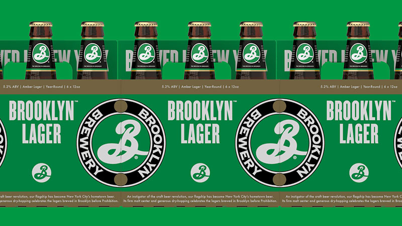
After establishing himself as a design icon, Milton Glaser continued producing significant work well into his later years. His Brooklyn Brewery identity in 1988 revitalized an emerging craft brewery while referencing historical Brooklyn imagery. The logo combined nostalgic elements with contemporary typography to create a brand that felt simultaneously authentic and fresh.
The design featured:
- Bold slab serif font for strength
- Historical Brooklyn motifs
- Strategic use of gradient for dimensional quality
This branding expert approach helped transform a small brewery into a national brand, demonstrating Glaser’s continued commercial relevance decades into his career.
In 1993, Glaser created the poster series for Tony Kushner’s groundbreaking play “Angels in America.” These designs showcased his mature style-combining symbolic imagery with powerful typographic elements. The posters utilized monochrome colors with strategic accent hues to create theatrical drama through static imagery.
His continued book cover designs for authors like Philip Roth maintained his connection to publishing while exploring new visual identity approaches. These projects reflected his evolving aesthetic sensibilities while retaining his fundamental commitment to communication.
Glaser’s design for the World Health Organization’s AIDS awareness campaign demonstrated his ability to address complex social issues through visual arts. The campaign required cultural sensitivity while delivering urgent public health information-exactly the kind of challenge that energized Glaser’s practice.
International Recognition
By the 1980s, Glaser’s reputation extended far beyond American borders. Major international exhibitions showcased his work to global audiences. His 1983 retrospective at the Centre Georges Pompidou in Paris established his significance within contemporary art discourse beyond commercial design circles.
The prestigious AIGA Medal in 1972 marked only the beginning of his accolades. Later honors included:
- National Design Award for Lifetime Achievement (2004)
- Cooper-Hewitt National Design Award (2004)
- National Medal of Arts from President Barack Obama (2009)
These recognitions affirmed Glaser’s enduring influence on visual culture. His work appeared in permanent collections at major museums including the Museum of Modern Art and the Smithsonian. Academia embraced his contributions through honorary degrees from prestigious institutions worldwide.
The documentary film “To Inform and Delight” (2008) introduced Glaser’s work and philosophy to new generations. This broader cultural recognition elevated design discourse beyond specialist circles into general cultural awareness.
Later Style Evolution
Glaser’s late-career work showed remarkable stylistic evolution. While maintaining his distinctive sensibility, he embraced new technologies and aesthetic approaches. His willingness to experiment with digital tools demonstrated extraordinary adaptability.
His mature style featured:
- Greater asymmetry in composition
- Increasingly expressive brushwork
- Integration of photographic elements
- Exploration of triadic color scheme relationships
While contemporaries often settled into predictable stylistic patterns, Glaser constantly revisited his assumptions about effective visual communication. This intellectual restlessness kept his work relevant across six decades of practice.
His experiments with digital design tools maintained his hand-drawn sensibility while exploring new production possibilities. Unlike designers who fully embraced bitmap aesthetics, Glaser integrated digital techniques while preserving his distinctive mark-making.
Personal Life and Character
Relationships and Partnerships
Milton Glaser’s 1957 marriage to Shirley Girton created both personal stability and creative partnership. Shirley, herself a designer, provided critical perspective on his work while managing their shared studio. Their collaborative approach to life and work represented an integrated creative practice.
His professional relationships extended beyond business transactions into genuine friendships. Lengthy collaborations with editors like Clay Felker and Walter Bernard created rich creative dialogues. These partnerships often yielded unexpected solutions that transcended individual contributions.
Glaser maintained connections with former students who became colleagues. His generosity in mentoring young designers created a network of creative relationships spanning generations. This extended professional family sustained his engagement with contemporary design discourse throughout his career.
Studio Environment and Work Habits
Glaser’s Manhattan studio on 32nd Street became legendary in design circles. The space reflected his working methods-organized yet allowing creative spontaneity. Bookshelves lined with art history volumes, literature, and philosophy texts revealed his intellectual foundations.
His daily routine demonstrated remarkable discipline. Arriving at the studio by 9 AM, he typically worked until early evening. Hands-on production remained central to his practice throughout his career. Even with capable assistants, Glaser insisted on personal involvement in all aspects of the design process.
His workspace featured:
- Drawing tables rather than computer workstations
- Art materials arranged for immediate access
- Walls covered with work-in-progress
- Reference materials organized by project
This environment facilitated his process-oriented approach to design. Ideas emerged through making rather than abstract conceptualization. The psychology of shapes in his work often resulted from intuitive drawing sessions rather than predetermined plans.
Unlike designers who separated business and creative roles, Glaser maintained direct client relationships throughout his career. This connection to real-world communication needs grounded his experimental impulses in practical application.
Interests Beyond Design
Glaser’s intellectual curiosity extended far beyond design. His passion for cooking paralleled his approach to visual composition-combining unexpected ingredients to create harmonious results. Food represented another creative outlet with both technical and expressive dimensions.
Music played a significant role in Glaser’s life and work. His record collection spanned classical, jazz, and world music-influences visible in the rhythmic qualities of his compositions. The structural principles of music often informed his approach to repetition and variation in visual arrangements.
His art collection reflected eclectic tastes ranging from Italian Renaissance drawings to Japanese woodblock prints. These historical references provided continuous inspiration throughout his career. Unlike designers who focused exclusively on contemporary visual culture, Glaser constantly engaged with art history.
Glaser’s interest in urban life made him a quintessential New Yorker. His daily walks through Manhattan neighborhoods provided visual stimulation and human connection. The city served as both subject matter and creative catalyst throughout his career.
His intellectual engagement with philosophy and literature informed his design thinking. References to writers and thinkers appeared throughout his work and writing. This integration of visual and verbal thinking distinguished his approach from purely formal design practices.
Cultural and Social Context
New York City Influence

New York City profoundly shaped Milton Glaser’s design sensibility. The city’s cultural diversity, architectural complexity, and visual density provided constant inspiration. His studio in Manhattan kept him connected to urban rhythms that energized his practice.
The city’s typography-from subway signage to storefront lettering-informed his understanding of public communication. New York’s CMYK printing industry provided technical knowledge that influenced his approach to color reproduction in print design.
Glaser’s contributions to New York’s visual identity included:
- The iconic “I ♥ NY” campaign
- New York Magazine’s editorial design
- Restaurant identities that defined neighborhood character
- Cultural institution branding
This reciprocal relationship made Glaser as much a product of New York as New York became a canvas for his vision. His work reflected the city’s energy while helping define its visual character for both residents and visitors.
Response to Social Movements

Glaser’s career spanned dramatic social transformations, from 1960s counterculture through digital revolution. His work consistently engaged with these cultural shifts rather than remaining in aesthetic isolation.
During the Vietnam War era, his poster designs often contained subtle political commentary. While avoiding explicit propaganda, these works reflected his progressive values through symbolic imagery and typographic elements.
His approach to social design emphasized:
- Communication clarity while respecting audience intelligence
- Positive messaging rather than confrontational rhetoric
- Visual sophistication accessible to diverse audiences
- Cross-cultural imagery that transcended political divisions
This balanced approach allowed his work to address complex issues while maintaining broad appeal. Unlike peers who created explicitly political work, Glaser embedded social consciousness within commercial projects-reaching audiences beyond activist circles.
The AIDS awareness campaign for World Health Organization demonstrated his ability to address urgent public health concerns through compelling visual language. This work required cultural sensitivity while delivering potentially lifesaving information across diverse cultural contexts.
American Design Movement

Glaser occupied a pivotal position in American design history. His work bridged European-influenced modernism and distinctly American visual expression. This synthesis created design that respected historical foundations while responding to contemporary American culture.
His timing proved fortuitous-emerging as postwar prosperity created unprecedented demand for visual communication. Corporate expansion, media proliferation, and consumer culture generated opportunities for designers to shape American visual identity.
Glaser’s American design perspective included:
- Pragmatic approach to communication problems
- Integration of fine art techniques with commercial purposes
- Cultural inclusivity reflecting American diversity
- Optimistic visual tone balancing sophistication with accessibility
These qualities distinguished American design from European traditions. While European modernism often emphasized systematic approaches and universal solutions, Glaser’s American perspective embraced flexibility and cultural specificity.
His teaching at School of Visual Arts institutionalized this American design perspective. Generations of students absorbed his balanced approach-respecting design history while responding to contemporary American realities. This educational impact extended his influence far beyond his personal design production.
Artistic and Design Influences
Historical Art Movements
Glaser freely borrowed from art history throughout his career. Unlike designers who pursued stylistic consistency, he selected historical references based on communicative needs rather than personal aesthetic preferences.
Art Nouveau’s flowing organic forms influenced his psychedelic period work, particularly the Bob Dylan poster. The movement’s integration of fine and applied arts resonated with his belief in erasing boundaries between artistic disciplines.
Renaissance art provided compositional lessons that informed his editorial layouts and poster designs. The period’s unity of mathematics, art, and humanism paralleled Glaser’s integrated approach to design problems.
Key historical influences included:
- Art Nouveau decorative patterns and typography
- Renaissance compositional balance and proportional relationships
- Constructivism political imagery and geometric structure
- Victorian ornamental typography and illustration techniques
These references appeared throughout his work not as nostalgic pastiche but as conceptual resources for contemporary communication. His historical knowledge allowed him to select precisely the visual language appropriate for specific communication tasks.
Glaser’s work with baseline grids demonstrated his ability to apply Renaissance proportional systems to contemporary design problems. This historical knowledge informed technical decisions like leading in typography and DPI (dots per inch) specifications.
Contemporary Design Scene

While deeply versed in design history, Glaser maintained awareness of contemporary developments. His relationship with other design movements was characterized by respectful engagement rather than competitive positioning.
He acknowledged Swiss International Style’s contributions to typographic clarity while rejecting its more dogmatic aspects. Similarly, he appreciated Brutalist graphic design experimentation while maintaining his commitment to communication effectiveness.
Glaser’s position relative to design contemporaries included:
- Shared pictorial modernism approach with Paul Rand
- More illustrative direction than Massimo Vignelli’s systematic work
- Less corporate focus than Saul Bass
- More historical reference than Herb Lubalin
These distinctions positioned him within American design’s creative ecology. Rather than leading a specific movement, Glaser demonstrated how individual vision could transcend stylistic categories.
His use of RGB color models in early digital experiments showed his willingness to engage with technological developments. Unlike designers who resisted digital tools, Glaser explored their potential while maintaining his distinctive voice.
Cross-Cultural Inspirations
Glaser’s work drew from global visual traditions beyond Western art history. This cross-cultural approach reflected his belief in design’s universal communicative potential despite cultural specificity.
Islamic pattern and ornament influenced his understanding of surface decoration and geometric structure. These references appeared in both commercial projects and personal explorations, demonstrating his integration of diverse cultural influences.
Japanese woodblock prints informed his approach to:
- Color layering techniques
- Compositional asymmetry
- Negative space utilization
- Fluid line qualities
These influences weren’t superficial stylistic borrowings but fundamental principles integrated into his design thinking. His global perspective expanded American design’s cultural references beyond European traditions.
Glaser’s incorporation of non-Western influences paralleled broader cultural trends toward globalization. His work demonstrated how designers could respectfully engage with diverse cultural expressions while avoiding appropriative exploitation.
His teaching encouraged students to build personal visual vocabularies from global sources rather than limiting themselves to Western design traditions. This cross-cultural perspective became increasingly relevant as design practice globalized throughout his career.
The integration of multiple cultural influences created work that transcended geographic boundaries while maintaining specific communicative intent. This balance between universal principles and cultural particularity characterized Glaser’s mature design approach.
Legacy and Impact
Influence on Modern Graphic Design
Milton Glaser’s influence permeates contemporary design practice in both obvious and subtle ways. His integration of fine art techniques with commercial communication transformed how designers approach their craft. Current practitioners continue to reference his methodologies even when unaware of their origin.
His design principles became mainstream through both direct teaching and the widespread circulation of his work. Ideas that appeared radical in the 1960s-like combining historical references with contemporary needs-now form standard design practice.
Stylistic elements that became industry standards include:
- Hand-drawn typography integrated with mechanical reproduction
- Strategic use of analogous colors for emotional impact
- Split-complementary color scheme applications in commercial contexts
- Image-text integration techniques that enhance both elements
Glaser’s influence extends beyond aesthetic considerations to fundamental approaches to problem-solving. His process-oriented methodology, which emphasized research and conceptual development, elevated design from mere decoration to strategic communication.
The current resurgence of interest in hand-crafted design directly connects to Glaser’s insistence on drawing as fundamental to design thinking. Contemporary designers returning to analog techniques often unknowingly follow paths he established decades earlier.
His impact on branding practice remains particularly significant. Glaser’s approach to corporate identity development-balancing systematic thinking with expressive qualities-continues to influence how organizations present themselves visually.
Cultural Significance of His Work
Glaser’s work transcended design circles to achieve broader cultural significance. The “I ♥ NY” logo became more than a successful tourism campaign-it entered global visual vocabulary as a template for expressing affection for places. Its ubiquity demonstrates design’s potential cultural impact when it taps universal human emotions.
Major museums worldwide including the Museum of Modern Art recognize his contributions through permanent collection acquisitions. This institutional validation acknowledges design’s cultural significance beyond commercial application.
The presence of Glaser’s work in popular consciousness extended beyond design professionals to general audiences. His posters, magazine covers, and campaigns reached millions, subtly elevating public visual literacy through everyday encounters with sophisticated design.
His work appears in various cultural contexts:
- Academic design education as canonical examples
- Packaging design case studies
- Popular merchandise featuring his iconic images
- Fine art contexts alongside traditional artists
This crossover between commercial and fine art spheres reflected Glaser’s belief in erasing artificial boundaries between creative disciplines. His success in multiple contexts demonstrated design’s potential significance beyond its functional origins.
The documentary film “To Inform and Delight” introduced his philosophy to new generations while affirming his cultural importance. This broader recognition elevated design discourse beyond specialist circles into general cultural awareness.
His obituaries in major publications following his 2020 death confirmed his status as a cultural figure transcending design specialization. The New York Times, for instance, chronicled his contributions to American visual culture alongside other significant cultural figures rather than limiting coverage to design publications.
Educational Impact
Glaser’s educational influence remains perhaps his most enduring legacy. Through formal teaching at School of Visual Arts and Cooper Union, he shaped generations of designers who carried his approaches into their own practices.
His books became essential texts in design education:
- “Graphic Design” (with Steven Heller)
- “The Design of Dissent” (with Mirko Ilić)
- “Drawing is Thinking”
- “Art is Work”
These publications articulated design philosophy that extended beyond technical considerations to address design’s cultural and ethical dimensions. Their continued use in design education ensures his perspectives remain relevant to new generations.
Glaser’s teaching emphasized fundamental skills over technological proficiency. His insistence on drawing ability-regardless of changing production technologies-maintained connections to design’s historical foundations. This approach balanced innovation with traditional craft knowledge.
His lectures and workshops worldwide extended his educational impact far beyond formal institutional connections. Through these presentations, he articulated complex design principles in accessible language that resonated with diverse audiences.
The Glaser Archives at School of Visual Arts preserve his process materials alongside finished work. This resource allows students to understand his working methods beyond the polished results. Access to sketches, notes, and rejected concepts provides invaluable insights into professional design development.
Most significantly, Glaser modeled integrated creative practice that transcended artificial divisions between art, design, and cultural commentary. This comprehensive approach encouraged students to develop personal philosophies rather than merely acquiring technical skills.
His teaching expanded design education beyond formal considerations to address content and meaning. By emphasizing design’s communicative purpose rather than merely its aesthetic dimensions, Glaser elevated design discourse toward greater cultural significance.
The values he championed-intellectual curiosity, historical awareness, craftsmanship, and social responsibility-remain essential aspirations for design education. As design practice continues evolving through technological and cultural change, these fundamental principles maintain their relevance.
Glaser’s examples of work maintaining integrity within commercial constraints provides continuing inspiration for designers negotiating marketplace demands. His success in creating meaningful work while satisfying client needs demonstrates design’s potential to transcend purely commercial functions.
His legacy continues through designers who never met him personally but absorbed his perspectives through his work, writing, and institutional influence. This extended impact ensures his approaches will influence design practice long after his personal connections have faded.
The Milton Glaser Design Study Center and Archives, established at SVA in 2003, ensures scholars and students can study his methodologies in depth. This institutional commitment to preserving his legacy acknowledges his fundamental contribution to design’s development as both professional practice and cultural force.
Ultimately, Glaser elevated American graphic design’s cultural significance through work that balanced commercial effectiveness with artistic integrity. His integration of fine art sensibility with practical communication needs created a model for design practice that transcends stylistic fashion to address fundamental human communication needs.
FAQ on Milton Glaser
What is Milton Glaser most famous for?
Milton Glaser is most renowned for creating the iconic “I ♥ NY” logo in 1977, which became a global symbol of place affection. He also designed the psychedelic Bob Dylan poster (1966), co-founded New York Magazine, and created numerous corporate identities including DC Comics and Brooklyn Brewery. His work profoundly influenced American graphic design principles.
When and where was Milton Glaser born?
Milton Glaser was born on June 26, 1929, in the Bronx, New York City, to Hungarian Jewish immigrant parents. This urban upbringing in America’s cultural capital significantly influenced his design sensibility and approach to visual hierarchy throughout his career.
What was Push Pin Studios?
Push Pin Studios was a revolutionary design and illustration studio co-founded by Milton Glaser with Seymour Chwast, Reynold Ruffins, and Edward Sorel in 1954. The studio rejected sterile Swiss design trends, instead embracing eclectic historical references, vibrant colors, and playful compositions that transformed American visual communication.
What education did Milton Glaser receive?
Glaser studied at the High School of Music and Art in Manhattan before attending Cooper Union College. He later received a Fulbright Scholarship to study with painter Giorgio Morandi in Bologna, Italy. This classical typography training combined with European art exposure created his distinctive approach blending historical and contemporary elements.
How did Milton Glaser influence modern design?
Glaser revolutionized design by integrating fine art techniques with commercial communication. His methods-combining hand-drawn elements with mechanical reproduction, strategic use of movement in design, and image-text integration-became industry standards. His process-oriented methodology elevated design from decoration to strategic communication.
What was Milton Glaser’s design philosophy?
Glaser believed design must first communicate clearly, then delight visually. His “Just enough is more” principle suggested optimal rather than minimal design. He valued hand-drawing as fundamental to design thinking and balanced seemingly contradictory elements: modernist clarity with historical references, rational structure with emotional appeal, and commercial effectiveness with artistic integrity.
What awards did Milton Glaser receive?
Glaser received numerous prestigious honors including the AIGA Medal (1972), National Design Award for Lifetime Achievement (2004), Cooper-Hewitt National Design Award (2004), and the National Medal of Arts from President Barack Obama (2009). These recognitions reflect his profound impact on font psychology and visual culture.
How did Glaser approach color in his designs?
Glaser masterfully used color theory to create emotional responses. He developed custom color palettes referencing historical periods while feeling contemporary. His work often employed tetradic color scheme relationships and strategic saturation variations to create visual interest and guide viewers’ attention.
When did Milton Glaser die?
Milton Glaser died on June 26, 2020-his 91st birthday-in Manhattan, New York. His passing prompted tributes from the design community worldwide, with obituaries in major publications confirming his status as a cultural figure who transcended design specialization and influenced generations of visual artists.
Where can I study Milton Glaser’s work?
The Milton Glaser Design Study Center and Archives at School of Visual Arts (SVA) in New York preserves his sketches, finished works, and process materials. His work also appears in permanent collections at major museums including MoMA and the Cooper Hewitt. Design students worldwide study his methodologies through his books on iconic fonts and design philosophy.
Conclusion
Milton Glaser’s extraordinary career demonstrates how one creative vision can transform visual culture across generations. His masterful typography elements and pioneering typeface selections continue influencing designers today. The design mentor leaves an unmatched legacy of work that balances commercial success with artistic integrity.
What makes Glaser’s contribution exceptional:
- His dedication to font spacing and proximity in design elevated ordinary communication
- He maintained hand-crafted quality even as JPEG and digital tools transformed production methods
- His designs feature strategic focal points that guide viewers through complex visual narratives
- His commitment to social responsibility showed how brand guidelines could serve both commercial and cultural purposes
As we create mood boards for tomorrow’s design challenges, Glaser’s principles remain relevant-reminding us that effective visual communication must both inform and delight.

Renowned for his expertise in logo design and visual branding, Bogdan has developed a multitude of logos for various clients.
His skills extend to creating posters, vector illustrations, business cards, and brochures. Additionally, Bogdan's UI kits were featured on marketplaces like Visual Hierarchy and UI8.
He also wrote in the past years on sites like Design Your Way, WebDesignerDepot, WPDean, Designmodo, Speckyboy, Slider Revolution, and more.
- The Windsurf Logo History, Colors, Font, And Meaning - 10 October 2026
- How to Remove Background From Product Photos (No Photoshop) - 10 October 2026
- How Designers can Build a Stronger Online Creative Identity - 9 October 2026

Bogdan Sandu is a seasoned designer who has been designing websites since 2008. Renowned for his expertise in logo design and visual branding, Bogdan has developed a multitude of logos for various clients. His skills extend to creating posters, vector illustrations, business cards, and brochures. Additionally, Bogdan's UI kits were featured on marketplaces like Visual Hierarchy and UI8. He also wrote in the past years on sites like Design Your Way, WebDesignerDepot, WPDean, Designmodo, Speckyboy, Slider Revolution, and more.
You Might Also Like


