


Letterforms transformed into visual poetry-this defined Herb Lubalin’s revolutionary approach to design. The American graphic designer shattered convention through his visionary typography work, redefining how we understand the relationship between form and meaning.
Active from the 1940s through the 1970s, Lubalin established himself as a type manipulation master whose influence remains ubiquitous in contemporary visual culture. His expressive typography pushed creative boundaries while maintaining perfect communicative clarity.
Designers today continue mining inspiration from his groundbreaking publications (Avant Garde, Eros, U&lc), iconic corporate identities, and typeface innovations including ITC Avant Garde Gothic. The Cooper Union graduate combined technical precision with conceptual depth, creating work that functioned simultaneously as commercial art and visual commentary.
This exploration examines Lubalin’s design philosophy, typographic innovations, landmark projects, and lasting cultural impact-revealing why this AIGA Medal recipient remains essential study for anyone interested in how typography elements shape visual communication.
Who is Herb Lubalin?
Herb Lubalin is an influential American graphic designer known for his innovative use of typography. He co-created iconic typefaces like ITC Avant Garde and designed visually striking editorial layouts. Lubalin’s work in advertising and magazines, such as U&lc, helped redefine modern graphic design during the mid-20th century.
Foundations of Lubalin’s Design Philosophy
Core Design Principles

Herb Lubalin, a pioneering typography master, revolutionized 20th century design through his unconventional approach. His core philosophy rested on treating letters not merely as tools but as expressive art forms.
At the heart of Lubalin’s work was the belief that typography could simultaneously serve as both form and message. This typographic expression became his signature-where letterforms themselves communicated meaning beyond the words they spelled.
His design visionary approach balanced perfect alignment with artistic freedom. Lubalin’s work showcases how carefully positioned elements create powerful visual statements. This mastery of visual hierarchy let him control exactly how viewers engaged with his designs.
Lubalin’s print design philosophy embraced several core principles:
- Letters as expressive design elements
- Meaning conveyed through form
- Perfect tension between legibility and artistic expression
- Deliberate manipulation of space
- Balance between commercial needs and creative vision
Influences and Inspirations
Cooper Union School of Art shaped Lubalin’s early design thinking. His modernist design approach echoed elements of Swiss design but rejected its rigid constraints for more playful expressions.
Lubalin’s commercial art career at Sudler & Hennessey exposed him to advertising’s demands while allowing experimentation. Ralph Ginzburg, his publishing collaborator, encouraged his most boundary-pushing work in publications like Eros magazine and Avant Garde.
His design aesthetics pulled from diverse sources:
- Mid-20th century art movements
- New York design scene energy
- Literary and cultural references
- Technical printing innovations
The vibrant New York commercial design environment of the 1950s-70s fostered his growth alongside contemporaries pushing typographic boundaries. This community encouraged his development of design principles that would earn him the AIGA Medal and Art Directors Club Hall of Fame recognition.
Evolution of His Design Thinking
Lubalin’s career traced a fascinating arc from conventional commercial artist to revolutionary design innovator. His early work shows competent but restrained approaches, while his later projects reveal bolder experimentation with typographic hierarchy and negative space.
His signature style emerged fully through magazine design for projects like Fact magazine. Here, he perfected the integration of contrast in design with editorial layout brilliance.
The transformation of Lubalin’s philosophy shows in his shifting priorities:
- Early phase: Client-focused clarity and commercial effectiveness
- Middle period: Expressive typography pushing readability boundaries
- Late period: Typography as pure visual art and social commentary
Typographic Innovations and Techniques
Letterform Manipulation

Lubalin revolutionized kerning through his “tight but not touching” approach. Letters nestled intimately together created new visual tensions while maintaining readability.
His manipulation of font spacing broke established rules yet somehow worked brilliantly. This distinctive technique involved precise adjustments to letter relationships that created unified visual entities rather than mere word sequences.
Lubalin didn’t just use typefaces, he transformed them. He would:
- Stretch and compress character shapes
- Blend separate letters into unified forms
- Create custom modifications for specific applications
- Develop unique ligatures that became signature elements
Signature Typographic Treatments
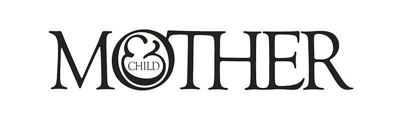
The “Mother & Child” logo for the Women’s Medical Center demonstrates Lubalin’s genius. This design used an ampersand to simultaneously represent both mother and fetus-showcasing how typographic elements could tell complex stories.
His use of ligatures went beyond traditional character combinations. Created during his partnership with Lubalin, Smith & Carnase studio, these custom joins formed entirely new visual relationships.
Lubalin mastered serif and sans-serif font combinations long before this became standard practice. His PBS logo demonstrates this beautifully with its dimensional quality and perfect balance.
His typographic art often featured:
- Unexpected scale relationships between elements
- Visual puns embedded within letterforms
- Integration of white space in design as active elements
- Creative letter combinations that formed pictures
Technical Mastery
Lubalin worked in the pre-digital era, making his achievements even more remarkable. His designs required meticulous hand-lettering before computer tools existed to simplify the process.
His phototypesetting expertise allowed him to push technical boundaries. Working closely with type houses, he demanded precision that machine operators initially thought impossible.
Lubalin’s problem-solving brilliance shines through his editorial design innovations. Each U&lc magazine issue presented new typographic challenges that he solved through ingenious combinations of:
- Custom hand-lettering
- Photo manipulation
- Paste-up techniques
- Collaborative processes with production specialists
The baseline in Lubalin’s designs often functioned as more than just an alignment tool, it became an expressive element itself, with carefully considered adjustments that created visual rhythm.
His work with display fonts broke new ground in how large-scale typography could function as both text and image simultaneously. This approach influences graphic design principles to this day.
Through ITC Avant Garde Gothic and his later creation of Lubalin Graph, he demonstrated how typography could transcend mere communication to become a genuine art form-one that continues to inspire designers decades after his passing.
Landmark Projects and Works
Magazine Design Revolution
Herb Lubalin transformed editorial design through three groundbreaking publications that showcased his typographic vision. Each pushed boundaries of what magazine design could achieve.
Eros magazine, his collaboration with Ralph Ginzburg, demonstrated Lubalin’s ability to craft sophisticated visual narratives. The publication featured unprecedented attention to typographic hierarchy, with headers and body text working in perfect harmony. Despite only publishing four issues before legal challenges ended its run, Eros established new standards for publication design.
Avant Garde magazine emerged as perhaps his most influential editorial work. Its bold, geometric masthead evolved into the iconic ITC Avant Garde Gothic typeface. Each issue displayed Lubalin’s mastery of:
- Dynamic page layouts with surprising asymmetry
- Custom letterforms that conveyed the magazine’s forward-thinking ethos
- Integration of typography with striking photography
- Innovative use of negative space as active design elements
U&lc (Upper and lower case) magazine served as Lubalin’s typographic playground. Published by International Typeface Corporation, this industry publication showcased experimental approaches to letterform design. Lubalin used its pages to demonstrate how typographic elements could function as both communication tools and artistic expression.
The design visionary approached each magazine with distinct focal points. His layouts guided readers through content with precision while delivering visual delight. These publications transformed editorial design from merely arranging text to creating holistic visual experiences.
Iconic Logo Designs
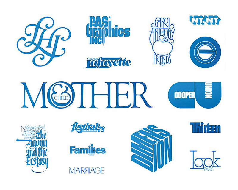
Lubalin’s approach to logo design principles reshaped corporate identity creation. His logos distilled complex messages into elegantly simple forms.
The PBS logo remains one of his most recognized works. Its simplified human profiles demonstrate Lubalin’s gift for creating logos with timeless appeal and instant recognition. This mark exemplifies his belief that effective design should communicate clearly while containing layers of meaning.
Mother & Child logo for the Women’s Medical Center represents Lubalin’s genius for visual storytelling. This masterful design uses typographic elements to create a dual representation:
- An ampersand symbol that forms both mother and child figures
- A perfectly balanced composition creating immediate emotional resonance
- Visual elements that require minimal explanation yet convey complex relationships
His corporate identity work extended beyond logos to complete visual systems. Each identity program reflected his meticulous attention to how design elements interact across applications. His work for numerous clients demonstrated how thoughtful visual hierarchy could establish brand recognition while conveying organizational values.
Poster and Print Design
Lubalin’s poster design work showcased his mastery of the rule of thirds and compositional balance. His posters typically featured:
- Bold typographic statements as central elements
- Strategic use of contrast to create visual impact
- Precise alignment choices that guided the viewer’s eye
- Integrated imagery that complemented rather than competed with typography
His editorial layouts for publications like Saturday Evening Post pushed boundaries of what print design could accomplish. Lubalin treated page composition as an art form, manipulating grid systems to create unexpected but harmonious arrangements.
Advertising work from his time at Sudler & Hennessey introduced new approaches to integrating copy and visuals. These pieces broke industry conventions by treating words as graphic elements rather than merely content to be contained. This approach influenced generations of designers to view typography as an expressive medium.
Typeface Development
ITC Avant Garde Gothic
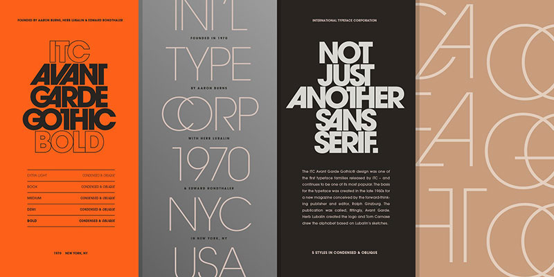
ITC Avant Garde Gothic emerged from Lubalin’s masthead design for Avant Garde magazine. This collaboration with Tom Carnase transformed a logo into one of the 20th century’s most influential typefaces.
The typeface features distinctive characteristics:
- Perfectly geometric letterforms with uniform stroke weights
- Unusual alternate characters that could interlock in creative ways
- A modernist sensibility balanced with practical usability
- Versatility across display and text applications
Avant Garde’s development process illustrates Lubalin’s collaborative approach. Working with the International Typeface Corporation, he expanded the original masthead concepts into a comprehensive character set. His partnership with type designer Tom Carnase brought technical precision to his creative vision.
The typeface’s cultural impact extended far beyond traditional graphic design. Avant Garde Gothic became emblematic of 1970s visual culture, appearing everywhere from album covers to corporate identities. Its clean lines and geometric precision perfectly captured the era’s forward-looking aesthetics.
Other Typeface Contributions

Lubalin Graph stands as another significant contribution to type design history. This serif font variant of Avant Garde demonstrated Lubalin’s understanding of how subtle modifications could transform a typeface’s character while maintaining its essential DNA.
His serif/sans-serif hybrid experiments predated current trends in typeface design by decades. These explorations showed remarkable insight into how font attributes could be mixed to create fresh typographic voices.
For specific projects, Lubalin frequently developed custom alphabets that precisely matched client needs or editorial contexts. Each custom typeface reflected his belief that typography should serve both functional and expressive purposes.
Typography as an Art Form
Lubalin elevated typography from mere text arrangement to pure artistic expression. His experimental alphabets pushed the boundaries between letterforms and illustration.
His approach to display fonts transformed how designers thought about headline typography. Rather than simply selecting appropriate typefaces, he showed how custom modifications could create unique visual experiences.
Some of Lubalin’s most innovative work involved typography that communicated without requiring reading. His visual puns and typographic compositions conveyed messages through form rather than literal text. These pieces demonstrated his understanding of the Gestalt principles – particularly how viewers perceive and process visual information.
His typographic art explored:
- Letter forms as abstract shapes with emotional qualities
- Spacing and tracking as expressive elements
- The visual impact of weight and scale variations
- Integration of photography and illustration with letterforms
Through these explorations, Lubalin demonstrated how typography could function as both communication tool and pure artistic expression. His work continues to influence designers worldwide, showing how attention to letterform relationships can create deeply resonant visual communication.
Teaching and Mentorship
Academic Contributions

Herb Lubalin transformed design education through his teaching at Cooper Union School of Art. His instructional approach rejected rigid formulas, instead encouraging students to discover their unique visual voices.
As a design educator, Lubalin emphasized:
- Typography as both technical craft and expressive art
- Critical thinking above mere stylistic execution
- The importance of concept development before visual exploration
- Learning through experimentation and calculated risk-taking
His curriculum development brought professional-level challenges into the classroom. Students worked on real-world projects that demanded both creativity and practicality. This approach bridged the gap between academic exercises and commercial realities.
Lubalin’s influence on design education extended beyond formal teaching. His lectures and workshops exposed countless students to his philosophy that typography served as the foundation of effective visual communication.
Mentorship Style and Approach
Lubalin’s mentorship transcended conventional teaching. He cultivated a studio environment where young designers learned by doing, observing, and receiving candid feedback.
His collaborative practices embraced an egalitarian approach. Junior designers received opportunities to contribute meaningfully to significant projects, with Lubalin guiding rather than dictating solutions. This created an atmosphere of creative unity while encouraging individual growth.
Relationships with younger designers often evolved from teacher-student to genuine creative partnerships. Many notable figures in American graphic design cite Lubalin’s mentorship as transformative in their development. His approach balanced:
- Rigorous standards that pushed designers beyond comfortable solutions
- Genuine curiosity about emerging perspectives
- Emphasis on finding personal design voices rather than creating replicas
- Respect for diverse approaches to visual problem-solving
The typographer’s studio functioned as an informal master class. Young designers absorbed Lubalin’s meticulous attention to letterform relationships, spacing, and the emotional impact of typographic choices. His insistence on exploring multiple solutions before settling on a direction taught valuable lessons about design process.
Educational Legacy
The Herb Lubalin Study Center establishment in 1985 at The Cooper Union preserves his work while inspiring new generations. This archive houses extensive collections of his designs, sketches, and correspondence.
His archives provide invaluable resources for understanding mid-20th century design evolution. Students studying these materials gain insights into both finished works and developmental processes-seeing how ideas transformed through iteration and refinement.
Lubalin’s influence continues in design schools worldwide. His approach to typography elements and typographic expression appears in countless curricula. Contemporary typography education remains deeply indebted to his innovations in:
- Treating letterforms as expressive shapes
- Understanding the psychology of shapes in letterforms
- Exploring leading in typography as an artistic choice
- Creating meaning through deliberate manipulation of typographic space
The Herb Lubalin Lecture Series brings leading design voices to discuss typography’s evolving role. This programming extends his educational impact beyond his lifetime, fostering ongoing conversation about typography’s place in visual culture.
FAQ on Herb Lubalin
Who was Herb Lubalin and why is he important to graphic design?
Herb Lubalin (1918-1981) was an American graphic designer, typographer, and art director who revolutionized expressive typography. His innovative approach to letterform design transformed how text could communicate visually. As a design visionary at the Cooper Union School of Art, he bridged commercial art and fine art, influencing generations of designers through publications like U&lc magazine.
What typefaces did Herb Lubalin create?
Lubalin’s most famous creation was ITC Avant Garde Gothic, developed with Tom Carnase from the Avant Garde magazine masthead. He also created Lubalin Graph, a slab serif font version of Avant Garde. His custom alphabets and experimental letterforms for specific projects showcased his masterful type design approach.
What is “expressive typography” and how did Lubalin develop it?
Expressive typography uses letterforms to convey meaning beyond the literal text. Lubalin pioneered this approach by treating type as both communication tool and visual art. He manipulated spacing, scale, and form to create emotional responses. His work demonstrated that typography could simultaneously express ideas through both verbal content and visual form.
What magazines did Herb Lubalin design?
Lubalin designed three groundbreaking publications: Eros magazine with Ralph Ginzburg, which featured sophisticated editorial layout; Avant Garde magazine, whose masthead evolved into his famous typeface; and U&lc (Upper and lower case), published by International Typeface Corporation as a showcase for experimental typographic approaches and creative typography.
What was Herb Lubalin’s educational background?
Lubalin graduated from the Cooper Union School of Art in New York City. This prestigious design education provided his technical foundation, though his most innovative approaches developed through professional practice. Later, he returned to Cooper Union as a teacher, significantly influencing design education. The Herb Lubalin Study Center at Cooper Union now preserves his legacy.
What are Herb Lubalin’s most famous logo designs?
Lubalin created numerous iconic logos, including the PBS logo with its distinctive profile forms. His Mother & Child logo for Women’s Medical Center brilliantly used an ampersand to simultaneously represent both figures. His corporate identity work consistently demonstrated how typography could create immediate visual recognition while conveying conceptual depth.
How did Herb Lubalin’s design style evolve throughout his career?
Lubalin’s career spanned three distinct phases. His early commercial work (1940s-50s) showed conventional but skilled approaches. His experimental middle period (1960s) introduced increasingly expressive typography. His mature style (1970s) revealed complete mastery of typographic form, where minimal elements created maximum impact through perfect visual hierarchy.
What was the Herb Lubalin Study Center?
Established in 1985 at The Cooper Union, the Herb Lubalin Study Center preserves his work and legacy. This archive houses extensive collections of his designs, sketches, and correspondence. It serves as an educational resource for students studying mid-20th century graphic design movements and provides inspiration for contemporary designers exploring typographic expression.
How did Herb Lubalin influence modern typography?
Lubalin’s influence appears throughout contemporary design practice. His approach to letterform manipulation anticipated digital typography possibilities. He demonstrated how type could function emotionally and conceptually beyond mere legibility. His integration of image and text concepts established approaches still evident in editorial design, advertising, and brand identity.
What awards and recognition did Herb Lubalin receive?
Lubalin received numerous honors, including the prestigious AIGA Medal recognizing his lifetime contributions to design. He was inducted into the Art Directors Club Hall of Fame and received recognition from organizations like Typography USA. These accolades confirmed his status as one of the most influential graphic designers of the 20th century.
Conclusion
Herb Lubalin’s legacy transcends mere graphic design achievement. His revolutionary approach to letterform design transformed how designers think about communication through visual form. The typographic art he created didn’t just deliver messages-it embodied them.
What distinguishes Lubalin’s contributions is their continued relevance decades later. His understanding of typographic hierarchy and focal point creation remains instructive for contemporary designers. Three enduring principles from his work include:
- Type as both messenger and message
- Perfect tension between rules and creative freedom
- Negative space as active communicative element
The Mid-20th century design pioneer demonstrated that serif vs sans-serif choices, tracking adjustments, and letterform relationships could create rich visual experiences. His poster design approach and editorial layout innovations maintain their power to inspire and instruct today’s visual communicators.

Renowned for his expertise in logo design and visual branding, Bogdan has developed a multitude of logos for various clients.
His skills extend to creating posters, vector illustrations, business cards, and brochures. Additionally, Bogdan's UI kits were featured on marketplaces like Visual Hierarchy and UI8.
He also wrote in the past years on sites like Design Your Way, WebDesignerDepot, WPDean, Designmodo, Speckyboy, Slider Revolution, and more.
- Canva vs Photoshop: When Does Each Make Sense? - 12 September 2026
- Briefing 3D Game Animation: Rigs, Clip Lists and Engine Handoffs - 11 September 2026
- The Webflow Logo History, Colors, Font, And Meaning - 10 September 2026

Bogdan Sandu is a seasoned designer who has been designing websites since 2008. Renowned for his expertise in logo design and visual branding, Bogdan has developed a multitude of logos for various clients. His skills extend to creating posters, vector illustrations, business cards, and brochures. Additionally, Bogdan's UI kits were featured on marketplaces like Visual Hierarchy and UI8. He also wrote in the past years on sites like Design Your Way, WebDesignerDepot, WPDean, Designmodo, Speckyboy, Slider Revolution, and more.
You Might Also Like


