


Few figures transformed visual communication as profoundly as Jan Tschichold. Born in 1902, this German typographer revolutionized design through his bold manifestos and meticulous practice. His journey from radical modernist to nuanced traditionalist mirrors the tumultuous cultural shifts of the 20th century.
Tschichold’s manifesto “Die Neue Typographie” shattered conventional typographic hierarchy and established new standards for functional design. When Nazi persecution forced his emigration to Switzerland, his design philosophy evolved toward a more balanced approach that would later influence his revolutionary work at Penguin Books.
This article explores Tschichold’s:
- Groundbreaking contributions to modernist typography
- Evolution from dogmatic revolutionary to measured traditionalist
- Development of the Sabon typeface
- Enduring influence on contemporary graphic design principles
His mastery of unity and balance created a legacy that continues to shape how we approach visual communication today.
Who is Jan Tschichold?
Jan Tschichold is a German typographer and designer known for shaping modern typography. He championed the New Typography movement, emphasizing asymmetry, sans-serif fonts, and clear hierarchy. Later, he shifted to more classical design, notably refining the Penguin Books style. His work greatly influenced 20th-century graphic and book design.
The Birth of New Typography
The New Typography movement emerged in the 1920s as a radical departure from traditional design principles. Jan Tschichold, a German typographer born in 1902, became its most influential advocate during the Weimar Republic design era. Unlike the ornate, symmetrical layouts that dominated prior print communication, this movement embraced functional design with stark clarity.
Tschichold’s approach focused on typographic hierarchy and the strategic use of white space. His work rejected decorative elements in favor of clear communication through typography that prioritized legibility studies and reader comprehension. This marked a decisive shift toward modernist typography that would transform visual communication forever.
“elementare typographie” Manifesto (1925)

In 1925, Tschichold published his revolutionary manifesto “elementare typographie” as a special issue of “Typographische Mitteilungen.” This design manifesto delivered a stark challenge to conventional wisdom. His bold proclamations shocked the industry.
Key principles included:
- Embracing asymmetry over traditional balance
- Prioritizing sans-serif font usage
- Implementing standardized paper sizes
- Establishing grid systems for cohesive layouts
- Using photography alongside type elements
The manifesto’s impact was immediate. Progressive printers and designers throughout Europe embraced these principles, recognizing their potential for modern communication. The essay challenged long-held beliefs about what constituted good design and offered a path forward based on function rather than tradition.
Visual Elements of the New Approach
Tschichold’s approach introduced striking visual contrasts through asymmetric layouts that created dynamic tension on the page. He advocated for precise alignment based on mathematical principles rather than decorative symmetry.
The Basel School of Design later expanded on these ideas, but Tschichold pioneered:
- Dramatic contrasts between type sizes for visual hierarchy
- Deliberate use of negative space as an active design element
- Integration of photographic elements with typography
- Consistent application of standardized baseline measurements
His approach to type arrangement featured horizontal and vertical alignments that created structural clarity. This represented a complete departure from traditional typography, where ornamental elements often overshadowed content.
“Die Neue Typographie” (1928)

Tschichold’s seminal book “Die Neue Typographie” (The New Typography) published in 1928 transformed typography rules from vague guidelines into systematic principles. This 236-page manifesto provided both theoretical framework and practical applications of his elemental typography concept.
Revolutionary Structure and Content
The book presented a comprehensive system for modern design thinking. Each section built upon the previous, creating a cohesive philosophy of visual communication design.
Tschichold included:
- Technical specifications for implementing grid-based layouts
- Visual examples demonstrating traditional versus modern approaches
- Practical guidelines for applying these principles to commercial work
- Theoretical justifications rooted in Constructivism and Bauhaus design movements
He advocated for standardized paper sizes and consistent type spacing techniques that would later influence the International Typographic Style. The book provided not just theory but practical implementation guidance for printers and designers.
Form Follows Function Approach
Tschichold’s principles rejected decoration in favor of purpose-driven design. His approach prioritized:
- Clear communication over aesthetic flourishes
- Contrast as a functional tool rather than decoration
- Standardization for efficiency and clarity
- Integration of proximity principles to group related elements
This systematic approach treated typography as an engineering discipline rather than an art form. Every element on the page served a functional purpose, creating a cohesive system where form directly supported meaning.
Impact on Design Education and Industry
The book’s influence extended far beyond individual practitioners. Design education institutions across Europe began incorporating Tschichold’s principles into their curricula, fundamentally changing how typography was taught.
Progressive printing firms adopted these standards, which spread across Europe and eventually worldwide. The typographic reform Tschichold championed transformed:
- Book design principles for enhanced readability
- Editorial design approaches for newspapers and magazines
- Advertising design methodologies focused on clarity
- Poster design techniques emphasizing visual impact
His influence on graphic design movements extended well beyond his contemporaries. Even designers who later rejected modernism’s strictest principles acknowledged Tschichold’s fundamental contribution to the field.
As his ideas spread through the publishing industry, they fundamentally altered expectations for professional typography. “Die Neue Typographie” remains one of the most influential design texts ever published, marking a clear dividing line between traditional and modern approaches to visual communication.
Tschichold’s Design Work
Jan Tschichold’s commercial work embodied his theoretical principles through practical application. His designs for various publishers demonstrated how typographic hierarchy could transform commercial communication. He mastered the subtle art of creating focal points that guided readers through content.
Commercial Projects and Clients
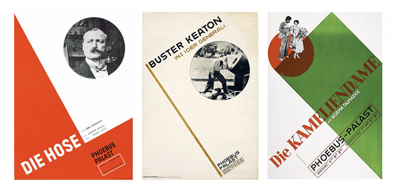
Tschichold’s client portfolio spanned multiple industries. His approach to book jacket design transformed publishing norms.
Major projects included:
- Film posters for Phoebus Palast featuring dynamic compositions
- Brochure designs integrating photography with bold typography
- Editorial design work for progressive publishers
- Corporate identity systems built on systematic principles
His work for Insel Verlag demonstrated how traditional publishers could embrace modernist principles without alienating readers. Every project reflected his commitment to functional design over mere decoration.
Innovative Techniques
Tschichold pioneered techniques that would become standard practice. His mastery of contrast created dramatic impact through simple means.
Key innovations included:
- Strategic use of red and black inks to create depth without additional printing costs
- Integration of type spacing techniques that enhanced readability
- Systematic application of margin principles
- Pioneering use of photographic elements in print design
His layouts featured carefully calculated proportions rather than arbitrary decisions. Every element placement reflected deliberate choices based on functional requirements. This systematic approach elevated commercial work to a new level of professionalism.
Notable Publications

Tschichold’s poster designs for cinema represent some of his most striking work. These compositions integrated movement that created dynamic energy within static images.
His most significant commercial achievements include:
- Pioneering asymmetric layouts for book design
- Standardized visual systems for print communication
- Integration of photographic elements with typography
- Application of rhythm to commercial work
While later known for his Penguin Books redesign, his early commercial work established new standards for professional design practice. These projects demonstrated how theoretical principles could solve practical communication problems with elegance and efficiency.
Political Context and Exile
The rise of National Socialism in Germany created a hostile environment for modernist designers. The Nazi regime’s opposition to modern art extended to typography and graphic design, forcing Tschichold to navigate dangerous political waters.
Nazi Opposition to Modernist Design
The Nazi regime classified modernist design as “degenerate art.” This classification wasn’t merely aesthetic-it had profound political implications.
The regime objected to:
- International influences in design that contradicted nationalist ideology
- Abstract forms viewed as “un-German” and culturally subversive
- Sans-serif typefaces associated with Bolshevism and Jewish designers
- Asymmetric layouts that challenged traditional order
Nazi design ideology favored blackletter typefaces and symmetrical compositions that evoked Germany’s past. Modern typography represented everything the regime opposed-internationalism, rationalism, and progressive values.
Forced Departure from Germany
In March 1933, shortly after Hitler’s rise to power, Tschichold was arrested. His home was searched. Materials were confiscated.
The authorities targeted him for:
- His vocal advocacy of modernist design principles
- Published works promoting “un-German” typography
- Connections to left-leaning cultural figures
- Professional relationships with Jewish designers
After his release, Tschichold recognized the danger. He fled with his family to Switzerland, abandoning his teaching position at the Munich Academy and most of his professional network. This forced emigration marked a dramatic turning point in his career and design philosophy.
Professional Adaptation in Exile
In Switzerland, Tschichold found new footing but faced significant challenges. The political upheaval prompted a professional reevaluation.
During this period, he:
- Secured teaching positions at Swiss institutions
- Developed commercial relationships with publishers
- Published “Typographische Gestaltung” (1935)
- Began reassessing his earlier dogmatic positions
Living in exile transformed his approach to design. He became increasingly critical of rigid modernist dogma, recognizing how political extremism could manifest in design ideology. His work began incorporating traditional elements previously rejected, creating a more nuanced approach to typography.
This period of professional adaptation saw Tschichold integrate his modernist training with renewed appreciation for classical typography. He maintained his commitment to clarity and visual hierarchy while softening his stance on symmetry and serif typefaces.
The political persecution Tschichold experienced demonstrated how design choices carry ideological weight. His evolution from strict modernism toward a more balanced approach reflected both political reality and professional maturation. This period established the foundation for his later influential work with Penguin Books, where he would apply these nuanced principles to mass-market publishing.
Evolution and Reassessment
Tschichold’s design philosophy underwent a profound transformation following his exile from Nazi Germany. This evolution shocked many modernist colleagues who viewed it as betrayal rather than growth.
Return to Traditional Typography
By the mid-1930s, Tschichold began questioning modernism’s rigid dogma. He recognized that absolute rules contradicted the flexibility good design required.
His reassessment focused on:
- Integration of classical typography principles with modern insights
- Recognition that serif and sans-serif fonts each had appropriate applications
- Reconsideration of symmetry as a valid design tool
- Appreciation for the subtle variations in traditional typefaces
“Typographische Gestaltung” (1935) marked this philosophical shift. Unlike his earlier dogmatic pronouncements, this work presented a more nuanced view that acknowledged design’s contextual nature. The man who once categorically rejected centered layouts now argued for their situational value.
His critics accused him of regression. But Tschichold maintained that his evolution represented deeper understanding rather than abandonment of principles. True mastery, he argued, required understanding design as a responsive tool rather than an ideological statement.
The Penguin Books Revolution

In 1947, Tschichold moved to England to redesign Penguin Books’ visual identity. This position gave him unprecedented influence over popular publishing.
His contributions included:
- Creation of comprehensive composition rules for typesetters
- Standardization of cover designs and internal page layouts
- Implementation of precise typography elements across varied publications
- Development of consistent margins and text block proportions
Despite working with limited resources during post-war austerity, Tschichold created an elegant system that transformed mass-market book production. His approach balanced modernist clarity with traditional warmth, creating accessible designs for everyday readers.
The Penguin Composition Rules codified his mature approach. These guidelines combined systematic thinking with traditional principles of book cover design, creating a flexible framework that suited varied content. His legacy at Penguin demonstrates how design systems can maintain consistency while accommodating diverse requirements.
Later Theoretical Writings
Tschichold’s later publications revealed his deepening interest in calligraphy and pre-industrial printing. “The Form of the Book” (1975) represented his mature philosophy, emphasizing timeless principles over passing trends.
This period saw Tschichold:
- Exploring Chinese and Japanese typographic traditions
- Refining principles of page proportions based on the golden ratio
- Reflecting critically on modernism’s limitations
- Advocating for typography that respected both tradition and innovation
His exploration of Eastern calligraphy revealed the difference between art and design in typographic practice. By connecting diverse traditions, Tschichold demonstrated how fundamental principles transcend cultural boundaries.
These later writings established Tschichold as more than a revolutionary-he became a master who understood typography’s full historical spectrum. This perspective allowed him to evaluate design choices based on their communicative effectiveness rather than ideological purity.
Tschichold’s Typeface Design
Jan Tschichold’s contribution to typeface design represents a crucial facet of his legacy. His approach to creating new type designs reflected his evolving philosophy about typography’s fundamental purpose.
Sabon Typeface Development

Sabon emerged from a practical challenge: creating a unified typeface for different typesetting systems. Commissioned by German master printers in 1960, this project demanded extraordinary technical understanding.
The design faced unique constraints:
- Required identical appearance across Monotype, Linotype, and hand-setting systems
- Needed optimal legibility for book publishing
- Demanded compatibility with existing typographic traditions
- Required consistent characters despite different mechanical limitations
Tschichold based Sabon on sixteenth-century designs by Claude Garamond, reimagined for modern printing requirements. The typeface demonstrated his mature philosophy that valued tradition while addressing contemporary needs.
The design featured carefully calculated proportions with subtle adjustments to create optical harmony across different sizes. Its elegant character was achieved through precise attention to the relationship between x-height and ascenders and descenders.
Sabon’s success came from Tschichold’s deep understanding of both historical type forms and modern production requirements. This typeface remains widely used in book publishing, demonstrating its enduring functionality and beauty.
Transit and Other Type Designs

Transit (1931) represented Tschichold’s early modernist approach to typeface design. Created during his Die Neue Typographie period, it embodied geometric sans-serif principles.
Key characteristics included:
- Geometric construction based on simple forms
- Minimal contrast between thick and thin strokes
- Highly rationalized proportions throughout the character set
- Forms optimized for maximum legibility in signage
Unlike his later work, Transit reflected functionalist principles with little reference to calligraphic tradition. It embodied the modernist belief that typefaces should be rational tools rather than artistic expressions.
Tschichold’s unreleased type designs further demonstrate his typographic evolution. These projects often explored ideas that commercial limitations prevented him from fully implementing. His sketch archives reveal continuous experimentation with letterforms throughout his career.
Contribution to Type Classification Systems
Tschichold developed systematic approaches to organizing historical typefaces. His classification frameworks helped designers understand relationships between different type styles.
His contributions included:
- Systems for categorizing historical type based on formal characteristics
- Analysis of structural relationships between seemingly disparate designs
- Frameworks connecting typographic forms to their cultural context
- Educational models for understanding type evolution
Unlike purely aesthetic classifications, Tschichold’s systems emphasized functional relationships and historical development. His approach helped designers select typefaces based on communicative requirements rather than superficial appearance.
These classification systems influenced how design schools taught typography. By creating structured frameworks for understanding type history, Tschichold enabled more informed decision-making in typeface selection.
His most significant contribution may be demonstrating how type design connects technical requirements with cultural contexts. Tschichold understood that typefaces embody both practical solutions and cultural values-a perspective that continues to influence contemporary font design practice.
The tension between tradition and innovation that characterized Tschichold’s career appears most clearly in his type designs. From Transit’s uncompromising modernism to Sabon’s refined classicism, his work spans typography’s full expressive range, demonstrating the field’s versatility as both functional tool and cultural expression.
FAQ on Jan Tschichold
What was Jan Tschichold’s greatest contribution to typography?
Tschichold’s greatest contribution was codifying modernist typographic principles in “Die Neue Typographie” (1928). This manifesto transformed design education and practice by establishing systematic approaches to typography that prioritized clarity, functionality, and reader-centered design. His later work with Penguin Books brought these principles to mass-market publishing.
Why did Tschichold shift from modernism to traditionalism?
His 1933 arrest by Nazis catalyzed this transformation. Living in exile, he recognized parallels between modernist dogma and political extremism. This insight drove him to reexamine classical typography principles and integrate them with his modernist training. The shift wasn’t abandonment but evolution toward a more nuanced understanding of typographic communication.
What is the Sabon typeface and why is it significant?
Sabon (1964) solved a technical challenge: creating identical typeface appearances across different typesetting systems. Based on Claude Garamond’s designs, it demonstrated Tschichold’s mature philosophy-respecting tradition while addressing contemporary needs. Its elegant proportions and technical excellence have made it an enduring choice for book typography.
How did Tschichold influence Penguin Books?
During 1947-1949, Tschichold revolutionized Penguin’s design by creating comprehensive composition rules that standardized book cover design, text formatting, and page proportions. His system balanced clarity with warmth, transforming mass-market publishing aesthetics while working within post-war material constraints.
What were the key principles of New Typography?
The movement championed:
- Asymmetric layouts over symmetry
- Sans-serif fonts for text
- Standardized paper sizes
- Functional grid systems
- Photography integration
- Elimination of decorative elements
- Conscious use of white space
How did political events shape Tschichold’s career?
Nazi persecution dramatically altered his trajectory. Classified as a cultural Bolshevik for his modernist principles, he was arrested in 1933, forcing emigration to Switzerland. This political trauma prompted philosophical reassessment and contributed to his shift toward more balanced typographic approaches integrating traditional and modern elements.
What was “elementare typographie”?
This 1925 manifesto, published in “Typographische Mitteilungen,” introduced revolutionary typographic ideas focused on functionality and clarity. It rejected traditional symmetry in favor of dynamic layouts, advocated for standardization, and positioned typography as a communication tool rather than decoration. The publication shocked the industry and catalyzed modernist typography.
How does Tschichold’s work remain relevant in digital design?
His principles of clear visual hierarchy, purposeful contrast, and systematic approach to layout inform contemporary web design and digital typography. Modern frameworks for responsive design and typographic systems build directly on his foundational concepts of structured communication.
What books did Tschichold write?
His key publications include:
- “Die Neue Typographie” (1928)
- “Typographische Gestaltung” (1935)
- “Asymmetric Typography” (English translation, 1967)
- “The Form of the Book” (1975)
- “Treasury of Alphabets and Lettering” (1966)
How did Tschichold influence design education?
He transformed typography education from craft apprenticeship to systematic discipline. His principles became foundational curriculum in design schools worldwide, establishing analytical approaches to typographic decision-making. The typographic elements he defined continue shaping how design is taught and practiced globally.
Conclusion
Jan Tschichold’s journey from revolutionary modernist to measured traditionalist exemplifies the evolution of 20th-century design thinking. His ability to recognize the value in both progressive and classical approaches sets him apart from contemporaries who remained ideologically rigid.
Three aspects define his enduring legacy:
- His systematic approach to print design that balanced functional design with aesthetic sensitivity
- The typographic reform he pioneered that transformed communication design education
- His nuanced understanding of type arrangement that influenced generations of designers
The Swiss design movement and contemporary editorial design practices bear his unmistakable influence. While technology continues evolving, Tschichold’s core principles-clarity, intention, and systematic thinking-remain fundamental to effective visual communication.
His greatest achievement may be demonstrating that design excellence comes not from dogmatic adherence to rules but from thoughtful application of principles suited to specific communicative needs.

Renowned for his expertise in logo design and visual branding, Bogdan has developed a multitude of logos for various clients.
His skills extend to creating posters, vector illustrations, business cards, and brochures. Additionally, Bogdan's UI kits were featured on marketplaces like Visual Hierarchy and UI8.
He also wrote in the past years on sites like Design Your Way, WebDesignerDepot, WPDean, Designmodo, Speckyboy, Slider Revolution, and more.
- The Cursor Logo History, Colors, Font, And Meaning - 24 September 2026
- Top 7 Web Design Subscription Services That Replace Full-Time Hires - 24 September 2026
- Canva vs PowerPoint: Which Is Better for Presentations? - 22 September 2026

Bogdan Sandu is a seasoned designer who has been designing websites since 2008. Renowned for his expertise in logo design and visual branding, Bogdan has developed a multitude of logos for various clients. His skills extend to creating posters, vector illustrations, business cards, and brochures. Additionally, Bogdan's UI kits were featured on marketplaces like Visual Hierarchy and UI8. He also wrote in the past years on sites like Design Your Way, WebDesignerDepot, WPDean, Designmodo, Speckyboy, Slider Revolution, and more.
You Might Also Like


