


A single logo can change how millions perceive a company. Few understood this power better than Paul Rand, the revolutionary designer who transformed corporate America through visual simplicity.
Born in Brooklyn to Jewish immigrants, Rand emerged as the defining voice in American graphic design during the mid-20th century. His work for IBM, ABC, UPS, and Westinghouse created visual identities that remain influential decades later.
What distinguished Rand was his systematic approach:
- Reducing complex ideas to their essence
- Creating symbols that communicated instantly
- Developing comprehensive brand guidelines rather than isolated marks
Beyond his commercial achievements, Rand’s teaching at Yale University and influential books like “Thoughts on Design” established principles that continue shaping graphic design movements today.
This article explores how a self-taught designer with European modernist influences revolutionized corporate visual communication and left an indelible mark on design history.
Who is Paul Rand?
Paul Rand was a pioneering American graphic designer best known for his iconic corporate logo designs, including those for IBM, ABC, and UPS. He helped define modern visual identity in the 20th century, blending Swiss design principles with American advertising. Rand also authored influential books on design theory and practice.

Early Life and Education
Paul Rand (1914-1996) emerged from humble beginnings in Brooklyn, New York, where his creative journey began. Born Peretz Rosenbaum to Jewish immigrants, his heritage significantly shaped his worldview and artistic sensibilities.
As a child, Rand showed remarkable talent with pencil and paper. His father’s grocery store provided his first canvas – creating signs and price tags that caught customers’ attention. These early experiments revealed his instinctive understanding of visual hierarchy and communication.
Self-education played a crucial role. Rand devoured European design magazines, studying works that would later influence his minimalist design approach. His formal education path included:
- Studying at Pratt Institute (evening classes)
- Attending Parsons School of Design
- Learning at the Art Students League
During this educational journey, Rand encountered instructors who introduced him to principles of Bauhaus graphic design. This exposure to European modernism dramatically shaped his thinking about form and function.
Unlike many contemporaries, Rand embraced the idea that typography could be more than just words on a page – it could express meaning through visual form. His instructors noted his exceptional ability to balance unity with variety in his compositions.
Manhattan’s vibrant commercial arts scene beckoned. Rand began synthesizing his Jewish cultural background with modernist principles, creating a unique visual language that would transform American design.
Rise to Prominence
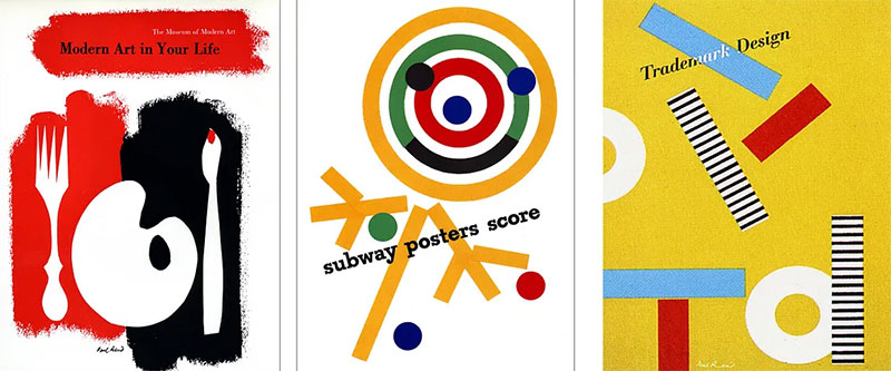
Rand’s early career steps were deliberate and strategic. In 1936, he secured a position creating media layouts, where he quickly distinguished himself through his bold use of white space in design.
The Direction magazine covers marked his breakthrough moment. While most American publications relied on literal illustrations, Rand created abstract compositions with powerful focal points that captured attention. His work for Apparel Arts similarly demonstrated his gift for contrast in design.
What set Rand apart from contemporaries was his systematic approach to logo design principles. He rejected decorative flourishes popular in mid-century America, instead creating symbols with:
- Functional simplicity
- Conceptual depth
- Timeless appeal
New York’s design community took notice. By age 23, Rand had been appointed art director at Esquire Magazine, unprecedented for someone so young. His designs applied symmetry and asymmetry with equal mastery.
The transition from commercial artist to design leader accelerated when Rand began working with advertising agencies. Bill Bernbach, the advertising pioneer, recognized Rand’s genius for storytelling and gave him unprecedented creative freedom.
By integrating principles from Swiss design with American commercial pragmatism, Rand created a new visual language for corporate communication. His belief that good design serves business objectives, not just aesthetic ones, revolutionized how companies presented themselves.
Rand’s philosophies about the elements of design began appearing in industry publications. This theoretical foundation elevated his status from talented practitioner to thought leader in the emerging field of graphic design.
As his reputation grew, Rand maintained his belief in visual problem-solving rather than trend-following. This principled approach would later make him one of the most influential graphic designers of the 20th century.
Design Philosophy and Methodology

Paul Rand’s approach to design emerged from a deep understanding of visual communication fundamentals. His method hinged on simplicity – not as a stylistic choice but as a problem-solving strategy.
The Rand Approach centered on three principles:
- Find the essence of the message
- Express it through fundamental visual relationships
- Remove everything that doesn’t serve communication
Rand’s design process balanced intuition with rigorous thinking. He believed that contrast in design created visual interest and cognitive engagement. When faced with client problems, he first sought to understand the core challenge before drawing a single line.
His mastery of color theory allowed him to use hue purposefully rather than decoratively. Rand often employed monochrome colors to focus attention on form and meaning rather than spectacle.
The most distinctive aspect of Rand’s methodology was his belief in the power of play. He maintained that experimental thinking generated stronger solutions than rigid formulas. This playfulness appeared in his work through unexpected typeface choices and surprising juxtapositions.
Rand’s visual vocabulary drew heavily from:
- Gestalt principles of design for creating unified compositions
- Typography elements as both functional and expressive tools
- Baseline structures that created invisible order
His belief that form follows function wasn’t merely philosophical – it was practical. Rand understood that design exists to solve problems and communicate messages, not merely to decorate. This functional aesthetic made his work simultaneously innovative and accessible.
The balance between client needs and artistic integrity defined Rand’s career. Unlike many designers who saw commercial work as a compromise, Rand viewed business constraints as creative catalysts.
Corporate Identity Revolution

Before Paul Rand, corporate identities were often ornate decorations rather than strategic assets. His revolutionary approach transformed logos from mere symbols into powerful communication tools.
Rand’s corporate identity innovations:
- Created systems rather than isolated marks
- Established consistent visual languages across applications
- Developed marks that worked at multiple scales and in various contexts
- Embedded meaningful symbolism rather than literal representation
The IBM transformation exemplifies his systematic thinking. What began as a simple logotype evolved into a striped emblem that suggested both speed and reliability. This symbol became the cornerstone of a comprehensive brand style guide that established rules for everything from alignment to emphasis.
His work for ABC demonstrated his gift for negative space in logo design. The simple lowercase letterforms contained in a circular field created a mark that worked effectively in both print design and the emerging medium of television.
The UPS shield redesign showed Rand’s understanding of visual hierarchy. By simplifying the previous emblem and creating stronger figure-ground relationships, he produced a mark with greater impact and recognition.
Westinghouse’s circle-W symbol demonstrated Rand’s ability to create vector graphics that conveyed complex ideas through simple forms. The mark suggested both electrical circuits and human interconnection, perfect for a company bridging technology and consumer needs.
Common threads across these identities included:
- Mathematical precision using grid systems
- Careful attention to kerning
- Application of the golden ratio for harmonious proportions
The NeXT logo for Steve Jobs’ computer company represented the pinnacle of Rand’s corporate work. Jobs paid $100,000 for a single solution – the tilted “e” in the black cube demonstrated Rand’s understanding of the psychology of shapes.
These corporate identities weren’t just visually striking – they redefined how businesses presented themselves. Rand taught companies that design wasn’t cosmetic but foundational to how audiences perceived their values and qualities.
His corporate identity work showed that the difference between art and design wasn’t a matter of quality but of purpose. Where art might raise questions, Rand’s corporate designs provided clear, immediate recognition while still rewarding deeper examination.
Teaching and Writing Career
Paul Rand’s impact extended far beyond his design studio through his influential teaching career at Yale University. From 1956 to 1991, he shaped generations of designers with his distinctive pedagogical approach.
Rand’s teaching philosophy centered on:
- Critical thinking over technical proficiency
- Understanding design fundamentals rather than trends
- Learning to defend creative decisions with logic
At Yale, Rand challenged students to justify every element in their compositions. A student might spend weeks perfecting a single letterform’s tracking in typography or understanding the subtle relationships between serif font and sans-serif font choices.
His classroom critiques were legendary – direct and unsparing. Students recalled how Rand would question the margin decisions or challenge them to explain why they’d chosen particular color palettes. These sessions taught them that design was about intention, not decoration.
Notable students who carried Rand’s teachings forward included:
- Tom Geismar (Chermayeff & Geismar)
- Ivan Chermayeff
- Armin Hoffman
Rand’s written works became foundational texts for design education. His first book, “Thoughts on Design” (1947), articulated principles that remain relevant in today’s web design environment.
“A Designer’s Art” (1985) expanded on his philosophy, emphasizing the relationship between form and function. “Design, Form, and Chaos” (1993) addressed the tension between order and creativity, examining how designers navigate competing demands.
His essays on design theory explored topics ranging from typographic hierarchy to the proper application of complementary color schemes. These writings demonstrated how graphical design principles could be both practical and intellectually rigorous.
Rand’s most famous quote – “Don’t try to be original; just try to be good” – summarized his educational philosophy. He taught that true innovation emerges from mastering fundamentals rather than pursuing novelty for its own sake.
Visual Language and Communication
Paul Rand approached design as a form of visual communication with its own grammar and vocabulary. His work demonstrated that effective design speaks directly to viewers without requiring translation.
Rand’s communication principles:
- Clarity trumps cleverness
- Form should support, not obscure meaning
- Visual relationships must be intentional, not accidental
As a communicator, Rand focused relentlessly on message clarity. He understood that effective design requires rhythm to guide the viewer’s eye through ithe nformation hierarchy. His layouts often employed repetition to establish visual consistency and aid comprehension.
Rand created visual conversations with audiences by employing proximity principles to group related elements. This spatial organization helped viewers instinctively understand relationships between concepts without explicit explanation.
His approach to breaking complex ideas into simple forms relied on:
- Distilling messages to their essence
- Using universal visual vocabulary
- Creating memorable visual shorthand
Humor and wit appeared frequently in Rand’s work. His El Producto cigar advertisements used playful manipulation of scale to create memorable brand impressions. This wasn’t mere decoration – it served the communication objective by making the message more engaging and memorable.
Rand’s IBM Eye-Bee-M rebus poster demonstrated his skill at visual wordplay. By substituting an eye, a bee, and an M for the letters in IBM, he created a puzzle that rewarded viewers for solving it, strengthening their connection to the brand.
His talent for balancing creativity with clarity appeared in his work for Westinghouse, where he used movement in design to suggest electrical energy while maintaining the mark’s formal integrity.
What separated Rand’s approach from contemporaries was his focus on creating timeless rather than trendy solutions. While many designers chased fashionable styles like Art Deco or Constructivism, Rand sought universal visual principles that would transcend passing fads.
His understanding of font psychology enabled him to select typefaces that conveyed appropriate emotional qualities while remaining readable. Rand rarely used decorative display fonts, preferring clean letterforms that didn’t compete with the message.
This approach to visual communication influenced generations of designers working across media from packaging design to motion graphics. Rand proved that design could be simultaneously intellectual and accessible, sophisticated and clear.
FAQ on Paul Rand
What logos did Paul Rand design?
Rand created iconic logos for IBM, ABC, UPS, Westinghouse, NeXT Computer, Enron, Yale University Press, and El Producto cigars. His most recognized work features simple geometric forms with conceptual depth. The striped IBM logo and circular ABC mark demonstrate his gift for creating timeless visual identities that transcend trends.
How did Paul Rand influence modern design?
Rand bridged European modernism and American commercial design, introducing minimalist design principles to corporate America. His systematic approach to brand identity, emphasis on conceptual thinking, and belief in the integration of form and function revolutionized how companies present themselves visually.
What was Paul Rand’s design philosophy?
Rand believed good design combined intuition with intellect. His approach centered on simplicity, visual hierarchy, and meaningful symbolism. He famously stated: “Design is the silent ambassador of your brand” and advocated for solutions that were simultaneously functional, aesthetic, and communicative.
Where did Paul Rand teach?
Rand taught primarily at Yale University (1956-1991), where he profoundly influenced generations of designers. He also held positions at Pratt Institute and briefly lectured at Cooper Union. His teaching emphasized understanding design fundamentals over mastering specific techniques or following trends.
What books did Paul Rand write?
Rand authored several influential texts:
- “Thoughts on Design” (1947)
- “A Designer’s Art” (1985)
- “Design, Form, and Chaos” (1993)
- “From Lascaux to Brooklyn” (1996)
These works explore design principles, the creative process, and the relationship between form and function.
How did Paul Rand approach typography?
Rand viewed typography as both functional and expressive. He favored clean, readable sans-serif fonts and precise kerning. His layouts demonstrated masterful use of typographic hierarchy to guide readers through information. Type wasn’t mere text – it was a visual element with communicative power.
What was unique about Rand’s client presentations?
Rand famously presented only one solution to clients rather than multiple options. He believed design required conviction, not democratic votes. His presentation books methodically explained the thinking behind each element, educating clients about design decisions rather than simply seeking approval.
How did Rand’s Jewish background influence his work?
Growing up in an Orthodox Jewish household exposed Rand to Hebrew typography and symbolic visual language. This early experience with abstract representation influenced his approach to creating meaningful symbols. His Brooklyn upbringing and Jewish cultural heritage provided a distinct perspective on European modernist principles.
What was Paul Rand’s relationship with Steve Jobs?
Rand designed the NeXT Computer logo for Steve Jobs in 1986. Jobs greatly admired Rand, calling him “the greatest living graphic designer.” Their collaboration exemplified Rand’s one-solution approach. Jobs paid $100,000 for a single design concept, demonstrating extraordinary trust in Rand’s expertise.
What is Paul Rand’s lasting legacy?
Rand elevated graphic design from commercial art to strategic communication. His integration of Swiss design principles with American commercial sensibilities created a visual language that remains influential today. Through his corporate identities, books, and teaching, Rand transformed how businesses and designers think about visual communication.
Conclusion
Paul Rand transformed the landscape of American visual communication with a design approach that balanced intellectual rigor and functional clarity. His work demonstrated that corporate identity could be both commercially effective and artistically significant. Through systematic thinking and bold simplicity, he elevated logo design principles from mere decoration to strategic business assets.
Rand’s enduring influence appears across multiple dimensions:
- His corporate symbols continue functioning effectively decades after creation
- His books remain essential reading in design education
- His teaching philosophy lives on through generations of designers
- His integration of Bauhaus design principles with American commercial needs created a unique visual language
The ultimate testimony to Rand’s genius lies in how his work transcends time. While many contemporaries followed postmodern graphic design trends, Rand pursued timeless visual solutions through color psychology, focal points, and masterful use of negative space. His legacy reminds us that great design combines artistry with purpose, form with function, and simplicity with substance.

Renowned for his expertise in logo design and visual branding, Bogdan has developed a multitude of logos for various clients.
His skills extend to creating posters, vector illustrations, business cards, and brochures. Additionally, Bogdan's UI kits were featured on marketplaces like Visual Hierarchy and UI8.
He also wrote in the past years on sites like Design Your Way, WebDesignerDepot, WPDean, Designmodo, Speckyboy, Slider Revolution, and more.
- The Windsurf Logo History, Colors, Font, And Meaning - 10 October 2026
- How to Remove Background From Product Photos (No Photoshop) - 10 October 2026
- How Designers can Build a Stronger Online Creative Identity - 9 October 2026

Bogdan Sandu is a seasoned designer who has been designing websites since 2008. Renowned for his expertise in logo design and visual branding, Bogdan has developed a multitude of logos for various clients. His skills extend to creating posters, vector illustrations, business cards, and brochures. Additionally, Bogdan's UI kits were featured on marketplaces like Visual Hierarchy and UI8. He also wrote in the past years on sites like Design Your Way, WebDesignerDepot, WPDean, Designmodo, Speckyboy, Slider Revolution, and more.
You Might Also Like


