


Few designers have disrupted typographic conventions as boldly as Neville Brody. Emerging from London’s punk scene in the early 1980s, Brody transformed The Face magazine into a laboratory for experimental design, challenging established rules of thirds and conventional wisdom.
His work spans album covers, magazine redesigns, corporate identities, and digital typefaces-each marked by his signature approach to repetition and disruption. Brody’s influence extends beyond specific designs to how we think about visual communication itself.
This article explores:
- His revolutionary typography for The Face and Arena magazines
- Groundbreaking font designs including FF Blur and Industria
- Major corporate identity projects for BBC and Channel 4
- Impact on design education through the Royal College of Art
- Legacy across print, digital, and brand design
Brody’s career reveals how breaking rules strategically can create new visual languages that resonate across decades.
Who is Neville Brody?
Neville Brody is a British graphic designer, typographer, and art director known for his innovative work in magazine design, particularly The Face and Arena. He co-founded the digital font company FontFont and has significantly influenced modern typography and visual communication.
Early Career and Style Development
The Face Magazine Era (1981-1986)
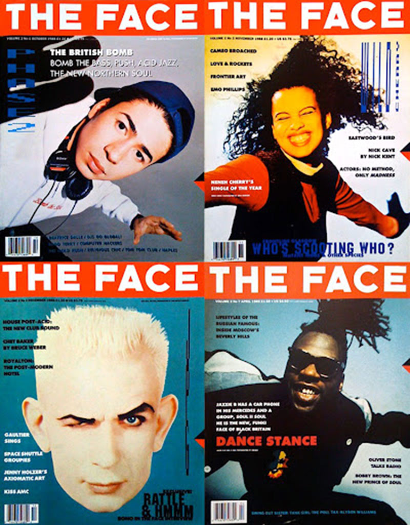
Neville Brody emerged as a revolutionary force in British design when he became art director at The Face magazine. His work during this period redefined editorial design through radical approaches to layout and typography.
His experimental techniques at The Face challenged conventional magazine design:
- Grid-breaking layouts that defied traditional column structures
- Bold manipulation of scale and proportion
- Integration of typographic elements as visual focal points rather than just text
Brody treated each page as a canvas for visual experimentation. His work reflected the punk and post-punk cultural movements of Thatcherite Britain, embodying an anti-establishment visual language that resonated with youth culture.
The impact on the magazine industry was immediate. Competitors scrambled to adopt similar approaches, but few matched Brody’s intuitive understanding of visual hierarchy and cultural relevance.
Record Cover Designs

Parallel to his magazine work, Brody created striking album covers for Fetish Records. These designs emphasized stark geometric forms, unconventional typography, and limited color palettes.
His collaborations with Depeche Mode and other artists established a visual language that:
- Embraced industrial aesthetics
- Used typography as image
- Balanced commercial appeal with avant-garde sensibilities
These record sleeves became iconic representations of 1980s design, blending minimalist graphic design principles with cultural subversion.
The Fuse Project Origins

The seeds for Fuse magazine were planted during this early period. Initially conceived as a platform for experimental digital typefaces, Fuse grew into a collaborative hub for typography innovation.
Early contributors included Jon Wozencroft and Phil Baines. The first issues featured radical explorations of font design that broke conventional rules of legibility and structure.
Public reception was polarized. Design professionals recognized the revolutionary potential, while traditional typographers criticized the apparent sacrifice of readability for visual impact.
Distinctive Typographic Elements and Techniques
Font Design Philosophy
Brody’s approach to font design balanced mathematical precision with creative disruption. His typefaces often incorporated:
- Geometric influences with unexpected modifications
- Deliberate tension between functional requirements and expressive form
- Strategic violations of conventional readability rules
His work challenged the notion that typography must prioritize function over form. Instead, Brody explored how font psychology could enhance communication through emotional resonance.
The FF Meta typeface exemplifies this balance. It offers structural clarity while maintaining distinctive character, demonstrating that experimental approaches can produce commercially viable typefaces.
Signature Visual Characteristics
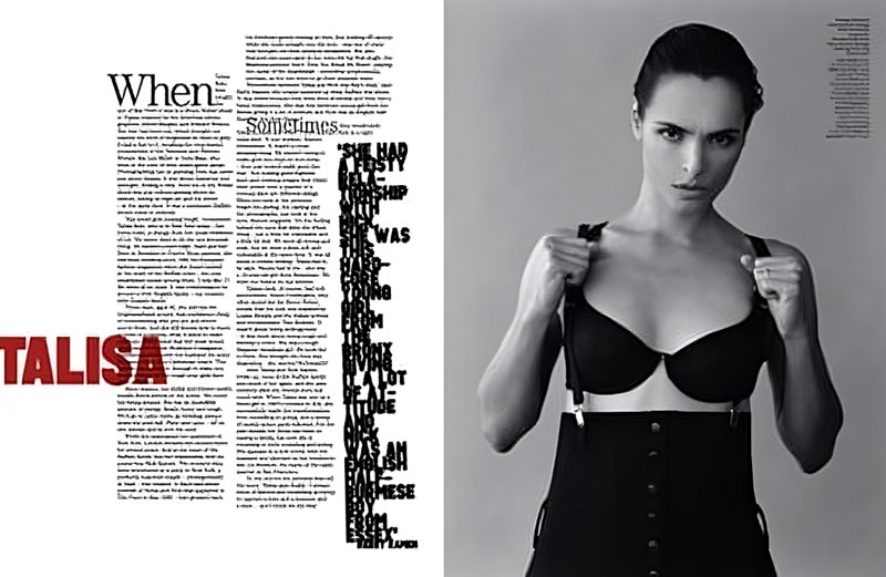
Key elements of Brody’s visual language include:
- Dramatic scale shifts – Manipulating size relationships to create tension and focal points
- High contrast – Juxtaposing opposing elements for visual impact
- Strategic use of white space – Creating breathing room that emphasizes key elements
His layouts frequently broke established grid systems yet maintained internal coherence through careful alignment and balance.
The tension between structure and disruption became Brody’s signature approach, influencing the postmodern graphic design movement.
Technological Integration
Brody was an early adopter of digital design tools, recognizing their potential for typographic experimentation. His work bridged the transition from analog to digital design processes.
His innovative approach included:
- Exploring the limitations of early digital tools as creative constraints
- Combining traditional drawing techniques with vector graphics capabilities
- Developing new production methods for font creation
The FF Blur font exemplifies his technical innovation. Created by deliberately degrading letter forms through multiple digital processes, it challenged the pixel-perfect precision that digital typography initially promised.
This willingness to embrace technological possibilities while questioning their conventions established Brody as not just a designer but a design theorist whose influence extended beyond visual artifacts to shape design thinking itself.
Major Projects and Publications
The Face Magazine Transformation
Brody’s work at The Face redefined editorial design in the 1980s. His approach integrated typographic hierarchy with cultural relevance, creating a visual language that spoke directly to youth culture during the post-punk era.
Key innovations included:
- Custom typefaces designed specifically for headlines and section markers
- Asymmetrical layouts that challenged conventional reading patterns
- Integration of photography and typography as equal design elements
Each page functioned as both content carrier and visual statement. Brody’s layouts broke the conventional margins, expanding typography beyond its traditional role into a form of visual commentary.
Arena Magazine Design
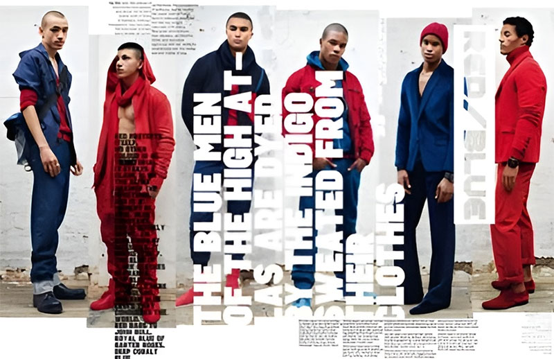
Building on his Face experience, Brody’s work for Arena magazine pushed typography further into experimental territory. He developed new approaches to:
- Negative space as active design element
- Headline treatments that functioned as both text and image
- Rhythm through variable page densities
Arena’s redesign demonstrated how typographic elements could create reader engagement through tension and surprise. The magazine became a platform for Brody to explore the balance between commercial viability and design innovation.
The Fuse Project Evolution
Fuse magazine evolved from a simple type publication into a laboratory for digital font experimentation. Each issue included actual working fonts on floppy disk (later CD-ROM), allowing readers to use the experimental typefaces directly.
The project’s collaborative nature brought together designers from different backgrounds to explore:
- Breaking conventional letterform structures
- Questioning the boundaries between legibility and expression
- Exploring how digital technology could transform typography
Fuse became a catalyst for experimental typography communities worldwide, establishing Brody as a leading voice in typographic innovation during the digital revolution.
Corporate and Brand Identity Work
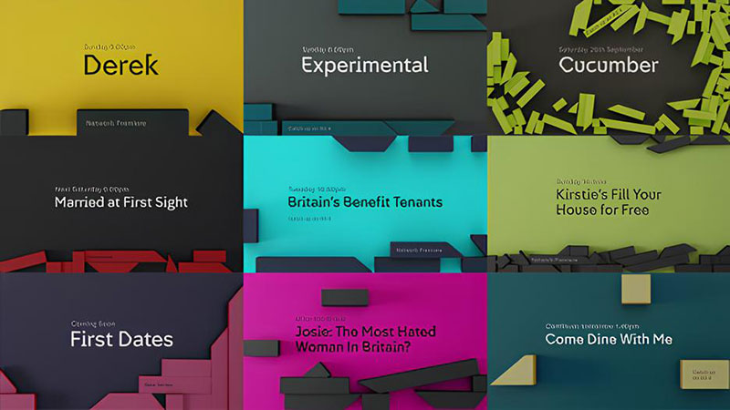
Brody’s commercial projects included major rebranding work for organizations like the BBC and Channel 4. These projects required balancing experimental approaches with commercial requirements.
His corporate identity work featured:
- Strong design principles with unexpected twists
- Custom typefaces that embodied brand values
- Visual systems rather than static identities
The BBC rebranding demonstrated Brody’s ability to create designs with cultural impact while meeting large-scale implementation needs. He created a system that worked across multiple media formats while maintaining distinctive character.
Technical Innovations in Digital Typography
FontFont and Commercial Font Design

Co-founding FontShop International with Erik Spiekermann marked Brody’s entry into commercial digital font distribution. The venture provided a platform for experimental typefaces with commercial applications.
Notable FontFont releases included:
- FF Blur – deliberately degraded forms challenging digital precision
- FF Gothic – exploring industrial aesthetics in digital type
- FF Pop – merging pop culture references with functional letterforms
These designs proved experimental typography could succeed commercially, influencing a generation of type designers exploring digital possibilities.
Cross-Media Applications
Brody’s work anticipated the challenges of typography across different media contexts. His innovations included:
- Early explorations of screen-based typography before web standards existed
- Variable fonts concepts decades before the technology was standardized
- Motion typography principles that influenced interactive design
By considering how type functions across different media, Brody established design thinking that prepared for the digital media explosion of the 1990s and beyond.
His typefaces demonstrated careful attention to both print design and emerging digital contexts, considering issues like DPI and screen rendering when most designers focused solely on print applications.
Brody’s cross-media insights established design principles that bridged the analog-digital divide, influencing how typography functions in today’s multi-platform environment.
Educational Impact and Teaching Philosophy
Royal College of Art Influence
Brody’s tenure at the Royal College of Art transformed design education approaches. His teaching methods emphasized experimentation over adherence to established rules.
Key aspects of his educational philosophy included:
- Questioning fundamental assumptions about communication design
- Prioritizing conceptual thinking over software proficiency
- Encouraging risk-taking within structured design problems
Students under Brody’s mentorship learned to balance experimental approaches with functional requirements. His critiques focused on conceptual strength rather than technical perfection.
“Typography isn’t about arranging pretty fonts,” he would tell students. “It’s about managing the space between where meaning happens.”
Workshops and Lectures
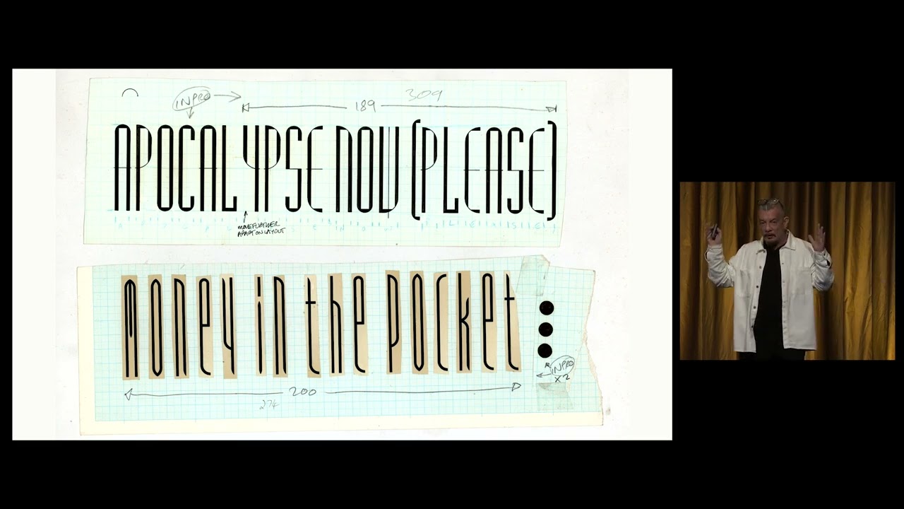
Brody’s global workshops extended his influence beyond formal education settings. His presentations typically covered:
- Breaking conventional typographic rules with purpose
- Exploring the tension between legibility and expression
- Understanding typography as cultural commentary
These sessions functioned as design interventions rather than traditional lectures. Participants engaged directly with concepts through hands-on experimentation with tracking, kerning, and manipulating x-height.
Research Through Design Network
Through Research Studios (later Brody Associates), he established collaborative networks connecting education and industry. These connections facilitated:
- Knowledge exchange between academic research and commercial practice
- Cross-disciplinary collaborations that expanded typographic applications
- Practical exploration of theoretical concepts through client work
This approach bridged the gap between experimental design education and professional practice, creating pathways for innovative approaches to enter mainstream design.
Key Works and Case Studies
Font Designs Analysis
FF Blur and Concept Development
FF Blur emerged as Brody’s rejection of digital precision. The typeface deliberately degraded letterforms through multiple processing steps, challenging the pixel-perfect aesthetic of early digital typography.
Key characteristics include:
- Deliberately eroded edges that question the nature of digital reproduction
- JPEG-like compression artifacts as design elements
- Readable core structure despite visual distortion
This typeface embodied Brody’s philosophy that imperfection can communicate more effectively than precision. It remains his most recognized contribution to digital typography.
Industria and Architectural Influences

The Industria typeface family drew from industrial signage and architectural forms. Its distinctive features:
- Geometric construction based on simple shapes
- Extreme weight contrasts between family members
- Mechanical aesthetic with unexpected organic elements
Industria demonstrated how serif and sans-serif forms could be reimagined through industrial references. The typeface found applications in editorial design and corporate identity systems throughout the 1990s.
Arcadia and Experimental Legibility
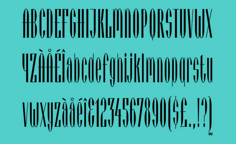
Arcadia pushed the boundaries between legibility and expression. This experimental typeface:
- Reduced letters to minimal geometric components
- Challenged conventional font spacing expectations
- Created tension between abstract form and functional communication
Though less commercially successful than other Brody designs, Arcadia established important principles about how far typography could stretch conventional reading expectations while remaining functional.
Editorial Design Masterpieces
The Face Landmark Issues
Several Face issues stand as definitive examples of Brody’s editorial approach:
- Issue 33 (January 1983) – Introduced dynamic typographic treatments that became magazine signatures
- Issue 45 (January 1984) – Refined the relationship between photography and custom typography
- Issue 69 (January 1986) – Demonstrated fully mature system combining all previous experiments
These issues demonstrated how typographic variety could create distinctive editorial voice. Their influence extended far beyond the magazine’s circulation numbers.
Arena’s Visual Identity
Arena magazine allowed Brody to evolve his editorial approach for a different audience. Key innovations included:
- More sophisticated color theory applications using monochrome and analogous palettes
- Integration of custom type with structural grid systems
- Storytelling through design that complemented editorial content
Arena’s design language established how typography could create distinct audience segments within similar content categories, influencing market-focused editorial design approaches.
Brand Identity Projects
BBC Rebranding Case Study

The BBC rebranding project represented Brody’s largest corporate identity challenge. The comprehensive system included:
- Custom typography for cross-platform applications
- Cohesive visual system adaptable across divisions
- Motion graphics guidelines for broadcast applications
This project demonstrated how experimental designers could successfully work within large institutional contexts. The system balanced innovation with the practical needs of a complex organization while respecting its heritage.
Channel 4 Visual Language
Brody’s work for Channel 4 established a visual language that defined British broadcast design:
- Abstract geometric forms that functioned as both logos and animation elements
- Custom display fonts that balanced distinctiveness with legibility
- Color psychology applications that differentiated programming categories
This system demonstrated how typography, movement in design, and brand elements could function cohesively across time-based media.
Nike and Commercial Applications
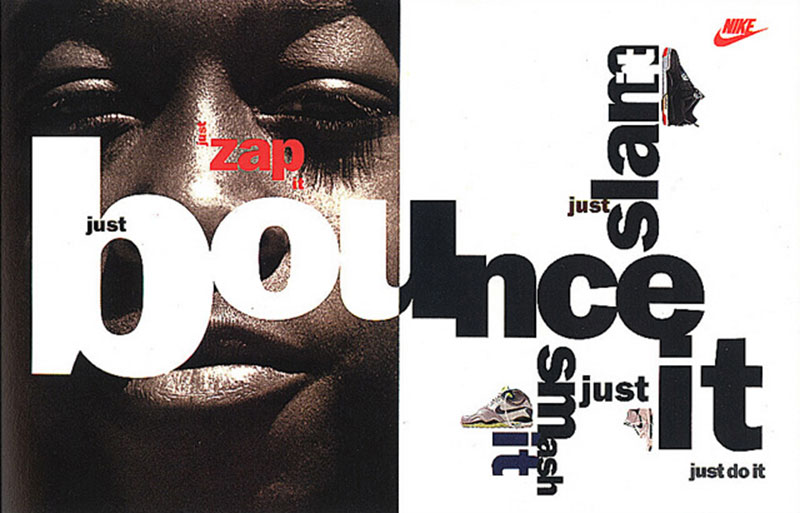
Brody’s work for Nike demonstrated his ability to apply experimental approaches to global brands:
- Typographic systems that supported both product categories and campaign themes
- Golden ratio proportions combined with dynamic compositions
- Integration of type with photographic and illustration styles
These projects showed how Brody’s experimental approach could enhance rather than conflict with established brand equity, influencing how corporations approach design innovation.
FAQ on Neville Brody
What makes Neville Brody’s typography unique?
Brody’s typography merges geometric precision with deliberate rule-breaking. He pioneered experimental digital typefaces that challenge legibility conventions while remaining functional. His work features dramatic scale contrasts, unexpected baseline adjustments, and strategic emphasis through typographic manipulation.
How did Brody influence magazine design?
Brody revolutionized editorial design at The Face by treating typography as content rather than mere vessel. He rejected standard grid systems, created custom typefaces for specific contexts, and established proximity relationships that challenged conventional reading patterns. His approach transformed how designers think about page architecture and visual hierarchy.
What was The Fuse Project?
Fuse was Brody’s experimental typography publication combining printed magazine with functional digital fonts. Each issue explored specific conceptual themes through collaborative typeface design. Launched in 1991, it provided a platform for pushing typographic boundaries beyond commercial constraints while distributing actual working fonts created through experimental processes.
What are Brody’s most famous fonts?
Brody’s most recognized typefaces include:
- FF Blur – deliberately degraded letterforms challenging digital perfection
- Industria – geometric sans inspired by industrial signage
- Arcadia – experimental letterforms reducing characters to minimal components
- FF Pop – blending pop culture references with functional typography
- FF Gothic – industrial aesthetics with unexpected organic elements
How did Brody transition to digital design?
Brody embraced digital tools early while maintaining a critical perspective on their limitations. He explored bitmap manipulation, pushed early software beyond intended capabilities, and treated pixels as design elements rather than mere rendering tools. This approach anticipated web typography challenges before most designers recognized them.
What was Brody’s educational impact?
At the Royal College of Art, Brody transformed design education by emphasizing conceptual thinking over technical execution. His teaching method encouraged questioning fundamental assumptions about communication design. Through global workshops, he extended this influence beyond formal education, treating design education as cultural intervention rather than skills training.
How did Brody’s work reflect cultural movements?
Brody’s early designs emerged from London’s punk scene, embodying its DIY ethos and anti-establishment stance during Thatcherite Britain. His work reflected cultural turbulence through visual tension and deliberate disruption of conventional design approaches. This connection to youth counterculture gave his work relevance beyond mere aesthetic innovation.
What major brands has Brody worked with?
Brody has created identity systems for numerous global organizations including:
- BBC (comprehensive rebranding)
- Channel 4 Television
- Sony PlayStation
- Nike
- The Guardian newspaper
- Dom Perignon
- Issey Miyake
How did Research Studios operate differently from typical design agencies?
Research Studios (later Brody Associates) blurred boundaries between commercial practice, education, and experimental research. The studio maintained a small core team supplemented by project-specific collaborators, balanced commercial projects with self-initiated exploration, and approached client education as fundamental to the design process.
What is Brody’s legacy in contemporary design?
Brody’s influence remains evident in accepted experimental typography, widespread use of variable design systems rather than fixed identities, and normalized expectation that typography should express cultural context. His work demonstrates how designers can maintain philosophical consistency while adapting to technological and cultural changes across decades.
Conclusion
Neville Brody‘s career represents a masterclass in balancing experimental vision with practical application. By challenging established conventions of font psychology and typographic hierarchy, he transformed visual communication across media formats and contexts.
His impact extends through multiple dimensions:
- Bridging Bauhaus structural principles with postmodern expression
- Demonstrating how iconic fonts can carry cultural messages beyond literal text
- Redefining relationships between the elements of design across print and digital contexts
Perhaps most significantly, Brody showed that experimental approaches need not sacrifice commercial viability. His work proves that questioning fundamental assumptions about how design functions can lead to solutions that communicate more effectively than following established formulas.
As design continues evolving through technological and cultural shifts, Brody’s methodology-challenging conventions while respecting communication fundamentals-remains relevant for designers seeking to create work with lasting impact.

Renowned for his expertise in logo design and visual branding, Bogdan has developed a multitude of logos for various clients.
His skills extend to creating posters, vector illustrations, business cards, and brochures. Additionally, Bogdan's UI kits were featured on marketplaces like Visual Hierarchy and UI8.
He also wrote in the past years on sites like Design Your Way, WebDesignerDepot, WPDean, Designmodo, Speckyboy, Slider Revolution, and more.
- From Mockup to Code: How AI-Augmented Development Speeds Up the Design Handoff - 19 September 2026
- The Beehiiv Logo History, Colors, Font, And Meaning - 18 September 2026
- Why Small Teams Wait Too Long to Bring On Specialist Engineers - 17 September 2026

Bogdan Sandu is a seasoned designer who has been designing websites since 2008. Renowned for his expertise in logo design and visual branding, Bogdan has developed a multitude of logos for various clients. His skills extend to creating posters, vector illustrations, business cards, and brochures. Additionally, Bogdan's UI kits were featured on marketplaces like Visual Hierarchy and UI8. He also wrote in the past years on sites like Design Your Way, WebDesignerDepot, WPDean, Designmodo, Speckyboy, Slider Revolution, and more.
You Might Also Like


