


Few designers have shaped visual communication as profoundly as Josef Müller-Brockmann. The Swiss modernist didn’t just create designs-he engineered visual solutions through mathematical precision.
As a pioneer of the International Typographic Style, Müller-Brockmann transformed graphic arts from decorative craft to systematic discipline. His approach to the elements of design created a revolution in visual clarity.
Working from his Zurich studio in the mid-20th century, he developed grid-based frameworks that still define contemporary visual organization. His concert posters for Tonhalle Zurich remain masterpieces of ordered design systems.
This article examines:
- His foundational role in Swiss design methodology
- Revolutionary grid systems theory
- Iconic work for Swiss Federal Railways and Automobile Club of Switzerland
- Educational legacy through books like “Grid Systems in Graphic Design”
- Lasting influence on digital interfaces and modern visual communication
Müller-Brockmann’s genius lay in finding freedom through structure, proving less information creates more impact.
Who is Josef Müller-Brockmann?
Josef Müller-Brockmann is a Swiss graphic designer known for his clean, grid-based design style and contributions to the International Typographic Style. He created iconic posters using minimalist typography and geometric layouts. His work emphasized clarity, objectivity, and function, profoundly influencing modern graphic design and visual communication.
The Swiss Style Movement
Origins and Development

The Swiss design movement emerged in the 1950s from a perfect storm of cultural and artistic influences. Post-war Europe needed clear communication systems. Rationality trumped decoration.
Pre-war influences included Constructivism, De Stijl, and the Bauhaus graphic design school. These movements valued order and objectivity. Function over form. Mathematical thinking. Visual clarity.
The International Typographic Style (its formal name) grew from Switzerland’s neutral stance during WWII. Swiss designers, unbound by nationalist propaganda, developed a design approach based on universality. Clean. Ordered. Systematic.
Key Figures
Josef Müller-Brockmann didn’t work in isolation. His contemporaries formed a design powerhouse:
- Armin Hofmann – Taught at the Kunstgewerbeschule Zürich, emphasizing fundamental design principles
- Max Bill – Applied mathematical thinking to graphic arts and architecture
- Richard Paul Lohse – Created systematic color grids and precise compositions
- Emil Ruder – Pioneered experimental typography with rigid structural systems
Müller-Brockmann held a central position within this movement as both practitioner and theorist. His work for the Zurich Town Hall and Swiss Federal Railways demonstrated how design could solve complex communication problems.
Through Neue Grafik magazine (co-founded with Lohse, Hans Neuburg, and Carlo Vivarelli), he established collaborative relationships that shaped graphic design movements globally. This publication spread Swiss design principles internationally through the Alliance Graphique Internationale organization.
Distinctive Characteristics
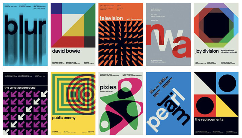
The Swiss Style’s most recognizable feature: grid systems and mathematical layouts. Every element placed with purpose. Nothing arbitrary.
Typography preferences were clear: sans-serif font families like Helvetica and Akzidenz-Grotesk. Text aligned with mathematical precision on baseline grids. No decorative flourishes.
Photography replaced illustration. Objective images communicated directly. No artistic interpretation necessary. Just clear information.
The movement rejected decoration entirely. White space became a functional element rather than emptiness to be filled. Space created rhythm and emphasized content hierarchy.
Müller-Brockmann’s Design Philosophy
Core Principles
Objectivity defined Müller-Brockmann’s work. His design wasn’t self-expression but problem-solving. Every choice served communication.
His approach prioritized:
- Clarity – Information presented without ambiguity
- Order – Systematic organization of elements
- Functionality – Design serving practical purpose
- Universality – Communication transcending language barriers
“The designer’s work should have the clearly intelligible, objective, functional, and aesthetic quality of mathematical thinking,” he wrote in one of his influential books, “Grid Systems in Graphic Design.”
He rejected personal expression. Design wasn’t art. It was visual communication, governed by graphic design principles that transcended individual style.
The Grid System

Müller-Brockmann didn’t invent the grid, but he codified it. His grid theory transformed design from intuitive arrangement to systematic organization.
The mathematical basis for his visual hierarchy came from the golden ratio. Proportions weren’t arbitrary but calculated for maximum effectiveness. His grids divided space mathematically, creating tension points where important elements naturally belonged.
He applied these systems across media:
- Concert posters for Zurich’s Tonhalle
- Corporate identity systems for the Automobile Club of Switzerland
- Editorial layouts for commercial publications
- Exhibition designs for Museum für Gestaltung Zürich
Over time, his grid thinking evolved from rigid to fluid. Later works showed how systems could accommodate creative thought while maintaining order. His approach influenced not just print but modern web design and digital interfaces.
Typography Approach
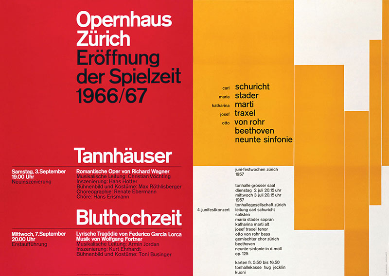
Müller-Brockmann’s preference for sans-serif typography stemmed from its directness. No ornamental serifs. Nothing historically referential. Just pure letterforms.
His alignment theories created tension through asymmetry rather than symmetry. Text blocks positioned precisely within the grid.
Hierarchy principles guided readers through information logically. Leading, kerning, and tracking weren’t aesthetic choices but functional decisions.
He integrated type with imagery through mathematical relationships. Text and images worked in balance, neither dominating the other. Both elements served the message with equal importance.
His minimalist design approach influenced generations of designers who learned that communication improves through reduction, not addition. Less information, more clarity. This principle remains at the core of effective design today.
Major Works and Projects
Concert Posters
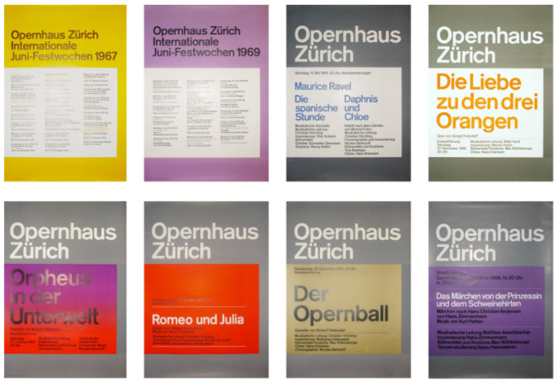
Müller-Brockmann’s Musica Viva concert series posters for Zürich Tonhalle represent his most iconic work. Pure visual music.
These poster design masterpieces translated sound into form. Mathematical precision embodied musical structure. Geometric shapes created visual harmony.
He used:
- Circular forms for string compositions
- Angular shapes for percussion and brass
- Grid-based patterns for complex orchestral pieces
His composition techniques established clear focal points without resorting to pictorial illustration. Black and white dominated, with occasional bursts of monochrome colors for emphasis.
When color appeared, it followed strict color theory applications. Limited palettes. Functional use only. Never decorative.
Corporate Identity Projects
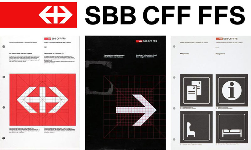
Major clients included Swiss Federal Railways and the Automobile Club of Switzerland. His systems-based design approach revolutionized brand guidelines.
Müller-Brockmann’s corporate work featured:
- Comprehensive logo design principles built on mathematical structure
- Standardized grid systems for all applications
- Systematic typeface usage across platforms
- Objective imagery guidelines
His revolutionary brand style guides established rules based on functional requirements, not aesthetic whims. These weren’t suggestions but mathematical systems.
The impact of his corporate work extends into modern identity design. Vector graphics programs still use his systematic approach to scaling across applications.
Editorial Design
Neue Grafik magazine embodied Swiss precision. Co-founded with Richard Paul Lohse, Hans Neuburg, and Carlo Vivarelli, this publication showcased International Typographic Style principles in action.
Each issue demonstrated:
- Mathematical grid layouts
- Perfect text-to-image ratios
- Consistent typographic hierarchy
- Objective photography
His book designs applied similar principles at larger scale. “Grid Systems in Graphic Design” and “The Graphic Artist and His Design Problems” weren’t just texts but visual demonstrations of his philosophy.
His publication layouts innovated through margin usage. White space wasn’t empty but purposeful. Every pixel (though the term didn’t exist then) had purpose.
Exhibition and Public Works
Museum für Gestaltung Zürich frequently featured Müller-Brockmann’s exhibition designs. These spatial works extended his grid thinking to three dimensions.
Public information systems for Swiss transportation showed his talent for wayfinding. Clear direction. No confusion. Maximum efficiency.
His signage projects demonstrated the difference between art and design perfectly. Function first. Beauty through clarity, not decoration.
Environmental graphic design work transformed architectural spaces into information systems. His sensitivity to proximity guided viewers through complex environments intuitively.
Teaching and Educational Impact
Zürich School of Arts and Crafts
Müller-Brockmann’s teaching methodology centered on problem-solving, not style development. Students learned design as systematic thinking, not personal expression.
His course structure focused on:
- Understanding grid mathematics
- Developing objective photography skills
- Mastering typography elements
- Applying contrast functionally
Famous students included many who would join Alliance Graphique Internationale. His influence spread globally through this teaching.
As his approach evolved, he incorporated more Gestalt principles into his curriculum. Structure remained paramount but gained psychological depth.
Books and Publications

“Grid Systems in Graphic Design” remains essential reading for students decades after publication. This wasn’t just theory but practical application.
His publishing approach mirrored his design philosophy:
- Clear, concise information
- Systematic organization
- Visual examples supporting text
- Progressive complexity
“History of Visual Communication” provided historical context for modernist principles. His own work represented not a break but an evolution of communication fundamentals.
He wrote as he designed – precisely, objectively, clearly. No wasted words.
Workshops and International Teaching
Müller-Brockmann’s global lecture circuit spread Swiss design thinking to America, Japan, and beyond. His workshop methodology focused on practical application over theory.
Teaching at international institutions, he adapted his Swiss precision to different cultural contexts. The principles remained consistent:
- Mathematical structure
- Clear communication
- Functional purpose
- Systematic thinking
His educational legacy extends beyond Switzerland to every design school teaching grid systems today. His cross-cultural impact transformed design education globally.
Famous graphic designers like Massimo Vignelli studied his methods and spread them further. The Museum of Modern Art featured his educational materials, establishing them as art objects themselves.
His commitment to design standardization ironically produced wildly creative results. By establishing clear boundaries, he gave students freedom to innovate within systematic frameworks – a paradox that continues to influence design education today.
Analysis of Design Techniques
Composition Methods
Müller-Brockmann mastered asymmetrical balance through mathematical precision. His layouts created tension through controlled opposition.
White space usage defined his work. Not empty space but active areas creating movement. Breathing room. Focused attention.
His tension and harmony principles derived from:
- Mathematical proportions
- Golden ratio relationships
- Grid-based positioning
- Counterpoint between elements
Visual hierarchy techniques guided viewers through information logically. He placed elements at intersection points where the eye naturally lands. Nothing random.
His use of negative space in logo design influenced corporate identity systems globally. Space became as important as form.
Color Theory Applications
Limited color palettes characterized Müller-Brockmann’s work. Often black and white only. When color appeared, it served function, not decoration.
He understood the psychological effects of color choices. His concert posters used hue and saturation to evoke emotional responses matching musical compositions.
Color functioned as information, not embellishment. Different color palettes differentiated content categories in complex information systems.
His early work relied heavily on black printing, but later projects incorporated strategic complementary color schemes for maximum impact. Never arbitrary.
Photographic Integration
Müller-Brockmann established strict photo selection criteria:
- Objective representation
- Clear communication value
- Technical precision
- Emotional neutrality
Image-text relationships followed mathematical proportions. Unlike designers who subordinated images to text, he viewed them as equal communication elements working in harmony.
His cropping techniques eliminated all unnecessary information. Every framing decision maximized communication efficiency.
When using photomontage, he maintained systematic organization rather than artistic expression. Images combined to create objective information, not subjective feelings.
Typography as Design Element
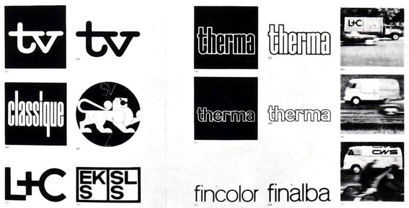
Müller-Brockmann treated letterforms as graphic elements with mathematical properties. Type wasn’t just for reading but for visual structure.
He mastered scale and contrast principles through typographic hierarchy. Size relationships followed mathematical progressions rather than arbitrary decisions.
Text became image in his concert posters. Letters functioned simultaneously as communication and visual structure.
His understanding of the difference between scale and proportion allowed him to create dynamic layouts while maintaining readability. Never sacrificing legibility for visual impact, he achieved both through systematic thinking.
FAQ on Josef Müller-Brockmann
Who was Josef Müller-Brockmann and why is he important?
Josef Müller-Brockmann was a Swiss graphic designer and pioneer of the International Typographic Style. His importance stems from developing mathematical grid systems that revolutionized visual communication. Through objective design principles and structured layout techniques, he transformed graphic arts from decorative craft to systematic discipline, influencing generations of designers worldwide.
What are Müller-Brockmann’s most famous works?
His most iconic works include:
- Musica Viva concert posters for Zürich Tonhalle
- Corporate identity for Swiss Federal Railways
- Automobile Club of Switzerland materials
- Neue Grafik magazine (co-founded with colleagues)
- “Grid Systems in Graphic Design” (book)
- “The Graphic Artist and His Design Problems” (book)
These showcase his masterful use of geometric forms and visual hierarchy.
What is the grid system that Müller-Brockmann developed?
Müller-Brockmann’s grid system is a mathematical framework dividing space into consistent units for organizing design elements. It creates structure through invisible lines forming a foundation for alignment decisions. His approach used proportional relationships based on the golden ratio to achieve visual harmony while maintaining functional clarity.
How did Müller-Brockmann influence modern design?
His influence permeates modern design through:
- Systematic approaches to visual organization
- Grid-based layouts in digital interfaces
- Objective communication principles
- Minimalist design aesthetic
- Functional typography treatment
- Corporate identity systems
His rational approach established design standards still evident in contemporary web design and branding.
What was Müller-Brockmann’s approach to typography?
Müller-Brockmann favored sans-serif fonts like Helvetica and Akzidenz-Grotesk for their clarity and objectivity. He applied mathematical precision to typographic hierarchy, treating text as functional information rather than decoration. His approach emphasized baseline alignment, precise spacing, and strategic use of size contrast to guide readers logically through content.
What was the Swiss Style movement and how did Müller-Brockmann contribute?
The Swiss design movement (International Typographic Style) emerged in 1950s Switzerland, emphasizing objectivity, grid systems, and sans-serif typography. Müller-Brockmann was its leading theorist and practitioner. Through his design work, teaching at Kunstgewerbeschule Zürich, publications like Neue Grafik, and books, he codified the movement’s principles and spread them globally.
How did Müller-Brockmann use photography in his designs?
Müller-Brockmann approached photography with the same objective clarity as typography. He selected images based on communication value, not artistic merit. His cropping techniques eliminated unnecessary information while maintaining objective representation. He integrated photos using mathematical proportions, treating images and text as equal elements within his grid system, creating harmonious relationships based on structure rather than intuition.
What books did Müller-Brockmann write?
His essential publications include:
- “Grid Systems in Graphic Design” (1981) – His definitive work on grid theory
- “The Graphic Artist and His Design Problems” (1961)
- “History of Visual Communication” (1971)
- “Die Neue Graphik” (co-authored)
These books weren’t just theoretical texts but practical guides demonstrating his systematic approach through visual examples and clear methodology.
How did Müller-Brockmann’s educational work impact design?
As a professor at Kunstgewerbeschule Zürich, Müller-Brockmann taught design as problem-solving rather than artistic expression. His teaching emphasized systematic thinking, objective communication, and functional purpose. His books became foundational texts in design education worldwide. His methodology continues influencing curriculum at major design schools, establishing grid systems as fundamental knowledge for designers.
What are the criticisms of Müller-Brockmann’s approach?
Critics argue his approach:
- Prioritizes structure over emotional connection
- Shows cultural bias toward Western mathematical thinking
- Can be rigid and limiting to creative expression
- Sometimes values perfection over accessibility
- Assumes universal perception regardless of cultural context
Despite these critiques, his principles remain remarkably resilient, proving their communication effectiveness across time and applications.
Conclusion
Josef Müller-Brockmann transformed design through mathematical precision and ordered design systems. His legacy isn’t just historical but actively shapes contemporary visual communication across media. The structured layout approaches he pioneered continue influencing designers who may never have heard his name.
His contributions reach beyond aesthetics:
- Establishing design functionality as paramount over decoration
- Demonstrating how negative space creates meaning, not emptiness
- Proving font spacing affects comprehension as much as content
- Showing how design standardization paradoxically enables creative freedom
What makes Müller-Brockmann’s approach endure is its fundamental truth: clear communication requires systematic thinking. His display font choices, x-height considerations, and management of ascenders and descenders weren’t stylistic choices but communication tools.
The Swiss precision he championed reminds us that design isn’t decoration but problem-solving. That’s his lasting gift.

Renowned for his expertise in logo design and visual branding, Bogdan has developed a multitude of logos for various clients.
His skills extend to creating posters, vector illustrations, business cards, and brochures. Additionally, Bogdan's UI kits were featured on marketplaces like Visual Hierarchy and UI8.
He also wrote in the past years on sites like Design Your Way, WebDesignerDepot, WPDean, Designmodo, Speckyboy, Slider Revolution, and more.
- The Cursor Logo History, Colors, Font, And Meaning - 24 September 2026
- Top 7 Web Design Subscription Services That Replace Full-Time Hires - 24 September 2026
- Canva vs PowerPoint: Which Is Better for Presentations? - 22 September 2026

Bogdan Sandu is a seasoned designer who has been designing websites since 2008. Renowned for his expertise in logo design and visual branding, Bogdan has developed a multitude of logos for various clients. His skills extend to creating posters, vector illustrations, business cards, and brochures. Additionally, Bogdan's UI kits were featured on marketplaces like Visual Hierarchy and UI8. He also wrote in the past years on sites like Design Your Way, WebDesignerDepot, WPDean, Designmodo, Speckyboy, Slider Revolution, and more.
You Might Also Like


