


Few designers transformed visual culture like Saul Bass. His work sliced through convention, creating unforgettable moments in film history and reshaping how companies present themselves to the world.
From the jagged arm in “The Man with the Golden Arm” to the AT&T Bell System logo, Bass crafted images that became cultural touchstones. His collaborations with directors Alfred Hitchcock and Otto Preminger revolutionized how films begin, turning title sequences into miniature artistic statements.
As a pioneer of minimalist design, Bass distilled complex ideas into powerful symbols. His work demonstrates how visual hierarchy creates immediate impact while conveying deeper meaning.
This article explores Bass’s revolutionary film title sequences, landmark corporate identities, distinctive visual style, and lasting influence on design that continues decades after his final projects.
Who is Saul Bass?
Saul Bass was a renowned American graphic designer and filmmaker, celebrated for revolutionizing film title sequences and poster design. Collaborating with directors like Hitchcock and Scorsese, he crafted iconic visuals for films such as Vertigo and Psycho. Bass also designed enduring corporate logos for AT&T and United Airlines.
Revolutionary Film Title Sequences
Breakthrough Works with Otto Preminger
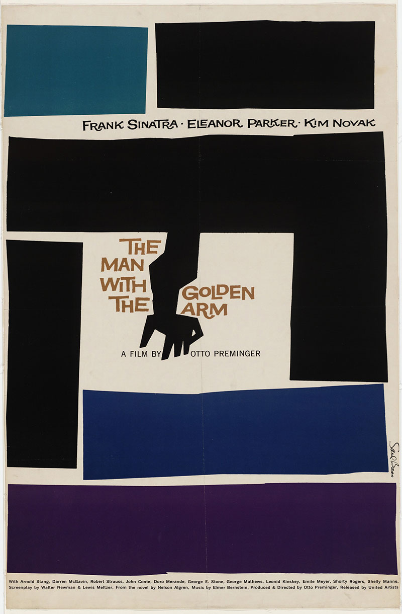
Saul Bass transformed the humble film credit sequence into an artform. His collaboration with Otto Preminger marked the beginning of his revolutionary approach to motion graphics.
“Carmen Jones” (1954) introduced his distinctive style-bold geometric forms with striking use of color theory. The sequence featured a simple rose icon against a flaming backdrop. Simple but powerful.
In “The Man with the Golden Arm” (1955), Bass created his most iconic work. The jagged, disjointed arm symbol perfectly captured the film’s theme of heroin addiction. His use of minimalist graphic design techniques stripped away everything unnecessary, leaving only what communicated the essence of the film.
For “Anatomy of a Murder” (1959), Bass employed a fragmented silhouette of a body-direct, unflinching visual storytelling. The sequence demonstrated his talent for creating a focal point that immediately grabs attention.
Iconic Collaborations with Alfred Hitchcock
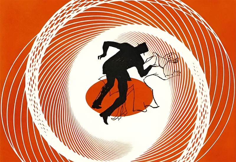
Bass’s work with Alfred Hitchcock pushed cinematic boundaries even further. Their partnership produced some of film history’s most memorable opening sequences.
“Vertigo” (1958) featured hypnotic spirals emerging from a woman’s eye, using movement in design to induce the film’s signature disorientation. The sequence employed kinetic typography alongside Bernard Herrmann’s haunting score.
For “North by Northwest” (1959), Bass created an abstract grid of lines that eventually formed into a skyscraper façade. His masterful use of grid systems and perspective created a dynamic visual journey.
In “Psycho” (1960), he employed stark black and white bars slicing across the screen-reflecting the film’s violent themes through contrast in design. The horizontal and vertical lines created tension through perfect balance.
Later Film Work
Bass’s collaboration with Martin Scorsese decades later showed his adaptability. For films like “Goodfellas” and “Casino,” he maintained his conceptual approach while embracing newer techniques. His style evolved while maintaining its core strengths.
His final film projects demonstrated his lasting influence on cinema. Even in his later years, he pushed creative boundaries. His work spanned decades yet remained fresh.
Technical Innovations
Bass pioneered animation techniques that transformed the industry. He mixed cut-paper style with hand-drawn elements, creating distinctive visuals impossible to ignore.
His approach to typography revolutionized how text could function in motion. Text wasn’t just informative, it became expressive, emotional, integral to storytelling.
Bass mastered symbolic visual storytelling. Every element served the film’s themes. Nothing was arbitrary. His sequences weren’t mere introductions-they were vital prologues setting tone, mood, and expectation.
Corporate Identity Revolution
Landmark Logo Designs

Saul Bass didn’t just transform film design, he revolutionized corporate identity with logos that defined American visual culture.
The AT&T Bell System logo (1969) featured a simplified bell within a circle. This perfect example of negative space in logo design became instantly recognizable nationwide.
United Airlines’ logo showcased his genius for logo design principles. The simple “U” shape created a distinctive mark that worked across all applications-from aircraft tails to letterheads.
Continental Airlines received a design that captured flight through abstract forms. Bold simplicity defined his approach.
For Quaker Oats, Bass refreshed the iconic Quaker figure without losing brand recognition-a masterclass in modernizing heritage brands.
The Minolta logo demonstrated his understanding of visual hierarchy. The rising sun symbol incorporated Japanese heritage while looking decidedly modern.
Design Philosophy and Approach
Bass embraced minimalism long before it became trendy. “Symbolize and summarize” was his mantra. His work exemplified the power of graphic design principles applied with intelligence and restraint.
His use of color psychology in corporate identities was strategic and deliberate. Each color choice supported brand personality and market positioning. Nothing was arbitrary.
Bass created designs that defied trends. The Bell System logo lasted decades without appearing dated-a testament to his focus on timelessness over fashionable aesthetics.
Branding Beyond Logos
Bass understood that effective branding extends beyond a single mark. He pioneered comprehensive visual identity systems with consistent application across all touchpoints.
His work anticipated the multi-platform world we now inhabit. From vehicle livery to uniforms, Bass considered how identity works across various contexts and scales.
His meticulous brand guidelines ensured consistent implementation. These documents became as influential as the designs themselves, teaching corporations how to maintain visual cohesion.
Bass’s influence from film extended into corporate work through his understanding of rhythm in design. His corporate identities weren’t static-they had movement, personality, life.
His work with Warner Communications exemplified the Bauhaus graphic design principle that form follows function. The simple “W” worked everywhere from movie screens to record labels.
The enduring power of Bass’s corporate designs comes from their perfect unity-every element working in harmony toward a single, clear expression of brand essence.
Visual Style and Artistic Approach
Distinctive Design Elements
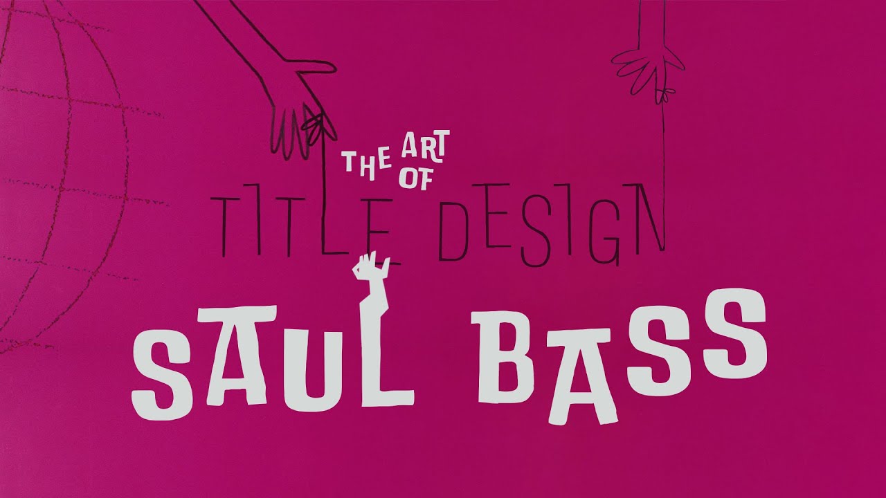
Saul Bass created a visual language instantly recognizable across media. His work prioritized emphasis through deliberate simplicity.
Bold geometric shapes dominated his compositions. Circles, rectangles, and jagged lines weren’t just design elements-they were characters in his visual stories. His work for “The Man with the Golden Arm” used a distorted arm symbol that communicated addiction’s disruptive force without a single word.
His limited color palettes demonstrated mastery of monochrome colors and strategic use of hue to maximize impact. Often working with just two or three colors, Bass proved restraint creates power. The “Vertigo” sequence used red and green, colors that create maximum contrast when placed together.
Bass pioneered kinetic typography that broke conventional rules. Text moved, pulsed, and transformed across the screen. His understanding of typographic hierarchy allowed him to emphasize key information while maintaining visual excitement.
His hand-drawn animation technique created organic, human qualities impossible to replicate mechanically. This approach predated digital tools yet remains more distinctive than much of today’s computer-generated work.
Influences and Inspirations
Bass drew heavily from Bauhaus and modernist movements that championed form following function. His work exemplified how graphic design movements can transform commercial art.
His connection to modern art ran deep. The influence of painters like Picasso and Matisse appeared in his use of flat, cut-paper style forms. Bass understood that asymmetry could create more dynamic compositions than perfect balance.
Jazz and musical influences shaped Bass’s approach to rhythm and timing. His film titles moved with musical precision, demonstrating his grasp of proximity in design and spacing to create visual syncopation. The “Anatomy of a Murder” sequence fragmented and reassembled like a visual jazz improvisation.
Evolution of Style
Bass’s early commercial work showed hints of his later genius. Even designing product packaging in the 1940s, he focused on bold symbols over decorative elements.
His mid-career experimentation pushed boundaries further. By combining vector graphics thinking with hand-crafted execution, he created a style simultaneously precise and human. His work for “Spartacus” showed increased confidence in symbolic abstraction.
Mature style and recurring motifs solidified his visual signature. The fractured, slicing compositions of “Psycho” reappeared throughout his later work, showing his understanding of how framing creates psychological impact.
Working Process and Methodology
Research and Conceptualization
Bass began projects with deep understanding of client needs and film themes. For “The Man with the Golden Arm,” he read Nelson Algren’s novel to fully grasp addiction’s destructive force before creating a single sketch.
His sketching and storyboarding process was exhaustive. Bass produced dozens of concepts before selecting final directions. Each drew from the psychology of shapes to communicate subliminal messages alongside obvious ones.
His pitching and client presentations became legendary. Bass didn’t just show designs-he performed them, demonstrating motion and pacing with his own body to help directors envision final results.
Collaboration Techniques
Bass mastered working with directors from Hitchcock to Scorsese. He built trust by demonstrating how his sequences could set audience expectations and establish thematic groundwork.
His skill at assembling creative teams showed his understanding that great design requires diverse talents. Bass connected filmmakers with animators, typographers, and craftspeople who could execute his vision with precision.
His relationships with animators and photographers were built on mutual respect and clear communication. Bass understood that tracking in typography and minute visual details required specialist knowledge beyond his own.
Technical Production Methods
Bass’s filming techniques often involved custom cameras and multiple exposures to achieve effects impossible through standard methods. His title sequence for “It’s a Mad, Mad, Mad, Mad World” used innovative aerial photography techniques.
His animation processes combined stop-motion, cel animation, and optical printing. He used baseline principles to ensure typography maintained readability even during complex motion sequences.
His approach to typography and lettering blended hand-crafted letterforms with careful alignment. Bass understood that the difference between art and design lies in communication clarity-even his most experimental work remained readable.
Bass pioneered techniques for combining white space in design with dynamic motion. The negative space in his compositions wasn’t empty, it was an active participant directing viewer attention.
His work showcased the rule of thirds not as a rigid formula but as a starting point for dynamic composition. Each frame could stand alone as a poster design masterpiece, demonstrating Bass’s commitment to excellence in every moment.
Cultural Impact
Influence on Film Industry

Saul Bass single-handedly elevated title design from afterthought to art form. Before Bass, credits were static cards. After him, they became integral storytelling components.
His work on “Vertigo” and “Psycho” created a new audience expectation. Film titles weren’t just information-they were artistic prologues setting tone and theme. The opening minutes became prime creative real estate.
Subsequent generations of designers cite Bass as their primary influence. Kyle Cooper’s title sequence for “Seven” shows clear Bass inspiration in its use of variety and unsettling imagery. Every designer working in film titles today works in Bass’s shadow.
Impact on Graphic Design Field
Bass pioneered conceptual thinking in commercial art. His approach to the elements of design transformed how designers approach problem-solving. His work wasn’t decorative-it communicated core meaning through simple, powerful symbols.
Corporate identity standardization owes much to Bass’s systematic approach. His comprehensive identity packages for companies like AT&T created templates for brand style guides that remain industry standard.
His integration of motion in design thinking was revolutionary. Bass understood that brands exist in time as well as space. His work anticipated the motion-based brand identities prevalent in today’s digital environment decades before the technology existed.
Legacy in Popular Culture
Bass achieved recognition beyond design circles. His paper-cut style and bold geometric approach became visual shorthand for sophistication and modernism in popular culture.
Major museums including MoMA and the Smithsonian have hosted Bass retrospectives. His work transcended commercial design to be recognized as culturally significant art.
References and homages appear frequently in contemporary media. The title sequences of “Mad Men” and “Catch Me If You Can” directly reference Bass’s visual language. His influence appears in unexpected places-from music videos to smartphone interfaces.
His work with typographic elements created a visual language so distinctive that even viewers without design knowledge recognize “the Bass style.” Few designers achieve this level of visual ownership.
Personal Philosophy and Teaching
Design Principles and Values
Bass believed form follows function wasn’t just a Bauhaus slogan but design’s core truth. His work showcased the power of Swiss design principles applied with personal expression.
He used symbolism and metaphor to distill complex ideas into immediate visual impact. His work demonstrated the Gestalt principles of design at their most effective-creating wholes greater than their parts.
Bass championed simplicity with depth. His designs appeared elementary at first glance but revealed conceptual richness upon examination. His approach to sans-serif font usage showed how apparently simple typography could carry emotional weight.
His work embodied the golden ratio in design, not through rigid formula but intuitive balance. His compositions achieved harmony through mathematical relationships most viewers sensed rather than consciously recognized.
Educational Contributions
Bass’s lectures and workshops influenced generations of designers. His presentations weren’t just about aesthetics but about thinking-how to approach visual problems conceptually rather than decoratively.
His mentorship of young designers was legendary. Many famous graphic designers today cite personal guidance from Bass as career-defining. He demonstrated font psychology principles to students by showing how typeface choices communicate subliminal messages.
Though not prolific as a writer, Bass’s published writings on design remain influential. His essay on film title design for “Cinefantastique” magazine established theoretical groundwork for motion graphics as a distinct discipline.
Famous Quotes and Insights

On commercial art: “Design is thinking made visual.” Bass rejected the false division between commercial and fine art, seeing all visual communication as potentially meaningful.
Regarding the creative process: “I want to make beautiful things, even if nobody cares.” This spoke to his commitment to excellence regardless of client understanding or budget.
His perspective on design’s role in society: “Symbolize and summarize.” Bass believed designers should distill complex messages to their essence, respecting audience intelligence while maximizing communication efficiency.
“My initial thoughts about what a title can do was to set mood and the prime underlying core of the film’s story, to express the story in some metaphorical way. I saw the title as a way of conditioning the audience, so that when the film actually began, viewers would already have an emotional resonance with it.” This insight transformed how filmmakers approach opening sequences.
Bass understood font spacing as emotional punctuation: “Space between letters is as important as the letters themselves.” His work with leading in typography showed how subtle adjustments created dramatic impact.
His documentary “Why Man Creates” won an Academy Award, demonstrating Bass’s ability to apply his design thinking to filmmaking itself. The film used complementary color scheme principles to create visual metaphors for creativity.
Unlike many famous designers, Bass maintained a successful partnership with his wife Elaine Bass. Their collaboration exemplified his belief in creative teamwork over individual genius.
FAQ on Saul Bass
What are Saul Bass’s most famous film title sequences?
Bass’s most renowned title sequences include “Vertigo,” “Psycho,” “The Man with the Golden Arm,” “Anatomy of a Murder,” and “North by Northwest.” His collaboration with Alfred Hitchcock produced particularly memorable work characterized by symbolic imagery and kinetic typography.
Which companies did Saul Bass design logos for?
Bass created iconic corporate identities for AT&T, United Airlines, Continental Airlines, Quaker Oats, Minolta, Warner Communications, and Bell System. His approach to logo design principles emphasized simple, memorable symbols that worked across multiple applications.
What was Saul Bass’s design style?
His style featured bold geometric shapes, limited color palettes, striking symmetry, and dynamic motion. Bass pioneered the cut-paper aesthetic and employed hand-drawn animation techniques. His work embodied graphic design principles of simplicity, impact, and conceptual thinking.
Did Saul Bass win any awards?
Yes. Bass received an Academy Award for his documentary “Why Man Creates” and earned multiple AIGA Medals for his contributions to design. His work for film and corporate clients garnered numerous industry accolades, cementing his place among famous graphic designers.
How did Saul Bass influence modern design?
Bass revolutionized title design, corporate identity, and motion graphics. His integration of storytelling in design influenced generations of designers. Today’s brand identity systems, film titles, and motion graphics all bear his influence through their conceptual approach and symbolic representation.
What was Bass’s educational background?
Bass studied at Brooklyn College and later at the Art Students League in New York under Gyorgy Kepes. Unlike many contemporaries, he didn’t attend prestigious design schools but developed his style through practical experience and the influence of Bauhaus graphic design principles.
Did Saul Bass design movie posters?
Absolutely. Bass created iconic posters for films like “The Shining,” “Vertigo,” and “Anatomy of a Murder.” His poster design approach often used the same symbolic elements from his title sequences, creating cohesive visual identities for films.
How did Bass approach typography?
Bass saw typography as both functional and expressive. He often used sans-serif fonts for their modern feel and manipulated letterforms to create dynamic compositions. His work demonstrated how font choice directly influences message reception.
Did Saul Bass collaborate with his wife?
Yes, Saul collaborated extensively with his wife Elaine Bass. Many of his later projects, especially film sequences for Martin Scorsese, were joint efforts. Their partnership exemplified collaborative design practice where unity of vision produced exceptional results.
What is Saul Bass’s lasting legacy?
Bass elevated commercial art to cultural significance. His work demonstrated how design thinking could solve communication problems across media. The integration of mood board in design approaches to conceptualization revolutionized how designers translate abstract concepts into visual solutions that continue to influence contemporary practice.
Conclusion
Saul Bass redefined visual communication across multiple disciplines. His work exemplifies how strong conceptual thinking can transform commercial art into cultural touchstones. The paper-cut animation style and symbolic approach to design elements created a visual language instantly recognizable yet endlessly adaptable.
His legacy lives on through three key contributions:
- Revolutionary approach to motion – Bass understood that repetition and rhythm could create emotional responses just as powerful as static imagery
- Corporate identity standardization – His systematic approach to brand guidelines created the template for modern branding practice
- Elevation of commercial design – Bass demonstrated how the difference between scale and proportion in visual composition could transform utilitarian communication into art
Bass’s influence transcends design circles. When we experience title sequences that function as emotional prologues or encounter logos that communicate complex brand values through simple forms, we’re witnessing the continued impact of his revolutionary vision.

Renowned for his expertise in logo design and visual branding, Bogdan has developed a multitude of logos for various clients.
His skills extend to creating posters, vector illustrations, business cards, and brochures. Additionally, Bogdan's UI kits were featured on marketplaces like Visual Hierarchy and UI8.
He also wrote in the past years on sites like Design Your Way, WebDesignerDepot, WPDean, Designmodo, Speckyboy, Slider Revolution, and more.
- How to Install Fonts on Mac (Step-by-Step Guide) - 20 September 2026
- From Mockup to Code: How AI-Augmented Development Speeds Up the Design Handoff - 19 September 2026
- The Beehiiv Logo History, Colors, Font, And Meaning - 18 September 2026

Bogdan Sandu is a seasoned designer who has been designing websites since 2008. Renowned for his expertise in logo design and visual branding, Bogdan has developed a multitude of logos for various clients. His skills extend to creating posters, vector illustrations, business cards, and brochures. Additionally, Bogdan's UI kits were featured on marketplaces like Visual Hierarchy and UI8. He also wrote in the past years on sites like Design Your Way, WebDesignerDepot, WPDean, Designmodo, Speckyboy, Slider Revolution, and more.
You Might Also Like


