


Pick up any magazine and the first thing you notice isn’t the cover story or celebrity photo. It’s that distinctive title treatment at the top that instantly tells you what a masthead is and which publication you’re holding.
Magazine mastheads serve as the visual fingerprint of every publication. They’re far more than decorative text.
These carefully crafted design elements function as brand ambassadors, legal requirements, and marketing tools rolled into one. From typography choices to color decisions, every masthead element influences reader behavior and business success.
Understanding masthead design reveals the hidden psychology of magazine publishing. This guide explores how these seemingly simple title treatments shape entire industries.
You’ll discover the historical evolution from basic newspaper headers to sophisticated brand identity systems. We’ll examine design principles, legal requirements, and digital adaptations that modern publishers navigate daily.
Whether you’re a designer, publisher, or curious reader, mastering masthead fundamentals unlocks the secrets behind successful publication branding.
What Is a Masthead?
A masthead is the section of a newspaper, magazine, or website that lists key information about the publication. It typically includes the name, logo, editorial staff, ownership, contact details, and sometimes legal disclaimers. In web design, it can also refer to the prominent header area displaying the site’s identity.
Historical Development of Magazine Mastheads
Early Print Publication Origins

Magazine mastheads didn’t appear overnight. They borrowed heavily from newspaper masthead traditions that had been around since the 1700s.
Early magazines copied what worked for newspapers. The masthead served as both identification and legal requirement.
Publishers needed a way to distinguish their publication from competitors on crowded newsstands. Simple text treatments dominated this era.
First Magazine Adaptations
The first magazine mastheads were basic affairs. Publishers used whatever typography their local printers had available.
Magazine title design was purely functional back then. No fancy graphics or custom lettering.
Most early magazines used serif fonts because that’s what was readily available. The focus was on getting information to readers, not winning design awards.
19th Century Standardization
The late 1800s brought more consistency to magazine design. Publishers realized that masthead recognition could drive sales.
Brand identity became important as the publishing industry grew more competitive. Magazines started developing signature looks.
This period saw the first attempts at custom typography for magazine titles. Publishers invested in unique typeface designs.
Design Evolution Through Decades
Typography Trends and Changes
The early 1900s introduced bold experimentation. Art Nouveau influences crept into magazine masthead design.
Publishers embraced decorative elements and ornate lettering. Visual identity mattered more than pure readability.
The 1920s brought cleaner, more geometric approaches. Sans-serif fonts gained popularity for their modern feel.
Color Introduction and Impact
Black and white dominated until printing technology improved. The introduction of color revolutionized masthead design.
Magazines could now use color psychology to communicate brand personality. Red suggested excitement, blue conveyed trust.
Color printing costs initially limited usage to premium publications. Mass market magazines stuck with single-color mastheads longer.
Size and Placement Variations
Early mastheads took up significant cover real estate. Publishers viewed the title as the most important element.
The rise of celebrity culture changed this approach. Cover personalities began competing with masthead space.
Modern magazines balance masthead visibility with cover model prominence. Some famous titles can shrink their logos and still maintain recognition.
Notable Masthead Transformations
Famous Magazine Redesigns

Vogue’s masthead has remained remarkably consistent since 1909. The font used by Vogue became instantly recognizable.
Time magazine went through multiple iterations before settling on its current design. Each change reflected the era’s graphic design principles.
Rolling Stone’s bold, condensed lettering captured the rebellious spirit of rock music. The typography became as iconic as the magazine’s content.
Brand Identity Shifts
Publishers sometimes redesign mastheads to signal editorial changes. A new look suggests fresh content and perspectives.
Publication branding decisions can make or break reader loyalty. Dramatic changes risk alienating longtime subscribers.
Successful transformations maintain core brand elements while updating outdated aspects. Evolution works better than revolution.
Reader Response to Changes
Magazine readers develop emotional attachments to familiar mastheads. Changes often trigger passionate responses.
Focus groups help publishers test new designs before committing. Reader recognition remains the top priority.
Some magazines revert to previous designs after negative feedback. The connection between masthead and brand loyalty runs deep.
Types and Styles of Magazine Mastheads
Traditional Text-Based Mastheads
Serif and Sans-Serif Approaches

Serif fonts dominated early magazine design. The small decorative strokes suggested tradition and authority.
News magazines still favor serif typography for credibility. Publication standards often dictate conservative type choices.
Sans-serif fonts gained popularity in the mid-20th century. Their clean lines suggested modernity and progress.
Custom Typography Creation
Premium magazines invest in custom typefaces. Unique lettering prevents competitors from copying the exact look.
Typography design becomes part of the brand’s intellectual property. Custom fonts can be trademarked and protected.
The investment pays off through improved brand recognition and market differentiation.
Readability Considerations
Masthead legibility trumps artistic expression. Readers must identify the magazine quickly from across a newsstand.
Font selection requires testing at various sizes and distances. What looks good up close might disappear from far away.
High contrast between text and background ensures visibility. Designers consider worst-case lighting scenarios.
Logo-Style and Graphic Mastheads
Symbol Integration Techniques
Some magazines incorporate symbols into their mastheads. Icons can communicate genre or subject matter instantly.
Visual communication through symbols transcends language barriers. International publications benefit from recognizable imagery.
The challenge lies in balancing text and graphics. Neither element should overwhelm the other.
Brand Mark Combinations
Established magazines sometimes develop separate logos alongside their mastheads. The logo works for merchandise and digital applications.
Brand consistency requires careful coordination between masthead and logo designs. Both elements must feel related.
Some publications use their masthead as their primary logo. This approach simplifies brand management across platforms.
Visual Identity Systems
Modern magazines develop comprehensive visual identity systems. The masthead anchors the entire design framework.
Design elements like color palettes and typography rules extend throughout the publication. Consistency builds stronger brand recognition.
Digital adaptations require flexible systems. Mastheads must work across multiple screen sizes and platforms.
Industry-Specific Masthead Conventions
Fashion Magazine Aesthetics

Fashion publications favor elegant, sophisticated typography. Masthead design reflects the luxury brands they feature.
Minimalist approaches dominate high-end fashion magazines. Clean lines suggest expensive taste and refined sensibilities.
Color choices often mirror seasonal fashion trends. Some magazines update masthead colors with each issue.
News Publication Standards
News magazines prioritize credibility over creativity. Traditional typography choices signal serious journalism.
Publication design emphasizes trustworthiness through conservative masthead treatments. Readers associate familiar styles with reliable information.
Breaking news formats sometimes use bold, urgent typography. The masthead style must match the content’s tone.
Specialty Interest Variations
Hobby magazines embrace more playful masthead designs. Magazine industry conventions vary dramatically by subject matter.
Tech publications might use futuristic fonts. Craft magazines often feature handwritten-style lettering.
The target audience influences every design decision. What appeals to motorcycle enthusiasts won’t work for cooking magazine readers.
Brand Identity and Recognition Functions
Visual Brand Building
Consistent Reader Recognition

Magazine mastheads create instant brand recognition at newsstands. Readers scan dozens of titles in seconds, relying on familiar visual cues to find their preferred publications.
Brand consistency across issues builds reader loyalty over time. A well-designed masthead becomes a trusted friend that readers actively seek out.
Successful magazines maintain their core masthead elements for decades. Changes happen gradually to preserve the recognition factor that drives sales.
Shelf Presence and Competition
Newsstand displays create intense competition for reader attention. Strong masthead design cuts through visual noise to grab wandering eyes.
Masthead positioning on covers affects purchase decisions. Publishers test different placements to find the sweet spot for maximum impact.
Bold typography and distinctive color schemes help magazines stand out from competitors. Every design choice serves the goal of shelf dominance.
Brand Equity Development
Recognizable mastheads become valuable business assets. Publishers can license their brand identity for merchandise and digital products.
Brand development through consistent masthead design increases the publication’s overall market value. Strong brands command higher advertising rates and subscription prices.
Investment in professional masthead design pays long-term dividends. The upfront cost creates lasting competitive advantages.
Market Positioning Through Design
Target Audience Communication
Masthead style immediately signals the intended readership. Elegant serif fonts suggest sophisticated content for educated audiences.
Visual communication happens before readers process a single word. Typography choices convey personality, quality level, and editorial perspective.
Young adult magazines use trendy fonts that older publications would never consider. Age-appropriate design choices help magazines connect with their core demographics.
Premium Versus Mass Market Signals
Luxury magazines invest heavily in custom typography and premium design elements. The masthead quality reflects the publication’s market positioning.
Mass market titles prioritize bold readability over artistic sophistication. Clear, simple designs work better for impulse purchases at checkout counters.
Design budgets often correlate with cover prices. Readers expect visual polish when paying premium subscription rates.
Genre and Category Identification
Fashion magazines develop distinctive masthead styles that readers associate with the industry. Publication design conventions help consumers navigate magazine categories.
Tech publications might use futuristic fonts to signal cutting-edge content. Craft magazines often feature handwritten styles that suggest personal creativity.
Genre conventions provide shortcuts for reader identification. Breaking established patterns risks confusing potential buyers.
Cross-Platform Brand Extension
Digital Adaptation Strategies
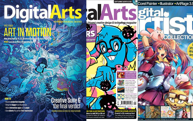
Print mastheads must translate effectively to digital screens. Brand identity consistency across platforms builds stronger consumer recognition.
Mobile displays require simplified masthead designs. Complex typography that works in print often becomes illegible on small screens.
Responsive design principles apply to masthead adaptation. The core brand elements must remain recognizable at any size.
Social Media Integration
Magazine mastheads appear in social media profile pictures and post headers. Digital branding extends the publication’s reach beyond traditional circulation.
Instagram and Facebook avatars require extremely condensed masthead versions. Designers must distill the brand essence into tiny square formats.
Social platforms become additional touchpoints for brand reinforcement. Consistent masthead usage strengthens overall brand recognition.
Merchandise and Licensing Uses
Successful magazine brands license their mastheads for clothing, accessories, and home goods. Brand extension opportunities multiply revenue streams.
T-shirts featuring iconic magazine logos tap into reader loyalty and nostalgia. The masthead becomes a lifestyle statement beyond reading preferences.
Licensing agreements require careful brand guidelines to maintain quality control. Improper usage can dilute the brand’s core identity.
Design Principles and Best Practices
Typography Selection Criteria
Legibility at Various Sizes
Masthead typography must remain readable from newsstand distance to close examination. Font selection requires testing at multiple viewing distances.
Serif fonts often work better for traditional publications seeking authority and trust. The small decorative strokes aid readability in print formats.
Sans-serif fonts provide cleaner digital reproduction and modern appeal. Technology publications frequently choose these streamlined options.
Character Spacing Considerations
Proper kerning ensures professional appearance and optimal readability. Letter spacing affects both aesthetic appeal and functional clarity.
Typography elements like tracking and leading influence the masthead’s overall impact and legibility.
Compressed fonts save space but sacrifice readability. Publishers must balance efficiency with visual clarity.
Brand Personality Expression
Typography choices convey emotional messages before readers process actual words. Font psychology influences reader perceptions and purchasing decisions.
Script fonts suggest elegance and femininity for lifestyle publications. Bold, condensed types communicate strength and urgency for news magazines.
Display fonts offer unique personality but require careful application. Novelty typography can quickly become dated or illegible.
Production and Printing Considerations
Complex font designs may not reproduce well in standard printing processes. Publication standards require fonts that maintain quality across different paper stocks.
Digital reproduction introduces additional constraints for font selection. Screen resolution affects how typography appears on various devices.
Font licensing costs impact design budgets, especially for custom typefaces. Publishers must balance uniqueness with practical financial considerations.
Color Theory and Application
Psychology of Color Choices

Red mastheads suggest energy, passion, and urgency. News magazines often use red to convey breaking information and important content.
Blue communicates trust, stability, and professionalism. Color psychology helps magazines align visual presentation with editorial positioning.
Black and white combinations offer timeless sophistication and maximum contrast. Classic color schemes never go out of style.
Emotional Color Associations
- Warm colors (red, orange, yellow) create excitement and energy
- Cool colors (blue, green, purple) suggest calm and trustworthiness
- Neutral colors (black, white, gray) convey sophistication and timelessness
Printing Cost Implications
Multiple colors increase production expenses significantly. Budget-conscious publications often limit masthead colors to control costs.
CMYK printing requires careful color specification to ensure consistent reproduction. RGB colors must be converted properly for print applications.
Pantone colors provide precise color matching but add expense. Premium publications justify the cost for brand consistency.
Accessibility and Contrast Standards
Sufficient contrast between masthead and background ensures readability for all users. Color accessibility considerations include color-blind readers.
High contrast ratios improve legibility under various lighting conditions. Newsstand fluorescent lighting can wash out subtle color differences.
Color-only information excludes readers with visual impairments. Effective mastheads rely on typography and contrast rather than color alone.
Layout and Positioning Guidelines
Cover Hierarchy Establishment

Masthead placement establishes the visual hierarchy for the entire cover design. Cover layout must balance title prominence with other design elements.
Top placement traditionally dominates magazine covers. Some publications experiment with alternative positions for creative impact.
Size relationships between masthead and other cover elements communicate relative importance. Larger mastheads suggest greater brand confidence.
Image Integration Techniques
Masthead and cover photography must work harmoniously together. Design integration requires careful coordination between typography and imagery.
Overlapping elements can create dynamic layouts but risk readability issues. Transparent effects and careful color selection solve integration challenges.
White space around mastheads provides breathing room and improves legibility. Cluttered layouts reduce impact and confuse readers.
Balance and Proportion
Golden ratio principles can guide masthead sizing and placement decisions. Mathematical proportions create naturally pleasing layouts.
Visual balance distributes design weight across the cover effectively. Heavy typography requires careful counterbalancing with other elements.
Scale and proportion relationships affect reader perception and engagement. Oversized mastheads can overwhelm, while undersized ones disappear.
FAQ on Mastheads
What exactly is a masthead on a magazine?
A masthead is the distinctive title treatment that appears prominently on magazine covers, typically at the top. It includes the publication name, design elements, and sometimes issue information. This visual identity serves as instant brand recognition for readers browsing newsstands.
Where does the masthead appear on magazines?
Magazine mastheads traditionally appear at the top of covers, though some publications experiment with alternative placements. The masthead positioning must balance visibility with other cover elements like photography and headlines for maximum newsstand impact.
How is a masthead different from a logo?
While both serve branding purposes, mastheads specifically identify publications and include regulatory information. Logos are simplified symbols used across platforms, whereas mastheads are comprehensive publication branding systems designed primarily for magazine covers and editorial pages.
What information must appear in magazine mastheads?
Legal requirements vary by country, but mastheads typically include publication name, issue date, volume number, and publisher information. Publication standards may mandate specific font sizes and placement for postal service compliance and circulation verification.
Can magazines change their masthead design?
Yes, but changes require careful consideration of brand recognition and reader loyalty. Successful redesigns evolve gradually while maintaining core identity elements. Dramatic changes risk alienating subscribers and reducing newsstand recognition.
What typography works best for magazine mastheads?
Serif fonts suggest tradition and authority, while sans-serif fonts convey modernity. Typography selection depends on target audience, genre conventions, and legibility requirements at various viewing distances.
How do digital platforms affect masthead design?
Digital adaptations require simplified designs that work across multiple screen sizes. Web design principles prioritize mobile responsiveness and loading speed, often forcing publishers to create streamlined masthead versions for online use.
Are magazine mastheads protected by trademark law?
Yes, distinctive masthead designs qualify for trademark protection when properly registered. Publishers must actively enforce their rights and monitor for infringement to maintain legal protection and prevent competitor copying.
What colors work best for magazine mastheads?
Color choices depend on color psychology and brand positioning. Red suggests energy and urgency, blue conveys trust, while black offers timeless sophistication. Color selection must consider printing costs and accessibility requirements.
How do mastheads affect magazine sales?
Strong masthead recognition drives impulse purchases and builds reader loyalty. Brand consistency helps magazines stand out on crowded newsstands and justifies premium advertising rates through improved brand recall and market positioning.
Conclusion
Understanding what is a masthead reveals the sophisticated design thinking behind every magazine cover. These carefully crafted elements blend art, business, and legal requirements into cohesive brand statements.
Successful mastheads balance multiple priorities. Magazine circulation depends on instant recognition while editorial credibility requires professional presentation. Publishers must consider everything from font spacing to color palettes when developing these critical brand assets.
Digital transformation continues reshaping masthead requirements. Responsive design demands simplified approaches that work across platforms while maintaining brand equity and reader connections.
From historical newspaper origins to modern multimedia applications, mastheads remain central to publishing industry success. Smart publishers invest in professional masthead development as a long-term competitive advantage that pays dividends through improved recognition, loyalty, and revenue generation across all distribution channels.

Renowned for his expertise in logo design and visual branding, Bogdan has developed a multitude of logos for various clients.
His skills extend to creating posters, vector illustrations, business cards, and brochures. Additionally, Bogdan's UI kits were featured on marketplaces like Visual Hierarchy and UI8.
He also wrote in the past years on sites like Design Your Way, WebDesignerDepot, WPDean, Designmodo, Speckyboy, Slider Revolution, and more.
- Canva vs PowerPoint: Which Is Better for Presentations? - 22 September 2026
- How to Install Fonts on Mac (Step-by-Step Guide) - 20 September 2026
- From Mockup to Code: How AI-Augmented Development Speeds Up the Design Handoff - 19 September 2026

Bogdan Sandu is a seasoned designer who has been designing websites since 2008. Renowned for his expertise in logo design and visual branding, Bogdan has developed a multitude of logos for various clients. His skills extend to creating posters, vector illustrations, business cards, and brochures. Additionally, Bogdan's UI kits were featured on marketplaces like Visual Hierarchy and UI8. He also wrote in the past years on sites like Design Your Way, WebDesignerDepot, WPDean, Designmodo, Speckyboy, Slider Revolution, and more.
You Might Also Like


