


In a world where women rarely led creative departments, Cipe Pineles shattered the glass ceiling as the first female art director of a major American magazine. This Viennese designer transformed editorial design with distinctive visual style and groundbreaking approaches to iconic fonts and layouts.
Arriving as a Jewish immigrant designer during the 1930s, she faced dual barriers of gender and ethnicity, yet rose to shape Condé Nast publications through innovative magazine layouts and experimental typography.
Her journey from M&F Schlosser apprentice to Glamour magazine’s revolutionary art director set new standards for publication design. Through her work at Seventeen, Charm, and Mademoiselle, Pineles pioneered food illustration techniques and created visual identities that respected readers’ intelligence while delighting their senses.
This article explores how this mid-century design pioneer:
- Transformed women’s magazine aesthetics
- Broke gender barriers in the graphic arts
- Created influential editorial design systems
- Established a legacy that continues inspiring contemporary designers
Who is Cipe Pineles?
Cipe Pineles is an influential graphic designer and art director, known for breaking gender barriers in design. She was the first female art director at major magazines like Seventeen and Glamour. Pineles combined fine art with editorial design, championing expressive layouts and helping shape mid-20th-century magazine aesthetics.
Breaking into the Industry
Education and Early Career

Cipe Pineles began her journey as a Viennese designer who immigrated to America with dreams of making her mark in the visual arts. Her formal training at Pratt Institute provided her with a foundation in typography and editorial design principles. During these formative years, she developed a keen understanding of visual hierarchy and composition that would later define her groundbreaking work.
Early freelance projects proved challenging. As a Jewish immigrant designer, Pineles faced dual barriers of xenophobia and sexism in the 1930s American publishing world. Yet her distinctive visual style quickly caught attention.
Her initial entry into publishing came through persistence and talent. She created innovative layouts that demonstrated her understanding of graphic design principles while maintaining commercial appeal.
Mentor Relationship with M. F. Agha
Working under M&F Agha at Condé Nast publications transformed Pineles’ career trajectory. Agha recognized her talent for visual storytelling and nurtured her development as an experimental typography innovator.
From Agha, she learned crucial skills:
- Mastery of balance between commercial needs and artistic integrity
- Strategic use of white space to create breathing room
- Sophisticated color theory applications for emotional impact
“Agha taught me to see the page as a canvas where alignment wasn’t just about order but about creating visual tension,” Pineles noted in a later interview.
This mentorship shaped her approach to magazine layouts, pushing her to explore decorative design elements while maintaining readability. Under his guidance, she developed a design philosophy merging European modernism with American commercial sensibilities.
Overcoming Gender Barriers
As a female graphic designer in the mid-century design world, Pineles faced significant discrimination. Male art directors frequently dismissed her portfolio without review. Her strategy? Excellence beyond reproach.
She built credibility through a meticulous approach to design problems. When commissioning illustrations, she created comprehensive briefs that demonstrated her mastery of contrast and proximity. Her work spoke volumes.
Pineles leveraged her unique perspective as an outsider. While male designers followed established patterns, she brought fresh approaches to publication design that resonated with readers.
“I had to be twice as good to be considered half as talented,” she once remarked. This reality drove her commitment to innovation and precision.
Revolutionary Work at Condé Nast
Innovations at Vogue and Vanity Fair
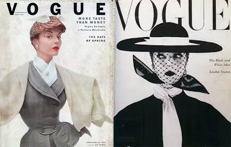
At prestigious Condé Nast publications, Pineles revolutionized magazine industry standards. Her work at Vogue and Vanity Fair introduced new approaches to grid systems that allowed for both structure and creative freedom.
Her integration of fine art with commercial design broke new ground. She commissioned painters and sculptors to create editorial illustrations, elevating the visual language of fashion magazines. This approach to conceptual imagery set new standards for print design innovation.
Pineles pioneered visual storytelling techniques that created narrative flow across layouts. She understood how typography elements could guide readers through content, using serif and sans-serif fonts strategically to establish pace and hierarchy.
Becoming the First Female Art Director
The appointment of Pineles as art director at Glamour magazine in 1942 shattered a significant glass ceiling. As the first female art director of a major American publication, her breakthrough represented professional advancement for women across the industry.
Industry reactions were mixed. Some male colleagues dismissed her promotion as a wartime necessity. Others recognized the undeniable quality of her work. The magazine’s circulation grew under her direction, silencing critics through measurable success.
Her position at Glamour allowed her to mentor other women, opening doors previously closed to female designers. She created opportunities for women in graphic arts by commissioning female illustrators and photographers when such practice was rare.
Visual Style and Creative Approach

Pineles developed a distinct aesthetic characterized by:
- Bold use of focal points to draw readers into the page
- Innovative margin choices that broke conventional grids
- Strategic emphasis through scale variations
Her color choices reflected sophisticated understanding of color psychology. She often used monochrome colors with strategic accent hues to create memorable visual identities for features.
Typography became Pineles’ signature. She mastered tracking and kerning to create perfectly balanced headlines. Her respect for baseline discipline demonstrated her technical rigor.
Pineles brought a revolutionary editorial design philosophy that balanced artistic expression with commercial needs. She believed magazines should respect readers’ intelligence while delighting their senses. This approach influenced generations of designers who followed in her footsteps.
Transforming Seventeen Magazine
Creating a Visual Identity for Teenage Girls
Pineles revolutionized editorial design when she joined Seventeen magazine. She understood a demographic previously ignored by serious designers: teenage girls. Unlike established women’s magazines, Seventeen needed a visual language that balanced youthful energy with sophistication.
Her layouts broke convention. She introduced asymmetry in page designs, creating dynamic tension that appealed to young readers while maintaining editorial clarity. This groundbreaking designer implemented a strategic color palette that differentiated Seventeen from adult publications.
“I wanted these girls to feel respected, not talked down to,” Pineles noted in her design archives. This philosophy guided her typography choices and image selection.
She crafted layouts with deliberate rhythm that kept pages engaging without becoming chaotic. This distinctive visual style became the publication’s signature.
Integration of Illustration and Photography
Pineles’ innovative approach to food illustrations and fashion photography transformed how magazines visualized content for young women. She commissioned fine artists rather than commercial illustrators, bringing unexpected variety to Seventeen’s pages.
Her photography direction broke from traditional women’s magazine designs by:
- Featuring models in active poses rather than static compositions
- Using natural lighting to create authenticity
- Incorporating movement through dynamic cropping
Pineles’ background as a mid-century design pioneer informed her experimental typography choices. She paired handwritten elements with clean sans-serif font treatments, creating a visual language that felt personal yet polished.
This integration created the magazine’s iconic visual identity. Young readers recognized Seventeen by its look alone.
Editorial Design Innovations
Pineles implemented layout techniques that influenced the entire industry. She developed a typographic hierarchy system that guided readers through complex content while maintaining visual interest-a challenge when designing for younger audiences with varying reading levels.
Her typography choices created systematic yet flexible frameworks. She understood how leading in typography affected readability and pace, adjusting spacing to maintain energy across feature articles.
Revolutionary content presentation strategies included:
- Department-specific typeface systems
- Consistent use of negative space for section markers
- Innovative use of repetition to create brand continuity
These innovations weren’t just aesthetic-they fundamentally changed how magazine content connected with teenage readers. The visual systems Pineles created at Seventeen influenced women’s magazines for decades.
Work at Charm and Mademoiselle
Evolution of Style and Approach
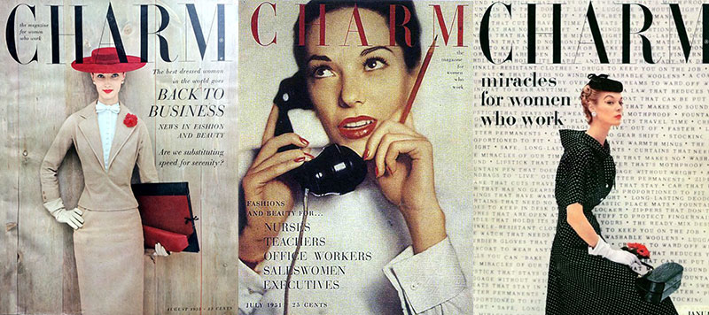
At Charm magazine, Pineles refined her distinctive visual approach for working women. Her layouts embraced Swiss design principles while maintaining accessibility for mainstream readers.
Her maturing aesthetic sensibilities showed through careful application of the rule of thirds and sophisticated golden ratio proportions. The Vienna-born designer brought European modernist influences to American commercial publishing.
At Mademoiselle, she pushed boundaries by implementing Bauhaus design principles in a commercial women’s magazine-a daring choice that distinguished the publication from competitors.
Her evolving approach demonstrated a deep understanding of the elements of design and how they could be adapted for different audiences while maintaining artistic integrity.
Food Illustration and Personal Work
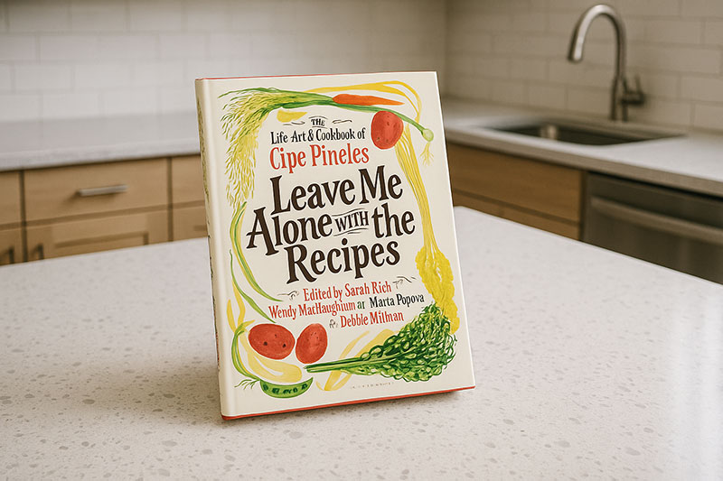
Pineles pioneered food illustration in mainstream magazines. Before her influence, food was rarely depicted with artistic consideration in periodicals. Her cookbook illustrations merged fine art sensibilities with practical information.
Her personal recipe collection, later published as “Leave Me Alone with the Recipes,” showcased her distinctive technique. She treated food as worthy of the same artistic consideration as fashion or decor, elevating everyday subjects through design.
Key characteristics of her food artwork included:
- Bold use of complementary color schemes for visual impact
- Incorporation of handmade illustrations with technical precision
- Integration of font spacing techniques that enhanced recipe readability
This work represented a genuine connection between personal interests and professional expertise. Her food art wasn’t merely illustrative-it transformed how Americans visualized culinary content.
Impact on Magazine Identity

Pineles’ design defined these publications’ identities so thoroughly that competing magazines began emulating her approach. Her work at Charm created an iconic layouts style that readers instantly recognized.
Reader response to her visual direction was overwhelmingly positive. Circulation increased across all publications she directed, proving the commercial value of her sophisticated design approach.
Her influence extended beyond individual magazines to shape the industry’s understanding of publication aesthetics. By treating magazine design as a holistic system rather than a collection of pages, she established new standards for editorial cohesion.
The Austrian-born designer brought consistent unity to publications that previously lacked visual continuity. Through strategic application of Gestalt principles, she created magazines that felt cohesive despite diverse content.
Her work demonstrated that sophisticated design could be commercially successful and reader-friendly-a lesson that transformed American magazine publishing forever.
Teaching and Mentorship
Role at Parsons School of Design
Pineles joined Parsons School of Design in 1963, bringing decades of industry experience to design education. Her teaching philosophy centered on practical application rather than abstract theory. “Design solves problems,” she often told students. “Make it work first, then make it beautiful.”
Her courses blended technical precision with creative exploration. She taught students to master font selection and kerning before encouraging stylistic experimentation.
Class assignments mirrored professional challenges:
- Creating comprehensive publication systems
- Developing consistent brand guidelines from concept to execution
- Solving real-world communication problems through visual solutions
She integrated professional standards into the classroom by inviting working designers to critique student projects. These connections bridged the gap between education and industry.
Influence on Students and Future Designers
Pineles mentored numerous students who became industry leaders. Her influence extended beyond technical skills to professional ethics and creative integrity. She particularly encouraged female students, showing by example that women could excel in design leadership.
Her pioneering status as the first female art director gave weight to her advice about breaking barriers. “Excellence isn’t optional when you’re a woman in design,” she often told female students. This philosophy of exceptional quality became her educational legacy.
She passed on specialized knowledge of pairing fonts and creating balanced layouts using baseline grid systems. These technical skills gave her students advantages in the competitive job market.
Pineles’ teaching extended beyond classroom walls. She connected promising designers with industry opportunities, building a network that sustained the next generation of creative professionals.
Educational Legacy
Pineles transformed design education by integrating print design expertise with conceptual thinking. Her influence appears in curriculum structures that balance technical training with creative development.
Her teaching materials emphasized understanding audience psychology before making design decisions. This user-centered approach predated formal UX methodologies by decades.
Her lasting educational contributions included:
- Design critique methods that balanced encouragement with rigorous standards
- Integration of fine art principles with commercial applications
- Systematic approach to visual problem-solving that remains relevant today
The AIGA medalist developed educational frameworks merging European design traditions with American commercial needs. This cross-cultural perspective enriched American design education beyond her lifetime.
Design Philosophy and Process
Approach to Problem-Solving
Pineles approached design challenges methodically. She began each project by defining communication goals before considering visual solutions. “What does this need to say, and to whom?” was her first question.
Her research process involved understanding both client needs and audience expectations. For magazine layouts, she studied reader demographics extensively before creating visual systems.
She balanced client requirements with creative vision through careful presentation of concepts. Rather than offering multiple options, she developed one thoroughly researched solution and defended it with strategic reasoning.
Her problem-solving approach included:
- Thorough analysis of communication context
- Strategic application of graphic design movements principles
- Systematic testing of visual solutions before implementation
This methodical process distinguished her work from designers who relied primarily on aesthetic intuition. She believed design should be both beautiful and functional.
Visual Storytelling Principles
Pineles pioneered visual storytelling techniques that transformed editorial design. She understood how to create narrative through strategic integration of text and image, establishing reading patterns that guided viewers through content.
Her expert use of framing directed attention to key content while creating visual interest. She employed contrast in design to establish information hierarchy across complex layouts.
Her storytelling principles included:
- Creating consistent visual systems that oriented readers throughout publications
- Using typography to establish tone and emotional context
- Developing visual hierarchy systems that guided readers intuitively
These principles made her magazine layouts both beautiful and highly functional. She believed visual communication should work on multiple levels simultaneously.
Balance of Artistry and Practicality
Pineles’ work exemplified the difference between art and design through its purposeful balance of aesthetic quality and functional effectiveness. She never sacrificed readability for visual impact.
Commercial considerations shaped her work without limiting creativity. She understood production constraints intimately and designed within technical limitations while pushing creative boundaries.
Her layouts for Condé Nast publications demonstrated this balance through:
- Sophisticated use of hue and saturation that worked within print limitations
- Typography systems that functioned across variable content
- Illustration styles that maintained quality through reproduction processes
Pineles maintained creative integrity within commercial contexts by focusing on quality over trends. She believed good design had lasting value beyond fashion cycles.
The influential art director found innovative solutions to practical problems throughout her career. When magazine production required CMYK color separations, she developed illustration techniques that enhanced rather than compromised the artistic vision.
This pragmatic artistry defined Pineles’ career and influenced generations of designers who learned to balance commercial requirements with creative excellence.
Artistic Influences and Collaborations
Connections to Fine Art Movements
Pineles bridged European modernism and American commercial design throughout her career. Her early exposure to Vienna’s artistic community influenced her sophisticated understanding of minimalist graphic design principles.
She incorporated Constructivism elements into magazine layouts, adapting revolutionary visual language for mainstream audiences. This integration of avant-garde sensibilities with commercial needs distinguished her work from contemporaries.
Her relationship to American design movements evolved through her career. She embraced aspects of Art Deco in early work while later adopting postmodern graphic design approaches that questioned established hierarchies.
Her distinctive style merged:
- Structural principles from European modernism
- Expressive typography from experimental movements
- Practical functionality from American commercial design
This synthesis created publication aesthetics that felt both accessible and sophisticated.
Collaboration with Photographers and Illustrators
Pineles revolutionized art direction through her collaborative approach. Rather than dictating exact requirements, she selected artists whose visual sensibilities complemented specific content needs, then gave them creative freedom within strategic parameters.
She commissioned fine artists for editorial work when such practice was uncommon. This approach elevated magazine illustration beyond mere decoration to become integral content elements with artistic merit.
Her photography direction broke new ground through:
- Encouraging experimental techniques that pushed boundaries of pixel-based image reproduction
- Selecting photographers who brought fresh perspectives to fashion and lifestyle content
- Creating comprehensive brand style guide elements that maintained conceptual continuity
She supported emerging talent by taking chances on unproven artists whose work showed unique perspective. Many illustrators and photographers gained industry recognition through her commissions.
Relationship with Other Design Pioneers
Pineles maintained significant connections with fellow design pioneers. Her exchanges with Alexey Brodovitch informed both designers’ approaches to experimental typography and editorial structure.
Her membership in the Art Directors Club created opportunities for collaborative projects with industry leaders. These professional relationships fostered exchange of innovative techniques and conceptual approaches.
Her marriage to William Golden, CBS’s legendary art director, created a household where design was constant conversation. Their creative exchanges influenced both designers’ work, though they maintained distinct professional identities.
She participated in design initiatives that established professional standards for the emerging field. These collaborative efforts shaped industry practices beyond individual careers.
FAQ on Cipe Pineles
What makes Pineles significant in design history?
As a pioneering female graphic designer, Pineles broke gender barriers in the mid-century design world. She established new standards for visual hierarchy in publications and elevated food illustration to an art form. Her integration of fine art with commercial design revolutionized magazine aesthetics and influenced generations of designers.
What publications did Pineles work for?
Pineles worked for several major Condé Nast publications including:
- Vogue
- Vanity Fair
- Glamour
- Seventeen
- Charm
- Mademoiselle
Her groundbreaking approaches to font selection and layout transformed each magazine’s visual identity while maintaining their distinct market positions.
How did Pineles influence food illustration?
Pineles pioneered food illustration in magazines, treating culinary subjects with artistic dignity previously reserved for fashion. Her cookbook illustrations combined analogous colors with meticulous attention to detail. This approach transformed how food appeared in print media, establishing a new standard for culinary visualization.
What was Pineles’ educational background?
Pineles studied at Pratt Institute, where she developed strong foundations in typography and publication design. Her formal education was supplemented by mentorship under M.F. Agha at Condé Nast. Later, she taught at Parsons School of Design, where she shaped curriculum development and mentored emerging designers.
How did Pineles overcome gender discrimination?
Pineles overcame discrimination through exceptional work quality and strategic professional relationships. Rather than directly confronting barriers, she produced designs too excellent to ignore. Her meticulous attention to contrast in design and technical precision established credibility that transcended gender limitations.
What was Pineles’ relationship with William Golden?
Pineles married William Golden, the CBS art director known for creating the iconic eye logo. Their partnership united two pioneering design voices in a household where creative exchange was constant. After Golden’s death, she married designer Will Burtin, forming another significant creative partnership in design history.
What design movements influenced Pineles’ work?
Pineles’ work showed influences from:
- European modernism
- Futurism typography techniques
- American commercial pragmatism
- Early Swiss design principles
She synthesized these movements into a distinctive approach that balanced artistic expression with functional communication, particularly in her use of triadic color scheme compositions.
What awards did Pineles receive?
Pineles received the AIGA Medal in 1984, recognizing her lifetime contribution to design excellence. She was inducted into the Art Directors Club Hall of Fame and received posthumous recognition from the Type Directors Club. Her groundbreaking work creating distinctive publication design systems earned numerous industry accolades throughout her career.
How is Pineles’ work preserved today?
Pineles’ designs are preserved in major archives including Condé Nast collections and Parsons School of Design. Her cookbook “Leave Me Alone with the Recipes” was posthumously published in 2017, reviving interest in her food illustrations. Digital preservation efforts continue making her pioneering poster design approaches and layouts accessible to new generations.
Conclusion
Cipe Pineles forever transformed American magazine design through her masterful integration of print design principles with artistic expression. Her groundbreaking designer journey from Vienna to New York created a legacy of innovation that continues influencing contemporary visual communication.
The impact of her professional advancement for women extends beyond her historic achievement as the first female art director. She established new paradigms for:
- Editorial illustration that elevated everyday subjects
- Script font applications that balanced personality with readability
- Strategic use of DPI (dots per inch) understanding to maximize print quality
Pineles’ integration of x-height considerations with expressive typography created magazine identities immediately recognizable to readers. Her distinctive visual style demonstrated that calligraphy vs typography needn’t be oppositional approaches.
The enduring influence of this Viennese designer proves that true innovation transcends technological limitations, remaining relevant across generations of design evolution.

Renowned for his expertise in logo design and visual branding, Bogdan has developed a multitude of logos for various clients.
His skills extend to creating posters, vector illustrations, business cards, and brochures. Additionally, Bogdan's UI kits were featured on marketplaces like Visual Hierarchy and UI8.
He also wrote in the past years on sites like Design Your Way, WebDesignerDepot, WPDean, Designmodo, Speckyboy, Slider Revolution, and more.
- The Windsurf Logo History, Colors, Font, And Meaning - 10 October 2026
- How to Remove Background From Product Photos (No Photoshop) - 10 October 2026
- How Designers can Build a Stronger Online Creative Identity - 9 October 2026

Bogdan Sandu is a seasoned designer who has been designing websites since 2008. Renowned for his expertise in logo design and visual branding, Bogdan has developed a multitude of logos for various clients. His skills extend to creating posters, vector illustrations, business cards, and brochures. Additionally, Bogdan's UI kits were featured on marketplaces like Visual Hierarchy and UI8. He also wrote in the past years on sites like Design Your Way, WebDesignerDepot, WPDean, Designmodo, Speckyboy, Slider Revolution, and more.
You Might Also Like


