


Most lifestyle magazines put a celebrity on the cover and call it a day. Real Simple magazine covers broke that rule from the very first issue in April 2000.
Clean still-life photography. Tons of white space. No famous faces. Just everyday objects arranged with the kind of care most publications reserve for A-list cover shoots. That editorial choice built a brand with over 7.6 million readers, published by Dotdash Meredith out of New York City.
But not every cover hit the same. Some became collector’s items. Others quietly redefined what a newsstand-worthy magazine cover could look like.
This article breaks down the best Real Simple covers across more than two decades of print issues. You’ll see what made each one work, from the color palettes and typography choices to the cover lines and art direction decisions behind them.
Best Real Simple Magazine Covers
April 2000 – The Inaugural Issue

Why This Cover Stands Out
This is where it all started. Time Inc. launched Real Simple in April 2000, and the debut cover set the tone for everything that followed.
No celebrity face. No flashy headlines screaming at you from the newsstand. Just a clean, object-based still life that said, “We’re different.”
At a time when every women’s lifestyle magazine fought for attention with bold cover models and dramatic photography, Real Simple did the opposite. The premiere issue relied on white space and a carefully arranged product shot to make its statement.
That was a gutsy move for a print publication.
Cover Design Breakdown
The layout used a minimalist design approach that would become the magazine’s signature. Few cover lines. Generous margins. Everything breathed.
Kristin van Ogtrop, the magazine’s long-time editor, once said that Real Simple launched as a “celebrity-free zone” with no sex, no chocolate, and no famous faces on the cover. And it worked. By 2013, the magazine had roughly 7.6 million readers.
Color Palette and Visual Style
Soft, muted tones dominated. The color palette leaned into whites, creams, and gentle pastels, setting Real Simple apart from the saturated, high-contrast covers competitors used.
The visual style felt calming on purpose. That’s not an accident when your target reader is an overwhelmed working mom looking for simplicity.
Cover Lines and Typography
Minimal text. The masthead was clean and bold, using a sans-serif font that communicated directness and approachability.
The cover lines were short, practical, and to the point. No hyperbole. No clickbait. Just clear promises about what you’d find inside.
The Story Behind This Issue
Time Inc. took a real gamble here. Industry people questioned whether a magazine could survive on newsstands without a celebrity on the front.
Turns out the market for “just give me useful information without all the noise” was massive. And nobody knew it existed until this cover proved it.
Where to Find This Cover
The April 2000 premiere issue is a collector’s item now. You can find copies on eBay and Etsy, often listed between $15 and $40 depending on condition. Magzter and Zinio carry the digital back issues archive.
October 2023 – The Real Simple Home Is Back
Why This Cover Stands Out
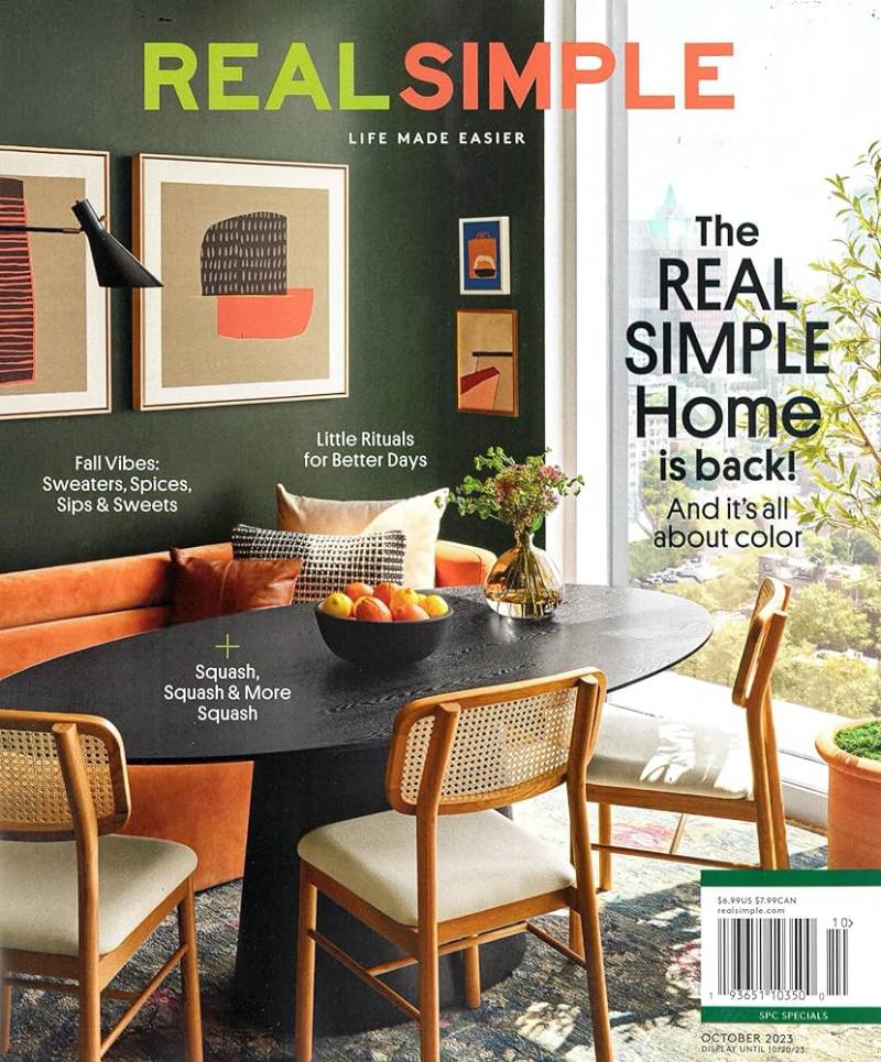
The annual home issue is Real Simple’s flagship franchise. The October 2023 edition featured the sixth annual Real Simple Home, a modern penthouse in Brooklyn designed by seven different designers.
This cover hits different because it showcases actual rooms that real people styled, not a staged set nobody would live in.
Cover Design Breakdown
The cover photo was shot by Christopher Testani with prop styling by Olga Grigorenko. The layout followed Real Simple’s classic grid system with the interior image taking center stage.
Strong focal point placement drew the eye straight into the room. The cover lines framed the image without crowding it.
Color Palette and Visual Style
Warm, livable tones. Think aged pine, rust, and marble. The palette reflected current home decor trends while staying true to the magazine’s signature clean look.
The contrast between warm wood tones and white text created easy readability at newsstand distance.
Cover Lines and Typography
“The Real Simple Home Is Back” ran as the primary headline. Bold, confident, and recognizable to loyal subscribers who look forward to this annual issue.
Since the 2017 redesign, Real Simple has used Sharp Grotesk across its layout. The typography stays consistent, which keeps the brand identity tight across every monthly issue.
The Story Behind This Issue
Seven designers each took over one room in the Brooklyn penthouse. The project ran for 10 months. Real Simple threw two parties to celebrate the reveal, and the collaboration generated significant buzz on social media and among the design community.
Where to Find This Cover
Available on Amazon, eBay, Pocketmags (digital), and through Dotdash Meredith’s own subscription service. Print copies still float around for about $7.
September 2023 – Jennifer Hudson Cover
Why This Cover Stands Out
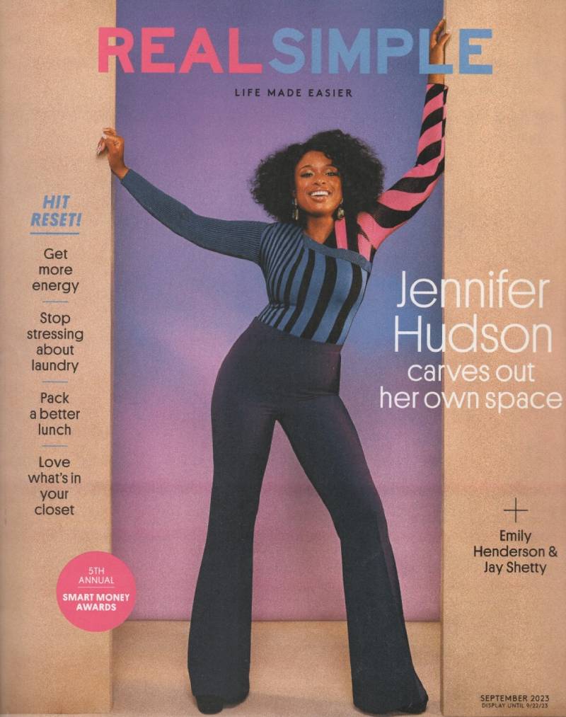
Real Simple built its identity on object covers. No people. No celebrities. That changed in recent years, and the Jennifer Hudson September 2023 cover is one of the strongest examples of this shift.
Hudson brought star power without undermining the magazine’s identity. The shoot felt warm and personal, not glossy and distant.
Cover Design Breakdown
Photographed by Chrisean Rose and styled by Elizabeth Stewart. The balance between Hudson’s portrait and the surrounding text was well managed.
The image didn’t fight with the cover lines. Everything had room. That’s the Real Simple way, even when there’s a person on the front.
Color Palette and Visual Style
Bright, optimistic tones. The backdrop and wardrobe choices kept things clean and uplifting. No heavy shadows or dramatic editorial lighting.
The overall hue stayed warm and welcoming, matching the magazine’s editorial tone.
Cover Lines and Typography
The masthead held its position at the top, with Hudson’s image slightly overlapping it. That’s a standard magazine trick to add depth without losing brand recognition.
Cover lines ran down the left side. Short phrases. Easy to scan. The typographic hierarchy moved cleanly from the main headline down to the secondary features.
The Story Behind This Issue
Hudson discussed parenting, career, and finding balance in her personal life. The interview matched Real Simple’s core mission of practical, real-world advice from someone who actually lives it.
Where to Find This Cover
Digital copies on Magzter and Zinio. Print back issues on eBay. Tom and Lorenzo covered the cover reveal with styling details if you want the full editorial breakdown.
January/February 2023 – New Year Fresh Start Issue

Why This Cover Stands Out
The combined January/February issue is always a big deal for lifestyle magazines. It’s the “reset” moment. Real Simple leaned hard into that energy here with a cover built around fresh beginnings and organizing.
Cover Design Breakdown
Object-based cover. Classic Real Simple. The alignment of elements created a structured, calming composition that matched the “start fresh” theme perfectly.
The layout followed the magazine’s standard 9 x 10.75 inch dimensions, slightly taller than the typical 8.5 x 11 format most publications use.
Color Palette and Visual Style
Cool whites and soft blues. January energy in visual form. The palette felt intentional, almost therapeutic. It signaled a clean slate before you even opened the magazine.
Cover Lines and Typography
Organizing tips and goal-setting features dominated the cover lines. The leading between text elements gave each headline breathing room.
No cramming. No shouting. Just well-spaced text with clear visual hierarchy.
The Story Behind This Issue
The issue focused on decluttering, meal prep, financial planning, and wellness routines. Standard January content, but delivered with the kind of editorial care that keeps subscribers coming back year after year.
Where to Find This Cover
Available digitally through Zinio and Pocketmags. Physical copies are harder to find since combined issues tend to sell out faster at retail.
May 2019 – “Take Time for You” Cover
Why This Cover Stands Out
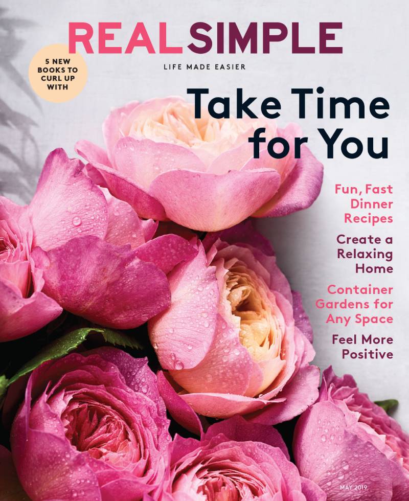
This issue landed right before the wellness boom went mainstream. The self-care angle felt ahead of its time, and the still-life cover reflected that message beautifully.
Real Simple always did self-care content well. But this particular issue nailed the visual translation of that idea on the cover itself.
Cover Design Breakdown
A textbook example of emphasis through simplicity. The central object drew immediate attention, with cover lines supporting rather than competing.
The rule of thirds was used effectively here. The main visual sat slightly off-center, creating a more dynamic composition than a dead-center placement would.
Color Palette and Visual Style
Soft pastels and natural tones. Relaxing to look at. The kind of cover that makes you want to slow down, which is exactly the point.
Cover Lines and Typography
“Take Time for You” was the headline. Direct. Personal. It spoke to the reader like a friend, not a brand.
The kerning on the headline was slightly loose, giving it a relaxed, unhurried feel that matched the self-care theme.
The Story Behind This Issue
Inside, the magazine covered skincare routines, mental health breaks, solo travel ideas, and quick recipes for one. The editorial direction felt personal, not prescriptive.
Where to Find This Cover
eBay listings still carry this issue. Digital back issues are available through Magzter’s Real Simple archive.
October 2022 – Annual Home Issue
Why This Cover Stands Out
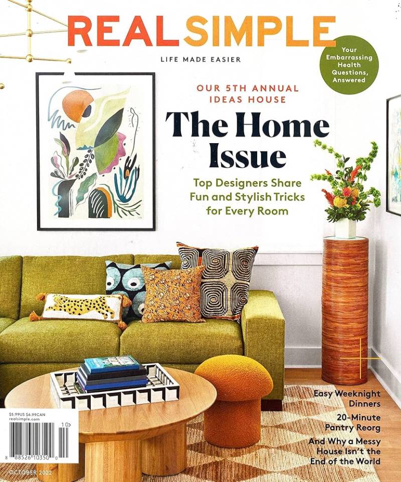
Another entry in the annual home franchise. The 2022 edition stood out for its warm, approachable take on home decorating. Not aspirational in a way that makes you feel bad. Aspirational in a way that makes you want to rearrange your living room.
Cover Design Breakdown
Interior photography as the primary image. The composition used natural light and framing techniques to draw the viewer into the space.
Real Simple’s art direction team kept the cover lines tight to the margins, leaving the room photo largely unobstructed.
Color Palette and Visual Style
Earthy, grounded tones. Terracotta, warm whites, and natural wood textures. The palette reflected the broader print design trend of organic, nature-inspired interiors that was peaking in late 2022.
Cover Lines and Typography
Home-focused headlines. Decorating tips, organizing ideas, and product picks. The tracking stayed consistent with the magazine’s clean aesthetic.
The Story Behind This Issue
This was the fifth annual Real Simple Home project. Each year the magazine partners with designers to transform a real home and document the process. It’s become one of their most anticipated editorial events.
Where to Find This Cover
Digital copies on Zinio, Pocketmags, and Magzter. Print issues occasionally surface on eBay.
December 2022 – Holiday Gift Guide
Why This Cover Stands Out
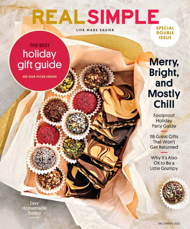
Holiday issues are where lifestyle magazines either shine or blend in. Real Simple’s December 2022 cover managed to feel festive without being cluttered or loud.
That’s tricky. Most holiday magazine covers scream with red and gold and tinsel. This one kept its composure.
Cover Design Breakdown
The cover balanced seasonal imagery with the magazine’s signature design elements. Clean lines, controlled proximity between text blocks, and a restrained approach to holiday decoration.
Color Palette and Visual Style
Festive but not overwhelming. Think deep greens, warm golds, and crisp whites. The color theory at work here used a complementary color scheme that felt seasonal without being cliche.
Cover Lines and Typography
Gift guides, holiday entertaining tips, and recipe features took center stage. The cover lines were stacked neatly, with enough font spacing to keep everything legible.
The Story Behind This Issue
The December issue is always one of Real Simple’s highest-selling newsstand editions. The gift guide alone drives significant retail interest, with curated picks across multiple price points.
Where to Find This Cover
Available through Dotdash Meredith’s digital platforms. Physical copies are increasingly rare as print runs decrease year over year.
September 2022 – Understanding Mental Health Special

Why This Cover Stands Out
This wasn’t a typical monthly issue. Real Simple released a special edition focused entirely on mental health. That’s a bold editorial choice for a magazine primarily known for recipes and organizing tips.
The cover reflected that seriousness without being heavy-handed. It found the right tone.
Cover Design Breakdown
Stripped-back layout. The graphic design principles at work here prioritized clarity over decoration. Fewer cover lines than usual. More negative space. The cover communicated “this matters” through restraint.
Color Palette and Visual Style
Calming, therapeutic tones. Soft blues and gentle greens. The color psychology was deliberate. Blue communicates trust and calm. Green signals growth and healing.
Cover Lines and Typography
“Understanding Mental Health” was the primary headline. No competing text vying for attention. The hierarchy was clear, and the typography elements supported the serious tone.
The Story Behind This Issue
The special edition covered anxiety, depression, therapy access, and practical coping strategies. It arrived during a period when mental health awareness was becoming a mainstream editorial priority across most lifestyle publications.
Where to Find This Cover
Listed on Zinio’s Real Simple archive. eBay sellers occasionally carry this special edition at slightly higher prices than standard monthly issues.
April 2013 – “No Time to Clean?” Cover

Why This Cover Stands Out
This is peak classic Real Simple. An object-based still life with cleaning supplies arranged like a piece of art. It turned something boring (a cleaning bottle) into something visually interesting.
Took me a minute to appreciate this one, honestly. But the more you look at it, the more you see how much thought went into the composition.
Cover Design Breakdown
The product arrangement followed careful scale and proportion principles. Objects were placed at varying heights and depths, creating layers within a flat image.
The rhythm of the layout moved your eye from the headline down through the products and into the secondary cover lines.
Color Palette and Visual Style
Bright, clean, and energetic. Lemon yellows and fresh greens. The palette screamed “spring cleaning” without needing to say it.
Cover Lines and Typography
“No Time to Clean?” was the main headline. It asked a question that every reader could relate to. The organizing makeover features filled the remaining cover line space.
At this point, the magazine hadn’t yet switched to Sharp Grotesk. The pre-2017 typeface choices were slightly different but still firmly in the sans-serif, no-frills camp.
The Story Behind This Issue
The April 2013 issue dropped during a period when Real Simple had roughly 7.6 million readers. The magazine was at the height of its print circulation under Kristin van Ogtrop’s editorial direction.
Where to Find This Cover
Pinterest boards and eBay are your best bets. This issue shows up frequently in “best Real Simple covers” collections online.
April 2015 – 15th Anniversary Issue
Why This Cover Stands Out
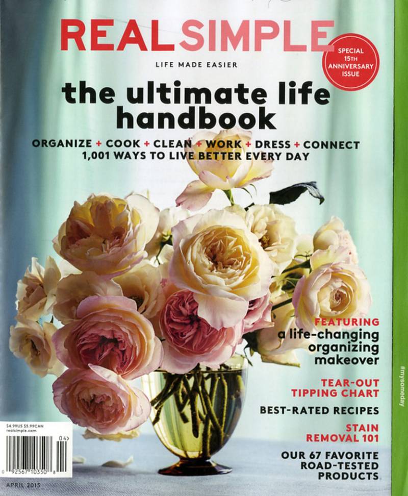
Anniversary issues carry extra weight. The 15th anniversary marked a milestone for a magazine that many industry insiders didn’t think would survive its first year on newsstands.
No celebrities. No sex. No chocolate on the cover. And 15 years later, still going strong.
Cover Design Breakdown
The anniversary cover balanced celebration with the brand’s core identity. It didn’t suddenly become something different for the milestone. The unity between this cover and the hundreds before it showed real brand discipline.
The repetition of the magazine’s established visual language created a sense of continuity that longtime subscribers would recognize instantly.
Color Palette and Visual Style
Celebratory but restrained. The cover didn’t go overboard with special effects or metallic finishes. Clean and confident, like always.
Cover Lines and Typography
The anniversary branding was integrated without dominating. Cover lines still focused on practical content, recipes, and organizing ideas. The milestone was acknowledged, not worshipped.
Understanding what makes a good magazine cover is about knowing your audience. Real Simple never forgot that their readers came for useful information, not self-congratulation.
The Story Behind This Issue
By 2015, Real Simple had expanded into TV (two PBS seasons, two TLC seasons), apps, and extensive digital content. The anniversary issue looked back at 15 years of making women’s lives simpler.
Editor Kristin van Ogtrop reflected that the brand’s success came from filling a need nobody in the magazine industry even knew existed.
Where to Find This Cover
Collector’s item status for Real Simple fans. eBay and Etsy carry copies. Digital versions available through Magzter’s complete back issue library.
If you’re interested in how other magazines have handled their cover design over the years, check out how publications like Time Magazine, People Magazine, and The New Yorker have each developed their own distinct cover identity. For a broader look at cover design across the industry, the guide to iconic magazine covers is worth reading. And if you’re thinking about creating your own, there are solid magazine cover templates to get you started.
The anatomy of a magazine cover goes deeper than most people think. From masthead placement to barcode positioning, every element serves a purpose. Real Simple understood that from day one, and their covers prove it issue after issue.
FAQ on Real Simple Magazine Covers
What makes Real Simple magazine covers different from other lifestyle magazines?
Real Simple built its brand on object-based still-life covers instead of celebrity portraits. Most women’s lifestyle publications rely on famous faces to sell at the newsstand. Real Simple used clean photography, generous white space, and minimal cover lines to stand apart from competitors like Good Housekeeping and Martha Stewart Living.
What size are Real Simple magazine covers?
Real Simple prints at 9 x 10.75 inches, slightly taller than the standard 8.5 x 11 inch magazine format. This non-standard dimension helps it stand out on retail shelves and gives the cover layout extra vertical room for photography and text placement.
What font does Real Simple use on its covers?
Since the 2017 redesign, Real Simple uses Sharp Grotesk, a sans-serif typeface with 259 style variations. Art Director Geraldson Chua and Design Director Danielle Jones led the switch. The font gives the masthead and cover lines a clean, modern, and approachable feel.
Does Real Simple put celebrities on its covers?
Historically, no. The magazine was a self-described “celebrity-free zone” for years under editor Kristin van Ogtrop. More recently, Dotdash Meredith has featured cover stars like Jennifer Hudson on the September 2023 issue, marking a shift in editorial direction.
Where can I find back issues of Real Simple magazine?
Digital back issues are available on Magzter, Zinio, and Pocketmags. Print copies of older issues show up on eBay and Etsy. Barnes and Noble carries current digital editions through their NOOK Newsstand platform. Collector editions may cost more.
How often does Real Simple publish new covers?
Real Simple is a monthly magazine, though some months are combined into double issues like January/February and July/August. That puts the total at roughly 10 issues per year, each with a unique cover design tied to a seasonal editorial theme.
What is the Real Simple Home issue?
The annual Real Simple Home is a flagship franchise, typically published in October. The magazine partners with multiple designers to transform a real home and documents the process. The 2023 edition featured a modern Brooklyn penthouse designed by seven different creatives.
Why are Real Simple covers mostly white?
White backgrounds and negative space are core to the magazine’s visual identity. The clean aesthetic reflects the brand’s mission of simplifying life. It also creates strong contrast with the cover lines and product photography, making everything easier to read at a glance.
Are old Real Simple magazine covers worth collecting?
Some are. The April 2000 premiere issue sells for $15 to $40 on resale platforms depending on condition. Anniversary editions and special issues like the mental health edition also carry collector value. Most standard monthly issues stay under $10.
How has Real Simple’s cover design changed over the years?
The magazine started with strict object-only covers in 2000. The 2017 typography redesign introduced Sharp Grotesk. Recent years brought celebrity cover stars and more lifestyle photography. The core approach remains minimalist, but the execution has evolved with changing reader expectations and print industry trends.
Conclusion
Real Simple magazine covers proved that you don’t need a celebrity face to sell a publication. From the April 2000 debut to the Jennifer Hudson cover in 2023, every issue reflected a deliberate editorial vision built on clean photography and restrained art direction.
The Sharp Grotesk typeface redesign in 2017 sharpened the brand’s visual identity. The annual home issue became a franchise. Special editions like the mental health cover showed the magazine could stretch beyond recipes and organizing tips.
What stays consistent is the approach. Generous negative space. Controlled color palettes. Cover lines that inform without shouting.
Whether you’re studying magazine cover design or just collecting back issues from Dotdash Meredith’s archive, these covers offer a masterclass in doing more with less. Real Simple got that right from day one.

Renowned for his expertise in logo design and visual branding, Bogdan has developed a multitude of logos for various clients.
His skills extend to creating posters, vector illustrations, business cards, and brochures. Additionally, Bogdan's UI kits were featured on marketplaces like Visual Hierarchy and UI8.
He also wrote in the past years on sites like Design Your Way, WebDesignerDepot, WPDean, Designmodo, Speckyboy, Slider Revolution, and more.
- Canva vs PowerPoint: Which Is Better for Presentations? - 22 September 2026
- How to Install Fonts on Mac (Step-by-Step Guide) - 20 September 2026
- From Mockup to Code: How AI-Augmented Development Speeds Up the Design Handoff - 19 September 2026

Bogdan Sandu is a seasoned designer who has been designing websites since 2008. Renowned for his expertise in logo design and visual branding, Bogdan has developed a multitude of logos for various clients. His skills extend to creating posters, vector illustrations, business cards, and brochures. Additionally, Bogdan's UI kits were featured on marketplaces like Visual Hierarchy and UI8. He also wrote in the past years on sites like Design Your Way, WebDesignerDepot, WPDean, Designmodo, Speckyboy, Slider Revolution, and more.
You Might Also Like


