


That red border has defined American journalism for nearly a century. Time Magazine covers have become cultural artifacts that capture defining moments, influential personalities, and societal shifts with unmatched visual impact.
From Winston Churchill to modern tech titans, these iconic magazine covers serve as a visual timeline of our collective history. Each cover represents careful editorial decisions about who and what matters most in any given week.
The magazine’s distinctive cover design and editorial photography have influenced countless publications while establishing standards for newsmagazine format. Time’s cover story headlines often spark national conversations and debates.
This article examines the design evolution, editorial choices, and cultural significance behind Time’s most memorable covers. You’ll discover how typography choices, visual hierarchy, and photographic composition create covers that stop readers at the newsstand.
We’ll explore vintage publication archives, analyze cover art direction techniques, and reveal the strategic thinking behind Person of the Year selections that have shaped public discourse for generations.
Time Magazine Covers
Time magazine’s most influential cover stories represent pivotal moments in American culture and global history. These carefully curated magazine covers demonstrate the publication’s power to capture and define cultural zeitgeist through strategic visual storytelling.
April 8, 1966 – “Is God Dead?”
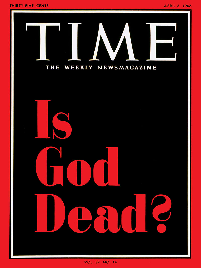
This groundbreaking cover marked the first Time magazine issue to feature only typography without photography. The stark black background with red lettering challenged traditional religious discourse during America’s cultural revolution.
About This Cover
- Publication date: April 8, 1966 (two days before Easter)
- Design format: Text-only cover (first in magazine history)
- Response volume: 3,421 reader letters (highest in Time history at that point)
- Editorial significance: Cover story by religion editor John Elson
Historical Context
The cover emerged during radical theological movements of the 1960s. Theologians Thomas Altizer and William Hamilton published “Radical Theology and the Death of God” coinciding with the Time article. The question reflected broader cultural shifts as Americans grappled with civil rights struggles, Cold War tensions, and changing social values.
The typography choice reinforced the provocative message through its stark visual presentation.
Notable Features
- Visual innovation: First cover using contrast as primary design element
- Cultural impact: Referenced by Bob Dylan in 1978 Playboy interview
- Media response: National Review counter-question about Time’s relevance
Relevant Info
Connected to the “Death of God” theological movement, radical 1960s philosophy, and Time’s broader coverage of religious and cultural transformations during America’s most turbulent decade.
April 14, 1997 – Ellen DeGeneres “Yep, I’m Gay”
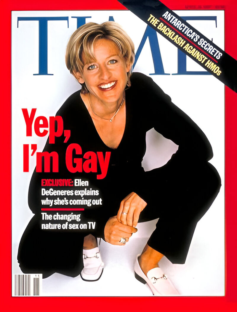
Ellen DeGeneres became the first primetime television star to publicly declare her homosexuality on a major magazine cover. This landmark issue coincided with her character’s coming-out episode on ABC’s sitcom “Ellen.”
About This Cover
- Cover subject: Ellen DeGeneres, comedian and television star
- Publication timing: Coordinated with April 30, 1997 “Ellen” episode
- Historic significance: First openly gay lead character on American network television
- Interview format: Exclusive Michael Krantz interview
Historical Context
DeGeneres’s announcement occurred during shifting American attitudes toward LGBTQ+ rights. The cover story explored the professional risks of public coming-out for entertainment figures. President Clinton’s “Don’t Ask, Don’t Tell” policy dominated military discussions while same-sex marriage remained legally prohibited nationwide.
Notable Features
- Media coordination: Synchronized with television episode broadcast
- Professional risk: Entertainment industry predictions of career damage
- Recognition: 2016 Presidential Medal of Freedom partly attributed to this decision
Relevant Info
Connected to 1990s LGBTQ+ rights movement, prime-time television representation, and evolving American social acceptance of sexual diversity in mainstream media.
September 14, 2001 – 9/11 Special Issue (Black Border)
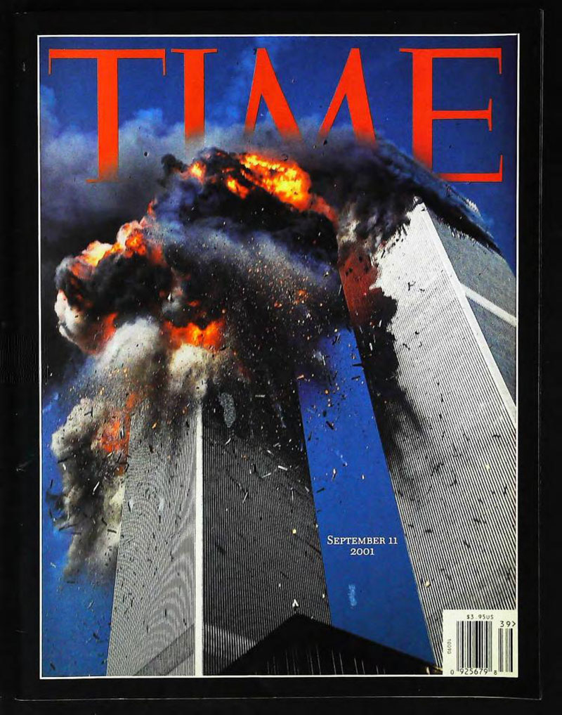
Time’s September 11 commemorative issue featured a black border replacing the traditional red frame. Art Spiegelman created the cover design for this unprecedented special edition published just three days after the attacks.
About This Cover
- Publication schedule: Extraordinary three-day production timeline
- Border modification: First black border in magazine history
- Cover story author: Nancy Gibbs (“If You Want to Humble an Empire”)
- Photography: James Nachtwey and other photojournalists’ documentation
Historical Context
Managing editor Jim Kelly coordinated an unprecedented publishing effort. The magazine shifted printing schedules to deliver newsstands coverage by Friday, September 14. Nancy Gibbs wrote the 10,000-word cover story under extreme deadline pressure while the magazine staff worked around transportation restrictions.
The visual hierarchy emphasized mourning through the black border design choice.
Notable Features
- Production feat: 72-hour magazine creation timeline
- Visual symbolism: Black border conveying national mourning
- Photojournalism: Multiple war photographers documented Ground Zero
Relevant Info
Connected to American tragedy commemoration, emergency journalism practices, and Time’s role as historical record-keeper during national crises.
March 3, 1923 – Joseph G. Cannon (First Time Cover)

The inaugural Time magazine issue featured Congressman Joseph G. Cannon, establishing the publication’s focus on political figures and current events. This 32-page magazine launched what would become America’s most influential news weekly.
About This Cover
- Historic significance: Volume 1, Issue 1 of Time magazine
- Cover subject: Joseph Gurney Cannon, House Speaker
- Page count: 32 pages total including covers
- Print run: 18,500 copies initially produced
- Founding editors: Henry Luce and Briton Hadden
Historical Context
Cannon represented “Uncle Joe,” the retiring congressman who served 23 terms at age 86. The 1923 launch coincided with America’s post-World War I economic boom and growing demand for weekly news synthesis. Luce and Hadden created Time to provide busy Americans with condensed current events coverage.
Notable Features
- Design simplicity: No red border (added later)
- Editorial approach: Serious national affairs mixed with arts reviews
- Subject choice: Political authority figure signaling magazine’s focus
Relevant Info
Connected to American political history, magazine publishing evolution, and Henry Luce’s media empire development through the 20th century.
December 23, 1974 – “The American Pet” (Beagle)

Photographer Eddie Adams captured this beagle image for Time’s pet-focused cover story. Adams, famous for his Pulitzer Prize-winning Vietnam War photography, demonstrated his versatility through this domestic subject matter.
About This Cover
- Photographer: Eddie Adams (Pulitzer Prize winner)
- Subject matter: American pet ownership trends
- Animal breed: Beagle (popular family dog)
- Cover date: December 23, 1974 (holiday issue timing)
Historical Context
The 1970s witnessed significant changes in American pet ownership patterns. Pets became integral family members rather than working animals. Economic prosperity allowed increased spending on pet care, food, and veterinary services.
Notable Features
- Photographer credentials: War correspondent shooting domestic subject
- Cultural timing: American prosperity enabling pet industry growth
- Visual appeal: Close-up animal photography techniques
Relevant Info
Connected to American consumer culture evolution, domestic lifestyle changes, and the growing pet industry’s economic significance during the 1970s.
January 2, 1989 – “Endangered Planet” by Christo
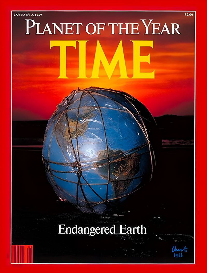
Artist Christo created Time’s “Planet of the Year” cover, marking the first time the magazine named Earth rather than a person for its annual recognition. This environmental awakening cover reflected growing ecological consciousness.
About This Cover
- Artist: Christo (renowned installation artist)
- Award recipient: Planet Earth (breaking Person of the Year tradition)
- Environmental theme: Global ecological crisis awareness
- Artistic approach: Conceptual art meets journalism
Historical Context
The late 1980s marked heightened environmental awareness following Chernobyl, ozone depletion discoveries, and climate change scientific consensus. Time’s editorial decision reflected shifting public consciousness about planetary stewardship and environmental responsibility.
Notable Features
- Award innovation: First non-human “Person” of the Year selection
- Artistic collaboration: Fine art merging with magazine design
- Environmental messaging: Visual metaphor for planetary fragility
Relevant Info
Connected to environmental movement growth, climate science advancement, and mass media’s role in ecological awareness promotion during the late 20th century.
December 29, 2008 – Barack Obama “Person of the Year”

Shepard Fairey’s iconic Obama portrait graced Time’s Person of the Year cover, celebrating the president-elect’s historic election victory. This artistic collaboration combined political journalism with contemporary graphic design.
About This Cover
- Cover artist: Shepard Fairey (street artist and graphic designer)
- Subject: Barack Obama (president-elect)
- Award timing: Following November 2008 election victory
- Design style: Pop art aesthetic merged with political portraiture
Historical Context
Obama’s election as America’s first African American president represented a watershed moment in national politics. The cover appeared during the global financial crisis as Americans anticipated change in leadership and economic policy.
Fairey’s graphic design approach drew from campaign poster aesthetics and street art influences.
Notable Features
- Artistic credibility: Renowned artist creating magazine cover
- Historical significance: First African American president recognition
- Design influence: Campaign aesthetic merging with journalism
Relevant Info
Connected to American political history, contemporary graphic design evolution, and the intersection of street art with mainstream media representation.
April 30, 1973 – Nixon During Watergate Scandal

Time’s Nixon cover captured the president during the unfolding Watergate crisis, representing investigative journalism’s impact on American democracy. The portrait reflected mounting political pressure and constitutional crisis.
About This Cover
- Political context: Watergate scandal investigations
- Publication timing: Congressional hearings period
- Subject positioning: Presidential authority under scrutiny
- Journalistic approach: Investigative reporting emphasis
Historical Context
The Watergate investigations dominated American politics throughout 1973. Time’s coverage contributed to public understanding of constitutional crisis implications. The magazine balanced reporting objectivity with democratic accountability journalism.
Notable Features
- Political documentation: Presidential crisis coverage
- Constitutional significance: Democratic institutions under stress
- Media responsibility: Journalism’s watchdog function demonstration
Relevant Info
Connected to American constitutional history, investigative journalism standards, and media’s role in democratic accountability during national political crises.
December 31, 1971 – Nixon “Man of the Year” (Papier-Mâché Sculpture)

This unique cover featured a papier-mâché sculpture of President Nixon, demonstrating Time’s willingness to experiment with three-dimensional art for magazine covers. The artistic approach reflected complex attitudes toward Nixon’s presidency.
About This Cover
- Artistic medium: Papier-mâché sculpture technique
- Award: “Man of the Year” 1971 recognition
- Visual innovation: Three-dimensional magazine cover art
- Political commentary: Artistic interpretation of leadership
Historical Context
Nixon’s 1971 recognition occurred during Vietnam War conclusion efforts and diplomatic breakthroughs with China. The sculptural approach suggested both gravitas and artificiality in political representation.
Notable Features
- Medium innovation: Sculptural art for magazine covers
- Political complexity: Mixed assessment of presidential leadership
- Artistic commentary: Beyond traditional photography or illustration
Relevant Info
Connected to American political art, magazine design innovation, and Time’s editorial approach to complex political figures during transformative historical periods.
June 21, 1971 – “The Jesus Revolution”

Time’s “Jesus Revolution” cover documented the Christian revival movement among American youth. This religious and cultural phenomenon emerged from 1960s counterculture movements, particularly affecting college campuses and hippie communities.
About This Cover
- Cultural movement: Christian revival among youth
- Geographic focus: American college campuses and California
- Religious significance: Evangelical Christianity growth
- Generational impact: Baby Boomer spiritual searching
Historical Context
The Jesus Movement represented young Americans’ spiritual searching following 1960s social upheaval. Many Vietnam War protesters and drug culture participants found evangelical Christianity appealing. Time documented this unexpected religious revival among typically secular demographics.
Notable Features
- Cultural documentation: Religious revival reporting
- Generational analysis: Youth spiritual movements
- Sociological significance: Counterculture religious transformation
Relevant Info
Connected to American religious history, 1970s cultural movements, and evangelical Christianity’s growth during post-1960s social reorganization.
September 19, 2011 – 10th Anniversary of 9/11 (Silver Border)

Time commemorated the tenth anniversary of September 11 with a silver border design, marking another departure from the traditional red frame. The metallic border suggested remembrance and reflection rather than mourning.
About This Cover
- Anniversary significance: 10-year September 11 commemoration
- Border design: Silver replacing traditional red
- Memorial approach: Reflection rather than immediate grief
- Historical perspective: Decade of post-9/11 America assessment
Historical Context
The tenth anniversary allowed retrospective analysis of America’s post-9/11 transformations. The silver border suggested both honor and distance from immediate trauma. Time examined lasting impacts on American society, foreign policy, and domestic security measures.
Notable Features
- Design symbolism: Metallic effects suggesting commemoration
- Historical assessment: Decade-long impact evaluation
- Memorial journalism: Balanced remembrance and analysis
Relevant Info
Connected to American memorial culture, post-9/11 societal changes, and journalism’s role in processing collective trauma over extended time periods.
April 28, 2008 – Earth Day (Green Border)

Time’s Earth Day issue featured a green border instead of the traditional red, emphasizing environmental themes through color psychology. This design choice reinforced the magazine’s commitment to climate change coverage.
About This Cover
- Border color: Green replacing traditional red
- Environmental focus: Earth Day commemoration
- Climate messaging: Global warming awareness
- Design symbolism: Color reinforcing content themes
Historical Context
The 2008 Earth Day issue appeared during heightened climate change discourse. Al Gore’s “An Inconvenient Truth” had increased environmental awareness while presidential candidates debated energy policy. Time’s green border demonstrated editorial commitment to environmental journalism.
Notable Features
- Color symbolism: Green suggesting environmental consciousness
- Editorial commitment: Climate change coverage priority
- Design innovation: Color palette modification for thematic emphasis
Relevant Info
Connected to environmental journalism, climate change activism, and mass media’s role in promoting ecological awareness during critical environmental policy periods.
September 24, 2020 – COVID-19 Deaths (Black Border)

Time’s second black border in magazine history commemorated COVID-19 pandemic deaths. The cover featured handwritten death counts for each day from February 29 to September 8, 2020, creating a powerful memorial timeline.
About This Cover
- Border significance: Second black border in Time history
- Data visualization: Daily death count timeline
- Memorial approach: Individual day documentation
- Pandemic documentation: COVID-19 impact quantification
Historical Context
The COVID-19 pandemic represented America’s greatest public health crisis since the 1918 influenza outbreak. Time’s black border recalled the September 11 commemorative issue while documenting ongoing tragedy. The handwritten numbers personalized statistical data.
Notable Features
- Data presentation: Typography as memorial design
- Historical parallel: Second black border usage
- Memorial innovation: Statistical data as artistic expression
Relevant Info
Connected to pandemic journalism, public health communication, and magazine design’s role in processing collective grief during extended crisis periods.
FAQ on Time Magazine Covers
What makes Time Magazine covers so recognizable?
The distinctive red border and consistent magazine layout design have remained virtually unchanged since 1927. This iconic branding, combined with bold typography and strategic use of white space, creates instant newsstand recognition. The magazine’s visual identity prioritizes readability and impact.
How does Time select its cover personalities?
Editorial teams evaluate global influence, cultural significance, and news relevance. Person of the Year selections follow rigorous editorial processes considering who most affected world events. Cover story decisions balance commercial appeal with journalistic integrity, often sparking public discourse about magazine collecting trends.
What font does Time Magazine use for headlines?
Time primarily uses custom serif fonts for headlines, maintaining traditional magazine aesthetics. The publication has evolved its typographic hierarchy over decades while preserving readability. Font choices reflect the magazine’s authoritative editorial photography style and newsmagazine format standards.
How has Time’s cover design evolved over time?
Early covers featured illustrated portraits before transitioning to editorial photography in the 1960s. Modern covers incorporate digital design elements while maintaining classic grid systems. The publication timeline shows gradual shifts toward bolder contrast and contemporary visual aesthetics.
What are the most valuable vintage Time Magazine covers?
First edition covers from 1923, Hitler’s Man of the Year issue, and Kennedy assassination coverage command highest prices. Magazine collectors particularly seek covers featuring historical figures like Einstein, Churchill, and Roosevelt. Publication archives show certain vintage publications appreciate significantly over time.
How does Time’s photography style differ from other magazines?
Time prioritizes authoritative portrait photography with dramatic lighting and focal point composition. Their editorial photography emphasizes subject gravitas over fashion aesthetics. Cover photographs often become iconic magazine covers that define public perception of historical figures and cultural moments.
What printing techniques create Time’s distinctive look?
High-quality offset printing ensures vibrant color reproduction and sharp typography. The magazine uses premium paper stock for cover durability and visual impact. Print production standards maintain consistency across international editions while adapting to regional publication covers requirements.
How do Time covers influence other publications?
Time’s design principles shaped the entire newsmagazine industry. Publications worldwide adopted similar visual hierarchy approaches and cover composition techniques. The magazine’s cover art direction established templates that influence contemporary magazine aesthetics and editorial design standards globally.
What makes certain Time covers controversial?
Bold editorial choices often challenge social norms or political sensibilities. Cover headlines addressing sensitive topics generate public debate and media coverage. Controversial selections for Person of the Year demonstrate journalism’s role in reflecting societal tensions and cultural shifts through visual storytelling.
How can collectors authenticate vintage Time covers?
Examine paper quality, printing techniques, and publication dates carefully. Original covers show specific printing characteristics and aging patterns. Magazine archives provide reference materials for verification. Professional appraisers can assess authenticity using specialized knowledge of historical printing methods and editorial timeline documentation.
Conclusion
Time Magazine covers represent more than weekly publication design-they’re cultural artifacts documenting American history through visual storytelling. Each cover demonstrates masterful color theory application and strategic emphasis techniques that capture readers’ attention instantly.
The magazine’s enduring success stems from consistent graphic design principles and thoughtful editorial photography choices. From Henry Luce’s original vision to today’s digital adaptations, Time maintains its position as America’s definitive newsmagazine through careful brand identity management.
Whether you’re studying magazine design evolution, building a vintage collection, or analyzing media history, Time’s covers offer invaluable insights into storytelling through visual communication. These iconic images continue shaping public perception while establishing benchmarks for editorial excellence that influence publications worldwide.
The red border remains timeless-a testament to effective design that transcends generations and technological changes.

Renowned for his expertise in logo design and visual branding, Bogdan has developed a multitude of logos for various clients.
His skills extend to creating posters, vector illustrations, business cards, and brochures. Additionally, Bogdan's UI kits were featured on marketplaces like Visual Hierarchy and UI8.
He also wrote in the past years on sites like Design Your Way, WebDesignerDepot, WPDean, Designmodo, Speckyboy, Slider Revolution, and more.
- Pantone to HEX converter - 21 July 2026
- The Retool Logo History, Colors, Font, And Meaning - 20 July 2026
- CMYK to Pantone Converter - 19 July 2026

Bogdan Sandu is a seasoned designer who has been designing websites since 2008. Renowned for his expertise in logo design and visual branding, Bogdan has developed a multitude of logos for various clients. His skills extend to creating posters, vector illustrations, business cards, and brochures. Additionally, Bogdan's UI kits were featured on marketplaces like Visual Hierarchy and UI8. He also wrote in the past years on sites like Design Your Way, WebDesignerDepot, WPDean, Designmodo, Speckyboy, Slider Revolution, and more.
You Might Also Like


