Walk into any apartment in Manhattan and you’ll likely spot them on coffee tables, framed on walls, or tucked into magazine racks. New Yorker covers have transcended their original purpose as weekly publication graphics to become cultural artifacts that define sophisticated taste and intellectual curiosity.
These iconic illustrations capture decades of American social commentary through brilliant satirical cartoons and editorial design. Each cover represents a masterclass in visual storytelling that balances artistic expression with cultural criticism.
What makes these magazine covers so enduringly appealing? The answer lies in their unique blend of wit, artistic excellence, and perfect timing.
This article examines the design elements that make New Yorker covers instantly recognizable, explores the artistic techniques behind their most memorable illustrations, and reveals how these weekly art pieces have influenced modern graphic design. You’ll discover the creative process behind cover selection and understand why collectors pay premium prices for vintage issues.
New Yorker Covers
September 11 Black Cover by Art Spiegelman

The September 24, 2001 New Yorker cover published immediately after the 9/11 attacks featuring the silhouette of the Twin Towers against a black background. Created by Art Spiegelman in collaboration with Françoise Mouly using minimalist black-on-black technique. This cover represents one of the most powerful visual responses to national tragedy during the immediate aftermath of September 11th.
Artist & Creative Background
Artist Name: Art Spiegelman
Art Style: Minimalist silhouette technique using negative space
Career Context: Pulitzer Prize-winning cartoonist best known for Maus graphic memoir
Creative Process: Collaborative effort with wife Françoise Mouly, combining Spiegelman’s concept with Mouly’s negative space approach
Visual Elements & Design
Color Palette: Complete black background with subtle tower outlines
Composition: Twin Towers silhouette visible only when light hits the page directly
Typography: Standard New Yorker masthead in white against black field
Symbolic Elements: Absence representing loss, optical illusion mirroring disorientation
Cultural & Historical Context
Publication Date: September 24, 2001 (Issue following 9/11 attacks)
Cultural Moment: Immediate aftermath of World Trade Center destruction
Historical Significance: First major magazine cover to address 9/11 through visual metaphor
Contemporary Events: National mourning period, beginning of War on Terror
Technical Specifications
Dimensions: Standard New Yorker magazine format (8.5 x 11 inches)
Print Quality: High-contrast black ink on white paper stock
Distribution: Nationwide circulation during peak readership period
Archival Status: Held in permanent collection at 9/11 Memorial Museum
Public Reception & Impact
Critical Response: Universally praised as appropriate visual response to tragedy
Popular Reaction: Became instant collector’s item, poster reprints created for charity
Awards/Recognition: Considered one of most memorable magazine covers in American history
Cultural Legacy: Referenced in journalism schools as example of visual restraint during crisis
Valentine’s Day 1925 Debut Cover by Rea Irvin
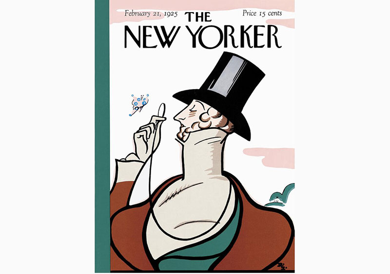
The February 21, 1925 New Yorker debut cover featuring Eustace Tilley examining a butterfly through his monocle. Created by Rea Irvin, the magazine’s first art editor, using pen and ink illustration. This cover established the magazine’s sophisticated visual identity and introduced its most enduring mascot.
Artist & Creative Background
Artist Name: Rea Irvin
Art Style: Classical pen and ink illustration with period costume details
Career Context: Former Life magazine art editor and stage performer
Creative Process: Based on 1834 Count d’Orsay caricature from Encyclopædia Britannica
Visual Elements & Design
Color Palette: Monochromatic black ink on cream paper
Composition: Centered figure with butterfly creating focal point
Typography: Original “Irvin” typeface designed specifically for the magazine
Symbolic Elements: Monocle representing intellect, butterfly symbolizing whimsy
Cultural & Historical Context
Publication Date: February 21, 1925 (Magazine’s first issue)
Cultural Moment: Jazz Age sophistication, Manhattan cultural renaissance
Historical Significance: Established template for American sophisticated periodical design
Contemporary Events: Prohibition era, Harlem Renaissance, economic prosperity
Technical Specifications
Dimensions: Original magazine format (smaller than current size)
Print Quality: Letterpress printing on uncoated paper stock
Distribution: Initial print run of approximately 15,000 copies
Archival Status: Original artwork held in private collection, numerous museum reproductions
Public Reception & Impact
Critical Response: Initially modest reception, later recognized as design masterpiece
Popular Reaction: Became symbol of magazine sophistication
Awards/Recognition: Considered foundation of American magazine cover design
Cultural Legacy: Eustace Tilley remains magazine mascot nearly 100 years later
Saul Steinberg’s View of the World from 9th Avenue
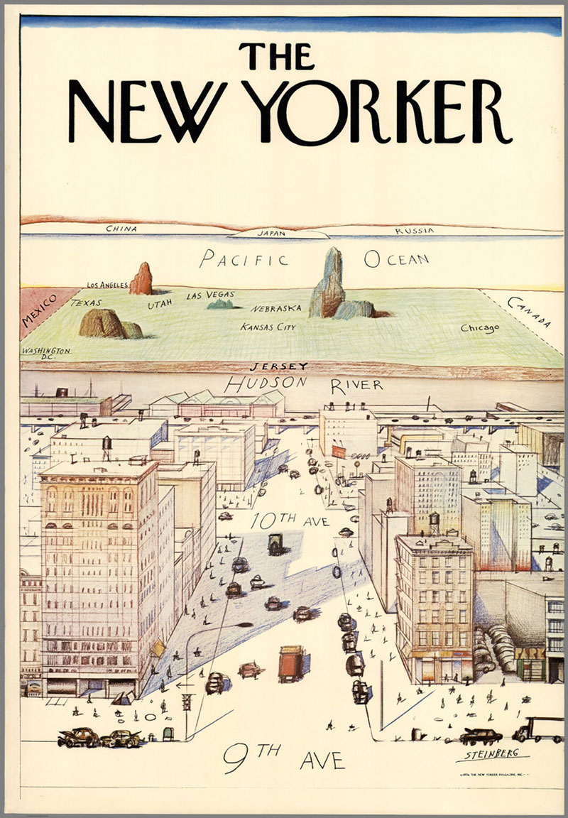
The March 29, 1976 New Yorker cover featuring Saul Steinberg’s famous perspective map showing Manhattan as center of the universe. Created by Saul Steinberg using ink, pencil, colored pencil and watercolor techniques. This cover became the magazine’s most parodied and recognizable image after Eustace Tilley.
Artist & Creative Background
Artist Name: Saul Steinberg
Art Style: Cartographic humor with perspective distortion
Career Context: Romanian-American cartoonist with 85 New Yorker covers to his credit
Creative Process: Satirical visual hierarchy showing Manhattan provincialism
Visual Elements & Design
Color Palette: Muted watercolor tones with selective color emphasis
Composition: Forced perspective from Manhattan westward across America
Typography: Standard New Yorker masthead with geographic labels
Symbolic Elements: Size distortion representing psychological distance and importance
Cultural & Historical Context
Publication Date: March 29, 1976
Cultural Moment: America’s Bicentennial year, urban decay concerns
Historical Significance: Became template for provincial worldview satire
Contemporary Events: New York City fiscal crisis, national economic challenges
Technical Specifications
Dimensions: Original artwork 28 x 19 inches, reduced for magazine
Print Quality: Full-color reproduction with watercolor texture preservation
Distribution: Standard New Yorker circulation during 1970s peak
Archival Status: Original in private collection, poster versions widely distributed
Public Reception & Impact
Critical Response: Instantly recognized as satirical masterpiece
Popular Reaction: Spawned countless parodies and unauthorized reproductions
Awards/Recognition: Led to successful copyright lawsuit against Columbia Pictures
Cultural Legacy: Most famous New Yorker cover, referenced in popular culture globally
Barack Obama as Muslim by Barry Blitt
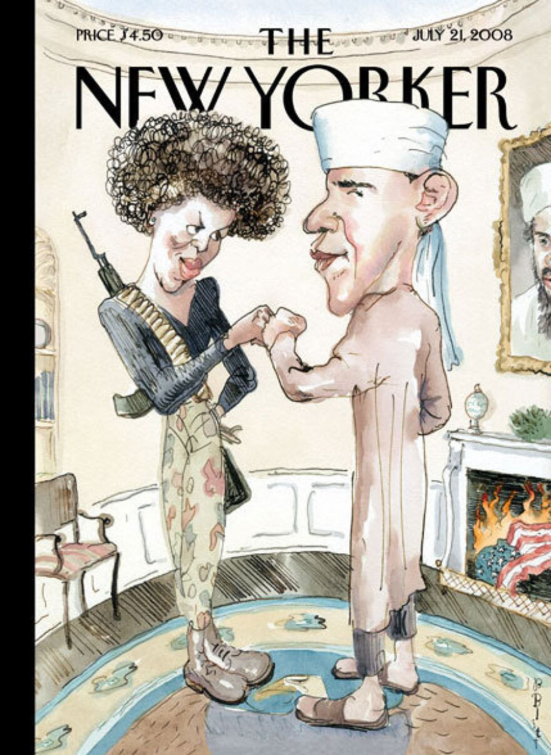
The July 21, 2008 New Yorker cover titled “The Politics of Fear” featuring Barack and Michelle Obama depicted in stereotypical terrorist/Muslim imagery. Created by Barry Blitt using watercolor and ink satire. This cover sparked massive controversy by ironically portraying right-wing conspiracy theories about the Obama family.
Artist & Creative Background
Artist Name: Barry Blitt
Art Style: Political satire with caricature emphasis
Career Context: Frequent New Yorker contributor specializing in political controversy
Creative Process: Satirical compilation of conspiracy theories and misinformation
Visual Elements & Design
Color Palette: Earth tones with selective color accents on symbolic elements
Composition: Oval Office setting with subversive imagery
Typography: “The Politics of Fear” title explaining satirical intent
Symbolic Elements: Burning flag, Osama portrait, fist bump, traditional Muslim dress
Cultural & Historical Context
Publication Date: July 21, 2008
Cultural Moment: Height of Obama presidential campaign, conspiracy theory proliferation
Historical Significance: Most controversial New Yorker cover in magazine history
Contemporary Events: Fox News “terrorist fist jab” commentary, email chain conspiracies
Technical Specifications
Dimensions: Standard magazine cover with enhanced security printing
Print Quality: Full-color with attention to satirical detail preservation
Distribution: Massive newsstand sales driven by controversy
Archival Status: Featured in journalism and satire study collections
Public Reception & Impact
Critical Response: Divided between those who understood satire and those who didn’t
Popular Reaction: Condemned by Obama and McCain campaigns, defended by satirists
Awards/Recognition: Most memorable image of 2008 campaign according to New York Times
Cultural Legacy: Case study in satirical intention versus public interpretation
Bert and Ernie Gay Marriage Cover by Jack Hunter

The July 1, 2013 New Yorker cover featuring Sesame Street characters Bert and Ernie watching the Supreme Court on television. Created by Jack Hunter using digital illustration techniques. This cover celebrated the Supreme Court’s marriage equality decisions through beloved children’s characters.
Artist & Creative Background
Artist Name: Jack Hunter
Art Style: Character illustration with emotional storytelling
Career Context: Illustrator specializing in character-driven narrative artwork
Creative Process: Borrowed iconography to comment on social progress
Visual Elements & Design
Color Palette: Warm domestic colors with television screen focal point
Composition: Intimate domestic scene with external celebration
Typography: Understated New Yorker treatment allowing image dominance
Symbolic Elements: Couch intimacy, television as window to social change
Cultural & Historical Context
Publication Date: July 1, 2013
Cultural Moment: Supreme Court strikes down Defense of Marriage Act
Historical Significance: Visual celebration of marriage equality milestone
Contemporary Events: Same-sex marriage becoming legal in multiple states
Technical Specifications
Dimensions: Standard magazine format optimized for character recognition
Print Quality: High-resolution digital printing preserving character details
Distribution: Special pride month circulation with increased visibility
Archival Status: Featured in LGBTQ+ rights museum exhibitions
Public Reception & Impact
Critical Response: Praised for gentle approach to controversial subject
Popular Reaction: Viral sharing across social media platforms
Awards/Recognition: GLAAD Media Award recognition for positive representation
Cultural Legacy: Symbol of mainstream acceptance of marriage equality
Black Lives Matter Protesters by Kadir Nelson
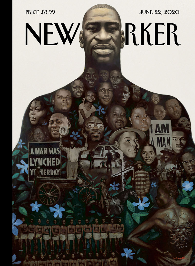
The June 22, 2020 New Yorker cover titled “Say Their Names” featuring George Floyd as monument containing images of Black Americans killed by police violence. Created by Kadir Nelson using traditional painting techniques. This cover became one of the most powerful visual responses to racial justice protests.
Artist & Creative Background
Artist Name: Kadir Nelson
Art Style: Hyperrealistic portraiture with historical narrative integration
Career Context: Caldecott Medal winner specializing in African American history illustration
Creative Process: Collaborative research documenting centuries of racial violence
Visual Elements & Design
Color Palette: Weighted shadows with monochromatic emphasis and blue periwinkle accents
Composition: Vertical monument format with layered historical imagery
Typography: George Floyd’s silhouette blocking letters “Y” and “O” from masthead
Symbolic Elements: Periwinkle flowers marking unmarked slave graves, historical civil rights imagery
Cultural & Historical Context
Publication Date: June 22, 2020
Cultural Moment: National Black Lives Matter protests following George Floyd’s murder
Historical Significance: Visual compilation of four centuries of racial violence in America
Contemporary Events: Nationwide demonstrations, police reform discussions, Confederate monument removals
Technical Specifications
Dimensions: Interactive digital version with scrollable annotations
Print Quality: Museum-quality reproduction preserving painting texture details
Distribution: Peak circulation during social justice movement coverage
Archival Status: Permanent collection at civil rights museums and institutions
Public Reception & Impact
Critical Response: Called “heartbreaker” by filmmaker Ava DuVernay, universally acclaimed
Popular Reaction: Viral sharing across social media platforms as protest symbol
Awards/Recognition: Featured in racial justice art exhibitions nationwide
Cultural Legacy: Definitive visual document of 2020 civil rights movement
Election Night 2016 by Bob Staake

The November 21, 2016 New Yorker cover titled “The Wall” featuring red brick wall partially obscuring magazine masthead. Created by Bob Staake using minimalist design principles. This cover responded to Trump’s unexpected electoral victory with stark symbolic imagery.
Artist & Creative Background
Artist Name: Bob Staake
Art Style: Geometric simplification with bold symbolic elements
Career Context: Children’s book illustrator pivoting between hopeful and somber political commentary
Creative Process: Last-minute deadline work abandoning prepared Clinton victory covers
Visual Elements & Design
Color Palette: Red brick monochrome with selective text visibility
Composition: Asymmetrical wall construction partially blocking magazine title
Typography: Iconic New Yorker masthead partially obscured by rising brickwork
Symbolic Elements: Unfinished wall representing campaign promises and barriers
Cultural & Historical Context
Publication Date: November 21, 2016
Cultural Moment: Immediate aftermath of Trump’s surprise electoral college victory
Historical Significance: Visual response to unexpected political outcome
Contemporary Events: Clinton popular vote victory, electoral college discussions, transition period
Technical Specifications
Dimensions: Standard magazine format with strategic text alignment
Print Quality: High-contrast reproduction emphasizing brick texture
Distribution: Massive newsstand sales driven by election aftermath interest
Archival Status: Featured in election year design retrospectives
Public Reception & Impact
Critical Response: Praised for immediate visual metaphor of political division
Popular Reaction: Symbolic representation of liberal media response to Trump victory
Awards/Recognition: Included in political design exhibitions documenting 2016 election
Cultural Legacy: Contrasts sharply with Staake’s hopeful 2008 Obama victory cover
Prince Tribute Purple Cover by Bob Staake

The May 2, 2016 New Yorker cover titled “Purple Rain” featuring purple-tinted cover commemorating Prince’s death. Created by Bob Staake using digital illustration with color psychology emphasis. This cover celebrated the musician’s cultural impact through urban imagery.
Artist & Creative Background
Artist Name: Bob Staake
Art Style: Minimalist design with musical culture celebration
Career Context: Pop culture illustrator adapting to memorial tribute work
Creative Process: Color-themed homage integrating musical iconography with urban landscape
Visual Elements & Design
Color Palette: Dominant purple monochrome referencing Prince’s signature color and song
Composition: City skyline transformed through musical color filter
Typography: Purple-tinted New Yorker masthead integration
Symbolic Elements: Purple rain effect over Manhattan representing musical influence
Cultural & Historical Context
Publication Date: May 2, 2016
Cultural Moment: Immediate aftermath of Prince’s unexpected death at age 57
Historical Significance: Visual tribute to influential musician and cultural icon
Contemporary Events: Global mourning, tribute concerts, music industry remembrances
Technical Specifications
Dimensions: Standard magazine format with enhanced color theory application
Print Quality: Specialized purple ink reproduction for tribute effect
Distribution: Memorial issue circulation with increased cultural coverage
Archival Status: Music history museums and pop culture documentation
Public Reception & Impact
Critical Response: Appreciated for elegant musical tribute approach
Popular Reaction: Viral sharing among Prince fans and music enthusiasts
Awards/Recognition: Featured in memorial design retrospectives
Cultural Legacy: Visual representation of musician’s lasting cultural influence
FAQ on New Yorker Covers
Who designs New Yorker covers?
Art Director Françoise Mouly oversees cover selection from submissions by established artists and cartoonists. Notable contributors include Barry Blitt, Roz Chast, Adrian Tomine, and Chris Ware. The magazine receives hundreds of cover concepts weekly from both staff illustrators and freelance artists worldwide.
How much do original New Yorker covers cost?
Original artwork ranges from $5,000 to $50,000 depending on the artist’s reputation and historical significance. Vintage covers from iconic artists like Saul Steinberg command premium prices. Art prints and posters typically cost $50-$300, making them accessible collector items for design enthusiasts.
What makes a New Yorker cover iconic?
Successful covers combine sharp political commentary with sophisticated visual wit. They capture current events through clever metaphors and artistic illustration styles. The most memorable designs use minimalist design principles, clear focal points, and timeless artistic expression that resonates beyond publication dates.
How are New Yorker covers chosen?
Weekly editorial meetings review submitted concepts against current events and cultural themes. Cover selection prioritizes artistic quality, cultural relevance, and sophisticated humor. Françoise Mouly evaluates submissions based on visual impact, thematic coherence, and alignment with the magazine’s intellectual brand identity.
Can anyone submit New Yorker cover ideas?
The magazine accepts unsolicited submissions from professional artists and illustrators. However, most published covers come from established contributors with proven track records. Submissions require high-quality portfolio work demonstrating mastery of editorial illustration and understanding of the publication’s satirical tone.
What art techniques do New Yorker covers use?
Artists employ diverse mediums including watercolor, digital illustration, pen and ink, and mixed media. Modern covers often blend traditional techniques with digital tools. The design elements emphasize strong visual hierarchy and sophisticated color palettes that work in print and digital formats.
Why are New Yorker covers considered collectible?
These magazine covers represent significant cultural commentary and artistic achievement. Limited print runs, historical significance, and association with literary culture make them valuable. Collectors appreciate the sophisticated graphic design and the magazine’s role in documenting American intellectual life through visual art.
How has New Yorker cover design evolved?
Early covers featured simple illustration styles and limited color theory applications. Modern designs incorporate complex digital techniques while maintaining the publication’s sophisticated aesthetic. Contemporary covers use bolder typography and more dynamic compositions reflecting current design trends.
Where can I buy New Yorker cover prints?
Official prints are available through the New Yorker’s online store and select art galleries. Art exhibitions often feature cover collections for purchase. Third-party retailers sell vintage reproductions, though original artwork typically appears at specialized auction houses and fine art dealers.
What’s the most expensive New Yorker cover ever sold?
Saul Steinberg’s “View of the World from 9th Avenue” reached auction prices exceeding $100,000. This iconic cover artwork represents Manhattan’s perspective of America and remains one of the most recognizable magazine illustrations. Other historically significant covers by renowned artists command similarly high collector prices.
Conclusion
New Yorker covers represent more than weekly publication graphics. They stand as masterpieces of editorial illustration that blend intellectual sophistication with artistic excellence. These iconic designs demonstrate how effective graphic design principles create lasting cultural impact.
The magazine’s commitment to artistic quality has produced countless collector items and museum-worthy pieces. From Saul Steinberg’s metropolitan perspectives to Barry Blitt’s sharp political satire, each cover reflects decades of creative evolution in magazine design.
Modern cover artists continue pushing boundaries while respecting the publication’s sophisticated aesthetic. They masterfully apply contrast and emphasis to create compelling visual narratives that capture contemporary culture.
Whether you’re a design professional studying artistic techniques or a collector seeking cultural artifacts, these covers offer timeless inspiration. They prove that thoughtful design transcends trends, creating enduring art that speaks to generations of readers and continues influencing graphic design today.

Renowned for his expertise in logo design and visual branding, Bogdan has developed a multitude of logos for various clients.
His skills extend to creating posters, vector illustrations, business cards, and brochures. Additionally, Bogdan's UI kits were featured on marketplaces like Visual Hierarchy and UI8.
He also wrote in the past years on sites like Design Your Way, WebDesignerDepot, WPDean, Designmodo, Speckyboy, Slider Revolution, and more.
- Canva vs PowerPoint: Which Is Better for Presentations? - 22 September 2026
- How to Install Fonts on Mac (Step-by-Step Guide) - 20 September 2026
- From Mockup to Code: How AI-Augmented Development Speeds Up the Design Handoff - 19 September 2026

Bogdan Sandu is a seasoned designer who has been designing websites since 2008. Renowned for his expertise in logo design and visual branding, Bogdan has developed a multitude of logos for various clients. His skills extend to creating posters, vector illustrations, business cards, and brochures. Additionally, Bogdan's UI kits were featured on marketplaces like Visual Hierarchy and UI8. He also wrote in the past years on sites like Design Your Way, WebDesignerDepot, WPDean, Designmodo, Speckyboy, Slider Revolution, and more.
You Might Also Like