Esquire magazine covers have started arguments, ended careers, and occasionally changed how Americans think about race, war, and power. Not bad for glossy paper.
Since its founding in 1933 by Arnold Gingrich, the Hearst publication has treated its front page as something closer to a political statement than a sales tool. Art director George Lois turned the 1960s covers into cultural provocations that landed in MoMA’s permanent collection.
This article breaks down the most significant Esquire covers ever published. You’ll see the design choices, the photographers behind each shot, the public reactions (some cost the magazine hundreds of thousands in lost advertising), and why these covers still matter decades later.
Whether you’re into editorial photography, magazine cover design, or just want to understand how a men’s lifestyle magazine shaped American pop culture, this is the list.
Best Esquire Magazine Covers
Sonny Liston as Santa Claus (December 1963)
The Cover Image
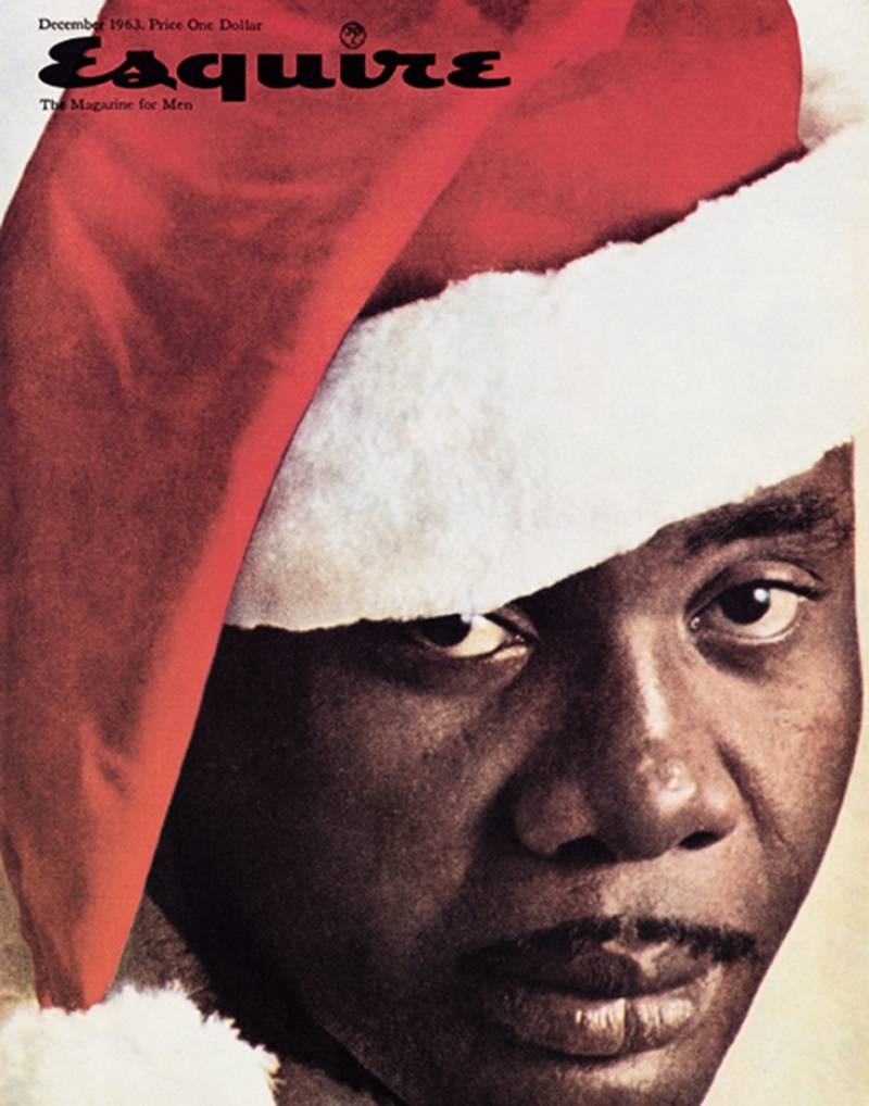
Heavyweight boxing champion Sonny Liston stares directly at the viewer, wearing a red-and-white Santa Claus hat. His expression is cold. Unflinching. There’s no holly, no presents, no warmth.
Just Liston’s face filling the entire frame against a plain background. The masthead sits above him, almost secondary to the image itself.
It’s one of the most stripped-down covers in Esquire’s history. No cover lines fighting for attention. No clutter. The concept did all the heavy lifting.
Art Director and Photographer
George Lois conceived the idea. Carl Fischer shot it at the Thunderbird Hotel in Las Vegas, where Liston was training at the time.
They lugged photography equipment into a hotel suite and turned it into a makeshift studio. A suitcase in the corner held the Santa costume, an elf’s hat, and a white acrylic beard. Fischer and Lois worked together on dozens of Esquire covers during the 1960s, but this one became their calling card.
Why This Cover Matters
December 1963. The civil rights movement was at a breaking point. Liston, an ex-convict who once worked as mob muscle, was the last person white America wanted associated with Christmas.
That was exactly the point.
Cassius Clay (later Muhammad Ali) reportedly saw the cover and said it showed “the last Black man America wants to see coming down their chimney.” The cover landed during one of the most racially charged periods in American history, and it hit a nerve that most publications wouldn’t dare touch.
Design Breakdown
The cover uses almost no text. Lois understood that the image alone would communicate everything. The contrast between Liston’s intimidating presence and the cheerful Santa hat creates the entire tension.
There’s a lesson in visual hierarchy here. By removing distractions (cover lines, feature teasers, taglines), the focal point becomes impossible to miss. Your eye goes straight to Liston’s face. Nowhere else.
Public Reaction and Legacy
Readers canceled subscriptions. Advertisers pulled out. Esquire lost an estimated $750,000 in ad revenue from that single Christmas issue.
But the magazine’s circulation grew anyway. By 1967, Esquire was pulling in $3 million in annual profit, with readership jumping from 500,000 to 2.5 million. In 2008, the Museum of Modern Art added this cover to its permanent collection. So yeah, it worked out.
Muhammad Ali as Saint Sebastian (April 1968)
The Cover Image
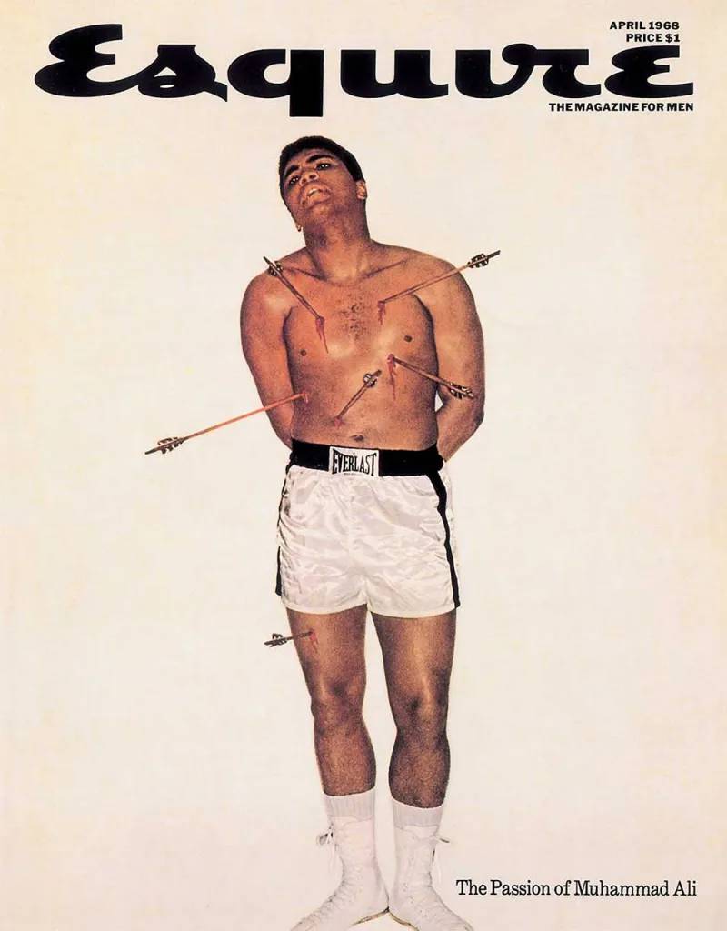
Ali stands shirtless in white boxing shorts and shoes against a stark white background. Six arrows appear to pierce his chest and right thigh, each wound producing visible blood. His arms are behind his back, his head thrown upward.
The subtitle at the bottom reads “The Passion of Muhammad Ali.” The emphasis is entirely on Ali’s body and the arrows. Nothing else competes for your attention.
Art Director and Photographer
George Lois designed the concept. Carl Fischer photographed it in his New York City studio.
Lois found a postcard of Francesco Botticini’s 15th-century painting of Saint Sebastian at the Metropolitan Museum of Art. He showed it to Ali on the day of the shoot. Ali initially refused to pose as a Christian figure because it conflicted with his Muslim faith. A frantic phone call to Elijah Muhammad’s son eventually got the green light.
The arrows were glued on and held up with transparent fishing line. Fischer shot on color film. The whole setup took a single session.
Why This Cover Matters
Ali had been stripped of his heavyweight title for refusing the Vietnam draft. He was banned from boxing anywhere in the country. The government wanted to make an example of him.
The cover hit newsstands on April 4, 1968. The same day Martin Luther King Jr. was assassinated. That grim timing gave the image even more weight than Lois could have planned.
During the shoot, Ali reportedly pointed to each arrow and named the people targeting him: Lyndon Johnson, General Westmoreland, Robert McNamara, and others.
Design Breakdown
White background. White shorts. White shoes. The only colors come from Ali’s skin and the blood on the arrows. This is white space used with real purpose.
The composition references Renaissance painting directly, which gives it a gravity that a typical celebrity portrait never could. Lois understood how visual storytelling works. One image, one clear message, zero ambiguity.
Public Reaction and Legacy
The cover shocked readers. It also became one of the most reproduced magazine images of the 20th century, later used as an actual anti-war protest poster. The National Museum of African American History and Culture holds an original copy.
It’s routinely called the greatest magazine cover ever made. That’s not hyperbole. At least in my experience, nothing else from that era comes close to its cultural impact.
Andy Warhol Drowning in Campbell’s Soup (May 1969)
The Cover Image
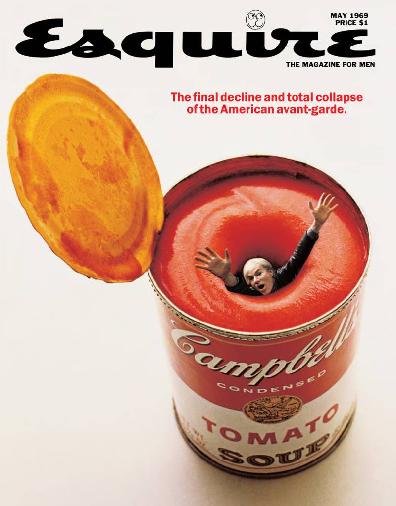
Andy Warhol appears to sink headfirst into a giant can of Campbell’s tomato soup. Only his upper body is visible. The can takes up most of the frame.
The story it illustrated was titled “The Final Decline and Total Collapse of the American Avant-Garde” by Eleanor Lester. The cover told you everything before you opened the magazine.
Art Director and Photographer
George Lois conceived it. Carl Fischer photographed Warhol and the soup can separately, then Lois created a composite image.
This was before Photoshop or any digital tools. Lois combined clip art, stock photography, and drawn elements to produce the final montage. According to Lois, he called Warhol and said he was putting him on the cover. Warhol’s response was cautious, but he agreed.
Why This Cover Matters
By 1969, Warhol’s Campbell’s soup paintings had become so tied to the Pop Art movement that the association was almost a cliche. Lois took that connection and flipped it into a commentary on the art world’s stagnation.
The cover works because it’s both a tribute and a critique. It acknowledges Warhol’s fame while suggesting he was being consumed by his own creation. That duality is what made it stick.
Design Breakdown
The image is a photo-montage, which was unusual for magazine covers in the late 1960s. Most covers relied on straightforward portrait photography. Lois was doing something closer to poster design than traditional editorial work.
The composition is vertically oriented, pulling your eye downward into the can. The analogous color relationship between the red soup label and Warhol’s skin tone keeps the palette tight and unified.
Public Reaction and Legacy
The cover became a Pop Art artifact in its own right. Collectors still seek out original copies. It demonstrated that magazine covers could function as standalone art, not just packaging for the content inside.
JFK, RFK, and Martin Luther King Jr. at Arlington (October 1968)
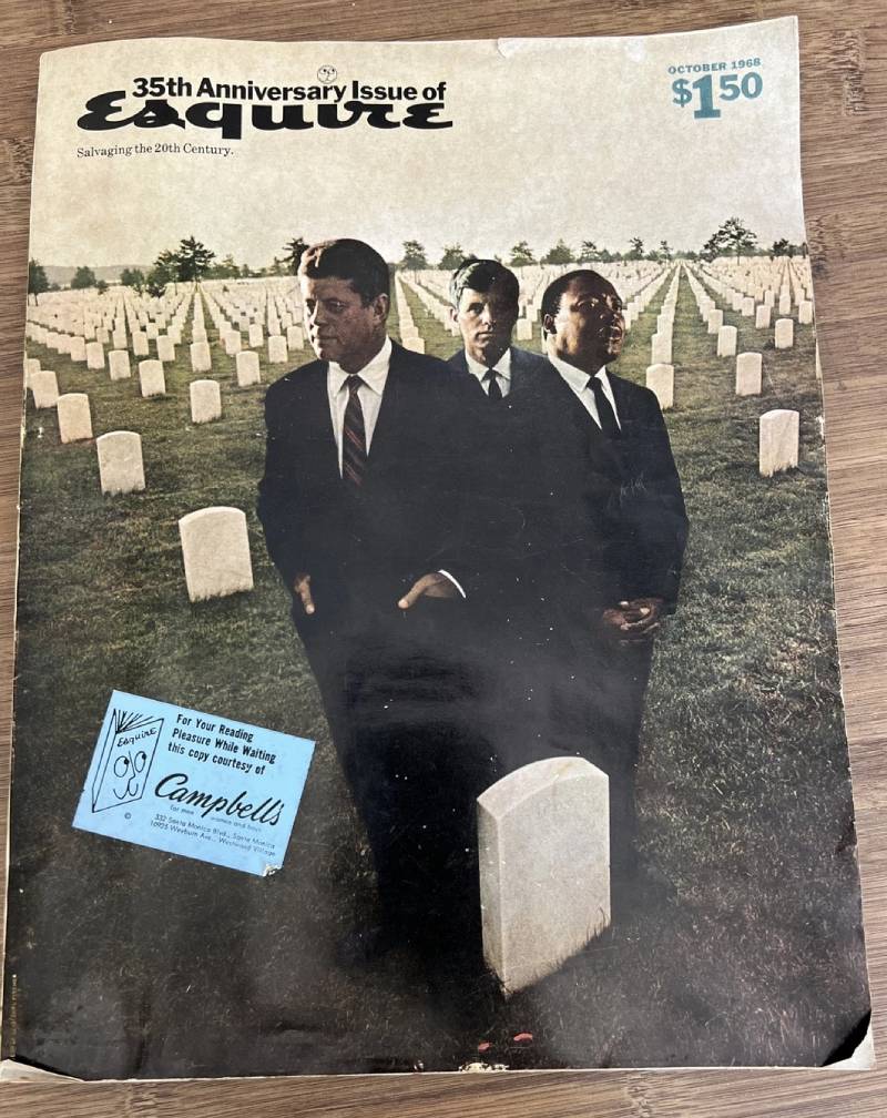
The Cover Image
Three men in dark suits stand among the headstones of Arlington National Cemetery: President John F. Kennedy, Senator Robert F. Kennedy, and Dr. Martin Luther King Jr. All three had been assassinated.
The image is a composite. None of these men could have posed together at Arlington. The cover made them appear as if they were attending their own funeral.
Art Director and Photographer
George Lois designed this for Esquire’s 35th anniversary issue. The image was assembled from separate photographs, placed together into a single scene through careful montage work.
No digital tools existed at the time. Everything was done by hand.
Why This Cover Matters
1968 was the most violent year in modern American political history. Robert Kennedy was killed in June. King in April. JFK had been dead since 1963.
Lois later described the cover as “a dream-like epitaph on the murder of American goodness.” The anniversary issue carried the quiet subtitle “Salvaging the 20th Century.”
Design Breakdown
The cover is a full-color image with almost no visible text. The balance between the three figures and the rows of white headstones creates a strong geometric structure. Each figure is placed with care.
The muted tones of the cemetery grounds contrast with the sharp black suits. It’s restrained and deliberate. No bold headlines, no feature teasers. The anatomy of this magazine cover breaks almost every rule of newsstand design, and that’s exactly why it worked.
Public Reaction and Legacy
This is one of the most emotionally charged iconic magazine covers ever published. It captured national grief better than any news photograph could. The Museum of Modern Art later included it in their permanent collection alongside other Lois Esquire covers.
Richard Nixon Getting Makeup Applied (May 1968)

The Cover Image
Richard Nixon sits with his eyes closed while four hands apply makeup, lipstick, and powder to his face. He looks passive. Almost lifeless. The tagline reads: “Nixon’s last chance. (This time he’d better look right!)”
Art Director and Photographer
George Lois designed it. The image was a composite, built from a stock photo of Nixon sleeping on Air Force One, combined with photographed hands applying cosmetics.
This was during the 1968 presidential campaign. Lois wanted to reference Nixon’s disastrous 1960 television debate against JFK, where Nixon appeared sweaty and unpolished on camera.
Why This Cover Matters
The 1960 debate is often cited as the moment television changed politics forever. Nixon looked bad on screen. Kennedy looked composed. The cover was a direct callback to that failure, suggesting Nixon needed serious cosmetic work (literal and figurative) to win.
Nixon’s staff called Esquire editor Harold Hayes after publication. They were furious. But not about the makeup. About the lipstick. They said it was “an attack on Nixon’s masculinity.”
Design Breakdown
The four hands entering the frame from different angles create a sense of frenzy around Nixon’s still face. It’s an interesting use of movement in an otherwise static composition.
The cover uses a traditional portrait format but subverts expectations. You expect a presidential candidate to look powerful. Here, he looks like he’s being prepped for an open casket.
Public Reaction and Legacy
Nixon won the 1968 election anyway. But the cover remains one of the sharpest political magazine images ever produced. TIME referenced it decades later when designing their own cosmetic surgery cover in 2015.
Lt. William Calley with Vietnamese Children (November 1970)
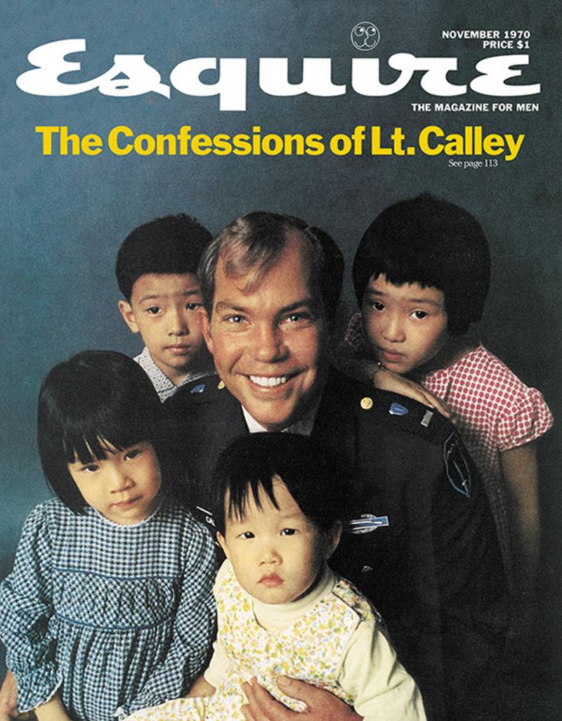
The Cover Image
Lt. William Calley stands in military uniform, surrounded by Asian children. He’s smiling. Calley was the officer facing trial for the My Lai massacre, where hundreds of unarmed Vietnamese civilians were killed.
The disconnect between his smile and what he had done is the entire point of the image.
Art Director and Photographer
George Lois designed the concept. Carl Fischer photographed it. The cover accompanied an excerpt from John Sack’s book about Calley.
Lois later said this cover made the Sonny Liston Santa Claus image “look like a Disney cartoon” by comparison.
Why This Cover Matters
The My Lai massacre was one of the most disturbing events of the Vietnam War. Calley was the only officer convicted. Putting him on the cover smiling with children forced readers to confront the reality of what American soldiers had done.
This wasn’t subtle. It wasn’t meant to be.
Design Breakdown
The composition looks like a family photo. That’s the horror of it. Lois used the conventions of portrait photography (centered subject, group arrangement, natural smiles) to create something deeply unsettling.
The framing is intentionally casual. There are no dramatic lighting effects or unusual angles. It looks normal. And that’s what makes it disturbing.
Public Reaction and Legacy
The issue was described as “a Molotov cocktail.” It generated massive controversy and remains one of the most politically charged covers in American magazine history.
The Autumn 1933 Debut Issue
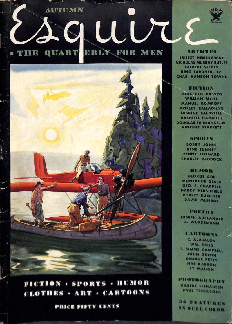
The Cover Image
A scarlet seaplane sits in a sun-drenched tropical bay. An olive sidebar runs along the left edge with bold black type listing contributors: Dashiell Hammett, Douglas Fairbanks Jr., John Dos Passos, and Ernest Hemingway at the top.
The illustration was painted by Edward Arthur Wilson, a Glasgow-born artist known for book illustrations and lithography.
Art Director and Photographer
The first issue was edited by Arnold Gingrich, who co-founded the magazine with David Smart and Henry L. Jackson. The cover was an illustration, not a photograph, which was standard for magazines in the early 1930s.
Gingrich personally recruited Hemingway by approaching him in a New York bookshop. Hemingway was already famous from The Sun Also Rises and A Farewell To Arms.
Why This Cover Matters
This is where it all started. Autumn 1933. The magazine was priced at 50 cents during the Great Depression. It promised “Fiction, Sports, Humour, Clothes, Art, Cartoons.”
The founders almost called it Trim, Beau, or Stag. But Gingrich’s secretary noticed a letter addressed to “Arnold Gingrich, Esq.” The name stuck.
Design Breakdown
The layout follows early 20th-century print design conventions: illustrated cover image paired with a text-heavy sidebar. The seaplane and tropical setting signal adventure and aspiration. The contributor names positioned prominently show that Esquire was selling literary prestige as much as lifestyle.
The color palette pairs the red seaplane with olive and gold accents. It’s warm and inviting, built to stand out on Depression-era newsstands.
Public Reaction and Legacy
The first issue was a hit. Esquire went from quarterly to monthly within its first year. Original copies in good condition now sell for hundreds of dollars. The debut issue established a template that men’s lifestyle magazines would follow for decades.
Today, it’s a highly sought-after collectible and a piece of American publishing history.
George Clooney “How to Be a Man” (May 2009)
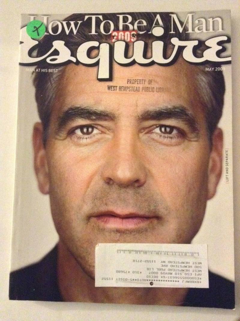
The Cover Image
George Clooney in a sharp suit, looking directly at the camera with his signature confidence. The cover text reads “How to Be a Man” in large type.
It’s a straightforward celebrity portrait. No conceptual trickery, no political provocation. Just Clooney doing what Clooney does.
Art Director and Photographer
This cover came during the David Granger era at Esquire. Granger served as editor-in-chief starting in 1997 and shifted the magazine’s cover strategy toward high-profile celebrity photography.
The approach was a deliberate departure from the conceptual Lois years. Clean portraits. Big names. A serif font for the masthead. Standard men’s magazine formula, executed well.
Why This Cover Matters
Clooney became Esquire’s go-to cover star. He appeared on the cover more than almost anyone else. This particular issue reflected a shift in how the magazine defined masculinity entering the 2000s.
It’s less about shock value and more about aspiration. Different strategy than Lois used in the 1960s, but it worked for its era.
Design Breakdown
Classic portrait alignment with the subject centered. The typographic hierarchy is clean: masthead at top, cover line centered large, secondary features smaller below.
The overall design follows the standard magazine cover layout that dominated newsstands in the late 1990s. Warm studio lighting, confident eye contact, minimal background distraction.
Public Reaction and Legacy
The Clooney era covers sold consistently well. They didn’t generate the controversy or cultural conversation of the George Lois covers. But they kept Esquire commercially viable during a period when the magazine industry was starting to feel pressure from digital media.
If you’re looking at what other publications were doing during this same period, compare this to GQ Magazine covers or Rolling Stone covers from the late 1990s. They were all chasing the same celebrity-driven formula.
FAQ on Esquire Magazine Covers
Who designed the most famous Esquire covers?
George Lois designed 92 covers between 1962 and 1972. He worked with photographer Carl Fischer under editor Harold Hayes. Their collaboration produced the most recognized magazine covers in American publishing history.
When was the first Esquire magazine published?
The first issue dropped in Autumn 1933. Arnold Gingrich, David Smart, and Henry L. Jackson founded it. The debut featured Ernest Hemingway and Dashiell Hammett, priced at 50 cents during the Great Depression.
What is the most iconic Esquire cover ever?
The April 1968 cover showing Muhammad Ali as Saint Sebastian is widely considered the greatest. Carl Fischer photographed Ali with six arrows attached to his body. It hit newsstands the same day Martin Luther King Jr. was killed.
Who publishes Esquire magazine?
Hearst Communications publishes Esquire in the United States. The magazine has expanded into multiple international editions, including Esquire UK. It started as a quarterly men’s lifestyle publication and shifted to monthly.
Why did the Sonny Liston Santa cover cause controversy?
Showing a Black heavyweight boxer as Santa Claus in December 1963 hit a raw nerve during the civil rights era. Readers canceled subscriptions. Advertisers pulled out. Esquire lost roughly $750,000 in ad revenue from that single issue.
Are vintage Esquire covers worth collecting?
Yes. Original 1960s issues with George Lois covers sell for significant prices. The Autumn 1933 debut issue is especially valuable. In 2008, MoMA added 38 Lois covers to its permanent collection, which boosted collector interest.
What size are Esquire magazine covers?
Standard Esquire covers measure approximately 10 by 12.5 inches. Early issues from the 1930s were larger at 14 by 10 inches. The trim size has shifted over the decades to match industry printing standards.
How did Esquire covers influence magazine design?
Lois proved that a single image with minimal text could outsell cluttered newsstand covers. His approach influenced editorial photography and art direction across the entire magazine industry. Most modern cover design owes something to his work.
What is Esquire’s Sexiest Woman Alive feature?
Esquire ran this annual cover feature starting in 2004 with Angelina Jolie. Scarlett Johansson became the first woman to win the title twice. The series generated major newsstand sales and kept the magazine culturally relevant through the 2010s.
Does Esquire still publish print covers?
Yes, Esquire still produces print issues with celebrity cover shoots. The magazine also publishes digital covers. The editorial style has shifted from the conceptual Lois era toward polished celebrity portrait photography, similar to GQ and other men’s titles.
Conclusion
The best Esquire magazine covers didn’t just sell copies. They challenged the country to look at itself differently, from racial tension to political corruption to the Vietnam War.
George Lois and Carl Fischer proved that editorial cover design could function as both art and journalism. Their work under editor Harold Hayes turned a struggling men’s magazine into the most talked-about publication of the 1960s.
What separates these covers from everything else on the newsstand is commitment. No focus groups. No safe choices. Just a clear idea executed with confidence.
The magazine industry has changed since then. Digital publishing, celebrity-driven formulas, and shrinking print budgets have shifted priorities. But the standard Esquire set during its golden age still holds up.
Good cover design doesn’t play it safe. It takes a position.

Renowned for his expertise in logo design and visual branding, Bogdan has developed a multitude of logos for various clients.
His skills extend to creating posters, vector illustrations, business cards, and brochures. Additionally, Bogdan's UI kits were featured on marketplaces like Visual Hierarchy and UI8.
He also wrote in the past years on sites like Design Your Way, WebDesignerDepot, WPDean, Designmodo, Speckyboy, Slider Revolution, and more.
- The Windsurf Logo History, Colors, Font, And Meaning - 10 October 2026
- How to Remove Background From Product Photos (No Photoshop) - 10 October 2026
- How Designers can Build a Stronger Online Creative Identity - 9 October 2026

Bogdan Sandu is a seasoned designer who has been designing websites since 2008. Renowned for his expertise in logo design and visual branding, Bogdan has developed a multitude of logos for various clients. His skills extend to creating posters, vector illustrations, business cards, and brochures. Additionally, Bogdan's UI kits were featured on marketplaces like Visual Hierarchy and UI8. He also wrote in the past years on sites like Design Your Way, WebDesignerDepot, WPDean, Designmodo, Speckyboy, Slider Revolution, and more.
You Might Also Like