


That split-second decision at the newsstand determines everything. Your eyes scan dozens of magazines in mere moments, but only one makes you stop and reach for your wallet.
Understanding the anatomy of a magazine cover reveals the calculated psychology behind every design choice. From typography placement to color psychology, successful covers follow proven principles.
Magazine designers study reader behavior obsessively. They know exactly where your eyes land first and how long you’ll spend processing their message.
This guide breaks down every element that transforms a simple image into a sales machine. You’ll discover how mastheads create brand recognition, why certain fonts for magazines outperform others, and which visual hierarchy techniques stop browsers mid-stride.
Professional publishers use these same strategies to sell millions of copies. Now you can apply their tested methods to your own publication design.
Magazine Cover Elements
Typography That Sells: Headlines and Text Elements
Masthead Design and Placement

The masthead sits at the top of your magazine cover hierarchy. It’s the brand anchor that readers spot first on crowded newsstands.
Brand recognition happens in milliseconds. Your masthead needs consistent typography across every issue.
Most successful magazines like Vogue and Time use custom typefaces for their mastheads. This creates instant brand differentiation from competitors.
Font Selection Criteria
Magazine covers demand fonts that work at multiple sizes. Your headline typography must be readable from three feet away.
Sans-serif fonts dominate modern magazine design. They’re clean, bold, and highly legible on both print and digital formats.
Serif fonts still work for traditional publications. National Geographic uses them to convey authority and timelessness.
Color and Contrast Requirements

High contrast between text and background is non-negotiable. Poor contrast kills readability at newsstand distances.
Color psychology drives purchasing decisions. Red headlines create urgency, while blue builds trust.
Test your cover lines in grayscale. If they’re not readable without color, your contrast needs work.
Cover Lines and Headlines
Writing Magnetic Headlines

Cover lines sell magazines, not pretty pictures. They promise specific benefits to your target audience.
Numbers perform exceptionally well in headlines. “7 Ways to…” or “50 Best…” create clear value propositions.
Question headlines engage readers directly. “Are You Making This Mistake?” forces mental participation.
Font Hierarchy Systems
Your cover needs at least three typographic hierarchy levels. Masthead, main headline, supporting cover lines.
Size creates the primary hierarchy. But weight, color, and spacing matter equally.
Secondary headlines should be 60-70% the size of your main headline. This creates clear information flow.
Text Placement Strategies
Left-aligned text follows natural reading patterns. Center alignment works for short, punchy headlines only.
Avoid placing text over busy image areas. Dark text needs light backgrounds, light text needs dark ones.
The rule of thirds applies to text placement. Position key headlines at intersection points.
Supporting Text Elements
Issue Dates and Pricing
Publication information belongs in standard locations. Readers expect to find dates and prices in specific spots.
Keep pricing typography small but readable. It’s necessary information, not a selling point.
Date formatting should match your brand style guide. Consistency builds professional credibility.
Barcode Positioning
Barcodes are ugly but required. Position them where they least interfere with your design.
Bottom right corner is the standard placement. Some magazines successfully integrate them into their overall design.
Never let barcodes cover important text or key image elements.
Taglines and Callouts
Taglines reinforce your brand promise. They should be distinctive but not compete with headlines.
Burst graphics and badges highlight special offers or exclusive content. Use them sparingly for maximum impact.
Callout boxes can organize multiple cover stories. They create visual breaks while maintaining information density.
Visual Impact: Photography and Graphics
Hero Image Selection
Subject Positioning Rules

Your cover image makes or breaks newsstand sales. It needs to stop browsers in their tracks.
Center-dominant compositions work best for magazine covers. They create strong focal points at viewing distance.
Leave space for text overlay. Your hero image must accommodate headlines without compromising readability.
Eye Contact and Angles
Direct eye contact creates emotional connection with potential buyers. It’s the oldest trick in magazine marketing.
Three-quarter angles often work better than straight-on shots. They add depth while maintaining engagement.
Celebrity covers perform best when the subject looks slightly upward. This suggests aspiration and optimism.
Background Considerations
Simple backgrounds let text overlay cleanly. Busy backgrounds create readability nightmares.
Gradient backgrounds can provide text-friendly areas while maintaining visual interest.
Studio photography gives you complete background control. Location shoots require careful composition planning.
Image Quality Standards
Resolution Requirements
Cover images need minimum 300 DPI for print quality. Digital versions can work at 150 DPI.
JPEG compression balances file size with image quality. Avoid over-compression that creates visible artifacts.
Raw photo files give editors maximum flexibility for color correction and cropping adjustments.
Color Correction Basics
Magazine covers need punchy, saturated colors that pop on newsstands. Subtle doesn’t sell.
Saturation adjustments should enhance natural skin tones while making backgrounds more vibrant.
CMYK color space is required for print production. RGB works for digital-only publications.
Lighting and Contrast
High-contrast lighting creates dramatic, attention-grabbing images. Flat lighting disappears on crowded shelves.
Contrast between light and dark areas helps text overlay stand out clearly.
Professional studio lighting gives you complete control over shadows and highlights.
Graphic Elements and Overlays
Burst Graphics and Badges
Promotional bursts highlight special content or limited-time offers. They create urgency and excitement.
Star bursts and circular badges work best for “New!” or “Exclusive!” callouts.
Color choices for burst graphics should contrast sharply with your background image.
Border and Frame Usage
Subtle borders can contain your design elements without overwhelming the image.
White space around borders creates breathing room and professional polish.
Avoid heavy borders that compete with your content for attention.
Icon Integration
Small icons can quickly communicate content categories. Fashion, food, and travel magazines use them effectively.
Vector graphics scale perfectly at any size without quality loss.
Keep icon styles consistent with your overall brand aesthetic and color palette.
Color Psychology in Magazine Design
Brand Color Consistency
Primary Palette Usage
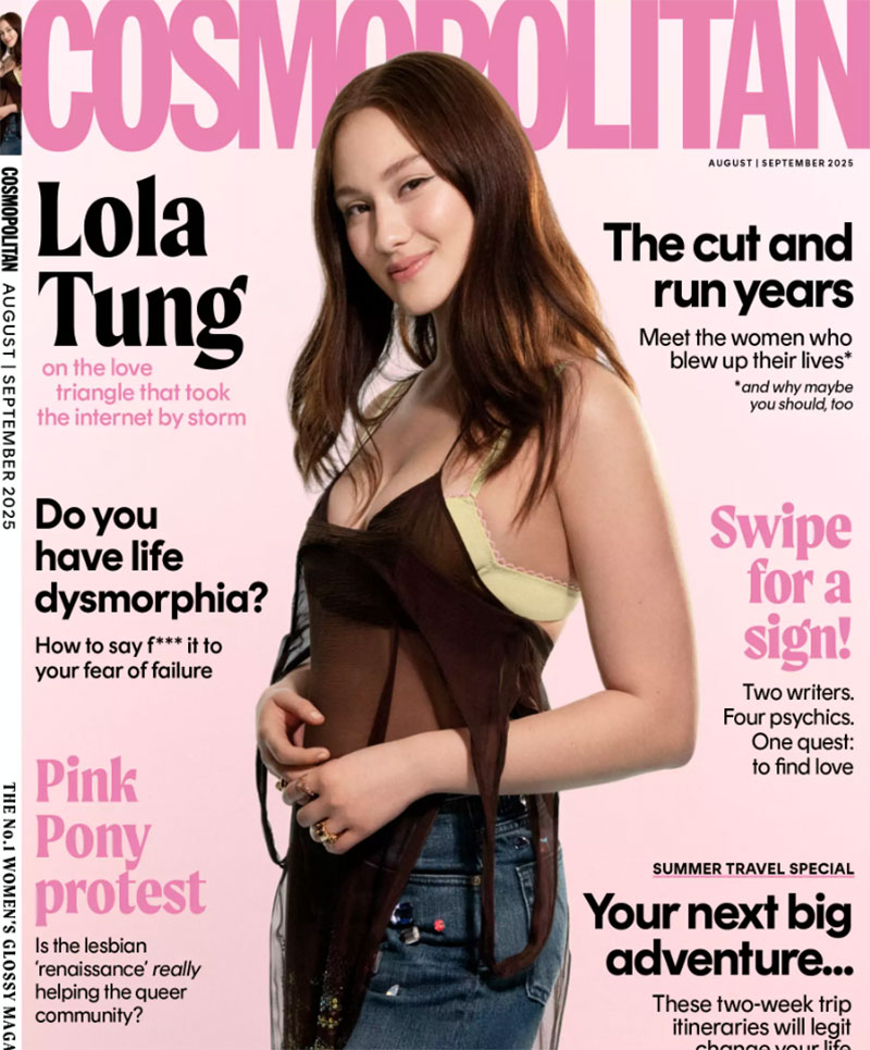
Magazine brands live or die by color recognition. Cosmopolitan’s hot pink is instantly recognizable from across a bookstore.
Your primary colors should appear on every cover. This builds subconscious brand loyalty with regular readers.
Conde Nast publications maintain strict brand guidelines for color usage. Vogue’s black masthead never changes, regardless of cover image.
Seasonal Color Variations
Fall issues embrace warm oranges and deep reds. Spring covers burst with fresh greens and vibrant yellows.
Analogous colors create harmonious seasonal palettes. They feel natural while maintaining visual appeal.
Holiday issues can break normal color rules. Christmas reds and greens override typical brand palettes when appropriate.
Target Audience Considerations
Women’s magazines favor bright, saturated colors that suggest energy and optimism.
Business publications stick to conservative blues and grays. These colors communicate trustworthiness and authority.
Teen magazines push neon brights and unexpected color combinations. Their audience craves visual excitement and rebellion.
Emotional Color Triggers
Red for Urgency and Excitement
Red creates immediate psychological arousal. It demands attention on crowded magazine racks.
Emergency red suggests limited-time offers or exclusive content. “Breaking News” headlines almost always use red typography.
Sports publications use red extensively. It matches the adrenaline and competition of athletic content.
Blue for Trust and Reliability

Financial magazines rely heavily on blue color schemes. Blue suggests stability and professional expertise.
Healthcare publications use calming blues to reduce anxiety about medical topics.
Technology magazines often combine blue with silver or white. This palette suggests innovation and precision.
Color Combinations That Work
Complementary color schemes create maximum visual impact. Orange and blue headlines pop against any background.
Triadic color schemes offer more variety while maintaining balance. They work well for lifestyle magazines with diverse content.
Monochrome colors create sophisticated, upscale appearances. Fashion magazines use them to suggest luxury and refinement.
Contrast and Readability
Text-to-Background Ratios
Poor contrast kills magazine sales. Readers must be able to scan headlines from three feet away.
White text requires very dark backgrounds. Black text needs light backgrounds with sufficient contrast ratios.
Color theory principles dictate minimum contrast levels. Test your covers in poor lighting conditions to verify readability.
Accessibility Guidelines
Color-blind readers represent 8% of the male population. Your design must work without color alone.
High contrast benefits everyone, not just those with visual impairments. Good accessibility is good business.
Pantone provides accessibility-tested color combinations. Use their resources to ensure inclusive design.
Print vs Digital Considerations
Print colors appear differently than screen colors. What looks great on your monitor might print muddy or dull.
CMYK color space has limitations compared to RGB. Bright screen colors often can’t be reproduced in print.
Proof your covers on actual printing paper. Digital proofs don’t show true color reproduction.
Content Strategy: What Goes on the Cover
Story Selection Criteria
Audience Interest Analysis
Your cover stories must match reader demographics precisely. Harper’s Bazaar covers fashion, not football.
Successful magazines survey their audiences regularly. They know exactly what topics drive newsstand sales.
Trending topics can boost sales, but they must align with your publication’s core mission and reader expectations.
Trending Topic Integration

Social media provides real-time insight into trending conversations. Twitter and Instagram reveal what people care about today.
Celebrity news cycles create cover story opportunities. Time your issues to coincide with movie releases or award shows.
Seasonal trends are predictable but effective. Weight loss in January, swimwear in May, holiday entertaining in November.
Exclusive Content Highlights
“Exclusive” is magazine marketing gold. It suggests content unavailable anywhere else.
Celebrity interviews work best when they reveal something genuinely new or surprising about the subject.
Behind-the-scenes access creates compelling exclusive content. Readers love insider perspectives on familiar topics.
Cover Line Writing Techniques
Action Words and Power Verbs

“Discover,” “Transform,” and “Reveal” promise active reader engagement. Passive language doesn’t sell magazines.
Strong verbs create urgency and excitement. “Unlock” suggests hidden knowledge, “Master” promises expertise.
Imperative commands work well for cover lines. “Stop,” “Start,” “Try,” and “Avoid” create immediate calls to action.
Number-Based Headlines
Specific numbers outperform vague promises. “7 Ways” beats “Several Ways” every time.
Odd numbers feel more authentic than even ones. “5 Tips” seems more credible than “6 Tips” to readers.
Large numbers suggest comprehensive coverage. “101 Best” implies exhaustive research and complete information.
Question and Teaser Formats
Questions engage readers mentally before they buy the magazine. “Are You Making This Mistake?” demands an answer.
Incomplete statements create curiosity gaps. “The Secret That…” forces readers to pick up the magazine.
“Why” questions tap into human need for explanations. They promise understanding of complex topics.
Content Positioning
Primary Story Placement
Your main story gets the largest headline and prime real estate. Usually upper left or center positioning.
The primary story should occupy roughly 40% of available text space on your cover.
Celebrity covers often place the main headline near the subject’s face. This creates visual connection between person and story.
Secondary Feature Arrangement
Secondary stories fill remaining cover space without overwhelming the primary message.
Group related stories together. Fashion, beauty, and lifestyle content can share cover sections.
White space between story groups prevents visual chaos. Don’t try to fit everything on one cover.
Special Offer Integration
Free gifts and special offers deserve prominent cover placement. They’re proven sales drivers.
“Free Inside” callouts work best in bright, contrasting colors. Make them impossible to miss.
Limited-time offers create urgency that drives immediate purchases. Use deadline language to motivate action.
Brand Identity and Recognition
Masthead Treatment
Logo Variations and Flexibility
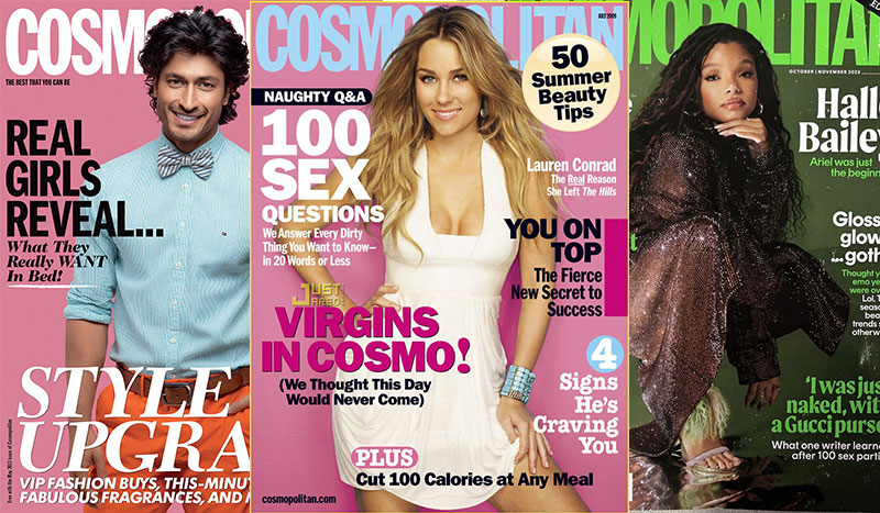
Your masthead is your magazine’s most valuable asset. It appears on every cover for decades, building recognition.
Logo design principles demand flexibility across different cover backgrounds. Dark mastheads need light versions, and vice versa.
Vogue uses their serif masthead consistently across 26 international editions. This creates global brand recognition.
Trademark Protection Elements
Magazine mastheads are registered trademarks. Legal protection prevents competitors from copying your distinctive design.
Typography choices become part of your trademark filing. Changing fonts can weaken legal protection.
Registration symbols (® or ™) should appear near your masthead on covers. This reinforces legal ownership.
Cross-Platform Consistency
Your masthead must work across print, digital, and social media. Simplified versions may be needed for small screens.
Mobile apps require readable mastheads at tiny sizes. This often means removing decorative elements.
Instagram posts need square-format adaptations of your masthead design.
Style Guide Adherence
Font Family Restrictions
Professional magazines limit themselves to 2-3 font families maximum. Too many choices create visual chaos.
Your brand style guide should specify exact fonts for headlines, body text, and captions.
Font licensing costs add up quickly. Budget for proper commercial licenses across your entire publication.
Color Palette Limitations
Strict color palettes prevent brand dilution. Every designer must follow the same rules.
Pantone spot colors ensure consistent reproduction across different printing facilities.
Digital hex codes translate your print colors to web and mobile platforms accurately.
Layout Template Usage
Templates speed up production while maintaining visual consistency. Every cover follows the same basic structure.
Grid systems provide invisible frameworks for text and image placement.
Template flexibility allows creative freedom within established boundaries.
Market Differentiation
Competitor Analysis
Study successful competitors to understand what works in your market. Then do something different.
Fashion magazines all compete for similar audiences. Subtle design differences create brand preference.
Color analysis reveals opportunities. If competitors use blue, consider red for your brand.
Unique Selling Propositions
Your cover design must communicate what makes your magazine special. Generic designs disappear on newsstands.
Rolling Stone uses distinctive typography that instantly says “music magazine” to browsers.
Photography style can differentiate your brand. Lifestyle magazines use this strategy effectively.
Target Demographic Alignment
Cover design must match reader expectations precisely. Business readers expect conservative designs.
Teen publications can experiment with bold colors and unusual layouts. Their audience craves visual excitement.
Age-appropriate design choices affect purchasing decisions subconsciously.
Technical Production Requirements
Print Specifications
Bleed and Trim Allowances
Magazine covers require 0.125-inch bleed on all sides. Images must extend beyond the final trim size.
Trim marks guide the cutting process. Without proper bleeds, you get ugly white borders.
Safety margins keep important text away from trim areas. Critical information needs 0.25-inch buffer zones.
Color Space Requirements
CMYK is the only acceptable color space for offset printing. RGB files will reproduce incorrectly.
Color conversion should happen during design, not at the printer. This prevents unexpected color shifts.
Spot colors like metallics or fluorescents require separate plates and increase printing costs.
Paper Stock Considerations
Glossy paper makes colors pop but shows fingerprints. Matte stocks feel premium but reduce color saturation.
Paper weight affects shipping costs and newsstand handling. Heavier stocks feel more expensive.
Coating options include UV, aqueous, or film lamination. Each creates different tactile experiences.
Digital Format Optimization
Screen Resolution Standards
Digital magazines need 150 DPI minimum for clear text rendering. Photos can use 72 DPI for file size management.
Retina displays require higher resolution assets. Plan for 2x and 3x scaling factors.
Vector graphics scale perfectly at any resolution without quality loss.
File Size Limitations
Large file sizes kill mobile download speeds. Optimize images aggressively for digital distribution.
JPEG compression balances quality with file size. Start at 80% quality and adjust downward.
Progressive JPEG loading improves user experience on slow connections.
Mobile Display Adaptation
Smartphone screens require completely different layouts. Text must remain readable at small sizes.
Touch targets need minimum 44-pixel dimensions. Buttons and links must be finger-friendly.
Responsive design adapts your cover to different screen orientations automatically.
Quality Control Processes
Proofing Procedures
Hard proofs show actual ink colors on real paper. Digital proofs can’t match this accuracy.
Color calibration ensures monitors display colors correctly during design and review phases.
Multiple proof rounds catch errors before expensive printing begins.
Color Accuracy Checks
Pantone swatches provide color references throughout the production process. Match them exactly.
Lighting conditions affect color perception. View proofs under standardized lighting.
Press checks let you adjust colors during the actual print run.
Text Readability Tests
Print test covers at actual size to verify headline legibility from normal viewing distances.
Different fonts perform differently at small sizes. Test thoroughly before finalizing choices.
Spell checking isn’t enough. Human proofreaders catch errors computers miss.
Psychology of Purchase: Newsstand Appeal
Shelf Positioning Strategy
Eye-Level Placement Advantages
Eye-level shelf space costs more but drives significantly higher sales. Premium magazines pay extra for these prime locations.
Grocery store impulse purchases happen within the shopper’s natural sight line. Covers positioned at adult eye level get noticed first.
Children’s magazines benefit from lower shelf placement. Kids can spot their favorite characters at their own eye level.
Competition Blocking Techniques
Strategic positioning next to weaker competitors can make your magazine appear more attractive by comparison.
Color contrast helps your cover stand out against neighboring publications. Red covers pop next to blue magazines.
Face-out positioning shows your entire cover while competitors display only spine edges.
Display Rack Considerations
Wire racks require different design approaches than flat magazine displays. Text must remain readable when covers are tilted.
Pocket depth varies between retail locations. Covers must work even when partially obscured by display hardware.
Checkout lane positioning targets impulse buyers but requires smaller cover sizes in many stores.
Impulse Purchase Triggers
Curiosity Gap Creation
Headlines that start stories but don’t finish them force readers to buy the magazine for completion.
“The Secret Hollywood Doesn’t Want You to Know” creates an information gap that demands resolution.
Question headlines like “Is Your Doctor Wrong?” tap into personal concerns and uncertainty.
Benefit-Driven Headlines
Clear value propositions work better than vague promises. “Lose 10 Pounds” beats “Get Healthier” every time.
Time-specific benefits add urgency. “30-Day Transformation” suggests achievable, concrete results.
Money-saving headlines appeal to practical concerns. “Save $500 This Month” targets universal desires.
Visual Stopping Power
Bright colors and high contrast stop browsers mid-stride. Subtle doesn’t work in crowded retail environments.
Celebrity eye contact creates psychological connection with potential buyers. Direct gaze suggests personal communication.
Unexpected visual elements break browsing patterns and force conscious attention.
Demographics and Design
Age-Appropriate Styling
Senior-focused publications use larger fonts and higher contrast for aging eyesight. Accessibility isn’t just about legal compliance.
Teen magazines embrace chaos and rebellion through experimental layouts. Their audience expects visual excitement.
Middle-aged demographics prefer clean, organized designs that suggest reliability and trustworthiness.
Gender-Specific Elements
Women’s magazines use beauty photography and fashion imagery to establish immediate relevance.
Men’s publications often feature technology, sports, or outdoor adventure subjects on covers.
Gender-neutral topics like health, finance, and home improvement require careful visual treatment.
Income Level Indicators
Luxury magazines use expensive photography and premium paper stocks. These tactile cues suggest exclusivity.
Budget publications can still look professional with smart design choices and strategic color usage.
Price point expectations are set by visual quality before readers check actual subscription costs.
Psychological Triggers
Fear-Based Appeals
Health magazines excel at creating anxiety about potential problems. “Is This Symptom Dangerous?” drives medical concern purchases.
Financial publications use economic uncertainty to motivate readership. “Market Crash Coming?” taps into investment fears.
Fear must be balanced with hope or solution promises to avoid overwhelming readers.
Aspiration and Success
Lifestyle magazines sell idealized versions of readers’ lives. Covers promise transformation and improvement.
Celebrity culture provides aspirational models. Readers want to emulate successful, attractive people.
“Transform Your Life” headlines suggest achievable personal evolution.
Social Proof Elements
“Most Popular” and “Reader’s Choice” labels leverage herd mentality. People want what others want.
Expert endorsements build credibility. “Doctor Recommended” carries authority weight.
Number-based social proof works well. “Join 2 Million Readers” suggests community membership.
Sensory Marketing
Touch and Texture
Glossy finishes feel expensive and suggest quality content inside. Matte stocks convey sophistication.
Embossed text and raised elements create premium tactile experiences. These cost more but increase perceived value.
Paper weight affects handling experience. Heavier stocks feel more substantial and valuable.
Color Temperature
Warm colors suggest comfort and approachability. Cool colors imply professionalism and expertise.
Seasonal color adjustments match environmental moods. Fall oranges feel appropriate in autumn shopping environments.
Hue selection affects emotional response before conscious thought occurs.
Retail Environment Factors
Lighting Conditions
Fluorescent store lighting affects color perception. Test covers under actual retail lighting conditions.
High contrast designs work better in poor lighting situations. Subtle color differences disappear under harsh fluorescents.
Metallic inks and special effects can catch available light to create attention-grabbing reflections.
Shopping Context
Grocery store browsers are in different mindsets than bookstore customers. Context affects purchasing decisions.
Time pressure in checkout lines favors simple, clear messaging over complex cover designs.
Airport newsstands serve travelers seeking entertainment or information for long flights.
Competitive Density
Crowded magazine sections require stronger visual differentiation. Your cover must stand out in visual noise.
Category clustering means similar publications compete directly. Fashion magazines fight other fashion titles for attention.
Strategic timing can reduce direct competition. Avoid release dates when major competitors launch issues.
FAQ on Anatomy Of A Magazine Cover
What are the essential elements of a magazine cover?
Every successful magazine cover includes a masthead, hero image, main headline, cover lines, publication information, and barcode. The masthead establishes brand identity while visual hierarchy guides reader attention through headlines and supporting text elements.
How important is typography in magazine cover design?
Typography drives purchasing decisions more than images. Headlines must be readable from three feet away on newsstands. Font selection affects brand perception, with sans-serif fonts dominating modern magazine design for clarity and impact.
What role does color psychology play in magazine covers?
Colors trigger immediate emotional responses that influence buying behavior. Red creates urgency and excitement, blue builds trust and authority. Color psychology helps magazines connect with target demographics and stand out on crowded retail shelves.
Where should the masthead be positioned on a magazine cover?
The masthead typically appears at the top center or left of the cover for maximum brand recognition. It should remain consistent across all issues while allowing flexibility for cover image integration and maintaining readability standards.
How do you create effective magazine cover headlines?
Successful headlines use action words, specific numbers, and benefit-driven language. They create curiosity gaps that force readers to purchase the magazine for completion. Question headlines and imperative commands perform exceptionally well in newsstand environments.
What makes a good magazine cover photo?
Cover photos need high contrast, clear focal points, and space for text overlay. Celebrity covers work best with direct eye contact. Studio photography provides better control over lighting and backgrounds than location shoots.
What are the technical requirements for magazine cover printing?
Magazine covers require 300 DPI resolution, CMYK color space, and 0.125-inch bleeds on all sides. Safety margins keep important text away from trim areas, while proper color calibration ensures accurate reproduction.
How do you optimize magazine covers for digital platforms?
Digital covers need 150 DPI minimum for clear text rendering and compressed file sizes for fast loading. Responsive design adapts layouts for different screen sizes while maintaining readability and visual impact across devices.
What psychological triggers influence magazine purchases?
Impulse purchases rely on curiosity gaps, fear-based appeals, and aspiration triggers. Eye-level positioning and high contrast colors stop browsers mid-stride. Social proof elements like “Most Popular” leverage herd mentality to drive sales.
How do successful magazines differentiate their covers from competitors?
Brand differentiation comes through consistent color palettes, unique typography choices, and distinctive photography styles. Market analysis reveals opportunities to stand out while maintaining target audience appeal and brand recognition.
Conclusion
Mastering the anatomy of a magazine cover transforms random design choices into strategic sales tools. Every element serves a purpose, from grid systems that organize information to contrast that ensures readability.
Professional magazine designers understand that covers must work as both artistic statements and marketing weapons. The publishing industry invests millions studying reader behavior, eye-tracking patterns, and purchasing psychology.
Your magazine cover has three seconds to capture attention and communicate value. Design elements like emphasis, balance, and strategic proximity create visual narratives that guide readers through your content hierarchy.
Whether you’re designing for print or digital platforms, these proven principles remain constant. Successful covers combine psychological insight with technical precision, turning browsers into buyers through calculated visual storytelling and strategic brand positioning.

Renowned for his expertise in logo design and visual branding, Bogdan has developed a multitude of logos for various clients.
His skills extend to creating posters, vector illustrations, business cards, and brochures. Additionally, Bogdan's UI kits were featured on marketplaces like Visual Hierarchy and UI8.
He also wrote in the past years on sites like Design Your Way, WebDesignerDepot, WPDean, Designmodo, Speckyboy, Slider Revolution, and more.
- Best Visual Regression Testing Tools for Web and App Design in 2026 - 13 October 2026
- Jujutsu Kaisen Font Generator - 12 October 2026
- The Windsurf Logo History, Colors, Font, And Meaning - 10 October 2026

Bogdan Sandu is a seasoned designer who has been designing websites since 2008. Renowned for his expertise in logo design and visual branding, Bogdan has developed a multitude of logos for various clients. His skills extend to creating posters, vector illustrations, business cards, and brochures. Additionally, Bogdan's UI kits were featured on marketplaces like Visual Hierarchy and UI8. He also wrote in the past years on sites like Design Your Way, WebDesignerDepot, WPDean, Designmodo, Speckyboy, Slider Revolution, and more.
You Might Also Like


