


A single glance at a magazine rack reveals an intense battle for attention. What makes a good magazine cover stand out in this crowded marketplace where readers make split-second decisions?
The answer involves far more than pretty pictures and catchy headlines. Successful covers combine color psychology, strategic typography, and carefully planned visual hierarchy to trigger immediate emotional responses.
This guide reveals the essential elements that transform ordinary magazine covers into newsstand magnets. You’ll discover proven techniques for celebrity selection, headline writing, and brand consistency that drive purchase decisions.
From graphic design principles to digital optimization strategies, these insights help publishers create covers that command attention and boost sales in both print and online environments.
What Makes a Good Magazine Cover
Essential Visual Elements That Command Attention
Typography and Font Selection
Headlines need to project authority while remaining readable from several feet away. Display fonts work best for primary headlines because they’re designed to grab attention at larger sizes.
The choice between serif font and sans-serif font depends on your magazine’s personality. Fashion magazines often use elegant serif typefaces. Tech publications lean toward clean sans-serif options.
Pairing fonts requires careful consideration. Your headline font should complement, not compete with, your subheading choices.
Font Psychology and Reader Response
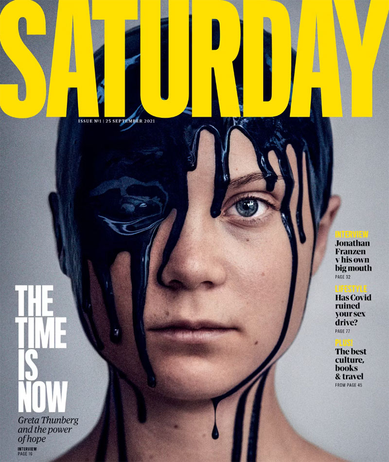
Font psychology plays a huge role in cover appeal. Bold, geometric fonts suggest modernity and innovation. Script fonts convey elegance and sophistication.
Typography elements like x-height affect readability at small sizes. Higher x-heights improve legibility on crowded newsstands.
Kerning and tracking adjustments make text appear more polished. Proper spacing between letters creates professional-looking headlines.
Image Composition and Subject Placement
The rule of thirds guides effective subject placement. Positioning your main subject along these grid lines creates more dynamic compositions than centering everything.
Direct eye contact from cover models creates instant connection with readers. This psychological trigger makes people feel personally addressed by the magazine.
Background selection affects how well cover text stands out. High-contrast backgrounds ensure your headlines remain readable across different printing conditions.
Creating Visual Impact Through Composition
Focal point establishment guides reader attention effectively. Your main subject should immediately draw the eye before secondary elements come into play.
Framing techniques help isolate your subject from busy backgrounds. Natural frames within the image create depth and visual interest.
Asymmetry often works better than perfect symmetry for magazine covers. Off-center compositions feel more dynamic and modern.
Color Palette Strategy

Color psychology influences buying decisions within seconds. Red creates urgency and excitement. Blue suggests trust and reliability.
Analogous colors create harmonious, pleasing combinations. These neighboring colors on the color wheel work well for lifestyle and wellness magazines.
Complementary color schemes provide maximum visual impact. Orange and blue combinations grab attention effectively on crowded magazine racks.
Advanced Color Techniques
Saturation levels affect emotional response. Highly saturated colors feel energetic and youthful. Muted tones suggest sophistication and maturity.
Hue variations within the same color family add depth without creating chaos. Slight shifts keep designs interesting while maintaining cohesion.
Pantone color matching ensures consistent reproduction across different printing runs. Brand colors should remain exactly the same every month.
Cover Lines and Headline Mastery
Writing Compelling Headlines
Power words trigger emotional responses that drive purchases. “Ultimate,” “secret,” “breakthrough,” and “exclusive” suggest valuable insider information.
Benefit-driven language speaks directly to reader needs. Instead of “New Workout Routine,” try “Lose 10 Pounds in 30 Days Without Gym Memberships.”
Question formats create curiosity gaps that readers want filled. “Are You Making These Common Investment Mistakes?” makes people examine their own behavior.
Psychological Triggers in Headlines
Numbers add credibility and specificity to promises. “5 Ways to…” feels more manageable than “Many Ways to…” for busy readers.
Urgency creates immediate action. Time-sensitive language like “before it’s too late” or “limited time” pushes fence-sitters toward purchase.
Personal pronouns make content feel individually relevant. “Your” and “you” create direct connection between magazine and potential buyer.
Strategic Cover Line Placement

Visual hierarchy guides reading patterns across your cover. Primary headlines should dominate, with secondary stories supporting but not competing.
Text placement around central imagery requires careful balance. Cover lines should complement, not obscure, your main visual element.
Multiple story teasers need strategic positioning to avoid clutter. Group related content and use consistent alignment to create order.
Creating Reading Flow
Proximity principles group related information together. Stories about health should cluster separately from fashion content.
White space prevents cognitive overload. Strategic gaps between text blocks help readers process information more easily.
Contrast ensures important headlines stand out. Light text on dark backgrounds or vice versa improves readability dramatically.
Language Techniques for Maximum Impact
Statistics and research findings add authority to claims. “Harvard Study Reveals…” or “New Research Shows…” positions your magazine as credible information source.
Partial reveals create intrigue without giving everything away. “The Surprising Truth About…” makes readers want to discover what that truth actually is.
Emotional language connects with target audience values. Health magazines use words like “energy,” “vitality,” and “strength” to appeal to wellness-focused readers.
Advanced Headline Strategies
Celebrity name-dropping leverages existing interest and recognition. Even B-list celebrities can boost newsstand appeal for the right demographic.
Controversy and conflict generate strong emotional responses. “Why Experts Are Wrong About…” positions your magazine as willing to challenge conventional wisdom.
Seasonal relevance makes content feel timely and necessary. “Summer Body Secrets” works better in May than December for fitness magazines.
The Power of Celebrity and Model Selection
Celebrity Appeal and Recognition Factor

A-list celebrities guarantee newsstand visibility but come with massive costs. Their star power can boost sales by 40% or more during peak popularity periods.
Emerging talent offers budget-friendly alternatives with growth potential. Smart publishers identify rising stars before their rates skyrocket.
Celebrity image must align with magazine brand values. A wellness publication featuring someone known for unhealthy lifestyle choices sends mixed messages to readers.
Timing Celebrity Features
Current relevance drives impulse purchases more than past achievements. Movie release dates, album launches, and award show appearances create perfect timing opportunities.
Social media buzz indicates trending celebrity status. Publishers track Instagram followers, Twitter mentions, and TikTok engagement to gauge current appeal.
Breaking news involving celebrities can make or break cover sales. Scandals might boost curiosity-driven purchases or damage brand reputation depending on your audience.
Model Photography and Styling
Professional makeup and hair styling transform ordinary photos into magazine-worthy images. Expert teams understand lighting requirements and camera techniques that work best for print design.
Wardrobe choices should complement overall cover design without competing for attention. Colors need to work with your planned color palette and text placement.
Pose selection affects cover story credibility. Serious investigative pieces require different body language than lifestyle features about summer fashion trends.
Technical Photography Considerations
High-resolution shooting ensures quality reproduction across different printing methods. DPI requirements vary between newsstand and digital distribution channels.
Lighting setups must account for text overlay areas. Dark shadows where headlines will appear create readability problems that expensive retouching can’t always fix.
Color space consistency between photography and final printing prevents disappointing color shifts. CMYK profiles should be established before the photo shoot begins.
Authentic Representation and Diversity
Target audience demographics should see themselves reflected in cover selections. Age, ethnicity, and body type representation affects purchase decisions more than publishers historically realized.
Cultural sensitivity prevents embarrassing mistakes that damage brand reputation. What works in one market might offend audiences in different regions or countries.
Body positivity movements influence reader expectations about model selection. Brands that embrace inclusive representation often see stronger reader loyalty and engagement.
Building Reader Connection
Aspirational vs. relatable balance determines emotional response to covers. Readers want to see both who they are and who they could become.
Regional preferences affect model selection for national publications. West Coast audiences respond differently than Midwest readers to certain celebrity types.
Age-appropriate choices build trust with core demographics. Teen magazines featuring 30-year-old models lose credibility with their intended audience.
Brand Identity and Design Consistency
Logo Integration and Brand Recognition
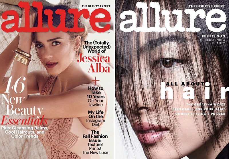
Logo placement affects recognition and shelf visibility. Top-left positioning works best for Western reading patterns, but cultural differences matter for international distribution.
Size relationships between logo and cover elements establish hierarchy. Your masthead should dominate without overwhelming the main cover story.
Brand colors must remain consistent across different cover themes. Pantone specifications ensure identical reproduction regardless of printing vendor changes.
Visual Brand Elements
Typography choices reinforce brand personality month after month. Changing fonts confuses readers and weakens brand recognition.
Graphic design principles should guide every cover decision. Consistent application of balance, contrast, and emphasis creates recognizable style.
White space usage becomes part of brand identity. Minimalist publications use generous spacing while tabloids pack information densely for different audience expectations.
Layout Templates and Design Systems
Grid systems provide structure while allowing creative flexibility. Well-designed templates accommodate different content types without losing brand consistency.
Flexible frameworks adapt to seasonal content changes without abandoning core design principles. Holiday issues should feel festive while remaining recognizably your brand.
Pattern recognition helps readers find your magazine quickly. Consistent cover line placement, color usage, and visual hierarchy create instant familiarity.
Maintaining Design Cohesion
Repetition of design elements across issues builds brand strength. Subtle recurring motifs create subconscious recognition patterns.
Unity principles ensure all cover elements work together harmoniously. Every design choice should support the overall brand message and aesthetic.
Variety within consistency prevents covers from becoming boring. Design elements can vary while maintaining recognizable brand characteristics.
Target Audience Alignment
Age-appropriate design choices reflect reader lifestyle and preferences. Teen publications use different color psychology than retirement-focused magazines.
Gender-specific visual preferences influence design decisions. Research shows different responses to color combinations, typography styles, and image composition between demographic groups.
Income level considerations affect production quality expectations. Luxury magazines require premium paper stocks and special finishes that budget publications can’t justify.
Demographic-Driven Design Decisions
Lifestyle alignment ensures cover design matches reader values and aspirations. Fitness magazines emphasize energy and movement through dynamic compositions and vibrant colors.
Regional preferences affect design choices for national publications. Urban vs. rural audiences respond differently to certain visual styles and celebrity selections.
Cultural context influences every design decision from color symbolism to typography choices. What appeals to one demographic might alienate another completely.
Technical Production and Print Quality
Photography Standards and Requirements
High-resolution images prevent pixelation during printing. 300 DPI minimum ensures crisp reproduction at newsstand sizes.
JPEG compression affects final image quality. Raw files provide maximum flexibility for color correction and retouching.
Vector graphics work best for logos and simple illustrations. They scale perfectly without losing sharpness at any size.
Color Management Systems
RGB files must convert to CMYK for printing. Color shifts during conversion can ruin carefully planned designs.
Professional calibration ensures consistent results across different monitors and printers. What you see on screen should match the final printed product.
Spot colors like Pantone inks cost extra but guarantee exact color matching. Brand colors often require this precision for consistency.
Paper Quality and Finishing Options
Gloss finishes make colors appear more vibrant and saturated. They reflect light dramatically, creating eye-catching shelf appeal.
Matte surfaces reduce glare but can make colors appear duller. Some brands prefer this sophisticated, understated look for their target audience.
Paper weight affects perceived value and durability. Heavier stocks feel more premium but increase printing and shipping costs significantly.
Special Finishing Techniques
Embossing creates raised textures that invite touch. This tactile element helps magazines stand out in digital-heavy environments.
Foil stamping adds metallic accents that catch light beautifully. Gold and silver foils suggest luxury and exclusivity to potential buyers.
UV coating protects covers from fingerprints and scuffing. High-traffic newsstands can damage unprotected surfaces quickly.
Print Production Considerations
Color calibration prevents expensive reprints and disappointed readers. Professional color management systems ensure consistency across different printing facilities.
Bleed areas accommodate cutting variations during production. Text placed too close to edges might get trimmed accidentally.
Quality control measures catch problems before distribution. Sample checking prevents entire print runs from being wasted on errors.
Production Timeline Management
Printing schedules affect cover design deadlines. Rush jobs cost more and limit special finishing options.
Distribution timing requires careful planning around holidays and events. Cover dates must align with actual shelf availability.
Backup plans prevent disasters when primary printers have problems. Alternative vendors should be pre-approved and ready to step in.
FAQ on What Makes A Good Magazine Cover
What colors work best for magazine covers?
High-contrast combinations grab attention effectively on newsstands. Red creates urgency, blue suggests trust, while complementary color schemes provide maximum visual impact. Color psychology influences buying decisions within seconds of viewing.
How important is celebrity selection for cover success?
Celebrity appeal can boost sales by 40% during peak popularity. A-list talent guarantees newsstand visibility but costs significantly more. Timing matters most – movie releases, album launches, and breaking news create optimal celebrity feature opportunities.
What typography choices improve cover readability?
Sans-serif fonts work better for headlines at newsstand distances. Bold, geometric typefaces suggest modernity while script fonts convey elegance. Font psychology affects reader perception and purchase decisions immediately.
How many cover lines should appear on magazine covers?
Three to five cover lines work best for most publications. Too many create clutter and overwhelm readers. Strategic placement around central imagery maintains visual hierarchy while promoting multiple stories effectively.
What image composition techniques improve cover appeal?
The rule of thirds creates dynamic layouts more effectively than centering subjects. Direct eye contact from models builds instant connection. Focal point establishment guides reader attention strategically.
How does digital optimization affect magazine cover design?
Covers must work as tiny thumbnails on social media platforms. Bold, high-contrast designs perform better than subtle layouts when compressed. Mobile-first considerations require larger text and simplified compositions for smartphone viewing.
What print quality factors affect cover success?
300 DPI minimum ensures crisp reproduction at newsstand sizes. CMYK color profiles prevent disappointing shifts from screen to print. Premium paper stocks and special finishes like embossing suggest higher value to potential buyers.
How do seasonal trends influence cover design decisions?
Summer fitness covers consistently outperform winter wellness content for lifestyle magazines. Holiday themes require early planning to align with distribution schedules. Seasonal color palettes and imagery create timely relevance for target audiences.
What role does brand consistency play in cover effectiveness?
Logo placement and brand colors must remain consistent across different cover themes. Pattern recognition helps readers find magazines quickly on crowded racks. Flexible templates accommodate various content while maintaining recognizable brand identity.
How can market research improve cover performance?
A/B testing different approaches provides concrete evidence for design decisions. Sales data reveals which cover elements drive purchases most effectively. Focus groups offer qualitative insights that supplement quantitative newsstand performance tracking for better results.
Conclusion
Understanding what makes a good magazine cover requires balancing multiple design elements that work together seamlessly. From contrast and emphasis to strategic celebrity selection, every choice impacts newsstand performance.
Successful covers combine proven design principles with current market research insights. Balance between text and imagery creates visual appeal that stops browsers mid-stride.
Technical execution matters as much as creative vision. Proper DPI settings, JPEG optimization, and Pantone color matching ensure professional results across different printing conditions.
Digital adaptation has become equally important as traditional print considerations. Mobile optimization and social media compatibility determine modern magazine success in an increasingly connected marketplace.
Ultimately, effective magazine covers combine art and science – creative intuition guided by data-driven insights about reader behavior and market trends.

Renowned for his expertise in logo design and visual branding, Bogdan has developed a multitude of logos for various clients.
His skills extend to creating posters, vector illustrations, business cards, and brochures. Additionally, Bogdan's UI kits were featured on marketplaces like Visual Hierarchy and UI8.
He also wrote in the past years on sites like Design Your Way, WebDesignerDepot, WPDean, Designmodo, Speckyboy, Slider Revolution, and more.
- Jujutsu Kaisen Font Generator - 12 October 2026
- The Windsurf Logo History, Colors, Font, And Meaning - 10 October 2026
- How to Remove Background From Product Photos (No Photoshop) - 10 October 2026

Bogdan Sandu is a seasoned designer who has been designing websites since 2008. Renowned for his expertise in logo design and visual branding, Bogdan has developed a multitude of logos for various clients. His skills extend to creating posters, vector illustrations, business cards, and brochures. Additionally, Bogdan's UI kits were featured on marketplaces like Visual Hierarchy and UI8. He also wrote in the past years on sites like Design Your Way, WebDesignerDepot, WPDean, Designmodo, Speckyboy, Slider Revolution, and more.
You Might Also Like


