


The Cash App logo is one of those fintech symbols that almost everyone recognizes on sight. A white dollar sign sitting inside a green rounded square. That’s it. No complex illustration, no hidden mascot, no over-designed wordmark trying too hard.
Block, Inc. (formerly Square, Inc.) launched Cash App back in October 2013 under the name Square Cash. The branding has gone through a handful of changes since then, but the core idea stayed the same: keep it clean, keep it green, make it about money.
The current version of the logo landed around 2018 when the company officially dropped “Square” from the name. That rebrand tightened everything up. The dollar sign got a slight forward tilt, the green became more electric, and the overall mark shifted from looking like a corporate side project to feeling like its own product.
Within the fintech branding space, Cash App’s mark does something unusual. Most payment apps lean on blue (trust, stability, all that). Cash App went green. And it works, because green is the color people already associate with money in the U.S. That’s not an accident.
What Is the Cash App Logo?
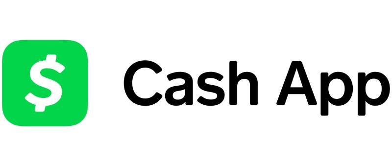
The Cash App logo is a combination mark featuring a custom-drawn white dollar sign placed inside a green rounded square. Square’s internal design team introduced the current version around 2018, building on the original 2013 branding. The symbol communicates instant money transfer through direct financial imagery.
Here’s what defines the mark:
- Design type: Combination mark (icon paired with wordmark in full-version usage)
- Primary elements: A stylized white dollar sign inside a green rounded square. The dollar sign tilts slightly forward, and the vertical line through the “S” is split into two short dashes at the top and bottom rather than one continuous stroke
- Official introduction: The original Square Cash branding launched October 15, 2013. The current Cash App version arrived around 2018 with the name change
- Designer: Square’s (now Block’s) internal design team. The custom typeface CashMarket was originally created by type designer Angus R. Shamal, adapted from his ARS Maquette font
- Trademark status: Registered with the USPTO. Registration #6014182 (filed April 2, 2018, registered March 17, 2020) covers the colored version. Registration #6262273 covers the combination mark with text. Owned by Block, Inc.
- Color palette: Primary green (#00D632), white (#FFFFFF), and black (#000000) for text applications
- Usage context: Mobile app icon, Cash Card (debit card), marketing materials, social media profiles, merchant payment interfaces, and digital advertising
How Has the Cash App Logo Evolved Over Time?

Cash App’s branding has been through two main phases. It started as Square Cash in 2013 with a straightforward corporate look tied to Square’s parent brand.
Then the 2018 rebrand cut the cord. The name shortened, the icon got bolder, and the whole identity became more independent. Not a dramatic overhaul, but enough to feel like a different product.
The Original Square Cash Logo (2013-2018)
Years active: 2013 to approximately 2018
The first version looked exactly like what it was: a Square product. The wordmark read “Square Cash” in thin, uppercase, sans-serif lettering. Clean but forgettable on its own.
To the left of the text sat a green square with rounded corners. Inside it, a standard white dollar sign. Nothing tilted, nothing stylized. Just a basic “$” centered in a green box.
The green was more muted compared to what came later. The font resembled Alte Haas Grotesk Regular or Neology Regular, though Square was already working with custom type through its SQ Market typeface (designed by Angus R. Shamal).
This logo served its purpose. It told you “this is a Square product that handles cash.” But it didn’t have much personality. It felt like a feature, not a brand.
The Cash App Rebrand (2018-Present)
Years active: 2018 to present
When the name shortened to “Cash App,” the designers took the opportunity to push the identity further.
The dollar sign got a redesign. It now tilts slightly to the right, giving it a sense of forward motion. The vertical stroke through the “S” was split into two short dashes, one poking out from the top and one from the bottom. It’s a small change that actually makes the symbol feel less generic and more owned.
The green went brighter. More electric. The rounded square stayed, but the overall proportions shifted to feel more modern and app-native.
For the wordmark portion, the team switched to a bolder, rounder typeface. Only the first letters of “Cash” and “App” are capitalized now. The rest is lowercase. This gave the brand a friendlier, more approachable feel compared to the all-caps Square Cash era.
The custom CashMarket typeface became the primary brand font. In early 2025, Block added a second custom font called Cash Sans for marketing. The promotional font Agrandir Wide by Pangram Pangram Foundry rounds out the type system.
This rebrand coincided with Cash App adding Bitcoin trading, the Cash Card, direct deposit, and stock investing. The logo needed to represent more than just peer-to-peer payments. It needed to say “financial platform.”
What Do the Design Elements of the Cash App Logo Mean?

Every piece of the Cash App logo points to the same thing: money, moving fast, with no friction.
The dollar sign is the most direct symbol possible for a payment app. No abstraction needed. The slight tilt adds energy, suggesting speed and forward momentum.
The rounded square works as a container that feels modern and digital. It reads well as an app icon (which is, let’s be honest, where most people see it). The rounded corners soften what could feel too rigid.
Why Did Cash App Choose These Specific Colors?
Primary Green (#00D632)
This is a bright, almost electric green. Not the deep forest green you see in traditional banking. It’s closer to what you’d associate with growth, money, and “go.” In terms of color psychology, green connects to wealth, health, and positive action.
The specific shade has high saturation, which makes it pop on mobile screens. That matters when your icon is competing for attention on someone’s home screen alongside dozens of other apps.
Some sources reference the green as #28C101 (called “Square Cash” green) or #00D54B (malachite). The exact hue has shifted slightly over time as the brand refined its palette.
White (#FFFFFF)
The dollar sign is white. Simple contrast play. White on bright green creates high visibility and readability even at small sizes. White also carries associations of simplicity, cleanliness, and transparency, which are all things you want from a financial app.
Black (#000000)
Used for the wordmark text in full logo versions. Black adds authority and professionalism without complicating the color palette. The three-color system (green, white, black) keeps things dead simple.
What Typography Style Is Used in the Cash App Logo?
Cash App uses a custom typeface called CashMarket. It was originally designed by Angus R. Shamal of ARS Type, adapted from his ARS Maquette font.
The letterforms are clean, rounded, and modern. No serifs. The corners have subtle rounding, which keeps the text feeling approachable rather than corporate.
Agrandir Wide handles promotional content, adding visual width and breathing room in marketing materials. Inside the actual app, Cash App uses platform-native system fonts (SF Pro on iOS, Roboto on Android) for interface consistency.
What Are the Hidden Meanings in the Cash App Logo?
The tilted dollar sign isn’t just stylistic. That forward lean suggests speed and progress. It makes the symbol feel like it’s moving, which aligns with the idea of instant transfers.
The split vertical stroke on the dollar sign is the most distinctive detail. Instead of one line through the “S,” there are two short dashes. This makes the symbol uniquely Cash App’s rather than a generic dollar sign pulled from a glyph set.
The rounded square is also worth noting. It mirrors app icon conventions on both iOS and Android, making the logo feel native to mobile devices by default. That’s not an afterthought. It’s built into the DNA of the mark.
How Does the Cash App Logo Compare to Competitor Logos?

Most fintech logos lean into blue. Venmo, PayPal, Zelle. They all sit in that trust-and-stability blue zone. Cash App breaks from this completely by going green.
That’s a real advantage when it comes to differentiation. If you line up the major payment app icons on a phone screen, Cash App is the one that doesn’t blend into the blue crowd.
Venmo uses a light blue with a stylized “V.” PayPal has its overlapping “P” letters in dark and light blue. Zelle goes with a purple-to-blue gradient. Apple Pay and Google Pay both use clean wordmarks without strong color identities on their icons.
Cash App’s use of a dollar sign is also more direct than its competitors. Venmo doesn’t reference money at all in its icon. PayPal’s “PP” is abstract. Cash App just puts a dollar sign right there. No guessing required.
Among other fintech brands, the Stripe logo uses a wordmark-focused approach, while the Square logo (Cash App’s own parent company) keeps things geometric and minimal. The Robinhood logo opts for a feather icon, and the Coinbase logo uses an abstract “C” shape. Cash App’s approach is arguably the most literal of the bunch.
What Are the Technical Specifications of the Cash App Logo?
Official Color Codes:
- Primary Green: Hex #00D632 | RGB (0, 214, 50) | CMYK (71, 0, 100, 0) | Pantone PMS 802 C
- White: Hex #FFFFFF | RGB (255, 255, 255) | CMYK (0, 0, 0, 0)
- Black: Hex #000000 | RGB (0, 0, 0) | CMYK (0, 0, 0, 100)
Dimensions and Proportions:
The icon uses a square format with rounded corners, designed primarily for mobile app icon specifications (1024×1024 pixels for app stores, scaling down to smaller sizes).
The dollar sign is centered within the square with consistent padding on all sides. Clear space around the logo should equal approximately the width of the dollar sign’s “S” curve to prevent visual crowding.
Official logo files are available in vector formats (SVG, AI) and raster formats (PNG, JPEG) through Block Inc.’s press resources. For print applications, the minimum recommended DPI is 300.
What Cultural Impact Has the Cash App Logo Had?
The Cash App logo has become shorthand for peer-to-peer payments in the U.S., especially among younger demographics. When someone says “just Cash App me,” that green icon is what people picture.
It shows up constantly on social media, in memes, on merchandise, and in music culture. Cash App has leaned hard into sponsorships and influencer partnerships, which means the logo gets exposure far beyond the typical fintech advertising channels.
The green square has become so recognizable that people identify it even without the wordmark. That’s a sign of strong brand recall, and it didn’t happen by accident. The minimalist design approach made the mark easy to reproduce and remember across every context.
How Does the Cash App Logo Fit Into the Overall Brand Identity?

Cash App sits under Block, Inc.’s family of brands, which also includes Square, TIDAL, and Weebly. Each has its own distinct visual identity, but Cash App’s is arguably the most consumer-facing and culturally visible.
The logo connects to the broader brand system through the Cash Card (a customizable Visa debit card), the $Cashtag system, Boost discount features, and in-app investing tools. The green carries across all of these touchpoints.
Block’s brand guidelines maintain strict consistency. The same green, the same icon proportions, the same typography rules apply everywhere. Whether you see the logo on a billboard, in your app drawer, or printed on a Cash Card, it looks identical. That kind of repetition builds recognition fast.
BUCK, the creative agency, worked with Cash App on evolving its spatial illustration system and 3D visual identity. This extended brand system builds on the logo’s foundation while pushing into richer visual territory for campaigns and product marketing.
How Should the Cash App Logo Be Used?
Do:
- Use official logo files from Block Inc.’s press kit or brand resource center
- Maintain the original color values (green #00D632, white, black)
- Keep proper clear space around the mark
- Use the logo at recommended minimum sizes to keep it legible
Don’t:
- Alter the colors, proportions, or tilt of the dollar sign
- Place the logo on busy backgrounds that reduce contrast
- Use the logo to imply endorsement or partnership without authorization
- Recreate or approximate the mark using standard fonts or clip art
The Cash App logo is a registered trademark of Block, Inc. Unauthorized use violates trademark law. Only official partnerships or licensed integrations allow third parties to display the logo, and those are subject to Block’s approval process.
If you need official logo assets, Block provides them through their press resources. These include approved versions in multiple formats and sizes, covering everything from web to print use cases.
For reporting trademark concerns, Block’s designated agent can be reached at their Oakland, California office or through their online reporting form.
FAQ on The Cash App Logo
What does the Cash App logo look like?
The Cash App logo is a white dollar sign inside a bright green rounded square. The dollar sign tilts slightly forward and has two short dashes instead of one continuous vertical line. It’s built for instant recognition on mobile screens.
What color is the Cash App logo?
The primary color is a bright green (#00D632). White fills the dollar sign symbol. Black appears in the wordmark for full-version layouts.
This limited palette keeps brand recall high across digital platforms, the Cash Card, and marketing materials.
Who designed the Cash App logo?
Square’s internal design team created the Cash App visual identity. The custom CashMarket typeface was designed by Angus R. Shamal of ARS Type, adapted from his ARS Maquette font. Block, Inc. maintains full ownership of the brand assets.
When was the Cash App logo created?
The original Square Cash branding launched on October 15, 2013. The current Cash App version arrived around 2018 during the rebrand.
That redesign introduced the tilted dollar sign, brighter green, and bolder typography elements that define the mark today.
What font does Cash App use?
Cash App uses a custom sans-serif called CashMarket for its primary branding. Promotional content uses Agrandir Wide by Pangram Pangram Foundry. Inside the app itself, platform-native system fonts handle the interface text.
Can I download the Cash App logo?
Official logo files are available through Block Inc.’s press kit and brand resource center. These include vector formats like SVG and AI, plus raster files in PNG and JPEG. Unauthorized use of the trademark is not permitted.
Why is the Cash App logo green?
Green connects directly to money in American culture. It also signals growth, trust, and positive action based on well-established color theory principles.
Most fintech competitors use blue. Going green gave Cash App immediate differentiation in a crowded mobile payment market.
Has the Cash App logo changed over the years?
Yes, but not dramatically. The original 2013 Square Cash logo used a standard dollar sign and muted green. The 2018 rebrand tilted the symbol forward, brightened the green, and split the vertical stroke into two dashes. Each update kept the core identity intact.
What does the dollar sign in the Cash App logo mean?
It’s the most literal symbol possible for a payment app. No abstraction, no guessing. The forward tilt adds a sense of speed, and the split stroke makes it uniquely Cash App’s rather than a generic currency symbol from any standard font library.
Is the Cash App logo trademarked?
Yes. Block, Inc. holds multiple USPTO registrations for the Cash App mark. Registration #6014182 covers the colored logo with text. The trademark was filed in April 2018 and registered in March 2020. All official brand style guidelines require approved usage only.
Conclusion
The Cash App logo works because it does one thing well: it tells you exactly what the app is for. A green square, a white dollar sign, zero ambiguity.
Block, Inc. built a fintech brand identity that cuts through a market full of blue logos and abstract symbols. The custom CashMarket typeface, the tilted dollar sign, the high-saturation green. Every choice serves the same goal.
Whether it shows up on a Cash Card, an app store listing, or a social media ad, the mark stays consistent. That kind of discipline across a visual hierarchy is what separates a recognizable brand from a forgettable one.
For anyone studying logo design principles in the digital payment space, Cash App’s approach is a solid reference point. Simple, direct, and built for screens first.

Renowned for his expertise in logo design and visual branding, Bogdan has developed a multitude of logos for various clients.
His skills extend to creating posters, vector illustrations, business cards, and brochures. Additionally, Bogdan's UI kits were featured on marketplaces like Visual Hierarchy and UI8.
He also wrote in the past years on sites like Design Your Way, WebDesignerDepot, WPDean, Designmodo, Speckyboy, Slider Revolution, and more.
- Versatile Work Sans Font Pairing for Every Project - 16 September 2026
- Organize Digital Files Like a Pro Before Your Next Client Handoff - 16 September 2026
- How to Set Up a Digital Menu Board: Hardware to Layout - 15 September 2026

Bogdan Sandu is a seasoned designer who has been designing websites since 2008. Renowned for his expertise in logo design and visual branding, Bogdan has developed a multitude of logos for various clients. His skills extend to creating posters, vector illustrations, business cards, and brochures. Additionally, Bogdan's UI kits were featured on marketplaces like Visual Hierarchy and UI8. He also wrote in the past years on sites like Design Your Way, WebDesignerDepot, WPDean, Designmodo, Speckyboy, Slider Revolution, and more.
You Might Also Like


