


The Adyen logo is one of the most recognized marks in global payment technology. It’s a lowercase wordmark set in green, and it has stayed pretty much the same since the company launched in 2006. That kind of consistency is rare in fintech.
Adyen N.V. is a Dutch payment platform headquartered in Amsterdam. Founded by Pieter van der Does and Arnout Schuijff, the company processes payments for major brands like Uber, Spotify, Netflix, and eBay. The name “Adyen” comes from Surinamese and means “start over again,” which was the founders’ mindset when they set out to rebuild how online payments work.
The logo itself is a pure wordmark. No icons, no symbols, no extra graphics. Just five lowercase letters in a custom typeface with open cuts in each character. The company went public on Euronext Amsterdam on June 13, 2018, with a valuation of around 7.1 billion euros, and the logo didn’t change one bit for the occasion. That tells you something about how much confidence they had in the original design. The mark has seen only minor refinements over nearly two decades.
What Is the Adyen Logo?
The Adyen logo is a lowercase wordmark rendered in a custom sans-serif font called Fakt, displayed in Malachite green (#0abf53) against white or dark backgrounds. Introduced in 2006 alongside the company’s founding, it uses geometric letterforms with open cuts to suggest accessibility and movement in digital payments.
Here’s what defines it:
- Design Type: Wordmark (logotype). No emblem, no mascot, no icon paired with it. The text is the entire identity.
- Primary Elements: Five lowercase letters (“adyen”) in a geometric sans-serif. Each character features deliberate open cuts in the strokes, which some interpret as slots in payment terminals or card readers. The openness of the glyphs gives the whole thing a sense of approachability.
- Official Introduction Date: 2006, when the company was founded in Amsterdam, the Netherlands.
- Designer/Agency: The typeface is based on Fakt, a commercial sans-serif designed by Thomas Thiemich. The logotype itself was developed with custom modifications for Adyen’s brand.
- Trademark Status: Adyen N.V. holds trademark protection for the logo and brand elements. The company is publicly listed on Euronext Amsterdam under the ticker symbol “ADYEN.”
- Color Palette: Malachite Green (#0abf53) as the primary color and Midnight Blue (#00112c) as the secondary. White is used for reversed applications on green or dark backgrounds.
- Usage Context: The logo appears on Adyen’s payment gateway interfaces, merchant checkout pages, point-of-sale terminals, mobile payment screens, corporate communications, press materials, and developer documentation.
How Has the Adyen Logo Evolved Over Time?
The Adyen logo has barely changed since 2006. Unlike most tech company logos that go through multiple redesigns, Adyen kept its original wordmark largely intact for nearly two decades.
That’s actually unusual. Most fintech brands refresh their identity every few years.
Original Adyen Logo (2006-Present)
Years Active: 2006 to present
The original logo featured the word “adyen” in all lowercase letters using a heavy, geometric sans-serif typeface. The characters were set close together but with enough spacing to avoid feeling cramped.
From the beginning, the green color was there. Malachite green (#0abf53) on white backgrounds, white on green backgrounds. That’s it. No gradients, no shadows, no extra decoration.
The font choice was Fakt, but with noticeable modifications to the letter shapes. The most distinctive feature? Open cuts in the strokes of each character. The “a” has a gap, the “d” has a gap, and so on. It looks like someone sliced into each letter with purpose.
Those cuts weren’t random. They give the letters a look that reminds you of card slots in payment terminals, or the opening of an ATM where you insert your card. Everything ties back to the payment processing business.
Context: The logo was introduced when Adyen was a startup in Amsterdam, founded by Pieter van der Does and Arnout Schuijff. They wanted to rebuild the fragmented payment processing industry from scratch, and the clean, modern mark reflected that ambition.
Cultural Significance: By keeping the same logo through the company’s growth from startup to a publicly traded giant (IPO in 2018 at a 7.1 billion euro valuation), Adyen turned the mark into a symbol of stability in fintech. While competitors went through rebrand after rebrand, Adyen’s consistency became part of its story.
Minor Refinements Over the Years
The logo hasn’t gone through a formal “version 2” or “version 3.” Instead, Adyen made subtle refinements to the typography weight and proportions as the brand scaled.
Digital display requirements changed. Mobile screens got sharper. High-DPI displays became standard. The logo needed to hold up at tiny sizes on app icons and payment terminal screens.
The core design elements, the lowercase letters, the open-cut glyphs, the green color, stayed constant. That’s been the case for over 18 years now.
What Do the Design Elements of the Adyen Logo Mean?

Every piece of the Adyen logo ties back to the company’s identity as a payment technology platform. The open-cut letterforms suggest accessibility and the physical mechanics of payment processing, like card slots and terminal readers.
The lowercase treatment signals approachability rather than corporate stiffness. And the green? That’s money. Growth. Progress.
Why Did Adyen Choose These Specific Colors?
Malachite Green (#0abf53)
This is the primary brand color. In RGB values, it’s 10, 191, 83.
Green is the obvious choice for a payments company, and I mean that as a compliment. It connects directly to money (dollar bills, euro notes) while also carrying associations with growth and renewal. The specific shade Adyen picked is brighter and more energetic than what you’d see from a traditional bank. It feels more startup than Wall Street, which is exactly the point.
From a color psychology standpoint, green builds trust while also suggesting forward motion. For a company that processes over 100 billion euros per year, that dual message matters.
Midnight Blue (#00112c)
The secondary color. In RGB, it’s 0, 17, 44.
This deep blue-black shows up in secondary text, supporting materials, and certain background treatments. It adds a layer of seriousness and professionalism that balances out the bright green. You’ll see it mostly in Adyen’s corporate communications rather than the logo itself.
White
Used for reversed logo applications. When the logo sits on a green or dark background, it flips to white. According to Adyen’s own press kit, the green logo goes on white backgrounds. On dark backgrounds, the logo stays green. On solid green or gradient backgrounds, it switches to white.
What Typography Style Is Used in the Adyen Logo?

Adyen uses Fakt, a sans-serif typeface designed by Thomas Thiemich. The logo version features custom modifications with open-cut counters and terminals in every letter.
The all-lowercase approach is deliberate. It strips away formality and makes the brand feel accessible. Your mileage may vary on whether that works for a multi-billion-dollar payments company, but the consistency has paid off in terms of recognition.
At small sizes (think app icons and terminal displays), the heavy weight and simple geometry keep things readable. The spacing between characters is tight but not cramped, which helps the wordmark feel like a single unit rather than five separate letters.
What Are the Hidden Meanings in the Adyen Logo?
The open cuts in the letterforms are the most discussed design feature. Each letter has a deliberate gap in its stroke that recalls the slot of a payment terminal or ATM card reader.
Then there’s the name itself. “Adyen” means “start over again” in Surinamese, and the forward-leaning energy of the typographic design reflects that fresh-start philosophy. The founders wanted to rebuild payment processing, and the clean, uncluttered mark suggests exactly that: starting with a blank canvas.
Some people also read the uniform weight of the characters as a nod to Adyen’s unified commerce platform, where every payment channel (online, mobile, in-store) gets equal treatment.
How Does the Adyen Logo Compare to Competitor Logos?

In the payments space, Adyen’s logo stands out by being aggressively simple. While competitors use a mix of symbols, icons, and multi-color palettes, Adyen sticks to text only.
The Stripe logo, for example, is also a wordmark, but it uses a gradient purple that leans into a more creative, developer-friendly vibe. Stripe’s weight is lighter, the letterforms are more refined. Different personality entirely.
Square’s mark (now Block) went with a geometric icon alongside its text. That gives it flexibility Adyen doesn’t have, but also introduces complexity.
PayPal uses overlapping “P” letterforms in blue, creating a layered icon that works at small sizes. It’s a different strategy altogether.
The Klarna logo takes a friendlier, rounder approach with a pink color palette that targets consumers rather than enterprise merchants.
What Adyen has that most of these don’t is nearly two decades of zero visual change. That kind of consistency builds its own form of recognition. You see that green wordmark and you know exactly what company you’re dealing with.
What Are the Technical Specifications of the Adyen Logo?
Official Color Codes
Primary Color: Malachite Green
- Hex: #0abf53
- RGB: (10, 191, 83)
- Usage: Primary logo color on white and dark backgrounds
Secondary Color: Midnight Blue
- Hex: #00112c
- RGB: (0, 17, 44)
- Usage: Supporting text, corporate materials, secondary brand applications
Tertiary: White
- Hex: #FFFFFF
- RGB: (255, 255, 255)
- Usage: Reversed logo on green or gradient backgrounds
Dimensions and Proportions
The logo’s SVG file on Wikimedia Commons is listed at 512 x 166 pixels nominal size, giving it an approximate aspect ratio of 3.08:1. That’s wider than many wordmarks, but the horizontal orientation works well for payment interfaces and checkout bars.
Adyen’s official press kit specifies that the logo should be placed in the bottom-left position in most applications. Clear space around the mark should be maintained to preserve legibility, though exact measurements are managed through their internal brand guidelines.
For vector graphics usage, SVG and AI formats are available through Adyen’s press kit. These scale without quality loss, which matters when the logo needs to appear on everything from a 16px favicon to a conference stage backdrop.
What Cultural Impact Has the Adyen Logo Had?
The Adyen logo’s cultural impact lives mostly in the B2B and fintech space rather than mainstream consumer culture. It’s not a mark you’ll see on t-shirts or baseball caps.
But within the payments industry, the logo carries weight. When Adyen went public in 2018 as the largest tech unicorn IPO in Europe in five years, the mark became associated with European tech success.
The logo also appears on checkout pages and payment confirmation screens for some of the biggest consumer brands on the planet. Most shoppers don’t notice it, and that’s actually the point. A payment processor’s brand works best when it signals security without stealing attention from the merchant’s own identity.
How Does the Adyen Logo Fit Into the Overall Brand Identity?
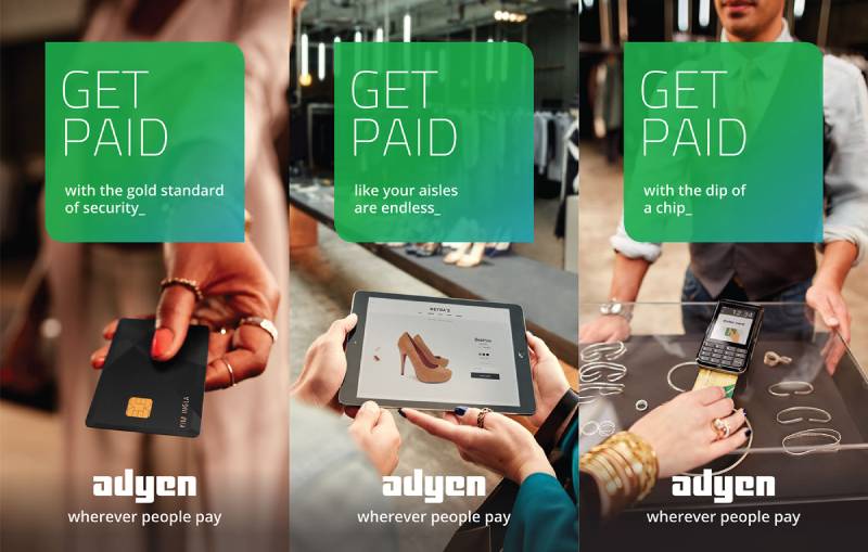
The Adyen logo is the anchor of a broader visual system that includes the Malachite green color palette, the Fakt typeface, and a minimalist design approach across all touchpoints.
The brand style guide keeps things tight. Green logo on white. White logo on green. Green logo on dark backgrounds. There aren’t many exceptions.
The company’s tagline, “Wherever people pay,” used to appear alongside the logo in black text. That tagline extends the brand story beyond the mark itself, positioning Adyen as ubiquitous in payment processing.
Everything in the identity system serves the same goal: looking modern, feeling trustworthy, and getting out of the way. The logo doesn’t try to be clever or flashy. It just does its job, which is kind of the same thing Adyen says about its payment platform.
How Should the Adyen Logo Be Used?
Official Usage Rules:
Adyen provides specific guidelines for logo placement. On white backgrounds, use the green version. On dark backgrounds, also use green. On solid green, gradient, or image backgrounds, switch to white. In most contexts, the logo should sit in the bottom-left corner of the layout.
Where to Access Official Logos:
The official press kit with brand photos, logos, and office images is available at adyen.com/press-and-media/presskit. For specific logo files and design-related requests, Adyen directs people to contact design@adyen.com.
Licensing and Permissions:
Using the Adyen logo requires permission. Authorized partners receive specific logo files for approved uses. If you’re integrating Adyen’s payment services and need to display their logo on your checkout page, you’ll need to follow their merchant guidelines for proper placement and sizing.
Trademark Protection:
The Adyen logo and brand elements are protected under trademark law. Unauthorized use, modification, or reproduction outside of approved contexts violates those protections. If you have questions about whether your intended use is allowed, reach out to Adyen directly through their press or design contacts.
FAQ on The Adyen Logo
What font is used in the Adyen logo?
The Adyen logo uses Fakt, a sans-serif typeface designed by Thomas Thiemich. The logotype version features custom modifications with open-cut letterforms. All characters are lowercase, giving the wordmark a modern, approachable feel across digital payment platforms.
What color is the Adyen logo?
The primary color is Malachite Green with the hex code #0abf53. Adyen also uses Midnight Blue (#00112c) as a secondary brand color.
On white backgrounds, the logo appears in green. On green or image backgrounds, it flips to white.
What does the Adyen logo mean?
The open cuts in each letter suggest payment terminal card slots and ATM openings. “Adyen” translates to “start over again” in Surinamese. The logo design reflects the founders’ goal of rebuilding the online payment processing industry from scratch.
Where can I download the official Adyen logo?
Adyen’s press kit at adyen.com/press-and-media/presskit includes official logo files. For specific design requests, contact design@adyen.com. The logo is available in vector formats like SVG for scalable use across merchant checkout pages and marketing materials.
Has the Adyen logo changed since the company was founded?
Barely. The logo has stayed virtually the same since 2006. That’s over 18 years of consistency.
Minor refinements to weight and proportions happened as digital displays improved, but the core brand identity never shifted. Most fintech companies can’t say the same.
Can I use the Adyen logo on my website?
You need permission. Authorized merchants and partners receive specific logo files for approved applications. Unauthorized use violates Adyen’s trademark protection. If you’re integrating their payment gateway, follow the merchant brand guidelines for proper placement.
What type of logo does Adyen have?
Adyen uses a wordmark, also called a logotype. There’s no icon, symbol, or emblem paired with it. Just five lowercase letters in a custom geometric typeface. It’s the kind of clean approach you see a lot in European Swiss-influenced design.
Why is the Adyen logo green?
Green connects directly to money, financial growth, and progress. For a payment service provider processing billions of euros annually, that association is deliberate.
The bright Malachite shade also sets Adyen apart from competitors who lean toward blues and purples in their color palettes.
What is the Adyen logo aspect ratio?
The logo’s dimensions sit at approximately 3.08:1 based on the SVG file (512 x 166 pixels nominal). That wide horizontal format works well for checkout page headers, payment confirmation screens, and point-of-sale terminal displays.
How does the Adyen logo compare to the Stripe logo?
Both are wordmarks. But the similarities stop there. Stripe uses a gradient purple palette with lighter letterforms aimed at developers. Adyen’s heavy green wordmark targets enterprise merchants. Different audiences, different typographic personalities entirely.
Conclusion
The Adyen logo proves that you don’t need constant redesigns to build strong brand recognition. One green wordmark, nearly two decades, zero major changes. That’s a rare thing in fintech.
The open-cut letterform details, the Malachite green hue, and the lowercase Fakt typeface all work together to communicate trust and accessibility across every payment touchpoint.
From checkout pages to point-of-sale terminals, the mark scales without losing clarity. It does well because it keeps things simple.
For a company processing payments for Uber, Spotify, and eBay worldwide, that kind of visual consistency isn’t just a design choice. It’s a business strategy.

Renowned for his expertise in logo design and visual branding, Bogdan has developed a multitude of logos for various clients.
His skills extend to creating posters, vector illustrations, business cards, and brochures. Additionally, Bogdan's UI kits were featured on marketplaces like Visual Hierarchy and UI8.
He also wrote in the past years on sites like Design Your Way, WebDesignerDepot, WPDean, Designmodo, Speckyboy, Slider Revolution, and more.
- The Cursor Logo History, Colors, Font, And Meaning - 24 September 2026
- Top 7 Web Design Subscription Services That Replace Full-Time Hires - 24 September 2026
- Canva vs PowerPoint: Which Is Better for Presentations? - 22 September 2026

Bogdan Sandu is a seasoned designer who has been designing websites since 2008. Renowned for his expertise in logo design and visual branding, Bogdan has developed a multitude of logos for various clients. His skills extend to creating posters, vector illustrations, business cards, and brochures. Additionally, Bogdan's UI kits were featured on marketplaces like Visual Hierarchy and UI8. He also wrote in the past years on sites like Design Your Way, WebDesignerDepot, WPDean, Designmodo, Speckyboy, Slider Revolution, and more.
You Might Also Like


