


The Klarna logo is one of those marks you see everywhere during online checkout, and it has become shorthand for “buy now, pay later” in a way few other fintech brands have managed. Founded in Stockholm in 2005 by Sebastian Siemiatkowski, Niklas Adalberth, and Victor Jacobsson, the company started as Kreditor Europe AB before rebranding to Klarna in 2007. The name itself means “to clarify” in Swedish, which says a lot about what the founders were going for.
The brand has gone through three distinct logo versions since launch. What started as a blue wordmark with a small flower icon has turned into a bold, pink-forward identity that breaks just about every rule traditional financial companies follow. And that was the point. Klarna wanted to feel like the opposite of a bank, and its visual identity does exactly that.
The current version, refined in 2024, keeps things clean. A custom sans-serif typeface, no unnecessary graphic elements, and that unmistakable pink. The Klarna logo sits at over 500,000 merchant partner checkout pages across 45 countries, serving more than 150 million users. That kind of reach makes the design choices behind it worth understanding.
What Is the Klarna Logo?

The Klarna logo is a custom wordmark rendered in a proprietary sans-serif typeface, featuring the company name in title case with a stylized “K” that has slightly arched diagonal bars. The current version was refined in 2024 by Klarna’s in-house design team, with the wordmark redrawn for better performance at small sizes.
Here is a breakdown of the logo’s key attributes:
- Design Type: Wordmark (text-only logo without accompanying symbol or icon in its primary form)
- Primary Elements: Custom sans-serif lettering in title case, featuring a distinctive “K” with arched diagonals and subtle ink traps for clarity at reduced sizes
- Official Introduction Date: Original logo launched in 2005. Current wordmark version introduced in 2017 with DDB Stockholm, then refined in 2024 in-house
- Designer/Agency: The 2017 typeface was created by Letters from Sweden in collaboration with Nord ID. The 2024 refresh was developed by Klarna’s in-house design team, with new brand typefaces created by Colophon Foundry
- Trademark Status: Registered with the USPTO under Klarna Bank AB. The word mark “KLARNA” holds registration number 4582346 (filed August 2013, registered August 2014). The stylized “KLARNA.” mark holds registration number 5736415 (filed February 2018, registered April 2019)
- Color Palette: Klarna Pink (#FFA8CD), Klarna Black (#0B051D), and Klarna Off White (#F9F8F5). White (#FFFFFF) is also used in certain applications
- Usage Context: E-commerce checkout buttons, the Klarna app, merchant partner marketing materials, digital advertising, payment gateway interfaces, and partnership lockups across web and print
How Has the Klarna Logo Evolved Over Time?
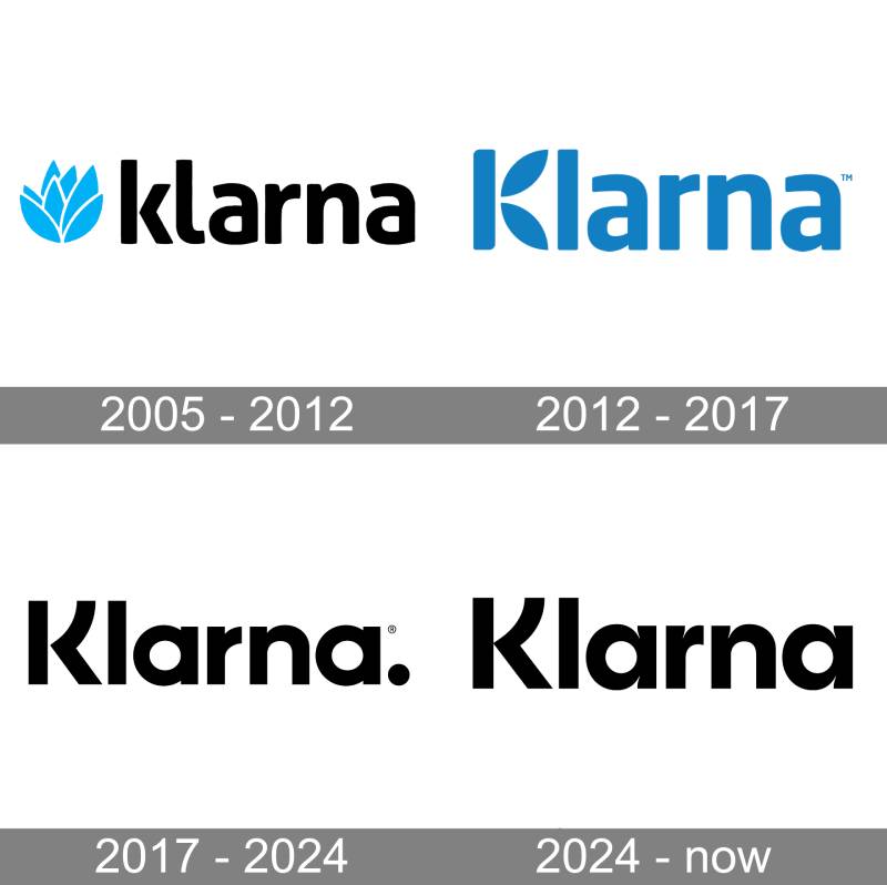
Klarna has had three main logo versions since its founding. The original 2005 design used blue tones and a flower-like emblem. The 2017 rebrand completely overhauled the identity, switching to a bold sans-serif wordmark with black lettering and a trailing period. The 2024 refresh removed the period, redrew the wordmark for digital clarity, and introduced new custom typefaces.
Original Klarna Logo (2005-2017)
The first Klarna logo was created when the company launched in 2005, back when it was still finding its footing as a Swedish payment processor.
It used a bright blue emblem that looked like a modest flower or abstract shape, sitting next to a black lowercase wordmark. The typeface was a modern sans-serif with softened contours, giving the whole thing a friendly, approachable feel.
The capital “K” had a distinctive style even then. Its two diagonal bars were drawn like petals, placed slightly apart from the vertical stem. That detail made the mark feel lighter and less corporate than typical payment company branding.
Blue was the obvious choice for a financial services startup. It communicates trust and reliability, and practically every bank logo in existence uses some shade of it. Klarna was no different at this stage.
The early version served its purpose. But it did not stand out. It looked like what you would expect from a Nordic fintech company trying to build credibility with merchants and consumers who had never heard of them.
Rebranded Klarna Logo (2017-2024)
This is where things got interesting.
In 2017, Klarna went through a complete visual overhaul with DDB Stockholm. The blue flower emblem? Gone. The lowercase wordmark? Replaced with bold title-case lettering.
The new logo featured a geometric sans-serif typeface with thick, confident strokes and straight-cut endings. A black solid dot (period) was placed at the end of the wordmark, which became a recognizable quirk of the design.
The custom typeface, called Klarna Headline Bold, was designed by Letters from Sweden working with Nord ID. It had a geometric structure but with enough personality to avoid feeling generic. The “K” kept its slightly separated diagonal bars as a nod to the original mark.
And then there was the pink. The 2017 rebrand introduced what would become Klarna’s most defining brand element. The use of pink in their branding was a deliberate rejection of the blues, greens, and navies that dominate financial services. It was a calculated move to attract younger, digitally native shoppers who associated traditional banking colors with institutions they did not trust.
The psychology behind the color choice was clear: pink reads as approachable, non-threatening, and modern. For a buy now, pay later service trying to make credit feel less intimidating, it was the right call.
Current Klarna Logo (2024-Present)
The 2024 refresh was handled entirely by Klarna’s in-house design team, ahead of the company’s anticipated IPO.
The changes are subtle but meaningful. The trailing period from the 2017 version was removed. The wordmark was redrawn with refined ink traps that make the letters sharper and cleaner at small sizes, which matters a lot when your logo shows up in tiny checkout cart icons.
The “K” was slightly widened, and the gap between its stem and leg was closed. This gives the letter a stronger presence, especially when used as a standalone icon in the Klarna app.
New brand typefaces were introduced. Klarna Title, developed with Colophon Foundry, serves as the headline face with an offbeat, energetic feel. Klarna Text handles body copy and comes in multiple weights. Both replaced the earlier Klarna Headline Bold as the primary brand typefaces.
The color system stayed rooted in pink but was balanced more deliberately with off-white and black. A secondary palette was introduced with purples, grey, and green for background use.
The whole refresh was built around what Klarna calls a “Curiously Bold” brand personality, guided by three creative principles: Offbeat Optimists, Strikingly Relevant, and Straight Up.
What Do the Design Elements of the Klarna Logo Mean?

The Klarna logo communicates accessibility and trust in digital payments. Its pink palette breaks with financial industry norms that default to blue and green. The rounded, bold typography signals friendliness over formality, targeting consumers who find traditional banking off-putting.
Why Did Klarna Choose These Specific Colors?
Klarna Pink (#FFA8CD) is the flagship brand color. It carries associations of warmth, approachability, and youthful energy. In color theory terms, this particular hue sits in a range that feels playful without tipping into childish. The saturation level is calibrated to read as confident and modern rather than soft or passive.
It is a deliberate anti-corporate statement. Financial services brands almost never use pink. That is exactly why Klarna picked it. The color creates instant differentiation at checkout screens crowded with blue logos from competitors and banks.
Klarna Black (#0B051D) is not a true black. It leans toward a very deep violet, which adds a layer of sophistication that pure black would not. It anchors the brand with seriousness and grounds the playfulness of the pink.
Klarna Off White (#F9F8F5) serves as the neutral base. It is warmer than pure white (#FFFFFF), which creates a more comfortable reading experience across digital interfaces and keeps things from feeling sterile.
What Typography Style Is Used in the Klarna Logo?
The logo uses a custom font family that is not available for public licensing. The original Klarna Headline Bold was developed by Letters from Sweden with Nord ID in 2017. It is a bold sans-serif with geometric foundations and slightly arched diagonals on the “K.”
The 2024 update introduced Klarna Title (by Colophon Foundry) for headlines and Klarna Text for body copy. Letter spacing is optimized for digital screens rather than print, which makes sense for a brand that lives primarily inside checkout flows and mobile apps.
The x-height of the letterforms is generous, keeping readability high even at the small sizes typical of payment buttons. Took me a while to appreciate how much thought goes into making a wordmark work at 16 pixels wide, but it really matters when millions of transactions flow through that tiny mark every day.
What Are the Hidden Meanings in the Klarna Logo?
The stylized “K” has been a consistent thread through every version. Its diagonal bars carry a subtle arch that references the original 2005 flower/petal motif. It is a quiet nod to the brand’s roots that most people would never notice.
The 2024 logo animation is inspired by the push of a button, a direct reference to the one-click payment experience Klarna sells. The closing of the gap in the “K” between stem and leg also creates a more unified, solid letterform, which you could read as a visual metaphor for financial security. Whether that was intentional or just good type design is up for debate.
How Does the Klarna Logo Compare to Competitor Logos?

Klarna’s pink wordmark sits in stark visual contrast to nearly every other major player in the payments and fintech space. Most competitors stick to safe, expected choices. The result is that Klarna is probably the most instantly recognizable logo at any given checkout page.
The Stripe logo uses a clean purple wordmark with a focus on developer appeal. Adyen’s logo is a green wordmark that feels corporate and understated. Square’s branding (now Block) centers on geometric simplicity in black.
PayPal’s overlapping blue “P” icons and Afterpay’s teal triangles both lean on cooler tones that signal trust through conventional financial color associations. Affirm’s blue wordmark follows the same playbook.
Klarna is the outlier. Where competitors try to look like payment companies, Klarna’s visual identity tries to look like anything but. The pink color scheme and rounded type feel closer to a lifestyle or consumer brand than a financial institution. That tension is the whole point and is something that many tech company logos are now starting to explore.
What Are the Technical Specifications of the Klarna Logo?
Official Color Codes
- Klarna Pink: Hex #FFA8CD | RGB (255, 168, 205) | CMYK (0, 34, 20, 0)
- Klarna Black: Hex #0B051D | RGB (11, 5, 29) | CMYK (62, 83, 0, 89)
- Klarna Off White: Hex #F9F8F5 | RGB (249, 248, 245) | CMYK (0, 0, 2, 2)
- White (secondary use): Hex #FFFFFF | RGB (255, 255, 255) | CMYK (0, 0, 0, 0)
Dimensions and Proportions
The minimum clear space around the Klarna wordmark equals the height of the wordmark itself. This rule applies to both the badge and the standalone wordmark. Clear space can be increased but never decreased.
For the Klarna icon (the standalone “K”), the minimum clear space is set to 50% of the icon’s full height.
Klarna specifies minimum sizes for each format (digital, print, badge, wordmark) in their official brand guidelines. The badge version, which places the wordmark on a Klarna Pink background, is the preferred option for most marketing contexts and must maintain rounded corners at its official radius.
The logo is available in SVG format through the Klarna Brand Portal. Vector files make sure the mark renders crisply across every screen density, from checkout buttons on mobile devices to large-format advertising.
What Cultural Impact Has the Klarna Logo Had?
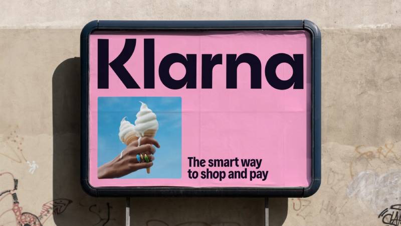
Klarna’s branding helped rewrite what a financial company could look like. Before the 2017 rebrand, pink was essentially absent from the fintech and banking space. Now it is the company’s most powerful brand asset.
The logo’s cultural significance goes beyond aesthetics. It legitimized a more playful, consumer-friendly approach to financial branding that other BNPL providers and neobanks have since tried to replicate. Campaigns featuring Snoop Dogg and other celebrities amplified the brand’s visibility, but it was the pink logo that gave those campaigns their visual anchor.
For younger consumers especially, the Klarna mark represents a generational shift in how people think about payments. It says “this is not your parents’ bank,” which is exactly the message the company wanted to send. Whether you think BNPL services are a great convenience or a potential debt trap, there is no denying the logo did its job in making credit feel casual and accessible.
How Does the Klarna Logo Fit Into the Overall Brand Identity?

The logo is just one piece of a tightly controlled brand system. Klarna’s visual identity connects the wordmark to custom typefaces, a defined color palette, motion design principles, photography direction, and illustration style.
The two custom typefaces, Klarna Title and Klarna Text, extend the personality of the wordmark into all brand communications. Klarna Title brings energy to headlines with an offbeat character (including a slightly tilted “o” that feels quirky on purpose). Klarna Text is functional and readable, handling everything from app interfaces to email copy.
The motion identity ties back to the logo directly. The main logo animation mimics the push of a button. Transitions in video content reference the app’s scroll and swipe gestures. All of it reinforces the same message: this brand lives in digital, and it was designed for how people actually interact with screens.
There is a structured style guide governing how the primary and secondary palettes interact. Primary colors (pink, black, off-white) dominate upper-funnel marketing. Secondary colors (purples, grey, green) appear in backgrounds for lower-funnel and CRM use. Tints extend both palettes for app and product design. The whole system is designed to feel cohesive whether you are seeing a billboard or a 48-pixel checkout badge.
How Should the Klarna Logo Be Used?
Klarna is pretty strict about this. Their trademark guidelines are detailed and leave little room for creative interpretation by partners or merchants.
Do:
- Use the Klarna badge (wordmark on pink background) as the default option for all marketing channels
- Maintain the minimum clear space equal to the wordmark’s height
- Use the wordmark in Klarna Pink on black backgrounds, black on light backgrounds, or white on dark backgrounds
- Download official assets in SVG format from the Klarna Brand Portal
- Follow the specific minimum size requirements for each format
Don’t:
- Alter the colors of the logo or badge
- Stretch, squeeze, or rotate the trademarks
- Add outlines, effects, or shadows
- Create new lockup arrangements not approved by Klarna
- Use the Klarna icon as a standalone primary brand element in external communications (it is designed for app and web contexts only)
- Color partnership trademarks
Official logo files are available through the Klarna Brand Portal and through their documentation for merchant partners. The badge and wordmark come in horizontal and vertical formats, in black or white color options for partnership lockups.
The “KLARNA” trademark is registered with the USPTO under Klarna Bank AB and is protected across multiple classes including financial services, advertising, and electronic payment processing. Any use of the mark by third parties must comply with Klarna’s published guidelines to avoid trademark infringement.
FAQ on The Klarna Logo
What font does the Klarna logo use?
The Klarna logo uses a custom typeface called Klarna Headline Bold, designed by Letters from Sweden with Nord ID in 2017. It is a proprietary sans-serif not available for public licensing. The 2024 refresh introduced Klarna Title and Klarna Text, both created with Colophon Foundry.
What are the official Klarna logo colors?
The core palette has three colors. Klarna Pink is #FFA8CD. Klarna Black is #0B051D, which leans toward deep violet. Klarna Off White is #F9F8F5. Secondary colors include purples, grey, and green for background applications.
Why is the Klarna logo pink?
Pink was a deliberate break from the blues and greens that dominate financial branding. The psychology behind the color signals approachability and warmth, targeting younger shoppers who find traditional banking off-putting. It was introduced during the 2017 rebrand.
Can I download the Klarna logo for my website?
Yes. Klarna provides official assets in SVG format through their Brand Portal and merchant documentation. You should always use the approved files rather than recreating the mark yourself. Their brand guidelines outline exactly which versions to use and where.
What does the Klarna logo symbolize?
The wordmark represents clarity and accessibility in digital payments. “Klarna” means “to clarify” in Swedish. The stylized “K” with its arched diagonal bars references the original 2005 flower motif. The overall design communicates trust without the stuffiness of traditional banking brands.
How has the Klarna logo changed over the years?
Three main versions. The 2005 original paired a blue flower emblem with a lowercase wordmark. The 2017 rebrand switched to bold title-case lettering in black with a trailing period. The 2024 refresh removed the period and redrew the wordmark with ink traps for better small-size performance.
What is the Klarna badge vs. the Klarna wordmark?
The badge places the Klarna wordmark on a pink background with rounded corners. It is the preferred trademark for most marketing uses. The wordmark is the standalone text mark, available in pink, black, or white depending on background brightness.
Who designed the current Klarna logo?
Klarna’s in-house design team led the 2024 refresh. The earlier 2017 identity was developed with DDB Stockholm. Custom typefaces came from Letters from Sweden (2017) and Colophon Foundry (2024). The brand identity reflects years of iterative refinement rather than a single designer’s vision.
What file formats is the Klarna logo available in?
Official Klarna logo files are provided in vector format (SVG) through the Brand Portal. Vector files keep the mark crisp across all screen densities and print sizes. Merchants can also access logo assets through Klarna’s API for checkout page integration.
Is the Klarna logo trademarked?
Yes. The word mark “KLARNA” is registered with the USPTO under Klarna Bank AB (registration number 4582346, filed 2013). The stylized version with the period holds a separate registration (number 5736415, filed 2018). Both are actively protected across multiple trademark classes.
Conclusion
The Klarna logo proves that breaking industry conventions can pay off. A pink wordmark in a sea of blue financial brands was a risk. It worked.
From the original 2005 blue emblem to the refined 2024 wordmark, every iteration moved the brand closer to what modern shoppers actually respond to. The custom typeface, the deliberate color choices, the clear space rules. All of it serves one goal: instant recognition at the checkout moment.
For merchants integrating Klarna’s payment badge or designers studying fintech branding, the takeaway is straightforward. Good logo design is not about following what your industry does. Sometimes the best move is doing the opposite.

Renowned for his expertise in logo design and visual branding, Bogdan has developed a multitude of logos for various clients.
His skills extend to creating posters, vector illustrations, business cards, and brochures. Additionally, Bogdan's UI kits were featured on marketplaces like Visual Hierarchy and UI8.
He also wrote in the past years on sites like Design Your Way, WebDesignerDepot, WPDean, Designmodo, Speckyboy, Slider Revolution, and more.
- The Windsurf Logo History, Colors, Font, And Meaning - 10 October 2026
- How to Remove Background From Product Photos (No Photoshop) - 10 October 2026
- How Designers can Build a Stronger Online Creative Identity - 9 October 2026

Bogdan Sandu is a seasoned designer who has been designing websites since 2008. Renowned for his expertise in logo design and visual branding, Bogdan has developed a multitude of logos for various clients. His skills extend to creating posters, vector illustrations, business cards, and brochures. Additionally, Bogdan's UI kits were featured on marketplaces like Visual Hierarchy and UI8. He also wrote in the past years on sites like Design Your Way, WebDesignerDepot, WPDean, Designmodo, Speckyboy, Slider Revolution, and more.
You Might Also Like


