The Mazda logo stands as one of the most recognizable symbols in the automotive world. A stylized “M” shaped like wings sits at the center of the current emblem, representing the Japanese automaker’s commitment to progress and flight toward the future.
Within the broader landscape of car logos, Mazda’s mark holds a distinct position. It blends Eastern philosophy with Western design sensibilities.
The current version debuted in 1997. Rei Yoshimara, a Mazda in-house designer, created it.
Mazda Motor Corporation was founded in 1920 as Toyo Cork Kogyo. The company has used at least seven different logos throughout its history, each reflecting the brand’s evolution from cork manufacturer to global automotive power.
What is the Mazda Logo?
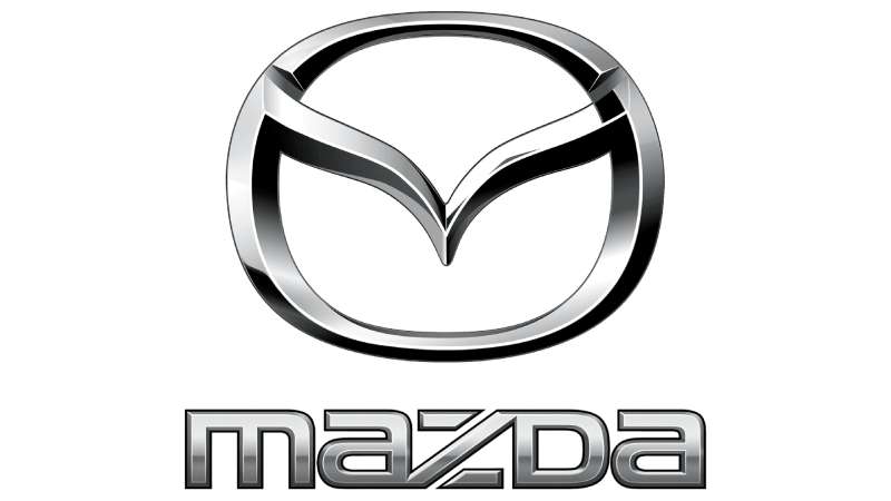
The Mazda logo is a stylized letter “M” designed to resemble wings or a bird in flight. Introduced in 1997, this emblem was created by Rei Yoshimara. It symbolizes Mazda’s vision of spreading wings toward the future while honoring the Zoroastrian god Ahura Mazda.
Design Type: Combination mark (symbol with wordmark)
Primary Elements:
- Stylized “M” wing symbol
- Oval frame surrounding the wings
- “MAZDA” wordmark (used separately or together)
Official Introduction Date: June 1997
Designer: Rei Yoshimara (Mazda in-house design team)
Trademark Status: Registered trademark of Mazda Motor Corporation globally
Color Palette:
- Primary Silver/Chrome: #C0C0C0
- Black: #000000
- Mazda Soul Red (brand color): #910A1C
Usage Context: Vehicle grilles, steering wheels, key fobs, dealership signage, marketing materials, digital platforms, and merchandise
How Has the Mazda Logo Evolved Over Time?
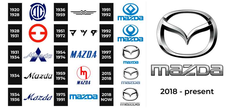
Mazda’s visual identity has gone through dramatic shifts since the 1930s. The brand started with simple text-based marks before moving to more abstract and symbolic designs.
Each redesign reflected changes in company direction, market positioning, and design trends of the era.
Original Mazda Logo (1934-1936)
Years Active: 1934-1936
Design Description: The first Mazda logo featured a stylized “Mazda” wordmark with three stacked lines forming an abstract “M” shape above the text. The design was angular and industrial.
Color Scheme: Black and white
Designer: Unknown (internal design)
Context: Introduced when the company transitioned from Toyo Kogyo to using the Mazda brand name for its three-wheeled trucks.
Cultural Significance: Marked the birth of the Mazda brand identity, named after both founder Jujiro Matsuda and the Zoroastrian god of wisdom.
Triple Mountain Logo (1936-1959)
Years Active: 1936-1959
Design Description: Three triangular shapes representing mountains, with “MAZDA” text below. The peaks symbolized Hiroshima’s mountainous landscape.
Color Scheme: Blue and white
Key Changes from Previous: Shifted from abstract letterforms to geographic symbolism. The design was cleaner and more memorable.
Cultural Significance: Connected the brand to its Hiroshima roots during a period of Japanese industrial growth.
Stylized “M” Era (1959-1975)
Years Active: 1959-1975
Design Description: A bold, angular “M” with upward-pointing peaks. This version introduced the concept of movement and aspiration.
Color Scheme: Red and silver
Context: Coincided with Mazda’s expansion into passenger car production and international markets.
Key Changes from Previous: Abandoned the mountain imagery for a more automotive-focused lettermark.
Corporate Wordmark Period (1975-1991)
Years Active: 1975-1991
Design Description: Clean, sans-serif “MAZDA” wordmark without additional symbols. Stark and corporate in appearance.
Color Scheme: Blue (later red)
Context: Reflected the minimalist corporate identity trends of the late 1970s and 1980s.
Key Changes from Previous: Removed all symbolic elements. Pure typography took center stage.
Cultural Significance: Represented Mazda’s maturation as a global automotive manufacturer.
Diamond Emblem (1991-1992)
Years Active: 1991-1992
Design Description: A circular emblem containing a diamond shape with a stylized flame or sun motif inside.
Color Scheme: Silver and blue
Context: Brief transitional logo during a period of corporate restructuring.
Key Changes from Previous: Reintroduced symbolic imagery after 16 years of wordmark-only branding.
Oval Wing Emblem (1992-1997)
Years Active: 1992-1997
Design Description: Circular design with a simplified wing-like shape inside. Early precursor to the current logo concept.
Color Scheme: Silver with dark blue accents
Key Changes from Previous: Introduced the wing motif that would define future designs.
Current Mazda Logo (1997-Present)
Years Active: 1997-Present
Design Description: Stylized “M” resembling wings or a bird with outstretched feathers, enclosed in an oval frame.
Color Scheme: Silver/chrome with black or body-color backgrounds
Designer: Rei Yoshimara
Context: Created to represent Mazda’s “brand symbol for the new millennium” and Kodo design philosophy.
Key Changes from Previous: Refined the wing concept into a more elegant, three-dimensional form. The “V” shape within the “M” represents spreading wings.
Cultural Significance: Embodies the Japanese concept of constant improvement and the brand’s commitment to driving pleasure.
What Do the Design Elements of the Mazda Logo Mean?
The current Mazda logo carries multiple layers of meaning. The winged “M” represents flight, freedom, and forward motion.
Its shape also suggests a bird spreading its wings, connecting to themes of creativity and soaring ambition.
What Does the Wing Shape Symbolize?
The wing shape represents Mazda’s desire to fly into the future. It shows growth, evolution, and the pursuit of higher goals.
The stretched V-shape within the wings suggests a flame or a bird taking flight. This connects to the Zoroastrian origins of the name Mazda.
Ahura Mazda was the god of light and wisdom in ancient Persian religion. The fire motif hidden in the design honors this spiritual connection.
Why Did Mazda Choose These Specific Colors?
Silver/Chrome
- Hex: #C0C0C0
- Symbolic meaning: Precision, technology, and quality
- Psychological impact: Conveys sophistication and modernity
- Brand connection: Reflects the metallic nature of automobiles and premium craftsmanship
Mazda Soul Red Crystal
- Hex: #910A1C
- Symbolic meaning: Passion, energy, and excitement
- Psychological impact: Creates emotional connection and excitement
- Brand connection: Signature Mazda color representing the brand’s focus on driving enjoyment
Black
- Hex: #000000
- Symbolic meaning: Elegance, power, and timelessness
- Psychological impact: Projects authority and luxury
- Brand connection: Used as background color to make the chrome emblem stand out
Understanding color psychology explains why these choices resonate with car buyers.
What Typography Style Is Used in the Mazda Logo?
The MAZDA wordmark uses a custom sans-serif font designed specifically for the brand. The letters are bold, clean, and slightly condensed.
Each character has subtle curves that soften the overall appearance. The “A” letters feature slightly angled crossbars for added personality.
Readability was a priority. The typeface works well at any size, from tiny key fobs to massive dealership signs.
What Are the Hidden Meanings in the Mazda Logo?
Look closely at the center of the “M” wings. You will see what appears to be a flame or a rising sun.
This references Ahura Mazda, the deity of light and wisdom. The flame represents enlightenment and the company’s commitment to innovation.
Some people see a tulip shape in the design. Others notice an owl (Mazda’s earlier mascot). These interpretations show how the psychology of shapes influences perception.
Designer Rei Yoshimara stated the logo represents “a company that is determined and sincere in its pursuit of the ideal.”
How Does the Mazda Logo Compare to Competitor Logos?
Among Japanese automakers, Mazda’s winged emblem stands apart from the corporate simplicity of competitors. Toyota’s overlapping ovals feel more conservative.
Honda’s bold “H” is straightforward and industrial.
Nissan’s recent redesign went flat and minimal. Mazda kept dimensional depth in its chrome emblem.
German competitors like BMW and Audi use geometric precision. Mazda’s organic wing shape offers a warmer, more emotional alternative.
Compared to luxury brands like Lexus or Acura, Mazda’s logo has similar sophistication without feeling cold or detached.
The wing motif puts Mazda in conversation with Bentley and Aston Martin, brands that also use wings. But Mazda’s interpretation is more abstract and modern.
What Are the Technical Specifications of the Mazda Logo?
Official Color Codes:
Primary Silver
Mazda Soul Red Crystal
- Hex: #910A1C
- RGB: (145, 10, 28)
- CMYK: (0, 93, 81, 43)
- Pantone: 187 C (approximate)
Black
- Hex: #000000
- RGB: (0, 0, 0)
- CMYK: (0, 0, 0, 100)
- Pantone: Black C
Dimensions and Proportions:
- Aspect ratio: Approximately 1:1 for the emblem alone
- Minimum size: 15mm width for print applications
- Clear space: Minimum padding equal to 25% of logo width on all sides
- The wordmark, when used, maintains specific spacing relative to the emblem
These specifications ensure the logo renders as crisp vector graphics across all applications.
What Cultural Impact Has the Mazda Logo Had?
The Mazda logo has become synonymous with affordable driving enjoyment. Car enthusiasts recognize the winged emblem as a mark of reliability and fun-to-drive engineering.
The MX-5 Miata, wearing this badge, became the best-selling roadster in history.
That kind of success turns a logo into a cultural symbol. It represents accessible sports car ownership for millions worldwide.
How Does the Mazda Logo Fit Into the Overall Brand Identity?

Mazda’s “Kodo: Soul of Motion” design philosophy extends from vehicles to visual identity. The logo’s dynamic wing shape mirrors the fluid lines found on every current Mazda model.
The brand’s brand guidelines ensure consistency across all touchpoints.
Soul Red Crystal paint, the signature color, appears in marketing materials alongside the silver emblem. This creates a unified look from showroom to roadway.
The logo works within a larger system. It connects to dealer signage, advertising, and even the interior design of Mazda vehicles.
How Should the Mazda Logo Be Used?
Official Usage Guidelines:
- Never stretch, rotate, or distort the logo proportions
- Maintain minimum clear space around the emblem
- Use only approved color variations (chrome, black, white, or Soul Red)
- Do not place the logo on busy or low-contrast backgrounds
- Never recreate or modify the logo manually
Where to Access Official Logos:
- Mazda’s official media portal (media.mazda.com)
- Authorized dealer marketing resources
- Official Mazda press kits
Licensing Information:
- The Mazda logo is a registered trademark
- Commercial use requires written permission from Mazda Motor Corporation
- Aftermarket products using the logo must be officially licensed
Trademark Protection:
- Registered in major markets worldwide
- Protected under international trademark law
- Unauthorized reproduction may result in legal action
FAQ on The Mazda Logo
What Does the Mazda Logo Represent?
The Mazda emblem represents wings spreading toward the future. The stylized “M” symbolizes the company’s ambition and growth.
It also references Ahura Mazda, the Zoroastrian god of wisdom and light. The design embodies motion, freedom, and continuous improvement.
Who Designed the Current Mazda Logo?
Rei Yoshimara, an in-house designer at Mazda Motor Corporation, created the current logo. He developed it in 1997.
The design emerged from Mazda’s Hiroshima headquarters. It replaced the previous oval wing emblem used since 1992.
When Was the Mazda Logo First Introduced?
The first Mazda brand mark appeared in 1934. That original design featured angular lines forming an abstract “M” shape.
The current winged version launched in June 1997. It has remained unchanged for over 25 years now.
Why Does the Mazda Logo Have a Wing Shape?
Wings represent flight and forward progress. Mazda wanted a symbol showing ambition and the drive to reach new heights.
The shape follows key logo design principles by creating a memorable focal point. It suggests speed without being literal about it.
What Colors Are Used in the Mazda Logo?
The primary color palette includes silver, black, and Mazda Soul Red. Silver dominates the chrome vehicle badge.
Soul Red Crystal (#910A1C) appears in marketing materials. This hue became Mazda’s signature brand color.
How Many Times Has the Mazda Logo Changed?
Mazda has used seven distinct logos since 1934. The brand identity evolved from text-based marks to symbolic emblems.
Major redesigns happened in 1936, 1959, 1975, 1991, 1992, and 1997. Each version reflected changing company direction and design movements of its era.
What Is the Meaning Behind the Name Mazda?
The name honors founder Jujiro Matsuda. It also references Ahura Mazda, the ancient Persian god of light and wisdom.
This dual meaning connects Japanese automotive heritage with universal themes. Pretty clever storytelling for a car company, honestly.
Is the Mazda Logo Trademarked?
Yes. The Mazda symbol is a registered trademark worldwide. Mazda Motor Corporation actively protects its brand identity.
Unauthorized commercial use can result in legal action. Even aftermarket parts using the badge need official licensing approval.
What Font Does Mazda Use in Its Logo?
Mazda uses a custom font designed specifically for the brand. The letters are bold and slightly condensed with subtle curves.
Good kerning keeps the wordmark balanced. The typography works at any scale from key fobs to billboards.
Where Can I Download the Official Mazda Logo?
Official Mazda logos are available through media.mazda.com. The press portal offers high-resolution files for journalists and partners.
Dealers access brand assets through internal marketing platforms. Random downloads from the internet often have incorrect colors or poor DPI quality.
Conclusion
The Mazda Logo tells a story of transformation. From simple text marks in 1934 to the iconic winged emblem we see today, the brand identity has always reflected the company’s ambitions.
That stylized “M” captures movement and aspiration in a single shape. Few automotive emblems achieve this level of unity between form and meaning.
The connection to Ahura Mazda adds depth. The Kodo design philosophy adds purpose.
Whether on a Mazda3 grille or a CX-5 steering wheel, this symbol works. It has earned its place among respected automotive logos worldwide.

Renowned for his expertise in logo design and visual branding, Bogdan has developed a multitude of logos for various clients.
His skills extend to creating posters, vector illustrations, business cards, and brochures. Additionally, Bogdan's UI kits were featured on marketplaces like Visual Hierarchy and UI8.
He also wrote in the past years on sites like Design Your Way, WebDesignerDepot, WPDean, Designmodo, Speckyboy, Slider Revolution, and more.
- The Cursor Logo History, Colors, Font, And Meaning - 24 September 2026
- Top 7 Web Design Subscription Services That Replace Full-Time Hires - 24 September 2026
- Canva vs PowerPoint: Which Is Better for Presentations? - 22 September 2026

Bogdan Sandu is a seasoned designer who has been designing websites since 2008. Renowned for his expertise in logo design and visual branding, Bogdan has developed a multitude of logos for various clients. His skills extend to creating posters, vector illustrations, business cards, and brochures. Additionally, Bogdan's UI kits were featured on marketplaces like Visual Hierarchy and UI8. He also wrote in the past years on sites like Design Your Way, WebDesignerDepot, WPDean, Designmodo, Speckyboy, Slider Revolution, and more.
You Might Also Like