The General Motors corporate emblem represents one of America’s largest automotive manufacturers.
Founded in 1908 by William Crapo Durant, GM has maintained brand recognition through strategic logo evolution. The current design, introduced in January 2021, marks only the fifth major redesign in the company’s 113-year history.
This blue square badge with lowercase lettering serves as the parent company identity for Chevrolet, Cadillac, Buick, and GMC divisions.
What is the General Motors Logo?

The GM logo is a lowercase “gm” wordmark set within a rounded square frame featuring a blue gradient background, officially introduced on January 8, 2021, designed by Bianca Iacopelli to represent the automaker’s transition to electric vehicles, with the “m” visually resembling an electric plug.
Design Type: Combination mark (wordmark with geometric frame)
Primary Elements:
- Lowercase “gm” lettering in white
- Rounded square frame
- Blue gradient background (light to dark)
- Underline beneath the “m” only
Official Introduction Date: January 8, 2021 (current version)
Designer: Bianca Iacopelli, GM graphic designer
Trademark Status: Registered trademark of General Motors Company
Color Palette:
- Dark Cornflower Blue: #194390
- Blue-Gray: #5C93CC
- White: #FFFFFF
- Dark Sky Blue: #86C1E2
- Navy Blue: #000082
Usage Context: Corporate communications, digital platforms, marketing materials, “Everybody In” EV campaign
How Has the General Motors Logo Evolved Over Time?

General Motors has undergone five distinct logo iterations since 1908, with the 2021 redesign representing the first substantial change since 1964, transitioning from uppercase to lowercase lettering and incorporating electric vehicle symbolism through the plug-shaped “m.”
Original General Motors Certificate (1908-1938)
Years Active: 1908-1938
Design Description: Certificate of Incorporation document used as corporate identifier
Color Scheme: Black text on white background
Context: Created immediately after company foundation by William Durant
Key Features: Full company name with Gothic typeface, legal document format
Cultural Significance: Reflected early 20th century business formality
First True Logo (1938-1964)
Years Active: 1938-1964
Design Description: Vertical rectangular badge divided into two sections
Color Scheme: Black and white monochrome
Designer: Unknown
Context: First actual logo design beyond documentary format
Key Changes from Previous: Shift from certificate to visual emblem, introduction of “GM” abbreviation
Cultural Significance: Established minimalist corporate identity during American industrial expansion
“Mark of Excellence” Logo (1964-2001)
Years Active: 1964-2001
Design Description: Blue square with rounded corners containing white “GM” in Helvetica
Color Scheme: Deep blue background, white lettering
Context: Debuted at GM’s Futurama Pavilion at New York World’s Fair
Key Changes from Previous: Simplified to essential elements, removed borders, introduced iconic blue square
Cultural Significance: Became one of most recognizable automotive emblems globally
Three-Dimensional Logo (2001-2010)
Years Active: 2001-2010
Design Description: Glossy, three-dimensional version with metallic effects
Color Scheme: Gradient blue with chrome highlights
Context: Introduced during period of technological advancement and digital media growth
Key Changes from Previous: Added depth, glossy finish, visible frame with ledge appearance
Cultural Significance: Reflected early 2000s design trends toward dimensional, metallic aesthetics
Refined Metallic Logo (2010-2021)
Years Active: 2010-2021
Design Description: Matte-metallic finish with shadowed lettering
Color Scheme: Even-toned matte blue with black shadows
Context: Post-bankruptcy restructuring, emphasis on core brands over corporate identity
Key Changes from Previous: Reduced glossiness, more subtle dimensionality, refined contrast
Cultural Significance: Represented “New GM” recovery and renewed focus
Current Electric Vehicle Logo (2021-Present)
Years Active: 2021-Present
Design Description: Lowercase letters with gradient blue, “m” shaped as electric plug
Color Scheme: Light-to-dark blue gradient
Designer: Bianca Iacopelli
Context: Announced alongside $27 billion EV investment and 30 new electric models by 2025
Key Changes from Previous: Lowercase typography, brighter sky blue tones, plug symbolism in “m”
Cultural Significance: Signals industry shift toward electrification and sustainable transportation
What Do the Design Elements of the GM Logo Mean?
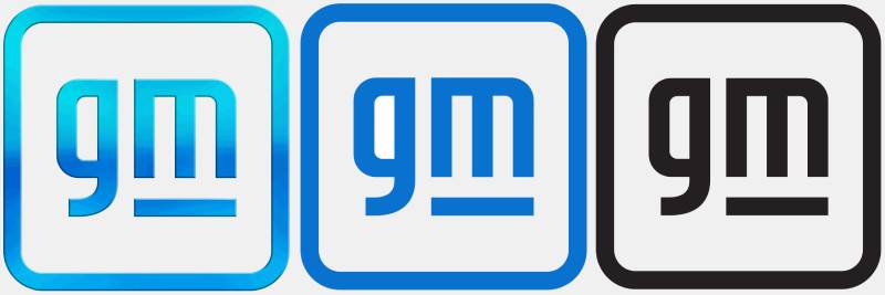
The lowercase “gm” lettering represents accessibility and approachability, departing from corporate formality, while the “m” character doubles as an electric plug symbol to communicate the company’s $27 billion commitment to electric vehicle production.
The rounded square frame creates button-like digital interface aesthetics. This reflects modern technology platforms and touchscreen interactions.
The blue gradient symbolizes sky, atmosphere, and clean air. These associations connect to zero-emissions vehicle development.
Why Did General Motors Choose These Specific Colors?
Primary Blue (#194390):
- Represents trust and reliability in automotive manufacturing
- Conveys corporate professionalism and expertise
- Creates strong contrast with white lettering
Sky Blue (#86C1E2):
- Symbolizes clean air and environmental responsibility
- References electric power through bright, energetic tone
- Connects to “sky’s the limit” innovation messaging
White (#FFFFFF):
- Provides maximum legibility and clarity
- Represents purity and forward-thinking transparency
- Ensures accessibility across digital and print media
Understanding color theory helps explain why blue dominates automotive branding. The color psychology research shows blue conveys dependability, which matters significantly in vehicle purchasing decisions.
What Typography Style Is Used in the GM Logo?
The 2021 logo uses custom sans-serif font with heavy weight and futuristic contours.
Closest commercial fonts include Venus Envy Regular and Deportivo Regular with modifications. The lowercase choice creates casual, personal impression compared to traditional corporate uppercase.
Bold letterforms ensure readability at small sizes. This matters for digital applications and vehicle badges.
What Are the Hidden Meanings in the GM Logo?
The “m” character subtly forms an electrical outlet or plug shape. This design intentionally references charging infrastructure for battery-electric vehicles.
The rounded square mimics app icons and digital buttons. This positions GM as technology company rather than traditional automaker.
Designer Bianca Iacopelli stated the brighter blue represents optimism and future possibilities. The gradient creates sense of movement and progress.
How Does the GM Logo Compare to Competitor Logos?

The GM emblem adopts minimalist geometric approach while Ford logo maintains classic blue oval with script lettering since 1927, and Toyota logo features three overlapping ellipses representing customer-company relationships.
Minimalism Scale:
GM emphasizes simplicity with two letters and basic square. Chevrolet logo (GM division) maintains iconic bowtie shape. Ford logo balances script with oval geometry.
Color Strategies:
Most American automakers use blue for trust association. Toyota logo employs silver and black. European luxury brands like BMW prefer circular badges.
Digital Adaptation:
GM’s button-like square translates effectively to mobile interfaces. Traditional ornate emblems struggle at small digital sizes.
Electric Vehicle Messaging:
Only GM incorporates EV symbolism directly into corporate identity. Tesla avoids conventional automotive badge styling entirely.
What Are the Technical Specifications of the GM Logo?
Official Color Codes:
- Primary Blue: Dark Cornflower Blue
- Hex: #194390
- RGB: (25, 67, 144)
- CMYK: (83, 54, 0, 44)
- Secondary Blue: Blue-Gray
- Hex: #5C93CC
- RGB: (92, 147, 204)
- CMYK: (55, 28, 0, 20)
- Tertiary Blue: Dark Sky Blue
- Hex: #86C1E2
- RGB: (134, 193, 226)
- CMYK: (41, 15, 0, 11)
- White: #FFFFFF
- RGB: (255, 255, 255)
- CMYK: (0, 0, 0, 0)
Dimensions and Proportions:
- Aspect ratio: 1:1 square format
- Rounded corners: Consistent radius across all four corners
- Letter spacing: Custom kerning between “g” and “m”
- Underline width: Matches lowercase “m” width exactly
Clear Space Specifications:
Minimum clear space equals height of lowercase “m” on all sides. This prevents visual clutter and maintains brand integrity.
Minimum Size Requirements:
Digital: 24 pixels minimum height Print: 0.5 inches minimum height
File Formats:
Vector graphics (.SVG, .AI, .EPS) for scalability Raster formats (PNG, JPEG) at minimum 300 DPI for print
What Cultural Impact Has the GM Logo Had?
The “Mark of Excellence” version (1964-2021) became synonymous with American automotive manufacturing during its 57-year run, appearing on millions of vehicles and establishing blue square as recognizable symbol of domestic car production during industry dominance period.
The 2021 redesign generated significant media coverage as first major automotive company to embed EV messaging in corporate identity. This sparked industry conversation about brand evolution versus heritage preservation.
Lowercase typography choice reflected broader cultural shift toward casual, accessible corporate communication. Traditional all-caps formality gave way to approachable design language.
The logo participated in Super Bowl advertising campaigns and high-profile marketing initiatives. These increased general public awareness beyond automotive enthusiasts.
How Does the GM Logo Fit Into The Overall Brand Identity?

The parent company logo operates as umbrella identity above division-specific brands like Chevrolet, Cadillac, GMC, and Buick, each maintaining distinct visual identities while GM corporate mark appears primarily in business communications, investor relations, and institutional messaging.
After 2009 bankruptcy reorganization, GM reduced corporate logo prominence on vehicles. The company emphasized individual brand identities over parent company.
“Everybody In” campaign language reinforces inclusive positioning. This aligns with broader corporate values beyond product offerings.
Brand guidelines specify when to use corporate GM mark versus division logos. This maintains clear hierarchy and prevents brand confusion.
The Ultium electric vehicle platform receives its own distinct branding. This creates sub-brand architecture within GM ecosystem.
How Should the GM Logo Be Used?
Official Usage Guidelines:
- Never alter proportions or stretch logo
- Maintain specified clear space around emblem
- Do not add effects, shadows, or outlines
- Use only approved color variations
- Never recreate or redraw logo manually
Approved Color Variations:
- Full color (gradient blue)
- Solid blue
- Black
- White (for dark backgrounds)
Where to Access Official Logos:
Official GM media site provides approved logo files. Brand partners receive access through authorized channels.
Licensing Information:
GM logo is registered trademark. Unauthorized commercial use requires written permission from General Motors Company.
Trademark Protection:
The GM emblem, “Mark of Excellence” phrase, and related branding receive federal trademark protection. Enforcement protects brand equity and prevents consumer confusion.
Do’s:
- Use current logo version for contemporary materials
- Maintain proper clear space
- Select appropriate color variation for background
- Scale proportionally
- Place on clean, uncluttered backgrounds
Don’ts:
- Mix old and new logo versions
- Place on busy photographic backgrounds
- Alter colors or add gradients beyond approved versions
- Rotate or distort
- Combine with competitor branding
FAQ About the GM Logo
When was the GM logo created?
The original General Motors identifier appeared in 1908 as a Certificate of Incorporation, but the first true logo design debuted in 1938 with the classic blue square “Mark of Excellence” version introduced in 1964.
Who designed the GM logo?
Bianca Iacopelli, a 29-year-old GM graphic designer from an artistic family, created the current 2021 logo design, while previous versions had designers whose names were not publicly documented.
What do the colors in the GM logo mean?
The blue gradient represents trust, professionalism, clean air, and electric power, with darker shades conveying reliability and lighter sky blue tones symbolizing environmental responsibility and innovation in zero-emissions vehicle development.
How many times has the GM logo been redesigned?
General Motors has undergone five major logo redesigns since 1908, with significant changes in 1938, 1964, 2001, 2010, and 2021, making the current version only the fifth substantial update in 113 years.
Where can I download the official GM logo?
Official GM logo files are available through the General Motors media website for authorized press and media use, with brand partners receiving assets through official corporate channels and licensing agreements.
Is the GM logo trademarked?
Yes, the GM logo is a registered trademark of General Motors Company, protected under federal trademark law, with unauthorized commercial use requiring written permission from the corporation to prevent infringement and brand dilution.
What font is used in the GM logo?
The 2021 logo employs a custom heavy-weight sans-serif font with futuristic contours, resembling Venus Envy Regular or Deportivo Regular with modifications, while the 1964-2021 version used Helvetica typeface.
Why did General Motors choose an electric plug for their logo?
The plug-shaped “m” symbolizes GM’s commitment to electric vehicle production, coinciding with announcement of 30 new EV models by 2025 and $27 billion investment in electrification as part of “Everybody In” campaign.
Conclusion
The General Motors logo evolution reflects American automotive industry transformation from industrial powerhouse to technology-focused electric vehicle manufacturer.
Current design attributes include lowercase accessibility, electric plug symbolism, gradient blue environmental messaging, and digital-friendly square format. These elements position GM as forward-thinking mobility company rather than traditional automaker.
Within automotive branding landscape, the 2021 redesign represents bold departure from heritage-focused approaches. While competitors maintain classic emblems, GM prioritized future messaging over historical continuity.
The shift toward electric vehicle symbolism signals industry-wide transformation. As other manufacturers develop EV portfolios, GM’s proactive brand positioning may influence broader automotive identity trends.

Renowned for his expertise in logo design and visual branding, Bogdan has developed a multitude of logos for various clients.
His skills extend to creating posters, vector illustrations, business cards, and brochures. Additionally, Bogdan's UI kits were featured on marketplaces like Visual Hierarchy and UI8.
He also wrote in the past years on sites like Design Your Way, WebDesignerDepot, WPDean, Designmodo, Speckyboy, Slider Revolution, and more.
- The Windsurf Logo History, Colors, Font, And Meaning - 10 October 2026
- How to Remove Background From Product Photos (No Photoshop) - 10 October 2026
- How Designers can Build a Stronger Online Creative Identity - 9 October 2026

Bogdan Sandu is a seasoned designer who has been designing websites since 2008. Renowned for his expertise in logo design and visual branding, Bogdan has developed a multitude of logos for various clients. His skills extend to creating posters, vector illustrations, business cards, and brochures. Additionally, Bogdan's UI kits were featured on marketplaces like Visual Hierarchy and UI8. He also wrote in the past years on sites like Design Your Way, WebDesignerDepot, WPDean, Designmodo, Speckyboy, Slider Revolution, and more.
You Might Also Like