


The Northern Trust logo is one of the most recognized marks in institutional banking. It pairs an anchor symbol with custom serif lettering, all rendered in a deep blue-green tone that signals financial stability and premium service.
Northern Trust Corporation has been operating out of Chicago since 1889. That makes it one of the oldest banks still running in the United States. The company manages trillions in assets for ultra-high-net-worth individuals, families, and big institutions worldwide.
Its visual identity has gone through a handful of changes over the decades, but the core look has stayed remarkably consistent. The anchor icon, which first appeared around 1940, became the foundation that every future redesign built on. VSA Partners handled the most recent rebrand, modernizing the mark while keeping that historic equity intact.
The company has had roughly four to five major logo versions across its 130-plus year history.
What Is the Northern Trust Logo?
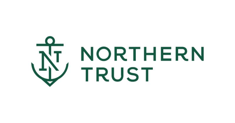
The Northern Trust logo is a combination mark featuring a stylized anchor symbol paired with the company name set in a neoclassical serif typeface. VSA Partners redesigned it as part of the “Achieve Greater” brand platform. The anchor represents strength and stability. The deep blue-green color signals trust and quality in financial services.
Design Breakdown
Design Type: Combination mark (symbol plus wordmark)
Primary Elements: A simplified anchor icon sits alongside the “Northern Trust” wordmark. The anchor uses unified line weights and clean geometry. The text is set in a neoclassical serif face closely matching ITC Modern No. 216 Medium, designed by Edward Benguiat.
Official Introduction Date: The current version launched around 2015-2016 as part of VSA Partners’ comprehensive rebrand.
Designer/Agency: VSA Partners, a Chicago-based strategy and design agency. They developed the full brand identity including the logo, messaging, and visual expression system.
Trademark Status: The logo is a registered trademark of Northern Trust Corporation, incorporated in Delaware. It is protected under U.S. trademark law.
Color Palette: The primary brand color is a blue-green (#115740). Secondary colors include white (#FFFFFF) and black (#000000) for supporting applications.
Usage Context: The logo appears on corporate communications, wealth management materials, digital banking platforms, mobile apps, event sponsorships (including PGA Tour golf tournaments), and office signage across more than 20 countries.
How Has the Northern Trust Logo Evolved Over Time?
Northern Trust’s visual identity started with plain text in the late 1800s and slowly added the anchor mark by the mid-20th century.
Each redesign refined the look without throwing out what came before. The most dramatic shift was the VSA Partners update, which stripped away old complexity while keeping the anchor front and center.
Original Northern Trust Logo (1889-1930s)
Years Active: 1889 through the 1930s
Design Description: Simple text-based branding. The company name appeared in traditional serif lettering, which was standard for Chicago’s financial district at the time. No graphic symbol. Just words.
Color Scheme: Black text on white, occasionally rendered in dark blue for formal documents.
Context: Northern Trust was founded by Byron Laflin Smith in 1889. Early branding was functional, not strategic. Banks in that era did not think about logos the way they do now. The text-only approach matched the conservative banking culture of the period.
Cultural Significance: It represented old-money Chicago banking. Clean, serious, no frills.
Introduction of the Anchor Mark (1940s-1960s)
Years Active: Approximately 1940 through the 1960s
Design Description: The anchor symbol entered the brand around 1940. It featured more ornate detailing, with thicker line work and traditional serif typefaces for the company name.
Color Scheme: Dark blue and black remained dominant.
Key Changes from Previous: This was the big one. Going from text-only to an anchor icon gave the brand a visual symbol people could actually remember. The anchor communicated maritime-inspired ideas of stability and security.
Cultural Significance: It built strong equity fast. Clients and employees came to associate the anchor with the institution’s reliability. That association stuck for the next 75-plus years.
Modernization Phase (1960s-2000s)
Years Active: 1960s through the early 2010s
Design Description: Designers streamlined the visual identity over several decades. The anchor got cleaner. The typography was updated to better match changing expectations in private banking. Details were simplified to work better in smaller sizes.
Color Scheme: A shift toward the now-signature blue-green. The palette became more refined and consistent across materials.
Key Changes from Previous: Reduced ornamental details on the anchor. Tighter spacing between elements. Better readability at small sizes for things like business cards and early digital screens.
Context: Northern Trust expanded globally during this period. The brand needed to work across cultures and continents, not just in downtown Chicago.
Current Northern Trust Logo (2015-Present)
Years Active: 2015/2016 to present
Design Description: VSA Partners removed unnecessary complexity from the anchor, unified line weights throughout the mark, and aligned the icon with custom letterforms. The result looks polished but not sterile.
Designer: VSA Partners (Chicago, New York, San Francisco)
Color Scheme: Blue-green (#115740) as the sole primary color, supported by white and black.
Key Changes from Previous: Simplified anchor geometry. Custom letterforms that mirror the visual character of the symbol itself. Everything feels more cohesive now. The “Achieve Greater” brand platform gave the visual update a strategic backbone.
Cultural Significance: It positioned Northern Trust as forward-looking while honoring its heritage. The brand could speak to a new generation of wealthy clients without alienating existing ones.
What Do the Design Elements of the Northern Trust Logo Mean?

The anchor is the whole story. It ties Northern Trust’s identity to ideas of security, grounding, and permanence.
These are not accidental associations. Financial institutions choose anchor imagery because it tells clients their money is safe. The clean geometry of the current version adds a modern layer of precision and care.
Why Did Northern Trust Choose These Specific Colors?
The primary brand color is blue-green, sometimes called “Eden.”
Hex: #115740. RGB: (17, 87, 64). CMYK: (80%, 0%, 26%, 66%). Pantone: PMS 343 C.
This specific hue sits between blue and green on the color wheel. Blue carries associations of trust and dependability. Green signals growth and prosperity. Combining them creates a tone that says “your money will grow safely here” without actually saying it.
According to color psychology research, blue-green tones produce calming effects while maintaining a sense of authority. That is exactly the emotional territory a wealth management firm wants to occupy.
The limited color palette (just one primary color plus black and white) is deliberate. Fewer colors mean stronger recall. You see that blue-green, you think Northern Trust. Period.
What Typography Style Is Used in the Northern Trust Logo?
The font closely resembles ITC Modern No. 216 Medium, a neoclassical typeface by Edward Benguiat.
It has high contrast between thick and thin strokes, which gives it an elegant look without feeling outdated. The serifs are refined, not heavy. That matters because chunky serifs can read as old-fashioned, while thin ones feel sophisticated.
VSA Partners aligned the custom letterforms with the anchor symbol’s visual weight. So the text and icon feel like they belong together, not like two separate pieces forced into the same space. Good kerning keeps the letters evenly spaced at any size.
What Are the Hidden Meanings in the Northern Trust Logo?
The anchor is the obvious symbol, but its simplification tells a subtler story. Older versions had more decorative detail, which communicated tradition and formality.
The current streamlined version says “we have that same history, but we are not stuck in it.” That shift was intentional. VSA Partners researched how clients and prospects perceived the brand before touching anything. They found the anchor had strong equity, so they kept it but made it feel contemporary.
There is no secret image hidden in the negative space or anything like that. The meaning lives in the choices: one color, one symbol, one typeface. Restraint is the message.
How Does the Northern Trust Logo Compare to Competitor Logos?

Most large financial institutions use blue. Think about it. JPMorgan Chase, Goldman Sachs, Bank of America, Citi. The blue wave in bank logos is overwhelming.
Northern Trust sidesteps this by going blue-green instead of straight blue. It is a small difference on paper but a noticeable one in practice. When every competitor looks navy or royal blue, that green undertone makes Northern Trust stand out.
The anchor symbol also sets it apart. Most competitors use abstract geometric marks or simple wordmarks. Northern Trust’s anchor is figurative and specific. You look at it and immediately get what it means. Compare that to, say, the Morningstar logo or the SoFi logo, which use more abstract approaches to communicate their brand values.
Other financial firms like Northwestern Mutual also lean into traditional branding, but Northern Trust’s combination of heritage symbol and modern execution gives it a distinct position. It reads as both established and current, which is tricky to pull off.
What Are the Technical Specifications of the Northern Trust Logo?
Official Color Codes
Primary Color: Blue-Green (Eden)
- Hex: #115740
- RGB: (17, 87, 64)
- CMYK: (80%, 0%, 26%, 66%)
- Pantone: PMS 343 C
Secondary Color: White
- Hex: #FFFFFF
- RGB: (255, 255, 255)
- CMYK: (0%, 0%, 0%, 0%)
Tertiary Color: Black
- Hex: #000000
- RGB: (0, 0, 0)
- CMYK: (0%, 0%, 0%, 100%)
Dimensions and Proportions
The logo uses a horizontal lockup where the anchor sits to the left of the wordmark. Northern Trust’s brand guidelines dictate clear space equal to at least the height of the anchor symbol on all sides.
Minimum size requirements exist to prevent the anchor’s details from becoming unreadable. For print applications, this is typically around 1 inch wide for the full lockup. Digital minimums adjust based on pixel density and screen resolution.
The logo is distributed in vector formats (SVG, EPS, AI) for scalability and in raster formats (PNG, JPEG) for everyday use. Vector files let the mark scale from a favicon to a building sign without losing sharpness.
What Cultural Impact Has the Northern Trust Logo Had?
Northern Trust’s logo gets seen a lot in the golf world. The company sponsors PGA Tour events, and that anchor symbol shows up on leaderboards, course signage, and broadcast graphics watched by millions.
That consistent visibility in a sport associated with affluence reinforces the brand’s positioning. You are not going to see this logo at a monster truck rally. The placement is deliberate and targeted.
Within financial services, the logo’s longevity is its own form of cultural impact. While fintech startups rebrand every few years, Northern Trust has maintained visual continuity for decades. That consistency says something to clients who plan in generations, not quarters.
How Does the Northern Trust Logo Fit Into the Overall Brand Identity?

The logo is the anchor (pun intended) of a broader brand style guide that covers everything from digital experiences to printed collateral.
Northern Trust’s design team builds on a component library that scales across the entire organization. They score 100 percent on the Disability Equality Index, so accessibility is built into their visual system from the ground up.
The “Achieve Greater” brand platform connects the logo to messaging, campaign work, and client experiences. The visual identity does not exist in isolation. It is tied to a value proposition about helping clients do more with their wealth.
The blue-green tone runs through everything: the website, presentations, office interiors, event branding. That unity across touchpoints builds the kind of repetition that makes brands stick in people’s minds.
How Should the Northern Trust Logo Be Used?
Usage Guidelines
Do:
- Use the logo in its approved color configurations (blue-green on white, white on blue-green, black for single-color applications)
- Maintain the required clear space around the mark
- Download official files from Northern Trust’s internal brand portal
- Follow minimum size requirements to keep the anchor readable
Don’t:
- Stretch, rotate, or distort the logo
- Change the colors to anything outside the approved palette
- Place the logo on busy backgrounds that reduce legibility
- Separate the anchor from the wordmark unless the guidelines explicitly allow it
- Add effects like drop shadows, outlines, or gradients
Accessing Official Logos
Northern Trust distributes approved logo files through internal brand portals to employees and authorized partners. External parties typically need written permission to use the mark.
Trademark Protection
The Northern Trust name and logo are registered trademarks. Unauthorized use, modification, or reproduction can result in legal action. This includes using the logo in ways that imply endorsement or partnership where none exists.
If you need to reference the Northern Trust brand in editorial or informational contexts, standard trademark fair use rules apply. But slapping their anchor on your product? That is a different conversation, and you will want a lawyer for it.
FAQ on The Northern Trust Logo
What does the Northern Trust logo look like?
The Northern Trust logo is a combination mark. It pairs a stylized anchor symbol with the company name in a neoclassical serif typeface.
The whole thing is rendered in a single blue-green color (#115740). Clean, simple, and built for recognition across digital and print formats.
What color is the Northern Trust logo?
The official brand color is a blue-green with hex code #115740 and Pantone PMS 343 C. It blends trust-associated blue with growth-associated green.
Northern Trust uses this single hue to represent quality and financial stability across all corporate materials.
Who designed the current Northern Trust logo?
VSA Partners, a Chicago-based strategy and design agency, handled the redesign. They modernized the anchor by simplifying its geometry and unifying line weights.
The project was part of the broader “Achieve Greater” brand platform that updated messaging and visual identity together.
What font is used in the Northern Trust logo?
The typeface closely resembles ITC Modern No. 216 Medium. Edward Benguiat designed that neoclassical serif face.
It has high contrast between thick and thin strokes. That gives the wordmark an elegant, authoritative feel that fits a wealth management institution.
What does the anchor symbol in the Northern Trust logo mean?
The anchor has represented the brand since around 1940. It communicates strength, stability, and security.
For a company managing trillions in assets, those associations matter. The anchor tells clients their money is grounded somewhere safe and dependable.
When was Northern Trust founded?
Northern Trust Corporation launched in 1889 in Chicago, Illinois. Byron Laflin Smith founded it as a trust bank serving high-net-worth individuals.
It remains headquartered at 50 South La Salle Street. The company now operates in over 20 countries with more than 24,000 employees.
Can I download the Northern Trust logo?
Official logo files are distributed through Northern Trust’s internal brand portal. Employees and authorized partners get access to approved vector graphics and raster versions.
Third-party sites offer downloads, but using the trademark without permission carries legal risk. Always check brand guidelines first.
How has the Northern Trust logo changed over time?
It started as plain text in 1889. The anchor appeared around 1940. Several refinements followed through the mid-20th century.
VSA Partners did the most recent overhaul around 2015-2016, stripping away complexity while preserving the anchor’s heritage and brand recognition.
What file formats is the Northern Trust logo available in?
The logo is distributed in SVG, EPS, and AI for scalable applications. PNG and JPEG versions exist for everyday digital use.
Vector formats keep the mark sharp at any size, from mobile app icons to large-format signage and corporate event displays.
How does the Northern Trust logo compare to other bank logos?
Most financial institution logos use straight blue. Northern Trust’s blue-green sets it apart immediately.
The figurative anchor also differentiates it from competitors who rely on abstract marks or plain wordmarks. It is specific, memorable, and tied to over 80 years of visual history.
Conclusion
The Northern Trust logo works because it does not try to do too much. One anchor, one color, one typeface. That restraint is what makes it effective after 130-plus years of corporate history.
VSA Partners proved that you can modernize a brand mark without gutting its identity. The simplified anchor kept decades of built-up trust intact while making the whole system work better on screens and mobile banking apps.
Financial institutions live or die on credibility. Northern Trust’s visual hierarchy, from its blue-green saturation to its precise leading and tracking, shows what happens when every design decision serves the brand’s core promise of stability and expertise.

Renowned for his expertise in logo design and visual branding, Bogdan has developed a multitude of logos for various clients.
His skills extend to creating posters, vector illustrations, business cards, and brochures. Additionally, Bogdan's UI kits were featured on marketplaces like Visual Hierarchy and UI8.
He also wrote in the past years on sites like Design Your Way, WebDesignerDepot, WPDean, Designmodo, Speckyboy, Slider Revolution, and more.
- The Cursor Logo History, Colors, Font, And Meaning - 24 September 2026
- Top 7 Web Design Subscription Services That Replace Full-Time Hires - 24 September 2026
- Canva vs PowerPoint: Which Is Better for Presentations? - 22 September 2026

Bogdan Sandu is a seasoned designer who has been designing websites since 2008. Renowned for his expertise in logo design and visual branding, Bogdan has developed a multitude of logos for various clients. His skills extend to creating posters, vector illustrations, business cards, and brochures. Additionally, Bogdan's UI kits were featured on marketplaces like Visual Hierarchy and UI8. He also wrote in the past years on sites like Design Your Way, WebDesignerDepot, WPDean, Designmodo, Speckyboy, Slider Revolution, and more.
You Might Also Like


