


The Varo Bank logo is one of the most recognizable marks in digital banking. It carries the weight of being the first fintech company in the United States to earn a full national bank charter, and everything about its design reflects that milestone.
Founded in 2015 by Colin Walsh in San Francisco, Varo Money started as a mobile-first financial platform before officially becoming Varo Bank in 2020. The brand has gone through at least two major visual identity phases. Its current logo is a clean wordmark built around a purple color palette and modern sans-serif type, designed to stand apart from legacy banking institutions.
The company now serves millions of customers with FDIC-insured accounts, and the logo appears across its mobile app, debit cards, and all customer-facing materials. For a neobank competing against names like Chase and Wells Fargo, that visual identity does a lot of heavy lifting.
What Is the Varo Bank Logo?
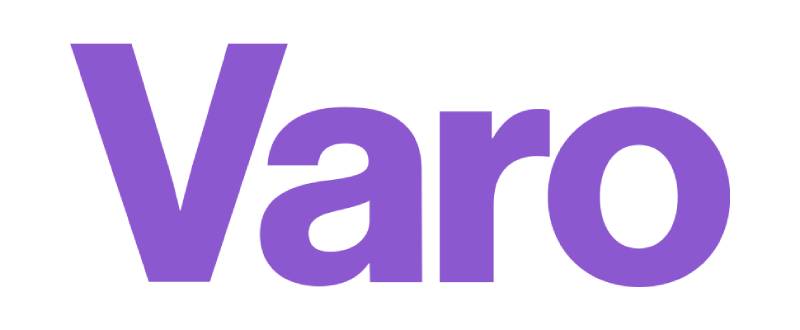
The Varo Bank logo is a sans-serif wordmark featuring the name “Varo” in a distinctive purple. It was officially updated around 2020 when the company transitioned from Varo Money to Varo Bank after the OCC granted its national charter. The typeface is Aktiv Grotesk by Dalton Maag, and the design signals trust, simplicity, and digital-first banking.
Here’s a breakdown of its core attributes:
- Design Type: Wordmark. No abstract icon, no mascot, no emblem. Just the name.
- Primary Elements: Custom-set letterforms in Aktiv Grotesk, a grotesque sans-serif font family. The letters sit with generous spacing, tuned for small-screen legibility.
- Official Introduction Date: The current version launched around August 2020, coinciding with the national bank charter approval.
- Designer/Agency: Specific agency credit is not publicly confirmed. The in-house team at Varo handled much of the brand transition work.
- Trademark Status: Registered with the USPTO as part of Varo Bank, N.A. branding.
- Color Palette: Primary purple (Amethyst, #8C58D0), with white (#FFFFFF) and dark gray/near-black (#1C1C1C) as supporting colors.
- Usage Context: Mobile banking app, debit card design, marketing campaigns, the Varo website, app store listings, ATM interfaces, and regulatory documentation.
How Has the Varo Bank Logo Evolved Over Time?

Varo’s visual identity has shifted twice in meaningful ways since the company started. The first version matched a scrappy fintech startup. The second reflected a regulated, chartered bank.
The timeline is short but significant. Most legacy banks have had decades of redesigns. Varo compressed that process into about five years.
Original Varo Money Logo (2015-2020)
Years Active: 2015 to mid-2020
When Colin Walsh launched Varo Money, the branding leaned into the fintech startup aesthetic. Think bright colors, approachable type, and a visual language that said “we’re not your parents’ bank.”
The original mark used a teal-blue color scheme, common among fintech startups at the time. It was built to work on screens first, print second.
The company partnered with The Bancorp Bank during this period, so the branding needed to feel independent even though Varo wasn’t yet a standalone bank. The logo had to communicate credibility without the regulatory backing that would come later.
At this stage, Varo was just another neobank in a crowded field. The visual identity served its purpose, but it wasn’t built to last through a charter transition.
Varo Bank Logo (2020-Present)
Years Active: 2020 to present
Everything changed on August 1, 2020. The OCC granted Varo its national bank charter, making it the first consumer fintech to reach that status. The rebrand wasn’t optional. It was required.
“Varo Money” became “Varo Bank.” And the logo needed to carry the authority that comes with being FDIC-insured and federally regulated.
The updated wordmark shifted to a purple palette, specifically an amethyst shade (#8C58D0). The typography tightened up. Aktiv Grotesk replaced whatever was there before, bringing that neutral, authoritative quality that grotesque sans-serifs are known for.
The new logo dropped any supplementary graphic elements. Pure text. That’s a bold choice for a bank, but it works because the name “Varo” is short and distinctive enough to function as its own symbol.
Key Changes from Previous: Color shift from teal-blue to purple. Name change from “Varo Money” to “Varo.” Cleaner letterforms. Removal of any accompanying graphic marks.
Cultural Significance: This version of the logo represents a turning point for fintech regulation in the U.S. When people see the Varo wordmark now, they’re looking at the first neobank that earned its own charter, not one borrowing someone else’s.
What Do the Design Elements of the Varo Bank Logo Mean?

The Varo Bank logo communicates through restraint. Every element, from the color to the letterforms, was chosen to build trust without relying on traditional banking cues like shields, columns, or serif typefaces.
The wordmark itself is the message. No hidden icons inside the letters. No clever negative space tricks. Just a name, set in a modern typeface, colored in purple.
Why Did Varo Bank Choose These Specific Colors?
Purple is unusual for a bank. Look at any collection of bank logos and you’ll see blue everywhere. Chase, Bank of America, Citi, Capital One. Blue dominates because color psychology ties it to trust and stability.
Varo went a different direction. Their primary amethyst purple (#8C58D0) sits in RGB at (140, 88, 208) and in CMYK at (33, 58, 0, 18). It’s not subtle.
Purple has long been associated with creativity and forward thinking. For a brand positioning itself as the anti-traditional-bank, that association works. It says “we’re different” before you even read the name.
The supporting colors keep things grounded. White (#FFFFFF) for backgrounds and clean space. Near-black (#1C1C1C) for text and secondary elements. That three-color system is tight, which helps with consistency across the mobile app, debit cards, and marketing.
Most fintech brands that pick purple logos are trying to differentiate from the blue-heavy banking sector. Varo just committed to it harder than most.
What Typography Style Is Used in the Varo Bank Logo?
The Varo Bank logo uses Aktiv Grotesk, a typeface designed by Dalton Maag. It’s a grotesque sans-serif with 24 styles, ranging from Hairline to Black.
The choice makes sense for a digital-first brand. Aktiv Grotesk was built to perform well at small sizes, which matters when your logo lives primarily on smartphone screens. The kerning in the Varo wordmark is generous enough to stay readable at app-icon scale without feeling loose at larger sizes.
Grotesque sans-serifs carry a specific personality: neutral, confident, modern. They don’t shout. Took me a while to appreciate how effective that restraint is for a brand that needs to feel both approachable and trustworthy at the same time.
The letter spacing in the logo creates visual breathing room. Each character sits clearly on its own while still reading as a unified word. That kind of font spacing detail is easy to overlook, but it’s what separates professional type work from something thrown together in Canva.
What Are the Hidden Meanings in the Varo Bank Logo?
Look, there aren’t really hidden meanings here, and that’s the point. The Varo logo doesn’t try to sneak in clever visual puzzles like the FedEx arrow or the Amazon smile.
What it does communicate is intentional simplicity. The four-letter word “Varo” is short, punchy, and easy to remember globally. The lack of a symbol or icon is itself a statement: we’re confident enough to let the name stand alone.
If anything is “hidden,” it’s the strategic decision to avoid every banking cliche in existence. No shield. No globe. No serif font trying to look established. That absence is the message. Varo is telling you they’re not pretending to be a hundred-year-old institution. They’re something new.
How Does the Varo Bank Logo Compare to Competitor Logos?

In the neobank space, Varo’s logo holds its own but doesn’t completely dominate visually. The competitive landscape is full of clean, modern wordmarks and it can feel like everyone got the same design brief.
Still, there are meaningful differences when you look closely.
The Chime logo uses a green color scheme with a simple wordmark, targeting a similar demographic but leaning harder into the “friendly and approachable” lane. The SoFi logo goes with a more corporate blue approach, which makes sense given their broader financial products lineup.
The Cash App logo takes a completely different approach with its bold green dollar-sign icon, prioritizing instant recognition over typographic sophistication. Meanwhile, the Robinhood logo uses a feather icon alongside its wordmark, mixing symbolism with text.
Where Varo stands out is the purple. In a sea of blues and greens, that amethyst shade catches your eye. Most tech company logos stick to safer color choices, so Varo’s willingness to break from the norm gives them an edge in raw visual differentiation.
The trade-off? Purple doesn’t carry the same automatic “trust” signal that blue does. Varo is betting that their charter status and FDIC insurance do that heavy lifting instead of color.
What Are the Technical Specifications of the Varo Bank Logo?
Official Color Codes
- Primary Color: Amethyst Purple
- Hex: #8C58D0
- RGB: (140, 88, 208)
- CMYK: (33, 58, 0, 18)
- HSL: (266, 56%, 58%)
- Secondary Color: White
- Hex: #FFFFFF
- RGB: (255, 255, 255)
- CMYK: (0, 0, 0, 0)
- Tertiary Color: Cod Gray (Near-Black)
- Hex: #1C1C1C
- RGB: (28, 28, 28)
- CMYK: (0, 0, 0, 89)
Dimensions and Proportions
The official SVG file from Wikimedia Commons lists the logo at a nominal size of 534 x 187 pixels, giving it an approximate aspect ratio of 2.85:1. That wide, horizontal format is standard for wordmark logos that need to fit inside mobile app headers and navigation bars.
Minimum size requirements aren’t publicly documented by Varo, but the logo’s clean geometry means it scales down well. At very small sizes (think 16px height for favicons), the wordmark still reads clearly because of the simple letterforms and open spacing.
Clear space around the logo should generally equal the height of the “V” in the wordmark, at minimum. This is standard practice for wordmark-based brand systems and prevents the logo from getting visually crowded by surrounding content.
For vector graphics applications, the logo is available in SVG format, which keeps it sharp at any resolution. Pixel-based versions in PNG exist at various resolutions up to 2560 x 896 for high-DPI displays.
What Cultural Impact Has the Varo Bank Logo Had?
The Varo Bank logo became a symbol for a shift in how Americans think about where they keep their money. When the OCC handed over that national charter in 2020, the Varo wordmark was suddenly on every fintech news site and financial publication.
It represented proof that a digital-only company could meet the same regulatory standards as the big banks. That’s cultural weight for a simple four-letter wordmark.
Varo’s “A bank for all of us” campaign put the logo alongside images of everyday Americans on $20 bills, tying the brand directly to financial inclusion. The purple mark became associated with a specific mission, not just a product.
In terms of design influence, Varo’s success with purple has likely encouraged other fintech startups to consider non-traditional banking colors. The days when every financial institution had to be blue to be taken seriously? Those are fading, and Varo played a part in that.
How Does the Varo Bank Logo Fit Into the Overall Brand Identity?

The logo is the anchor of a tightly controlled brand system. Every touchpoint, from the mobile app icon to the debit card, the email templates to the ATM screens, pulls from the same visual language.
The brand guidelines dictate how the purple wordmark interacts with supporting elements. The app icon uses a simplified version, sometimes just the “V” lettermark, optimized for the small square format of iOS and Android home screens.
The debit card design extends the purple palette across a physical product, which is tricky. Card manufacturers have specific printing limitations, so CMYK accuracy matters there. The card also includes the Visa logo, which creates a visual hierarchy challenge when two brands share such limited real estate.
Varo’s marketing materials lean heavily on white space and clean layouts. The logo rarely competes with busy backgrounds or complex imagery. That minimalist design approach keeps the brand feeling premium even though Varo positions itself as the affordable alternative to traditional banks.
The overall system works because everything points back to one thing: the purple wordmark. No secondary logos, no sub-brands, no distracting visual clutter. Just Varo.
How Should the Varo Bank Logo Be Used?
Varo maintains strict controls over logo usage, which makes sense for a federally regulated bank. Misuse of a bank’s logo can create legal issues around implied endorsement or affiliation.
Do’s:
- Use the official logo files from Varo’s press resources or authorized brand asset platforms
- Maintain the required clear space around the wordmark
- Keep the logo on approved background colors (white, dark, or the brand purple)
- Use vector formats (SVG, PDF) whenever possible for print and large-format applications
Don’ts:
- Don’t stretch, rotate, or distort the wordmark
- Don’t change the logo colors outside the approved palette
- Don’t place the logo on busy photographic backgrounds without proper contrast
- Don’t recreate the logo using different fonts, even if they look similar
- Don’t use outdated “Varo Money” branding in current materials
Official logo files can be accessed through brand resource platforms like Brandfetch, or by contacting Varo’s press and communications team directly. For editorial and news use, the logo is generally available under fair use guidelines.
The Varo Bank name and logo are registered trademarks. Any commercial use beyond editorial coverage requires explicit permission from Varo Bank, N.A. Using the logo to imply a partnership or endorsement that doesn’t exist could violate federal banking regulations, and that’s not the kind of problem you want.
FAQ on The Varo Bank Logo
What font does the Varo Bank logo use?
The Varo Bank logo uses Aktiv Grotesk, a grotesque sans-serif typeface designed by Dalton Maag. It’s a 24-style family built for digital readability.
The choice prioritizes legibility on smartphone screens, where most Varo customers interact with their checking and savings accounts daily.
What color is the Varo Bank logo?
The primary color is an amethyst purple with hex code #8C58D0. Supporting colors include white (#FFFFFF) and near-black (#1C1C1C).
Purple is uncommon in financial branding, where blue and green dominate. Varo picked it specifically to stand apart from traditional banks.
When was the Varo Bank logo introduced?
The current logo launched around August 2020. That’s when the OCC granted Varo its national bank charter, and the company rebranded from Varo Money to Varo Bank.
The timing wasn’t coincidental. Regulatory status demanded updated brand assets across every customer touchpoint.
Who designed the Varo Bank logo?
No external agency has been publicly credited. The brand transition from Varo Money to Varo Bank was handled largely by internal teams under CEO Colin Walsh’s direction.
The in-house approach gave Varo tighter control over how their new identity matched regulatory requirements and their fintech brand vision.
What type of logo does Varo Bank use?
Varo uses a wordmark. No icon, no emblem, no mascot. Just the four letters of the company name set in a clean typeface.
This approach follows logo design principles that favor simplicity and instant recognition, especially on mobile banking apps.
Can I download the Varo Bank logo?
Yes. The Varo Bank logo is available through brand resource platforms like Brandfetch and Logotyp.us in SVG, PNG, and PDF formats.
For commercial use beyond editorial coverage, you need explicit permission from Varo Bank, N.A. The logo is a registered trademark with the USPTO.
Why did Varo change its logo from Varo Money?
The FDIC and OCC charter approval in 2020 made Varo a fully independent bank. The name and visual identity had to reflect that new regulatory status.
“Varo Money” suggested a fintech app. “Varo Bank” needed to communicate trust and authority as an FDIC-insured institution.
What does the Varo Bank logo symbolize?
The logo represents digital-first banking and financial inclusion. Its minimalist approach signals a deliberate break from the heavy, ornate branding that legacy banks have used for decades.
The purple color adds a layer of creativity and forward thinking to that message.
How does the Varo Bank logo compare to the Chime logo?
Both are neobank wordmarks targeting similar demographics. Chime uses green to signal growth and friendliness. Varo uses purple for differentiation.
Chime’s logo feels warmer. Varo’s feels bolder. Your mileage may vary on which approach builds more trust with mobile banking customers.
What are the official Varo Bank brand colors?
Amethyst purple (#8C58D0) is the primary brand color with high saturation levels. White and cod gray (#1C1C1C) round out the palette.
These three colors create a tight system that works across Varo’s debit card design, mobile app, and all digital marketing materials.
Conclusion
The Varo Bank logo proves that a four-letter wordmark in purple can carry the weight of a national bank charter. It broke away from the blue-heavy fintech branding playbook and made that choice stick.
From the Aktiv Grotesk typography elements to the tight three-color system, every detail serves the mobile banking experience first. The logo scales from app icons to debit cards without losing clarity.
Varo’s brand identity reflects what challenger banks should aim for. Simple, confident, and built for screens. No gimmicks needed.
As neobank competition grows with players like Stripe and Square expanding into banking, Varo’s visual identity gives it a clear edge in brand recognition across the digital banking space.

Renowned for his expertise in logo design and visual branding, Bogdan has developed a multitude of logos for various clients.
His skills extend to creating posters, vector illustrations, business cards, and brochures. Additionally, Bogdan's UI kits were featured on marketplaces like Visual Hierarchy and UI8.
He also wrote in the past years on sites like Design Your Way, WebDesignerDepot, WPDean, Designmodo, Speckyboy, Slider Revolution, and more.
- The Windsurf Logo History, Colors, Font, And Meaning - 10 October 2026
- How to Remove Background From Product Photos (No Photoshop) - 10 October 2026
- How Designers can Build a Stronger Online Creative Identity - 9 October 2026

Bogdan Sandu is a seasoned designer who has been designing websites since 2008. Renowned for his expertise in logo design and visual branding, Bogdan has developed a multitude of logos for various clients. His skills extend to creating posters, vector illustrations, business cards, and brochures. Additionally, Bogdan's UI kits were featured on marketplaces like Visual Hierarchy and UI8. He also wrote in the past years on sites like Design Your Way, WebDesignerDepot, WPDean, Designmodo, Speckyboy, Slider Revolution, and more.
You Might Also Like


