


The Plaid logo is one of those fintech marks that people see constantly without always knowing it. If you have ever linked a bank account through Venmo, Robinhood, or Coinbase, you have interacted with Plaid’s interface and, by extension, its branding. The company was founded in 2012 by Zach Perret and William Hockey, and the logo itself came from a happy accident. An algorithmic visualization the founders sketched on a whiteboard produced a cross-hatched pattern that looked like plaid fabric. Someone checked if plaid.com was available. It was. And just like that, a fintech brand was born.
Plaid now connects to one in two banked Americans and powers over 7,000 fintech companies. The logo has become a quiet but constant presence across digital finance, a small symbol of trust that appears when users share their financial data with third-party apps.
What Is the Plaid Logo?

The Plaid logo is a combination mark featuring a geometric icon alongside a custom wordmark. The icon consists of intersecting lines that form a cross-hatched plaid pattern, directly referencing the company name. It was introduced around 2013 when the company formally launched after its seed funding round. The design was developed internally by the founding team.
Here is a breakdown of the logo’s key attributes:
- Design Type: Combination mark (icon plus wordmark)
- Primary Elements: A geometric cross-hatched symbol paired with a lowercase wordmark. The icon features converging lines that suggest connectivity and data flow between financial institutions.
- Official Introduction: Approximately 2013, coinciding with Plaid’s first seed round and public launch
- Designer/Agency: Originally created in-house by the founding team. The 2025 brand refresh was also handled by Plaid’s internal brand, creative, and product design teams.
- Trademark Status: Plaid holds registered trademarks for its brand name and logo in the United States
- Color Palette: The logo primarily uses Black (#000000) for the wordmark and icon in standard applications. The broader brand palette introduced in the 2025 rebrand includes Cerulean (#109DD7), Genoa green (#117460), and Purple Heart (#8D39D1), along with White (#FFFFFF) for reversed applications.
- Usage Context: The logo appears on developer documentation, API interfaces, bank-linking screens within third-party apps, marketing materials, and the company website. It is most visible to consumers during the account-linking flow within fintech products.
How Has the Plaid Logo Evolved Over Time?
Plaid’s logo story is unusual because the core mark has barely changed since launch. The company confirmed in its 2025 rebrand announcement that the logo remains an unchanged element carried forward into the future. Most of the brand evolution happened around the logo, not to it.
That said, there have been clear phases in how the brand presents itself.
The Original Plaid Logo (2013-2024)
Years Active: 2013 to 2024
The original logo came directly from that whiteboard moment. Zach Perret and William Hockey had been trying to build consumer financial management tools and were visualizing transaction location data. The pattern on the whiteboard sat there for a while before anyone connected the dots. Literally.
The cross-hatched design became the company icon, and it paired with a clean, lowercase wordmark. Everything was kept in black and white for most uses. Simple.
This version served the company through massive growth, from a tiny startup processing a few thousand connections to the infrastructure behind half of all American banking app connections. The visual stayed consistent while the company underneath changed dramatically.
It was not the most exciting logo, and that was the point. Fintech infrastructure does not need to shout. It needs to feel reliable. The understated mark worked well in the bank-linking screens where most people encountered it.
The Refreshed Plaid Brand Identity (2025-Present)
Years Active: 2025 to present
In February 2025, Plaid rolled out a full rebrand under the tagline “the fabric of financial progress.” But here is the interesting part: they kept the logo itself untouched.
What changed was everything surrounding it. The brand team, led by Head of Creative Heather Mounsey and Head of Design Christophe Tauziet, built a whole new visual system inspired by paper currency from around the world. Guilloche patterns (those intricate engraved curves you see on banknotes), holographic textures, and woodcut illustrations now form the broader brand language.
The color palette expanded significantly. What used to be a mostly black-and-white identity now includes blues, greens, and purples pulled from the iridescent qualities of security strips on physical money.
This was a smart move. The logo had enough equity and recognition that changing it would have been risky. Instead, the team gave the brand more depth and personality while keeping its anchor point stable.
What Do the Design Elements of the Plaid Logo Mean?

The Plaid logo is built on a geometric icon that represents connection. The intersecting lines show data flowing between different points, which maps directly to what Plaid does: it connects financial institutions with applications.
According to the motion design team at Plaid, the converging threads in the logo represent the unification of multiple entities within fintech, symbolizing reliable connections between banks and people.
Why Did Plaid Choose These Specific Colors?
The original logo kept things deliberately simple with black and white. In color theory, black communicates authority, professionalism, and trust. For a company asking people to hand over their banking credentials, those associations matter quite a bit.
The 2025 rebrand introduced a richer palette. Here is what each color brings:
- Black (#000000): Still the primary logo color. Signals stability, security, and seriousness. In color psychology, black projects strength without being flashy, which fits fintech infrastructure perfectly.
- White (#FFFFFF): Used for reversed logo versions on dark backgrounds. Keeps the mark legible across contexts and supports clean layouts.
- Cerulean (#109DD7): A medium blue that connects to trust and technology. Blue is the most common color in fintech branding for a reason. It reduces anxiety, which matters when you are handling people’s money.
- Genoa (#117460): A deep teal-green that ties to growth and financial progress. It also references the color of physical currency.
- Purple Heart (#8D39D1): A bold purple that adds energy and signals innovation. It distinguishes Plaid from the sea of blue-only fintech brands.
Together, these colors were inspired by the holographic strips found on modern banknotes, connecting the digital future of finance to its physical past.
What Typography Style Is Used in the Plaid Logo?
Plaid uses a custom sans-serif font for its wordmark. The letters are all lowercase, which gives the brand a more approachable, developer-friendly feel. Took me a while to appreciate this choice, but it makes sense.
The letterforms are geometric and clean, with even stroke weights. There is nothing ornamental about the typography. The characters have generous spacing, which helps with readability at small sizes (and the logo shows up pretty small in most bank-linking screens).
If you are looking for something similar, bold geometric sans-serif fonts with a modern feel would get you close. The font called “Plaid” that exists as a commercial typeface is actually a textured display font and has nothing to do with the company’s logo.
What Are the Hidden Meanings in the Plaid Logo?
The most obvious layer is the fabric reference. Cross-hatched lines create a plaid pattern, which ties the visual mark directly to the company name. But there is a second reading that is more relevant to what Plaid actually does.
The intersecting lines also represent data threads connecting separate systems. Banks on one side, apps on the other, with Plaid as the weave holding them together. The founders did not plan this when they first saw the whiteboard doodle, but the meaning aged well.
There is a third interpretation that emerged after the 2025 rebrand: the pattern echoes the guilloche engravings found on paper currency. That was not the original intent, but the brand team leaned into it with the broader identity refresh.
How Does the Plaid Logo Compare to Competitor Logos?

Fintech infrastructure logos tend to fall into two camps: abstract geometric marks and clean wordmarks. Plaid lives in both. Its competitors take different approaches, and comparing them shows some clear patterns (no pun intended).
The Stripe logo uses a bold, italic wordmark in a deep purple-indigo shade. No icon, just text. It reads as confident and developer-first. Where Plaid hints at connectivity through its pattern, Stripe lets the name do the talking. Both work, but Stripe’s approach is arguably bolder.
The Square logo went through a big shift when the company became Block. The original tilted square was one of the most recognizable fintech marks ever created. Simple geometry, strong shape psychology, instant recall.
Then you have companies like Robinhood, which uses a single feather icon, and Coinbase, which features a stylized “C” inside a circle. Both are simpler than Plaid’s mark.
Among tech company logos, Plaid sits in an interesting middle ground. It is not as stripped-down as Stripe, not as iconic as Square’s original mark, but arguably more meaningful because the visual directly references the company name and its function. One fintech logo ranking placed Plaid in its top three, noting that the logo connects to both the fabric pattern and the company’s purpose of linking financial data.
What Are the Technical Specifications of the Plaid Logo?
Official Color Codes
- Primary (Black): Hex #000000 | RGB (0, 0, 0) | CMYK (0, 0, 0, 100)
- White: Hex #FFFFFF | RGB (255, 255, 255) | CMYK (0, 0, 0, 0)
- Cerulean Blue: Hex #109DD7 | RGB (16, 157, 215) | CMYK (93, 27, 0, 16)
- Genoa Green: Hex #117460 | RGB (17, 116, 96) | CMYK (85, 0, 17, 55)
- Purple Heart: Hex #8D39D1 | RGB (141, 57, 209) | CMYK (33, 73, 0, 18)
Dimensions and Proportions
The logo uses a horizontal layout with the icon to the left of the wordmark in most applications. Plaid provides official logo files in vector graphics formats (SVG) for scalability, plus raster formats for web use.
Clear space around the logo should generally equal the height of the “p” in the wordmark on all sides. The minimum size for print should keep the icon legible, which usually means no smaller than about 20mm in width for the full lockup. For digital use, scaling down to fit within bank-linking interfaces is common, and the icon often appears solo without the wordmark at very small sizes.
When preparing files for print, maintaining a high DPI (at least 300) is standard practice. For digital screens, the logo should render cleanly at the pixel level since it frequently appears in compact UI components.
What Cultural Impact Has the Plaid Logo Had?
Plaid’s logo has become something of a trust signal in digital finance. When users see it during a bank-linking flow, it tells them that the connection is handled by a recognized intermediary rather than some unknown third party.
Half of all banked Americans have used Plaid at some point. That is a massive reach for a brand that most people never intentionally seek out. The logo works as an implicit endorsement. “Your data is going through us, and we are legit.” That kind of emphasis on quiet credibility defines the mark’s cultural role.
Within the fintech community, the Plaid logo is also recognized as one of the better-designed marks in the space. The cross-hatched pattern has become shorthand for open banking and financial data connectivity.
How Does the Plaid Logo Fit Into the Overall Brand Identity?
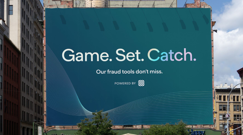
The 2025 rebrand placed the logo at the center of a much larger system. While the mark stayed the same, the brand guidelines expanded to include guilloche patterns inspired by paper currency, holographic color treatments, woodcut-style illustrations, and a whole new photographic direction.
According to Plaid’s blog, the brand team described the logo as “an element of our history that we are taking unchanged into our future.” Everything else in the visual system evolved around it, treating the logo as the fixed point while the surrounding identity flexed and grew.
This approach mirrors how some famous graphic designers have handled legacy marks. You do not throw away recognition. You build around it. The brand style guide now covers everything from pattern usage to photographic art direction, all flowing from the same conceptual thread: Plaid as the fabric connecting old finance and new.
The visual hierarchy across Plaid’s materials is clear. Logo first, typography second, patterns and textures as supporting elements. This layered approach keeps the identity from feeling cluttered, even with all the new elements in play.
How Should the Plaid Logo Be Used?
If you are a developer or partner working with Plaid, there are guidelines to follow. Here is what you need to know:
- Do use official files. Plaid provides vector and raster logo files for partners. Always use these rather than screenshotting or recreating the mark.
- Do not modify the logo. No stretching, recoloring (outside approved versions), adding effects, or altering the proportions. This is standard practice for any trademark, and Plaid enforces it.
- Maintain clear space. Keep adequate breathing room around the logo so it is not crowded by other elements. Poor spacing kills brand recognition faster than almost anything else.
- Use the right version for the background. Black logo on light backgrounds, white logo on dark backgrounds. Do not place the dark version on a busy image or pattern where it loses legibility.
- Plaid Link branding. When integrating Plaid Link (the bank-connection interface), the Plaid logo will appear within the linking flow. This is required and serves as a trust signal for end users.
For official logo downloads and complete usage documentation, visit Plaid’s website or developer portal. The trademark is registered, so unauthorized commercial use of the logo without permission could result in legal action. If you are building something with Plaid’s API, the partnership agreement will outline exactly how and where the logo should appear.
FAQ on The Plaid Logo
What does the Plaid logo look like?
The Plaid logo is a combination mark featuring a geometric cross-hatched icon next to a lowercase wordmark. The icon uses intersecting lines that form a plaid pattern. It typically appears in black on light backgrounds or white on dark ones.
Who designed the Plaid logo?
The original logo came from founders Zach Perret and William Hockey. They spotted a cross-hatched pattern on a whiteboard during an early algorithmic visualization session.
The pattern resembled plaid fabric. They checked if plaid.com was available, and the rest just happened.
What colors are used in the Plaid logo?
The primary logo uses black (#000000) and white (#FFFFFF). The 2025 brand refresh added Cerulean blue (#109DD7), Genoa green (#117460), and Purple Heart (#8D39D1) to the broader color palette for supporting brand materials.
Has the Plaid logo changed over time?
Not really. Plaid confirmed during its 2025 rebrand that the logo stayed untouched. The surrounding brand identity changed significantly, with new patterns inspired by paper currency and holographic textures.
The logo itself remained the fixed point.
What font does the Plaid logo use?
Plaid uses a custom geometric sans-serif font for its wordmark. All lowercase letters, clean strokes, even weights. If you want something similar, look for bold modern sans-serif typefaces with a tech-forward feel.
What does the Plaid logo symbolize?
The cross-hatched lines represent connectivity between financial institutions and apps. That is literally what Plaid does as a fintech data network.
The pattern also references the plaid fabric that gave the company its name, tying storytelling into the visual identity.
Where does the Plaid logo appear most often?
Most people encounter the logo during bank-linking flows inside third-party fintech apps. If you have connected a bank account through Venmo, Cash App, or similar services, you have seen it.
It also appears on developer documentation and marketing materials.
Can I download the Plaid logo for my project?
Yes. Plaid provides official logo files in vector and raster formats through its website and developer portal. Partners and developers integrating Plaid Link must follow specific brand usage rules, including maintaining clear space and not modifying the mark.
How does the Plaid logo compare to other fintech logos?
It sits between the stripped-down wordmark approach of Stripe and the standalone icon style used by companies like Square. Plaid’s mark is more meaningful than most because the visual directly ties to both the company name and its core function.
What made Plaid keep its logo during the 2025 rebrand?
Brand recognition. With half of all banked Americans having used Plaid, the logo had too much equity to discard. The internal creative team built the entire new identity system around the existing mark rather than replacing it.
Smart call, honestly.
e entire new identity system around the existing mark rather than replacing it. Smart call, honestly.” } } ] } “
Conclusion
The Plaid logo proves that a strong mark does not need constant redesigns to stay relevant. A cross-hatched pattern born from a whiteboard sketch now represents one of the largest fintech data networks in the world.
Its geometric structure communicates connection, security, and reliability without trying too hard. That restraint is rare in an industry where brands chase trends every few years.
The 2025 brand refresh showed how to grow an identity without abandoning its core. Build around what works. Keep the focal point steady and let everything else evolve.
Whether you are studying logo design or building a fintech brand from scratch, Plaid’s approach is worth paying attention to. Simple geometry, clear meaning, and patience go further than most people think.

Renowned for his expertise in logo design and visual branding, Bogdan has developed a multitude of logos for various clients.
His skills extend to creating posters, vector illustrations, business cards, and brochures. Additionally, Bogdan's UI kits were featured on marketplaces like Visual Hierarchy and UI8.
He also wrote in the past years on sites like Design Your Way, WebDesignerDepot, WPDean, Designmodo, Speckyboy, Slider Revolution, and more.
- Canva vs PowerPoint: Which Is Better for Presentations? - 22 September 2026
- How to Install Fonts on Mac (Step-by-Step Guide) - 20 September 2026
- From Mockup to Code: How AI-Augmented Development Speeds Up the Design Handoff - 19 September 2026

Bogdan Sandu is a seasoned designer who has been designing websites since 2008. Renowned for his expertise in logo design and visual branding, Bogdan has developed a multitude of logos for various clients. His skills extend to creating posters, vector illustrations, business cards, and brochures. Additionally, Bogdan's UI kits were featured on marketplaces like Visual Hierarchy and UI8. He also wrote in the past years on sites like Design Your Way, WebDesignerDepot, WPDean, Designmodo, Speckyboy, Slider Revolution, and more.
You Might Also Like


