


The Avant logo is the visual identity of one of the biggest fintech lending companies in the United States. Based in Chicago, Illinois, Avant has been around since 2012 and has served over 4 million customers with more than $12.5 billion in personal loans. The brand went through a major visual overhaul in 2022, marking its 10-year anniversary with a complete rebrand handled by Favorite Child, the brand design arm of Betty (a Quad agency). That rebrand gave the company a bolder, more confident look that better matched its shift from a simple online lender to a credit-first neobank offering personal loans, credit cards, and mobile banking.
The current Avant logo is a clean wordmark built around a bright blue color (#0D5BFF), paired with a dark Ebony Clay (#2A2A3F) and white. It leans hard into a minimalist design approach, which makes sense for a fintech brand that needs to feel modern and trustworthy at the same time.
What Is the Avant Logo?

The Avant logo is a wordmark-style mark featuring the company name “Avant” rendered in a geometric sans-serif font with a bold blue color scheme. It was officially updated in late 2022 as part of a full rebrand, designed by Favorite Child agency. The mark communicates financial accessibility, forward momentum, and trust.
Here is a breakdown of the logo’s key attributes:
- Design Type: Wordmark (text-based logo with no standalone icon or mascot)
- Primary Elements: The word “Avant” set in clean, geometric sans-serif typography with rounded character forms. The font is closely associated with ITC Avant Garde Gothic, a geometric typeface designed by Herb Lubalin and Tom Carnase in 1970, originally created for Avant Garde magazine.
- Official Introduction Date: The company launched in 2012 under the name AvantCredit, rebranded to “Avant” in 2015, and received its current visual identity in late 2022.
- Designer/Agency: The 2022 rebrand was executed by Favorite Child, the brand design arm of Betty, a Quad agency.
- Trademark Status: Avant, LLC holds registered trademarks. The company has filed over 80 patents related to its technology, and its brand assets are protected under standard U.S. intellectual property law.
- Color Palette: Primary blue (#0D5BFF, known as “Blue Ribbon”), white (#FFFFFF), and a dark shade called Ebony Clay (#2A2A3F).
- Usage Context: The logo appears across the Avant website, mobile app, credit card products, marketing materials, social media profiles, and partner communications.
How Has the Avant Logo Evolved Over Time?
Avant’s visual identity has gone through three distinct phases since the company was founded in 2012. It started as AvantCredit with a fairly straightforward mark, simplified when the company dropped “Credit” from its name in 2015, and then got a full overhaul in 2022 to reflect its broader product lineup and growing customer base.
The progression tracks a pretty typical fintech story. Scrappy startup branding gives way to something more polished as the company grows up.
Original AvantCredit Logo (2012-2015)
- Years Active: 2012-2015
- Design Description: The original mark featured the full name “AvantCredit” as a single wordmark. It used a straightforward sans-serif font with clean lines. Nothing flashy. The kind of branding you put together when you are a startup running out of Y Combinator and your main concern is getting the product to work, not winning design awards.
- Color Scheme: Blue and white, consistent with financial services conventions
- Designer: Internal or early-stage branding (specific agency not publicly documented)
- Context: Launched when founders Al Goldstein, John Sun, and Paul Zhang were building their lending platform from a Chicago office with seed funding of about $1 million. The brand needed to look credible enough to earn consumer trust for online personal loans.
- Cultural Significance: The name “AvantCredit” clearly stated what the company did. No guessing. It positioned the brand as forward-thinking (“Avant” comes from the French word for “before” or “ahead”) while anchoring it in the lending space.
Simplified Avant Logo (2015-2022)
- Years Active: 2015-2022
- Design Description: When the company rebranded from AvantCredit to just “Avant” in February 2015, the logo was shortened and cleaned up. The wordmark became more compact and the typography elements were refined. This version kept the same general feel but shed the “Credit” portion to reflect the company’s broader ambitions beyond just lending.
- Color Scheme: Still rooted in blue tones with white, reinforcing trust and financial stability
- Designer: The change coincided with the company’s acquisition of ReadyForZero and a strategic pivot
- Context: By 2015, Avant had originated over $1 billion in loans and raised more than $1.4 billion from investors like Tiger Global, KKR, and PayPal co-founder Peter Thiel. The shortened name reflected a company that had outgrown its startup identity.
- Key Changes from Previous: Dropped “Credit” from the name. The mark became simpler and more versatile for use across expanding digital products.
- Cultural Significance: This was a signal to the fintech industry that Avant was thinking bigger than personal loans alone.
Current Avant Logo (2022-Present)
- Years Active: 2022-present
- Design Description: A complete visual overhaul. The new logo features a bolder, more confident wordmark with a bright blue that pops harder than the previous versions. Dynamic patterns, a refreshed color palette, and empowering photography were baked into the broader brand system. The mark itself is tighter, more geometric, and built for digital-first applications.
- Color Scheme: Blue Ribbon (#0D5BFF), White (#FFFFFF), and Ebony Clay (#2A2A3F)
- Designer: Favorite Child, the brand design division of Betty, a Quad agency
- Context: CEO Matt Bochenek, who took over in May 2021, made the rebrand a top priority. It marked Avant’s 10-year anniversary and its evolution from a single-product lender to a credit-first neobank. The company had already served over 2 million customers at this point.
- Key Changes from Previous: Brighter, more saturated blue. Bolder weight. New brand voice. Dynamic visual assets including motion graphics and pattern systems. The entire brand identity was rebuilt from scratch, not just tweaked.
- Cultural Significance: The rebrand positioned Avant as an empowerment brand, not just a lending platform. The messaging shifted to “moving financial lives forward,” which better connected with its middle-income customer base.
What Do the Design Elements of the Avant Logo Mean?

Every piece of the Avant logo was designed to communicate trust, forward movement, and accessibility. The geometric letterforms suggest precision and reliability. The bright blue signals confidence without feeling cold or corporate.
The word “Avant” itself does a lot of heavy lifting. It comes from French and means “before” or “ahead,” which positions the brand as something that is pushing forward. And honestly, that is a smart move for a company serving customers who are working toward better financial outcomes.
Why Did Avant Choose These Specific Colors?
The Avant color theory behind the brand is straightforward but effective.
Blue Ribbon (#0D5BFF) is the primary brand color. In RGB terms, it is (13, 91, 255). The CMYK breakdown runs (95, 64, 0, 0). Blue is probably the most common color in financial branding for a reason. It projects trust, stability, and professionalism. But this particular shade is brighter and more energetic than what you would see in traditional bank logos. It feels more like a tech company than a stuffy financial institution.
White (#FFFFFF) serves as the secondary color. Clean backgrounds, clear white space, and a sense of openness. Standard stuff, but it works well to keep the brand feeling approachable.
Ebony Clay (#2A2A3F) is the dark accent, sitting at RGB (42, 42, 63) with CMYK (33, 33, 0, 75). This is a deep, almost-black shade with a subtle blue undertone. It provides contrast and grounding. Rather than using pure black, this choice keeps the overall palette feeling warmer and more connected.
The combination puts Avant right in line with other fintech brands that use blue logos to build trust. But the brightness of the primary blue separates it from more conservative competitors.
What Typography Style Is Used in the Avant Logo?
The Avant logo uses a geometric sans-serif typeface closely related to ITC Avant Garde Gothic. That font was originally designed by Herb Lubalin and Tom Carnase in 1970 for Avant Garde magazine.
It is a clean, rounded sans-serif with very uniform stroke widths. The letterforms are built on circular and geometric shapes, which gives the logo a modern, almost mathematical precision. The x-height proportions make it readable at small sizes, which matters when you are putting your brand on a credit card or a mobile app icon.
Took me a while to notice, but the kerning between the letters is tight enough to feel cohesive without looking cramped. The tracking is carefully balanced so the word reads as a single unit, not five separate characters.
Fun side note: the ITC Avant Garde Gothic face was inspired by the 1920s German Bauhaus design movement. So there is a deep lineage of geometric clarity baked into the type choice.
What Are the Hidden Meanings in the Avant Logo?
There is no buried Easter egg or secret arrow hidden between the letters (this is not the FedEx logo). But there are intentional design decisions worth noting.
The forward-leaning energy in the geometric type suggests forward motion. The “A” shapes in the logo have a slightly pointed, upward quality that communicates ambition. According to the psychology of shapes, angular forms create feelings of energy and direction.
The name itself, “Avant,” carries built-in symbolism. It is a word that literally means “forward” or “ahead” in French. That is not hidden so much as baked right into the brand from day one.
How Does the Avant Logo Compare to Competitor Logos?

In the fintech lending space, most logos follow a similar playbook: clean sans-serif text, blue or green color palettes, and minimal graphic elements. Avant fits this pattern but pushes harder on the blue.
The SoFi logo, for example, uses a softer, rounded wordmark in a slightly darker blue-purple range. It feels friendlier, maybe a bit more casual. Avant’s brighter blue is more assertive.
The Chime logo goes with green, which hits different. Green says growth and money pretty directly. Avant’s blue says trust and technology first.
Look at the Robinhood logo and you see a brand that went with a feather icon plus wordmark. That is a more illustration-heavy approach. Avant stayed pure wordmark, which is arguably more versatile across digital and physical touchpoints.
The Stripe logo takes a similar wordmark-only approach but in a deeper purple-blue. And the Square logo (now Block) uses a geometric shape as a standalone mark.
What sets Avant apart is the combination of its geometric type with that very specific, punchy blue. Among tech company logos in the financial space, it reads as both credible and energetic. Not all fintech brands manage that balance.
What Are the Technical Specifications of the Avant Logo?
Official Color Codes
- Primary Color: Blue Ribbon
- Hex: #0D5BFF
- RGB: (13, 91, 255)
- CMYK: (95, 64, 0, 0)
- HSL: (221, 100, 53)
- Secondary Color: White
- Hex: #FFFFFF
- RGB: (255, 255, 255)
- CMYK: (0, 0, 0, 0)
- Accent Color: Ebony Clay
- Hex: #2A2A3F
- RGB: (42, 42, 63)
- CMYK: (33, 33, 0, 75)
- HSL: (240, 20, 21)
Dimensions and Proportions
Like most modern fintech brands, the Avant logo follows strict brand guidelines for usage. The logo is built as vector graphics, which means it scales cleanly from a tiny mobile app icon all the way up to a billboard without losing quality.
Standard brand guidelines for a logo like this typically include minimum size requirements (usually around 24-30px height for digital), clear space rules that prevent other elements from crowding the mark, and approved color variations for light and dark backgrounds. Avant provides its logo in SVG and PNG formats for different use cases.
The aspect ratio of the wordmark is landscape-oriented, wider than it is tall. This makes it work well in website headers, email signatures, and app interfaces where horizontal space is more available than vertical.
What Cultural Impact Has the Avant Logo Had?

Avant’s branding impact lives mostly within the fintech and personal lending world. It is not the kind of logo that has crossed over into mainstream pop culture the way something like the Cash App logo has. But within its niche, the 2022 rebrand was notable.
The rebrand represented a shift in how fintech companies talk to middle-income consumers. Instead of the typical sterile, corporate financial branding, Avant’s new identity used dynamic patterns, bright colors, and photography that reflected real people. That approach has influenced how other fintech challengers think about connecting with underserved markets.
Avant was also featured in The Wall Street Journal, The New York Times, TechCrunch, Fortune, and Bloomberg over the years. That kind of coverage means the logo has appeared in some pretty high-profile contexts, even if most people would not recognize it on the street.
How Does the Avant Logo Fit Into the Overall Brand Identity?
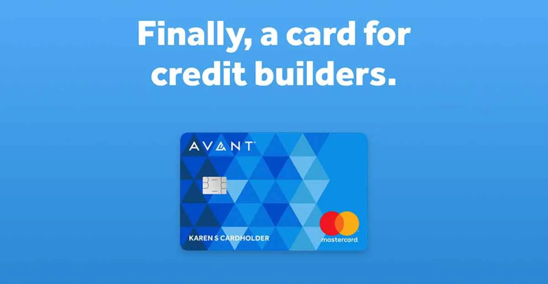
The logo is just one piece of a much bigger brand system that Avant built during the 2022 rebrand. It connects directly to the company’s brand style guide, which includes rules for typography, photography, iconography, motion, and voice.
The wordmark anchors everything. It sits at the top of the website, on credit card faces, in app interfaces, and across marketing materials. The bright blue brand color connects through every touchpoint, creating a consistent thread from a billboard in Chicago to a push notification on someone’s phone.
Avant’s tagline “Financially Forward” ties the visual identity back to the company’s mission. The logo’s geometric, forward-leaning energy matches the language. The whole system feels like it was designed together rather than assembled from parts, which is what you want from a solid logo design process.
How Should the Avant Logo Be Used?
Avant maintains specific guidelines for how its logo can and cannot be used. If you are a partner, vendor, or media outlet working with the brand, here are the basics:
- Do: Use the official logo files provided by Avant. Maintain the clear space around the logo. Use approved color variations on appropriate backgrounds. Keep the logo proportions locked (do not stretch or distort).
- Don’t: Modify the logo colors, rearrange the letterforms, add drop shadows or effects, place the logo on busy backgrounds where it loses readability, or combine it with other brand marks without approval.
- Where to Access Official Logos: Avant’s official brand assets can be found through their press page at avant.com/press, and vector logo files are available through brand asset platforms like Brandfetch.
- Licensing: The Avant name and logo are registered trademarks of Avant, LLC. Unauthorized use of the mark is prohibited. All Avant-branded credit products are issued by WebBank, not Avant directly, so proper attribution matters in co-branded materials.
- Trademark Protection: Avant, LLC actively protects its brand assets. The company has filed over 80 patents related to its technology platform, and its brand trademarks are protected under standard U.S. intellectual property registration.
FAQ on The Avant Logo
What does the Avant logo look like?
The Avant logo is a wordmark featuring the company name in a geometric sans-serif typeface. It uses a bright blue called Blue Ribbon (#0D5BFF) against white or dark backgrounds.
There is no icon or symbol. Just the text, clean and simple.
What font does the Avant logo use?
The logo uses a typeface closely based on ITC Avant Garde Gothic, a geometric sans-serif designed by Herb Lubalin and Tom Carnase in 1970. It has uniform stroke widths and circular letterforms that give it a modern, precise look.
What are the official Avant logo colors?
The primary color is Blue Ribbon (#0D5BFF) with an RGB value of (13, 91, 255). White (#FFFFFF) and Ebony Clay (#2A2A3F) complete the palette.
That combination of bright blue and near-black gives the brand both energy and seriousness.
When was the Avant logo last updated?
Avant completed a full rebrand in late 2022, coinciding with the company’s 10-year anniversary. Favorite Child, the brand design arm of Betty (a Quad agency), handled the visual identity overhaul. The update brought bolder colors, dynamic patterns, and refreshed messaging.
Why did Avant rebrand in 2022?
The company had outgrown its original brand identity. Avant shifted from a single-product online lender to a credit-first fintech platform offering personal loans, credit cards, and mobile banking.
CEO Matt Bochenek made the rebrand a priority after stepping into the role in 2021.
What does the name “Avant” mean?
“Avant” comes from French. It means “before” or “ahead.” The name positions the brand as forward-looking, which fits its mission of helping middle-income consumers move toward better financial outcomes.
Originally, the company was called AvantCredit before shortening it in 2015.
Where can I download the official Avant logo?
Official Avant brand assets are available through the company’s press page at avant.com/press. You can also find vector logo files on brand asset platforms like Brandfetch, which hosts SVG and PNG versions.
Always use official files. Never recreate the mark yourself.
How does the Avant logo compare to other fintech logos?
Most fintech lending brands lean on blue or green wordmarks. Avant’s brighter blue (#0D5BFF) stands out against competitors like SoFi and Chime, which use softer tones. The pure wordmark approach keeps things versatile across digital and print.
Is the Avant logo trademarked?
Yes. Avant, LLC holds registered trademarks on its brand name and logo under U.S. intellectual property law. The company has also filed over 80 patents related to its technology. All Avant-branded credit products are issued by WebBank.
What design style influenced the Avant logo?
The logo draws from Bauhaus-era geometric design principles through its connection to ITC Avant Garde Gothic. That typeface was rooted in 1920s German design thinking, which emphasized clean geometry and functional clarity.
The 2022 rebrand layered in contemporary fintech branding trends on top of that foundation.
Conclusion
The Avant logo tells a clear story about how a fintech startup matures into a full-service financial brand. From its AvantCredit days to the bold 2022 redesign, every version of the mark reflected where the company stood at that moment.
The current wordmark, with its geometric sans-serif type and punchy Blue Ribbon color, works because it does not try to do too much. It is readable, scalable, and consistent across every touchpoint from credit cards to the mobile app.
For a company that has connected over 4 million customers to billions in loans, that kind of visual hierarchy and brand consistency matters more than any clever design trick.

Renowned for his expertise in logo design and visual branding, Bogdan has developed a multitude of logos for various clients.
His skills extend to creating posters, vector illustrations, business cards, and brochures. Additionally, Bogdan's UI kits were featured on marketplaces like Visual Hierarchy and UI8.
He also wrote in the past years on sites like Design Your Way, WebDesignerDepot, WPDean, Designmodo, Speckyboy, Slider Revolution, and more.
- The Windsurf Logo History, Colors, Font, And Meaning - 10 October 2026
- How to Remove Background From Product Photos (No Photoshop) - 10 October 2026
- How Designers can Build a Stronger Online Creative Identity - 9 October 2026

Bogdan Sandu is a seasoned designer who has been designing websites since 2008. Renowned for his expertise in logo design and visual branding, Bogdan has developed a multitude of logos for various clients. His skills extend to creating posters, vector illustrations, business cards, and brochures. Additionally, Bogdan's UI kits were featured on marketplaces like Visual Hierarchy and UI8. He also wrote in the past years on sites like Design Your Way, WebDesignerDepot, WPDean, Designmodo, Speckyboy, Slider Revolution, and more.
You Might Also Like


