


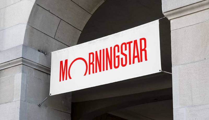
The Morningstar logo is one of the most recognized marks in the financial services industry. Designed by Paul Rand in 1991, it turns a simple wordmark into something far more memorable through one small but clever trick: the letter “O” is trimmed at the base to suggest a rising sun.
That detail alone separates it from the sea of forgettable corporate identities in finance. The company, founded by Joe Mansueto in 1984 in a Chicago apartment, needed a visual identity that could carry its mission of independent investment research. Rand delivered exactly that.
The Morningstar logo has gone through refinements over the decades, but its core concept has stayed intact. It’s a combination mark that pairs custom typography with a built-in symbol, and it currently exists in its signature red form (Pantone 185) across print, digital, and broadcast media. The company considers it one of its most valuable assets, and honestly, it’s hard to argue with that.
What Is the Morningstar Logo?

The Morningstar logo is a wordmark-based combination mark featuring the company name in condensed lettering, with the “O” modified into a rising sun shape. Paul Rand designed it in 1991. The truncated circle represents new beginnings and enlightenment, directly referencing the Thoreau quote that inspired the company’s name.
Design Breakdown
- Design Type: Combination mark (wordmark with integrated symbol)
- Primary Elements: Condensed sans-serif letterforms with a modified “O” shaped as a rising sun. The logomark (the “O” alone) also functions independently as a brand identifier, described by Morningstar’s own design system as a closed circle with a gradient suggesting a horizon.
- Official Introduction Date: 1991 (some sources cite 1992, when it was formally adopted across all company materials)
- Designer: Paul Rand, working from his own office. Rand is the same designer behind the IBM, UPS, and NeXT logos. Joe Mansueto personally convinced him to take on the project.
- Trademark Status: Registered trademark in the United States and most countries where Morningstar operates. The logotype carries an (R) symbol when used by external parties.
- Color Palette: Morningstar Red (Pantone 185 U), with black as a secondary option when color printing isn’t available. White backgrounds are preferred for maximum contrast.
- Usage Context: Investment research reports, Morningstar Direct platform, Morningstar Investor, fund rating materials, corporate communications, digital platforms, and social media. The logo also appears in animated form for video and application splash screens.
How Has the Morningstar Logo Evolved Over Time?
The Morningstar logo history is surprisingly short on major overhauls. Paul Rand’s 1991 design became the foundation that the company built on for over three decades.
Before Rand’s involvement, Morningstar used a simpler wordmark. After Rand’s redesign, the changes have been about refinement rather than reinvention.
Pre-Rand Era (1984-1991)
- Years Active: 1984 to 1991
- Design Description: A straightforward text-based logo without the rising sun element. The earliest versions were functional but lacked a memorable visual hook. The company was still a small startup operating out of Joe Mansueto’s apartment, so branding wasn’t the top priority.
- Color Scheme: Black and white
- Designer: Unknown, likely internal
- Context: Morningstar was focused on building its mutual fund data business. The logo served a basic identification purpose and nothing more.
- Cultural Significance: Minimal. The company was still finding its footing in the financial data space.
The Paul Rand Redesign (1991-Present)
- Years Active: 1991 to present
- Design Description: Condensed letterforms spelling “Morningstar” with the “O” trimmed at the base to create a rising sun silhouette. Rand documented his entire design process, showing how he moved from a star replacing the “O” to a simple round shape, and finally to the trimmed circle that suggested a sunrise.
- Color Scheme: Morningstar Red (Pantone 185 U), with approved black and white versions
- Designer: Paul Rand
- Context: By 1991, Morningstar was growing fast. The mutual fund industry was booming, and the company needed a visual identity that matched its increasing authority. Mansueto reportedly paid Rand a flat fee for the work, which was standard for Rand’s process. He famously presented a single solution, not multiple options.
- Key Changes from Previous: Everything changed. The generic wordmark became a designed mark with built-in symbolism. The condensed letterforms solved spacing problems Rand identified in the word “Morningstar” (the letter clusters NIN, GS, and TA tended to separate from the whole).
- Cultural Significance: It tied Morningstar to a lineage of major American corporate identities. Having a Paul Rand logo carried weight in design circles, and it still does.
Modern Refinements (2000s-Present)
- Years Active: 2000s onward
- Design Description: The core Rand design remains untouched. Morningstar has expanded the brand system around it, adding animated versions, product lockups, and a complete design system. The logomark (the “O” alone) now functions as a standalone identifier in certain contexts.
- Color Scheme: Still Morningstar Red as the primary, with an expanded supporting color palette for the broader design system
- Context: As Morningstar went public in 2005 and expanded globally, the logo needed to work across more touchpoints. Digital platforms, mobile apps, and video content all required adaptations. The company developed a comprehensive design system that wraps around the original Rand logo.
- Key Changes from Previous: No structural changes to the logo itself. The additions are contextual: animated versions with rising/setting sun motion, defined clear space rules, minimum size requirements (20px height for digital, 0.125 inches for print), and strict guidelines about what you can and cannot do with the mark.
What Do the Design Elements of the Morningstar Logo Mean?

Every piece of the Morningstar logo ties back to the company’s name and mission. The rising sun in the “O” is the most obvious symbol, pulled directly from Henry David Thoreau’s Walden: “The sun is but a morning star.”
But there’s more going on under the surface. The condensed letterforms, the specific red, the proportions. Rand thought about all of it.
What Does the Rising Sun Symbol Represent?
The trimmed “O” is the heart of the logo. Rand arrived at this solution after testing several alternatives: a star replacing the “O,” a plain round “O” for dynamic contrast with the condensed letters, and finally the trimmed version.
He compared the solution to the puzzle of making an egg stand on end. By cutting the base of the circle, the “O” becomes a sunrise.
For Morningstar, this represents illumination (bringing clarity to investment decisions), new beginnings (each trading day starts fresh), and optimism (the promise of growth). It connects the company’s practical mission to something bigger without being heavy-handed about it.
Why Did Morningstar Choose These Specific Colors?
- Morningstar Red
- Pantone: 185 U
- Hex: #E4002B
- RGB: (228, 0, 43)
- CMYK: (0, 100, 81, 11)
- Paul Rand chose this specific red in 1991. At the time, it was an unusual pick for a financial services company. Most competitors leaned on blues and greens. The red signaled confidence, energy, and a willingness to challenge the status quo. It still stands out in the financial industry, where blue logos remain the default.
- Black (Secondary)
- Hex: #000000
- Used when color reproduction isn’t possible. The black version maintains readability and brand recognition in single-color print applications.
- White (Background)
- Hex: #FFFFFF
- The logo is designed to sit on white or light-colored backgrounds. This maximizes saturation and keeps the red punchy.
What Typography Style Is Used in the Morningstar Logo?
The logo uses condensed sans-serif letterforms. Rand condensed each letter to save space and keep the long word “Morningstar” compact and readable.
The brand typeface across Morningstar’s communications is Univers Next, developed in collaboration with Monotype. But the logo lettering itself is custom, not a standard font you can download.
Rand specifically noted that “Morningstar” as a word is tricky to set. It’s two words jammed together, neither short nor easy to read. The letter combinations create spacing problems. His condensed approach fixed that while giving the logo a distinct profile.
What Are the Hidden Meanings in the Morningstar Logo?
Rand’s design documentation reveals a deliberate process. The rising sun wasn’t his first idea. He tried a star shape first, then a plain circle, before landing on the trimmed “O.”
There’s an intentional tension between the rigid, condensed letters and the organic, sun-like “O.” That contrast gives the mark visual energy. Rand called it a “kind of pictorial punctuation” that adds interest and intensifies meaning.
The Thoreau connection runs deeper than most people realize. The company’s name comes from the final sentence of Walden, and the logo visually enacts that same idea of a new day. At least in my view, that kind of alignment between name, mission, and mark is rare in corporate branding.
How Does the Morningstar Logo Compare to Competitor Logos?

Financial services logos tend to cluster around a few safe choices. Blues, conservative serif fonts, abstract geometric shapes. The Morningstar logo breaks from all of those patterns.
Bloomberg uses a bold, black wordmark. Functional, heavy, imposing. S&P Global runs with a blue and red combination that’s corporate but not particularly memorable. The FactSet logo is a clean wordmark in green and gray. MSCI leans on a deep blue square with white lettering.
Morningstar is the outlier. A bright red wordmark with an embedded symbol, designed by one of the most famous graphic designers in history. Most financial data companies treat their logos as something functional. Morningstar treated theirs as an asset worth investing in, literally. And it shows.
Where competitors rely on the psychology of color to project stability (blue, always blue), Morningstar chose red. That was a contrarian move in 1991 and it still reads as one today. The mark also carries a designer pedigree that none of its direct competitors can match.
What Are the Technical Specifications of the Morningstar Logo?
Official Color Codes
- Primary Color: Morningstar Red
- Hex: #E4002B
- RGB: (228, 0, 43)
- CMYK: (0, 100, 81, 11)
- Pantone: 185 U
- Secondary Color: Black
- Hex: #000000
- RGB: (0, 0, 0)
- CMYK: (0, 0, 0, 100)
- Background: White
- Hex: #FFFFFF
- RGB: (255, 255, 255)
Dimensions and Proportions
- Minimum Size (Digital): 20 pixels in height to keep the wordmark and trademark symbol readable
- Minimum Size (Print): 0.125 inches or 3.175 mm in height
- Scaling Limits: Do not reduce below 75% or enlarge above 175% of original size. Below 75%, the trademark symbol becomes illegible. Above 175%, it becomes distractingly large.
- Clear Space: A defined buffer zone must surround the logo at all times to prevent visual clutter. The specific measurement is proportional to the logo’s size.
- File Formats: Available as vector graphics (EPS) for print, optimized TIFF for presentations and Word documents, and GIF/PNG for digital platforms. The EPS version is the highest quality and can be resized without losing sharpness.
- Placement: In landscape compositions, the logo sits in designated areas with clear space. In portrait layouts, similar rules apply. The company recommends optically centering the logotype rather than mathematically centering it.
What Cultural Impact Has the Morningstar Logo Had?
The Morningstar logo occupies a unique spot. It’s one of the last major corporate identity projects Paul Rand completed before his death in 1996.
That gives it a historical significance beyond Morningstar itself. The Chicago Design Archive catalogs it as a notable piece of American graphic design. Morningstar won the 2010 AIGA Chicago Chapter Corporate Design Leadership Award, which recognized the company’s commitment to design as a business practice.
Within the financial industry specifically, the logo helped establish that an investment research firm could look different from a bank. It didn’t need to signal “old money” or “institutional trust” through conservative design. The red, the embedded symbol, the Rand pedigree. All of it said something about how Morningstar saw itself, and that confidence carried over into how investors saw the company.
How Does the Morningstar Logo Fit Into the Overall Brand Identity?
The logo is the anchor of a much larger brand system. Morningstar has built a complete design framework around Rand’s original mark, covering everything from brand guidelines for color usage to product naming conventions, animated logo treatments, and typographic hierarchy.
The logomark (just the “O”) can function alone as a brand identifier. Product lockups combine the Morningstar name with sub-brand names like Morningstar Direct, Morningstar Investor, and Morningstar DBRS. Each lockup follows strict rules about spacing, sizing, and relationship to the parent logo.
The brand style guide extends into motion too. Animated versions of the logo exist in three speeds (standard, rapid, and gentle) for different contexts, from app splash screens to long-form editorial video. That vertical rising and setting movement ties back to the sunrise concept.
Morningstar’s star rating system (the one-to-five-star fund ratings) is a separate visual element, but it builds on the same solar symbolism. Stars and suns. Everything connects.
How Should the Morningstar Logo Be Used?
Official Do’s
- Reproduce the logo only in Morningstar Red or black
- Use the provided master files in the size closest to your final reproduction size
- Place the logo on white or light-colored backgrounds
- Maintain the required clear space around the logotype
- Use EPS files for print, optimized digital formats for screens
- Include the registered trademark symbol when the logo is used by external parties
- Apply subtle drop shadows or overlays when placing on busy backgrounds to keep legibility
Official Don’ts
- Don’t squish, stretch, or deform the logotype
- Don’t apply gradients, color effects, or nonstandard colors
- Don’t place the logo on backgrounds with similar color values
- Don’t lock it up with other logos without prior approval from the brand team
- Don’t add symbols, glyphs, text, or slogans to the logotype
- Don’t use the animated version as a loading indicator or loop it
- Don’t take elements from the logotype to create new artwork
- Don’t place the logotype within inline text
Where to Access and Licensing
Official logo files are available through Morningstar’s corporate design team. All communication materials using the logotype must be submitted for review and approval before publication. This includes co-branded promotions, press releases, and any web content featuring the mark.
Unauthorized use of the Morningstar logotype violates trademark protections. The company actively maintains its registered trademark status across multiple jurisdictions and distinguishes between internal use (no trademark symbol needed on Morningstar-owned properties) and external use (trademark symbol required, with legal attribution text that varies by country).
For questions about logo usage, Morningstar provides two contact points: Corporate Marketing at +1 312 696-6537 and the Corporate Design team at +1 312 384-3863.
FAQ on The Morningstar Logo
Who Designed the Morningstar Logo?
Paul Rand designed the Morningstar logo in 1991. He’s the same designer behind the IBM and UPS corporate identities.
Joe Mansueto personally convinced Rand to take on the project. Rand presented a single solution, not multiple options. That was his standard approach.
What Does the “O” in the Morningstar Logo Mean?
The “O” is trimmed at the base to look like a rising sun. It references the last line of Thoreau’s Walden, which inspired the company’s name.
Rand called it “pictorial punctuation.” The shape suggests new beginnings and hope, tying the Morningstar brand identity to its investment research mission.
What Color Is the Official Morningstar Logo?
The primary color is Morningstar Red, specified as Pantone 185 U (Hex: #E4002B). Paul Rand chose this red in 1991.
Black versions exist for single-color printing. The logo always sits on white or light backgrounds to keep the red sharp and readable.
What Font Does the Morningstar Logo Use?
The logo lettering is custom, not a commercially available font. Rand designed condensed letterforms specifically to solve spacing issues in the word “Morningstar.”
The broader Morningstar brand uses Univers Next, developed with Monotype. But the logo itself is a one-off.
Has the Morningstar Logo Changed Over the Years?
Not much. The pre-Rand logo (1984-1991) was a basic wordmark. Since Rand’s 1991 redesign, the core mark hasn’t been structurally altered.
Morningstar added animated versions, product lockups, and a full design system around it. The logo itself stayed the same.
Can I Download and Use the Morningstar Logo?
Not freely. The Morningstar trademark is registered across most countries where the company operates. Any use requires approval from their Corporate Marketing or Corporate Design team.
All materials featuring the logotype must be submitted for review before publication. Unauthorized use violates trademark protections.
What File Formats Is the Morningstar Logo Available In?
EPS for print materials, TIFF for presentations and documents, and GIF or PNG for digital platforms. The EPS version is vector-based, so it scales without losing quality.
Different sizes exist to keep the registration mark legible at each scale.
Why Did Morningstar Choose Red Instead of Blue?
Most financial services companies default to blue. Rand picked red to signal confidence and a willingness to challenge industry norms.
It worked. Morningstar Red still stands out among competitors like Bloomberg, S&P Global, and FactSet, who all lean on darker, more conservative palettes.
What Is the Morningstar Logomark?
The logomark is just the “O” from the Morningstar logo, used alone as a brand identifier. Morningstar’s design system describes it as a closed circle with a gradient suggesting a horizon.
It appears in contexts where the full wordmark isn’t needed.
What Are the Size Requirements for the Morningstar Logo?
Minimum height is 20 pixels for digital and 0.125 inches for print. The logo shouldn’t be reduced below 75% or enlarged above 175% of its original size.
Required clear space surrounds the mark at all times. These specifications keep the Morningstar symbol readable across every application.
Conclusion
The Morningstar logo is a case study in how a single smart design decision can carry a brand for decades. Paul Rand’s trimmed “O” gave a Chicago-based investment research startup a visual identity that still outperforms most tech company logos and financial marks in recognition.
That Morningstar Red, the condensed custom lettering, the sunrise built into the wordmark. None of it happened by accident.
For anyone studying logo design principles or corporate brand positioning, this mark shows what’s possible when a founder invests in getting the design elements right from the start. Morningstar Inc. built a global reputation on independent fund analysis and stock research. Their logo matches that reputation, no shortcuts.

Renowned for his expertise in logo design and visual branding, Bogdan has developed a multitude of logos for various clients.
His skills extend to creating posters, vector illustrations, business cards, and brochures. Additionally, Bogdan's UI kits were featured on marketplaces like Visual Hierarchy and UI8.
He also wrote in the past years on sites like Design Your Way, WebDesignerDepot, WPDean, Designmodo, Speckyboy, Slider Revolution, and more.
- The Windsurf Logo History, Colors, Font, And Meaning - 10 October 2026
- How to Remove Background From Product Photos (No Photoshop) - 10 October 2026
- How Designers can Build a Stronger Online Creative Identity - 9 October 2026

Bogdan Sandu is a seasoned designer who has been designing websites since 2008. Renowned for his expertise in logo design and visual branding, Bogdan has developed a multitude of logos for various clients. His skills extend to creating posters, vector illustrations, business cards, and brochures. Additionally, Bogdan's UI kits were featured on marketplaces like Visual Hierarchy and UI8. He also wrote in the past years on sites like Design Your Way, WebDesignerDepot, WPDean, Designmodo, Speckyboy, Slider Revolution, and more.
You Might Also Like


