


The Earnest logo is the visual mark of a San Francisco-based fintech lender that specializes in student loan refinancing and private student loans. Founded in 2013 by Louis Beryl and Benjamin Hutchinson, the company has grown into one of the most recognized names in education financing.
Its logo has gone through multiple changes since launch. The current version reflects a modern, approachable identity built around clean typography and a bright color system. Earnest’s branding positions it against traditional loan servicers like Sallie Mae and Navient, leaning into a visual language that speaks to younger, tech-comfortable borrowers.
The company has refined its look at least three times, with the most significant overhaul handled by the agency Motto. That rebrand introduced a modernized “e” mark, a bold highlighter green, and secondary tones like lavender and ocean blue. By late 2025, CNBC named Earnest among the world’s top fintech companies, a recognition that came on the heels of a $24 billion lifetime total in refinanced student loans.
What Is the Earnest Logo?

The Earnest logo is a combination mark featuring a modernized lowercase “e” symbol alongside a custom sans-serif wordmark. It was most recently redesigned by the branding agency Motto. The mark signals trust, progress, and continuity, with a highlighter green and lavender color system built to feel energetic yet reassuring.
Design Type: Combination mark (symbol plus wordmark)
Primary Elements: A stylized lowercase “e” icon paired with the full “earnest” wordmark in a custom sans-serif typeface. The “e” uses a continuous line style meant to represent guidance and forward movement.
Official Introduction Date: The original logo launched with the company in 2013. The most recent version came out of the Motto rebrand, which was completed around 2024-2025.
Designer/Agency: Motto (for the current rebrand). Earlier design system work was led internally by product designer Raphael Socrates, who built a full design system from the ground up during his time at the company.
Trademark Status: Earnest Inc. holds trademark protection for the logo and brand assets. Legal protection covers variations used across financial services marketing materials.
Color Palette: Highlighter green (primary action color), lavender, ocean blue, and supporting neutrals. The earlier brand iteration used blue as the dominant color, a holdover from Earnest’s initial identity.
Usage Context: The logo appears across Earnest’s website, mobile app, marketing campaigns, email communications, social media profiles, partner integrations, and print materials related to student loan products.
How Has the Earnest Logo Evolved Over Time?
The Earnest logo has gone through at least three major phases since 2013. It started as plain black text, shifted to a blue-dominated wordmark during the company’s growth stage, and landed on a green-and-purple system with a custom “e” mark in its most recent rebrand.
Each version tracked a specific moment in the company’s development.
Original Earnest Logo (2013-2015)
Years Active: 2013 to roughly 2015
Design Description: Simple black text. No icon, no distinctive visual element. Just the company name in a basic typeface.
This was the minimum viable brand. Earnest launched in Boston as a personal loan test market before expanding, and the logo reflected that scrappy early stage.
Color Scheme: Black on white. Nothing else.
Designer: Not publicly attributed.
Context: Louis Beryl and Benjamin Hutchinson co-founded Earnest coming from Andreessen Horowitz and BBC finance backgrounds. The initial focus was on getting the product right, not the branding.
Cultural Significance: It looked like a hundred other early-stage fintech startups. Which, honestly, was fine for a company distributing $8M in loans and figuring out product-market fit.
Growth-Stage Earnest Logo (2015-2023)
Years Active: Roughly 2015 to 2023
Design Description: A lowercase wordmark in a clean sans-serif typeface. The rounded letterforms were chosen to feel friendly and approachable. Blue became the dominant brand color.
Color Scheme: Blue and white, consistent with broader fintech industry trends. Companies like SoFi and CommonBond used similar palettes during this period.
Designer: Internal team, with significant design system contributions from Raphael Socrates.
Context: This version arrived as Earnest closed its Series A ($17M led by Maveron in January 2015), launched student loan refinancing, and began competing seriously against established servicers. The $75M funding round from Battery Ventures in late 2015 gave them runway to invest in brand consistency.
Key Changes from Previous: The shift from black text to a blue wordmark with rounded characters. It went from “we exist” to “we’re a real company with a point of view.”
Cultural Significance: This was the logo people saw when Navient acquired Earnest for $155M in October 2017. It carried the brand through its biggest corporate transition.
Current Earnest Logo (2023-Present)
Years Active: 2023 to present
Design Description: A modernized “e” symbol alongside the wordmark. The “e” uses a continuous line approach meant to communicate progress and guidance. The overall system is brighter, bolder, and more distinct from competitors.
Color Scheme: Highlighter green as the primary action color, with purple as a structural color. Secondary tones include lavender and ocean blue. The internal rebrand work introduced purple as a primary UI color, reserving green for interaction states and important information callouts.
Designer: Motto (agency rebrand); internal design system led by Raphael Socrates
Context: Research showed the existing brand felt outdated to consumers. Products were too complex, the user experience lacked consistency, and brand trust had taken a hit. The rebrand aimed to reposition Earnest from “just a lender” to “a partner in education.” Competitor analysis included Sallie Mae, SoFi, and Citizens Bank, with inspiration drawn from brands like Stripe, Airbnb, and Robinhood.
Key Changes from Previous: The addition of the “e” icon mark. The color shift from blue to green and purple. A continuous line iconography style. And a comprehensive design system with over 150 active components built in under a year.
Cultural Significance: This is the logo that represents Earnest as a CNBC-recognized top fintech company with $24 billion in lifetime refinanced student loans. It signals maturity without losing the approachability that younger borrowers expect.
What Do the Design Elements of the Earnest Logo Mean?

The modernized “e” sits at the center of the current Earnest logo. Its continuous line form is supposed to represent the idea of unbroken support and forward progress, which maps to the company’s positioning as a long-term financial partner rather than a one-time lender.
But look, it’s also just a nice-looking letter mark. Sometimes a good logo works because it’s clean and memorable, not because the symbolism is 47 layers deep.
Why Did Earnest Choose These Specific Colors?
The highlighter green is the most aggressive departure from Earnest’s earlier look. It’s meant to signal energy and action, which is a deliberate move away from the “safe blue” that dominates fintech branding.
Green in a financial context usually triggers associations with money, growth, and positive movement. The psychology behind color choices matters here because Earnest needed something that would read as optimistic without feeling reckless.
Purple was introduced as the primary structural color in the UI, with green reserved for interactions and key information. Lavender and ocean blue fill in as calming secondary tones, keeping the overall palette from tipping too far into intensity. The combination feels more like an edtech product than a traditional bank, which is exactly the point.
What Typography Style Is Used in the Earnest Logo?

Earnest uses a custom or heavily modified sans-serif font with rounded letterforms. The lowercase treatment is deliberate. It makes the brand feel less corporate and more conversational.
The x-height on the letterforms is generous, which helps with readability at smaller sizes (think app icons, email headers, mobile ads).
Rounded sans-serif fonts generally test well with younger audiences. They feel modern without being trendy, and they hold up across screen sizes. The psychological effect of typeface selection nudges people toward feeling that the company is accessible and transparent. Which, for a lender targeting students, is exactly what you’d want.
What Are the Hidden Meanings in the Earnest Logo?
The continuous line used in the “e” icon and throughout the brand’s iconography system isn’t just decorative. It’s supposed to represent a connected journey, the idea that Earnest stays with borrowers from application through repayment.
The lowercase wordmark is another intentional choice. Traditional lenders use capitalized names and serif typefaces to project authority. Earnest goes the opposite direction to feel like a peer, not an institution.
There’s no hidden arrow or clever negative space trick in this one, though. The design leans on clarity over cleverness, which is actually the harder thing to pull off well.
How Does the Earnest Logo Compare to Competitor Logos?
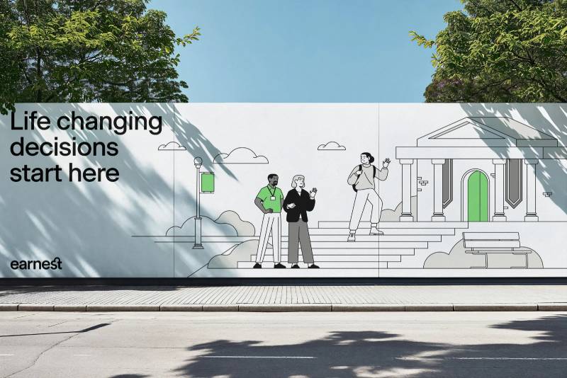
Fintech lending logos tend to fall into two camps. You’ve got the “we’re a serious bank” look (think Sallie Mae, Citizens Bank) and the “we’re a cool tech company” look (SoFi, Chime). Earnest’s current branding sits closer to the second camp but with more color personality than most.
The SoFi logo uses a bold, angular approach. Robinhood’s mark leans on neon yellow-green against black. Earnest’s green-and-purple combination is distinct in the student lending space specifically. Most competitors haven’t moved this far from blue.
Where Earnest stands out is in the completeness of its visual system. The Motto rebrand wasn’t just a logo swap. It included a new design system with 150+ components, a custom illustration library, data visualization standards, and a full UI overhaul. That level of investment puts it closer to how companies like Stripe approach brand design.
One thing worth noting: most fintech tech company logos in the lending space don’t include a standalone icon mark. Earnest’s “e” gives them something many competitors lack, a symbol that works independently of the wordmark for app icons, favicons, and social avatars.
What Are the Technical Specifications of the Earnest Logo?
Official Color Codes
Primary Color: Highlighter Green
Used for interactive elements, CTAs, and key information callouts. The exact hex code is not publicly documented in detail, but it falls in the bright, saturated green range that reads as energetic and action-oriented.
Secondary Color: Purple
Serves as the primary structural color in the design system. It anchors backgrounds, headers, and navigation elements. This was a strategic addition during the internal rebrand, chosen after exploring how colors interact and complement each other within the full palette.
Supporting Tones: Lavender and Ocean Blue
These provide visual relief and help create breathing room in the interface. They balance the intensity of the green and purple.
Dimensions and Proportions
Earnest’s brand documentation defines specific placement rules and sizing requirements. Clear space protection zones surround the logo to prevent visual clutter.
The logo is available in vector formats (SVG, EPS) for scalability across all sizes and in pixel-based formats (PNG) for digital use. The “e” icon works independently at small sizes, while the full wordmark is used when space allows.
Minimum size requirements exist to make sure the logo stays legible at smaller display sizes (favicons, social media thumbnails). The design system documentation covers all breakpoints and responsive behavior.
What Cultural Impact Has the Earnest Logo Had?
Earnest’s branding has pushed the conversation about what a student loan company is “allowed” to look like. Before companies like Earnest (and SoFi, and CommonBond), the lending space was visually dominated by stiff corporate identities. Blues, serifs, stock photos of smiling graduates. You know the look.
The green-and-purple palette, combined with the lowercase wordmark and continuous-line iconography, set a different tone. It says “we’re a technology company that happens to do loans” instead of “we’re a bank that happens to have a website.”
Earnest’s inclusion on CNBC’s World’s Top FinTech Companies list in 2024 came after the rebrand. And while you can’t draw a straight line from a logo to a ranking like that, brand perception matters in a market where trust is the whole game.
The design system work (150 active components in under a year, 250 product pages built in under six months) also influenced how other fintech startups think about scaling visual identity. It showed that a mid-size lending company could invest in brand infrastructure the way larger tech firms do.
How Does the Earnest Logo Fit Into the Overall Brand Identity?
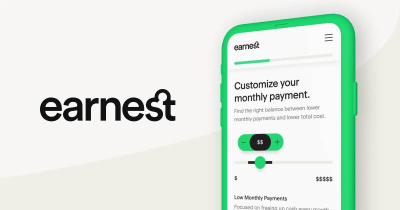
The logo is one piece of a bigger system that includes the wordmark, the “e” icon, a custom illustration library, a data visualization framework, a continuous-line iconography style, and specific photography guidelines (minimal, spacious, clarity-focused).
Earnest’s brand style documentation ties all of these together under three strategic pillars: being an educator first, supporting inclusive growth, and pushing accessibility forward. The logo’s approachable, modern feel is designed to match the tone of the rest of the brand experience, from the website to email communications to the mobile app.
The verbal identity mirrors the visual one. Earnest’s copy is written to be clear, empathetic, and confident, which lines up with the rounded typeface and bright color system. Everything is tuned toward making financial decisions feel less intimidating for students and families.
How Should the Earnest Logo Be Used?
Official usage guidelines are maintained internally and cover placement, sizing, color variations, and clear space requirements. The logo should not be distorted, recolored outside of approved variations, or placed on busy backgrounds that reduce legibility.
Where to access official logos: Earnest maintains a brand kit on Brandfolder (brandfolder.com/earnest/earnest-brand-kit) where approved assets are available. The logo is offered in SVG vector format for sharp rendering at any size, along with PNG versions for standard digital use.
Licensing information: The Earnest logo and associated brand marks are proprietary assets of Earnest Inc. (a Navient subsidiary). Use by third parties, such as affiliate partners, educational institutions, or media outlets, typically requires written permission and must follow the brand’s usage specifications.
Trademark protection: Earnest Inc. holds trademark protection for the logo and brand assets. This covers the wordmark, the “e” icon, and variations used across marketing materials. Unauthorized use in the student lending or financial services space could result in trademark enforcement action.
FAQ on The Earnest Logo
What does the Earnest logo look like?
The current Earnest logo features a modernized lowercase “e” icon paired with a custom sans-serif wordmark. It uses a highlighter green and purple color palette with lavender accents. The continuous line style in the “e” represents progress and borrower guidance.
Who designed the Earnest logo?
The most recent Earnest brand identity was created by Motto, a branding agency. Earlier design system work was led internally by Raphael Socrates, who built over 150 components. The original 2013 logo designer is not publicly credited.
When was the Earnest logo last updated?
Earnest completed its most significant rebrand around 2024. The Motto agency led the project after research showed the previous blue wordmark felt outdated. The redesign introduced new colors, a distinct “e” mark, and a full brand style guide.
What colors are in the Earnest logo?
The primary color is a bold highlighter green used for interactive elements. Purple serves as the structural UI color. Lavender and ocean blue act as calming secondary tones. The older version relied heavily on blue, following standard fintech branding trends.
What font does the Earnest logo use?
Earnest uses a custom or heavily modified sans-serif typeface with rounded letterforms. The lowercase treatment keeps it approachable. Generous x-height helps readability across app icons, email headers, and mobile screens.
Can I download the Earnest logo?
Earnest maintains a brand kit on Brandfolder with approved assets. The logo is available in vector formats like SVG for clean scaling. Third-party use typically requires written permission from Earnest Inc.
What does the “e” symbol in the Earnest logo mean?
The stylized “e” uses a continuous line to suggest unbroken support through a borrower’s financial journey. It doubles as a standalone mark for app icons and social media, working well because of its strong focal point. The design signals trust, continuity, and forward movement in student loan refinancing.
How does the Earnest logo compare to the SoFi logo?
SoFi uses a bold, angular wordmark that projects confidence. Earnest leans into rounded letterforms and a green-purple palette that feels more like an edtech product. Both target younger borrowers, but Earnest’s “e” icon gives it a separate identity element SoFi lacks.
Is the Earnest logo trademarked?
Yes. Earnest Inc., a Navient Corporation subsidiary, holds trademark protection on the logo and brand assets. This covers the wordmark, the “e” icon, and all approved variations used across financial services marketing and digital platforms.
Why did Earnest change its logo from blue to green?
Research showed the previous blue identity blended in with competitors like Sallie Mae and Citizens Bank. The green-and-purple shift came from exploring how colors work together to find something that felt energetic yet trustworthy. It helped Earnest stand apart in the student lending market.
Conclusion
The Earnest logo tells a clear story about where fintech branding is headed. A company that started with plain black text in 2013 now runs a full visual hierarchy system with custom iconography, a green-and-purple palette, and a standalone “e” mark that works across every screen size.
That kind of brand evolution doesn’t happen by accident. It takes real investment in logo design fundamentals and a willingness to break from what every other student loan company looks like.
Whether you’re studying fintech logo design or building your own lending platform identity, Earnest’s shift from generic wordmark to complete design system is worth paying attention to. The rebrand proved that even in financial services, bold visual choices can build trust instead of undermining it.

Renowned for his expertise in logo design and visual branding, Bogdan has developed a multitude of logos for various clients.
His skills extend to creating posters, vector illustrations, business cards, and brochures. Additionally, Bogdan's UI kits were featured on marketplaces like Visual Hierarchy and UI8.
He also wrote in the past years on sites like Design Your Way, WebDesignerDepot, WPDean, Designmodo, Speckyboy, Slider Revolution, and more.
- The Windsurf Logo History, Colors, Font, And Meaning - 10 October 2026
- How to Remove Background From Product Photos (No Photoshop) - 10 October 2026
- How Designers can Build a Stronger Online Creative Identity - 9 October 2026

Bogdan Sandu is a seasoned designer who has been designing websites since 2008. Renowned for his expertise in logo design and visual branding, Bogdan has developed a multitude of logos for various clients. His skills extend to creating posters, vector illustrations, business cards, and brochures. Additionally, Bogdan's UI kits were featured on marketplaces like Visual Hierarchy and UI8. He also wrote in the past years on sites like Design Your Way, WebDesignerDepot, WPDean, Designmodo, Speckyboy, Slider Revolution, and more.
You Might Also Like


