


The PennyMac logo is the official visual mark of PennyMac Financial Services, one of the largest residential mortgage lenders in the United States. It functions as a combination mark, pairing a stylized roofline icon with bold uppercase lettering. The current version was introduced in January 2022 as part of a full rebrand handled by Ludwig+, a woman-owned agency based in Detroit.
Within the mortgage and financial services sector, branding has always played a tricky role. Most lenders lean on safe, predictable marks. PennyMac’s approach stands out because it directly ties homeownership imagery into its logo identity. Founded in 2008 during the subprime mortgage crisis by Stanford Kurland, the company built its reputation from the ground up. The logo has gone through two main versions since then, with the 2022 redesign marking a significant shift in how the brand presents itself across consumer and B2B channels.
What Is the PennyMac Logo?

The PennyMac logo is a combination mark featuring an abstract roofline symbol above bold, uppercase sans-serif lettering spelling “PENNYMAC.” Introduced in January 2022 and designed by Ludwig+, it represents forward momentum and homeownership through its modernized roof graphic and clean typographic treatment.
Design Type: Combination mark (icon plus wordmark)
Primary Elements: The logo contains two main parts. First, there’s the stylized roofline icon sitting above the wordmark. It resembles an angular roof shape, but with an open, forward-leaning structure that suggests a window or doorway. Below that sits the company name in all caps. The lettering is tight, clean, and modern.
Official Introduction Date: January 10, 2022. PennyMac Financial Services (NYSE: PFSI) and PennyMac Mortgage Investment Trust (NYSE: PMT) announced the rebrand through a joint press release.
Designer/Agency: Ludwig+ (stylized as LUDWIG+), a brand agency headquartered in the Detroit area. Mode Project, a woman-owned production studio, created the animated rebrand launch video.
Trademark Status: The PennyMac name and logo are registered trademarks of PennyMac Financial Services, Inc. The brand is traded publicly on the NYSE.
Color Palette: The official color palette features Resolution Blue (#002F88) as the primary brand color, with Golden Glow (#FBEB9D) as a secondary accent and Tangaroa (#031634) as a deep navy supporting tone.
Usage Context: The logo appears across the company’s website, mobile apps, advertising campaigns, social media profiles, broker partner materials, consumer mortgage documents, and corporate communications. It also appears on signage at the Westlake Village, California headquarters.
How Has the PennyMac Logo Evolved Over Time?

PennyMac has used two primary logo designs since its founding. The original launched with the company in 2008, and the current version arrived in January 2022. Both feature a roofline element, but the 2022 version brought sharper geometry, uppercase type, and a more contemporary color treatment.
Original PennyMac Logo (2008-2021)
Years Active: 2008 to late 2021
The first PennyMac logo used a more traditional roofline graphic positioned above or beside the company name. The wordmark mixed uppercase and lowercase letters, giving it a softer, more approachable feel. Think of the kind of mark you’d expect from a mid-2000s financial services startup trying to look accessible rather than corporate.
The color scheme was a standard dark blue, which is common among companies that use blue in their logos. Blue signals trust and reliability in financial branding, and PennyMac followed that convention from day one.
The original logo served the company well through its IPO on the NYSE in 2013, its move to Westlake Village in 2015, and its growth into one of the top three mortgage lenders in the U.S. by 2019. But by 2021, leadership felt the mark no longer reflected where the company was headed.
One interesting problem: people kept confusing PennyMac with a government agency. The name sounds a lot like Freddie Mac or Farmer Mac, both of which are government-sponsored enterprises. The old logo didn’t do enough to separate them from that association.
Current PennyMac Logo (2022-Present)
Years Active: January 2022 to present
The current logo completely changes the typographic approach. All letters are now uppercase, which gives the mark more authority. The roofline icon was modernized into a sharper, more geometric form that PennyMac describes as representing forward momentum and a window into the future.
Ludwig+ spent roughly a year developing the rebrand. That process included quantitative and qualitative research, cultural analysis, and deep collaboration with PennyMac’s internal teams.
The typography shifted to a sans-serif style that reads as clean and contemporary. Paired with the bold caps treatment, it communicates stability without feeling stuffy.
David Spector, chairman and CEO, said the update was rooted in the company’s strategic goals and mission to be the most trusted partner in the mortgage industry. The rollout covered every touchpoint: website, social media, advertising, broker communications, and consumer materials. The wholesale division also rebranded from PennyMac Broker Direct to Pennymac TPO as part of this broader initiative.
What Do the Design Elements of the PennyMac Logo Mean?

Every element in the PennyMac logo ties back to homeownership and financial stability. The roofline icon directly references a house, while the uppercase wordmark signals corporate strength. The deep blue hue builds trust, and the geometric structure adds a modern edge.
Why Did PennyMac Choose These Specific Colors?
Understanding color psychology in branding helps explain why PennyMac went with its current palette.
Resolution Blue (#002F88): This is the primary brand color. It’s a deep, saturated blue that sits between royal and navy. In RGB terms, it’s (0, 47, 136). In CMYK, it translates to (100, 65, 0, 47). Blue is the most popular color in financial services branding because it triggers associations with dependability and calm. PennyMac’s particular shade leans assertive rather than passive.
Golden Glow (#FBEB9D): The warm secondary tone adds contrast and energy to the predominantly cool palette. RGB values are (251, 235, 157). It shows up in accent elements and gradient treatments across PennyMac’s marketing materials.
Tangaroa (#031634): A near-black navy that provides depth. RGB is (3, 22, 52). It works as a background color and adds weight to layouts where the primary blue might feel too light.
What Typography Style Is Used in the PennyMac Logo?
The PennyMac wordmark uses a custom sans-serif treatment in all uppercase letters. The letterforms are clean, with consistent stroke widths and tight letter spacing.
The all-caps approach was a deliberate choice. PennyMac wanted the psychological weight that uppercase lettering carries. It reads as strong and authoritative without being aggressive. The spacing between individual characters is balanced enough that the word stays legible at small sizes, which matters a lot for mobile and app contexts.
Took me a while to notice, but the letter proportions feel slightly condensed compared to standard sans-serifs. That gives the wordmark a more compact footprint, which helps when you’re stacking it under the roofline icon.
What Are the Hidden Meanings in the PennyMac Logo?
The roofline icon does double duty. It obviously represents a house (mortgage company, after all), but PennyMac describes it as also suggesting a window and forward-leaning momentum. Look at it closely. The open angle creates a feeling of looking ahead rather than sitting still.
The shapes used in the design matter here. Angular, upward-pointing forms suggest growth and progress. That’s not accidental. The previous roofline was more static, more of a traditional house outline. The new version tilts forward, almost like it’s in motion.
There’s also a subtlety in how the “PENNYMAC” text grounds the whole thing. The roof floats above with energy, and the wordmark anchors it. It creates a clear visual hierarchy that draws your eye up first, then down to the name.
How Does the PennyMac Logo Compare to Competitor Logos?
Most mortgage lender logos follow a predictable formula: blue color scheme, conservative typeface, sometimes a house icon. PennyMac fits within that category but pushes it further with its abstract roofline and bold uppercase treatment. Compared to peers, it feels more modern and less generic.
Look at the broader landscape of bank and financial institution logos. Companies like Wells Fargo use the stagecoach, Chase has its octagonal mark, and Quicken Loans (now Rocket Mortgage) went full tech-brand with its rebrand. PennyMac lands somewhere between traditional finance and modern fintech in its visual positioning.
Fintech competitors like SoFi and Robinhood skew much more toward minimalist, tech-forward design. PennyMac keeps the homeownership imagery, which makes sense. They’re a mortgage company, not a trading app. The roofline does real work in immediately communicating what the business is about.
One thing that sets PennyMac apart from many competitors: the golden accent color. Most mortgage lenders stick to blue and white. Adding that warm gold tone gives PennyMac’s brand materials more visual range and personality.
What Are the Technical Specifications of the PennyMac Logo?
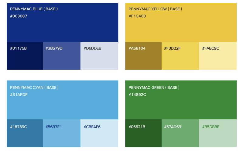
Official Color Codes
Primary Color: Resolution Blue
- Hex: #002F88
- RGB: (0, 47, 136)
- CMYK: (100, 65, 0, 47)
- HSL: (219, 100, 27)
Secondary Color: Golden Glow
- Hex: #FBEB9D
- RGB: (251, 235, 157)
- CMYK: (0, 6, 37, 2)
- HSL: (50, 92, 80)
Tertiary Color: Tangaroa
- Hex: #031634
- RGB: (3, 22, 52)
- CMYK: (94, 58, 0, 80)
- HSL: (217, 89, 11)
Dimensions and Proportions
The logo uses a vertical stacking arrangement with the roofline icon on top and the wordmark below. The SVG source file on Wikimedia Commons is nominally sized at 395 x 128 pixels, but being a vector graphic, it scales to any resolution without quality loss.
Adequate clear space around the logo is important. While PennyMac hasn’t made its exact spacing rules public, standard practice for combination marks like this calls for a minimum buffer zone equal to the height of a specific letter (often the “P” in the wordmark) on all sides.
The logo works in horizontal lockup, vertical stacking, and as a standalone icon (the roofline only). Each version is used depending on the placement context.
What Cultural Impact Has the PennyMac Logo Had?
PennyMac’s brand reach is significant. The company has serviced over $1 trillion in loans for more than 4 million homeowners. For those borrowers, the PennyMac logo is something they see on monthly statements, email communications, and their online mortgage portal.
The 2022 rebrand specifically aimed to clear up the government agency confusion. That’s a real problem when your name sounds like Freddie Mac or Ginnie Mae. The bolder, more corporate logo treatment helps signal that PennyMac is a private-sector company, not a quasi-governmental entity.
The brand also earned a spot on Fortune’s list of Fastest Growing Companies, which gave the logo broader visibility in business media. For an industry where most people can’t name their mortgage servicer’s logo, PennyMac has pushed harder than average to build recognition.
How Does the PennyMac Logo Fit Into the Overall Brand Identity?

The logo is just one piece of a larger brand system. PennyMac’s identity includes the “Greatness Lives Here” campaign platform, a cohesive set of brand guidelines covering everything from photography style to tone of voice, and a unified look across all five of its business lines.
Ludwig+ built the identity with brand storytelling in mind, connecting the visual mark to PennyMac’s core values of accountability, reliability, and ethics. Gradient accents and custom graphic elements extend the logo’s visual language into marketing materials, creating what the agency calls “connective tissue” across consumer-facing and B2B communications.
The brand style guide ensures consistency whether the logo appears on a billboard, a mobile app screen, or a broker’s co-branded flyer. That kind of control matters when you’re operating across correspondent, consumer direct, and wholesale lending channels simultaneously.
How Should the PennyMac Logo Be Used?
Official Usage: The PennyMac logo should always appear in its approved color configurations. The primary version uses Resolution Blue on a white background. Reversed versions (white on blue or dark backgrounds) exist for specific contexts. The roofline icon and wordmark should never be separated in unapproved ways or redrawn.
Where to Access Official Logos: PennyMac provides brand assets to its broker and correspondent partners through internal portals. General corporate logo files can be found on brand asset platforms like Brandfetch. The SVG file is also available on Wikimedia Commons for informational and editorial use.
Licensing: The PennyMac name and logo are proprietary. Third-party use requires explicit permission from PennyMac Financial Services. Broker partners operating under Pennymac TPO receive co-branding resources through their partnership agreements.
Trademark Protection: PennyMac Financial Services, Inc. holds trademarks on its name and logo. Unauthorized use, modification, or reproduction of the mark is restricted. The company actively maintains its brand across all digital and print channels to ensure proper representation.
Following proper logo design principles and creating clear emphasis in every placement are key to keeping the PennyMac identity consistent. If you’re a partner or vendor working with the brand, always use the latest approved files and follow the spacing and color requirements outlined in the official guidelines.
FAQ on The PennyMac Logo
What does the PennyMac logo look like?
The PennyMac logo is a combination mark. It features a stylized roofline icon above the word “PENNYMAC” in bold, uppercase sans-serif lettering. The color palette uses Resolution Blue (#002F88) as the primary tone, with Golden Glow (#FBEB9D) as a secondary accent.
When was the current PennyMac logo introduced?
PennyMac Financial Services unveiled its current logo on January 10, 2022. The rebrand was a joint announcement from PennyMac Financial Services (NYSE: PFSI) and PennyMac Mortgage Investment Trust (NYSE: PMT). Ludwig+, a Detroit-area agency, handled the redesign.
Who designed the PennyMac logo?
Ludwig+ developed the full rebrand after roughly a year of research and collaboration. Mode Project produced the animated launch video. PennyMac’s internal teams worked closely with the agency throughout the process, led by CEO David Spector.
What do the colors in the PennyMac logo mean?
The deep blue signals trust and stability, which is standard in mortgage industry branding. Golden Glow adds warmth and energy. Tangaroa (#031634), a near-black navy, provides depth. Together they create a strong contrast that feels both professional and approachable.
What does the roofline symbol in the PennyMac logo represent?
The angular roofline icon represents homeownership. But it does more than that. PennyMac describes the shape as suggesting forward momentum and a window into the future. The open, tilted angle gives it a sense of progress rather than something static.
Has the PennyMac logo changed since 2008?
Yes. The original 2008 logo used mixed-case lettering and a more traditional roof graphic. The 2022 version switched to all uppercase type and a modernized, geometric roofline. That’s two main versions across the company’s history as a residential mortgage lender.
Where can I download the official PennyMac logo?
Brand asset platforms like Brandfetch host PennyMac logo files in SVG and PNG formats. An SVG version also exists on Wikimedia Commons. Broker partners get access to co-branding assets through PennyMac’s internal partner portals. Always use the latest approved files.
What font does the PennyMac logo use?
The wordmark uses a custom sans-serif typeface in all caps. The letterforms are clean with consistent stroke widths and balanced spacing. It reads as modern and authoritative, which fits PennyMac’s position as one of the largest loan servicers in the U.S.
Is the PennyMac logo trademarked?
Yes. PennyMac Financial Services, Inc. holds trademarks on both the name and the logo. Unauthorized reproduction or modification is restricted. Third-party use, including by mortgage brokers and correspondent lenders, requires explicit permission or a formal partnership agreement.
Why did PennyMac rebrand in 2022?
The company needed to fix a perception problem. People often confused PennyMac with a government agency because the name sounds like Freddie Mac or Ginnie Mae. The rebrand also marked PennyMac’s push into B2C retail originations and broader marketing for the first time in its history.
Conclusion
The PennyMac logo does what a good financial services mark should do. It communicates trust, ties directly to homeownership, and scales cleanly across digital platforms and print materials.
The 2022 rebrand by Ludwig+ gave PennyMac Loan Services a sharper corporate identity. The modernized roofline, uppercase wordmark, and refined color saturation all work together to separate the brand from its government-agency lookalikes.
For a company managing over $500 billion in mortgage servicing and serving millions of borrowers, brand recognition matters more than most people think. The logo is the first thing customers see on statements, apps, and loan documents.
It holds up. And in this industry, that’s saying something.

Renowned for his expertise in logo design and visual branding, Bogdan has developed a multitude of logos for various clients.
His skills extend to creating posters, vector illustrations, business cards, and brochures. Additionally, Bogdan's UI kits were featured on marketplaces like Visual Hierarchy and UI8.
He also wrote in the past years on sites like Design Your Way, WebDesignerDepot, WPDean, Designmodo, Speckyboy, Slider Revolution, and more.
- The Windsurf Logo History, Colors, Font, And Meaning - 10 October 2026
- How to Remove Background From Product Photos (No Photoshop) - 10 October 2026
- How Designers can Build a Stronger Online Creative Identity - 9 October 2026

Bogdan Sandu is a seasoned designer who has been designing websites since 2008. Renowned for his expertise in logo design and visual branding, Bogdan has developed a multitude of logos for various clients. His skills extend to creating posters, vector illustrations, business cards, and brochures. Additionally, Bogdan's UI kits were featured on marketplaces like Visual Hierarchy and UI8. He also wrote in the past years on sites like Design Your Way, WebDesignerDepot, WPDean, Designmodo, Speckyboy, Slider Revolution, and more.
You Might Also Like


