
The Chevrolet Logo stands as one of the most recognized automotive symbols worldwide. That golden bowtie shape has been sitting on car grilles since 1913.
It represents more than just a car brand. The emblem carries over a century of American manufacturing history and cultural identity.
Chevrolet currently uses a refined version introduced in 2021. The company has gone through roughly nine major logo iterations since its founding in 1911.
General Motors owns the trademark. The bowtie design has become synonymous with affordable American vehicles, from the Corvette to the Silverado.
What is the Chevrolet Logo?
The Chevrolet Logo is a bowtie-shaped emblem featuring a gold cross design with silver borders. It was first introduced in 1913 by co-founder William C. Durant. The symbol represents reliability and American automotive heritage.
Key Attributes:
- Design Type: Combination mark (symbol with wordmark used separately)
- Primary Elements: Bowtie cross shape, metallic finish, beveled edges
- Official Introduction Date: 1913 (exact month disputed)
- Designer: William C. Durant (origin story varies)
- Trademark Status: Registered trademark of General Motors LLC
- Color Palette: Gold (#D4AF37), Silver (#C0C0C0), Black (#000000) for borders
- Usage Context: Vehicle grilles, dealership signage, marketing materials, merchandise, digital platforms
How Has the Chevrolet Logo Evolved Over Time?
The Chevrolet bowtie has undergone nine major redesigns since 1913. Early versions were simple and flat. Modern iterations feature 3D effects and metallic finishes.
The core shape has remained consistent throughout. That’s actually impressive for a logo this old.
Original Chevrolet Logo (1911-1913)
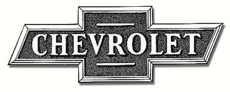
- Years Active: 1911-1913
- Design Description: Script wordmark reading “Chevrolet” in cursive lettering. No bowtie present yet.
- Color Scheme: Black text on white background
- Designer: Unknown
- Context: Used when Louis Chevrolet and William Durant founded the company
- Key Changes from Previous: First logo, established brand name recognition
- Cultural Significance: Represented the birth of an American automotive legend
First Bowtie Logo (1913-1942)
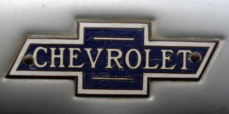
- Years Active: 1913-1942
- Design Description: Simple bowtie outline with “Chevrolet” text inside. Flat design with thin borders.
- Color Scheme: Blue and white
- Designer: William C. Durant
- Context: Durant reportedly saw the pattern in Paris hotel wallpaper (though this origin is disputed)
- Key Changes from Previous: Introduction of the iconic bowtie shape
- Cultural Significance: Created one of the most enduring automotive symbols
Post-War Chevrolet Logo (1942-1964)
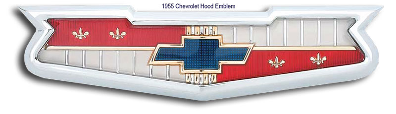
- Years Active: 1942-1964
- Design Description: More refined bowtie with cleaner edges. Added dimensionality through shading.
- Color Scheme: Blue, white, and silver accents
- Designer: GM Design Team
- Context: Post-WWII optimism and automotive boom
- Key Changes from Previous: More polished appearance, removed interior text
- Cultural Significance: Became associated with the American Dream era
Modern Era Logo (1964-2004)
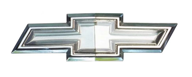
- Years Active: 1964-2004
- Design Description: Bold, solid bowtie shape. Chrome-like appearance on vehicles.
- Color Scheme: Gold and silver
- Designer: GM Corporate Design
- Context: Muscle car era through SUV boom
- Key Changes from Previous: Shift to gold coloring, more aggressive styling
- Cultural Significance: Appeared on iconic models like the Camaro and Corvette
Contemporary Chevrolet Logo (2004-Present)

- Years Active: 2004-present (refined in 2021)
- Design Description: 3D rendered bowtie with gradient effects and metallic textures. Beveled edges create depth.
- Color Scheme: Gold gradient with chrome border
- Designer: GM Global Design
- Context: Digital age requiring scalable, modern aesthetics
- Key Changes from Previous: Enhanced 3D effects, works well as vector graphics across platforms
- Cultural Significance: Bridges traditional American automotive heritage with modern design expectations
What Do the Design Elements of the Chevrolet Logo Mean?
The bowtie shape symbolizes confidence and forward motion. Its horizontal orientation suggests stability and reliability.
The cross-like structure creates symmetry that feels balanced. People trust symmetrical designs more. There’s actual psychology behind this.
Why Did Chevrolet Choose These Specific Colors?
Gold communicates prestige and quality. It’s a classic choice for brands that want to feel premium without being untouchable.
Understanding color psychology helps explain this choice.
Silver and chrome borders add an industrial, automotive quality. They suggest durability and craftsmanship.
Color Breakdown:
- Chevrolet Gold: Hex #D4AF37, represents value, tradition, and American craftsmanship
- Chrome Silver: Hex #C0C0C0, symbolizes precision engineering and durability
- Black Accents: Hex #000000, provides contrast and definition
What Typography Style Is Used in the Chevrolet Logo?
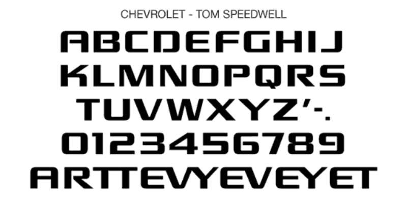
Chevrolet uses a custom sans-serif font for its wordmark. Clean lines and geometric shapes define the letterforms.
The typography stands separate from the bowtie. This gives flexibility in applications.
Recent versions feature a bold, all-caps treatment. Readability stays strong at any size.
What Are the Hidden Meanings in the Chevrolet Logo?
The bowtie origin remains a mystery. Durant claimed he saw it in Paris hotel wallpaper.
His wife said it came from a Virginia newspaper ad. Some historians point to a coal company logo.
The psychology of shapes suggests the cross pattern indicates intersection and connection. Maybe that’s a stretch.
How Does the Chevrolet Logo Compare to Competitor Logos?
Most American automakers use text-heavy designs. Ford has its blue oval with script. Dodge relies on ram imagery.
Chevrolet stands apart with pure geometric abstraction. The bowtie doesn’t try to be literal.
Competitive Comparison:
- vs. Ford: Ford uses nostalgic script typography. Chevrolet’s abstract shape feels more modern and adaptable.
- vs. RAM: RAM features a literal ram’s head. Chevrolet’s abstraction allows broader interpretation.
- vs. Toyota: Toyota’s overlapping ovals focus on global unity. Chevrolet’s bowtie emphasizes American heritage.
- vs. Honda: Honda uses a simple “H” lettermark. Less distinctive but highly practical.
What Are the Technical Specifications of the Chevrolet Logo?
Official Color Codes:
Chevrolet Gold
Chrome Silver
- Hex: #C0C0C0
- RGB: (192, 192, 192)
- CMYK: (0, 0, 0, 25)
- Pantone: 877 C (metallic)
Black
- Hex: #000000
- RGB: (0, 0, 0)
- CMYK: (0, 0, 0, 100)
Dimensions and Proportions:
- Aspect Ratio: Approximately 2.5:1 (width to height)
- Minimum Size: 0.5 inches (12.7mm) for print applications
- Clear Space: Minimum of 25% of logo height on all sides
- Digital Minimum: 50 pixels width for web use
What Cultural Impact Has the Chevrolet Logo Had?
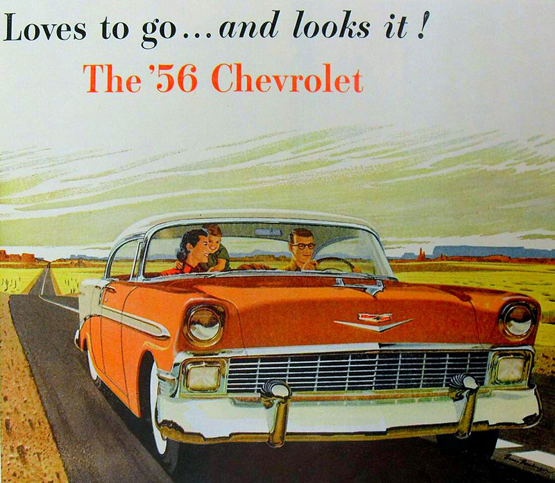
The bowtie appears in countless films and TV shows. It’s shorthand for “American car” in media worldwide.
NASCAR made the logo iconic in motorsports. The Corvette racing program built performance credibility.
You see it on everything from t-shirts to tattoos. That kind of cultural penetration is rare for automotive branding.
How Does the Chevrolet Logo Fit Into the Overall Brand Identity?
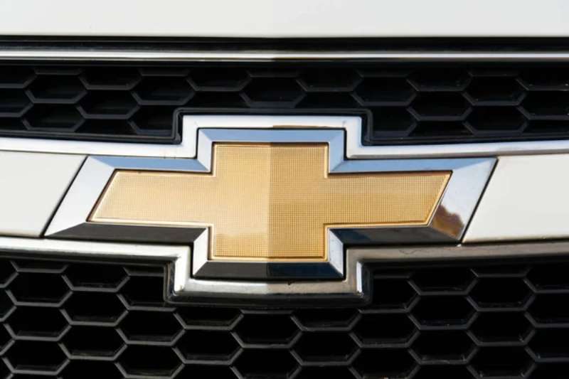
The bowtie anchors all Chevrolet communications. Every vehicle, advertisement, and dealership features it prominently.
Strong brand guidelines govern its use. GM protects the trademark aggressively.
Sub-brands like Corvette and Silverado have their own identities. But the bowtie always appears somewhere. It creates family recognition across a diverse product lineup.
The color palette extends throughout marketing materials. Gold and black dominate showroom design.
How Should the Chevrolet Logo Be Used?
Official Usage Guidelines:
- Do: Use official logo files from GM media resources
- Do: Maintain clear space requirements around the logo
- Do: Use approved color variations (full color, black, white)
- Don’t: Stretch, rotate, or distort the bowtie shape
- Don’t: Add effects like shadows or glows not in official files
- Don’t: Place on busy backgrounds that reduce visibility
Access and Licensing:
- Official Assets: Available through GM Media or authorized dealer portals
- Licensing: Required for any commercial use outside GM-approved contexts
- Trademark Protection: Registered in 150+ countries, actively enforced
- Fan Use: Personal, non-commercial use generally tolerated but not officially permitted
FAQ on The Chevrolet Logo
What Does the Chevrolet Bowtie Logo Mean?
The bowtie emblem represents strength, reliability, and American automotive heritage.
Its cross-like shape suggests intersection and progress. The golden color communicates quality and value.
General Motors has never provided one official meaning. Interpretations vary based on who you ask.
Who Designed the Chevrolet Logo?
William C. Durant, Chevrolet co-founder, introduced the bowtie in 1913.
The exact origin story remains disputed. Durant claimed he saw the design in Paris hotel wallpaper during a trip.
His wife told a different story about a newspaper advertisement. No designer is officially credited.
When Was the Chevrolet Logo First Created?
The bowtie first appeared in 1913, two years after Louis Chevrolet and Durant founded the company.
Before the bowtie, Chevrolet used a simple script wordmark. The switch to a symbol improved brand recognition significantly.
Why Is the Chevrolet Logo Called a Bowtie?
The shape resembles a bowtie or cross pattern. Simple as that.
Some call it a cross. Others see a plus sign.
The nickname stuck because “bowtie” was easier to remember than “Chevrolet cross emblem.”
Has the Chevrolet Logo Changed Over Time?
Yes. The logo evolution includes roughly nine major redesigns since 1913.
Early versions were flat and simple. Modern versions feature 3D effects and metallic finishes that follow current logo design principles.
The core bowtie shape never changed. That consistency built remarkable brand recognition over a century.
What Are the Official Chevrolet Logo Colors?
Gold and silver dominate the current Chevy badge. Black provides border definition.
The gold connects to gold logos used by premium brands. It signals value without feeling exclusive.
Chrome silver adds an industrial, automotive quality that customers associate with durability.
What Font Does Chevrolet Use in Its Branding?
Chevrolet uses a custom typeface for its wordmark. Clean, geometric letterforms define the style.
The font features bold, all-caps treatment. Good kerning keeps letters readable at any size.
Is the Chevrolet Logo Trademarked?
Absolutely. General Motors holds trademark registration in over 150 countries.
They protect it aggressively. Unauthorized commercial use will get you a cease-and-desist letter fast.
The bowtie is one of the most protected car logos in the automotive industry.
Where Did the Chevrolet Bowtie Idea Come From?
Three origin stories exist. Durant said Paris hotel wallpaper inspired him.
His wife claimed a Virginia newspaper ad caught his eye. Historians found a similar design from a coal company.
The truth? Nobody knows for certain. GM has never confirmed any version officially.
How Can I Download the Official Chevrolet Logo?
GM Media provides official assets for authorized users. Dealerships access files through internal portals.
Public downloads require licensing approval. The company maintains strict brand style guide requirements.
For personal projects, you can find reference images online. Just don’t use them commercially.
Conclusion
The Chevrolet Logo has survived over a century of automotive history. That golden bowtie still works.
Few brand symbols achieve this kind of staying power. The Detroit automaker got it right in 1913 and stuck with it.
Whether on a Corvette grille or Silverado tailgate, the emblem communicates the same thing. American manufacturing. Accessible quality.
The origin story remains a mystery. Honestly, that adds to its appeal.
Good visual hierarchy and simple geometry made the bowtie timeless. Sometimes the best designs are the ones you don’t overthink.

Renowned for his expertise in logo design and visual branding, Bogdan has developed a multitude of logos for various clients.
His skills extend to creating posters, vector illustrations, business cards, and brochures. Additionally, Bogdan's UI kits were featured on marketplaces like Visual Hierarchy and UI8.
He also wrote in the past years on sites like Design Your Way, WebDesignerDepot, WPDean, Designmodo, Speckyboy, Slider Revolution, and more.
- NBA Team Color Codes - 26 July 2026
- The Figma Logo History, Colors, Font, And Meaning - 25 July 2026
- Canva for Teams Review: Is It Worth the Business Plan? - 24 July 2026

Bogdan Sandu is a seasoned designer who has been designing websites since 2008. Renowned for his expertise in logo design and visual branding, Bogdan has developed a multitude of logos for various clients. His skills extend to creating posters, vector illustrations, business cards, and brochures. Additionally, Bogdan's UI kits were featured on marketplaces like Visual Hierarchy and UI8. He also wrote in the past years on sites like Design Your Way, WebDesignerDepot, WPDean, Designmodo, Speckyboy, Slider Revolution, and more.
You Might Also Like