The Ford logo stands as one of the most recognized automotive emblems worldwide. That blue oval with the scripted “Ford” lettering has appeared on vehicles since 1927, though the company itself dates back to 1903.
Ford Motor Company, headquartered in Dearborn, Michigan, has updated its logo roughly eight times throughout its history. The current version maintains the classic blue oval shape while refining the script for modern applications.
Henry Ford founded the company, but the distinctive script came from Childe Harold Wills, Ford’s chief engineer and draftsman. His handwriting became the basis for one of automotive history’s most lasting brand marks.
What is the Ford Logo?
The Ford logo is a blue oval emblem featuring the word “Ford” in white script lettering. Introduced in its current oval form in 1927, the design originated from engineer Childe Harold Wills’ personal handwriting style. It represents reliability, American manufacturing heritage, and over a century of automotive production.
Design Type: Combination mark (emblem with wordmark)
Primary Elements:
- Oval shape container
- Custom script typography spelling “Ford”
- Blue background field
- White lettering with slight dimensional effects
Official Introduction Date: 1927 (oval version)
Designer: Childe Harold Wills (original script, 1903)
Trademark Status: Registered trademark of Ford Motor Company globally
Color Palette:
- Ford Blue: #003478
- White: #FFFFFF
Usage Context: Vehicle grilles and badges, dealership signage, marketing materials, digital platforms, merchandise, racing liveries, and corporate communications.
How Has the Ford Logo Evolved Over Time?
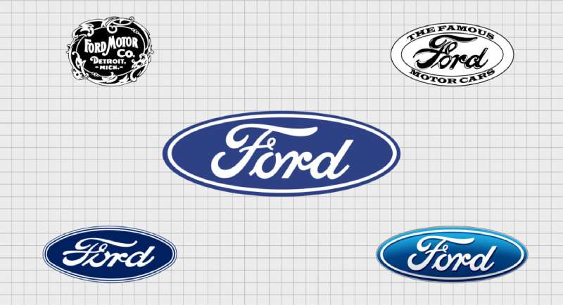
The Ford logo has gone through roughly eight major versions since 1903. Each redesign reflected changing design trends and manufacturing capabilities.
The script remained consistent throughout. But the framing elements shifted from ornate Victorian borders to the clean oval we see today.
Most changes were subtle refinements rather than complete overhauls. Ford understood early on that brand recognition requires consistency.
Original Ford Logo (1903-1907)
Years Active: 1903-1907
Design Description: The first Ford logo featured elaborate Victorian-style ornamentation. The word “Ford” appeared in a decorative frame with swirling borders and the tagline “Detroit” below. Very busy by today’s standards.
Color Scheme: Black and white primarily
Designer: Childe Harold Wills created the script based on his own handwriting
Context: Ford Motor Company had just been founded. The ornate style matched the design conventions of early 1900s American business.
Key Changes from Previous: This was the original, so no prior version existed
Cultural Significance: It marked the birth of what would become America’s most influential automaker. The script established an identity that would last over 120 years.
Winged Ford Logo (1909-1912)
Years Active: 1909-1912
Design Description: Ford added wings extending from either side of the wordmark. The design suggested speed and flight, common themes in early automotive branding.
Color Scheme: Black and white
Context: The automobile industry was booming. Ford needed to communicate performance and progress to early adopters.
Key Changes from Previous: Dropped the ornate Victorian frame. Added wings for a more dynamic appearance.
Cultural Significance: Reflected the era’s fascination with aviation and mechanical progress. Took me a while to find good examples of this one, actually. It’s not as documented as the later versions.
Introduction of the Oval (1927-1957)
Years Active: 1927-1957
Design Description: The blue oval made its first appearance. The script sat centered within an elliptical shape, creating the basic template still used today.
Color Scheme: Blue background with white script
Context: Ford needed a more unified brand identity as the company expanded globally. The oval provided a clean, recognizable shape.
Key Changes from Previous: Eliminated the wings entirely. Introduced the oval container and blue color.
Cultural Significance: This version established the visual identity that generations would recognize. It coincided with Ford’s massive growth as an international company.
Refined Blue Oval (1957-1976)
Years Active: 1957-1976
Design Description: The oval became more refined with cleaner edges. The script maintained its flowing character but received subtle updates for better reproduction.
Color Scheme: Deeper blue with crisp white lettering
Context: Post-war manufacturing advances allowed for more precise badge production. The logo needed to work on an expanding vehicle lineup.
Key Changes from Previous: Sharper definition overall. The oval shape became more consistent across applications.
Modern Ford Logo (1976-2003)
Years Active: 1976-2003
Design Description: Ford introduced a more three-dimensional appearance. The oval gained depth and chrome-like qualities for vehicle badges.
Color Scheme: Ford Blue (#003478) with white script and metallic accents
Context: Automotive design was becoming more sophisticated. Badges needed to complement increasingly styled vehicle exteriors.
Key Changes from Previous: Added dimensionality and metallic effects. The script became slightly bolder.
Current Ford Logo (2003-Present)
Years Active: 2003-Present
Design Description: The current logo retains the classic oval but with refined proportions. A subtle gradient adds depth while maintaining clarity at any size.
Color Scheme: Ford Blue with white script and subtle dimensional shading
Designer: Internal Ford design team
Context: Digital applications required a logo that worked across screens, print, and physical badges.
Key Changes from Previous: Simplified the dimensional effects. Optimized for digital reproduction while keeping the classic feel.
What Do the Design Elements of the Ford Logo Mean?
The Ford logo communicates heritage, reliability, and American manufacturing through its core elements.
The oval shape creates a sense of completeness. The script adds a personal, handwritten quality that connects to the company’s founder.
Blue conveys trust and dependability. White provides clarity and contrast that makes the logo readable at any distance.
Why Did Ford Choose These Specific Colors?

Ford Blue serves as the primary brand color. The specific shade (#003478) falls into the darker end of the blue spectrum.
This particular blue communicates stability and trustworthiness. According to color psychology, blue is the most universally preferred color and suggests reliability.
White provides maximum contrast against the blue background. It keeps the script legible whether on a vehicle grille or a tiny digital icon.
The combination is deliberately conservative. Ford sells trucks to farmers and sedans to families. The color palette needed to appeal across demographics without feeling flashy or exclusive.
What Typography Style Is Used in the Ford Logo?
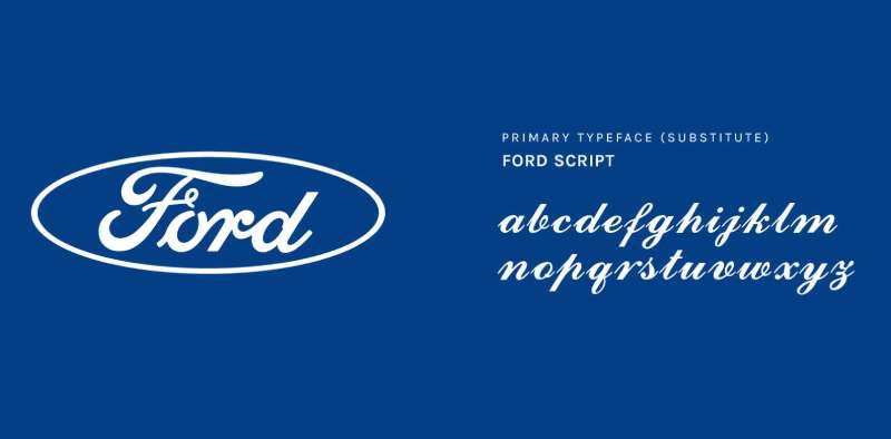
The Ford script is a custom typeface based on Childe Harold Wills’ handwriting from 1903.
It’s not a standard font you can download. The lettering was hand-drawn originally and has been refined over decades.
The script has a flowing, connected quality. Each letter joins naturally to the next, creating a signature-like appearance that feels personal rather than corporate.
Readability works at almost any scale. The letterforms are distinct enough that even small badge versions remain clear.
What Are the Hidden Meanings in the Ford Logo?
Honestly, the Ford logo is pretty straightforward. It doesn’t hide arrows like FedEx or contain secret symbols.
The oval shape might suggest a running track or racetrack. Ford has significant motorsport history, so this reading makes some sense.
The script’s personal quality connects directly to Henry Ford. It feels like a signature, implying a personal guarantee of quality.
Some see the oval as representing global reach. But that might be reading too much into a practical design choice from 1927.
How Does the Ford Logo Compare to Competitor Logos?
Ford takes a distinctly American approach compared to its competitors. While German brands like the BMW logo and Audi logo emphasize precision geometry, Ford keeps things warmer with that handwritten script.
The Chevrolet logo uses a bowtie shape. The Dodge logo went through various ram imagery. Ford stuck with its basic concept longer than almost anyone.
Japanese competitors like Toyota and Honda use more abstract, geometric marks. Ford’s script feels almost old-fashioned by comparison. But that’s the point.
Among car logos, Ford’s emblem ranks among the most recognizable globally. The consistency has paid off over time.
What Are the Technical Specifications of the Ford Logo?
Official Color Codes:
Primary Color: Ford Blue
Secondary Color: White
- Hex: #FFFFFF
- RGB: (255, 255, 255)
- CMYK: (0, 0, 0, 0)
Dimensions and Proportions:
- Aspect ratio: Approximately 2.5:1 (width to height)
- Minimum size: 0.5 inches (12.7mm) width for print applications
- Clear space: Equal to the height of the “F” on all sides
- The oval should never be stretched, compressed, or rotated
For digital applications, Ford specifies minimum pixel dimensions to maintain legibility. Vector graphics versions exist for scalable applications.
What Cultural Impact Has the Ford Logo Had?
The Ford logo appears in countless films, photographs, and cultural artifacts documenting American life since the early 1900s.
It’s shown up in everything from Depression-era photographs to modern action movies. The blue oval signals “American-made” in ways few other symbols can match.
During wartime, Ford produced military vehicles. The logo appeared on tanks and trucks, connecting it to national service.
The “Built Ford Tough” tagline extended the logo’s meaning beyond transportation. It became shorthand for durability and working-class values.
How Does the Ford Logo Fit Into the Overall Brand Identity?
Ford’s brand guidelines position the logo as the centerpiece of all communications.
The blue oval appears on vehicles, dealerships, advertisements, and merchandise. It anchors everything from the F-150 to the Mustang.
Sub-brands like Ford Performance use modified versions while maintaining the core script. Lincoln, Ford’s luxury division, has its own distinct identity but shares corporate resources.
The logo works across contexts because it’s simple enough to adapt. It scales from tiny key fobs to massive dealership signs without losing recognition.
Ford’s brand style guide covers applications most people never consider. Things like proper placement on racing vehicles or how the logo should appear in monochrome contexts.
How Should the Ford Logo Be Used?
Official Usage Guidelines:
- Always use official logo files from Ford’s media resources
- Maintain minimum clear space around the logo
- Never alter the colors, proportions, or orientation
- Do not add effects, shadows, or outlines not included in official versions
- The logo should never appear on busy backgrounds that reduce legibility
Where to Access Official Logos:
Ford provides official logo files through its media portal for press and partner use. Dealerships receive brand assets through internal channels.
Licensing Information:
The Ford logo is a registered trademark. Unauthorized commercial use is prohibited. Licensing for merchandise requires formal agreement with Ford Motor Company.
Trademark Protection:
Ford actively protects its trademark globally. The company monitors unauthorized use and takes legal action when necessary. The blue oval design and “Ford” script are protected in most countries.
FAQ on The Ford Logo
Who Designed the Ford Logo?
Childe Harold Wills designed the original Ford script in 1903. He was Henry Ford’s chief engineer and draftsman.
Wills based the lettering on his own handwriting. That personal touch gave the Ford emblem its signature quality that remains today.
When Was the Ford Logo Created?
The Ford script first appeared in 1903 when the company launched. The famous blue oval came later, in 1927.
Ford Motor Company has refined the badge several times since. But the core typography stayed remarkably consistent across 120 years.
What Does the Ford Blue Oval Mean?
The oval shape represents completeness and unity. It frames the Ford nameplate in a clean, recognizable container.
Some interpret the oval as a racetrack, connecting to Ford’s motorsport heritage. The psychology of shapes suggests ovals feel approachable and stable.
What Font Is Used in the Ford Logo?
Ford uses a custom script font based on Childe Harold Wills’ handwriting. You cannot download it anywhere.
The letterforms connect naturally, creating a signature-like appearance. This falls under iconic fonts that define major brands.
Why Is the Ford Logo Blue?
Blue communicates trust, reliability, and dependability. These qualities align with Ford’s brand positioning in the American automotive market.
The specific shade (Ford Blue) appears in many blue logos across industries. It works well for companies selling products that require consumer confidence.
Has the Ford Logo Changed Over the Years?
Yes. Ford updated its emblem roughly eight times since 1903. Early versions featured ornate Victorian borders and even wings.
The blue oval arrived in 1927. Since then, changes have been subtle refinements rather than complete redesigns. Consistency matters in logo design principles.
What Are the Official Ford Logo Colors?
Ford Blue (#003478) and white make up the official palette. The combination creates strong visual hierarchy and readability.
These colors work across print design, digital applications, and vehicle badges without losing clarity.
Can I Use the Ford Logo for Personal Projects?
The Ford trademark is protected. Commercial use without permission is illegal.
Fan art and personal, non-commercial projects exist in a gray area. But selling merchandise with the Ford badge will get you in trouble. Always check font licensing rules too.
Why Does Ford Use a Cursive Script Style?
The script creates a personal, signature-like quality. It suggests Henry Ford himself stands behind every vehicle.
This approach differs from geometric marks used by competitors. Understanding font psychology explains why scripts feel warm and trustworthy.
Where Is the Ford Logo Placed on Vehicles?
The blue oval appears on the front grille and rear liftgate or trunk. Some models feature it on the steering wheel too.
Placement follows strict graphic design principles for balance and visibility. The badge serves as the focal point of vehicle identity.
Conclusion
The Ford logo proves that lasting brand identity comes from simplicity and consistency. Over 120 years, the blue oval and script lettering became synonymous with American automotive heritage.
Childe Harold Wills’ handwriting from 1903 still defines Ford Motor Company today. That’s remarkable when you think about it.
The design elements work together through strong emphasis and clear symmetry. No hidden tricks. No complicated symbolism.
Just a name in an oval that billions recognize instantly. Sometimes the best logos are the ones that refuse to overthink things.

Renowned for his expertise in logo design and visual branding, Bogdan has developed a multitude of logos for various clients.
His skills extend to creating posters, vector illustrations, business cards, and brochures. Additionally, Bogdan's UI kits were featured on marketplaces like Visual Hierarchy and UI8.
He also wrote in the past years on sites like Design Your Way, WebDesignerDepot, WPDean, Designmodo, Speckyboy, Slider Revolution, and more.
- Best Email Design System Examples From Leading Brands - 5 October 2026
- Canva AI Features Reviewed: Are They Actually Useful? - 4 October 2026
- The Substack Logo History, Colors, Font, And Meaning - 2 October 2026

Bogdan Sandu is a seasoned designer who has been designing websites since 2008. Renowned for his expertise in logo design and visual branding, Bogdan has developed a multitude of logos for various clients. His skills extend to creating posters, vector illustrations, business cards, and brochures. Additionally, Bogdan's UI kits were featured on marketplaces like Visual Hierarchy and UI8. He also wrote in the past years on sites like Design Your Way, WebDesignerDepot, WPDean, Designmodo, Speckyboy, Slider Revolution, and more.
You Might Also Like