


The Toulouse logo is one of the most recognizable crests in French football. It belongs to Toulouse Football Club, a professional club based in the city of Toulouse, competing in Ligue 1. The current version of the badge was introduced in 2018, designed through a fan competition won by supporter Julien Labazuy. The club traces its roots back to 1970, though its founding year is officially listed as 1937 on the crest. Over the decades, the club has gone through roughly nine different logo versions, each reflecting a different chapter of its identity.
Within French football branding, the Toulouse logo holds a distinctive position. Few clubs in Ligue 1 have managed to merge city heritage with modern sports design quite like this. The circular crest format, the Occitan cross, and the violet color scheme set it apart from the more conventional approaches seen across European football.
What Is the Toulouse FC Logo?

The Toulouse FC logo is a circular emblem featuring the coat of arms of the city of Toulouse at its center. It includes the Occitan cross, a lamb, fleurs-de-lis, and crenellated towers rendered in gold, red, blue, and white. Introduced in 2018 and refined in 2021, the badge was born out of a fan design competition and carries the club’s founding year of 1937.
Here is a breakdown of the key attributes:
- Design Type: Combination mark (circular emblem with text and heraldic imagery)
- Primary Elements: The Occitan cross (gold and blood-red), a white lamb, three fleurs-de-lis on a blue field, crenellated castle towers on a red field, and the full club name encircling the crest
- Official Introduction Date: June 25, 2018 (current version refined in 2021)
- Designer: Julien Labazuy (fan and graphic designer, winner of the club’s 80th anniversary design competition in 2017)
- Trademark Status: Registered trademark of Toulouse Football Club, owned by RedBird Capital Partners (85% stake acquired in 2020)
- Color Palette: Violet (#3E2C56), Light Violet (#745990), Red (#E60746), Gold (#E1B57A), White (#FFFFFF)
- Usage Context: Match kits, stadium signage, broadcast graphics, digital platforms, fan merchandise, official stationery, and social media profiles
How Has the Toulouse FC Logo Evolved Over Time?
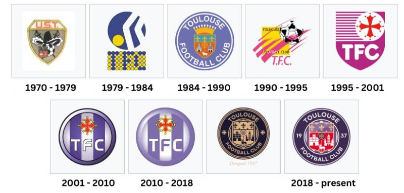
The Toulouse FC logo has been through approximately nine redesigns since 1970. Early versions leaned heavily on traditional heraldic imagery, while more recent updates simplified the badge for digital use. The biggest shift happened in 2018, when the club replaced its long-standing “TFC” monogram with a full circular emblem referencing the city’s coat of arms.
Original Toulouse Logo (1970-1979)
Years Active: 1970-1979
When the club was re-established as Union Sportive Toulouse in 1970, the first badge was simple and direct. It featured basic lettering and minimal graphic elements, reflecting the modest origins of a club starting in the lower divisions.
The color scheme at the time used red and yellow, matching the team’s original jersey colors. There was no elaborate crest or heraldic symbolism at this stage.
It was a practical badge more than anything else. Football clubs in France during the 1970s rarely invested in sophisticated branding, and Toulouse was no different.
The Transition to Purple (1979-1990)
Years Active: 1979-1990
In 1979, the club officially reclaimed the name Toulouse FC. With that came a shift to purple and white as the primary team colors.
The badge during this period started incorporating more recognizable elements. The violet color appeared, tying the club to its city nickname, “la Cite des violettes” (the City of Violets).
Multiple iterations came through the 1980s. The logo from 1984 onward began introducing shield-based designs with a more structured layout. It was during this era that the club first competed in European competition, beating Maradona’s Napoli in the 1986-87 UEFA Cup.
The branding needed to match that ambition. And it did, at least partially.
The Shield Era (1990-2001)
Years Active: 1990-2001
Through the 1990s, the Toulouse logo settled into a shield-based format. The design was more polished, featuring the “TFC” initials prominently.
This version reflected a period of instability for the club. Toulouse bounced between Ligue 1 and Ligue 2 through much of the decade, ultimately facing financial collapse in 2001.
The color palette remained anchored in purple and white, but the execution was still fairly rigid by modern standards. The shield shape was common among European football clubs at the time, and Toulouse’s version didn’t stand out as much as it could have.
The Modern Rebuild (2001-2010)
Years Active: 2001-2010
After the club’s bankruptcy and relegation to the Championnat National in 2001, a new era began under Olivier Sadran’s ownership. A fresh logo came with that restart.
The 2001 version introduced cleaner lines and a more contemporary feel. The “TFC” abbreviation took center stage in a simplified circular badge. Purple remained dominant, but the overall design moved away from the heavy heraldic look.
This logo saw the club through its return to Ligue 1 and its historic third-place finish in 2007, which earned Toulouse a spot in the UEFA Champions League qualifying rounds. It was a badge that, for many fans, represented a period of genuine hope.
Refinement and Simplification (2010-2018)
Years Active: 2010-2018
A subtle update arrived in 2010. The logo kept the circular format and the “TFC” lettering but adjusted spacing, line weights, and color values.
Think of it as a tune-up, not a rebuild. The changes were small enough that casual fans might not have noticed. But the improvements in legibility at small sizes mattered, especially as digital media became more important for clubs.
This version carried the club through several more Ligue 1 seasons, including some close calls with relegation. The badge was functional but lacked the personality that the club’s history deserved.
The Fan-Designed Crest (2018-2021)
Years Active: 2018-2021
This is the big one. In 2017, for the club’s 80th anniversary, Toulouse FC asked fans to submit their own logo proposals. Over 400 entries came in, and the winning design was by Julien Labazuy, a supporter and graphic designer.
The new badge combined three key historical crests: the coat of arms of the city of Toulouse, the 1986-era club logo, and the 2001 rebirth badge. It brought back the full “Toulouse Football Club” name around the circular border, replaced the simple “TFC” initials, and prominently featured 1937 as the founding year.
Inside the crest, you could now see the Occitan cross, the city’s castle towers, the lamb, and the fleurs-de-lis. The resemblance to Manchester City’s recent redesign was immediately noted by fans and media, though the Toulouse design has its own distinct roots in the city’s heraldry.
The Current Logo (2021-Present)
Years Active: 2021-present
A further refinement arrived in 2021, coinciding with RedBird Capital Partners’ ownership. The basic structure from 2018 remained, but small adjustments improved clarity and versatility across digital and print applications.
The current version is the most polished iteration yet. It works on jersey badges, broadcast overlays, and social media icons without losing detail. The typographic elements within the crest are clean and bold, readable at nearly any size.
This logo accompanied the club’s Ligue 2 title in 2022 and its historic Coupe de France victory in 2023, beating Nantes 5-1 in the final. For many current fans, this is the badge that defined the club’s best modern era.
What Do the Design Elements of the Toulouse FC Logo Mean?
Every element inside the Toulouse FC crest carries direct ties to the city and region. The Occitan cross represents the historical capital of Occitania. The lamb and fleurs-de-lis reference the city’s coat of arms. The castle towers depict Toulouse’s medieval architecture. Together, these elements say one thing: this club belongs to this city.
Why Did Toulouse FC Choose These Specific Colors?
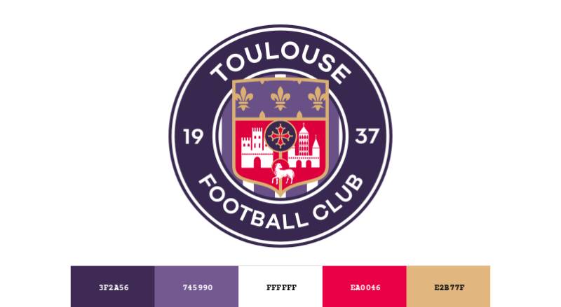
The violet (or purple) in the Toulouse logo directly ties to the city’s nickname, “la Cite des violettes.” Toulouse has been associated with violet flowers for centuries, and the football club adopted that identity when it switched from red and yellow jerseys in 1979.
Understanding how color affects perception matters here. Purple has long been linked to royalty, ambition, and distinction. It sets Toulouse apart visually from most French clubs, which tend to favor blue, red, or green.
Here are the official colors broken down:
- Violet: Hex #3E2C56 | RGB (62, 44, 86) | CMYK (83, 90, 37, 31) | Pantone PMS 669 XGC. The primary color. It represents the violet flower heritage of the city.
- Red: Hex #E60746 | RGB (230, 7, 70) | CMYK (3, 100, 69, 0) | Pantone PMS 192 C. Used within the city coat of arms section of the crest.
- Gold: Hex #E1B57A | RGB (225, 181, 122) | CMYK (12, 29, 59, 0) | Pantone PMS 7508 C. Represents the Occitan cross and historical prestige.
- Light Violet: Hex #745990 | RGB (116, 89, 144) | CMYK (63, 73, 16, 2) | Pantone PMS 268 U. A secondary shade used for depth and detail.
- White: Hex #FFFFFF | RGB (255, 255, 255) | CMYK (0, 0, 0, 0). Used for text, borders, and background contrast.
The gold and red within the crest are not random either. They come directly from the Occitan cross, which is blood-red and gold, a symbol that predates the football club by centuries.
What Typography Style Is Used in the Toulouse FC Logo?
The text within the Toulouse FC badge uses a custom sans-serif typeface. It is bold and uppercase, with tight letter spacing that keeps everything readable even on small jersey badges.
The font has clean, geometric lines. No serifs, no decorative flourishes. It sits within the circular border and needs to work at many sizes, from tiny social media icons to massive stadium banners.
Earlier logos used more traditional lettering. The shift to a modern sans-serif in 2018 was a clear signal that the club wanted its typographic hierarchy to feel contemporary rather than old-fashioned.
What Are the Hidden Meanings in the Toulouse FC Logo?
The 2018 redesign was specifically built to merge three different eras of the club’s history. Look closely, and you will notice the coat of arms structure mirrors the city of Toulouse’s official heraldry.
The lamb in the crest is the Agnus Dei (Lamb of God), a traditional symbol found on the city’s arms since medieval times. The crenellated towers represent the Capitole de Toulouse, the city’s famous administrative building.
The year 1937 at the bottom of the badge references the original Toulouse FC, which won the Coupe de France in 1957. Including this date was a deliberate choice to connect the current club with its predecessor, even though the modern club was founded in 1970.
How Does the Toulouse FC Logo Compare to Competitor Logos?
Compared to other Ligue 1 crests, the Toulouse badge sits on the more detailed end of the spectrum. Clubs like Paris Saint-Germain and Olympique Lyonnais also use circular emblem formats, but their designs tend to be simpler.
The closest comparison in terms of structure is Manchester City’s 2016 rebrand. Both clubs adopted a circular crest built around city heraldry, and some critics pointed out the similarity when the Toulouse version launched in 2018. That said, the internal elements are completely different.
Among other French clubs, Olympique de Marseille goes for a more minimalist approach with their iconic “OM” lettermark. AS Monaco keeps things very clean with a diagonal shield. RC Lens uses a bold, straightforward circular badge but with far less internal detail than Toulouse.
What Toulouse gets right is the sense of place. You look at that badge and you know exactly which city it represents. Not every football crest can say the same.
What Are the Technical Specifications of the Toulouse FC Logo?
Official Color Codes
- Violet (Primary): Hex #3E2C56 | RGB (62, 44, 86) | CMYK (83, 90, 37, 31) | Pantone PMS 669 XGC
- Red: Hex #E60746 | RGB (230, 7, 70) | CMYK (3, 100, 69, 0) | Pantone PMS 192 C
- Gold: Hex #E1B57A | RGB (225, 181, 122) | CMYK (12, 29, 59, 0) | Pantone PMS 7508 C
- Light Violet: Hex #745990 | RGB (116, 89, 144) | CMYK (63, 73, 16, 2) | Pantone PMS 268 U
- White: Hex #FFFFFF | RGB (255, 255, 255) | CMYK (0, 0, 0, 0)
Dimensions and Proportions
The Toulouse FC logo is circular, meaning its aspect ratio is 1:1. The crest’s proportions follow a centered composition where the city coat of arms sits inside a shield at the middle of the circle, with text running along the outer ring.
For print applications, the logo should be reproduced at no less than 300 DPI to maintain detail integrity. At small sizes (below 20mm diameter), some of the finer heraldic elements within the shield may lose clarity, so the club also uses a simplified version for those contexts.
Clear space around the badge should be at least equal to the width of the outer border ring on all sides. This prevents the crest from looking cramped when placed against busy backgrounds or alongside sponsor logos.
The logo is available in vector formats (SVG, EPS, AI) for scalable use, and in raster formats (PNG, JPEG) for standard digital applications.
What Cultural Impact Has the Toulouse FC Logo Had?

The Toulouse FC crest goes beyond match-day use. It functions as a symbol of regional pride for the Occitanie area of southern France. The inclusion of the Occitan cross gives the badge cultural weight that extends past football.
When the club won the Coupe de France in 2023, the badge was everywhere across the city. On shop windows, spray-painted on walls, printed on bakery bags. That kind of grassroots adoption tells you a logo has crossed over from sports branding into genuine cultural identification.
The fan-designed origin story adds to its significance. Not many professional football clubs can say their badge was created by a supporter through a public competition. That fact alone gives the Toulouse logo a sense of community ownership that most corporate redesigns lack.
How Does the Toulouse FC Logo Fit Into the Overall Brand Identity?
The logo sits at the center of Toulouse FC’s complete visual system. Everything else, from the stadium graphics to the team’s social media presence, extends outward from the crest. The club’s brand guidelines specify how the badge interacts with partner logos, sponsor placements, and merchandise layouts.
The violet color scheme flows into everything. Jersey designs, training gear, fan scarves, the club’s website. Even the Stadium de Toulouse gets dressed in purple on match days. This level of consistency is what turns a badge into a proper brand identity.
Connected to the crest is the club’s brand style guide, which governs typographic choices, photography treatments, and tone of voice in communications. The logo is the anchor, but it works as part of a broader system. Without that system, a badge is just a picture. With it, it becomes the focal point of the club’s entire visual presence.
How Should the Toulouse FC Logo Be Used?
If you are working with the Toulouse FC logo for any official or approved purpose, there are clear rules to follow:
- Do: Use the full-color version on white or light backgrounds. Maintain the minimum clear space around the badge. Use approved vector files for scaling.
- Don’t: Stretch, rotate, or distort the crest. Change the official colors. Place the logo on busy backgrounds without sufficient contrast. Add effects like drop shadows or outlines not specified in the guidelines.
- Where to access official logos: The club’s official website and authorized press portals offer downloadable assets. Some third-party brand resource sites also carry the badge in vector and raster formats.
- Licensing: The Toulouse FC logo is a registered trademark. Any commercial use requires written permission from the club. Fan-created content for non-commercial purposes typically falls under more relaxed guidelines, but it is always best to check.
- Trademark protection: The badge and its elements (including the specific color combinations and the circular layout) are protected under French and European trademark law. Unauthorized reproduction for profit is prohibited.
FAQ on The Toulouse Logo
What does the Toulouse FC logo look like?
The Toulouse FC logo is a circular emblem with the city’s coat of arms at its center. It features the Occitan cross, a lamb, fleurs-de-lis, and castle towers. The full club name and founding year 1937 run along the outer ring.
When was the current Toulouse logo introduced?
The current version launched in June 2018 during the club’s 80th anniversary celebrations. A further refinement came in 2021.
Fan designer Julien Labazuy created the winning concept from over 400 submissions in a public competition held by the club.
What colors are in the Toulouse Football Club badge?
The official Toulouse FC crest uses violet (#3E2C56), red (#E60746), gold (#E1B57A), light violet (#745990), and white (#FFFFFF). Violet is the dominant color, tied to the city’s historic nickname as the City of Violets.
Why is purple the main color in the Toulouse city emblem?
Toulouse has been called “la Cite des violettes” for centuries. The club adopted purple in 1979 when it reclaimed the Toulouse FC name.
Before that, the team wore red and yellow. The switch to violet gave the club a unique visual identity within French football.
What does the Occitan cross on the Toulouse crest mean?
The gold and blood-red Occitan cross represents the Occitanie region of southern France. Toulouse is its historical capital. This symbol predates the football club by many centuries and connects the badge directly to regional heritage.
Who designed the Toulouse FC logo?
Julien Labazuy, a supporter and graphic designer, won the club’s design competition in 2017. His concept merged three key crests from the club’s past: the city coat of arms, the 1986 logo, and the 2001 rebirth badge.
How many times has the Toulouse logo changed?
The club has used roughly nine different logo versions since 1970. Major shifts happened in 1979, 1984, 1990, 1995, 2001, 2010, and 2018.
Each redesign reflected changes in ownership, league status, or broader branding strategy for the club.
Does the Toulouse logo look similar to Manchester City’s badge?
Yes, many noticed the resemblance when Toulouse unveiled its 2018 crest. Both use a circular format built around city heraldry. But the internal elements are completely different, rooted in each city’s own coat of arms and history.
Where can I download the official Toulouse FC logo?
The club’s official website and authorized press portals offer downloadable files. Third-party brand resource sites also carry the badge in vector and raster formats.
Remember, the Toulouse logo is a registered trademark. Commercial use requires written permission from the club.
What is the founding year shown on the Toulouse badge?
The crest displays 1937, referencing the original Toulouse FC that won the Coupe de France in 1957. The modern club was actually re-established in 1970. Including 1937 was a deliberate choice to honor the club’s full lineage.
Conclusion
The Toulouse logo tells a story that most football crests only hint at. It pulls from medieval heraldry, regional identity, and a genuine fan connection that started with a public design competition.
Few Ligue 1 clubs carry this much local history inside a single badge. The Occitan cross, the violet hue, the city’s coat of arms. Every piece has a reason.
And with the Coupe de France win in 2023 and RedBird Capital’s backing, this crest now represents a club on the rise. The balance between Toulouse’s deep roots and its modern ambitions is exactly what good sports branding looks like.

Renowned for his expertise in logo design and visual branding, Bogdan has developed a multitude of logos for various clients.
His skills extend to creating posters, vector illustrations, business cards, and brochures. Additionally, Bogdan's UI kits were featured on marketplaces like Visual Hierarchy and UI8.
He also wrote in the past years on sites like Design Your Way, WebDesignerDepot, WPDean, Designmodo, Speckyboy, Slider Revolution, and more.
- How Designers can Build a Stronger Online Creative Identity - 9 October 2026
- Minecraft Font Generator - 8 October 2026
- How Top Meta Ad Creative Is Designed for E-commerce Brands - 8 October 2026

Bogdan Sandu is a seasoned designer who has been designing websites since 2008. Renowned for his expertise in logo design and visual branding, Bogdan has developed a multitude of logos for various clients. His skills extend to creating posters, vector illustrations, business cards, and brochures. Additionally, Bogdan's UI kits were featured on marketplaces like Visual Hierarchy and UI8. He also wrote in the past years on sites like Design Your Way, WebDesignerDepot, WPDean, Designmodo, Speckyboy, Slider Revolution, and more.
You Might Also Like


