


The Olympique Lyonnais logo is one of the most recognized football crests in France. It belongs to the Ligue 1 club based in Lyon, a team founded in 1950 after splitting from Lyon Olympique Universitaire. The badge centers on a rampant lion pulled straight from Lyon’s city coat of arms, paired with the club’s “OL” initials and a shield structure rooted in heraldic tradition.
Football club branding has gone through massive shifts over the past few decades. Clubs used to slap a city crest on a shirt and call it a day. Now there are entire teams of designers working on badge updates that need to work across jerseys, apps, stadium signage, and social feeds. Lyon’s crest sits right in the middle of that shift. It has kept its heraldic DNA while adapting for digital screens and modern merchandise.
The current version of the Olympique Lyonnais logo was introduced in 2022. It was created by a Parisian design agency. The club has gone through roughly 12 distinct logo iterations since 1950, making it one of the more frequently updated crests in French football. The emblem uses blue, red, white, and gold as its official colors, and the rampant lion has appeared in nearly every version.
What Is the Olympique Lyonnais Logo?
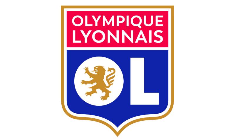
The Olympique Lyonnais logo is a combination mark featuring a shield-shaped crest divided into blue and red sections, with bold white “OL” initials and a gold rampant lion inside the letter “O.” It was last redesigned in 2022 by a Parisian agency. The lion represents the city of Lyon’s heraldic heritage.
Here is a breakdown of the logo’s main attributes:
- Design Type: Combination mark (emblem with letterforms). The crest merges a shield shape with typographic initials and an illustrated lion, making it both a symbol and wordmark at once.
- Primary Elements: A rampant lion, the letters “O” and “L,” a divided shield, and the full “Olympique Lyonnais” wordmark across the top in a red banner.
- Official Introduction Date: The current version launched in July 2022. The previous iteration ran from 2006 to 2022.
- Designer/Agency: A Parisian design agency handled the 2022 update. The specific studio name has not been publicly confirmed by the club.
- Trademark Status: The logo is a registered trademark of OL Groupe, the parent company that manages the club’s commercial operations.
- Color Palette: Red (#DA0812), Blue (#14387F), White (#FFFFFF), and Gold (#D29D46). These are based on the French tricolor flag and the city of Lyon’s traditional heraldic gold.
- Usage Context: Match kits, Groupama Stadium branding, official merchandise, digital platforms, broadcast graphics, and OL Groupe corporate materials.
How Has the Olympique Lyonnais Logo Evolved Over Time?

The Olympique Lyonnais crest has been redesigned roughly a dozen times since the club’s founding. Early versions borrowed directly from Lyon’s city coat of arms. The 1970s brought standalone designs without the shield. A minimalist era followed in 1989. And the lion returned in 1996 before being refined in 2006 and again in 2022.
Original Olympique Lyonnais Logo (1950-1957)
Years Active: 1950 to 1957
The first badge was a shield with a blue frame split into two sections. The upper white area held blue “O” and “L” letters. The lower red section showed a white rampant lion.
It borrowed heavily from Lyon’s city coat of arms. The designers kept the same color palette of blue, white, and red but swapped the three golden fleurs-de-lis for the club’s initials.
There was nothing fancy about it. The whole thing screamed municipal pride. And honestly, for a brand-new club trying to build local support, that was the right call.
Early Shield Variations (1957-1974)
Years Active: 1957 to 1974
Around 1957, the blue was replaced with purple, and the lion’s pose got a subtle adjustment. By 1965, things changed more noticeably. The frame turned gold, the lion picked up a light blue outline, and the spacing between letters increased.
In 1974, the shield’s interior flipped to mostly red, with thin stripes of white and blue on the right. The “L” shifted below the “O,” and a soccer ball appeared for the first time. It was the beginning of a less formal look.
These were small tweaks, year after year. But they added up. The hue shifts and layout changes reflected a club still figuring out its visual identity, which is pretty normal for that era of French football.
The Lion and Key Era (1974-1989)
Years Active: 1974 to 1989
The 1970s brought the first Olympique Lyonnais emblem without a shield. A red rampant lion outlined in gold stood on a black-and-white football, holding a stylized key formed by intertwined “O” and “L” letters in blue with gold outlines.
It was bold. Maybe too bold. The gold outlines made it look cluttered at smaller sizes.
By 1980, the designers stripped out the outlines and cleaned up the lines. The lion stayed red, but the football and key shifted to light purple tones. The “OL” lettering became solid and thick. This version felt more modern, less like a coat of arms and more like an actual sports brand.
The Minimalist OL Badge (1989-1996)
Years Active: 1989 to 1996
This one is the outlier. The lion disappeared entirely. Jean-Michel Aulas, who bought the club in 1987, pushed for something different.
The result was a clean geometric “OL” in white with thick black outlines and a subtle shadow. A French flag chevron ran across the letters. That’s it. No lion, no shield, no crest.
Looking back, it was ahead of its time in terms of minimalist design. But football fans want tradition. They want animals and shields and history baked into the badge. This version respected the French tricolor but traded heritage for clean lines.
It lasted about seven years. Not bad for something that radical.
Return of the Lion (1996-2006)
Years Active: 1996 to 2006
The lion came back inside a blue shield. A gold lion sat within a white letter “O,” next to a large “L.” Both letters had gold outlines. A red banner along the top held the “Olympique Lyonnais” wordmark in gold lettering.
This is the version most fans from the dynasty years (2002-2008, seven straight Ligue 1 titles) remember. It became tied to the club’s greatest era. The emphasis shifted back to tradition, and the crest felt regal again.
Around 2000, the letters in the red section grew wider and bolder. A minor change, but it made the initials more readable at a distance on the pitch.
The 2006 Redesign (2006-2022)
Years Active: 2006 to 2022
The composition stayed the same, but the intensity went up. Darker blue, richer red, bolder gold. The lion’s contours were modernized with sharper lines and cleaner curves.
This version accompanied Lyon through their final title years, their Champions League semi-final runs, and the move to Groupama Stadium in 2016. It became the most widely seen version of the crest internationally.
The “Olympique Lyonnais” wordmark across the top was enlarged to make the full club name more prominent. That was a branding decision more than a design one. The club wanted name recognition beyond France.
Current Olympique Lyonnais Logo (2022-Present)
Years Active: 2022 to present
The 2022 update was subtle but significant. Brighter red and blue replaced the darker tones. The gold outlines around the “O” and “L” were removed entirely. A new white line was added alongside the remaining gold border at the shield’s edge.
The wordmark switched to the Trenda typeface, designed by Daniel Hernandez and Paula Nazal Selaive. The lion got slimmed down with smaller claws and fewer hair details, making it more scalable across digital formats.
This was clearly a digital-first update. The whole point was to make the crest look crisp on phone screens, social media avatars, and streaming platforms. Print badges can afford complexity. App icons cannot.
What Do the Design Elements of the Olympique Lyonnais Logo Mean?
Every piece of the Olympique Lyonnais crest carries specific meaning tied to the city of Lyon, the club’s football heritage, and French national identity. The rampant lion is the most significant element. It connects the club directly to Lyon’s centuries-old heraldic tradition.
The shield structure follows classic European heraldic design. It signals authority, protection, and history.
What Does the Lion Represent?
The lion is taken from Lyon’s city coat of arms. It stands on its hind legs in what heraldry calls a “rampant” pose, symbolizing courage and fighting spirit.
Lyon has used this lion since the Middle Ages. When the club’s founders set up Olympique Lyonnais in 1950, they grabbed the lion to tie the team to the city’s identity. It was never meant to be just a mascot. It’s a statement of place, of belonging.
The psychology of shapes matters here. The lion’s aggressive upward stance creates a feeling of motion and power. Paired with the shield, it gives the whole crest a sense of forward momentum. Most fans don’t consciously register that, but it works.
Why Did Olympique Lyonnais Choose These Specific Colors?

The club uses four official colors. Each one carries weight.
- Red (#DA0812, Pantone 2035 C): Passion, energy, and competition. Red is everywhere in French football, but for Lyon it also ties back to the city’s historical flag. From a color psychology standpoint, red triggers urgency and excitement, which is exactly what you want on a matchday badge.
- Blue (#14387F, Pantone 7687 C): Loyalty, stability, and tradition. The deep blue in the crest echoes the blue from the French tricolor. It grounds the design and provides contrast against the red, making both colors pop.
- White (#FFFFFF): Purity and unity. White sits between the red and blue, just like it does on the national flag. In the logo, it serves as the letter color for the “OL” initials, making them the first thing your eye catches.
- Gold (#D29D46, Pantone 4025 CP): Prestige and achievement. Gold outlines the shield and fills the lion. It’s not part of the tricolor. This one is purely about status, about a club that sees itself as one of France’s elite.
The combination of red, white, and blue also echoes the French flag, which is a deliberate patriotic choice. Most Ligue 1 clubs lean into regional identity. Lyon does both, blending city pride with national color theory.
What Typography Style Is Used in the Olympique Lyonnais Logo?
The current logo uses the Trenda sans-serif font for the “Olympique Lyonnais” wordmark. It was developed by Daniel Hernandez and Paula Nazal Selaive in 2013. Clean strokes. No decorative elements. Equal weight across all letters.
Before 2022, the wordmark used a more traditional sans-serif with slightly thicker strokes. The shift to Trenda was about readability on small screens. Typography in football badges has always been an afterthought for most clubs, but Lyon’s 2022 update specifically addressed it.
The big “O” and “L” initials inside the crest use a custom geometric form. These aren’t off-the-shelf letterforms. They’re built to integrate with the lion and the shield’s proportions. The kerning between the two letters is tight, which keeps the mark compact at smaller sizes.
What Are the Hidden Meanings in the Olympique Lyonnais Logo?
The shield split between blue and red mirrors the French flag’s layout. That’s intentional. It positions the club as a representative of France, not just Lyon.
The lion’s pose has shifted subtly over the decades. In earlier versions, it faced left. Now it faces right, which in European visual culture implies moving forward. Whether that was a conscious design decision or just how it ended up after redrawing, the effect is the same.
The gold “OL” key from the 1970s versions actually referenced Lyon’s historical role as a gateway city between northern and southern France. That element disappeared, but the gold color stayed. Most current fans have no idea about the key. It’s a lost piece of the logo’s story.
How Does the Olympique Lyonnais Logo Compare to Competitor Logos?
Among Ligue 1 clubs, Lyon’s crest occupies a middle ground between heavy tradition and modern simplification. It’s more classic than Paris Saint-Germain’s logo, which leans into clean circular geometry, and more polished than some of the older, busier French crests.
Olympique de Marseille’s logo also uses a shield and heraldic elements, but its star and “OM” lettering give it a different feel. Marseille’s crest is rounder, more open. Lyon’s is tighter, more structured.
Saint-Etienne’s logo, belonging to Lyon’s biggest rival in the Derby, uses green and white with a circular layout. Totally different approach. No animal, no shield. Just initials and color.
Compared to AS Monaco’s logo, which uses a diamond shape with a simple monogram, Lyon’s crest has more visual complexity. Monaco keeps it simple. Lyon keeps it layered.
Among German clubs, Bayern Munich’s logo shares a similar DNA. Both use circular or shield shapes, strong colors, and regional symbolism. But Bayern’s is cleaner. Lyon’s has more moving parts, which can be a strength or a weakness depending on the application.
The broader trend in European football has been toward simplified, flat crests that work on digital screens. Juventus started that conversation in 2017. Lyon’s 2022 update moved in that direction without going all the way. They cleaned things up but kept the lion, the shield, and the initials. It’s a compromise, and honestly, it works.
What Are the Technical Specifications of the Olympique Lyonnais Logo?
Official Color Codes
- Red: Hex #DA0812 | RGB (218, 8, 18) | CMYK (8, 100, 100, 1) | Pantone 2035 C
- Blue: Hex #14387F | RGB (20, 56, 127) | CMYK (100, 89, 21, 7) | Pantone 7687 C
- White: Hex #FFFFFF | RGB (255, 255, 255) | CMYK (0, 0, 0, 0) | Pantone P 1-1 C
- Gold: Hex #D29D46 | RGB (210, 157, 70) | CMYK (18, 39, 86, 1) | Pantone 4025 CP
Dimensions and Proportions
The crest follows a roughly 1:1.16 width-to-height ratio. The shield is taller than it is wide, which is standard for European football badges.
Minimum size for print reproduction is typically around 15mm wide to keep the lion details readable. For digital use, the logo needs to hold up at pixel sizes as small as 32×32 for favicons, though at that size only the general shape and colors register.
Clear space rules require a buffer zone around the crest equal to roughly the height of the “OL” letters. This keeps other graphic elements from crowding the badge.
The club provides vector graphics files (SVG and AI formats) for official partners. Bitmap versions in PNG and JPEG are available at multiple resolutions for web and broadcast use. The DPI for print assets is set at 300 minimum.
What Cultural Impact Has the Olympique Lyonnais Logo Had?
The OL crest became a symbol of French football dominance during the club’s seven consecutive league title run from 2002 to 2008. For a generation of fans, that lion on the blue and red shield meant the best team in the country. No other French club has matched that streak.
In Lyon specifically, the badge shows up everywhere. Stickers on cars, flags in apartment windows, tattoos on arms. It’s a civic symbol as much as a football one.
The women’s team, which has dominated European women’s football for over a decade, carried the same crest until 2025 when they rebranded as “OL Lyonnes” with a new lioness-based logo. That split actually strengthened both brands. The men’s lion and the women’s lioness now complement each other.
International recognition grew during Lyon’s Champions League runs in the 2000s and 2010s. The semi-final appearance in 2010 and again in 2020 put the crest in front of global audiences. Football fans across Europe can identify the OL badge, which matters a lot for commercial partnerships.
How Does the Olympique Lyonnais Logo Fit Into the Overall Brand Identity?
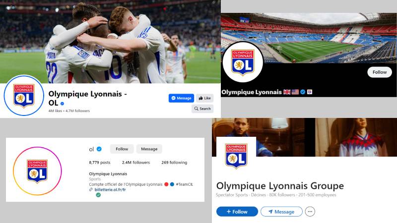
The logo sits at the center of OL Groupe’s brand system. It connects the men’s team, the stadium (Groupama Stadium), the academy, and the club’s commercial operations under one visual identity.
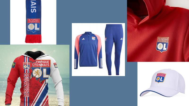
Adidas, the club’s kit manufacturer since 2010, integrates the crest into jersey designs, training gear, and retail merchandise. The partnership runs through at least 2029.
The club’s brand guidelines dictate exactly how the logo can appear alongside sponsor marks. On the jersey, it sits over the left chest. On digital platforms, it functions as the profile avatar. At the stadium, it’s displayed at massive scale on the exterior and on the pitch.
The red, blue, white, and gold palette extends beyond the logo into everything from the club’s website design to matchday programs. Unity across all these touchpoints is what turns a badge into a proper brand. And Lyon has been fairly disciplined about that, especially since the 2022 update cleaned up inconsistencies from the previous era.
How Should the Olympique Lyonnais Logo Be Used?
Do:
- Use the official vector files for any reproduction. Scaling a bitmap up will make the lion look like a blob.
- Maintain the required clear space around the crest.
- Use the logo on approved color backgrounds (white, dark blue, or red).
- Follow OL Groupe’s color specifications exactly. Close-enough red is not good enough.
Don’t:
- Stretch, skew, or rotate the crest. Ever.
- Change the logo colors to match a design project’s palette.
- Place the logo on busy photographic backgrounds without a solid backing shape.
- Add effects like drop shadows, gradients, or outlines that aren’t part of the official design.
- Use outdated versions of the logo for current-season materials.
Official logo files are available through OL Groupe’s media and partnership departments. Licensed partners receive access to a brand portal with downloads in SVG, PNG, EPS, and AI formats.
The crest is protected under French trademark law and registered with the Institut National de la Propriete Industrielle (INPI). Unauthorized commercial use can result in legal action. Fan-made merchandise using the logo without a license violates these protections, though clubs typically focus enforcement on larger-scale operations rather than individual supporters.
For press and editorial use, the logo can generally be reproduced in the context of news coverage and commentary under fair use principles. But slapping it on a product for sale? That’s a different story entirely.
FAQ on The Olympique Lyonnais Logo
What does the Olympique Lyonnais logo look like?
The OL badge is a shield-shaped crest split into blue and red sections. It features a gold rampant lion inside a white letter “O,” a bold “L” beside it, and the full club name across a red banner at the top.
Why is there a lion on the Lyon football crest?
The lion comes from Lyon’s city coat of arms. It has represented the city since the Middle Ages.
The club’s founders in 1950 used it to tie the team directly to the city’s identity. It stands for courage, pride, and local heritage within Ligue 1 football.
When was the current Olympique Lyonnais logo introduced?
The current version launched in July 2022. A Parisian agency designed it as a modernized update of the 2006 crest. Colors got brighter, the lion was simplified, and the font switched to Trenda for better digital readability.
What colors are in the OL logo?
Red (#DA0812), blue (#14387F), white (#FFFFFF), and gold (#D29D46). The red, white, and blue mirror the French national flag.
Gold adds a layer of prestige. It outlines the shield and fills the lion, connecting back to Lyon’s heraldic traditions and the club’s self-image as one of France’s top sides.
How many times has the Olympique Lyonnais logo changed?
Roughly 12 times since 1950. Early versions stuck close to Lyon’s city arms. The 1970s dropped the shield entirely. A minimalist “OL” design ran from 1989 to 1996. Then the lion returned and has stayed through every logo redesign since.
What font does the Olympique Lyonnais badge use?
The wordmark uses Trenda, a clean-spaced typeface by Daniel Hernandez and Paula Nazal Selaive from 2013. It replaced the previous heavier lettering in the 2022 update.
The large “O” and “L” inside the crest are custom geometric letterforms built to fit the shield’s proportions.
What is the meaning behind the Olympique Lyonnais shield shape?
The shield follows European heraldic tradition. It signals authority, protection, and history. Most French football club emblems use similar shapes.
Lyon’s version splits into blue and red halves, reflecting the complementary color scheme of the national flag. The gold border adds distinction from other Ligue 1 crests.
Can I download the official OL logo for personal use?
OL Groupe provides official files through its media department. Licensed partners get access to a brand portal with SVG, PNG, and AI formats.
For personal, non-commercial use like fan projects, the club’s brand style guide should still be respected. Commercial use without a license violates French trademark law.
How does the Lyon logo compare to other French football crests?
It sits between tradition and modern simplification. RC Lens uses a circular badge with bold lettering. Nantes features a canary on a green field. Stade Rennais keeps things tight with a circular mark.
Lyon’s crest has more layered detail than most Ligue 1 rivals, which gives it a heavier, more classical feel on match kits and merchandise.
Did the OL women’s team keep the same logo?
No. In 2025, the women’s side rebranded as OL Lyonnes with a new crest featuring a roaring lioness instead of the traditional lion. The design uses rounded curves and flame-shaped elements to create a distinct identity separate from the men’s team badge.
Conclusion
The Olympique Lyonnais logo has held its ground across seven decades of French football. From a basic city arms adaptation in 1950 to a digital-ready crest in 2022, it tells the story of a club that respects where it came from while keeping up with how fans actually see badges today.
The rampant lion, the tricolor shield, the gold accents. These aren’t random choices. They connect OL to Lyon’s civic history and to the club’s run of seven straight Ligue 1 titles.
Few European football crests manage to balance rhythm between old and new this well. The 2022 update proved you can sharpen a badge for screens without gutting its soul. That matters more than most clubs realize.

Renowned for his expertise in logo design and visual branding, Bogdan has developed a multitude of logos for various clients.
His skills extend to creating posters, vector illustrations, business cards, and brochures. Additionally, Bogdan's UI kits were featured on marketplaces like Visual Hierarchy and UI8.
He also wrote in the past years on sites like Design Your Way, WebDesignerDepot, WPDean, Designmodo, Speckyboy, Slider Revolution, and more.
- How to Install Fonts on Mac (Step-by-Step Guide) - 20 September 2026
- From Mockup to Code: How AI-Augmented Development Speeds Up the Design Handoff - 19 September 2026
- The Beehiiv Logo History, Colors, Font, And Meaning - 18 September 2026

Bogdan Sandu is a seasoned designer who has been designing websites since 2008. Renowned for his expertise in logo design and visual branding, Bogdan has developed a multitude of logos for various clients. His skills extend to creating posters, vector illustrations, business cards, and brochures. Additionally, Bogdan's UI kits were featured on marketplaces like Visual Hierarchy and UI8. He also wrote in the past years on sites like Design Your Way, WebDesignerDepot, WPDean, Designmodo, Speckyboy, Slider Revolution, and more.
You Might Also Like


