


The RC Lens logo is a shield-shaped crest that represents Racing Club de Lens, a professional football club founded in 1906 in Lens, Pas-de-Calais, France. It ranks among the most recognizable badges in Ligue 1, carrying over a century of working-class history inside its red and yellow frame.
The badge belongs to a club nicknamed “Sang et Or” (Blood and Gold). Those colors weren’t always part of the identity, though. The club originally played in green and black. But since 1924, the red-and-gold scheme has stuck, and the crest has gone through roughly five major redesigns while keeping the same core symbols intact.
Within the broader world of French football branding, few clubs tie their logo so directly to regional industrial heritage. The miner’s lamp at the center of the RC Lens badge isn’t decorative filler. It’s a direct reference to the coal mines that shaped the Pas-de-Calais region for generations. The current version has been in use since 2014, and the club has had around 11 total logo iterations since its founding.
What Is the RC Lens Logo?
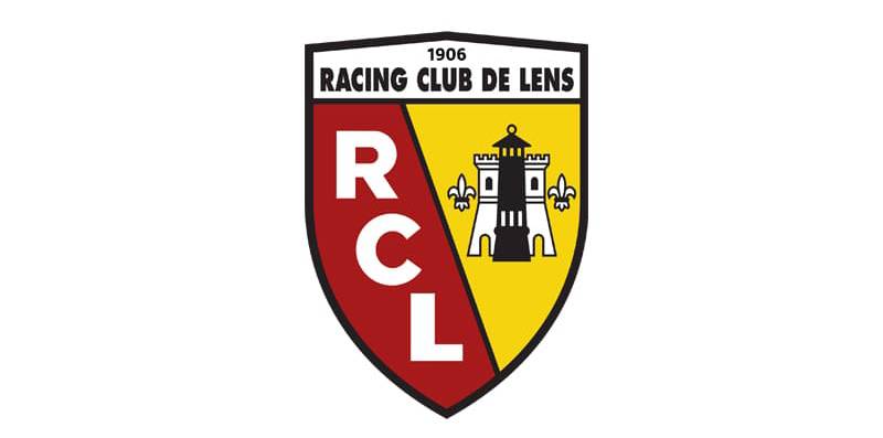
The RC Lens logo is a pointed shield crest split diagonally, featuring the “RCL” monogram in white on a red field and a black miner’s lamp flanked by fleurs-de-lis on a yellow field. First introduced in its current form in 2014, it carries the full club name and founding year at the top.
Here’s what defines the badge at a technical level:
- Design Type: Combination mark (emblem with monogram and graphic elements inside a shield)
- Primary Elements: Shield shape, diagonal color split, “RCL” monogram, miner’s lamp, castle tower, two fleurs-de-lis, “Racing Club de Lens” text banner, “1906” founding year
- Official Introduction Date: Current version introduced in 2014, building on the 2001 redesign
- Designer/Agency: Not publicly credited. The redesigns have been handled internally or through undisclosed agencies
- Trademark Status: Registered trademark of Racing Club de Lens. Protected under French intellectual property law
- Color Palette: Red (#EC1C24), Yellow (#FFF200), White (#FFFFFF), Black (#000000)
- Usage Context: Match kits, stadium signage at Stade Bollaert-Delelis, official merchandise, digital platforms, broadcast graphics, and supporter materials
How Has the RC Lens Logo Changed Over Time?

The RC Lens badge has gone through five distinct eras since the mid-1950s. Each version kept the miner’s lamp as a central symbol but adjusted the shield structure, color treatment, and typographic details to match the club’s growing profile in French football.
Before 1955, the club used more basic markings. The real visual identity started taking shape once the team settled into a consistent competitive presence.
Original RC Lens Crest (1955-1968)
Years Active: 1955 to 1968
The first formal crest was dark and heavy. Black dominated the shield, with a red outline framing the whole thing. A yellow banner sat across the top with the “RCL” monogram in red sans-serif lettering.
The miner’s lamp appeared in yellow with six red rays shooting out from the sides. Think of it like a warning light. Strong, direct, and not trying to be pretty.
This version set the template that every future redesign would follow. The lamp never left. That matters more than people realize when you’re looking at badge consistency across decades.
Cultural Significance: It connected the club directly to the mining communities of northern France. No other Ligue 1 badge made that kind of industrial statement at the time.
The Modernized Shield (1968-1979)
Years Active: 1968 to 1979
The 1968 redesign lightened things up. The shield got a diagonal split, dividing it into two color fields. Orange replaced red on the left side. Yellow filled the right.
The “RCL” initials moved to the orange section, and the miner’s lamp (now in black) sat on the yellow portion.
White and black outlines gave the whole thing a cleaner feel. It lost some of the heaviness of the 1955 version.
Key Changes: Diagonal division introduced. Orange replaced deep red. Overall tone shifted from industrial to something slightly more modern.
Context: French football was growing its broadcast presence in the late 1960s. A lighter, more legible crest made sense for that moment.
The Classic Lens Badge (1979-2001)
Years Active: 1979 to 2001
This is where the logo really became the logo most fans recognize. The orange reverted back to red. The diagonal split stayed. And two big additions showed up.
First, the castle tower and two fleurs-de-lis appeared on the yellow side, pulled directly from the coat of arms of the city of Lens. The mining company that had managed the club gave way to city governance in 1969, and the crest reflected that shift.
Second, the full inscription “Racing Club De Lens” was placed in black sans-serif text on a white banner at the top of the shield.
Cultural Significance: This version carried the club through its greatest era, including the 1997-98 Ligue 1 championship. For a whole generation of supporters, this IS the RC Lens badge.
The Refined Crest (2001-2014)
Years Active: 2001 to 2014
The 2001 update wasn’t a complete overhaul. It was a refinement. The castle tower and fleurs-de-lis gained clearer black outlines. The “RCL” monogram got a sleeker, more traditional typeface.
The top banner text became bolder. And “Depuis 1906” appeared in thin letters above the club name for the first time.
Small changes. But they added up. The badge looked sharper on screen and on merchandise without losing any of its character.
The Current RC Lens Logo (2014-Present)
Years Active: 2014 to present
The 2014 version cleaned up the contours and made the “RCL” lettering bolder with thicker, smoother lines. The cuts on the letter forms became more distinct.
At some point, “Depuis 1906” was removed to simplify the top section. The rest stayed put. Same diagonal split. Same miner’s lamp. Same castle and fleurs-de-lis.
It’s the version you see on kits today, across digital platforms, and on everything the club produces. Minimal change, maximum continuity.
What Do the Design Elements of the RC Lens Logo Mean?
Every piece of the RC Lens crest connects to something real. The miner’s lamp points to coal mining history. The castle and fleurs-de-lis come from the city’s coat of arms. The diagonal split and bold initials give the badge its structure and readability.
None of it is decorative guesswork. Each element has a documented reason for being there.
Why Did RC Lens Choose Red and Yellow?

The story behind the colors is more unusual than you’d expect.
The club started in green and black in 1906. After World War I, they briefly played in colors resembling the American flag. Then in 1924, club president Pierre Moglia picked red and yellow.
One version of the story says Moglia was inspired by the ruins of the Saint-Leger church, a leftover from Spanish occupation. The colors carry psychological weight, too. Red and yellow together create high visibility and strong emotional pull.
The popular interpretation ties red to the blood of miners and yellow (gold) to the precious coal they extracted. Whether that’s the true origin or a later retelling, it’s the meaning that stuck.
Here are the official color specifications:
- Red – Hex: #EC1C24, RGB: (236, 28, 36), CMYK: (1, 99, 97, 0), Pantone: PMS 1788 C
- Yellow – Hex: #FFF200, RGB: (255, 242, 0), CMYK: (4, 0, 93, 0), Pantone: PMS Yellow U
- White – Hex: #FFFFFF, RGB: (255, 255, 255), CMYK: (0, 0, 0, 0)
- Black – Hex: #000000, RGB: (0, 0, 0), CMYK: (70, 50, 50, 100), Pantone: PMS Process Black C
What Typography Style Appears in the RC Lens Logo?
The badge uses a custom sans-serif for the “RCL” monogram. It’s bold, with thick strokes and clean geometric cuts at the letter terminals.
The “Racing Club de Lens” text at the top uses a more traditional sans-serif with tighter tracking. It’s functional, not decorative. Readability at small sizes was clearly a priority across all the later redesigns.
The typography has gotten progressively bolder with each version. The 1955 original had spaced-out, thinner characters. By 2014, the letterforms are chunky and assertive.
What Are the Hidden Meanings in the RC Lens Logo?
The miner’s lamp is the most loaded symbol. It represents light in darkness, which is both a literal mining reference and a statement about the community’s character.
The fleurs-de-lis carry French royal and regional identity. The castle tower ties to the city of Lens itself, pulled directly from its municipal coat of arms.
The diagonal split of the shield creates a sense of forward motion if you look at it long enough. Whether that was intentional or a happy accident, it gives the crest energy that a straight vertical divide wouldn’t.
How Does the RC Lens Logo Compare to Competitor Logos?
Within Ligue 1, the RC Lens crest holds a unique position. It’s one of the few badges that directly references a specific industry. Most French club crests lean on municipal heraldry, animals, or abstract shapes.
The LOSC Lille badge, their biggest rival, uses a red mastiff dog on a white background. Clean and modern. The Paris Saint-Germain logo features the Eiffel Tower and a fleur-de-lis in a circular format. The Olympique de Marseille crest centers on an “OM” monogram inside a circular badge.
Lens stands apart because the miner’s lamp gives it a story that you can’t fake or replicate. PSG has the Eiffel Tower, sure. But the lamp is tied to lived, working-class experience in a way that feels different. It’s not a tourism landmark. It’s a tool that kept people alive underground.
Compared to other European clubs, the RC Lens badge shares structural DNA with Borussia Dortmund’s logo in terms of regional industrial pride. Both clubs come from mining regions. Both use bold, high-contrast color palettes that stand out on broadcast.
What Are the Technical Specifications of the RC Lens Logo?
Official Color Codes
- Primary Red: Hex #EC1C24, RGB (236, 28, 36), CMYK (1, 99, 97, 0), Pantone PMS 1788 C
- Primary Yellow: Hex #FFF200, RGB (255, 242, 0), CMYK (4, 0, 93, 0), Pantone PMS Yellow U
- White: Hex #FFFFFF, RGB (255, 255, 255), CMYK (0, 0, 0, 0)
- Black: Hex #000000, RGB (0, 0, 0), CMYK (70, 50, 50, 100), Pantone PMS Process Black C
Dimensions and Proportions
The shield is taller than it is wide, with a pointed base. The aspect ratio is roughly 5:6 (width to height). The top banner containing the club name sits above the diagonal split and takes up about 15-20% of the total badge height.
For vector formats, the logo scales without quality loss. Common download sizes run from 64×64 pixels for favicons up to 3000×3000 pixels for print use. Minimum clear space should be maintained around the shield at roughly 10% of the badge width on all sides.
The logo works well across digital platforms and printed materials because of its high contrast between the red, yellow, white, and black elements. At very small sizes, the miner’s lamp detail can get lost, which is why the club also uses a simplified “RCL” mark for social media avatars.
What Cultural Impact Has the RC Lens Logo Had?

The RC Lens crest is a symbol of identity for the entire Pas-de-Calais region. It goes beyond football fandom. In a part of France where coal mining shaped entire communities for over a century, the badge carries genuine emotional weight.
The Stade Bollaert-Delelis, one of the most atmospheric grounds in French football, is where the crest comes alive. Supporters display it on flags, scarves, and banners in ways that blur the line between sports branding and regional pride.
The “Sang et Or” identity built around the crest has also become a kind of cultural shorthand. When people in northern France reference “Blood and Gold,” they’re talking about more than a football club. They’re referencing a shared history of hard work, community solidarity, and resilience through economic change.
How Does the RC Lens Logo Fit Into the Overall Brand Identity?

The logo sits at the center of everything RC Lens does as a brand. It connects to the kit design (produced by Puma), the stadium experience at Bollaert-Delelis, matchday programs, social media presence, and supporter merchandise.
The red-and-yellow scheme extends well beyond the badge. It shapes the brand guidelines for all club communications, from the website to advertising to youth academy materials. The “RCL” monogram also functions as a standalone mark for contexts where the full shield is too detailed.
The club’s relationship with its crest is tighter than what you see at many Ligue 1 clubs. Some French teams have gone through dramatic rebrandings (Juventus-style geometric shifts aren’t unheard of in football). Lens has taken the opposite approach. Keep the core. Refine the edges. Don’t fix what connects people to the club in the first place.
How Should the RC Lens Logo Be Used?
If you need to use the RC Lens badge for editorial, media, or fan-created content, here are the basics.
Do:
- Use official vector files (SVG, EPS, AI) for any print or high-resolution application
- Maintain the original color values. Don’t swap the red for a different shade or adjust the yellow
- Keep clear space around the badge so it doesn’t get crowded by other elements
- Use the full-color version on light or neutral backgrounds
Don’t:
- Stretch, skew, or rotate the badge
- Apply effects like drop shadows, glows, or gradients on top of the crest
- Alter the arrangement of internal elements (lamp, letters, fleurs-de-lis)
- Use low-resolution bitmap versions where vector is available
- Place the logo on busy backgrounds that reduce legibility
The RC Lens crest is a registered trademark. Any commercial use requires written permission from the club. Fan and editorial use generally falls under standard fair use guidelines, but if you’re producing merchandise or branded content for sale, you need licensing approval directly from Racing Club de Lens.
Official logo files can typically be accessed through the club’s media department or through licensed design resource sites that carry verified football crests in SVG and PNG formats.
FAQ on The RC Lens Logo
What does the RC Lens logo look like?
The RC Lens badge is a pointed shield split diagonally. Red fills the left side with white “RCL” initials. Yellow fills the right with a black miner’s lamp, castle tower, and two fleurs-de-lis.
The club name and founding year sit in a white banner across the top.
When was the current RC Lens logo introduced?
The current version launched in 2014. It refined the 2001 design by making the RCL lettering bolder and cleaning up contour lines.
The core layout hasn’t changed much since the 1979 redesign, though. That’s nearly five decades of the same basic structure.
What do the colors in the RC Lens crest mean?
Red and yellow represent “Sang et Or” (Blood and Gold). The popular meaning ties red to the blood of coal miners and gold to the precious resource they extracted in the Pas-de-Calais region.
The actual origin traces back to 1924 and the Spanish flag’s influence.
What is the miner’s lamp in the RC Lens emblem?
The miner’s lamp is a direct tribute to the coal mining heritage of Lens, France. It has appeared in every version of the club badge since 1955.
No other Ligue 1 football crest features this kind of industrial symbol.
How many times has the RC Lens logo changed?
The club has had roughly 11 different logos since its founding in 1906. Five major versions span from 1955 to the present.
Each redesign kept the miner’s lamp and shield shape intact while updating details like font choices and color treatments.
What are the official RC Lens logo colors?
The official color scheme includes red (#EC1C24), yellow (#FFF200), white (#FFFFFF), and black (#000000).
Red carries the Pantone code PMS 1788 C. Yellow is PMS Yellow U. Black is PMS Process Black C.
What do the fleurs-de-lis represent on the Lens badge?
The two fleurs-de-lis come from the coat of arms of the city of Lens. They were added to the badge in 1979 after the city took over club management from the mining company.
They represent French regional heritage and municipal identity.
Can I download the RC Lens logo for free?
Yes. Several design resource sites offer the Racing Club de Lens crest in SVG and PNG formats with transparent backgrounds. Sizes range from 64×64 pixels to 3000×3000 pixels.
Commercial use still requires licensing approval from the club.
How does the RC Lens logo compare to other Ligue 1 badges?
Most French football club crests use municipal heraldry or animal mascots. The RC Lens logo stands apart with its mining lamp symbol, which directly references working-class industrial history.
Rivals like Nantes and Toulouse take very different visual approaches.
Why is the RC Lens logo shaped like a shield?
Shield-shaped crests are traditional in European football. They draw from heraldic design and signal unity and protection.
For RC Lens, the shield also connects to the city’s own coat of arms, which uses a similar form. It ties the club’s identity to its home city at a structural level.
Conclusion
The RC Lens logo tells a story that most football badges don’t even attempt. It connects a Ligue 1 club to coal miners, city heraldry, and over a century of community identity in northern France.
Five major redesigns since 1955, and the miner’s lamp never left. That kind of visual consistency is rare in professional football branding.
The red and gold color scheme, the shield structure, the fleurs-de-lis, the “RCL” monogram. Every piece has a reason rooted in the club’s history at Stade Bollaert-Delelis and the Pas-de-Calais region.
For supporters of Racing Club de Lens, this crest isn’t just a brand identifier. It’s proof that a badge can carry real meaning when it stays connected to the people it represents.

Renowned for his expertise in logo design and visual branding, Bogdan has developed a multitude of logos for various clients.
His skills extend to creating posters, vector illustrations, business cards, and brochures. Additionally, Bogdan's UI kits were featured on marketplaces like Visual Hierarchy and UI8.
He also wrote in the past years on sites like Design Your Way, WebDesignerDepot, WPDean, Designmodo, Speckyboy, Slider Revolution, and more.
- How Designers can Build a Stronger Online Creative Identity - 9 October 2026
- Minecraft Font Generator - 8 October 2026
- How Top Meta Ad Creative Is Designed for E-commerce Brands - 8 October 2026

Bogdan Sandu is a seasoned designer who has been designing websites since 2008. Renowned for his expertise in logo design and visual branding, Bogdan has developed a multitude of logos for various clients. His skills extend to creating posters, vector illustrations, business cards, and brochures. Additionally, Bogdan's UI kits were featured on marketplaces like Visual Hierarchy and UI8. He also wrote in the past years on sites like Design Your Way, WebDesignerDepot, WPDean, Designmodo, Speckyboy, Slider Revolution, and more.
You Might Also Like


