


The Amiens logo is the official badge of Amiens Sporting Club, a French football club founded in 1901 in the city of Amiens, located in the Hauts-de-France region. The crest features two rearing unicorns flanking a central shield, pulled directly from the coat of arms of the city itself. It is one of those badges that carries local identity in a way that goes beyond just football.
Within the broader history of French football branding, the Amiens SC emblem stands as a club that has consistently tied its visual identity to its home city. The current version, introduced in 2022, uses only black and white, marking a departure from previous iterations that included blue and grey tones. The club has gone through roughly seven distinct badge versions since the mid-1970s. Founded as Amiens Athletic Club in October 1901, the club did not take the name Amiens Sporting Club until 1961.
What Is the Amiens SC Logo?

The Amiens SC logo is a combination mark badge featuring two silver unicorns, the initials “ASC,” the club name, and the founding year 1901, all set within a shield shape. It was most recently updated in 2022, designed in-house with input from the club’s branding team. The unicorns come straight from the city of Amiens’ heraldic coat of arms.
Design Type: Combination mark (emblem with text and graphic elements combined inside a shield)
Primary Elements: Two rearing unicorns facing each other, a central shield divided into quadrants, the letters “ASC” in bold type, the word “Amiens” at the top, “Football” below center, a laurel wreath at the base, and a ribbon displaying “1901”
Official Introduction Date: The current black-and-white version was introduced in 2022. The previous version with grey and blue tones was used from 1998 to 2021.
Designer/Agency: Created by the club’s internal design team in collaboration with graphic designers specializing in sports branding. The EPS vector version available publicly was designed by Anatoliy Agnyotkin.
Trademark Status: The badge is an active, registered trademark of Amiens Sporting Club, protected under French intellectual property law.
Color Palette: Black (#000000) and White (#FFFFFF). Previous versions also used shades of grey (#808080), blue (#007AC1), and light grey (#F3F3F3).
Usage Context: The badge appears on match-day kits (currently supplied by Puma), official merchandise, the club’s digital platforms, stadium signage at the Stade de la Licorne, and all official communications from the club.
How Has the Amiens SC Logo Evolved Over Time?

The Amiens badge has gone through seven major versions since the 1970s. Early designs were simple and text-focused. The 1980s introduced the city’s coat of arms into the badge.
By the late 1990s, the full heraldic imagery, including the unicorns, became the standard. The 2022 update stripped the palette down to black and white, ending the club’s long association with blue.
Early Amiens Badge (1976-1979)
Years Active: 1976 to 1979
This was one of the earliest formalized badges. It used basic shapes and the club’s initials. Nothing fancy. Just functional.
At this point, Amiens was competing in the lower tiers of French football, so the badge was really just a mark to put on a shirt. The colors leaned toward the club’s original blue identity.
There was no unicorn, no city arms, none of that. It was stripped down and did not pretend to be anything more than what it was.
City Shield Badge (1984-1993)
Years Active: 1984 to approximately 1993
The 1980s brought a significant shift. The club started incorporating the coat of arms of the city of Amiens into the badge. This was a common approach across European football, tying local municipal heritage to the club’s identity.
The shield shape appeared for the first time. Blue remained the dominant color, consistent with the club’s original color palette dating back to its 1901 founding. The overall look was more structured, but still lacked the detail of later versions.
If you look at what clubs like RC Lens or LOSC Lille were doing with their badges around the same time, you can see a similar trend across northern French football of folding regional identity into club branding.
Transitional Badge (1994-1997)
Years Active: 1994 to 1997
A refinement period. The badge kept the shield but adjusted proportions and color handling. Red appeared briefly as an accent color during this era, which was actually a nod to the club’s very early days in the 1910s when red featured on kits.
The club was becoming professional again after losing that status in 1952 and regaining it in 1993. So the badge updates coincided with a genuine organizational shift. It wasn’t just cosmetic.
Heraldic Unicorn Badge (1998-2021)
Years Active: 1998 to 2021
This is the version most people recognize. Two unicorns rearing up on either side of a detailed shield, with “ASC” prominently displayed. The laurel wreath, the ribbon with “1901,” the word “Football” below the initials. All of it came together here.
The timing made sense. Amiens had just moved into the Stade de la Licorne (the name literally means “Stadium of the Unicorn”), which was inaugurated in July 1999. The unicorn imagery was baked into the club’s physical infrastructure and visual identity at the same time.
Colors included grey, blue, white, and black. The emphasis sat squarely on the unicorn figures, which served as the clear focal point of the badge.
This version carried the club through its historic 2017 promotion to Ligue 1 for the first time ever.
120th Anniversary Badge (2021-2022)
Years Active: 2021 to 2022 (one season only)
For their 120th anniversary, Amiens released a special commemorative badge used exclusively during the 2021-22 season. It combined elements from three different eras of the club’s visual identity.
The overall shield shape came from the 1980s version. Small decorative bands from the 1990s design were layered in. And the central unicorn graphic came from the then-current badge. The entire thing was rendered in red, a callback to the very earliest kits from the 1910s.
It was a one-off. Designed as a collector’s piece, really. Fans appreciated the historical depth of it.
Current Amiens SC Badge (2022-Present)
Years Active: 2022 to present
The 2022 redesign stripped everything back to black and white. Blue, which had been part of the club’s identity since 1901, was removed entirely from the badge. This was a deliberate move to align the logo with the club’s modern kit aesthetic, which had already shifted toward white and black over the previous decade.
The structural elements stayed the same: unicorns, shield, “ASC,” laurel wreath, “1901.” But the feel changed completely. The contrast between black and white gives it a sharper, more contemporary look. It works better on digital screens. It scales well for social media avatars and mobile apps.
Look, some fans were not thrilled about losing the blue. Understandably. But from a logo usability standpoint, the simplified palette makes the badge more versatile across different backgrounds and formats.
What Do the Design Elements of the Amiens SC Logo Mean?
Every element in the Amiens badge connects back to the city’s heritage and the club’s founding story. The unicorns represent strength and municipal identity. The shield format signals tradition within European football.
The “1901” ribbon grounds the badge in the club’s long history. These are not random choices. They tell a specific story about place and time.
Why Does the Amiens Logo Feature Unicorns?
The two unicorns come from the official coat of arms of the city of Amiens, which dates back centuries. In heraldry, unicorns represent purity, strength, and grace. They are common in French municipal emblems, particularly in the Picardy region.
The Stade de la Licorne, where the club plays, takes its name from this same symbol. So the unicorn is not just a design element. It is the core identity marker for both the city and the club.
Within the psychology of shapes in badge design, the two figures facing each other create natural symmetry, which adds a sense of stability and formality to the overall composition.
Why Did Amiens SC Choose These Specific Colors?
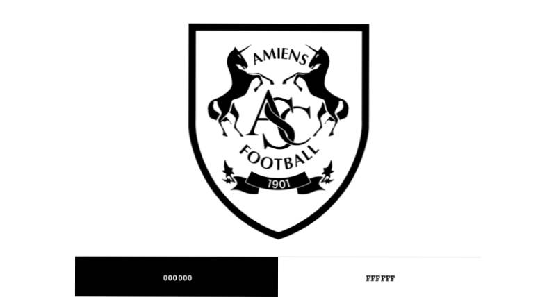
Black (Hex: #000000, RGB: 0, 0, 0, CMYK: 0, 0, 0, 100): Black represents authority and formality. In the context of Amiens’ current badge, it provides the structural backbone of every line and shape. From a color psychology standpoint, it signals seriousness and competitive intent.
White (Hex: #FFFFFF, RGB: 255, 255, 255, CMYK: 0, 0, 0, 0): White brings clarity and simplicity. It has been the club’s primary kit color since the 1990s. Historically, the club played in blue, but the shift to white over the last three decades has become fully reflected in the 2022 badge redesign.
The earlier versions also used Grey (#808080) for depth and Blue (#007AC1) as a nod to the original club color from 1901. These have been removed from the current identity, though older black logos and white logos in football show similar two-tone approaches gaining popularity.
What Typography Style Is Used in the Amiens SC Logo?
The Amiens badge uses a custom typeface for the “ASC” initials and the surrounding text. The letters are bold, slightly condensed, and designed to remain readable at small sizes.
It is a sans-serif font style, which makes sense for a modern sports badge. The kerning between letters is tight but not cramped. At scale, the text maintains legibility even on merchandise and small digital displays.
The typography has been refined with each logo update, moving from more decorative lettering in earlier versions to the cleaner, more functional type seen today.
What Are the Hidden Meanings in the Amiens SC Logo?
The laurel wreath at the base of the shield is a classical symbol of achievement. It has been part of the badge since the late 1990s version, even though Amiens has never won a major national trophy. I think it speaks more to aspiration than accomplishment. Which, honestly, is the case for a lot of clubs.
The four quadrants inside the shield mirror the structure of the city’s coat of arms, maintaining a direct visual link between the football club and the municipality. The “1901” on the ribbon below is not just a date. It positions Amiens among the oldest football clubs in France, which carries weight within French football culture.
How Does the Amiens SC Logo Compare to Competitor Logos?
Among French Ligue 2 clubs, the Amiens badge stands out for its heraldic complexity. Most Ligue 2 badges lean toward simpler graphic marks. The Amiens crest goes the other direction, with full heraldic supporters (the unicorns), a divided shield, and multiple text layers.
Compare it to nearby clubs. The Stade de Reims logo uses a cleaner, more modern circular format. The Metz badge also favors a tighter, more streamlined design. The Strasbourg crest has some complexity but stays within a single central motif.
Amiens is closer in design philosophy to clubs like Paris Saint-Germain, where the badge incorporates city symbols (the Eiffel Tower, the fleur-de-lis). But Amiens does it with a more traditional heraldic approach, while PSG modernized their city references into a sleeker format.
Against regional rivals like Nantes and Toulouse, Amiens’ commitment to the full coat of arms treatment is distinctive. Not better or worse. Just different. It appeals to supporters who value that deep connection to municipal heritage.
What Are the Technical Specifications of the Amiens SC Logo?
Official Color Codes
Primary Color: Black
- Hex: #000000
- RGB: (0, 0, 0)
- CMYK: (0, 0, 0, 100)
- Pantone: Black 6 C (approximate)
Secondary Color: White
- Hex: #FFFFFF
- RGB: (255, 255, 255)
- CMYK: (0, 0, 0, 0)
- Pantone: 7436 C (approximate)
Legacy Colors (pre-2022):
- Grey: #808080
- Blue: #007AC1
- Light Grey: #F3F3F3
Dimensions and Proportions
The badge uses a roughly vertical shield shape. The aspect ratio is close to 5:6 (width to height), though this varies slightly depending on the application. The official vector graphics versions (SVG and EPS formats) allow the badge to scale without quality loss.
For print design applications, the minimum recommended size keeps the “ASC” text legible, generally no smaller than 20mm in width. Clear space around the badge should equal approximately the height of the “ASC” text on all sides.
Digital versions are typically distributed in SVG format for web design use and PNG for standard applications. The club provides specific DPI guidelines for print reproduction to make sure the fine details of the unicorn figures remain sharp.
What Cultural Impact Has the Amiens SC Logo Had?

The Amiens badge has become a regional symbol in Picardy and the broader Hauts-de-France area. It directly reflects the city’s municipal identity through its heraldic elements. For supporters, it functions as more than a football crest.
During the club’s historic three seasons in Ligue 1 (2017-2020), the badge gained wider national recognition. It appeared on broadcast graphics alongside clubs like PSG and Marseille, exposing the unicorn imagery to a much larger audience.
The 120th anniversary badge in 2021 sparked genuine enthusiasm among fans and badge collectors, with limited-edition merchandise selling out quickly. It showed that the club’s visual heritage has commercial and emotional value beyond match-day use.
How Does the Amiens SC Logo Fit Into the Overall Brand Identity?
The badge sits at the center of everything Amiens SC does visually. From the Stade de la Licorne to the official kits (currently produced by Puma), the unicorn motif ties every piece together. Even the stadium’s name, which translates to “Stadium of the Unicorn,” reinforces the connection.
The club’s brand guidelines require consistent use of the badge across all media. Sponsor Intersport, who has been the kit partner since 2009, integrates the badge alongside their own branding on official retail merchandise.
The 2022 shift to black and white was part of a larger brand style guide update. It aligned the badge with the club’s current kit colors and digital presence. The club’s social media profiles, website, and stadium signage all reflect this unified monochrome approach.
It works because there is consistency across touchpoints. The badge on a scarf looks the same as the badge on the website header. That kind of unity is what makes a club identity feel solid.
How Should the Amiens SC Logo Be Used?
The Amiens SC badge is a registered trademark. Any commercial use outside of official club channels requires written authorization from the club. This includes printing the badge on merchandise, using it in marketing materials, or displaying it in commercial digital products.
For editorial and informational use, the badge should be reproduced without modification. That means no color changes, no stretching, no removing elements. The unicorns, text, and shield must remain intact as a single unit.
Official logo files in SVG and PNG formats are sometimes available through brand asset platforms. Always use the most current version. The pre-2022 versions with blue and grey are no longer the active badge, so using them in current materials would be incorrect.
Fan-created content generally falls under a grey area. Most clubs tolerate non-commercial fan use, but anything sold for profit without a license could be subject to legal action. If you are making something for a fan project, it is worth reaching out to the club directly.
The club’s official website at amiensfootball.com is the primary source for current branding assets and usage guidelines.
FAQ on The Amiens Logo
What does the Amiens SC logo look like?
The Amiens SC badge features two rearing unicorns flanking a shield divided into quadrants. The initials “ASC” sit at the center, with “Amiens” above and “Football” below. A ribbon at the base displays “1901.”
Why are there unicorns on the Amiens football crest?
The unicorns come from the official coat of arms of the city of Amiens. They represent strength and purity in heraldic tradition.
The Stade de la Licorne, the club’s home ground, also takes its name from the unicorn symbol. It ties everything together.
What are the official colors of the Amiens SC emblem?
Since 2022, the official Amiens SC colors are black (#000000) and white (#FFFFFF). Previous versions used grey, blue (#007AC1), and light grey. The shift dropped blue for the first time in the club’s history.
When was the Amiens SC logo last updated?
The current version launched in 2022. It replaced the grey-and-blue badge that had been active since 1998.
A special 120th anniversary edition was also used during the 2021-22 Ligue 2 season, rendered entirely in red.
What font does the Amiens logo use?
The badge uses a custom typeface for the “ASC” lettering and surrounding text. It is a bold, slightly condensed sans-serif style designed for readability at small sizes on kits and merchandise.
How many times has the Amiens club badge changed?
Roughly seven distinct versions exist since the mid-1970s. Major updates came in 1984, 1994, 1998, 2021 (anniversary edition), and 2022.
Each redesign aligned with a specific milestone in the club’s journey through French football.
Can I download the Amiens SC logo in vector format?
Yes. The Amiens SC logo is available in SVG and EPS formats through brand asset platforms. The SVG version scales without losing quality, which makes it suitable for both digital and print applications.
What does “ASC” stand for in the Amiens badge?
ASC stands for Amiens Sporting Club. The club was originally founded as Amiens Athletic Club in 1901. It adopted the Sporting Club name in 1961 after merging with a local omnisports structure in the Picardy region.
Is the Amiens SC logo trademarked?
Yes. The badge is a registered trademark of Amiens Sporting Club under French intellectual property law. Any commercial use requires written authorization from the club. Fan-created non-commercial content generally falls into a grey area.
How does the Amiens logo compare to other Ligue 2 club badges?
The Amiens crest is more detailed than most Ligue 2 badges. Its full heraldic design with dual unicorns sets it apart from simpler marks used by clubs like Metz or Troyes.
It shares that city-arms approach with a few French clubs, but the execution is distinctly its own.
Conclusion
The Amiens logo carries over a century of football heritage in a single badge. From its early text-only marks to the current black-and-white emblem, every version reflects a specific chapter of the club’s story in French football.
The unicorn imagery, borrowed from the city’s heraldic arms, gives this Ligue 2 club a visual identity that most rivals simply cannot match.
Whether displayed on Puma kits at the Stade de la Licorne or scaled down for a social media avatar, the Amiens SC crest holds up. It connects supporters to something bigger than match results. That is what good club branding actually does.

Renowned for his expertise in logo design and visual branding, Bogdan has developed a multitude of logos for various clients.
His skills extend to creating posters, vector illustrations, business cards, and brochures. Additionally, Bogdan's UI kits were featured on marketplaces like Visual Hierarchy and UI8.
He also wrote in the past years on sites like Design Your Way, WebDesignerDepot, WPDean, Designmodo, Speckyboy, Slider Revolution, and more.
- Jujutsu Kaisen Font Generator - 12 October 2026
- The Windsurf Logo History, Colors, Font, And Meaning - 10 October 2026
- How to Remove Background From Product Photos (No Photoshop) - 10 October 2026

Bogdan Sandu is a seasoned designer who has been designing websites since 2008. Renowned for his expertise in logo design and visual branding, Bogdan has developed a multitude of logos for various clients. His skills extend to creating posters, vector illustrations, business cards, and brochures. Additionally, Bogdan's UI kits were featured on marketplaces like Visual Hierarchy and UI8. He also wrote in the past years on sites like Design Your Way, WebDesignerDepot, WPDean, Designmodo, Speckyboy, Slider Revolution, and more.
You Might Also Like


