


The Metz logo is one of the most historically layered emblems in French football. It belongs to Football Club de Metz, a professional club based in the Lorraine region, founded on March 23, 1932. The club came together from a merger of two amateur athletic associations and quickly turned professional, making it one of the oldest pro teams in France.
Within football branding, the FC Metz crest sits in a unique spot. Very few clubs in Europe carry a political or regional symbol on their shirt with official authorization. FC Metz does, through its use of the Cross of Lorraine. The club’s visual identity has gone through roughly five major iterations since the 1930s, with the current version launched in 2021 by Coast, a Brussels-based branding agency.
That 2021 rebrand stripped away decades of crest tradition, removing the shield and the Graoully dragon entirely. What remains is a bold, bevelled Lorraine cross in deep grenat (maroon) with the “Fc Metz” wordmark sitting above it. It is, by any measure, a radical approach to minimalist design in sports branding.
What Is the FC Metz Logo?
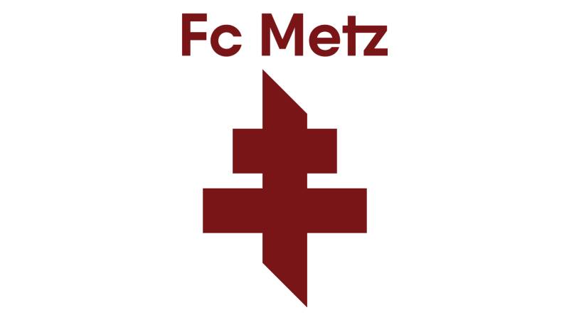
The FC Metz logo is a combination mark featuring a stylized Cross of Lorraine and a clean sans-serif wordmark reading “Fc Metz,” rendered entirely in grenat (maroon). It was officially introduced on May 27, 2021, designed by Coast agency in Brussels.
Here is a breakdown of the current Metz emblem:
- Design Type: Combination mark (symbol plus wordmark)
- Primary Elements: Stylized Cross of Lorraine with bevelled edges and pointed tips, “Fc Metz” wordmark in a custom sans-serif typeface
- Official Introduction Date: May 27, 2021
- Designer/Agency: Coast Branding Agency, Brussels
- Trademark Status: Registered trademark of Football Club de Metz
- Color Palette: Grenat/maroon (#6E0F12) and white (#FFFFFF), with fire orange used as an accent across broader brand materials
- Usage Context: Match kits, stadium signage, digital platforms, merchandise, official communications, and supporter materials
How Has the FC Metz Logo Evolved Over Time?

FC Metz has used approximately five distinct logo versions since its founding in 1932. The emblem shifted from simple rounded badges in the early decades to a detailed heraldic crest in 1967, then to a refined shield in 2000, before landing on the radical minimalist cross in 2021.
The Early Metz Badge (1932-1966)
The club’s first visual identity was straightforward. A rounded emblem built around a football shape, colored in maroon, the shade that gave the team its nickname “Les Grenats” (The Maroons).
At the center sat a black and white shield carrying a gold Cross of Lorraine. The “FC Metz” text appeared above in light blue capitals with a gold outline.
It looked simple. Almost amateur by current standards. But the Lorraine cross was already there from the start, tying the club to its region right from day one.
The cross had appeared on Metz shirts specifically during the 1944-45 season, marking the return of Moselle to France after German annexation during World War II. That moment gave the symbol a deep emotional weight it has never lost.
The Heraldic Crest Era (1967-2000)
Everything changed in 1967. Carlo Molinari, a former motocross champion who became club president, pushed for a completely new badge when the team reached the first division.
The new crest was a classic shield, split vertically into two halves. Yellow on the left, maroon on the right. A white banner at the top carried the “F.C. Metz” name in gold lettering.
Two symbols shared the shield. On the yellow side, a maroon dragon. On the maroon side, a yellow Cross of Lorraine. The dragon was the Graoully, a legendary creature from Metz folklore said to have terrorized the city before being vanquished by Saint Clement, the city’s first bishop.
The yellow came from the Pierre de Jaumont, a golden limestone quarried in the Moselle region north of Metz. So even the color choices were rooted in local geography.
This crest lasted over three decades. It became the badge most older supporters identify with. The balance between the dragon and the cross, split across two color fields, gave it a strong heraldic quality that set it apart from many French football clubs at the time.
The Modernized Shield (2000-2021)
By 2000, the club felt the heraldic style needed an update. The redesign kept the same general structure but simplified things considerably.
The color palette shrank to maroon and white. Gone was the yellow. The dragon grew larger and more prominent. The Lorraine cross became bolder, with thicker lines.
The wordmark switched to a sharp sans-serif typeface in maroon on white. Clean edges, distinct letter cuts.
It was still recognizably Metz. But it felt tighter, more modern. The kind of crest that scaled better across digital screens and merchandise, something the 1967 version struggled with.
The Minimalist Rebrand (2021-Present)
Then came 2021. And honestly, it surprised a lot of people.
Coast agency in Brussels took the whole identity apart and rebuilt it around one single element: the Cross of Lorraine. No shield. No Graoully dragon. Just the cross and a wordmark.
The club surveyed supporters beforehand. 69% said the Lorraine cross was the symbol that best represented FC Metz. So the dragon, despite being part of the badge since 1967, was moved out of the primary logo and kept as a supporting element in the wider brand system.
The cross itself was redesigned. Thicker. Bevelled. Pointed at the tips. It looks almost industrial, which was intentional. Coast also introduced a perforated metal pattern across brand materials to reference the region’s industrial heritage.
Fire orange was added as an accent color in the broader identity system, pulling in the story of Lorraine’s steel and metalworking past.
What Do the Design Elements of the FC Metz Logo Mean?
Every piece of the Metz logo ties back to place and history. The Cross of Lorraine connects the club to its region and to the French Resistance movement. The grenat color references the club’s nickname. Even the geometry of the cross was shaped to suggest industrial strength.
Why Did FC Metz Choose These Specific Colors?

The club’s color psychology is straightforward but effective.
Grenat (Maroon) has been the club’s primary color since its founding. Hex code #6E0F12. Pantone PMS 188 C. RGB values of 110, 15, 18. CMYK at 32, 99, 96, 47. It communicates determination, resilience, and grit. The team earned its nickname “Les Grenats” directly from this color.
White (#FFFFFF) works as the secondary color, adding clarity and contrast. It keeps the maroon from feeling heavy and makes the logo more readable at smaller sizes.
Fire Orange, introduced in the 2021 rebrand, does not appear in the primary logo mark itself but runs through the broader brand system. It references the industrial fire and steelwork that defined the Lorraine economy for generations.
What Typography Style Is Used in the FC Metz Logo?
The current wordmark uses a custom sans-serif typeface. Clean, modern, with no decorative extras.
Earlier versions used more ornate lettering. The 1967 crest had gold serif-style text. The 2000 redesign switched to a bolder sans-serif with sharp edges.
The 2021 version dialed back the font to something deliberately understated. The cross is the star. The wordmark just identifies. It works well at small sizes, scales cleanly on mobile, and does not compete with the symbol for attention.
What Are the Hidden Meanings in the FC Metz Logo?
The Cross of Lorraine was not always a football symbol. It started as a religious emblem, then became the badge of the French Resistance during World War II and the symbol of Free France under Charles de Gaulle.
FC Metz is reportedly the only sports club in Europe officially authorized to wear this cross. Its bevelled, industrial treatment in the 2021 version specifically nods to the Moselle region’s steelmaking history. The pointed tips give it an aggressive, forward-leaning energy that older versions lacked.
How Does the FC Metz Logo Compare to Competitor Logos?
Among French football clubs, Metz went further into minimalism than almost anyone else. Compare it to the Paris Saint-Germain logo, which still uses a detailed roundel with the Eiffel Tower and fleur-de-lis. Or the Olympique Lyonnais emblem, which retains a full heraldic lion inside a circular badge.
Metz stripped everything down to one symbol and a wordmark. It is closer in philosophy to what FC Nantes did with their 2019 rebrand, or what Juventus started in 2017 when they dropped their traditional crest for a stylized “J.”
Within Ligue 1, clubs like Strasbourg and RC Lens still lean into more traditional badge structures. AS Monaco keeps its diamond-shaped crest. Stade Rennais uses a detailed roundel.
The Metz approach feels like a gamble, honestly. You lose some of the historical richness (the Graoully dragon, the shield). But you gain something that works much better across social media avatars, app icons, and merchandise where small-scale readability matters.
What Are the Technical Specifications of the FC Metz Logo?
Official Color Codes
- Primary Color: Grenat (Maroon) – Hex: #6E0F12 | RGB: (110, 15, 18) | CMYK: (32, 99, 96, 47) | Pantone: PMS 188 C
- Secondary Color: White – Hex: #FFFFFF | RGB: (255, 255, 255) | CMYK: (0, 0, 0, 0)
- Accent Color: Fire Orange – Used in extended brand materials, not in the primary logo mark
Dimensions and Proportions
The official SVG file dimensions are nominally 200 x 286 pixels, giving it a roughly 7:10 aspect ratio. The logo is distributed primarily as vector graphics (SVG format) for scalability.
Clear space rules require a buffer zone around the mark equal to the height of the wordmark text. The club’s brand guidelines specify that the logo should not be distorted, recolored outside approved palettes, or placed on backgrounds that reduce legibility.
What Cultural Impact Has the FC Metz Logo Had?
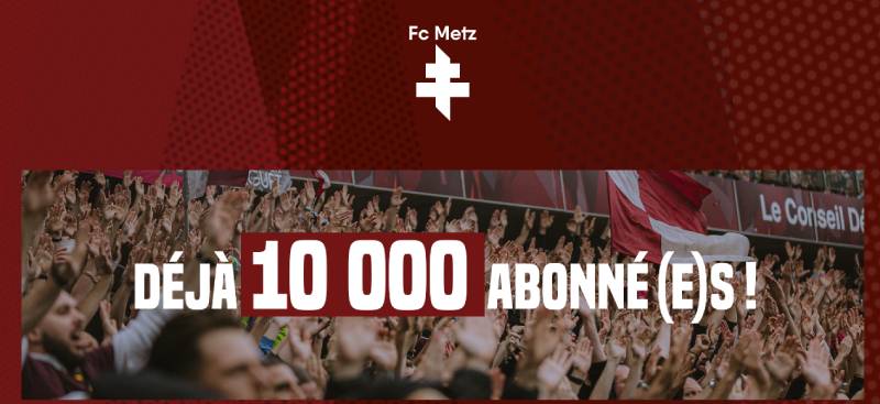
The 2021 rebrand sparked heated debate among supporters. Many long-time fans felt the removal of the Graoully dragon erased decades of identity. The club argued that the cross tested stronger in surveys and better represented the collective values of the fanbase.
The Lorraine cross itself carries weight far beyond football. It evokes the French Resistance, regional pride, and a complicated history of borders shifting between France and Germany. Wearing it on a football shirt is a statement, even now.
The minimalist direction also placed FC Metz in a broader conversation about football identity and how clubs balance heritage with modern branding needs. Some praised the boldness. Others called it a step too far.
How Does the FC Metz Logo Fit Into the Overall Brand Identity?
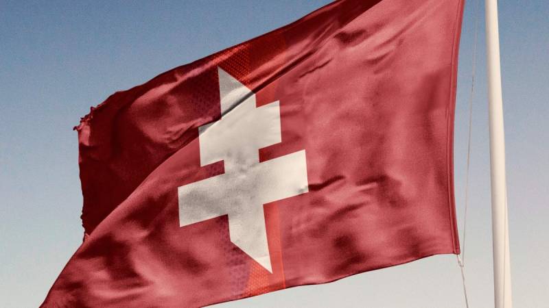
The logo does not stand alone. Coast designed a full flexible identity system around it. The Lorraine cross functions as the primary mark, but the Graoully dragon lives on as a secondary graphic element, appearing in supporter materials and special editions.
A perforated metal pattern runs through stadium graphics, merchandise, and digital content. It ties the visual language to Lorraine’s industrial roots. The fire orange accent color appears in backgrounds, overlays, and campaign materials, giving the brand energy the maroon and white alone cannot provide.
Everything connects back to one idea: the club is Lorraine. The cross says it. The colors say it. Even the textures say it. And the brand style guide makes sure those connections stay consistent across every touchpoint, from the stadium to Instagram.
How Should the FC Metz Logo Be Used?
The club maintains strict usage rules. The logo must appear in grenat on white or white on grenat. No gradient treatments. No shadow effects. No rotation or stretching.
Official logo files (SVG, PNG with transparent backgrounds) are available through the club’s official channels and various football logo repositories for editorial and reference purposes.
The FC Metz name, crest, and associated marks are registered trademarks. Commercial use requires explicit licensing from the club. For editorial or fan-created content, the standard practice is to use official files without modification and credit the source.
If you are working on anything that involves the Metz brand for commercial purposes, reach out to the club directly. They take trademark protection seriously, as most professional football organizations do across print and digital channels.
FAQ on The Metz Logo
What does the FC Metz logo represent?
The Metz logo represents the club’s deep connection to the Lorraine region. Its central element, the Cross of Lorraine, stands for courage, loyalty, and resistance.
The grenat color reflects the team’s nickname, “Les Grenats.” Every detail ties back to regional identity and club heritage.
When was the current Metz logo introduced?
The current logo launched on May 27, 2021. Coast agency in Brussels handled the full rebrand.
It replaced the shield-based crest that had been in use since 2000. The update followed a supporter survey where 69% chose the Lorraine cross as the club’s most recognizable symbol.
Why did FC Metz remove the Graoully dragon from the logo?
The club dropped the Graoully dragon from the primary mark to simplify the visual identity. Survey data showed supporters connected more strongly with the Lorraine cross.
The dragon still appears in secondary brand materials and supporter merchandise. It was not erased, just repositioned.
What are the official colors of the Metz logo?
Grenat (maroon) and white. The grenat hex code is #6E0F12 with a Pantone value of PMS 188 C.
Fire orange works as an accent across the broader brand system but does not appear in the logo itself. The saturation of the maroon gives it a deep, rich tone.
What is the Cross of Lorraine on the Metz emblem?
The Cross of Lorraine is a double-barred cross originally tied to the Dukes of Lorraine. During World War II, it became the symbol of the French Resistance and Free France under Charles de Gaulle.
FC Metz adopted it in 1944-45 when Moselle returned to France.
Who designed the current Metz logo?
Coast, a branding agency based in Brussels, designed the 2021 identity. They built a flexible system around the Lorraine cross, adding a perforated metal pattern that references Lorraine’s industrial past.
The project covered everything from the logotype to stadium graphics.
What font does the FC Metz logo use?
The wordmark uses a custom sans-serif typeface. Clean lines, no decoration. It sits above the cross and stays deliberately understated.
Earlier versions used gold serif lettering and bolder type. The current font spacing keeps things open and readable at small sizes.
How many times has the Metz logo changed?
Roughly five major versions since the club’s founding in 1932. The early rounded badge gave way to the heraldic crest in 1967, a modernized shield in 2000, and the stripped-down cross mark in 2021.
Each shift reflected broader design trends of its time.
Can I download the FC Metz logo for personal use?
Official logo files in SVG and PNG formats are available through football logo repositories for editorial and reference purposes. The crest is a registered trademark of Football Club de Metz.
Any commercial use requires direct licensing from the club.
How does the Metz logo compare to other Ligue 1 club badges?
Metz went further into minimalism than most French football clubs. Rivals like Olympique de Marseille and Toulouse retain detailed crests.
The approach mirrors what Juventus did in 2017. Bold, stripped back, built for digital platforms and small-scale applications where traditional badges lose clarity.
Conclusion
The Metz logo tells a story that goes beyond football. It carries the weight of Lorraine’s history, the memory of the French Resistance, and the identity of a city that has rebuilt itself more than once.
The 2021 rebrand was a bold call. Dropping the Graoully dragon and the traditional shield in favor of a single cross took real nerve.
But the result works. The grenat Lorraine cross scales cleanly across digital platforms, stadium signage, and packaging. It reads at any size.
Few club emblems in Ligue 1 manage to pack this much regional meaning into something so visually simple. Whether you are a supporter from Moselle or just someone who appreciates smart graphic design principles, this crest deserves a closer look.

Renowned for his expertise in logo design and visual branding, Bogdan has developed a multitude of logos for various clients.
His skills extend to creating posters, vector illustrations, business cards, and brochures. Additionally, Bogdan's UI kits were featured on marketplaces like Visual Hierarchy and UI8.
He also wrote in the past years on sites like Design Your Way, WebDesignerDepot, WPDean, Designmodo, Speckyboy, Slider Revolution, and more.
- Jujutsu Kaisen Font Generator - 12 October 2026
- The Windsurf Logo History, Colors, Font, And Meaning - 10 October 2026
- How to Remove Background From Product Photos (No Photoshop) - 10 October 2026

Bogdan Sandu is a seasoned designer who has been designing websites since 2008. Renowned for his expertise in logo design and visual branding, Bogdan has developed a multitude of logos for various clients. His skills extend to creating posters, vector illustrations, business cards, and brochures. Additionally, Bogdan's UI kits were featured on marketplaces like Visual Hierarchy and UI8. He also wrote in the past years on sites like Design Your Way, WebDesignerDepot, WPDean, Designmodo, Speckyboy, Slider Revolution, and more.
You Might Also Like


