


The Troyes logo belongs to Esperance Sportive Troyes Aube Champagne, a French football club rooted in the Aube department of the Champagne region. ESTAC’s badge carries over a century of footballing history through its shield-shaped crest, blue and white palette, and bold lettering. The club’s roots stretch back to 1900 with Union Sportive Troyenne, though ESTAC in its current form was founded in 1986. Since then, the emblem has gone through roughly five distinct versions, each tied to a specific chapter of the club’s identity. The current crest, designed by Coudon Interactive, launched on June 18, 2007, and remains in active use today.
What Is the ESTAC Troyes Logo?

The ESTAC Troyes logo is a shield-shaped combination mark featuring the club initials “ESTAC” in bold custom lettering, set against a blue and white color scheme with gold accents. It was officially introduced on June 18, 2007, designed by French agency Coudon Interactive to reflect both the club’s Champagne-region roots and its professional ambitions.
Here’s a breakdown of the key attributes:
- Design Type: Combination mark (shield emblem with wordmark elements)
- Primary Elements: Shield shape, “ESTAC” initials, stylized graphic representing the Aube region, star motif
- Official Introduction Date: June 18, 2007
- Designer/Agency: Coudon Interactive
- Trademark Status: Registered and actively used by the club
- Color Palette: Blue (#006EB2), Gold (#DC9D0F), White (#FFFFFF)
- Usage Context: Matchday kits, stadium signage, digital platforms, official merchandise, broadcast graphics, and club documentation
The concept of a logo in football goes beyond decoration. It acts as the visual anchor for everything the club does publicly. And ESTAC’s version handles that job well, staying clean enough for small digital icons while keeping enough detail to look good on a jersey.
How Has the ESTAC Troyes Logo Evolved Over Time?
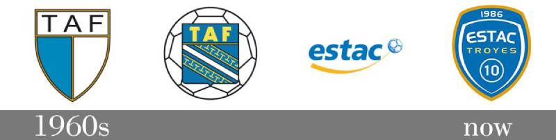
The Troyes football badge has gone through five main versions since 1970, tracking the club’s turbulent journey through bankruptcy, rebirth, and professional resurgence. Each redesign marked a turning point, not just for branding but for the club’s actual survival.
What’s interesting is that Troyes didn’t just tweak colors or fonts between versions. Entire identities shifted because the club literally ceased to exist more than once.
Troyes Aube Football Logo (1970-1975)
Years Active: 1970 to approximately 1975
When Troyes Omnisports renamed itself Troyes Aube Football (TAF) in 1970 and reclaimed professional status, it needed a fresh badge. The original TAF crest was fairly straightforward for the era.
It leaned on circular design elements with the club name wrapped around a central football motif. Blues were present from the start. Nothing too flashy.
At the time, most French lower-division clubs weren’t investing much thought into their logo design principles. You got a shape, some text, maybe a local reference, and that was it. TAF was no different.
The badge served its purpose during the club’s rapid climb from the third division into the second, and eventually into Ligue 1 by 1973.
Updated Troyes Aube Football Logo (1975-1979)
Years Active: 1975 to 1979
A mid-decade refresh came around 1975, though it wasn’t a dramatic overhaul. The overall structure stayed similar, but the graphic treatment got a slight modernization.
This version carried the club through their longest consecutive run in the French top flight, from 1973 to 1978.
Then the club went bankrupt. So, well, the logo died with it. Troyes was left without a professional football team, and the TAF badge became a memory.
Association Troyes Aube Champagne Logo (1986-2000)
Years Active: 1986 to 2000
After years without a proper club, ATAC (Association Troyes Aube Champagne) was born in 1986. Starting in the sixth division, the club needed a completely new identity.
The ATAC crest reflected a fresh start. It used the blue and white colors that had become associated with Troyes football, but the design language was different from the TAF era.
Under manager Alain Perrin, ATAC climbed from regional football all the way to Ligue 2 by 1996. The badge traveled with them through ten years of grinding promotion campaigns.
By the time Troyes reached the first division in 1999, the ATAC branding felt outdated. The club had outgrown its logo, which was built for a regional side, not a top-flight competitor. It showed how much design elements matter when a club’s ambitions change rapidly.
ESTAC Troyes Logo (2000-2007)
Years Active: 2000 to 2007
When the club rebranded as Esperance Sportive Troyes Aube Champagne in 2000, a new crest arrived with it. This version marked the biggest identity shift since 1986.
The shield shape became more pronounced. The “ESTAC” initials took center stage. Blue remained dominant, with white providing contrast.
This was the badge during Troyes’ golden period. They won the Intertoto Cup in 2001, beat Newcastle United, and played in the UEFA Cup against Leeds United.
It was a proper European-level crest, and for a club from a city of about 60,000, that mattered. But by 2007, even this version needed updating.
Current ESTAC Troyes Logo (2007-Present)
Years Active: 2007 to present
Launched on June 18, 2007, the current crest was created by Coudon Interactive. It kept the shield shape and ESTAC lettering but cleaned everything up significantly.
The blue got deeper. Gold accents replaced some of the white detailing. The overall look became tighter and more suitable for digital applications, which mattered more and more as online branding grew.
This badge has seen the club through multiple promotions and relegations, a City Football Group takeover in 2020, and the ongoing ups and downs of life between Ligue 1 and Ligue 2. It’s proven surprisingly durable.
What Do the Design Elements of the ESTAC Troyes Logo Mean?
Every part of the ESTAC Troyes crest carries meaning tied to the club’s geography, history, and values. The shield represents protection and tradition. The initials ground the badge in the club’s full name. And the colors connect directly to the Aube department.
It’s not overly complicated, which is actually the point. Football crests that try to say too much end up saying nothing.
Why Did ESTAC Troyes Choose These Specific Colors?
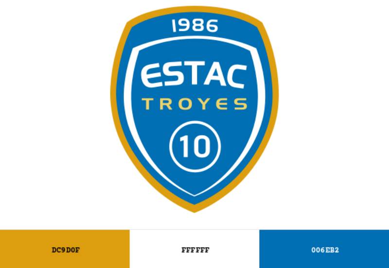
The club uses three official colors, and none of them are accidental.
Blue (#006EB2, Pantone PMS 2196 C) is the primary color. It carries associations of trust, loyalty, and stability. For ESTAC, blue has been a constant since the very first Troyes football clubs in the early 1900s.
Gold (#DC9D0F, Pantone PMS 7550 C) adds a layer of prestige. It references ambition and achievement. Not every Ligue 2 club uses gold, and it gives ESTAC a sense of aspiration that goes beyond their current division.
White (#FFFFFF) provides clarity and breathing room. It keeps the blue and gold from feeling heavy, and it’s been part of the Troyes kit tradition for decades.
From a color psychology standpoint, the combination works. Blue builds credibility, gold suggests quality, and white keeps things approachable. The color palette is simple but effective, and it reproduces well across both print and screen.
What Typography Style Is Used in the ESTAC Troyes Logo?
The typography in the ESTAC crest uses a custom sans-serif style. It’s bold, condensed, and built for legibility at small sizes.
The letterforms are geometric with slightly rounded edges. No frills, no decorative serifs. Just clean, punchy letters that read well whether you’re looking at a stadium scoreboard or a 32-pixel favicon.
The font was likely custom-drawn for the 2007 redesign rather than pulled from an existing typeface family. That’s common in football crest design. You want something nobody else has.
Good kerning keeps the five letters of “ESTAC” balanced within the shield. They don’t feel cramped or overly spaced, which is harder to pull off than it sounds with a five-letter acronym.
What Are the Hidden Meanings in the ESTAC Troyes Logo?
The shield shape itself is probably the most loaded element. In French football, shields reference heraldic tradition, and the Aube department has its own coat of arms that influenced Troyes’ sporting badges historically.
The gold accents aren’t just decorative. They tie into the Champagne region’s associations with luxury and celebration. Troyes is, after all, the capital of the Aube department within Champagne.
There’s also the matter of what’s not in the logo. Unlike many French clubs, ESTAC doesn’t include a founding year on the current crest. That’s a deliberate choice, given the club’s complicated lineage of predecessors that folded. The badge looks forward, not back.
How Does the ESTAC Troyes Logo Compare to Competitor Logos?
Troyes’ main local rivalry is with Stade de Reims, another Champagne-region club. Reims uses a circular badge with prominent red and white tones, giving it a completely different feel.
Where ESTAC goes for a tight, corporate-modern shield, Reims leans into its historical prestige with a more ornamental design.
Among other Ligue 2 clubs, Troyes’ crest holds up well. Metz uses a similar shield approach but with darker maroon tones. Lorient keeps things minimal with an orange and black palette that feels sportier.
Strasbourg and Nantes both use more complex crests with regional symbolism baked in, while Troyes stays relatively stripped back.
Compared to the bigger French clubs, Paris Saint-Germain and Olympique de Marseille operate on a different level of brand recognition entirely. But ESTAC’s logo doesn’t try to compete with that. It knows what it is, and it does it cleanly.
What Are the Technical Specifications of the ESTAC Troyes Logo?
Official Color Codes
- Blue (Primary): Hex #006EB2 | RGB (0, 110, 178) | CMYK (90, 55, 3, 0) | Pantone PMS 2196 C
- Gold (Secondary): Hex #DC9D0F | RGB (220, 157, 15) | CMYK (14, 40, 100, 1) | Pantone PMS 7550 C
- White (Accent): Hex #FFFFFF | RGB (255, 255, 255) | CMYK (0, 0, 0, 0)
Dimensions and Proportions
The logo’s original SVG file measures nominally 461 x 567 pixels, giving it an approximate aspect ratio of 0.81:1 (slightly taller than wide). This vertical orientation is standard for shield-based football crests.
The crest is available as a vector graphic in SVG, AI, and EPS formats, which means it scales to any size without quality loss. For bitmap uses, PNG versions exist at resolutions up to 1623 x 2000 pixels.
Clear space around the logo should generally equal at least the width of the “E” in ESTAC on all sides. Minimum reproduction size depends on the application, but anything below about 20mm in width starts to lose legibility on the initials.
For print applications, using the Pantone references is the safest way to keep colors consistent. Screen-based work should stick to the hex or RGB values. The DPI for print should be at least 300 to keep the shield’s fine details sharp.
What Cultural Impact Has the ESTAC Troyes Logo Had?

For a city of roughly 60,000 people, the ESTAC badge punches above its weight in terms of recognition. It traveled across Europe during the club’s Intertoto and UEFA Cup campaigns in the early 2000s, putting Troyes on the football map for fans who’d never heard of the Aube department.
The City Football Group’s acquisition in 2020 gave the logo another boost in visibility. Suddenly, ESTAC’s crest sat alongside Manchester City, Melbourne City, and other clubs in a global portfolio.
Locally, the badge is a source of identity for the Aubois community. You see it on car stickers, shop windows, and bar signs throughout Troyes. It functions as a civic symbol almost as much as a sporting one.
How Does the ESTAC Troyes Logo Fit Into the Overall Brand Identity?
The logo sits at the center of a broader visual system that includes the club’s kits, stadium branding, and digital presence. ESTAC’s brand guidelines tie everything together through consistent use of the blue, gold, and white palette.
Kit manufacturers have changed over the years. Kappa handled things from 2015 to 2019. Le Coq Sportif took over in 2019 for a five-year deal, which made sense given that the brand originates from the Aube department. As of 2025, Puma replaced them as part of the City Football Group’s wider kit strategy.
The club’s web design and social media presence all use the crest as the primary visual anchor. On Instagram, the badge works well as a circular profile icon, and the blue tones translate naturally to both light and dark interface backgrounds.
Match programs, press materials, and ticket designs all reference the crest’s color codes and proportions. The visual hierarchy consistently places the logo at the top, with supporting text and imagery flowing beneath it.
How Should the ESTAC Troyes Logo Be Used?
If you need to use the ESTAC Troyes crest for editorial, fan content, or reference purposes, here are some things to keep in mind.
Do: Use the official color codes listed above. Maintain the shield’s proportions (don’t stretch or squish it). Keep adequate clear space around the badge. Use vector formats whenever possible.
Don’t: Alter the colors to match your own brand. Add effects like drop shadows or outlines that aren’t part of the original design. Place the logo over busy backgrounds where it loses readability. Rotate or distort the crest.
Official logos can typically be sourced from the club’s website at estac.fr. For commercial use, you’d need to contact the club directly about licensing, as the crest is a registered trademark.
Fan art and personal memorabilia generally get a pass for non-commercial use, but always check the club’s current policies. With City Football Group now involved, trademark enforcement tends to be stricter than it was when ESTAC was independently run.
FAQ on The Troyes Logo
What does the ESTAC Troyes logo look like?
The ESTAC Troyes badge is a shield-shaped crest featuring the club initials in bold custom lettering. It uses a blue and white color scheme with gold accents. The design is clean, modern, and built for both digital and print use.
When was the current Troyes football club emblem introduced?
The current crest launched on June 18, 2007. It was designed by Coudon Interactive as part of a full club identity refresh.
This version replaced the 2000-2007 badge that carried ESTAC through their UEFA Cup and Intertoto campaigns.
What colors are used in the Troyes club crest?
Three official colors make up the palette. Blue (#006EB2) is the primary color. Gold (#DC9D0F) serves as the secondary. White (#FFFFFF) rounds things out.
The blue and white combination has been tied to Troyes football since the early 1900s.
Who designed the ESTAC Troyes logo?
Coudon Interactive, a French design agency, created the current version. They focused on making the crest work across merchandise, stadium signage, and digital platforms.
The designer’s name for earlier versions remains undocumented.
How many times has the Troyes logo been redesigned?
Roughly five distinct versions exist. The Troyes Aube Football era produced two (1970-1975, 1975-1979). ATAC introduced one in 1986. Then ESTAC brought two more in 2000 and 2007.
Each redesign followed a major shift in the club’s history.
What does the shield shape in the ESTAC crest represent?
Shield shapes in French football crests reference heraldic tradition. For ESTAC, the shield connects to the Aube department’s coat of arms and signals protection, stability, and regional pride.
It’s a common choice across Ligue 1 and Ligue 2 club badges.
Can I download the Troyes logo in vector format?
Yes. The crest is available as an SVG, AI, and EPS file through various logo databases. The original SVG measures 461 x 567 pixels nominally.
For commercial use, you’d need licensing permission directly from the club at estac.fr.
Why doesn’t the ESTAC Troyes badge include a founding year?
That’s a deliberate choice. The club’s lineage is complicated, with predecessor clubs folding in 1967 and 1979. Including a single founding date would misrepresent the Troyes football heritage.
So the crest focuses on the present instead.
How does the Troyes logo compare to other French football club logos?
It’s cleaner and more minimal than most. Stade de Reims uses a circular ornamental badge. Metz goes darker with maroon tones. Troyes keeps things tight with a corporate-modern feel that works well at small sizes.
Is the ESTAC Troyes logo trademarked?
Yes. The crest is a registered trademark. Since City Football Group acquired the club in 2020, enforcement has gotten stricter.
Fan art for personal use is generally fine. Anything commercial needs approval from the ESTAC brand team.
Conclusion
The Troyes logo tells the story of a club that refused to disappear. Through bankruptcy, rebirth, and multiple name changes, the ESTAC crest kept evolving alongside the team it represents.
Its blue, gold, and white shield works across jerseys, digital platforms, and matchday programs without losing clarity. That’s harder to pull off than most people think.
With City Football Group now behind the club and Ligue 2 competition driving continued visibility, the badge carries more weight than ever for the Aubois community.
Few French football emblems pack this much regional identity into such a clean, modern design.

Renowned for his expertise in logo design and visual branding, Bogdan has developed a multitude of logos for various clients.
His skills extend to creating posters, vector illustrations, business cards, and brochures. Additionally, Bogdan's UI kits were featured on marketplaces like Visual Hierarchy and UI8.
He also wrote in the past years on sites like Design Your Way, WebDesignerDepot, WPDean, Designmodo, Speckyboy, Slider Revolution, and more.
- How to Install Fonts on Mac (Step-by-Step Guide) - 20 September 2026
- From Mockup to Code: How AI-Augmented Development Speeds Up the Design Handoff - 19 September 2026
- The Beehiiv Logo History, Colors, Font, And Meaning - 18 September 2026

Bogdan Sandu is a seasoned designer who has been designing websites since 2008. Renowned for his expertise in logo design and visual branding, Bogdan has developed a multitude of logos for various clients. His skills extend to creating posters, vector illustrations, business cards, and brochures. Additionally, Bogdan's UI kits were featured on marketplaces like Visual Hierarchy and UI8. He also wrote in the past years on sites like Design Your Way, WebDesignerDepot, WPDean, Designmodo, Speckyboy, Slider Revolution, and more.
You Might Also Like


