


The Auxerre logo is one of the most recognizable crests in French football. It belongs to Association de la Jeunesse Auxerroise, a club founded on December 29, 1905, in the Burgundy region of France. The badge carries an eight-pointed cross at its center, a direct link to the club’s origins under Abbe Deschamps, the priest who started the whole thing.
Within the wider world of football branding, Auxerre sits in a tricky spot. It’s not PSG. It’s not Marseille. But its crest has held a steady visual identity for decades, and that kind of consistency matters more than most people realize. The current version of the emblem has been in use since 2006, making it one of the longer-running designs among Ligue 1 clubs. Across its history, the club has gone through four distinct logo versions.
What Is the AJ Auxerre Logo?
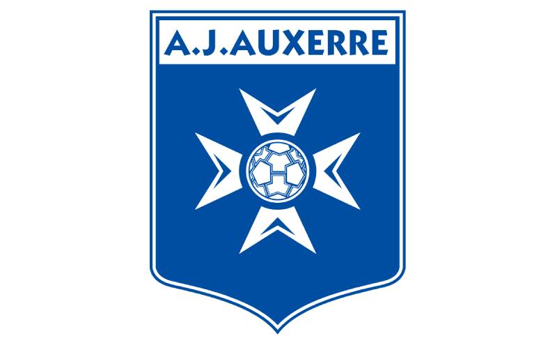
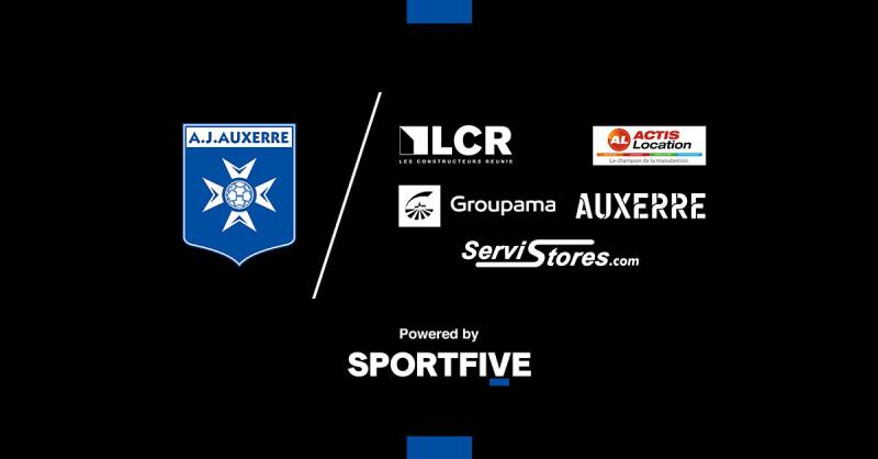
The AJ Auxerre logo is a shield-shaped emblem featuring an eight-pointed star cross in white set against a blue background, with the club’s name displayed at the top and a stylized football at the center. It was introduced in its current form in 2006 and draws directly from the Catholic Association of French Youth’s cross symbol.
Design Type: Emblem (combination mark with shield, symbol, and text)
Primary Elements: Eight-pointed star cross, shield shape, stylized soccer ball, club name banner, pointed base
Official Introduction Date: 2006 (current version)
Designer/Agency: Not publicly credited to a specific designer or agency
Trademark Status: Registered by the Association de la Jeunesse Auxerroise as a protected club emblem under French football federation regulations
Color Palette: Blue (#4087BF) and White (#FFFFFF). These two colors have defined the club’s identity since its earliest days.
Usage Context: Match kits, official merchandise, stadium signage, digital platforms including the club website and social media, marketing materials, and all licensed AJA products
How Has the AJ Auxerre Logo Evolved Over Time?
The Auxerre crest has gone through four versions since the 1960s.
Each redesign kept the core blue and white scheme but shifted the graphic treatment significantly.
The biggest jump happened between 1997 and 2006, when the club moved to a cleaner, more modern shield design.
Original AJ Auxerre Logo (1960-1992)
Years Active: 1960-1992
This was the first formalized version of the crest. It featured a more traditional heraldic look with detailed line work and multiple colors including blue, gold, and darker tones.
The design included the cross symbol already, along with regional references tied to the Yonne department and Burgundy.
It felt old-school, like something you’d find on a municipal building rather than a football shirt. But it did the job for over three decades.
This was the era of Guy Roux building something from nothing, and the badge matched that kind of grassroots grit.
Second AJ Auxerre Logo (1992-1997)
Years Active: 1992-1997
The club updated its badge in 1992 to reflect its growing status in French football. By this point, AJA was a regular in Division 1 and competing in European tournaments.
The redesign simplified some of the older heraldic details while keeping the cross and the blue/white color base.
It was a transitional design. Think of it as the club trying to look more professional without completely abandoning what made the original crest work.
This version coincided with some of the club’s best seasons, including the 1994 Coupe de France win.
Third AJ Auxerre Logo (1997-2006)
Years Active: 1997-2006
After winning the Ligue 1 title in 1996, the club rolled out another update. The third logo carried a stronger, bolder visual presence with cleaner lines and a more defined shield shape.
The eight-pointed cross was more prominent here, and the overall layout started moving toward the modern look we see today.
Colors tightened up. Less noise, more focus. The color palette became strictly blue and white, dropping the older multi-toned approach.
Current AJ Auxerre Logo (2006-Present)
Years Active: 2006-present
The current version is the most polished iteration. It features a clean shield with a pointed base, the eight-pointed star cross rendered in white against a solid blue field, and a small stylized football at the center.
“A.J. AUXERRE” sits in bold uppercase white letters across a banner at the top of the shield.
The design feels modern without trying too hard. It’s the kind of crest that scales well, from a tiny app icon to a massive stadium banner. That balance between detail and simplicity is hard to get right, and this version nails it.
This badge has now been in use through Ligue 1 highs, Ligue 2 lows, and everything in between.
What Do the Design Elements of the AJ Auxerre Logo Mean?
Every piece of the Auxerre badge ties back to the club’s roots in Burgundy and its founding by a Catholic priest.
The eight-pointed cross isn’t random decoration. It comes directly from the Catholic Association of French Youth, the organization that Abbe Deschamps was connected to when he founded the club in 1905.
Why Did AJ Auxerre Choose These Specific Colors?
Blue and white aren’t just picked because they look good together (although, well, they do).
Blue represents loyalty, trust, and depth. It ties directly to the city of Auxerre’s own identity. White stands for purity and integrity.
Together they create a pairing that works from a color psychology standpoint too. Blue builds confidence and reliability, while white keeps things clean and approachable.
Primary Blue: Hex #4087BF, RGB (64, 135, 191), CMYK (75, 38, 4, 0), Pantone PMS 109-7 U
White: Hex #FFFFFF, RGB (255, 255, 255), CMYK (0, 0, 0, 0)
What Typography Style Is Used in the AJ Auxerre Logo?
The font used in the Auxerre crest is a custom bold, uppercase sans-serif style.
It’s clean and highly legible, even at small sizes. Earlier versions of the logo used more ornate lettering, but the current typeface leans toward simplicity.
The letters sit on a white banner that provides strong contrast against the blue background. This makes the club name pop immediately, which is what you want when someone’s scanning a broadcast or scrolling through a feed.
What Are the Hidden Meanings in the AJ Auxerre Logo?
The eight-pointed cross is the big one. Most casual fans see a star shape. But it’s actually derived from the Maltese cross tradition, adapted through the Catholic Association of French Youth.
The pointed shield base gives the whole emblem a downward anchor, suggesting stability and groundedness. The football at the center of the cross connects the religious heritage to the club’s actual purpose. It’s subtle but it works.
Abbe Deschamps never just wanted a sports club. He wanted a youth organization. The cross reminds you of that original intent, even if most fans today don’t think about it.
How Does the AJ Auxerre Logo Compare to Competitor Logos?
Among French football clubs, Auxerre’s crest sits in the more traditional camp. It doesn’t chase trends.
Compare it to the Paris Saint-Germain logo, which blends the Eiffel Tower and a fleur-de-lis into a globally recognizable mark. Or the Olympique de Marseille logo, with its bold “OM” letterform.
Auxerre’s approach is quieter. The Olympique Lyonnais logo goes heavier on the heraldic elements. The Stade Rennais logo keeps things geometric and tight.
Where AJA stands out is in the religious symbolism. Not many football clubs carry a cross that actually means something beyond decoration. The RC Lens logo and the Nantes logo lean more toward regional identity without the faith-based connection.
Honestly, Auxerre’s badge has more in common with some older university logos than with most modern football crests. And that’s kind of the point.
What Are the Technical Specifications of the AJ Auxerre Logo?
Official Color Codes
Primary Color – Blue:
Secondary Color – White:
- Hex: #FFFFFF
- RGB: (255, 255, 255)
- CMYK: (0, 0, 0, 0)
Dimensions and Proportions
The shield follows a roughly 5:6 width-to-height ratio. The star cross sits centered within the shield, taking up about 60% of the vertical space below the name banner.
Minimum size for legibility on print materials is generally around 25mm wide. On digital platforms, the logo should not appear smaller than 40 pixels wide.
Clear space around the emblem should be maintained at roughly the width of the “A” in the club name on all sides. The logo should not be stretched, rotated, or recolored outside of approved variations.
What Cultural Impact Has the AJ Auxerre Logo Had?
Auxerre’s crest represents something bigger than football in its region. It’s the most visible symbol of the city of Auxerre itself for people outside of France.
The club produced players like Eric Cantona, Laurent Blanc, and Djibril Cisse. When those players appeared on international stages wearing the AJA badge, the logo traveled with them.
In Burgundy, the crest is a source of local pride. You’ll find it on car stickers, shop windows, and cafe walls around the Yonne department. It has become part of the regional identity, not just a sports mark.
For a city of roughly 35,000 people, having a logo that has appeared in Champions League matches is a big deal. That kind of exposure doesn’t fade easily.
How Does the AJ Auxerre Logo Fit Into the Overall Brand Identity?
The logo is the anchor of everything AJA does visually. The blue and white scheme runs through the kits, the stadium, the website, the merchandise, all of it.
Stade de l’Abbe-Deschamps, the club’s home ground, reflects the same color identity. The name itself connects back to the founder whose cross symbol lives in the badge.
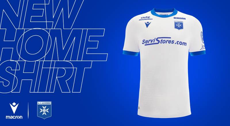
The club’s brand guidelines keep everything tight. Kit manufacturers have to follow strict rules about how the crest appears on jerseys. Digital assets use the same blue (#4087BF) across all platforms.
What makes it work is the consistency. Four logo versions in over 60 years isn’t a lot. Most clubs change their crests more often than that. AJA lets its badge do the talking without constant reinvention, and that restraint actually builds stronger recognition over time.
How Should the AJ Auxerre Logo Be Used?
Do:
- Use the official vector files for any print or large-format applications
- Maintain the clear space around the emblem at all times
- Use the logo on white or dark blue backgrounds for best visibility
- Reference the official color codes when reproducing the badge
Don’t:
- Alter the proportions or stretch the logo in any direction
- Change the official colors outside of approved monochrome versions
- Place the logo on busy backgrounds that reduce legibility
- Add effects like drop shadows, gradients, or outlines that are not part of the official design
Official logo files can typically be accessed through the club’s media department or the LFP’s brand asset portals. For fan-made content, the club generally allows use of the emblem as long as it’s not modified or used for commercial purposes without permission.
The AJ Auxerre crest is a registered trademark. Any commercial use outside of licensed partnerships requires written approval from the club.
FAQ on The Auxerre Logo
What does the AJ Auxerre logo look like?
The AJ Auxerre badge is a blue shield with an eight-pointed white star cross at its center. A stylized soccer ball sits inside the cross.
The club name appears in bold uppercase letters across a banner at the top. The shield tapers to a pointed base.
When was the current Auxerre club emblem introduced?
The current version was introduced in 2006. It replaced the 1997 design that had served the club through nearly a decade of Ligue 1 football.
This is the fourth crest in the club’s history, and it’s held up well for close to two decades now.
What do the colors in the Auxerre team crest mean?
Blue (#4087BF) represents loyalty and depth. It connects directly to the city of Auxerre in the Burgundy region.
White stands for purity and integrity. Together, these two colors have defined the club’s visual identity since its founding in 1905.
Why does the Auxerre logo have a cross?
The eight-pointed cross comes from the Catholic Association of French Youth. Abbe Deschamps, the priest who founded the club, adopted this symbol.
It reflects the Christian heritage of the Yonne department and the club’s origins as a youth organization.
How many times has the AJ Auxerre logo changed?
The club has used four distinct versions. The timeline runs 1960-1992, 1992-1997, 1997-2006, and 2006 to present.
Each Auxerre logo redesign kept the blue and white scheme but updated the graphic treatment to match the era.
What is the official font used in the Auxerre badge?
The crest uses a custom bold, uppercase sans-serif typeface. It prioritizes readability at all sizes.
Earlier versions featured more ornate typography, but the modern design leans toward clean, simple letterforms that work across digital and print.
Where can I download the AJ Auxerre logo in high quality?
Official files are available through the club’s media department and LFP brand portals. Fan sites offer PNG and SVG versions too.
For anything commercial, you need written approval from the club. The AJA logo is a registered trademark of Association de la Jeunesse Auxerroise.
What makes the Auxerre crest different from other French football logos?
The religious symbolism sets it apart. Most Ligue 1 crests lean on regional heraldry or abstract shapes.
Auxerre’s eight-pointed star cross has a direct link to the club’s founding story, which gives the club insignia a layer of meaning that competitors lack.
Is the Auxerre logo available as a vector file?
Yes. Multiple sources offer the Auxerre emblem in EPS, AI, and SVG formats. These scale without losing quality, which matters for large-format printing.
The official club version should always be used for licensed products or professional media work.
What is the connection between the Auxerre logo and the city’s history?
The club was founded in Auxerre, Burgundy, on December 29, 1905. The crest ties to the Stade de l’Abbe-Deschamps, named after the founder.
Blue and white mirror the city’s own identity. The cross reflects the region’s Catholic roots, making the badge a piece of local heritage as much as a football mark.
Conclusion
The Auxerre logo is more than a football badge. It carries over a century of history from a small Burgundy city to European competition stages.
Four versions, two colors, one eight-pointed cross. That kind of restraint in club branding is rare in modern football.
From the Coupe de France triumphs to the 1996 Ligue 1 title, the AJA emblem has been there through every chapter. Players like Laurent Blanc and Djibril Cisse wore it before the world knew their names.
The Auxerre team crest proves that strong visual identity doesn’t need constant reinvention. Sometimes the best design decision is knowing what to keep.

Renowned for his expertise in logo design and visual branding, Bogdan has developed a multitude of logos for various clients.
His skills extend to creating posters, vector illustrations, business cards, and brochures. Additionally, Bogdan's UI kits were featured on marketplaces like Visual Hierarchy and UI8.
He also wrote in the past years on sites like Design Your Way, WebDesignerDepot, WPDean, Designmodo, Speckyboy, Slider Revolution, and more.
- Canva vs PowerPoint: Which Is Better for Presentations? - 22 September 2026
- How to Install Fonts on Mac (Step-by-Step Guide) - 20 September 2026
- From Mockup to Code: How AI-Augmented Development Speeds Up the Design Handoff - 19 September 2026

Bogdan Sandu is a seasoned designer who has been designing websites since 2008. Renowned for his expertise in logo design and visual branding, Bogdan has developed a multitude of logos for various clients. His skills extend to creating posters, vector illustrations, business cards, and brochures. Additionally, Bogdan's UI kits were featured on marketplaces like Visual Hierarchy and UI8. He also wrote in the past years on sites like Design Your Way, WebDesignerDepot, WPDean, Designmodo, Speckyboy, Slider Revolution, and more.
You Might Also Like


