


The LOSC logo is the official visual mark of Lille Olympique Sporting Club, one of France’s most storied football clubs. It sits inside a pentagon shape, with a white mastiff head at its center and the letters “LOSC” printed underneath in a custom typeface. Red, navy blue, and white make up the color palette, and a small fleur-de-lys appears just above the wordmark.
Founded in 1944 through the merger of Olympique Lillois and SC Fives, the club has gone through roughly ten different badge designs. The current version was introduced in 2018, designed by Dragon Rouge, a Paris-based branding agency that had been working with the club since 2012. French football branding has always leaned heavily on regional identity. And LOSC’s emblem leans harder than most, pulling directly from the city of Lille’s architecture and heraldic symbols.
What Is the LOSC Logo?
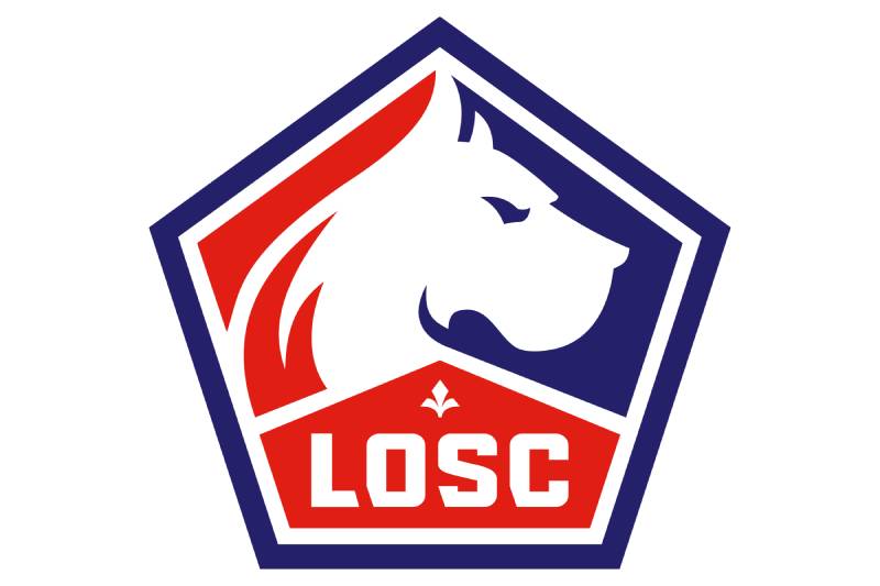
The LOSC logo is a pentagon-shaped emblem featuring a right-facing white mastiff, the “LOSC” acronym in a custom font, a fleur-de-lys, and a subtle flame detail. It was introduced in June 2018 and designed by Dragon Rouge agency, with the pentagon shape drawn from the Citadel of Lille built by Vauban.
Design type: Combination mark (symbol plus wordmark)
Primary elements: Mastiff (Great Dane) profile in white, “LOSC” lettering, fleur-de-lys, flame detail on the left side, pentagon shield
Official introduction date: June 19, 2018
Designer/Agency: Dragon Rouge (Paris). The agency had been LOSC’s design partner since 2012 and also created the previous 2012 badge.
Trademark status: Registered by Lille Olympique Sporting Club. The emblem is protected as club intellectual property across merchandise, broadcast, and digital media.
Color palette:
- Red: #E01E13
- Navy Blue: #24216A
- White: #FFFFFF
Usage context: Match kits, stadium branding at Stade Pierre-Mauroy, official merchandise, social media channels, press materials, broadcast graphics, and Ligue 1 competition assets.
How Has the LOSC Logo Evolved Over Time?

The LOSC logo has been redesigned roughly ten times since 1944. The earliest badges focused on the fleur-de-lys inside heraldic shields.
The mastiff first appeared in 1981, and every version since has kept it. The 2002 and 2012 redesigns shifted toward modern, sport-focused branding before the current 2018 pentagon was introduced.
Original Lille Badge (1944-1946)
Years active: 1944-1946
The very first badge for the newly merged club was a bold red shield with a white fleur-de-lys at its center, outlined in black. The full “Lille-Olympique Sporting-Club” name ran along the white border in a clean sans-serif typeface.
There was no mastiff. No “LOSC” abbreviation. Just the lily flower on a shield, announcing a new club born from two founding members of French Division 1.
Red and white were carried over from Olympique Lillois. The fleur-de-lys tied the badge to Lille’s civic identity. Pretty straightforward for the time.
Fleur-de-Lys Shield Variations (1946-1974)
Years active: 1946-1974
Several versions came and went during this stretch, but they all stuck with the same basic structure. Shield shape. Fleur-de-lys in the middle. Red and white as the main colors, sometimes adding blue.
The “LOSC” abbreviation started appearing during this period, usually in a compact arrangement on or around the shield. These were the club’s golden years on the pitch, with seven major trophies won between 1946 and 1956.
The badge didn’t change dramatically. It didn’t need to. The club was winning everything.
Inverted Shield with Football (1974-1981)
Years active: 1974-1981
This one’s interesting. The shield got flipped upside-down so the pointed end faced upward. Red, white, and blue all came back in full force.
The fleur-de-lys stayed but got a blue outline with black details. And here’s the fun part: the “O” in “LOSC” was replaced with a black and white football. The lettering curved along the bottom in a rounded extra-bold sans-serif.
It was the last version to feature the fleur-de-lys as the sole central symbol. The mastiff was about to take over.
First Mastiff Badge (1981-1989)
Years active: 1981-1989
The Great Dane finally showed up. This was a big moment for the club’s identity. The nickname “Les Dogues” (The Mastiffs) had been used since the 1920s for Olympique Lillois players, but the dog had never been on the crest before.
The “LOSC” text appeared in an italicized extra-bold sans-serif, colored light blue, with “Lille Metropole” written underneath in gray.
This badge broke completely from the fleur-de-lys tradition. A bold move. And it stuck.
Combined Mastiff and Fleur-de-Lys (1989-1997)
Years active: 1989-1997
The club merged both symbols. The new crest showed the mastiff jumping out of a fleur-de-lys, which was a nice way to respect both eras of the badge’s history.
“Lille Metropole” was added to the name to represent the wider metropolitan area. Club officials wanted to root the brand in the broader region, not just the city itself.
This was the period when things got tough on the pitch, with financial struggles eventually leading to relegation in 1997.
Square Emblem (1997-2002)
Years active: 1997-2002
The “winged” bulldog got placed inside a square frame. “LOSC” sat on a red rectangular background directly under the dog. “Lille Metropole” appeared beneath the whole thing in traditional sans-serif capitals.
This badge coincided with one of the club’s lowest points. Bankruptcy threats. Second division football. But also the start of a comeback under new ownership.
Swoosh-Era Badge (2002-2012)
Years active: 2002-2012
A full rethink. The mastiff was redrawn in a sleeker, more modern style and placed above the red “LOSC” wordmark. Both got wrapped in a double white and blue outline.
A swoosh-like curved line framed the whole logo, giving it a sense of forward motion. “Lille Metropole” sat underneath in blue, split by a small red fleur-de-lys between the two words.
This badge saw the club return to serious success, including Champions League football and eventually the 2011 Ligue 1 title.
Heraldic Revival Badge (2012-2018)
Years active: 2012-2018
Dragon Rouge, the agency that would later create the current version too, designed this one. The fleur-de-lys came back as a central feature. The badge recalled traditional heraldry, with “Lille” arched above the shield in a serif font and a bold red “LOSC” underneath.
It launched alongside the move to Stade Pierre-Mauroy. New stadium, new badge. That was the idea.
Current Pentagon Badge (2018-Present)
Years active: 2018-present
The badge that’s in use right now. Dragon Rouge created a pentagon shape inspired by the Citadel of Lille, a star-shaped fortress designed by Vauban in the 17th century.
Every club symbol made it into this version: the mastiff profile facing right, the fleur-de-lys above the lettering, the three traditional colors, and the “LOSC” acronym in a custom typeface where every letter was shaped to echo the angles of the citadel.
There’s also a small flame on the left side of the design, representing supporter passion. Most people miss it on first look.
The word “Lille” was dropped entirely. The club chose to build the brand around “LOSC” alone. Launched through a social media campaign using #FollowTheDogue, the reveal was rolled out gradually on Facebook before the full version was shown.
What Do the Design Elements of the LOSC Logo Mean?
Every piece of the current LOSC emblem carries a specific meaning. The mastiff represents the club’s fighting spirit and its “Les Dogues” identity. The pentagon comes from the Citadel of Lille. The fleur-de-lys connects to the city’s heraldic roots and the region of Flanders.
These aren’t random design choices. They were built to tie the club to its geography and history in a single, compact shape.
Why Did LOSC Choose These Specific Colors?

The three colors in the LOSC badge each have a different origin story.
Red (#E01E13, Pantone PMS 485 C) was the primary color of Olympique Lillois. It signals energy and competitive drive. It’s the dominant color across the emblem, filling the right half of the pentagon.
Navy blue (#24216A, Pantone PMS 2119 C) comes from SC Fives, the other founding club. It fills the left portion and adds weight to the overall design. In terms of color psychology, blue suggests loyalty and stability.
White (#FFFFFF) is used for the mastiff, the lettering, and the fleur-de-lys. It creates the contrast needed to make everything readable against the red and blue split background.
Together, the three colors also mirror the French tricolor. That duality (club history plus national identity) has been part of the palette since 1944.
What Typography Style Is Used in the LOSC Logo?
The current “LOSC” lettering uses a custom typeface designed by Dragon Rouge specifically for this badge. Every letter was shaped to reflect the angular geometry of the Citadel of Lille.
It’s bold. It’s geometric. And it reads clearly even at small sizes, which matters for jersey badges and digital thumbnails.
Earlier versions used standard sans-serif and serif faces. The 2012 badge had an arched serif “Lille” with a heavier “LOSC” below it. The 1974 version used a rounded extra-bold sans-serif with a football replacing the “O.”
What Are the Hidden Meanings in the LOSC Logo?
The flame detail on the left edge of the pentagon is the one most people miss. It’s meant to represent supporter passion, but it blends into the overall shape if you’re not looking for it.
The pentagon itself isn’t just a modern design choice. It’s a direct reference to the five-pointed star shape of the Vauban citadel, one of Lille’s most significant landmarks.
And the mastiff facing right? In heraldic tradition, a figure facing right (from the viewer’s perspective) typically signals forward motion and ambition. That was intentional.
How Does the LOSC Logo Compare to Competitor Logos?
French football crests tend to lean heavily on civic and regional identity. LOSC fits right into that pattern, but it does a few things differently.
The Paris Saint-Germain logo uses the Eiffel Tower and a fleur-de-lys inside a circular badge. Olympique Lyonnais keeps a traditional rounded shield with “OL” lettering. Olympique de Marseille puts its emphasis on the letter “O” and “M” with classic blue and white tones.
LOSC’s biggest rival, RC Lens, uses a round badge centered on “RC” initials with gold and red. It’s traditional. Almost conservative. LOSC’s pentagon feels sharper and more aggressive by comparison.
Where LOSC really stands apart is the mastiff. Most Ligue 1 clubs don’t feature an animal so prominently. AS Monaco has a diamond shape with simple initials. Stade Rennais uses a rounded heraldic shape with ermine patterns. The dog gives LOSC a more aggressive, mascot-driven look that’s closer to what you’d see in English or German football branding.
Across Ligue 1, most badges are circular or shield-shaped. The pentagon is unusual. It gives the LOSC crest a distinct silhouette that’s easy to pick out even from a distance. From a psychology of shapes standpoint, the angular form conveys authority and structure.
What Are the Technical Specifications of the LOSC Logo?
Official Color Codes
Primary Color: Red
Secondary Color: Navy Blue
- Hex: #24216A
- RGB: (36, 33, 106)
- CMYK: (100, 100, 27, 16)
- Pantone: PMS 2119 C
Tertiary Color: White
- Hex: #FFFFFF
- RGB: (255, 255, 255)
- CMYK: (0, 0, 0, 0)
Dimensions and Proportions
The pentagon shape has five sides with clean straight edges and pointed angles. The proportions are roughly symmetrical along a vertical axis, with the widest point at the upper third of the badge.
For jersey use, the badge typically appears at around 8-10 cm in height on the left chest. Digital use requires a minimum size where the “LOSC” text remains legible, generally around 40 pixels in height for web applications.
Clear space around the badge should be maintained to avoid crowding by sponsor logos or other graphics. The club’s brand guidelines specify this, and the badge should never be stretched, rotated, or recolored outside the official palette.
For print reproduction, the badge works best at 300 DPI or higher. Vector graphics formats (SVG, AI, EPS) are the standard for scalable reproduction across merchandise, stadium signage, and broadcast overlays.
What Cultural Impact Has the LOSC Logo Had?

The LOSC badge has become a genuine symbol of regional identity in northern France. It represents more than football for many people in the Hauts-de-France region. The mastiff, the colors, the pentagon, these carry emotional weight for supporters and locals who connect them to Lille itself.
The 2021 Ligue 1 title win put the badge on an even bigger stage. Merchandise sales spiked. The emblem showed up across international broadcasts and Champions League fixtures.
It’s worth noting that the #FollowTheDogue campaign around the 2018 rebrand also changed how French football clubs think about logo launches. The gradual social media reveal became something of a template. Several clubs have since used similar phased rollout strategies for their own visual identity updates.
How Does the LOSC Logo Fit Into the Overall Brand Identity?

The logo sits at the center of a broader system built by Dragon Rouge. The custom typeface designed for “LOSC” extends to all club communications, from stadium signage to matchday programs.
The pentagon shape shows up repeatedly across the brand, framing photos, defining layout sections on digital platforms, and structuring merchandise designs. It’s the foundation of visual hierarchy across every LOSC touchpoint.
The club dropped “Lille” from the badge to push “LOSC” as a standalone brand. That decision extended into sub-brands across media, community programs, and business operations, each using the same visual style but with variations suited to their specific audience.
Press rooms, player changing rooms, and hospitality areas at Stade Pierre-Mauroy were all redesigned alongside the 2018 badge launch. The physical spaces match the visual identity. When fans walk into the stadium, the branding is consistent from gate to seat.
How Should the LOSC Logo Be Used?
Official usage rules:
- Never alter the proportions, colors, or arrangement of the logo elements
- Always maintain the specified clear space around the badge
- Do not place the logo on backgrounds that reduce the contrast between the red, blue, and white
- Use only the official color codes provided in the club’s brand style guide
Where to access official logos: The LOSC official website and media relations department provide approved logo files for press and partner use. Licensed partners receive assets directly through the club’s commercial department.
Licensing: Any commercial use of the LOSC badge requires written permission from the club. This includes merchandise production, co-branding, and digital content featuring the emblem. Unauthorized reproduction is a trademark violation under French intellectual property law.
Trademark protection: The LOSC badge, including the pentagon shape, mastiff illustration, custom typeface, and fleur-de-lys arrangement, is a registered trademark. It’s protected across the European Union and internationally through standard sports brand registration processes.
FAQ on The LOSC Logo
What does the LOSC logo look like?
The current LOSC logo is a pentagon-shaped emblem with a white mastiff profile facing right. Below the dog sits the “LOSC” acronym in a custom typeface. A small fleur-de-lys appears above the lettering.
Red and navy blue split the background. White ties it all together.
When was the current LOSC Lille emblem introduced?
The club unveiled its current badge on June 19, 2018. Dragon Rouge, a Paris-based branding agency, designed it.
They had been LOSC’s design partner since 2012. The launch used the #FollowTheDogue campaign across social media before the full reveal.
Why is there a dog on the Lille football club badge?
The mastiff represents the club’s nickname, “Les Dogues” (The Mastiffs). That name dates back to the 1920s when Olympique Lillois players first earned it.
The dog first appeared on the crest in 1981. It’s been there ever since.
What do the colors in the LOSC crest mean?
Red (#E01E13) came from Olympique Lillois. Blue (#24216A) came from SC Fives. These were the two clubs that merged in 1944 to form Lille OSC.
White provides contrast and represents integrity. Together, the three also echo the French tricolor.
What is the pentagon shape in the LOSC logo based on?
The pentagon references the Citadel of Lille, a star-shaped fortress designed by Vauban in the 17th century. It’s one of the city’s most recognized landmarks.
Dragon Rouge used that architectural form to anchor the club’s visual identity to its hometown.
How many times has the LOSC Lille logo changed?
Roughly ten versions have existed since 1944. Early badges featured a fleur-de-lys inside heraldic shields. The mastiff arrived in 1981.
Major redesigns happened in 1989, 1997, 2002, 2012, and 2018. Each one reflected a different chapter in the club’s history.
What does the fleur-de-lys in the Lille OSC crest represent?
The fleur-de-lys connects to the city of Lille’s name and its location in the historical province of Flanders. It’s a symbol of French royalty and regional heritage.
It was the original central element of the very first 1944 badge.
Who designed the current LOSC logo?
Dragon Rouge, a global creative agency based in Paris, handled the 2018 redesign. They also created the 2012 version before it.
The agency shaped every letter of the custom typeface to mirror the angular geometry of the Citadel of Lille.
Can I download the LOSC logo for personal use?
The badge is available as PNG and SVG files through various sports logo databases. But any commercial use requires written permission from Lille Olympique Sporting Club.
The emblem is a registered trademark. Unauthorized reproduction violates French intellectual property law.
How does the LOSC badge compare to other Ligue 1 logos?
Most Ligue 1 crests use circular or shield shapes. LOSC’s pentagon stands out immediately. The prominent mastiff also sets it apart, since few French clubs feature an animal so boldly.
It reads as more aggressive than typical French football branding.
Conclusion
The LOSC logo does what the best football club emblems do. It carries history, geography, and identity in a single mark. The pentagon, the mastiff, the fleur-de-lys, every piece connects back to Lille and the people who support the club.
Ten redesigns across eight decades show a club that’s willing to evolve its visual identity without losing what makes it recognizable.
The 2018 badge from Dragon Rouge brought everything together. Custom lettering shaped by the Citadel’s geometry. A color scheme rooted in the 1944 merger. A cleaner, bolder crest built for digital platforms and matchday kits alike.
Few Ligue 1 badges tell their story this clearly. That’s what good logo design looks like in practice.

Renowned for his expertise in logo design and visual branding, Bogdan has developed a multitude of logos for various clients.
His skills extend to creating posters, vector illustrations, business cards, and brochures. Additionally, Bogdan's UI kits were featured on marketplaces like Visual Hierarchy and UI8.
He also wrote in the past years on sites like Design Your Way, WebDesignerDepot, WPDean, Designmodo, Speckyboy, Slider Revolution, and more.
- Jujutsu Kaisen Font Generator - 12 October 2026
- The Windsurf Logo History, Colors, Font, And Meaning - 10 October 2026
- How to Remove Background From Product Photos (No Photoshop) - 10 October 2026

Bogdan Sandu is a seasoned designer who has been designing websites since 2008. Renowned for his expertise in logo design and visual branding, Bogdan has developed a multitude of logos for various clients. His skills extend to creating posters, vector illustrations, business cards, and brochures. Additionally, Bogdan's UI kits were featured on marketplaces like Visual Hierarchy and UI8. He also wrote in the past years on sites like Design Your Way, WebDesignerDepot, WPDean, Designmodo, Speckyboy, Slider Revolution, and more.
You Might Also Like


