


The AS Monaco logo is one of the most recognizable crests in European football. It belongs to Association Sportive de Monaco Football Club, a professional club based in the Principality of Monaco that competes in France’s Ligue 1.
Few football badges carry the weight of actual sovereignty behind them. But that’s exactly the case here. The club was formed in 1919 through a merger of local teams, and its crest has always drawn directly from Monaco’s royal heritage and the House of Grimaldi. The current version of the badge, refined by Interbrand in 2021, is the fifth major iteration in over a century.
The logo itself is a shield-based emblem featuring a red and white diagonal pattern, a golden crown, and the club’s full name. It sits at the crossroads of football identity and national symbolism, something almost no other club in the world can claim.
What Is the AS Monaco Logo?
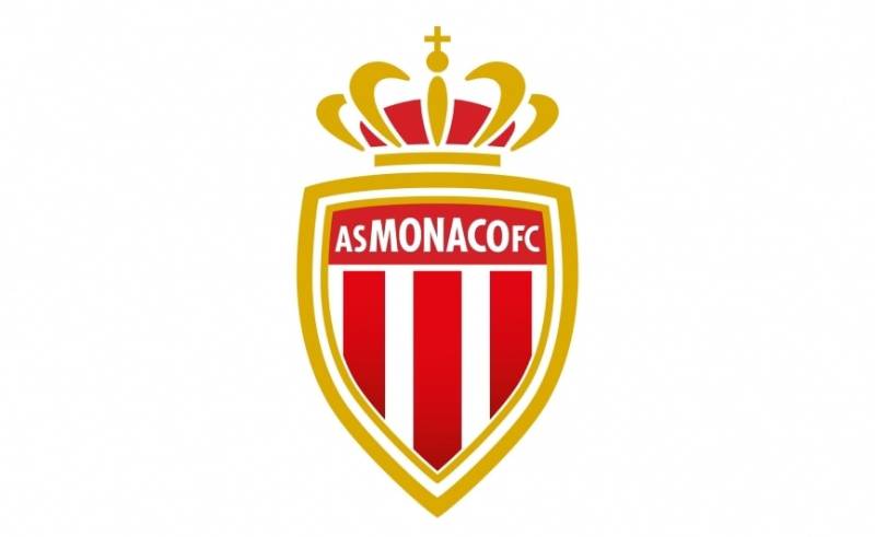
The AS Monaco logo is a heraldic shield emblem featuring a red diagonal sash on a white background, topped by a golden crown. It was most recently refined in 2021 by Interbrand, the same agency behind Juventus’s rebrand. The design ties the club directly to the Principality of Monaco and the Grimaldi dynasty.
Here’s a breakdown of the badge’s key attributes:
- Design Type: Combination mark (emblem with integrated text). The shield acts as the primary container for all visual and typographic elements.
- Primary Elements: A pointed shield shape, a red diagonal sash over white, a golden crown at the top, and the text “AS MONACO FC” set within the upper section of the shield.
- Official Introduction Date: The current refined version launched in May 2021 alongside the “RISE. RISK. REPEAT.” brand campaign.
- Designer/Agency: Interbrand handled the 2021 refinement. They stripped away gradients and shadow effects from the 2013 version while keeping the core structure intact.
- Trademark Status: The club filed its current trademark with the EU trade mark registry. The badge is a protected intellectual property of AS Monaco FC.
- Color Palette: The official colors are Daring Red (#E51B22), Regal Gold (#CB9F18), and White (#FFFFFF). These were named specifically during the 2021 rebrand.
- Usage Context: The badge appears on match kits (currently supplied by Mizuno), merchandise, the club’s digital platforms, stadium signage at the Stade Louis II, and all official communications.
How Has the AS Monaco Logo Evolved Over Time?

The AS Monaco badge has gone through five distinct versions since 1919. Each redesign reflected the club’s growing stature, from local amateur outfit to one of France’s most decorated teams.
The changes were never drastic. More like careful adjustments. The core concept, a shield with red and white, has stayed consistent for over a hundred years.
Original AS Monaco Badge (1919-1962)
Years Active: 1919-1962
The earliest badge was about as basic as they come. It featured the club’s initials and the red-and-white colors of Monaco’s national flag. No crown, no fancy shield work.
This was the amateur era. The club had only recently formed through the merger of five local teams, and professional status didn’t come until 1948. The badge matched that scrappy, grass-roots identity.
Design wasn’t the priority. Functionality was. The early crest mostly just needed to tell people who they were watching.
The Shield Era Badge (1962-2002)
Years Active: 1962-2002
This is where the badge started to look like the one most fans would recognize today. A proper shield took shape, the diagonal sash became prominent, and the crown appeared for the first time.
There’s a fascinating story behind the diagonal design. Princess Grace Kelly, who married Prince Rainier III in 1956, reportedly imagined a new visual identity for the club’s kit. She drew inspiration from the red and white diamond pattern of the Grimaldi coat of arms and turned it into the famous diagonal stripe.
When Monaco won their first league title in 1960-61 wearing that diagonal kit, the design stuck. And the badge followed suit.
This version also saw the initials “ASM FC” placed within the shield shape. The golden elements grew more prominent over time, connecting the club more directly to Monaco’s princely status.
Modernized Crest (2002-2013)
Years Active: 2002-2013
The early 2000s brought a visual update. Sharper lines, a cleaner shield outline, and more defined color separation between the red sash and white background.
This happened around the time Monaco was making serious noise in European competition. They reached the Champions League final in 2004, losing to Porto. The badge needed to hold up on an international stage, across broadcast graphics and merchandise sold well beyond the French Riviera.
The crown got more detailed during this period. Gold accents became richer. The overall feel moved from “local football club” to “European contender.”
Refined Modern Badge (2013-2021)
Years Active: 2013-2021
When Dmitri Rybolovlev took ownership in 2011, the club saw a surge of investment. The 2013 redesign reflected that new ambition.
The full club name “AS MONACO FC” replaced the old “ASM FC” abbreviation. Gradients and shadow effects were added to give the badge a three-dimensional appearance. The shield proportions were tightened for better reproduction on digital screens and kits.
This was the badge during Kylian Mbappe’s breakout season and the 2017 Ligue 1 title win. It carries a lot of nostalgia for recent fans.
Current AS Monaco Badge (2021-Present)
Years Active: 2021-present
Interbrand took on the refinement in 2021. The differences between this version and the 2013 badge are subtle, almost invisible at first glance.
Gradients and shadows were removed. The lines became more linear. The red shifted slightly, and the gold was toned down. The result is a flatter, more digital-friendly design that works better across social media thumbnails, app icons, and responsive websites.
A custom font called “AS Monaco Diagonale” was also created as part of this rebrand. The pointed, geometric letterforms echo the diagonal motif of the badge itself.
What Do the Design Elements of the AS Monaco Logo Mean?
Every piece of this badge serves a specific purpose. The shield references heraldic tradition and protection. The diagonal sash pulls directly from the Grimaldi family’s coat of arms. And the crown signals something no other Ligue 1 club can claim: actual royal backing.
It’s not decoration. It’s identity, compressed into a single image.
Why Does the Shield Feature a Diagonal Sash?
The red and white diagonal is the club’s most distinctive visual feature. It comes from the lozengy pattern (repeating red and white diamonds) found on the Grimaldi family coat of arms, which dates back to 12th-century Genoa.
Princess Grace Kelly adapted this pattern into the diagonal stripe for Monaco’s kits around 1960. The badge absorbed the same design language.
The diagonal creates a sense of movement within the static shield. It pulls the eye from one corner to the other, giving the emblem a dynamic quality that purely horizontal or vertical stripes wouldn’t achieve.
Why Did AS Monaco Choose These Specific Colors?

The badge uses three colors, and each one has a clear reason behind it.
Daring Red – Hex: #E51B22, RGB: (229, 27, 34), CMYK: (4, 100, 100, 1), Pantone: PMS 1788 C. Red is taken from the Monegasque national flag. In color psychology, red signals energy, courage, and passion. For the Grimaldi dynasty, it represented valor in battle.
Regal Gold – Hex: #CB9F18, RGB: (203, 159, 24), CMYK: (22, 36, 100, 1), Pantone: PMS 10-16 C. Gold is the color of royalty and prestige. Monaco is one of the wealthiest places on earth, and the gold accents on the badge reflect that status. It frames the shield and crown, tying them together visually.
White – Hex: #FFFFFF, RGB: (255, 255, 255), CMYK: (0, 0, 0, 0). White is the other half of Monaco’s national colors. It represents purity and peace in Monegasque heraldic tradition.
The combination of red and white on the diagonal sash is what gives the club its nickname, “Les Rouge et Blanc” (The Red and Whites). Those of you familiar with brands that use red in their logos will know how well the color grabs attention, and this badge is no exception.
What Typography Style Is Used in the AS Monaco Logo?
The club name “AS MONACO FC” appears in uppercase lettering within the top section of the shield, rendered in white against the red background.
Since 2021, the club uses a custom typeface called “AS Monaco Diagonale.” It’s a geometric sans-serif with sharp, pointed letterforms. The angles in the characters mirror the diagonal motif of the badge.
Before the custom font, the lettering was more traditional. Think standard serif letterforms that fit the classic heraldic feel of the older badges.
Readability at small sizes was a driving factor in the 2021 update. Flat design with clean typography reproduces much better on mobile screens and social media icons than the shadowed, gradient-heavy type from 2013.
What Are the Hidden Meanings in the AS Monaco Logo?
The crown at the top of the badge isn’t just a generic royal symbol. It specifically references Monaco’s status as a sovereign principality under the Grimaldi family, who have ruled since 1297.
Look closely at the shield’s proportions. The pointed base is a traditional heraldic form associated with protection and honor. The slight narrowing at the bottom creates a focal point that draws the eye toward the center of the diagonal sash.
The year “1924” appears in some badge renditions. That’s when the Association Sportive de Monaco was formally established as a multi-sport organization, even though the football section had been active since 1919.
How Does the AS Monaco Logo Compare to Competitor Logos?
Most Ligue 1 club badges follow the traditional European football template: a circular or shield-shaped crest with local symbolism. But Monaco’s badge stands apart because it represents a sovereign nation, not a French city.
The Paris Saint-Germain logo uses a circular emblem with the Eiffel Tower. Olympique Lyonnais features a lion. Olympique de Marseille has its “OM” monogram. These are all city-based identities.
Monaco’s badge is closer in spirit to something like a national team crest. The crown, the national colors, and the heraldic shield give it a gravitas that club-level badges rarely carry. You could put it alongside the badges of Bayern Munich or Borussia Dortmund and it wouldn’t look out of place in terms of weight and heritage.
The diagonal sash is also unique. Most football crests use vertical or horizontal divisions. Monaco’s angled stripe creates instant recognition. You could spot it from across a stadium.
Compared to other Ligue 1 rivals like Stade Rennais or RC Lens, the Monaco badge leans more toward luxury branding. That gold framing and the refined linework from the 2021 update put it closer to a fashion house mark than a typical sports crest.
What Are the Technical Specifications of the AS Monaco Logo?
Official Color Codes
Primary Color: Daring Red
- Hex: #E51B22
- RGB: (229, 27, 34)
- CMYK: (4, 100, 100, 1)
- Pantone: PMS 1788 C
Secondary Color: Regal Gold
- Hex: #CB9F18
- RGB: (203, 159, 24)
- CMYK: (22, 36, 100, 1)
- Pantone: PMS 10-16 C
Tertiary Color: White
- Hex: #FFFFFF
- RGB: (255, 255, 255)
- CMYK: (0, 0, 0, 0)
Dimensions and Proportions
The badge follows a vertical shield format with the crown extending above the top edge. The overall shape is taller than it is wide, roughly following a 3:4 width-to-height ratio when the crown is included.
The 2021 update specifically adjusted the shield proportions for better digital reproduction. The flat design (no gradients or drop shadows) means the badge scales cleanly from a 16×16 pixel favicon all the way up to stadium-sized prints.
The club provides the badge in vector graphics format (SVG) for partners and licensees. This makes sure the linework stays crisp at any size, which is always better than working from a bitmap source file.
Clear space requirements follow standard brand guidelines practice: the badge should have a minimum margin of space around it equal to the height of the crown element. This keeps it from getting visually crowded when placed alongside sponsor logos or other graphics.
What Cultural Impact Has the AS Monaco Logo Had?
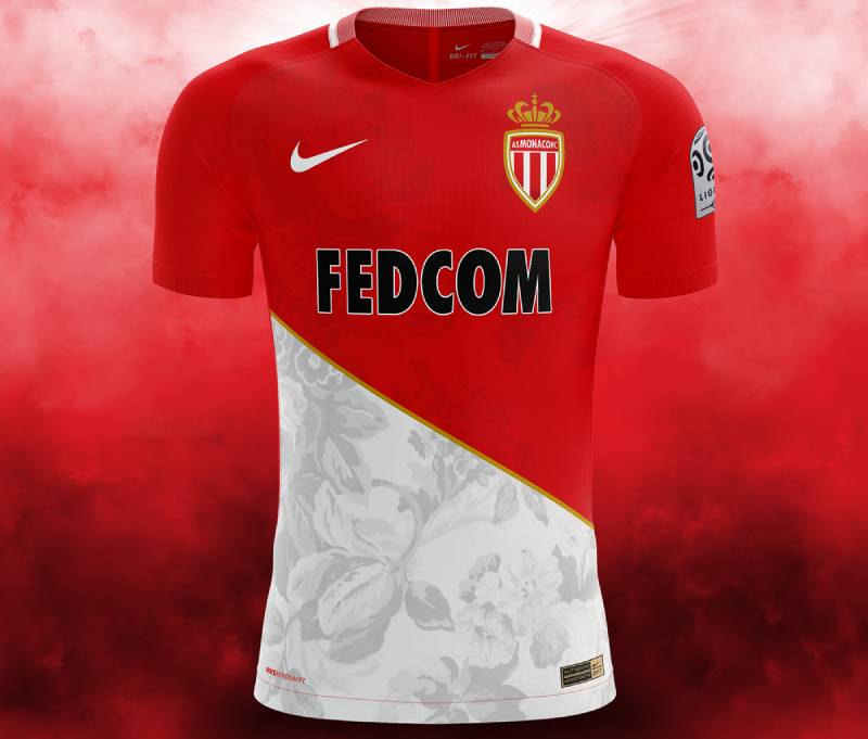
The AS Monaco crest carries weight beyond football. It’s one of the few club badges that functions as a genuine symbol of national identity.
Monaco is a country of about 40,000 people. The football club is its most visible cultural export, recognized across Europe and beyond. The badge appears on everything from luxury merchandise sold in Monte Carlo boutiques to fan scarves in supporter bars across France.
The Princess Grace connection adds a layer of cultural meaning that no other football badge can match. Having a Hollywood icon turned princess design your kit’s signature look? That’s not marketing. That’s real history baked into the visual identity.
The 2017 Ligue 1 title run, with young stars like Mbappe and Bernardo Silva, introduced the badge to a whole new generation of global football fans. And the club’s Champions League appearances (especially that 2004 final) put it in front of massive international audiences.
How Does the AS Monaco Logo Fit Into the Overall Brand Identity?
The badge isn’t a standalone mark. It sits at the center of a broader brand system that was formalized during the 2021 rebrand.
The “RISE. RISK. REPEAT.” campaign established the club’s positioning: a team built on youth development, bold decisions, and resilience. The badge anchors that identity with its royal symbolism and historical depth.
Everything connects. The “AS Monaco Diagonale” font pulls its angular character from the diagonal sash. The official colors, Daring Red and Regal Gold, have names that reflect the brand’s personality. Even the flat design approach signals a forward-thinking digital-first club.
The badge works alongside the Stade Louis II as a physical touchpoint, the club’s youth academy reputation, and partnerships with brands like Mizuno. Together, these form a brand style guide that’s consistent from the pitch to social media to licensed products.
The relationship between the badge and Monaco as a nation is the strongest thread. The club doesn’t just play in Monaco. It represents Monaco. And the badge makes that connection visible in every context it appears.
How Should the AS Monaco Logo Be Used?
If you’re working with the AS Monaco badge for any kind of project, there are rules.
Do:
- Use the official vector file provided by the club for any reproduction.
- Maintain the minimum clear space around the badge (at least the height of the crown on all sides).
- Use the badge on backgrounds that provide enough contrast for the colors to read clearly. White or dark backgrounds work best.
- Use the monochrome (white) version when placing the badge on complex or photographic backgrounds.
Don’t:
- Stretch, rotate, or distort the badge in any way.
- Change the official colors. The Daring Red and Regal Gold values are specific for a reason.
- Place the badge too close to other logos or text that could create confusion about the club’s identity.
- Recreate the badge from scratch using approximations. Always work from the official source files.
The official badge and brand assets can be accessed through the club’s official website at asmonaco.com. Licensed partners receive a full brand toolkit with usage specifications.
The AS Monaco FC badge is trademarked intellectual property. Unauthorized commercial use (printing it on merchandise for sale, using it in advertising without a license) can result in legal action. Fan-made content and editorial usage typically fall under different rules, but when in doubt, check with the club directly.
For high-resolution downloads in JPEG or PNG format, the club’s media center and third-party brand asset platforms like Brandfetch offer options. But always confirm you have the right to use it for your specific purpose.
FAQ on The AS Monaco Logo
What does the AS Monaco logo look like?
It’s a pointed shield with a red and white diagonal sash, topped by a golden crown. The text “AS MONACO FC” sits in the upper red section. Gold framing outlines the entire crest.
The diagonal pattern comes from the Grimaldi coat of arms. You won’t find another Ligue 1 badge that looks anything like it.
What do the colors in the AS Monaco badge mean?
Red and white are Monaco’s national colors, pulled directly from the flag of the Principality. Gold represents royalty and the club’s connection to the House of Grimaldi, who have ruled since 1297.
The red carries a hex value of #E51B22. The gold is #CB9F18. These were named “Daring Red” and “Regal Gold” during the 2021 rebrand.
Who designed the current AS Monaco crest?
Interbrand refined the badge in May 2021. They’re the same agency behind the Juventus logo overhaul. The Monaco update was subtler, though. Gradients and shadows were stripped away for a cleaner, flatter look.
When was the AS Monaco club founded?
The football section formed in 1919 through a merger of five local clubs. The broader Association Sportive de Monaco was officially established in 1924. That’s why some badge versions show “1924” on the shield.
How many times has the AS Monaco logo changed?
Five major versions. The timeline breaks down as 1919-1962, 1962-2002, 2002-2013, 2013-2021, and 2021 to present. Each redesign kept the red and white diagonal as the core visual element.
The changes got smaller over time. The last two updates were refinements, not full overhauls.
Why is there a crown on the AS Monaco emblem?
Monaco is a sovereign principality, currently ruled by Prince Albert II. The crown on the football club emblem signals that royal connection. No other French football club badge carries this kind of national symbolism.
What is the AS Monaco Diagonale font?
It’s a custom typeface created during the 2021 brand refresh. The letterforms are geometric and angular, with pointed shapes that mirror the diagonal stripe on the club’s shield. Mizuno uses it on current match kits.
Where does the diagonal stripe on the Monaco badge come from?
Princess Grace Kelly designed the diagonal kit pattern around 1960. She drew from the red and white diamond pattern on the Grimaldi family coat of arms. When Monaco won the league that season, the diagonal became permanent.
The badge adopted the same motif shortly after.
Can I download the AS Monaco logo for personal use?
The club’s official media center and platforms like Brandfetch offer downloads in SVG, PNG, and other formats. Editorial and fan use is generally fine. Commercial use without a license is a trademark violation.
How does the AS Monaco logo compare to other Ligue 1 club badges?
Most French football club crests represent cities. Monaco’s represents a country. That gives it a weight closer to a national team badge than a typical club emblem from the Stade Louis II to Champions League broadcasts.
The diagonal sash and royal crown set it apart from competitors like PSG, Lyon, and Marseille.
Conclusion
The AS Monaco logo is more than a football club badge. It’s the visual shorthand for a sovereign nation’s sporting identity, refined across five versions since 1919.
From Princess Grace’s diagonal stripe to Interbrand’s 2021 flat redesign, every update respected what came before. The Grimaldi crown, the red and white sash, the gold shield framing. These aren’t arbitrary choices.
They’re direct links to Monaco’s heraldic tradition and Ligue 1 legacy.
Whether it appears on a Mizuno kit at the Stade Louis II or a tiny social media thumbnail, the ASM crest holds up. That’s the mark of a well-built visual identity.

Renowned for his expertise in logo design and visual branding, Bogdan has developed a multitude of logos for various clients.
His skills extend to creating posters, vector illustrations, business cards, and brochures. Additionally, Bogdan's UI kits were featured on marketplaces like Visual Hierarchy and UI8.
He also wrote in the past years on sites like Design Your Way, WebDesignerDepot, WPDean, Designmodo, Speckyboy, Slider Revolution, and more.
- Jujutsu Kaisen Font Generator - 12 October 2026
- The Windsurf Logo History, Colors, Font, And Meaning - 10 October 2026
- How to Remove Background From Product Photos (No Photoshop) - 10 October 2026

Bogdan Sandu is a seasoned designer who has been designing websites since 2008. Renowned for his expertise in logo design and visual branding, Bogdan has developed a multitude of logos for various clients. His skills extend to creating posters, vector illustrations, business cards, and brochures. Additionally, Bogdan's UI kits were featured on marketplaces like Visual Hierarchy and UI8. He also wrote in the past years on sites like Design Your Way, WebDesignerDepot, WPDean, Designmodo, Speckyboy, Slider Revolution, and more.
You Might Also Like


