


The Girondins de Bordeaux logo is one of the most recognizable crests in French football. Built around a navy blue shield and a white chevron (called the scapulaire), it carries the weight of a club founded in 1881. And for most of its life, the badge has stayed true to a geometric, stripped-back look that sets it apart from clubs that lean on animals or floral symbols.
Few football emblems have gone through as many identity shifts in recent years. The club introduced a controversial rebrand in 2020, reversed it in 2021, and now competes in France’s fourth tier after financial collapse. But the crest itself? It keeps showing up. On scarves, on walls, on tattoos across southwestern France. That tells you something about what a logo can mean to a community when it’s done right.
The badge has gone through roughly eight distinct versions since the 1930s, each one pushing and pulling between tradition and modernization. What’s stayed constant: the V-shaped chevron, the blue-and-white palette, and a general preference for clean lines over decorative clutter.
What Is the Girondins de Bordeaux Logo?
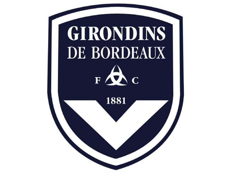
The Girondins de Bordeaux logo is a navy blue shield-shaped emblem featuring the club’s name, a white chevron (scapulaire), and the founding year 1881. The current version dates from 2001, reinstated in 2021 after a failed 2020 rebrand. It uses a custom typeface and two official colors.
- Design Type: Combination mark. Shield emblem with integrated wordmark and geometric symbol.
- Primary Elements: Navy blue shield, white V-shaped chevron (scapulaire), club name in serif and sans-serif lettering, “1881” founding year, and a small representation of the Bordeaux city figure (three crescents of the moon, the port emblem).
- Official Introduction Date: The current shield version was first introduced in 2001. It was restored as the active badge on July 23, 2021, after the 2020 redesign was scrapped.
- Designer/Agency: The 2020 short-lived redesign was created by Allegories Creations. The restored 2001 version’s original designer has not been publicly credited to a single agency.
- Trademark Status: Registered trademark of FC Girondins de Bordeaux. Protected under French intellectual property law.
- Color Palette: Navy Blue (#001B50) and White (#FFFFFF). The 2020 version briefly added gold accents and multiple blue tones, but these were dropped with the reversion.
- Usage Context: Match kits, official merchandise, digital platforms, stadium signage, press materials, and supporter gear. The logo appears on the facade of the Matmut Atlantique stadium and across all official club communications.
How Has the Girondins de Bordeaux Logo Evolved Over Time?

The Girondins de Bordeaux crest has been redesigned at least eight times since the 1930s. It moved from circular badges with gold accents to a clean shield format, with the scapulaire chevron remaining the one constant design thread across every version.
Original Girondins de Bordeaux Logo (1936-1955)
The first official badge appeared when the club turned professional. It was a white circular emblem outlined in gold and black.
Inside, a blue triangular background held a white chevron shaped like a capital “V,” outlined in gold. Above the chevron sat a gold “Gb” monogram for “Girondins de Bordeaux.”
The club name was written around the sides of the V in a simple sans-serif typeface, all capitals, in blue. A small golden rounded symbol sat above everything. The whole thing had an almost military quality to it.
- Years Active: 1936-1955
- Color Scheme: White, blue, gold, and black
- Context: Created to mark Bordeaux’s entry into professional football in 1937. The club’s first Division 2 season kicked off on August 22, 1937, with a match against Toulouse.
- Cultural Significance: Set the template for every version that followed. The chevron and the geometric approach were locked in from the start.
Revised Girondins de Bordeaux Logo (1955-1979)
The 1955 redesign introduced a more refined look. The circular badge gained a wide light blue outline, and massive gold lettering was added around its perimeter.
The inner circle was filled with a light sea-blue shade. The chevron became thinner and wider, still in white with a gold outline.
Here’s where it gets interesting. The upper part of the circle now featured an ornate anchor with curved lines, enclosed in a golden circle. The anchor connected the club to Bordeaux’s identity as a port city on the Garonne River.
- Years Active: 1955-1979
- Color Scheme: Light blue, white, gold
- Key Changes from Previous: Addition of the anchor motif, lighter blue tones, more decorative style overall
- Context: This era saw Bordeaux competing in the top division and building a regional following. The anchor gave the badge a stronger local identity.
Girondins de Bordeaux Logo (1981-1993)
The 1981 version brought back the 1936 design, but with brighter colors and a thicker outline. Bold white serif lettering ran around the blue frame’s perimeter.
Two blue “FC” letters were added on both sides of the chevron symbol inside the circle. It was a deliberate callback, but cleaned up for the era of Claude Bez’s ownership and Aime Jacquet’s management.
During this period, Bordeaux won three Ligue 1 titles and two Coupe de France trophies. The badge became associated with a golden age on the pitch.
- Years Active: 1981-1993
- Color Scheme: Blue and white with bolder outlines
- Key Changes from Previous: Returned to the 1936 structure, added “FC” initials, bolder serif wordmark
- Cultural Significance: The crest fans most associate with the club’s dominant 1980s run, featuring players like Alain Giresse and Jean Tigana.
Minimalist Girondins de Bordeaux Logo (1993-2001)
This one stripped things way back. A light gray “F.C. Girondins de Bordeaux” inscription in a bold sans-serif typeface sat above the blue chevron, all enclosed in a thin circular frame.
It was simple. Almost too simple. But it became the foundation that every future version was built on.
The 1990s squad included Zinedine Zidane, Christophe Dugarry, and Bixente Lizarazu. This badge was on the shirts when Bordeaux reached the 1996 UEFA Cup final against Bayern Munich and won the 1999 Ligue 1 title.
- Years Active: 1993-2001
- Color Scheme: Gray and blue
- Designer: Not publicly credited
- Key Changes from Previous: Dropped the serif font, removed the “FC” flanking the chevron, switched to a thinner circular frame
- Cultural Significance: Tied to the Zidane era and European competition runs. This is the badge that owner Gerard Lopez referenced in 2021 when he reversed the rebrand.
Shield-Era Girondins de Bordeaux Logo (2001-2020)
The circle was replaced by a shield. Dark blue crest, white and blue outline, white lettering and symbols. The nameplate used a new serif font, with “Girondins” in bolder lines.
The chevron moved to the bottom of the shield and became thicker, now carrying “1881” in its center. The Bordeaux city figure (three moon crescents, representing the port) appeared inside the design.
Over time, the shield gained gradient shading in blue and white, giving it a more three-dimensional look. This was the badge during the 2009 Ligue 1 title and the last real period of sporting success.
- Years Active: 2001-2020
- Color Scheme: Navy blue and white with gradient effects
- Key Changes from Previous: Circle to shield shape, addition of “1881,” city figure incorporated, serif font for the club name
- Cultural Significance: The longest-serving modern version. Associated with the club’s last league title and Champions League campaigns.
Controversial Girondins de Bordeaux Rebrand (2020-2021)
President Frederic Longuepee launched a full rebrand on June 30, 2020. The agency Allegories Creations designed it. The full club name “FCGB” disappeared, replaced by “Bordeaux Girondins” with “Bordeaux” in larger white letters on top and “Girondins” smaller underneath in dark gold.
Different tones of blue were introduced. Gold accents appeared. The city figure was removed. The scapulaire stayed, along with the founding year.
Fans hated it. The Ultramarines supporter group had been consulted early but the final result still landed poorly. When Gerard Lopez bought the club in July 2021, his first move was reverting to the pre-2020 shield badge. He said it wasn’t going back to an old logo. It was going back to the logo.
- Years Active: 2020-2021 (one season)
- Color Scheme: Multiple blues, gold, and white
- Designer: Allegories Creations
- Key Changes from Previous: Removed “FC,” reordered name hierarchy to put “Bordeaux” first, added gold accents, dropped city figure
- Context: Part of a broader strategy to develop the “Bordeaux brand” internationally. It was modeled after trends seen at Juventus and Inter Milan, where clubs simplified logos for commercial appeal.
Restored Girondins de Bordeaux Logo (2021-Present)
The 2001 shield design came back on July 23, 2021. Same navy blue shield. Same white chevron. Same serif-and-sans-serif lettering. Same city figure and “1881” mark.
What changed around it was everything else. The club was relegated from Ligue 1 in 2022, faced repeated financial crises, and was ultimately demoted to France’s fourth tier (Championnat National 2) in August 2024 after filing for bankruptcy.
The badge endures, though. It is now the one stable piece of identity for a club in the middle of a total rebuild.
- Years Active: 2021-present
- Color Scheme: Navy blue (#001B50) and white (#FFFFFF)
- Key Changes from Previous: Full reversion to the 2001 shield design, all 2020 rebrand elements discarded
- Cultural Significance: Represents fan power over corporate rebranding. A rare case of supporters winning the identity battle.
What Do the Design Elements of the Girondins de Bordeaux Logo Mean?
Every piece of the Girondins de Bordeaux crest carries a specific meaning. The shield shape represents defense and strength. The chevron (scapulaire) is a naval symbol tied to the port city’s maritime history. The city figure inside the badge shows the three crescents of the Bordeaux port.
These aren’t decorative choices. They connect the football club to the geography, history, and character of the Gironde region. Look at them closely and you’re looking at Bordeaux itself.
Why Did Girondins de Bordeaux Choose These Specific Colors?
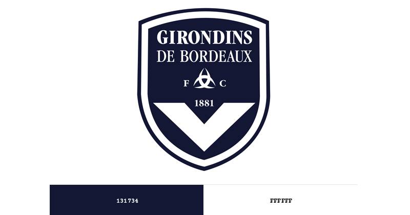
Navy blue and white have been the club’s colors since its earliest days. The players are even nicknamed “les Marine et Blanc” (the Navy and White).
Navy blue (#001B50, Pantone PMS 655 C) carries associations of depth, tradition, and authority. It’s a color you see across naval and maritime institutions, which fits a club named after the Gironde estuary.
White (#FFFFFF) provides the contrast. It reads as clean and direct. Together, the two colors create a combination that’s been consistent across nearly every version of the badge.
The psychology behind these colors matters. Navy blue creates trust and stability. White suggests openness. The pairing works because it doesn’t try too hard. It just sits there, confident.
What Typography Style Is Used in the Girondins de Bordeaux Logo?
The current shield version uses a mix of serif and sans-serif type. “Girondins” is set in a bold serif face, while other text elements use a cleaner sans-serif style.
Earlier versions were all over the place. The 1936 badge used a strict sans-serif. The 1981 version went bold serif. The 1993 redesign switched to a sans-serif font that was almost brutally plain.
The current typographic approach balances heritage (the serif) with readability (the sans-serif). It’s a custom typeface made specifically for the club, which means you won’t find it in any public font library.
What Are the Hidden Meanings in the Girondins de Bordeaux Logo?
The V-shaped chevron is the scapulaire, originally a religious garment symbol that became associated with French naval tradition. It’s on the jersey, it’s on the badge, it’s everywhere.
The horizontal lines at the bottom of the crest represent the Gironde River, the waterway that gives the club its name. The three crescents in the city figure are the historic emblem of the port of Bordeaux.
There’s a layered geographic story baked into every element. The shield itself signals protection. The founding date grounds everything in time. Nothing is accidental here, even if some of these details are easy to miss at first glance.
How Does the Girondins de Bordeaux Logo Compare to Competitor Logos?
French football crests tend to lean heavily on regional identity. Bordeaux’s shield-and-chevron approach is distinct from its main rivals and peers.
The Toulouse logo uses a rounded badge with a violet color scheme and the Occitan cross. Completely different visual language. The Nantes crest features a canary on a green-and-yellow background, which is about as far from Bordeaux’s abstract approach as you can get.
Olympique de Marseille’s emblem uses a circular badge with a strong letter “M” and an “O” framing device, anchored in light blue and white. Paris Saint-Germain’s logo combines the Eiffel Tower with a fleur-de-lis in a circular format.
What makes Bordeaux different: the crest relies purely on geometric shapes and text. No mascot. No architectural landmark used as a primary symbol. No floral or animal motif. That minimalist approach gives it a severity that most French clubs don’t share. The closest comparison might be Olympique Lyonnais, which also uses a shield format with clean geometry, but even Lyon incorporates a lion.
What Are the Technical Specifications of the Girondins de Bordeaux Logo?
Official Color Codes
- Primary Color: Navy Blue
- Hex: #001B50
- RGB: (0, 27, 80)
- CMYK: (100, 93, 34, 41)
- Pantone: PMS 655 C
- Secondary Color: White
- Hex: #FFFFFF
- RGB: (255, 255, 255)
- CMYK: (0, 0, 0, 0)
Dimensions and Proportions
The badge uses a tapered shield format, wider at the top and narrowing to a point at the bottom. The chevron sits in the lower third of the shield. The exact aspect ratio and minimum size requirements are defined in the club’s internal brand guidelines, though these documents have not been made publicly available.
For digital use, the logo is commonly distributed in vector formats (SVG, EPS) to allow clean scaling, and in raster formats (PNG with transparent background) for web and social media use. A minimum clear space is maintained around the shield to prevent visual crowding.
What Cultural Impact Has the Girondins de Bordeaux Logo Had?

The Girondins badge carries a specific kind of cultural weight in southwestern France. It represents not just a football club but a regional identity tied to the Gironde, the port, and the city of Bordeaux itself.
When the 2020 rebrand dropped the full “FC Girondins de Bordeaux” name from the badge, the backlash wasn’t just about aesthetics. Supporters felt their identity had been stripped for commercial reasons. The Ultramarines and other fan groups pushed back hard.
The 2021 reversion became a symbol of supporter influence. At a time when clubs across Europe (Juventus, Inter Milan) were simplifying their crests for global brand appeal, Bordeaux went the opposite direction. Gerard Lopez called it returning to “the logo of Girondins de Bordeaux,” not an old logo.
Now, with the club playing in France’s fourth tier after the 2024 financial collapse and bankruptcy, the badge takes on a different kind of meaning. It’s the thread connecting the club’s present to its past, to the era of Zidane and Giresse, to six league titles and European nights. It’s what fans hold onto when everything else falls apart.
How Does the Girondins de Bordeaux Logo Fit Into the Overall Brand Identity?
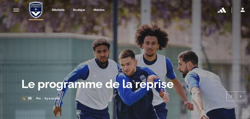
The badge is the anchor of a broader identity system that includes kit design, stadium branding, and digital presence. The scapulaire chevron appears not just on the crest but as the signature element of every Bordeaux home jersey, a white V on a navy blue shirt.
The color palette of navy and white carries through to all official communications, signage at the Matmut Atlantique, the club’s website, and merchandise.
Before the 2024 crisis, the club’s brand identity also extended to youth development branding, commercial partnerships, and regional engagement campaigns built around the “Girondins community” concept.
The badge connects to the city’s coat of arms through the three crescents of the moon, and to French maritime tradition through the scapulaire. That layered network of references gives the crest more depth than a surface-level look would suggest. It’s a badge that works at multiple scales, from a tiny favicon to a stadium facade.
How Should the Girondins de Bordeaux Logo Be Used?
The FC Girondins de Bordeaux badge is a registered trademark. Using it requires permission from the club or its authorized licensees.
Official usage guidelines include:
- The logo should not be stretched, rotated, or altered in proportions
- Colors must match the official navy blue (#001B50) and white (#FFFFFF) values
- A minimum clear space must be maintained around the shield
- The badge should not be placed on backgrounds that reduce its legibility
- No elements should be added to or removed from the crest
For fan-created content, the club generally allows non-commercial use of the badge in supporter materials, but commercial reproduction (merchandise, products for sale) requires licensing agreements.
Official logo files can typically be accessed through the club’s media and press section or through brand asset platforms that host verified versions. Given the club’s current restructuring, some of these channels may be limited compared to when it operated as a fully professional entity.
FAQ on The Girondins De Bordeaux Logo
What does the Girondins de Bordeaux logo look like?
It’s a navy blue shield with a white chevron (the scapulaire) in the lower section. The club name sits above in mixed serif and sans-serif lettering. “1881” marks the founding year inside the chevron. The Bordeaux city figure appears within the crest.
What does the scapulaire on the Bordeaux badge mean?
The scapulaire is a V-shaped chevron rooted in French naval tradition. It represents Bordeaux’s connection to its port and the Gironde estuary.
You’ll see it on every home jersey too. White V on a navy shirt. Been that way for decades.
When was the current Girondins de Bordeaux emblem introduced?
The shield format first appeared in 2001. A rebrand replaced it in 2020, but that lasted just one season. Gerard Lopez restored the original shield on July 23, 2021, after fans rejected the new version.
What are the official colors of the Bordeaux football club crest?
Navy blue (#001B50) and white (#FFFFFF). That’s it.
The 2020 redesign briefly added gold and multiple blue tones. Those are gone now. The club’s nickname, “les Marine et Blanc,” comes directly from this two-color palette.
Why did Girondins de Bordeaux change their logo in 2020?
President Frederic Longuepee wanted to develop the “Bordeaux brand” for international markets. The agency Allegories Creations redesigned it. They dropped “FC,” put “Bordeaux” above “Girondins,” and added gold accents. Supporters pushed back immediately.
Why did Bordeaux revert to their old logo in 2021?
New owner Gerard Lopez made it his first decision after buying the club. Fan groups like the Ultramarines had criticized the 2020 rebrand from day one. Lopez called it returning to “the logo of Girondins de Bordeaux,” not an old logo.
How many times has the Girondins de Bordeaux logo been redesigned?
At least eight distinct versions since the 1930s. The badge moved from circular formats with gold detailing to the clean shield design used today.
Every version kept the chevron. That’s the one element that never got dropped through any French football club emblem redesign.
What font is used in the Girondins de Bordeaux logo?
A custom typeface made for the club. “Girondins” uses a bold serif style while other text appears in sans-serif. Earlier versions used everything from ornate serifs to plain block lettering. You won’t find this specific font publicly available.
Is the Girondins de Bordeaux logo trademarked?
Yes. It’s a registered trademark under French intellectual property law. Commercial use requires licensing from the club. Fan-made content for non-commercial purposes is generally tolerated, but selling merchandise with the crest without permission is not allowed.
What happened to Girondins de Bordeaux and does the club still use the same badge?
The club filed for bankruptcy in 2024 and was relegated to Championnat National 2, France’s fourth tier. The shield badge from 2001 remains the official crest. It’s now the most stable piece of identity for a club rebuilding from scratch.
Conclusion
The Girondins de Bordeaux logo has survived relegations, ownership changes, a failed rebrand, and a full financial collapse. That says more about its design strength than any technical breakdown ever could.
The scapulaire chevron, the navy blue shield, the founding year. These pieces hold together a visual hierarchy that connects the club to Ligue 1 glory days, UEFA Cup nights, and the Gironde region itself.
Whether Bordeaux climbs back through the French football pyramid or stays in Championnat National 2, the crest remains. Fans made sure of that in 2021. And that might be the most important design decision the club ever made.

Renowned for his expertise in logo design and visual branding, Bogdan has developed a multitude of logos for various clients.
His skills extend to creating posters, vector illustrations, business cards, and brochures. Additionally, Bogdan's UI kits were featured on marketplaces like Visual Hierarchy and UI8.
He also wrote in the past years on sites like Design Your Way, WebDesignerDepot, WPDean, Designmodo, Speckyboy, Slider Revolution, and more.
- How to Install Fonts on Mac (Step-by-Step Guide) - 20 September 2026
- From Mockup to Code: How AI-Augmented Development Speeds Up the Design Handoff - 19 September 2026
- The Beehiiv Logo History, Colors, Font, And Meaning - 18 September 2026

Bogdan Sandu is a seasoned designer who has been designing websites since 2008. Renowned for his expertise in logo design and visual branding, Bogdan has developed a multitude of logos for various clients. His skills extend to creating posters, vector illustrations, business cards, and brochures. Additionally, Bogdan's UI kits were featured on marketplaces like Visual Hierarchy and UI8. He also wrote in the past years on sites like Design Your Way, WebDesignerDepot, WPDean, Designmodo, Speckyboy, Slider Revolution, and more.
You Might Also Like


