


The SCO Angers logo is the official badge of Angers Sporting Club de l’Ouest, a French professional football club founded in 1919 and based in Angers, Maine-et-Loire. The current diamond-shaped crest was introduced ahead of the 2021-22 season, designed by local agency Welko. It features black and white vertical stripes, gold accents, the “SCO” lettering, and a fleur-de-lys. A logo like this does more than identify a team. It ties together a century of history, regional pride, and the identity of a community that calls itself “Les Noirs et Blancs.”
Within French football branding, the SCO Angers crest sits in a unique position. Most Ligue 1 clubs have gone through dramatic visual overhauls in recent years (some for the worse, if you ask fans of certain clubs). Angers took a different route. The 2021 redesign kept the club’s core visual DNA intact while quietly modernizing details that had started to feel dated. Five logo versions have been used since 1919. The current one is the fifth, and arguably the most thought-through.
What Is the SCO Angers Logo?
The SCO Angers logo is a diamond-shaped emblem featuring black and white vertical stripes, gold detailing, the “SCO” initials, and a fleur-de-lys. Introduced in 2021 and designed by Welko agency in Angers, it represents the club’s connection to the Anjou region and its century-long football heritage.
Here is a breakdown of its key attributes:
- Design Type: Combination mark (emblem with wordmark). The diamond shape acts as the container, while “SCO” and “ANGERS” function as integrated typographic elements.
- Primary Elements: Diamond-shaped shield, black and white vertical stripes, fleur-de-lys, arch representing the Chateau d’Angers gate, “SCO” initials, and “ANGERS” wordmark.
- Official Introduction Date: May 19, 2021. First used on kits and branding materials starting with the 2021-22 season.
- Designer/Agency: Welko, an agency based in Angers. Over 80 sketches were produced before the final selection. Supporters’ groups had the deciding vote between two finalist designs.
- Trademark Status: Registered as part of the Angers SCO brand, which covers the football club, Angers SCO Futsal, Angers SCO Handball, the SCO Foundation, and Ecole Noir&Blanc.
- Color Palette: Black (#000000), White (#FFFFFF), and Gold (#D9C395). These three colors form the full official palette, with gold being more prominent than in previous versions.
- Usage Context: Match kits, stadium signage at Stade Raymond Kopa, official merchandise, social media profiles, the club’s website, digital campaigns, and all official communications.
How Has the SCO Angers Logo Evolved Over Time?
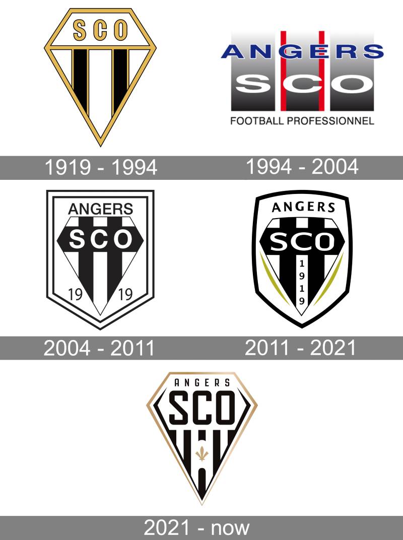
The SCO Angers badge has gone through five distinct versions since 1919. Each redesign tracked a shift in the club’s ambitions and circumstances, from early amateur football to Ligue 1 competition.
The diamond motif has been the thread connecting most of these versions. It disappeared once, in 1994, and came back a decade later. That tells you something about how deeply supporters associate that shape with the club.
Original SCO Angers Logo (1919-1994)
Years Active: 1919 to 1994
The first badge was a diamond-shaped crest with a gold outline. Inside, two black vertical stripes and three white ones created the pattern that gave the club its nickname: “Les Noirs et Blancs.”
The “SCO” lettering sat in gold inside a white trapezoid at the top of the diamond. It was clean, geometric, and pretty straightforward for the era.
Color Scheme: Black, white, and gold.
Context: This badge covered most of the club’s history, including its best-ever league finish (third place in 1966-67) and its first forays into European competition with the UEFA Cup in 1972-73.
Cultural Significance: This was the version that established the diamond as the club’s signature shape. Most of what came after was, in some way, a conversation with this original design. Understanding the psychology of shapes helps explain why the diamond has persisted. It conveys stability when viewed as a rotated square, yet dynamism through its pointed orientation.
The 1994 Departure (1994-2004)
Years Active: 1994 to 2004
This is the weird one. And I say that with some affection.
The diamond disappeared entirely. In its place: three wide vertical bars in gradient gray and black. Each bar carried one letter of “SCO” in white. “ANGERS” ran across the top in blue capitals. Red vertical lines framed the center bar.
Color Scheme: Gray, black, white, blue, and red.
Designer: Unknown (in-house or local agency).
Key Changes from Previous: Total departure. The diamond was gone. The gold was gone. The color palette shifted completely, introducing blues and reds for the first and only time in the club’s visual history.
Context: This version arrived during a rough stretch. The club had dropped out of Ligue 1 in 1994 and would spend the next two decades bouncing between lower divisions. Looking back, it is the only badge that broke from the club’s core identity, almost like the club was trying to be something it was not.
Cultural Significance: It is remembered mostly as the “odd one out.” Fans did not strongly connect with it. But it served a purpose as a lesson in what not to abandon when you’re rethinking your brand.
Return of the Diamond (2004-2011)
Years Active: 2004 to 2011
The diamond came back. Smart move.
This version placed the diamond crest inside a rectangular shield with a double black and white frame. “ANGERS” sat above in a thin, clean sans-serif typeface. The “SCO” initials appeared on a black horizontal bar crossing the vertical stripes.
Color Scheme: Black and white, with no gold.
Key Changes from Previous: The diamond returned, the blue and red were dropped, and the overall approach became much cleaner. The addition of “1919” on both sides of the diamond anchored the badge in the club’s founding year.
Context: The club was climbing back. This badge coincided with their return to Ligue 2 in 2007 and the start of a steady rise through French football.
The Refined Diamond (2011-2021)
Years Active: 2011 to 2021
Gold accents returned as two diagonal lines framing the lower portion of the diamond. The contours were redrawn with smoother lines, giving the whole thing a more polished feel.
“1919” was repositioned vertically on the center white stripe. “ANGERS” appeared in a bold sans-serif above the crest, more prominent than before.
Color Scheme: Black, white, and gold.
Context: This badge saw the club’s modern golden era. Promotion to Ligue 1 in 2015 (first time since 1994), a ninth-place finish in their first season back, and a Coupe de France final in 2017 at the Stade de France against Paris Saint-Germain.
Cultural Significance: This is the version most current fans grew up with. It carried the club through its most successful modern period and established the gold-black-white combination as the definitive Angers palette.
Current SCO Angers Logo (2021-Present)
Years Active: 2021 to present
Unveiled on May 19, 2021, under the slogan “Notre Diamant” (Our Diamond). Designed by Welko after more than a year of consultations with four agencies and over 80 sketches.
The biggest new addition: a fleur-de-lys, appearing in the Angers badge for the first time ever. Behind it, an arch representing the gateway of the Chateau d’Angers. The founding date “1919” was removed and replaced by these territorial symbols.
Color Scheme: Black, white, and a more prominent gold than previous versions.
Key Changes from Previous: Fleur-de-lys added. Chateau d’Angers gateway subtly integrated. “1919” removed. Updated typography with a stronger, more modern “SCO” treatment. Gold is used more boldly across the design.
Context: The club deliberately avoided the kind of radical rebranding that Nantes and Juventus had pursued. Morgan Paltier, the club’s Director of Sales and Marketing, specifically told the agencies not to follow that path. Supporters’ groups had the final vote between two shortlisted designs.
Cultural Significance: This badge strengthened the link between the football club and the Anjou region’s heritage. The fleur-de-lys and castle references made the crest feel less like a sports logo and more like a coat of arms. Which, honestly, was the whole point.
What Do the Design Elements of the SCO Angers Logo Mean?
Every piece of the current SCO Angers badge carries specific meaning tied to the club, the city, or the Anjou region. None of it is accidental.
The diamond shape is the anchor. It has been part of the club’s identity since the original badge, and Welko kept it as the non-negotiable starting point for the redesign. The vertical black and white stripes inside reference the team’s kits and their nickname.
Why Did SCO Angers Choose These Specific Colors?

Black and white go back to the very beginning. The club was called “Les Noirs et Blancs” long before anyone was thinking about brand identity, and these two colors have appeared on every version of the badge.
Black (#000000) – Pantone PMS Process Black C. It carries weight and seriousness. In color psychology, black communicates authority and strength, which fits a club that has fought its way back to the top division more than once.
White (#FFFFFF) – Clean, open, direct. It provides the contrast needed to make the stripes and lettering readable at any size.
Gold (#D9C395) – Pantone PMS 12-2 C. Gold entered the palette early but has become more prominent with each redesign. It connects to the historical prestige of the Anjou region and adds a layer of warmth to what would otherwise be a pretty stark black-and-white badge. Clubs with gold in their logos tend to project heritage and tradition, and that is exactly the message here.
What Typography Style Is Used in the SCO Angers Logo?
The current badge uses a custom bold sans-serif for the “SCO” initials. It is thick, confident, and designed to work at small and large sizes.
“ANGERS” appears in a different weight, slightly thinner, creating a clear typographic hierarchy between the two text elements. The font choices were updated as part of the 2021 redesign to feel more contemporary without breaking from the club’s visual tradition.
Readability at small sizes matters a lot for a football badge. It needs to work on a jersey, on a social media avatar, and on a stadium banner. The clean letterforms here handle all of those situations well.
What Are the Hidden Meanings in the SCO Angers Logo?
The fleur-de-lys is the most obvious new symbol, but look closer at the lower portion of the diamond.
The two tower shapes at the bottom represent the entrance towers of the Chateau d’Angers, one of the most recognized landmarks in the city. They are created through negative space, which is a nice touch. You do not see them immediately, but once you do, you cannot unsee them.
Behind the fleur-de-lys sits an arch shape that references the Porte des Champs, one of the castle’s gates. It is the kind of detail that rewards closer inspection, and it grounds the badge firmly in the geography and architecture of Angers.
How Does the SCO Angers Logo Compare to Competitor Logos?
In Ligue 1, most clubs lean toward circular or shield-shaped badges. The diamond puts Angers in a category of its own, at least visually.
Olympique Lyonnais uses a circular badge centered on the city’s heraldic lion. Olympique de Marseille has its own circular treatment. Stade Rennais works with a heraldic shield.
The Angers diamond stands out because it is neither circle nor standard shield. It is a rotated square, and that immediately makes it distinctive in a lineup of French football crests.
Color-wise, Angers is one of the few Ligue 1 clubs running a black-and-white-dominant palette. Most French clubs use blues, reds, or greens. The monochrome approach with gold accents gives Angers a visual identity that reads as classic and restrained compared to its more colorful competitors like RC Lens or Toulouse.
Compared to other French clubs that recently rebranded (the Nice refresh, the Nantes overhaul), Angers took the most conservative path. And it worked. There was no backlash from supporters, which is more than you can say for some of those other redesigns.
What Are the Technical Specifications of the SCO Angers Logo?
Official Color Codes
- Primary Color: Black – Hex: #000000, RGB: (0, 0, 0), CMYK: (70, 50, 50, 100), Pantone: PMS Process Black C
- Secondary Color: White – Hex: #FFFFFF, RGB: (255, 255, 255), CMYK: (0, 0, 0, 0)
- Accent Color: Gold – Hex: #D9C395, RGB: (217, 195, 149), CMYK: (15, 21, 46, 0), Pantone: PMS 12-2 C
Dimensions and Proportions
The diamond shape dictates a roughly 1:1 aspect ratio when measured corner to corner. In practice, the badge is slightly taller than it is wide due to the “ANGERS” text placement above the diamond.
Clear space around the logo should be at least the width of one vertical stripe on all sides. The club’s brand guidelines specify that the badge should not be placed on busy backgrounds without a solid backing color.
For digital use, minimum display size is typically around 32 pixels wide for social media favicons, though the “SCO” lettering becomes hard to read below about 48 pixels. For print, the badge is available in vector formats to allow scaling without quality loss.
What Cultural Impact Has the SCO Angers Logo Had?
The SCO Angers badge is one of the more recognizable club symbols in western France. It represents more than football results. For the city of Angers and the wider Anjou region, it is a cultural marker.
The 2021 redesign made this connection even stronger. By adding the fleur-de-lys and the Chateau d’Angers references, the club positioned its badge as a piece of regional identity, not just a sports mark.
The unveiling itself became a public event. A 6-meter by 6-meter illustration inspired by Delacroix’s “Liberty Leading the People” was displayed at Place du Ralliement in downtown Angers, showing supporters carrying the new badge like a flag. That kind of public rollout turns a logo change into a civic moment.
Merchandise featuring the updated badge has become a point of pride, especially the gold detailing on dark backgrounds. Supporters wear it as much as a statement of where they are from as which team they support.
How Does the SCO Angers Logo Fit Into the Overall Brand Identity?

The badge sits at the center of a broader brand system that covers multiple entities: the senior football team, the futsal program, the handball division, the SCO Foundation, and the Ecole Noir&Blanc youth academy.
All of these use the same core visual language. Black, white, and gold. The diamond. The “SCO” initials. It creates a consistent identity across very different activities, which is something a lot of multi-sport organizations struggle with.
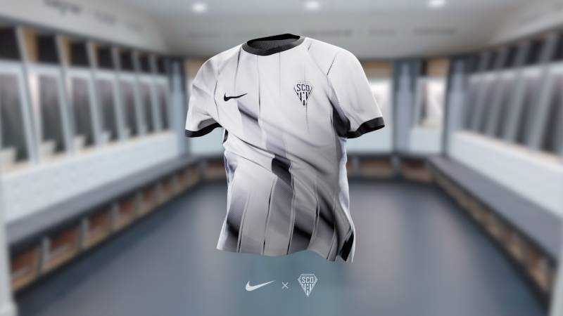
The club’s brand style guide (developed alongside the 2021 badge by Welko) defines how the logo interacts with sponsor placement, kit design, stadium branding, and digital platforms. Nike, the current kit supplier since 2023, integrates the diamond badge into jersey designs that respect the crest’s proportions and clear-space requirements.
What ties it all together is restraint. The Angers brand does not try to be flashy. It relies on the strong geometry of the diamond, the high contrast of black on white, and the warmth of gold. That consistency is what makes it work across a stadium wall and a phone screen alike.
How Should the SCO Angers Logo Be Used?
Do:
- Use the official files provided by the club for any reproduction
- Maintain the minimum clear space around the badge
- Place the logo on solid backgrounds (black, white, or gold work best)
- Use the full-color version as the default across all materials
Don’t:
- Alter the proportions, stretch, or skew the diamond
- Change the official colors or add effects like drop shadows or gradients that are not part of the original design
- Place the badge on patterned or photographic backgrounds without a backing panel
- Separate the “SCO” or “ANGERS” text from the diamond shape
Official logo files can be accessed through the club’s press and media department. For editorial use, the badge is widely available in PNG and vector formats through official club channels.
The SCO Angers logo is a registered trademark. Any commercial use (merchandise, promotional materials, partnerships) requires written authorization from the club. Fan-created content for non-commercial purposes generally falls under fair use, but the club has been protective of how its badge appears in contexts that could misrepresent the brand.
FAQ on The SCO Angers Logo
What does the SCO Angers logo look like?
The current SCO Angers crest is a diamond-shaped emblem with black and white vertical stripes, gold accents, the “SCO” initials, and a fleur-de-lys.
It also includes a subtle arch representing the Chateau d’Angers gateway. The club name “ANGERS” sits above the diamond in a bold typeface.
When was the current SCO Angers badge introduced?
The club unveiled its current badge on May 19, 2021. Welko, a local agency in Angers, designed it after producing over 80 sketches.
It was first used on kits and branding for the 2021-22 season at Stade Raymond Kopa.
What do the colors in the SCO Angers emblem mean?
Black and white are the club’s original colors, dating back to 1919. They earned Angers the nickname “Les Noirs et Blancs.”
Gold was added to reflect the heritage of the Anjou region. Together, the three colors create a palette that feels both classic and grounded.
Why is the SCO Angers logo shaped like a diamond?
The diamond shape has been part of the Angers football club identity since the original badge. It disappeared briefly between 1994 and 2004.
When the club brought it back, supporters responded positively. The diamond is now considered the core of the club’s visual identity.
What is the fleur-de-lys in the SCO Angers crest?
The 2021 redesign added a fleur-de-lys for the first time in the club’s history. It references French royalty and the Anjou territory’s coat of arms.
Behind it sits an arch that represents the Porte des Champs, a gate at the Chateau d’Angers.
Who designed the current SCO Angers logo?
Welko, an agency based in Angers, created the final design. Four agencies were consulted over more than a year.
Supporters’ groups had the final say between two shortlisted options. The club wanted to avoid the kind of radical rebrand that other Ligue 1 clubs had attempted.
How many logo versions has SCO Angers had?
Five versions total. The original ran from 1919 to 1994. Then came the 1994 departure, the 2004 return of the diamond, the 2011 refinement, and the current 2021 version.
Only the 1994 badge dropped the diamond motif entirely.
What is the difference between the old and new SCO Angers badge?
The 2021 version added the fleur-de-lys and Chateau d’Angers references. It removed the “1919” founding date that appeared on the previous crest.
Gold is used more prominently now. The SCO lettering was redrawn in a more modern style with updated spacing.
Where can I download the SCO Angers logo?
Official logo files are available through the club’s press and media department. PNG versions circulate on sports logo databases.
For anything commercial, you need written authorization from Angers SCO. The badge is a registered trademark of the club.
How does the SCO Angers logo compare to other French football logos?
Most Ligue 1 clubs use circular or shield-shaped badges. The diamond makes Angers immediately distinct in any lineup of French football club logos.
The black-and-white-dominant palette is also unusual. Most rivals lean on blues, reds, or greens for their club crests.
Conclusion
The SCO Angers logo tells a clear story. Five versions across a century, and the club kept coming back to the same diamond shape, the same black and white stripes, the same three letters.
That kind of consistency is rare in French professional football, where badge redesigns often chase trends at the cost of heritage.
Welko’s 2021 crest got the balance right. The fleur-de-lys and Chateau d’Angers details gave the badge deeper roots in the Maine-et-Loire region without abandoning what supporters already recognized.
For a club that has bounced between Ligue 1 and Ligue 2 more than once, that kind of visual stability matters. The badge stays the same even when the league table does not.
It is a football club emblem that actually works like a coat of arms. And that is exactly what Angers SCO set out to build.

Renowned for his expertise in logo design and visual branding, Bogdan has developed a multitude of logos for various clients.
His skills extend to creating posters, vector illustrations, business cards, and brochures. Additionally, Bogdan's UI kits were featured on marketplaces like Visual Hierarchy and UI8.
He also wrote in the past years on sites like Design Your Way, WebDesignerDepot, WPDean, Designmodo, Speckyboy, Slider Revolution, and more.
- Canva vs PowerPoint: Which Is Better for Presentations? - 22 September 2026
- How to Install Fonts on Mac (Step-by-Step Guide) - 20 September 2026
- From Mockup to Code: How AI-Augmented Development Speeds Up the Design Handoff - 19 September 2026

Bogdan Sandu is a seasoned designer who has been designing websites since 2008. Renowned for his expertise in logo design and visual branding, Bogdan has developed a multitude of logos for various clients. His skills extend to creating posters, vector illustrations, business cards, and brochures. Additionally, Bogdan's UI kits were featured on marketplaces like Visual Hierarchy and UI8. He also wrote in the past years on sites like Design Your Way, WebDesignerDepot, WPDean, Designmodo, Speckyboy, Slider Revolution, and more.
You Might Also Like


