


The Montpellier logo is one of the more recognizable crests in French football. It belongs to Montpellier Herault Sport Club, a professional club based in the Occitanie region of southern France. The club’s origins go back to 1919 when it was founded as Stade Olympique Montpellierain, though the current version of the club came together through a merger in 1974.
What makes this badge interesting, at least from a design perspective, is the way it has shifted identities over the decades. The visual history splits neatly into two chapters: a red era running from 1975 to 1989, and a blue era from 1989 to today. That kind of hard color break is pretty unusual for European football clubs. Most teams just tweak things gradually. Montpellier basically reinvented its look.
The current emblem features a circular design with blue and orange as the primary colors, diagonal stripes running through the center, and the full club name wrapped around the perimeter. It sits within the broader tradition of French football branding, where circular badges and regional symbolism tend to dominate. But the color combination gives Montpellier a distinct identity compared to clubs that lean heavily on the standard red, blue, or green palettes. Understanding what makes a logo work starts with looking at exactly these kinds of choices.
What Is the Montpellier Logo?
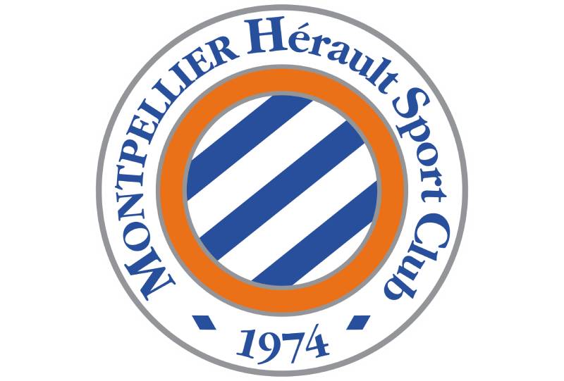
The Montpellier HSC logo is a circular emblem featuring diagonal blue and white stripes at its center, framed by a thick orange ring and an outer blue border carrying the club’s full name. It was introduced in 2000 and represents the club’s identity rooted in southern France’s Occitanie region.
Here is a breakdown of the key attributes:
- Design Type: Combination mark. The badge merges graphic elements (striped circle, colored rings) with typographic elements (the club name running along the outer border). It functions as both a symbol and a wordmark at the same time.
- Primary Elements: Three diagonal blue stripes alternating with white stripes form the central motif. An orange ring surrounds this striped core, followed by a white divider, then a blue outer ring that holds the “Montpellier Herault Sport Club” inscription.
- Official Introduction Date: 2000. This is the version that has remained active for over two decades, with minor tweaks for anniversary editions in 2014 (40th anniversary) and 2024 (50th anniversary).
- Designer/Agency: The redesign was handled internally through the club’s branding team under the direction of the Nicollin family ownership. No external agency has been publicly credited.
- Trademark Status: The logo is a registered trademark of Montpellier Herault Sport Club, protected under French intellectual property law and UEFA’s branding regulations.
- Color Palette: Blue (#344575), Orange (#D87043), Gray (#7F7D7C), and White (#FFFFFF). These four colors define the full color palette of the club’s visual identity.
- Usage Context: The logo appears on match kits, official merchandise, the club’s website and social media channels, stadium signage at Stade de la Mosson, press materials, and all licensed products.
How Has the Montpellier Logo Evolved Over Time?

The Montpellier crest has gone through roughly ten distinct versions since 1919. Early designs were simple shields and monograms. The 1970s brought circular badges in red. Then in 1989, the club shifted to blue, and the 2000 redesign created the version most fans know today.
That is a lot of changes for one club. But the history makes more sense once you know the context behind each shift.
Original Montpellier Logo (1919-1923)
- Years Active: 1919-1923
- Design Description: A plain white shield with a bold red circle centered inside it. Very stripped back. Almost no detail.
- Color Scheme: Red and white
- Context: This was the founding era of Stade Olympique Montpellierain. The red circle likely referenced Montpellier’s nickname as “La Ville de Soleil” (The City of Sun). Football badges in France during this period were rarely complex.
- Cultural Significance: It set the initial red identity that would stick around for decades. The shield shape reflected standard European heraldic traditions in sports branding at the time.
Monogram Era (1923-1974)
- Years Active: 1923 through the early 1970s
- Design Description: The badge evolved into a red circle with overlapping “M” and “S” letters inside. Over the following decades, the design went through subtle changes but kept the monogram concept alive.
- Color Scheme: Primarily red and white throughout this entire stretch
- Key Changes: The shift from shield to circle was the biggest move here. Monogram-based crests were common across French football during this period.
- Context: The club competed in Division 1’s inaugural 1932-33 season but later faced financial difficulties. These changes in fortune did not really show up in the badge, which stayed conservative.
Paillade SC Circular Badge (1975-1989)
- Years Active: 1975-1989, with variations in 1982-83 and 1985-87
- Design Description: A rounded frame containing “Montpellier” arched along the top and “Paillade” along the bottom. A red and white football sat in the center with “S.C” lettering. One brief version in 1982 featured a pointed shield with the Virgin Mary holding baby Jesus, which was pretty unusual for a football crest.
- Color Scheme: Red and white
- Designer: Created under the new ownership of Louis Nicollin, who acquired the club in 1974
- Key Changes from Previous: This was the first version that clearly spelled out the club name around a circular perimeter. The introduction of a football image in the center also pushed the design toward modern sports branding.
- Cultural Significance: The Nicollin era began here. Louis Nicollin transformed the club from an amateur side into a professional outfit, and the new badge reflected those ambitions. The brief appearance of the Virgin Mary referenced Montpellier’s coat of arms and city heritage.
Transition to Blue (1987-1989)
- Years Active: 1987-1989
- Design Description: A shield outline containing a large serif letter “M” with a red and white football at its base. “PSC” appeared on the ball. The Virgin Mary and Jesus appeared above the football in this version too.
- Color Scheme: Red outline with black and white elements
- Key Changes: This was the last red-era logo. The large “M” became a design direction that would carry into the blue period. The shield shape was also the final time this format appeared before the permanent move to circular badges.
First Blue Badge (1989-2000)
- Years Active: 1989-2000
- Design Description: The Virgin Mary was removed. A bold blue “M” stood at the center with a blue and white football placed below it. “Montpellier Herault” was written above in a clean sans-serif typeface, with thin horizontal lines separating the text from the graphic.
- Color Scheme: Blue and white, marking the permanent departure from red
- Key Changes from Previous: This redesign fundamentally changed the club’s visual identity. The color shift from red to blue signaled a new chapter. The religious imagery was gone. The design felt more modern and professional.
- Context: The club changed its name to Montpellier Herault Sport Club in 1989. This badge coincided with the club’s most successful period, including the 1990 Coupe de France win and the 1992 Coupe de la Ligue victory.
Current Montpellier Logo (2000-Present)
- Years Active: 2000 to present
- Design Description: A circular badge with a wide double outline. The center features diagonal stripes in blue and white (three blue, four white). A thick orange ring encircles the striped center, followed by a white ring, and then a blue outer ring carrying “Montpellier Herault Sport Club” in a bold serif typeface.
- Color Scheme: Blue (#344575), Orange (#D87043), White (#FFFFFF), Gray (#7F7D7C)
- Key Changes from Previous: The addition of orange was a big deal. It gave the badge a warmth and energy the all-blue version lacked. The diagonal stripes added movement to what had been a fairly static design. And wrapping the full club name around the perimeter gave it the feel of a proper institutional crest.
- Cultural Significance: This is the badge that saw Montpellier win the 2011-12 Ligue 1 title, beating Paris Saint-Germain to the championship. For a generation of fans, this is the Montpellier logo. Special anniversary editions were created in 2014 and 2024, but they were temporary overlays rather than full redesigns.
What Do the Design Elements of the Montpellier Logo Mean?
Every piece of the Montpellier badge serves a purpose. The diagonal stripes reference the club’s home kit pattern, which has featured striped designs throughout its modern history. The circular form connects to traditions of French municipal and football heraldry.
Understanding the psychology of shapes tells you that circles communicate community and completeness. That matters for a club deeply tied to its city.
Why Did Montpellier Choose These Specific Colors?

The club uses four official colors, each with specific codes and intent behind it.
Blue (#344575) is the dominant color. In terms of color psychology, blue signals trust, loyalty, and stability. For a football club, those associations matter. The specific shade is a deep navy-like tone, not a bright blue. It feels serious. Pantone reference: PMS 534 C. RGB values: (52, 69, 117). CMYK: (91, 80, 28, 13).
Orange (#D87043) provides the energy. It is the accent that separates Montpellier from the many other French clubs using blue. Orange reads as enthusiasm and warmth. Pantone: PMS 1595 C. RGB: (216, 112, 67). CMYK: (11, 67, 82, 1). If you look at other orange logos, you will see this color is often used to stand out in crowded markets.
Gray (#7F7D7C) serves a supporting role. It appears in secondary branding and merchandise applications. Pantone: PMS 8401 C. RGB: (127, 125, 124). CMYK: (52, 44, 45, 9).
White (#FFFFFF) provides the breathing room. It separates the colored rings and creates the alternating stripe pattern in the center.
The pairing of blue and orange is a near-complementary color combination on the color wheel. That contrast is what makes the badge pop, even at small sizes. The principles of color theory explain exactly why this pairing works so well.
What Typography Style Is Used in the Montpellier Logo?
The current badge uses a bold serif typeface for the “MONTPELLIER” text in the outer ring. It is set in all capitals with fairly generous spacing between letters.
The rest of the name, “Herault Sport Club,” appears in title case using the same font family but at a smaller size. Understanding how typography works in badge design helps explain why serifs were chosen here. They add a sense of tradition and weight.
Earlier versions used different approaches. The 1989 badge went with a clean sans-serif for a more modern look. The 1975 version used a narrowed serif with heavy strokes. The psychology behind font choices played a role in each era, even if the designers were not thinking about it in those exact terms.
What Are the Hidden Meanings in the Montpellier Logo?
The diagonal stripes in the center are not just decorative. They reference the club’s traditional striped jersey design, tying the badge directly to what the players wear on the pitch.
The orange ring creates a visual “sun” effect around the blue and white core. Some fans read this as a nod to Montpellier’s reputation as one of the sunniest cities in France. Whether that was intentional or not, the association sticks.
The removal of the Virgin Mary in 1989 was itself a statement. It shifted the club’s identity from one rooted in religious and civic heraldry to a more modern, secular sports brand. That was a conscious choice that aligned with broader trends in European football branding during the late 1980s and 1990s.
How Does the Montpellier Logo Compare to Competitor Logos?
French football is full of circular crests. The Paris Saint-Germain emblem uses a similar round format but relies on red, blue, and white with the Eiffel Tower at its center.
The Olympique de Marseille badge is also circular, featuring a predominantly blue and white scheme. Olympique Lyonnais uses red and blue within their circular design.
What sets Montpellier apart is the orange. Very few major French clubs use orange as a primary accent. The Toulouse FC badge leans purple. Stade Rennais goes with red and black. Montpellier’s color combination makes its badge instantly identifiable, even in thumbnail sizes on a TV broadcast or a phone screen.
The diagonal stripes also differentiate it. Most French football crests use horizontal or vertical divisions, or no stripes at all. The diagonal creates a sense of movement and energy that you do not see much in this league. Clubs like those with blue-focused logos tend to stick with more traditional layouts.
What Are the Technical Specifications of the Montpellier Logo?
Official Color Codes
- Primary Color: Blue – Hex: #344575, RGB: (52, 69, 117), CMYK: (91, 80, 28, 13), Pantone: PMS 534 C
- Secondary Color: Orange – Hex: #D87043, RGB: (216, 112, 67), CMYK: (11, 67, 82, 1), Pantone: PMS 1595 C
- Tertiary Color: Gray – Hex: #7F7D7C, RGB: (127, 125, 124), CMYK: (52, 44, 45, 9), Pantone: PMS 8401 C
- Neutral Color: White – Hex: #FFFFFF, RGB: (255, 255, 255), CMYK: (0, 0, 0, 0)
Dimensions and Proportions
The badge is a perfect circle, giving it a 1:1 aspect ratio. The outer blue ring occupies roughly 15% of the total diameter on each side. The orange ring sits inside that and is slightly thinner. The striped center takes up approximately 50% of the total badge area.
For vector-based applications, the logo scales cleanly to any size because of its geometric simplicity. The minimum recommended display size for legibility is around 30px in width for digital use, at which point the text in the outer ring becomes unreadable but the color pattern and stripes remain recognizable.
Clear space around the badge should equal roughly 10% of the badge’s diameter on all sides. This ensures the colors and details read clearly against any background.
What Cultural Impact Has the Montpellier Logo Had?
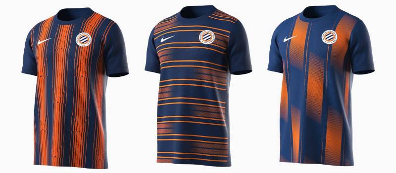
The 2012 Ligue 1 title win cemented this badge in French football culture. Montpellier’s championship was a genuine underdog story, and the blue-and-orange crest became a symbol of what a smaller club could achieve against financial giants.
For the city of Montpellier itself, the logo functions as a point of civic pride. You see it on bumper stickers, cafe windows, and street art around the Ecusson (old town). The Nicollin family’s long ownership built a tight bond between club and community, and the badge is the most visible expression of that relationship.
The 2024 50th anniversary badge generated a lot of conversation among fans and designers. Anniversary editions let clubs experiment without fully committing to a redesign, and Montpellier used that opportunity well. It was a smart bit of visual storytelling.
How Does the Montpellier Logo Fit Into the Overall Brand Identity?
The badge is the anchor of a broader identity system. The club’s brand guidelines dictate how the blue and orange palette extends across everything from match-day programs to social media templates to the Stade de la Mosson signage.
The visual hierarchy places the badge at the top. Below it, secondary elements like the club’s wordmark, kit manufacturer branding, and sponsor logos all follow the same color rules.
Merchandise design depends heavily on the badge’s flexibility. The stripes and the orange ring work well at large sizes on scarves and flags. At smaller sizes on pins or phone cases, the color blocking still reads clearly. That kind of scalability is something a lot of clubs struggle with, actually.
The relationship between the badge, the city’s identity, and the Occitanie region creates a layered brand. It is not just a football club. The emphasis always comes back to regional belonging. The orange warmth and the blue depth together build something that feels local and specific, not generic.
Good balance in design keeps everything working together. And the unity across all applications, from stadium to screen, is what turns a badge into a real brand.
How Should the Montpellier Logo Be Used?
Here are the practical details worth knowing.
Do: Always reproduce the badge in its full-color version when possible. Maintain the clear space around it. Use the official color codes listed above for any printed or digital materials. Scale proportionally, never stretch or compress the badge.
Don’t: Alter the colors. Rearrange the internal elements. Place the badge on busy backgrounds that compete with the orange ring. Crop any portion of the outer text ring. Rotate the badge from its standard orientation.
The official logo files are available through the club’s media center at mhscfoot.com. High-resolution versions in SVG, PNG, and EPS formats are typically provided for press and partner use.
As a registered trademark, the Montpellier badge cannot be used commercially without licensing approval from the club. Fan-created merchandise that uses the badge needs explicit permission. This applies to both physical products and digital content. UEFA and Ligue de Football Professionnel also have separate guidelines for broadcast and media use of the badge.
Following sound logo design principles means respecting how a badge is meant to be displayed, and the Montpellier crest is no exception. Treating it with care is part of respecting what it represents: a club, a city, and over a hundred years of football history.
FAQ on The Montpellier Logo
When Was the Current Montpellier HSC Logo Introduced?
The current Montpellier Herault Sport Club badge was introduced in 2000. It replaced the 1989 blue-and-white design. The circular emblem with diagonal stripes and an orange ring has stayed in use for over two decades, with only minor anniversary editions in 2014 and 2024.
What Do the Colors in the Montpellier Logo Represent?
Blue (#344575) stands for trust and loyalty. Orange (#D87043) represents energy and warmth.
White creates separation between elements. Gray (#7F7D7C) supports secondary branding. The blue-orange complementary color pairing gives the badge its strong visual identity across kits and merchandise.
Why Did Montpellier Change From Red to Blue?
The club switched to blue in 1989 when it officially became Montpellier Herault Sport Club. The red era ran from 1975 to 1989 under the Paillade SC name.
Blue marked a fresh start. New name, new ownership direction from the Nicollin family, new visual identity for Ligue 1 competition.
What Font Is Used in the Montpellier Badge?
The outer ring uses a bold serif typeface with “MONTPELLIER” in all capitals. The remaining words sit in title case at a smaller size.
Serif fonts add weight and tradition to sports crests. Earlier versions used narrowed serifs in the 1975 badge and clean sans-serifs in the 1989 redesign.
How Many Logo Versions Has Montpellier HSC Had?
Roughly ten distinct versions since 1919. The earliest was a white shield with a red circle.
The brand evolution moved through monograms, circular red badges, a brief shield featuring the Virgin Mary, and finally the blue-era designs. Each version reflected the club’s changing status in French football.
What Is the Meaning Behind the Diagonal Stripes?
The three blue and four white diagonal stripes reference the club’s traditional striped jersey design. They also add a sense of movement to the static circular shape.
Most Ligue 1 crests use horizontal or vertical divisions. The diagonal pattern gives Montpellier a distinct look among French football club emblems.
Is the Montpellier Logo Trademarked?
Yes. The badge is a registered trademark of Montpellier Herault Sport Club under French intellectual property law. UEFA and Ligue de Football Professionnel also regulate its use in broadcast and print contexts.
Commercial use requires licensing approval from the club.
Where Can I Download the Official Montpellier Logo?
The club’s official media center at mhscfoot.com provides high-resolution files. Formats typically include SVG, PNG, and EPS for press and partner use.
Fan or commercial projects that use the crest need explicit permission. Unauthorized reproduction on merchandise or digital content is not allowed under trademark protections.
Why Was the Virgin Mary Removed From the Badge?
The 1989 redesign dropped the religious imagery. Earlier versions from the 1982 and 1987 badges featured the Virgin Mary with baby Jesus, taken from Montpellier’s city coat of arms.
The removal aligned with broader European football trends toward secular, modern sports branding during that period.
How Does the Montpellier Crest Compare to Other Ligue 1 Badges?
Most French clubs use circular crests with blue, red, or green as primary colors. Montpellier’s orange accent makes it unusual.
The AS Monaco badge leans red and white. The Nantes emblem uses green and yellow. Montpellier sits in its own lane with the blue-orange combination, which is rare across all of European football.
Conclusion
The Montpellier logo tells a story that stretches back over a century. From simple red shields to the current blue-and-orange circular badge, every redesign tracked the club’s growth within French football and the Occitanie region.
The 2000 emblem got the color choices right. Blue for depth, orange for energy, white for clarity. That combination still holds up.
Few Ligue 1 crests carry this much visual identity history while staying immediately recognizable at any size. The Montpellier Herault Sport Club badge earns its place among the most distinctive in European football.

Renowned for his expertise in logo design and visual branding, Bogdan has developed a multitude of logos for various clients.
His skills extend to creating posters, vector illustrations, business cards, and brochures. Additionally, Bogdan's UI kits were featured on marketplaces like Visual Hierarchy and UI8.
He also wrote in the past years on sites like Design Your Way, WebDesignerDepot, WPDean, Designmodo, Speckyboy, Slider Revolution, and more.
- Jujutsu Kaisen Font Generator - 12 October 2026
- The Windsurf Logo History, Colors, Font, And Meaning - 10 October 2026
- How to Remove Background From Product Photos (No Photoshop) - 10 October 2026

Bogdan Sandu is a seasoned designer who has been designing websites since 2008. Renowned for his expertise in logo design and visual branding, Bogdan has developed a multitude of logos for various clients. His skills extend to creating posters, vector illustrations, business cards, and brochures. Additionally, Bogdan's UI kits were featured on marketplaces like Visual Hierarchy and UI8. He also wrote in the past years on sites like Design Your Way, WebDesignerDepot, WPDean, Designmodo, Speckyboy, Slider Revolution, and more.
You Might Also Like


