


The Lorient logo is one of the most recognizable badges in French football. It belongs to FC Lorient, a professional club founded on April 2, 1926, in the port city of Lorient, Brittany. The club’s full name is Football Club de Lorient Bretagne Sud, and its crest has gone through four distinct versions since the 1920s.
What makes this badge stand out from most Ligue 1 crests is the fish. A hake, to be specific. It directly ties back to the city’s fishing industry and the club’s nickname, “Les Merlus” (The Hakes). The club’s founders were fishmongers, stokers, and fishermen from Lorient’s Quai de l’Estacade, so the connection runs deep.
In the larger picture of European football branding, the Lorient crest sits in a category of badges that lean heavily on local identity rather than generic heraldic imagery. While plenty of clubs slap a lion or an eagle on their shield and call it a day, Lorient went with a fish. And honestly, that’s part of what makes it memorable.
The current version has been in use since 2010. A sports branding agency worked with the club to develop it. The badge has been redesigned four times total across the club’s nearly century-long existence.
What Is the FC Lorient Logo?
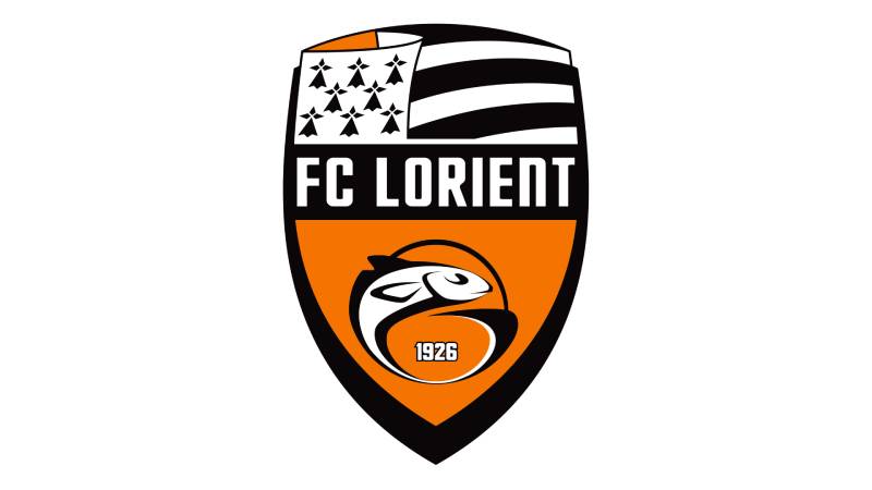
The FC Lorient logo is a shield-shaped emblem featuring a stylized hake fish in orange, the Brittany flag at the top, the club name “FC Lorient” across the center on a black band, and the founding year “1926” near the fish’s tail. It was introduced in 2010.
Design Type: Combination mark. It blends a pictorial mascot element (the hake fish) with text and heraldic elements inside a shield shape.
Primary Elements: The badge contains a shield divided into sections. The top portion shows the Gwenn-ha-du, the Breton flag with its black and white stripes and ermine canton. A black horizontal band runs through the middle with “FC Lorient” in white sans-serif lettering. The lower section features the hake fish on an orange background, with “1926” outlined in white near its curved tail.
Official Introduction Date: 2010. This is the fourth logo version in the club’s history.
Designer/Agency: Created by a professional sports branding agency in collaboration with the club’s management. The specific designer name hasn’t been publicly credited.
Trademark Status: The logo is a registered trademark of Football Club de Lorient Bretagne Sud, protected under French intellectual property law.
Color Palette: Orange (#F58113), Black (#000000), and White (#FFFFFF). These three colors have been consistent across most of the club’s visual history.
Usage Context: The crest appears on matchday kits, training gear, official merchandise, the club’s website (fclorient.bzh), stadium signage at the Stade du Moustoir, digital platforms, and all official communications.
How Has the FC Lorient Logo Evolved Over Time?

The Lorient badge has gone through four versions since the club’s founding in 1926. Each redesign kept the fish as the central motif but changed the framing, typography, and overall structure around it.
The progression moved from a simple monochrome illustration to a circular badge, then a more polished circular mark, and finally the shield format used today.
Original FC Lorient Logo (1926-1994)
Years Active: 1926 to 1994. Almost seventy years with basically the same mark.
The original design was straightforward. A monochrome illustration of a hake fish alongside a football, with the full name “Football Club Lorient” set below in a bold serif typeface. Two horizontal black lines framed an orange wordmark underneath the illustration.
There was no shield, no circle, no elaborate framing. Just the fish, the ball, and the name. It looked like something hand-drawn, which it probably was.
The context here matters. The club was founded by the Cuissard family, successors to La Maree Sportive, a workers’ team from the local fish processing industry. The tangerine and black color scheme reportedly came from a checkered sweater worn by Charlotte Cuissard, the president’s sister, during the club’s founding assembly.
For a badge that lasted nearly seven decades, it did its job well. It was simple, identifiable, and connected to the community. Nobody needed a branding agency to explain what it meant.
Circular Badge Era (1994-2002)
Years Active: 1994 to 2002.
This was the first real overhaul. The fish moved onto a solid orange circle enclosed in a thick black frame. The club name was placed around the circular perimeter in black serif capitals, with “Lorient” appearing larger than the rest of the text.
The fish image itself stayed similar, but the overall presentation jumped forward significantly. It finally looked like a proper football club badge instead of a regional illustration.
Why the change? By the mid-1990s, Lorient was pushing toward professional status and eventually reached Ligue 1 for the first time in 1998-99. A more polished identity made sense. You can’t really show up to the top flight with a badge that looks like it belongs on a fish market sign. Well, you could, but the timing was right for an upgrade.
The shift from the diamond-like original layout to a circular format also brought the design closer to what most European football clubs were doing at the time. Circles and roundels were everywhere in the 1990s.
Refined Circular Logo (2002-2010)
Years Active: 2002 to 2010.
The 2002 version didn’t scrap the circular concept. Instead, it refined it. The fish and football lines became bolder, more confident. The orange background picked up a gradient effect, darker near the perimeter and lighter toward the center.
The biggest typographic change: the full inscription “F.C. Lorient Bretagne Sud” moved outside the badge, placed above it in an arched arrangement. And the font switched from serif to a clean sans-serif with strict, sleek lines.
This version coincided with a strong period for the club. Lorient won the Coupe de France in 2002, beating Bastia 1-0 in the final. That’s the club’s biggest honor to date. So the badge from this era carries some weight with supporters, even if the design itself was a transitional step.
The gradient orange was a trendy choice at the time. Lots of clubs were experimenting with gradients and dimensional effects in the early 2000s. It didn’t age particularly well, but it served its purpose.
Current Shield Logo (2010-Present)
Years Active: 2010 to present.
The 2010 redesign changed everything except the fish. The circular format was replaced with a shield, which brought a more heraldic quality to the badge. The shield is divided into three horizontal sections.
At the top: the Brittany flag (Gwenn-ha-du) with its black and white stripes and ermine symbols. This was the first time the regional flag appeared directly in the crest. Middle: a black band with “FC Lorient” in white geometric sans-serif type. Bottom: the hake fish, now positioned horizontally on an orange background, its tail curved to create a frame around the “1926” founding date.
The football was completely removed. That’s a detail worth noting. After decades of having a ball next to the fish, the 2010 version dropped it entirely. The fish stands alone.
This design feels more confident than its predecessors. The visual hierarchy is clear: regional identity at the top, club name in the middle, heritage at the bottom. It reads well at any size, from stadium screens to small merchandise tags.
What Do the Design Elements of the FC Lorient Logo Mean?
Every piece of the Lorient badge connects back to something specific. The hake fish represents the club’s fishing port origins and its “Les Merlus” nickname.
The Brittany flag signals regional pride. The shield shape follows traditional heraldic conventions found across European football.
And “1926” grounds the whole thing in history. Nothing here is decorative for its own sake.
Why Did FC Lorient Choose These Specific Colors?

The color palette goes back to the club’s founding. According to historical records, the tangerine-and-black combination was adopted in 1926 when FC Lorient succeeded La Maree Sportive.
Orange (Hex: #F58113, Pantone PMS 151 C) is the dominant color. It represents energy, warmth, and the local maritime identity. From a color psychology standpoint, orange signals enthusiasm and creativity. It also makes the badge pop against nearly any background, which is practical for kit design and broadcast visibility.
Black (Hex: #000000, Pantone PMS Process Black C) provides the structure. It frames elements, anchors the typography, and creates contrast against the orange. Black communicates strength and authority without competing with the primary color.
White (Hex: #FFFFFF) works as the supporting color. It appears in the Brittany flag section, the text, and the “1926” inscription. White brings clarity and makes sure nothing gets lost in the orange-and-black pairing.
Together, the three colors form a color theory combination that’s high-contrast and instantly recognizable. You don’t see a lot of orange-dominant badges in French football, which gives Lorient a real advantage in terms of visual distinctiveness.
What Typography Style Is Used in the FC Lorient Logo?
The current badge uses a custom geometric sans-serif typeface. The letters are bold, evenly spaced, and uppercase.
It reads well at small sizes. That’s actually harder to get right than most people think, especially when you’re cramming text into a narrow band on a shield.
Earlier versions of the badge used serif lettering, which gave those logos a more traditional feel. The switch to sans-serif in the early 2000s moved the club’s identity toward a more modern look, and the 2010 version pushed that further with cleaner, more geometric letterforms.
The spacing between characters is tight but not cramped. Each letter has room to breathe without gaps that would break the reading flow at smaller reproduction sizes.
What Are the Hidden Meanings in the FC Lorient Logo?
The ermine symbols in the Brittany flag portion of the crest carry historical significance. Ermines are a traditional Breton heraldic symbol tied to the old Duchy of Brittany.
The hake’s curved tail framing the “1926” inscription is a deliberate design choice. It creates a visual container for the date, tying the club’s founding directly to its mascot. Look, there’s nothing subliminal going on here. It’s all pretty intentional.
But there is something interesting about what’s absent. The football was removed in 2010. The designers chose to let the fish and the regional symbols carry the identity entirely, which says something about priorities: local heritage over generic sport imagery.
How Does the FC Lorient Logo Compare to Competitor Logos?
Most Ligue 1 crests lean on traditional heraldic imagery or abstract geometric shapes. The Lorient badge stands out because of its fish.
Among its closest rivals, Stade Rennais uses an ermine and red-black color scheme with strong Breton identity. FC Nantes goes with a canary-themed badge in yellow and green. RC Lens keeps things tight with a clean red-and-gold circular mark.
Where Lorient wins is distinctiveness. That orange is hard to miss. Most French clubs cluster around blue, red, or green palettes. Orange gives Lorient clear visual separation in any league table, broadcast graphic, or merchandise display. The use of orange in sports branding is relatively rare, and that scarcity works in the club’s favor.
Compared to other Breton clubs, Lorient does the best job of integrating the Gwenn-ha-du directly into the badge. It’s right there at the top of the shield, not tucked away or referenced vaguely. Strasbourg does something similar with Alsatian identity, and Bastia references Corsican symbolism, but Lorient’s approach is clean and prominent.
What Are the Technical Specifications of the FC Lorient Logo?
Official Color Codes
Primary Color: Orange
Secondary Color: Black
- Hex: #000000
- RGB: (0, 0, 0)
- CMYK: (70, 50, 50, 100)
- Pantone: PMS Process Black C
Accent Color: White
- Hex: #FFFFFF
- RGB: (255, 255, 255)
- CMYK: (0, 0, 0, 0)
Dimensions and Proportions
The shield shape follows a roughly vertical orientation, taller than it is wide. The aspect ratio sits close to 5:6 (width to height), though exact specs depend on the reproduction format.
For digital use, the badge is typically distributed as vector graphics (SVG, EPS, AI) for scalability, and raster formats (PNG, JPEG) for web and social media. Minimum size guidelines generally require the badge to remain legible, which usually means no smaller than about 20mm in height for print applications.
Clear space around the logo should equal at least the height of the “FC Lorient” text band, measured from all four sides of the shield. This prevents other visual elements from crowding the badge and keeps it readable in busy layouts.
What Cultural Impact Has the FC Lorient Logo Had?

The Lorient badge is more than a sports mark in its home city. Lorient is a port city with about 57,000 residents, and the club is one of its most visible cultural institutions.
The hake fish motif connects the club to the fishing community that built both the team and the city’s economy. It’s common to see the badge on storefronts, cars, and flags throughout the Morbihan department.
With the club’s centenary approaching in 2026, Lorient released special anniversary kits featuring the original 1926 diamond-shaped crest. That move shows how deeply the earlier logo versions still resonate with supporters. Heritage matters here, and the logo is the most visible expression of it.
How Does the FC Lorient Logo Fit Into the Overall Brand Identity?

The badge sits at the center of a broader system. The orange-black-white palette runs through everything: the kits (manufactured by Joma and Umbro), the stadium signage at Stade du Moustoir, the official website, social media channels, and all fan merchandise.
The “Les Merlus” nickname and the fish imagery extend beyond the crest itself. They show up in supporter group banners, chants, and community events. The club also ties into the Interceltic Festival of Lorient, one of the biggest Celtic cultural events in the world, which reinforces the Breton identity embedded in the badge.
A strong set of brand guidelines ensures everything stays consistent. From the style guide that governs how the crest appears on different backgrounds to the rules about minimum sizing and clear space, the club treats its visual identity seriously.
How Should the FC Lorient Logo Be Used?
Do:
- Use the official color values listed above when reproducing the badge
- Maintain the required clear space around the shield
- Use vector formats for print and large-format applications
- Scale proportionally without stretching or distorting the shield
Don’t:
- Alter the colors, rearrange elements, or remove any part of the badge
- Place the logo on busy backgrounds that reduce legibility
- Add effects like drop shadows, outlines, or gradients that aren’t in the original
- Use low-resolution bitmap versions where vector files are available
Official logo files can be accessed through FC Lorient’s official website at fclorient.bzh or through authorized brand asset distributors. For commercial use, written permission from the club is required. The logo, the name “FC Lorient,” and related marks are protected trademarks. Unauthorized reproduction on merchandise or marketing materials is a trademark violation under French and EU intellectual property law.
If you’re a fan making non-commercial content, most clubs including Lorient are reasonable about personal use. But if money’s involved, get clearance first.
FAQ on The Lorient Logo
What does the FC Lorient logo look like?
The current FC Lorient badge is a shield featuring a stylized hake fish on an orange background, the Brittany flag at the top, and “FC Lorient” in white sans-serif across a black band. The founding year “1926” sits near the fish’s curved tail.
Why is there a fish on the Lorient crest?
The fish is a European hake, called “merlu” in French. It references the club’s nickname “Les Merlus” and the fishing port origins of Lorient.
The club’s founders were fishermen and fishmongers from the city’s harbor district, so the connection is literal.
What are the official Lorient logo colors?
The Lorient team colors are orange (#F58113), black (#000000), and white (#FFFFFF). Orange has been the club’s primary color since 1926.
The tangerine shade reportedly came from a checkered sweater worn during the club’s founding assembly in Brittany.
When was the current Lorient logo introduced?
The current shield-shaped emblem was introduced in 2010. It replaced the circular badge that had been used since 1994.
This is the fourth version of the Lorient club crest since the club was established on April 2, 1926.
How many times has the Lorient badge changed?
Four versions total. The original monochrome design lasted from 1926 to 1994. Then a circular badge from 1994 to 2002. A refined circular mark from 2002 to 2010. And the current shield since 2010.
What does the Brittany flag in the Lorient logo represent?
The top section of the shield shows the Gwenn-ha-du, Brittany’s black-and-white striped flag with ermine symbols. It was added in the 2010 redesign.
It ties FC Lorient directly to its Breton regional identity and the Morbihan department where the city sits.
What font does the Lorient logo use?
The badge uses a custom geometric sans-serif typeface. Bold, uppercase, evenly spaced letters sit on the black band across the shield’s center.
Earlier versions used serif lettering. The shift to sans-serif happened during the 2002 logo redesign of the Lorient football badge.
Can I download the FC Lorient logo?
Official logo files are available through FC Lorient’s website at fclorient.bzh. Vector formats like SVG work best for clean scaling.
PNG versions with transparent backgrounds circulate on brand asset sites. Commercial use requires written permission from the Ligue 1 club.
What is the meaning behind the Lorient logo shield shape?
The shield replaced the earlier circular format to bring a more heraldic feel to the Lorient emblem. Shields are common across European football crests and signal tradition and strength.
It also gave the designers room to stack three distinct elements: regional flag, club name, and mascot.
How does the Lorient logo compare to other French football club logos?
The orange color scheme gives Lorient a unique position among Ligue 1 badges. Most French clubs use blue, red, or green palettes.
The hake fish mascot also sets it apart. Few football clubs worldwide build their entire visual identity around a fish from their local fishing industry.
Conclusion
The Lorient logo tells a complete story in one shield. Four redesigns across nearly a century, and the hake fish never left.
That kind of consistency is rare in football club branding. From the monochrome original to the current crest with its Gwenn-ha-du and orange backdrop, every version has kept the club’s fishing port roots front and center.
The orange-black-white palette, the bold sans-serif lettering, the Breton heraldic elements. They all work together to give Les Merlus a visual identity that stands apart in Ligue 1 and across European football.
It’s a badge that means something to the people who wear it. And at the end of the day, that’s what good logo design does.

Renowned for his expertise in logo design and visual branding, Bogdan has developed a multitude of logos for various clients.
His skills extend to creating posters, vector illustrations, business cards, and brochures. Additionally, Bogdan's UI kits were featured on marketplaces like Visual Hierarchy and UI8.
He also wrote in the past years on sites like Design Your Way, WebDesignerDepot, WPDean, Designmodo, Speckyboy, Slider Revolution, and more.
- Best Visual Regression Testing Tools for Web and App Design in 2026 - 13 October 2026
- Jujutsu Kaisen Font Generator - 12 October 2026
- The Windsurf Logo History, Colors, Font, And Meaning - 10 October 2026

Bogdan Sandu is a seasoned designer who has been designing websites since 2008. Renowned for his expertise in logo design and visual branding, Bogdan has developed a multitude of logos for various clients. His skills extend to creating posters, vector illustrations, business cards, and brochures. Additionally, Bogdan's UI kits were featured on marketplaces like Visual Hierarchy and UI8. He also wrote in the past years on sites like Design Your Way, WebDesignerDepot, WPDean, Designmodo, Speckyboy, Slider Revolution, and more.
You Might Also Like


