


The FC Nantes logo is one of the most recognizable crests in French football. It tells the story of a club founded in 1943 during World War II, built from the merger of five smaller local teams in the city of Nantes. The current version, introduced in 2019, replaced over seven decades of crest designs that leaned heavily on maritime imagery and the club’s deep connection to Brittany.
What makes this badge stand out in Ligue 1 is the green and yellow color palette. Most French clubs go with blue, red, or white. Nantes went a completely different direction. The origin of those colors? Jean Le Guillou, one of the club’s founders, owned a racehorse called Ali Pacha. The jockey wore yellow and green. That horse kept winning. So Le Guillou figured those colors were lucky enough for a football club too.
The crest has gone through roughly ten versions since 1955. And the 2019 redesign, well, it divided opinion pretty strongly among supporters. The club stripped away the clipper ship, the stars representing championship titles, and most of the traditional detail. What remains is a stylized “N” inside a shield, an ermine symbol, and the “FC Nantes” wordmark in a clean sans-serif font.
What Is the FC Nantes Logo?

The FC Nantes logo is a shield-shaped crest featuring a stylized letter “N” in green, a yellow ermine symbol at the base, and the “FC Nantes” inscription above. Introduced in 2019, it replaced the club’s ship-centric designs with a stripped-back identity focused on regional symbolism.
- Design Type: Combination mark (shield emblem with wordmark)
- Primary Elements: Stylized “N” letterform, ermine symbol, shield shape, “FC Nantes” text
- Official Introduction Date: May 22, 2019
- Designer/Agency: Club’s internal branding team (no external agency publicly credited)
- Trademark Status: Registered trademark of Football Club de Nantes
- Color Palette: Yellow (#FCD405) and Green (#1B8F3A), with white used for background variants
- Usage Context: Matchday jerseys, official merchandise, digital platforms, stadium signage, club communications, and licensing materials
How Has the FC Nantes Logo Evolved Over Time?
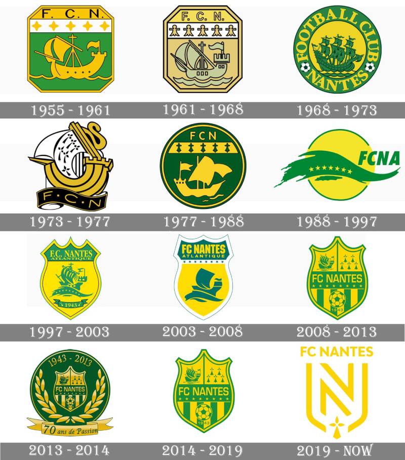
The FC Nantes badge has been redesigned roughly ten times since 1955. Early versions featured octagonal and circular shapes with a prominent clipper ship, then shifted through various shield formats before arriving at the current stripped-down design in 2019.
Each version tells you something about where the club was at that moment. The designs got busier, then simpler, then busy again.
It’s been a bit of a rollercoaster, honestly.
The First FC Nantes Crest (1955-1961)
The original badge was an octagonal shape. Actually closer to a square with the corners sliced off diagonally.
Green and white dominated the shield, with yellow outlining. A yellow clipper ship sat on a curved line meant to represent the sea. Above the ship, five four-pointed stars were arranged in a row. The top section carried a clean “F.C.N.” in black lettering on a yellow background.
For a first attempt at a club crest, it packed a lot of symbolism into a tight space. The ship was the obvious focal point, linking the club to Nantes’ identity as a major port city.
The psychology of shapes matters here. That angular, almost militaristic frame gave the badge a feeling of structure. It fit the era.
The Refined Badge (1961-1968)
Not a dramatic change. The shape narrowed slightly, and the green gave way to pale yellow.
The composition stayed basically the same. Ship, stars, initials. But the lighter color scheme softened the overall look.
It felt less aggressive, more approachable. Sometimes a small shift in hue does more than a complete redesign.
The Circular Era (1968-1973)
This is where things got interesting. The club ditched the angular frame entirely and went circular.
The clipper ship stayed. Green and yellow came back strong. A bold serif wordmark wrapped around the perimeter, with “Nantes” separated from “Football Club” by two small footballs.
But the real detail? On the ship’s sails, six stylized cross-like symbols appeared for the first time. These “four petals” would eventually become the club’s most significant heraldic element, the ermine motif tied to Breton identity.
The circular format gave the badge better balance. Everything felt more unified.
The Modernist Redesign (1973-1977)
Completely new style. Black, yellow, and white replaced the green.
The clipper and the sail ornament survived, but rendered in a much more contemporary way. It looked like something from a graphic design movement of that decade. Bolder. Sharper. Less traditional.
This was FC Nantes saying “we’re not just a regional club anymore.” They’d won multiple league titles by this point, and the badge reflected that ambition.
The Dark Palette Version (1977-1988)
Back to circular. But the colors went darker and more intense.
The yellow ship on a green background became sleeker, with fewer decorative details. A thick yellow stripe above the clipper displayed five arrow-like symbols in green. Those were the “four petals” again, but bolder and tighter.
The increased saturation gave the badge more weight on a jersey. It photographed better, stood out more on television. Smart thinking for the era.
The Ship-Free Experiment (1988-1997)
For the first time ever, the clipper ship disappeared.
The new badge was a bright yellow circle with a thin green outline. A wide green wave dominated the lower half, carrying seven small yellow stars. Above the wave, “FCNA” appeared in a bold, slightly italicized sans-serif. The name change to FC Nantes Atlantique in 1992 fit right into this branding.
It was divisive. Some fans loved the clean, modern approach. Others felt something important had been lost.
Took me a while to appreciate what they were going for. The wave motif kept the maritime connection without being so literal about it.
The Return of the Ship (1997-2003)
Fans got their ship back. The 1997 crest combined several earlier design ideas into one.
A smooth shield with a yellow background featured the green clipper on a green wave, now accompanied by eight yellow stars representing the club’s championship titles. A green ribbon at the bottom displayed “1943.” The wordmark “F.C. Nantes Atlantique” sat in a classy bold serif typeface across the top green section.
This felt like a greatest hits compilation. Every symbol that mattered, all in one place.
The Cleaned-Up Shield (2003-2008)
A refinement, not a reinvention. The foundation ribbon with “1943” got removed. The ship became more minimal.
Stars moved from the wave to a white stripe above the clipper image. The wordmark switched to a strong, bold sans-serif. The whole thing felt tighter and more modern without losing its identity.
This is the version a lot of fans in their 30s grew up with. There’s a natural attachment to whichever crest you first saw on a match scarf.
The Four-Section Badge (2008-2019)
The most complex version the club ever used. The crest was divided into four distinct sections with a horizontal green “FC Nantes” bar running through the middle.
The bottom section had vertical stripes with a green and yellow football and “1943.” The top half split into two segments, with the clipper on the left and five ermine symbols on the right.
It was detailed. Maybe too detailed. At small sizes, the elements competed with each other for attention. Good visual hierarchy needs breathing room, and this badge was cramped.
The Current FC Nantes Logo (2019-Present)
On May 22, 2019, FC Nantes revealed what many called the most radical change in the club’s visual history.
Gone was the ship. Gone were the stars. Gone was “1943.” The new crest featured a green or white shield with an oversized stylized “N” and a single yellow ermine at the bottom. “FC Nantes” sat above in a clean sans-serif.
Supporters were not happy. The general feeling was that the club had traded 77 years of history for something that looked more like a corporate logo than a football crest. But there’s something to be said for minimalist design that works across every platform and size.
The club has since won the 2022 Coupe de France with this badge. So at least it has a trophy attached to it now.
What Do the Design Elements of the FC Nantes Logo Mean?
Every piece of the current FC Nantes crest connects to something specific. The stylized “N” represents the city itself. The ermine ties the club to Brittany’s heraldic tradition. The shield shape roots the badge in football’s coat-of-arms conventions.
There’s less going on visually than in previous versions, but each remaining element carries more weight because of it.
Why Did FC Nantes Choose These Specific Colors?

The yellow and green of FC Nantes trace back to a racehorse. Jean Le Guillou, a founding member, chose the colors from his jockey’s winning outfit in 1943.
Yellow (#FCD405, Pantone PMS Yellow 012 C) represents the city’s maritime and cultural heritage. It carries energy. Optimism. It’s the color that earned the club their “Les Canaris” nickname.
Green (#1B8F3A, Pantone PMS 355 C) connects to the parks, gardens, and natural spaces around Nantes. Growth, renewal, the city’s identity as an ecologically conscious place. Understanding color psychology explains why these two work so well together. They create a sense of vitality without being overwhelming.
In Ligue 1, where blue and red dominate, this combination gives FC Nantes instant visual separation. You can spot a Nantes jersey from across a stadium.
What Typography Style Is Used in the FC Nantes Logo?
The current badge uses a custom sans-serif font designed specifically for the club. Clean lines. No decorative elements. Strong readability at any size.
It’s a big departure from the serif and decorative typography used in earlier versions. The 1997 crest, for example, had a bold serif that felt classic and authoritative.
The switch to sans-serif reflects a broader trend in sports branding. Clubs want typefaces that work equally well on a jersey, a mobile screen, and a billboard. Tracking and spacing become critical at those different scales.
What Are the Hidden Meanings in the FC Nantes Logo?
The ermine is the detail most people miss or don’t understand if they’re not familiar with Breton culture. It’s one of the oldest symbols of Brittany, originating from the coat of arms of Pierre de Dreux, the Duke of Brittany.
The ermine represents purity in heraldic tradition. By keeping this single symbol while removing everything else, the 2019 redesign made a deliberate choice. Regional identity over football-specific imagery.
The stylized “N” does double duty. It’s the club’s city initial, but its proportions and angles also suggest upward movement. Whether that was intentional or not, the designers haven’t said publicly.
How Does the FC Nantes Logo Compare to Competitor Logos?
Most Ligue 1 clubs keep detailed, tradition-heavy crests. Paris Saint-Germain has the Eiffel Tower and fleur-de-lis. Olympique de Marseille uses an ornate “OM” monogram. Olympique Lyonnais features a detailed lion.
FC Nantes went the opposite direction. The 2019 crest is among the most minimal in French professional football.
It’s closer in spirit to what RC Lens and LOSC Lille have done with their modernized badges, though Nantes pushed further. Stade Rennais, their biggest rival from Brittany, keeps a more complex heraldic approach.
The debate over whether simpler is better for football crests is still ongoing. Juventus sparked it in 2017 with their “J” rebrand, and the conversation hasn’t really settled. Nantes landed on that same side of the argument.
If you look at AS Monaco’s diamond crest or the detailed badge of Toulouse, the difference in philosophy is stark. Some clubs hold onto every piece of their history in their crest. Nantes decided that less says more.
What Are the Technical Specifications of the FC Nantes Logo?
Official Color Codes
- Yellow
- Hex: #FCD405
- RGB: (252, 212, 5)
- CMYK: (2, 14, 99, 0)
- Pantone: PMS Yellow 012 C
- Green
- Hex: #1B8F3A
- RGB: (27, 143, 58)
- CMYK: (81, 0, 59, 44)
- Pantone: PMS 355 C
- White (background variant)
- Hex: #FFFFFF
- RGB: (255, 255, 255)
- CMYK: (0, 0, 0, 0)
Dimensions and Proportions
The shield shape follows a roughly 5:6 width-to-height ratio. The “N” letterform occupies approximately 60% of the shield’s interior area, with the ermine symbol filling the remaining lower portion.
Minimum reproduction size should maintain legibility of both the “FC Nantes” text and the ermine detail. For print design, the club’s guidelines specify clear space equal to the height of the “FC” text surrounding the entire mark.
The logo works in both green-on-white and white-on-green variants. For digital use, vector graphics formats (SVG, EPS) are the standard. JPEG and PNG files at 300 DPI minimum are specified for printed materials.
What Cultural Impact Has the FC Nantes Logo Had?
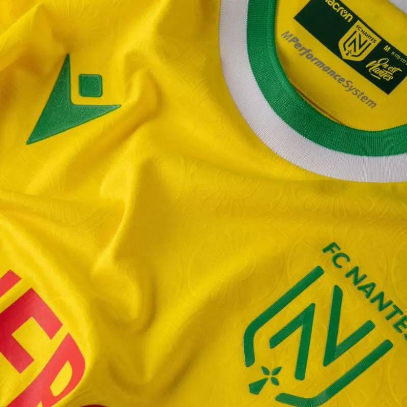
The FC Nantes crest carries weight beyond football. In Nantes, it’s a symbol of civic pride. The yellow and green appear on murals, cafe signs, and street art throughout the city. The club is part of the local identity in a way that goes deeper than match results.
The 2019 redesign triggered one of the bigger fan backlashes in recent French football history. Supporter groups protested. Social media lit up. The general consensus was that the club had erased too much history in one move.
But something shifted after the 2022 Coupe de France victory. Fans celebrated with that new badge on their scarves. Trophies have a way of softening opinions about branding changes. The club’s legacy, from Marcel Desailly to Didier Deschamps to their famous “jeu a la nantaise” philosophy, now extends through this current mark.
How Does the FC Nantes Logo Fit Into the Overall Brand Identity?
The logo sits at the center of a broader visual system. The green and yellow extend across everything: jerseys, the Stade de la Beaujoire interior, digital channels, youth academy branding, and retail merchandise.
The current crest was designed with web design and digital-first thinking in mind. It scales cleanly to a social media avatar. It embroiders well on fabric. It works as a favicon. Previous versions with their complex detail didn’t translate as smoothly across those different contexts.
FC Nantes maintains brand guidelines that control how the crest appears alongside partner logos and sponsor marks. The clean design gives commercial partners more room to breathe, which, whether fans like it or not, matters in modern football business.
The ermine connects the football club’s identity to the city’s broader heraldic tradition. Nantes’ city coat of arms also features an ermine and a ship. By keeping the ermine and dropping the ship, the club chose the more abstract regional connection over the literal maritime reference.
How Should the FC Nantes Logo Be Used?
The official FC Nantes crest is available for download through the club’s website and official media channels. But there are rules.
The logo cannot be altered, recolored, or distorted. The green and yellow values must match the specified Pantone, Hex, and RGB codes exactly. Placing the badge on busy backgrounds that reduce contrast is not allowed under the club’s guidelines.
For licensed merchandise and commercial use, written authorization from the club is required. The FC Nantes name and crest are registered trademarks. Unauthorized use on products, websites, or promotional materials can result in legal action.
Fan-created content generally gets more latitude, but the club still asks that the badge be used respectfully and without modification. If you’re designing fan art or supporter materials, stick to the official colors and don’t stretch or crop the shield shape.
For press and media, high-resolution files are typically available through the club’s media relations department. Always use the most current version of the crest unless you’re specifically discussing historical badges.
FAQ on The Nantes Logo
What does the FC Nantes logo look like?
The current FC Nantes crest is a shield with a stylized green “N” and a yellow ermine symbol at the base. “FC Nantes” sits above in a clean sans-serif typeface.
It’s minimal compared to what came before it.
When was the current Nantes logo introduced?
FC Nantes revealed its current badge on May 22, 2019. It replaced the four-section crest that had been used since 2008.
The club unveiled it alongside the new home kit for that season. Fans had strong opinions, and most of them weren’t positive.
What do the colors of the Nantes logo mean?
Yellow and green have been the club colors since 1943. Jean Le Guillou picked them from the outfit of his winning jockey.
Yellow ties to the city’s maritime culture. Green connects to the parks and natural spaces around Nantes.
Why is there an ermine on the FC Nantes badge?
The ermine is a traditional Breton heraldic symbol. It appears on the flag of Brittany and the coat of arms of the city of Nantes.
It represents purity. The club kept this single element when they stripped everything else away in the 2019 redesign.
What happened to the ship on the Nantes logo?
The clipper ship was removed in 2019 after appearing on nearly every version since 1955. It referenced the city’s history as a major French port.
Supporters were upset. The ship had been part of the football club’s identity for over six decades.
How many times has the FC Nantes logo changed?
Roughly ten times since the first crest appeared in 1955. The club went through octagonal, circular, and shield-shaped designs before landing on the current version.
Some changes were subtle. Others, like 1988 and 2019, were dramatic.
What font is used in the Nantes logo?
A custom sans-serif font designed for the club. It replaced the serif and decorative typefaces from earlier versions.
The choice prioritizes readability across digital platforms, jersey printing, and merchandise. It scales well at small sizes too.
What are the official Nantes logo color codes?
Yellow is #FCD405 (PMS Yellow 012 C). Green is #1B8F3A (PMS 355 C).
These values stay consistent across all Ligue 1 materials, stadium branding at La Beaujoire, kit production, and digital channels.
Can I download and use the FC Nantes logo?
Official files are available through the club’s website. But the crest is a registered trademark of Football Club de Nantes.
Commercial use requires written permission. Fan content gets more flexibility, but you still can’t alter the badge design or change its colors.
Why did FC Nantes change its logo in 2019?
The club wanted a modern visual identity that worked across digital and physical formats. Previous crests with their complex detail didn’t translate well to social media or small-scale applications.
Les Canaris traded tradition for versatility. The debate about whether that was the right call hasn’t really ended.
Conclusion
The Nantes logo carries the full weight of a club that has shaped French football since 1943. Eight Ligue 1 titles, a Coupe de France in 2022, and a youth academy that produced world-class talent. All of that fits inside one green and yellow shield.
The 2019 redesign was a gamble. Dropping the clipper ship and the championship stars hurt longtime supporters of Les Canaris.
But the ermine stayed. The colors stayed. The connection to Brittany and the city’s heritage stayed.
Whether you prefer the detailed crests from the Stade de la Beaujoire era or the current stripped-back version, the FC Nantes emblem remains one of the most distinctive badges in Ligue 1. That yellow and green combination isn’t going anywhere.

Renowned for his expertise in logo design and visual branding, Bogdan has developed a multitude of logos for various clients.
His skills extend to creating posters, vector illustrations, business cards, and brochures. Additionally, Bogdan's UI kits were featured on marketplaces like Visual Hierarchy and UI8.
He also wrote in the past years on sites like Design Your Way, WebDesignerDepot, WPDean, Designmodo, Speckyboy, Slider Revolution, and more.
- Jujutsu Kaisen Font Generator - 12 October 2026
- The Windsurf Logo History, Colors, Font, And Meaning - 10 October 2026
- How to Remove Background From Product Photos (No Photoshop) - 10 October 2026

Bogdan Sandu is a seasoned designer who has been designing websites since 2008. Renowned for his expertise in logo design and visual branding, Bogdan has developed a multitude of logos for various clients. His skills extend to creating posters, vector illustrations, business cards, and brochures. Additionally, Bogdan's UI kits were featured on marketplaces like Visual Hierarchy and UI8. He also wrote in the past years on sites like Design Your Way, WebDesignerDepot, WPDean, Designmodo, Speckyboy, Slider Revolution, and more.
You Might Also Like


