


The RC Strasbourg logo is one of the most recognizable crests in French football. It belongs to Racing Club de Strasbourg Alsace, a professional club founded in 1906 in the Alsace region of eastern France. The emblem ties together regional identity, historical symbols, and over a century of competitive football into a single circular badge.
Within the broader world of European football branding, the Strasbourg crest sits in a unique position. It’s not just a club mark. It reflects the Franco-German cultural crossroads that define Alsace itself. The club has gone through more than ten logo iterations since the 1920s, each one shaped by the political and sporting climate of its time.
The current version of the badge, active since 2016, builds on the 1976 design that fans consider the “true” crest. It features a stylized stork, a red diagonal stripe, the Strasbourg Cathedral silhouette, and the RCSA monogram. The club was originally founded as Fussballclub Neudorf and became professional in 1933.
What Is the RC Strasbourg Logo?
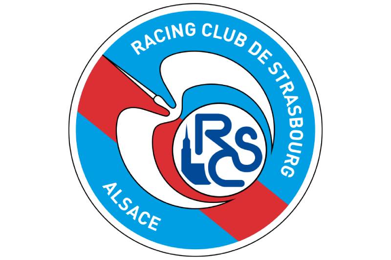
The RC Strasbourg logo is a circular emblem featuring a stylized white stork in flight, a red diagonal stripe, and a depiction of Strasbourg Cathedral alongside the club’s RCSA initials. Introduced in its current form in 2016, the design builds on the 1976 crest and symbolizes Alsatian regional pride, French football tradition, and the club’s deep connection to the city of Strasbourg.
Here’s what you need to know about the specific attributes of this badge:
- Design Type: Combination mark (emblem with wordmark). The circular format contains both graphic elements and text arranged around the perimeter.
- Primary Elements: A white stork with a black outline (the stork is the traditional symbol of Alsace), a red diagonal stripe pulled from the city’s coat of arms, and a small white inner circle containing the RCSA monogram and a blue Cathedral tower silhouette.
- Official Introduction Date: The base design dates to 1976. The current version with “RCSA” and “Alsace” text was introduced in 2012 and slightly refined by 2016.
- Designer/Agency: The 1997 interim logo was created by Patrick Proisy. The 2006 revival and subsequent updates were handled internally by the club’s management in response to supporter demand.
- Trademark Status: Registered as the official emblem of Racing Club de Strasbourg Alsace, a professional club competing in Ligue 1.
- Color Palette: Blue (#009FE3), Red (#DC2F34), Navy Blue (#004996), White (#FFFFFF), and Black (#000000).
- Usage Context: Official team kits (currently supplied by Adidas), matchday programs, stadium signage, merchandise, digital platforms, and all club communications. The logo appears on jerseys, scarves, flags, and promotional materials distributed by the club and its commercial partners.
How Has the RC Strasbourg Logo Evolved Over Time?

The RC Strasbourg logo has been through more than ten distinct versions since the 1920s, shifting from simple oval monograms to diamond crests, heraldic shields, and finally the circular badge fans know today. The most significant redesigns happened in 1945, 1960, 1976, 1997, 2006, and 2012.
Each change mirrored something happening either politically or within the club itself. And honestly, the 1997 version might be one of the most controversial redesigns in all of Ligue 1 history.
Original RC Strasbourg Logo (1920-1945)
- Years Active: 1920-1945
- Design Description: The earliest known crest was a simple oval shape containing the letters “R,” “C,” and “S.” A second variant added a small flag of white and red stripes above the oval. These were stripped-down marks, mostly black and white, with no elaborate artwork.
- Color Scheme: Black and white, with occasional red and white flag accents.
- Designer: Unknown. Likely created in-house by club administrators.
- Context: The club had just transitioned from its German-era name (FC Neudorf) to Racing Club de Strasbourg after Alsace was returned to France following World War I. The simple monogram was functional, nothing more.
- Key Changes from Previous: This was the first formal crest. No predecessor existed in a standardized form.
- Cultural Significance: The renaming and adoption of a French-style club name was a clear political statement. The “Racing” name was borrowed from Pierre de Coubertin’s Racing Club de France, signaling Francophilia.
Rhombus and Shield Era (1945-1976)
- Years Active: 1945-1976 (multiple sub-versions)
- Design Description: After WWII, the club adopted a blue rhombus (diamond) shape with white side strips, creating a diagonal blue stripe where the “RCS” acronym sat. By the 1950s, this shifted to a shield with diagonal white-red-white stripes and two heron birds at the center. The 1960 version introduced a blue diamond with a white diagonal stripe and, for the first time, a silhouette of Strasbourg Cathedral outlined in gold. In 1971, the Cathedral became black, the design flattened.
- Color Scheme: Blue, white, red, and gold (varying by decade).
- Designer: Unknown for most iterations.
- Context: This was a period of rebuilding after WWII. The club won its first Coupe de France in 1951 and a second in 1966. The logo kept getting more detailed as the club grew in stature.
- Key Changes from Previous: Moved from simple ovals to geometric shapes. Introduced the Cathedral and heron bird motifs that would become permanent features.
- Cultural Significance: The Cathedral and herons tied the club firmly to Strasbourg’s identity. Took me a while to appreciate how much the city’s architecture shaped these early crests. The gold outlines in the 1960 version gave it an almost municipal feel, like something you’d see on a city document.
The Iconic Circular Badge (1976-1997)
- Years Active: 1976-1997 (and later revivals)
- Design Description: A turquoise/blue circle with a red diagonal stripe running through it. At the center, a white stork (often described as a heron, but it’s the Alsatian stork) with outstretched wings wrapping around a smaller inner circle. That inner circle contained a blue Cathedral silhouette and the “RCS” monogram. The club name and “Football” text wrapped around the inside perimeter.
- Color Scheme: Blue, red, and white.
- Designer: Not publicly credited, but this is the version fans consider the “real” logo.
- Context: Introduced during a strong period for the club. Three years later, in 1979, RC Strasbourg won the French championship for the first and only time. The badge became synonymous with the club’s greatest era.
- Key Changes from Previous: Completely new format. Circular instead of diamond or shield. First time all the key symbols (stork, Cathedral, red stripe, monogram) appeared together in one unified design.
- Cultural Significance: The blue, red, and white color palette directly references the French tricolore. The stork connects to Alsatian folklore and regional pride. This badge basically said: “We’re French, we’re Alsatian, and we’re from Strasbourg.” All in one circle.
The “Pac-Man” Logo (1997-2006)
- Years Active: 1997-2006
- Design Description: Designed by Patrick Proisy, this version kept the circular shape but went for a more abstract look. A bright blue circle featured a large stylized star shape in deep blue and white that was supposed to represent both the Cathedral and a stork simultaneously. Three small yellow stars sat along the circle’s edge. The wordmark wrapped around the outside in dark blue capitals.
- Color Scheme: Two shades of blue, yellow, and white.
- Designer: Patrick Proisy.
- Context: The club wanted something “modern.” The problem was, most people couldn’t actually see either a cathedral or a stork in the abstract shape. Supporters quickly nicknamed it “Pac-Man” because, well, that’s what it looked like.
- Key Changes from Previous: Dropped the literal stork illustration. Removed red entirely. Introduced yellow. Went abstract when nobody asked for abstract.
- Cultural Significance: This one’s significant mostly for what it taught the club. Supporters hated it. The backlash was strong enough that when new management took over in 2006, reinstating the 1976 badge was one of their first moves. A good reminder that messing with a beloved crest without fan buy-in is risky.
The Revival and Modern Update (2006-Present)
- Years Active: 2006-present (updated in 2012 and 2016)
- Design Description: The 2006 revival brought back the 1976 circular badge with a fresh execution. Bright blue circle, red diagonal stripe (initially with a gradient effect), white stork in flight with a thin black outline, and a white inner circle containing the RCS monogram and Cathedral tower in blue. In 2012, the club renamed itself RC Strasbourg Alsace, changing the monogram to “RCSA” and swapping “Football” for “Alsace” on the wordmark. The gradient on the red stripe was also replaced with a flat color. A thin white outer ring was added.
- Color Scheme: Blue (#009FE3), Red (#DC2F34), Navy Blue (#004996), White, Black.
- Designer: Internal club design team.
- Context: The 2006 revival responded directly to supporter demand. The 2012 update coincided with the club’s renaming after financial liquidation forced a restart from the fifth tier of French football. Despite hitting rock bottom competitively, the badge remained a source of pride.
- Key Changes from Previous: Compared to the Pac-Man era, everything changed. Compared to the original 1976 version, the updates were subtle: cleaner lines on the monogram, sans-serif lettering that reads crisper, and the “Alsace” addition reflecting the club’s new identity.
- Cultural Significance: The revival felt like a homecoming. Fans got their badge back. And the 2012 rename to “Alsace” doubled down on regional identity at a time when the club needed its community most. Racing was in the fifth division. The logo was one of the few things that still felt like Ligue 1.
What Do the Design Elements of the RC Strasbourg Logo Mean?
Every piece of the RC Strasbourg badge carries a specific meaning rooted in the club’s geography, history, and cultural identity. The stork references Alsace. The Cathedral points to Strasbourg itself. The red stripe borrows from the city’s coat of arms.
Nothing here is decorative for the sake of it. The design elements work together to tell a story about where this club comes from and what it represents.
Why Did RC Strasbourg Choose These Specific Colors?

The blue, red, and white combination directly mirrors the French national flag. That’s not accidental. For a club in Alsace, a region that changed hands between France and Germany three times, wearing the tricolore on the badge is a statement of national identity.
Blue is the dominant hue. Hex #009FE3, Pantone PMS 2191 C. It covers most of the circular background and communicates trust and stability. At the RGB level, it sits at (0, 159, 227), giving it a bright, sky-like quality that reads well on screen and print.
Red (Hex #DC2F34, Pantone PMS 1788 C) appears as the diagonal stripe. In CMYK terms, it prints at (8, 96, 88, 1). The red comes from Strasbourg’s municipal coat of arms. It adds energy and, in terms of color psychology, signals passion and competitive drive.
Navy blue (#004996, PMS 2945 C) is used for accents and interior details. White and black round out the palette for contrast and legibility.
What Typography Style Is Used in the RC Strasbourg Logo?
The club uses a custom sans-serif typeface for the wordmark that wraps around the badge’s inner perimeter. It’s set in all capitals, with “Racing Club de Strasbourg” across the top and “Alsace” along the bottom.
The font is clean and modern. No decorative serifs, no script elements. The letter spacing is tight but readable, even at small sizes on merchandise. The RCSA monogram inside the inner circle uses a bolder weight of what appears to be the same family, giving it more presence at the badge’s center.
What Are the Hidden Meanings in the RC Strasbourg Logo?
The stork isn’t just a bird. In Alsatian tradition, storks represent fidelity, good fortune, and homecoming. For a club whose region was taken from France twice (and returned twice), the stork carries a weight that goes beyond simple mascot duty.
The red diagonal stripe is pulled directly from Strasbourg’s municipal heraldry. Most fans know this, but what’s less obvious is how the stripe creates a sense of movement through the badge, cutting across the circle at an angle. It gives the whole design a forward-leaning energy. The Cathedral silhouette inside the inner circle anchors everything to the city itself. It’s a subtle inclusion, but it separates this crest from any other blue-and-red football badge in Europe.
How Does the RC Strasbourg Logo Compare to Competitor Logos?
Among Ligue 1 crests, the Strasbourg badge is one of the most regionally specific. While clubs like Paris Saint-Germain or Olympique de Marseille use their logos to project global brand ambitions, Strasbourg’s crest is firmly rooted in its local identity.
Compare it to the Metz logo, the club’s biggest rival. Both are from eastern France, both use circular formats, but Metz leans into darker reds and a different symbolic language. Olympique Lyonnais uses a lion and a more corporate look. LOSC Lille goes for a clean, modernized mastiff. Stade Rennais uses a hermine (ermine), tying their identity to Brittany the way Strasbourg ties theirs to Alsace.
Where Strasbourg really stands out is in how much information is packed into one badge. You’ve got a stork, a Cathedral, a heraldic stripe, a monogram, and a full wordmark, all inside a circle. That’s a lot. But it works because each element occupies its own space within the design’s visual hierarchy.
What Are the Technical Specifications of the RC Strasbourg Logo?
Official Color Codes
- Blue (Primary): Hex #009FE3 | RGB (0, 159, 227) | CMYK (74, 23, 0, 0) | Pantone PMS 2191 C
- Red: Hex #DC2F34 | RGB (220, 47, 52) | CMYK (8, 96, 88, 1) | Pantone PMS 1788 C
- Navy Blue: Hex #004996 | RGB (0, 73, 150) | CMYK (100, 82, 9, 1) | Pantone PMS 2945 C
- White: Hex #FFFFFF | RGB (255, 255, 255) | CMYK (0, 0, 0, 0)
- Black: Hex #000000 | RGB (0, 0, 0) | CMYK (70, 50, 50, 100) | Pantone PMS Process Black C
Dimensions and Proportions
The logo uses a 1:1 aspect ratio given its circular shape. The outer ring, main circular body, inner white circle, and stork illustration all follow concentric layering. The inner circle sits slightly above center, offset by the diagonal red stripe.
For digital use, the badge should be rendered as vector graphics (SVG or EPS formats) to maintain sharpness across all sizes. At small sizes, below roughly 32 pixels, the Cathedral detail and RCSA monogram become difficult to read, so a simplified version is typically used for favicon-type applications. Minimum clear space around the badge is generally equal to the width of the outer white ring.
For print applications, the logo should be output at a minimum of 300 DPI to preserve fine details like the stork’s outline and the Cathedral silhouette.
What Cultural Impact Has the RC Strasbourg Logo Had?
The RC Strasbourg badge carries meaning well beyond matchday. In Alsace, the stork crest functions as a regional symbol almost as much as a sporting one. You see it on car stickers across the Grand Est region, on cafe walls in the Petite France district, and tattooed on supporters who may never have stepped inside the Stade de la Meinau.
The Pac-Man episode in the late 1990s showed just how emotionally invested the community is in this badge. When the club tried to modernize away from the classic crest, the pushback was immediate and sustained. That kind of emotional ownership doesn’t happen with most logos.
And then there’s the 2012 chapter. The club was bankrupt, restarting from the fifth division. The badge got updated with “Alsace” in the wordmark. At that point, the crest was practically all the club had left. It became a rallying point for supporters during a climb back through four divisions to Ligue 1.
How Does the RC Strasbourg Logo Fit Into the Overall Brand Identity?
The logo sits at the center of a visual identity system that connects the club to its kit manufacturer (Adidas), its sponsors, and its community programs. Everything radiates out from the badge. Kit designs, stadium signage, the club’s web presence, social media assets, and merchandise all anchor back to the blue, red, and white crest.
Since 2007, the Flag of Alsace has appeared on the back of the club’s shirt, adding another layer of regional identity alongside the logo. The brand guidelines dictate how the logo can be combined with sponsor marks and third-party branding, keeping the crest’s integrity intact across all touchpoints.
The nickname “Les Bleus et Blancs” (The Blues and Whites) reinforces the color identity. The blue-and-white palette differentiates RC Strasbourg from the city of Strasbourg itself, which uses red and white in its municipal branding. That distinction matters. The club’s colors are its own.
How Should the RC Strasbourg Logo Be Used?
If you’re working with the RC Strasbourg badge for any official or licensed purpose, there are guidelines to follow. The club maintains strict rules about how the crest appears in commercial and promotional contexts.
Do: Use the full-color version on white or light backgrounds whenever possible. Maintain the minimum clear space (equal to the outer ring width). Use official vector files sourced from the club or its authorized partners. Reproduce colors accurately using the specified Hex, RGB, CMYK, or Pantone values.
Don’t: Stretch or distort the circular proportions. Place the badge on busy backgrounds that reduce legibility. Alter the color palette. Remove or rearrange individual elements (like detaching the stork from the badge). Use bitmap formats at low resolution where vector alternatives exist.
Official logo files are available through the club’s website at rcstrasbourgalsace.fr and through authorized media channels. For commercial licensing, you’ll need to contact the club directly, as the crest is a protected trademark of Racing Club de Strasbourg Alsace.
The logo also follows Ligue 1’s broader guidelines for how club crests appear on broadcast graphics, matchday programs, and league-wide marketing. Your mileage may vary on exactly what’s allowed depending on the specific use case, but the general rule is: keep it clean, keep it accurate, and don’t improvise.
FAQ on The Strasbourg Logo
What does the RC Strasbourg logo represent?
The RC Strasbourg logo represents the club’s Alsatian heritage and its connection to the city of Strasbourg. The circular emblem features a stylized stork, the Strasbourg Cathedral silhouette, and a red diagonal stripe from the municipal coat of arms.
When was the current Strasbourg logo introduced?
The current version dates to 2012, when the club renamed itself Racing Club de Strasbourg Alsace. It builds on the 1976 badge design that supporters fought to bring back in 2006 after the unpopular “Pac-Man” crest was retired.
What colors are used in the Strasbourg emblem?
The official Strasbourg city branding colors are blue (#009FE3), red (#DC2F34), navy blue (#004996), white, and black. The blue, red, and white combination mirrors the French national flag, a deliberate choice for a club in the Alsace region.
What is the stork symbol on the Strasbourg badge?
The white stork is the traditional symbol of Alsace, representing fidelity and good fortune. In the RC Strasbourg crest, it appears in flight with outstretched wings, rendered in white with a thin black outline against the blue circular background.
Why did RC Strasbourg change its logo in 1997?
The club wanted a more modern look. Designer Patrick Proisy created an abstract badge that was supposed to show a cathedral and stork together. Fans called it “Pac-Man” instead. The Ligue 1 club reverted to its classic crest in 2006.
How many logo versions has RC Strasbourg had?
The club has had over ten distinct logo versions since the 1920s. These range from simple oval monograms to diamond crests, heraldic shields with lions, and the circular badges used from 1976 onward. Each reflected the club’s identity at the time.
What font does the Strasbourg logo use?
The RC Strasbourg badge uses a custom typeface for its wordmark. It’s a clean, bold sans-serif set in all capitals. The RCSA monogram inside the inner circle uses a heavier weight of the same family.
Where can I download the official Strasbourg logo?
Official logo files are available through the club’s website at rcstrasbourgalsace.fr. For commercial use, you need licensing from the club directly. The crest is a registered trademark of Racing Club de Strasbourg Alsace and protected under French law.
What is the meaning behind the red diagonal stripe?
The red stripe comes from the Strasbourg coat of arms. It cuts diagonally across the badge, referencing the city’s heraldic tradition. In the current version, it uses a flat red (#DC2F34) after earlier versions used color saturation with gradient shading.
How does the Strasbourg logo compare to other French football club logos?
The Strasbourg crest packs more regional symbolism than most Ligue 1 badges. While clubs like AS Monaco or Toulouse keep things simpler, the RCSA emblem layers a stork, Cathedral, heraldic stripe, and full wordmark into one mark.
Conclusion
The Strasbourg logo is more than a football crest. It’s a compressed history of Alsace, French football, and a community that refused to let its symbols disappear, even when the club hit the fifth division.
From the early oval monograms of the 1920s to the current RCSA emblem, every version tells you something about where the club stood at that moment. The stork, the Cathedral, the red diagonal stripe from the city’s heraldry. None of it is filler.
Few club logos carry this much regional DNA. The Strasbourg badge earns its place among the most meaningful crests in European football, and the Eurometropolis of Strasbourg should be proud of that.

Renowned for his expertise in logo design and visual branding, Bogdan has developed a multitude of logos for various clients.
His skills extend to creating posters, vector illustrations, business cards, and brochures. Additionally, Bogdan's UI kits were featured on marketplaces like Visual Hierarchy and UI8.
He also wrote in the past years on sites like Design Your Way, WebDesignerDepot, WPDean, Designmodo, Speckyboy, Slider Revolution, and more.
- How to Install Fonts on Mac (Step-by-Step Guide) - 20 September 2026
- From Mockup to Code: How AI-Augmented Development Speeds Up the Design Handoff - 19 September 2026
- The Beehiiv Logo History, Colors, Font, And Meaning - 18 September 2026

Bogdan Sandu is a seasoned designer who has been designing websites since 2008. Renowned for his expertise in logo design and visual branding, Bogdan has developed a multitude of logos for various clients. His skills extend to creating posters, vector illustrations, business cards, and brochures. Additionally, Bogdan's UI kits were featured on marketplaces like Visual Hierarchy and UI8. He also wrote in the past years on sites like Design Your Way, WebDesignerDepot, WPDean, Designmodo, Speckyboy, Slider Revolution, and more.
You Might Also Like


