


The Stade de Reims logo is one of the more interesting visual identities in French football. Not just because of what it looks like now, but because of what it went through to get here. Founded on June 18, 1931, the club has had roughly five distinct logo phases, including a bizarre seven-year stretch where they had no badge at all. The current crest, introduced in 2020 by the agency Leroy Tremblot, replaced a circular red-and-white emblem that had been in use since 1999. It features a crowned shield with an “SR” monogram, and its design pulls directly from the architecture of the Reims Cathedral.
This is a club that won six Ligue 1 titles and reached two European Cup finals in the 1950s. That history matters when you look at how the badge has changed. It’s not just about colors and shapes. There’s a legal battle with alcohol advertising laws baked right into the logo timeline, which is something you don’t see with most football clubs.
What Is the Stade de Reims Logo?

The Stade de Reims logo is a red shield-shaped crest topped by a stylized crown, with a vertical “SR” monogram at its center. It was officially introduced on June 18, 2020, designed by the branding agency Leroy Tremblot. The crest’s curved lines reference the main portal of the Reims Cathedral, and the crown honors the city’s historic role as the coronation site for French kings.
Here’s what makes up the current identity:
- Design Type: Combination mark. The crest pairs a shield-shaped emblem with a wordmark below it. It falls somewhere between a traditional football badge and the more stripped-back approach you see in modern rebrandings like Juventus.
- Primary Elements: A crowned shield featuring the “SR” monogram in a custom bold sans-serif typeface with sharp, pointed terminals. A pentagon shape sits at the center of the crown, referencing a football’s panels. Below the shield, the “Stade Reims” wordmark uses variable weights where “de” blends into “Stade” through thinner letterforms.
- Official Introduction Date: June 18, 2020. The reveal was timed to coincide with the club’s 89th anniversary.
- Designer/Agency: Leroy Tremblot, a sports-focused branding agency and subsidiary of LAFOURMI. The creative direction was led by Dominique Jubert, General Manager of Leroy Tremblot, and Antoine Tremblot as Creative Director.
- Trademark Status: The logo is a registered trademark of Stade de Reims. The club has historically dealt with unauthorized variations circulating online, including a well-known “fake” version with subtle differences that keeps getting used by mistake.
- Color Palette: Red (#EE2223) and white (#FFFFFF). That’s it. Two colors. The simplicity is intentional.
- Usage Context: Match kits, stadium signage at Stade Auguste-Delaune, the Raymond Kopa lifestyle centre, digital platforms, merchandise, and official club communications. The brand platform extends under the signature “Maison de Football.”
How Has the Stade de Reims Logo Evolved Over Time?
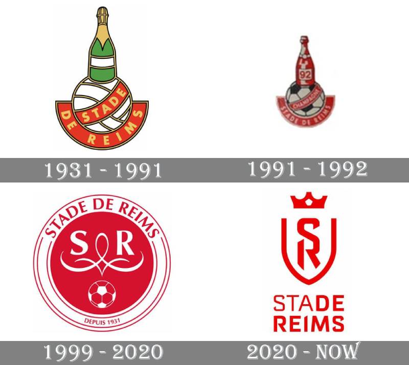
The Stade de Reims badge has gone through five major phases since the club’s founding in 1931. It started with tango and black colors, shifted to a champagne bottle design, lost its identity entirely due to French advertising law, came back as a circular red-and-white badge, and eventually became the modern crowned crest we see today.
The whole story is kind of wild, honestly. Most clubs just tweak their badge every decade or so. Reims had to deal with going bankrupt, getting legally blocked from using their own imagery, and basically starting from scratch. Twice.
The First Stade de Reims Badge (1931-1938)
Years Active: 1931 to roughly 1938.
The club was born from the merger of several local teams, most notably the Societe sportive du parc Pommery. At this point, the club’s colors were tango (a burnt orange) and black, not the red and white most people associate with Reims today.
The first badge was simple. Difficult to find images of it now, but it reflected those original tango and black team colors. It was functional more than anything.
Cultural Significance: This early identity got a brief revival in the 2010-2011 season when the club wore a commemorative tango and black kit for their 80th anniversary. A nice callback that most supporters appreciated.
The Champagne Bottle Logo (circa 1938-1991)
Years Active: Roughly late 1930s through 1991.
This is the badge most people think of when they picture classic Stade de Reims. A football with a green and gold champagne bottle sitting on top, a diagonal red ribbon across the ball, and a gold arched ribbon underneath. The club’s name appeared in gold capitals using a clean sans-serif font.
Here’s the thing though. According to multiple sources, this wasn’t technically an official club logo. It was originally the badge of the supporters’ club “Allez Reims.” The actual club used the city of Reims coat of arms on its European Cup pennants. But the champagne bottle became so popular that it basically became the club’s identity by default.
Context: This era covers the golden years. Raymond Kopa, Just Fontaine, Albert Batteux coaching the team to those six league titles and two European Cup finals against Real Madrid. The champagne bottle felt right for a club based in the Champagne region, and it carried serious emotional weight for fans.
Color Scheme: Green and gold bottle, red ribbons, gold lettering on earlier versions. The palette shifted over the years with various informal updates.
The Stade de Reims Champagne FC Transition (1991-1992)
Years Active: 1991 to 1992. Very brief.
In October 1991, Stade de Reims went bankrupt. The club was reformed as Stade de Reims Champagne FC. The logo kept the same basic structure but the bottle turned red and white, and the football got a more traditional black-and-white panel design.
Key Change: The wordmark was updated to reflect the new club name. But this version barely had time to breathe.
Then France’s Loi Evin kicked in. This 1991 law banned alcohol advertising and imagery in sports. A champagne bottle on a football club’s badge? That couldn’t fly anymore.
No Logo Period (1992-1999)
Years Active: 1992 to 1999. Seven years without a badge.
This is the part that surprises people. After the second liquidation and the Loi Evin restrictions, the club just… didn’t have a visual identity. They played without any crest on their kits. No badge. No emblem. Nothing.
The club had dropped into the lower divisions of French football. Resources were limited. Creating a new logo apparently wasn’t the top priority when you’re fighting to survive as a club.
The Circular Red and White Badge (1999-2020)
Years Active: 1999 to 2020.
When the club reverted to the name Stade de Reims in 1999, designer Christophe Blottin created a new circular emblem. It was a red disc inside a white rounded frame, with “Stade de Reims” written around the border in a sleek red typeface. The letters “S” and “R” sat in the center alongside decorative elements inspired by the Ange au Sourire (the Smiling Angel of Reims Cathedral). A small football appeared beneath the initials, and “Depuis 1931” was added at the bottom.
Cultural Significance: This badge accompanied the club through two promotions to Ligue 1 (in 2012 and 2018) and the Ligue 2 championship in 2018. It’s the badge that brought Reims back to prominence after decades in the lower leagues. A lot of current fans grew up with this version.
Color Scheme: Red and white only. Clean, no clutter.
The Modern Crest (2020-Present)
Years Active: 2020 to present.
Leroy Tremblot designed this one after about 18 months of work. The brief was clear: modernize the identity while keeping the club’s roots visible. The club’s president Jean-Pierre Caillot admitted they first explored bringing back the champagne bottle, but legal research shut that idea down fast.
The result is a crowned shield with a vertical “SR” monogram. The crown references Reims as the “Cite des Sacres” (Coronation City), where French kings were crowned. The shield’s curves mirror the arches of the Reims Cathedral’s main portal. A pentagon at the crown’s center represents a football panel.
Key Changes from Previous: Gone is the circular frame. Gone is the football imagery. The approach is minimalist, closer to what Juventus and Inter Milan did with their rebrandings. The wordmark below the crest plays with font weight and spacing so that “de” almost disappears into “Stade,” putting “Reims” in the spotlight.
What Do the Design Elements of the Stade de Reims Logo Mean?
Every piece of the current Stade de Reims crest connects to either the city’s identity or the club’s football heritage. The crown, the shield shape, the monogram, and the wordmark all carry specific meaning rather than being purely decorative choices. Leroy Tremblot built the entire system around what they called a “Maison de Football” concept.
The crowned shield is the anchor. It ties the football club to the city’s history as the place where French kings were coronated for centuries. That’s not just branding fluff. It’s a real piece of Reims’ identity that locals take seriously.
Why Did Stade de Reims Choose These Specific Colors?

Red and white have been the club’s primary color combination since 1938, when Stade de Reims merged with the local rival Sporting Club Remois, who played in red and white kits. Before that merger, Reims actually wore tango and black.
The nickname “Les Rouges et Blancs” (The Red and Whites) stuck from that point forward.
Red (#EE2223)
- Pantone: PMS Bright Red C
- RGB: (238, 34, 35)
- CMYK: (0, 98, 98, 0)
- Red is the dominant color. It carries associations of energy and determination, but for Reims specifically, it connects to the club’s post-merger identity and the passion of the supporter base.
White (#FFFFFF)
- RGB: (255, 255, 255)
- CMYK: (0, 0, 0, 0)
- White serves as a balancing element. It provides breathing room in the crest and keeps the overall design from feeling heavy.
The two-color approach is deliberate. Limiting the palette keeps reproduction clean across different media. A red-dominant logo stands out on merchandise, broadcast graphics, and digital screens without getting muddy at small sizes.
What Typography Style Is Used in the Stade de Reims Logo?
The “SR” monogram and “Stade Reims” wordmark both use a custom-designed sans-serif typeface created specifically for this identity. It wasn’t pulled from any existing font library.
The letterforms feature sharp, pointed terminals on the stroke endings. That detail gives the type an angular, somewhat aggressive quality that matches the shield’s geometry.
In the wordmark below the crest, there’s a clever weight trick happening. “Stade” starts at a lighter weight, and “de” is rendered even thinner so it nearly blends in. Then “Reims” hits at the heaviest weight. The idea is that your eye skips to “Reims” first. It creates a subtle typographic hierarchy without adding more elements.
What Are the Hidden Meanings in the Stade de Reims Logo?
The shield outline’s curved base is modeled after the main portal of Reims Cathedral, specifically the arch of its entrance. Most people see a generic shield. But hold it up against a photo of the cathedral’s facade and you’ll spot the connection right away.
The crown’s central jewel is a pentagon. That’s straight from a football’s panel geometry. So the crown itself becomes a bridge between royal history and the sport.
The “SR” monogram echoes the original club crest from the 1930s, which also featured those initials. Dominique Jubert from Leroy Tremblot specifically mentioned preserving this continuity as a design priority. Even the open space around the letterforms was an intentional choice to suggest “openness” as a club value.
How Does the Stade de Reims Logo Compare to Competitor Logos?
Stade de Reims sits in an interesting spot within Ligue 1 branding. Their 2020 redesign pushed them toward the clean, crest-based approach that’s become popular across European football. But most French clubs haven’t gone that route yet. The majority still use traditional circular or shield badges with detailed imagery.
Compare it to Paris Saint-Germain’s logo, which keeps its detailed Eiffel Tower and fleur-de-lis inside a circle. Or Olympique Lyonnais, which maintains a traditional circular crest with a lion. Reims stripped almost everything away.
The closest comparison in French football is probably FC Nantes, and that’s no coincidence. Leroy Tremblot redesigned Nantes’ badge in 2019, just a year before tackling Reims. Both share that same “less is more” philosophy.
Outside of France, the Reims crest lives in the same design neighborhood as Juventus’ 2017 rebrand and Inter Milan’s 2021 simplification. Shield shape, monogram focus, minimal color use. It’s a trend that either excites or frustrates fans depending on who you ask.
Against their actual Ligue 1 rivals, the Reims badge reads as modern and forward-thinking. RC Lens keeps a detailed traditional badge. Strasbourg uses a full-color shield with a stork. Metz features a detailed dragon crest. Reims went the other direction entirely.
What Are the Technical Specifications of the Stade de Reims Logo?
Official Color Codes:
- Primary Color – Red: Hex: #EE2223 | RGB: (238, 34, 35) | CMYK: (0, 98, 98, 0) | Pantone: PMS Bright Red C
- Secondary Color – White: Hex: #FFFFFF | RGB: (255, 255, 255) | CMYK: (0, 0, 0, 0)
Dimensions and Proportions:
The full logo composition (crest plus wordmark) uses a roughly 1:2 vertical aspect ratio. The shield element alone is closer to 1:1.2. The SVG master file on Wikimedia Commons lists the nominal dimensions at 512 x 1,019 pixels, which reflects the tall, narrow proportion of the combined mark.
Like most professional football clubs, Stade de Reims maintains clear space rules around the crest. The minimum clear zone typically equals the height of the crown element, applied on all four sides. The brand guidelines developed by Leroy Tremblot cover these specifics across different application contexts, from stadium signage down to social media avatars.
The logo works in both full-lockup (shield plus wordmark) and standalone formats (shield only). At very small sizes, like favicons or app icons, only the crowned “SR” shield is used. The vector-based format makes sure it stays crisp at any resolution.
What Cultural Impact Has the Stade de Reims Logo Had?

The champagne bottle badge from the mid-20th century remains one of the most recognized symbols in French football history, even though it hasn’t been used officially in over 30 years. It tied a football club directly to its region’s most famous export in a way that felt completely natural at the time.
The Loi Evin’s effect on the logo is a case study in how legislation can reshape sports branding overnight. Reims is probably the clearest example of a European football club losing its core visual identity because of government regulation.
The 2020 rebrand hasn’t had the same level of controversy as, say, the Juventus redesign. Most Reims supporters accepted it as a reasonable update. The “Maison de Football” brand platform gave the new identity a narrative that went beyond just the badge. It connected the crest to the Raymond Kopa lifestyle centre, the academy, and the club’s broader identity within Reims as a city.
The fake logo situation is genuinely funny. There’s a bootleg version floating around online that’s almost identical to the 1999 badge, except a few tiny details are off. This knockoff keeps showing up in official contexts, including on broadcast graphics and even other clubs’ stadium screens. Supporters on social media regularly call it out.
How Does the Stade de Reims Logo Fit Into the Overall Brand Identity?

The 2020 logo wasn’t a standalone project. Leroy Tremblot built a complete brand system around it. The crest connects to a custom typographic system, a defined brand style framework, and the “Maison de Football” positioning that runs through everything the club does.
The Raymond Kopa lifestyle centre at the club’s training ground got a full environmental redesign aligned with the new identity. Same goes for signage at Stade Auguste-Delaune. The red-and-white system scales from the crest on a player’s chest to the wayfinding signs inside the stadium. That kind of consistency is what separates a logo update from an actual rebrand.
Merchandise uses the shield mark prominently. The standalone crest (without the wordmark) appears on kits, while the full lockup shows up on official documents and marketing. The flexible system means the club doesn’t have to cram the entire logo onto a sleeve patch where it would be unreadable.
The brand also leans into the Champagne region’s reputation for craftsmanship and quality. That “Maison de Football” tagline is a direct reference to the “Maisons de Champagne” (the established champagne houses). It’s a clever workaround. They can’t put a champagne bottle on the badge, but they can borrow the language of the industry.
How Should the Stade de Reims Logo Be Used?
The club’s official brand guidelines, developed by Leroy Tremblot, lay out specific rules for logo usage. Here’s what to keep in mind:
Do:
- Use the official files provided by the club. Don’t screenshot the logo from a website and call it a day.
- Maintain the specified clear space around the crest.
- Use the full-color version (red on white, or white on red for reversed applications) whenever possible.
- Scale the logo proportionally. Always.
Don’t:
- Alter the colors. The red is #EE2223, not “close enough.”
- Stretch, rotate, or distort the logo.
- Add drop shadows, outlines, or effects.
- Use the old circular badge or (definitely not) the champagne bottle badge for current official purposes.
- Use unofficial versions found through generic image searches. That fake version is still circulating.
Where to access official logos: The club’s official website (stade-de-reims.com) and their media/press resources are the most reliable sources. For editorial use, sports logo databases like SportsLogos.net carry verified versions.
Licensing: The Stade de Reims logo is a protected trademark. Any commercial use requires explicit permission from the club. Fan-made merchandise using the logo without authorization can (and does) get flagged. If you’re a media outlet covering the team, standard editorial use guidelines apply, but always grab the logo from an official source.
FAQ on The Stade De Reims Logo
What does the Stade de Reims logo look like?
The current Stade de Reims logo is a red shield-shaped crest with a stylized crown on top. A vertical “SR” monogram sits at the center, rendered in a custom bold sans-serif with sharp pointed ends. Below the shield, the “Stade Reims” wordmark appears in red.
When was the current Stade de Reims badge introduced?
The club unveiled its modern crest on June 18, 2020. That date was chosen on purpose. It matched the club’s 89th anniversary.
Leroy Tremblot, a sports branding agency based in France, spent about 18 months developing the full identity system.
What do the colors in the Stade de Reims emblem mean?
Red (#EE2223) and white (#FFFFFF) are the only two colors. Red represents the club’s energy and its supporter culture. White provides contrast and keeps the design clean.
These colors date back to 1938, after the merger with Sporting Club Remois.
Why did Stade de Reims have no logo between 1992 and 1999?
France’s Loi Evin banned alcohol imagery in sports. The club’s champagne bottle badge couldn’t be used anymore. After going bankrupt and being reformed, Reims simply played without any crest for seven years while competing in the lower divisions of French football.
Who designed the current Stade de Reims club crest?
The agency Leroy Tremblot handled the redesign. They’re a branding firm that focuses on sports, and they also created the FC Nantes rebrand a year earlier.
Dominique Jubert led the project as General Manager. Antoine Tremblot served as Creative Director.
What does the crown in the Stade de Reims logo represent?
Reims is known as the “Cite des Sacres” because French kings were crowned at its cathedral. The crown in the badge honors that legacy. Its central pentagon references a football panel, connecting the city’s royal history to the sport.
How does the Stade de Reims logo compare to other Ligue 1 club badges?
Most Ligue 1 teams still use detailed traditional crests. Reims went minimal. The approach is closer to what Juventus did in 2017 than what you’ll find at clubs like Olympique de Marseille or Toulouse, which keep busier designs.
What was the original Stade de Reims logo?
The first badge appeared in 1931 when the club was founded. It used tango and black colors, not the red and white people know today. That palette came from the Societe sportive du parc Pommery, one of the founding clubs.
The famous champagne bottle design came later and defined the Reims identity for decades.
Can I download or use the Stade de Reims logo?
The crest is a protected trademark. Commercial use requires permission from the club. For editorial purposes, grab official files from stade-de-reims.com or verified databases.
Watch out for the well-known fake version that circulates online with subtle differences from the real badge.
What font is used in the Stade de Reims logo?
It’s a custom typeface built specifically for this identity. You won’t find it in any public font library. The letterforms have angular, pointed stroke endings that give the type design an aggressive, modern feel matching the shield’s geometry.
Conclusion
The Stade de Reims logo tells a story that most football club badges can’t match. From a champagne bottle that got banned by law, to seven years with no crest at all, to a modern crowned shield designed by one of France’s top sports branding agencies. Few Ligue 1 emblems carry that kind of baggage.
The 2020 redesign tied the club’s Champagne region roots to a forward-looking identity built around the Reims Cathedral’s architecture and the “Cite des Sacres” legacy. It works at every size, from stadium signage to kit patches.
Whether you’re studying how logos are built or just curious about French football heritage, this badge is worth a closer look. It respects the past without getting stuck in it.

Renowned for his expertise in logo design and visual branding, Bogdan has developed a multitude of logos for various clients.
His skills extend to creating posters, vector illustrations, business cards, and brochures. Additionally, Bogdan's UI kits were featured on marketplaces like Visual Hierarchy and UI8.
He also wrote in the past years on sites like Design Your Way, WebDesignerDepot, WPDean, Designmodo, Speckyboy, Slider Revolution, and more.
- How to Install Fonts on Mac (Step-by-Step Guide) - 20 September 2026
- From Mockup to Code: How AI-Augmented Development Speeds Up the Design Handoff - 19 September 2026
- The Beehiiv Logo History, Colors, Font, And Meaning - 18 September 2026

Bogdan Sandu is a seasoned designer who has been designing websites since 2008. Renowned for his expertise in logo design and visual branding, Bogdan has developed a multitude of logos for various clients. His skills extend to creating posters, vector illustrations, business cards, and brochures. Additionally, Bogdan's UI kits were featured on marketplaces like Visual Hierarchy and UI8. He also wrote in the past years on sites like Design Your Way, WebDesignerDepot, WPDean, Designmodo, Speckyboy, Slider Revolution, and more.
You Might Also Like


