


The Olympique de Marseille logo is one of the most recognized football club badges in Europe. Built around an intertwined “O” and “M” monogram, the crest has gone through roughly twelve redesigns since the club’s founding in 1899. The current version was introduced on February 17, 2004, designed by Marseille-based agency Encore Nous.
Few football emblems carry this much weight in their local community. The OM badge shows up on homes, boats, public transit, and storefronts across the city. It functions less like a sports logo and more like a civic symbol, which says a lot about how deeply the club is woven into daily life in southern France.
OM was founded on August 31, 1899, by Rene Dufaure de Montmirail, originally as a multisport organization covering rugby, fencing, swimming, and football. The club has won ten Ligue 1 titles and, most famously, became the first and only French club to win the UEFA Champions League in 1993. That Champions League star sitting above the monogram? It’s been there ever since.
What Is the Olympique de Marseille Logo?

The Olympique de Marseille logo is a combination mark featuring a fused “O” and “M” monogram in sky blue, topped by a gold star, with the club motto “DROIT AU BUT” written in gold beneath. Designed by the agency Encore Nous, it was officially introduced on February 17, 2004, and represents the club’s identity, its 1993 Champions League triumph, and its motto meaning “Straight to the Goal.”
Design Type: Combination mark. The OM badge blends a letterform monogram with text and a symbolic star element. It’s not a pure wordmark or a shield-based emblem. The fused letters form a single visual unit that works at small sizes, as a favicon, and on merchandise.
Primary Elements: The “O” and “M” are merged into one solid shape rather than intertwined as in previous versions. A five-pointed gold star sits above, and the motto “DROIT AU BUT” appears below in uppercase gold lettering. The whole thing sits on a white background.
Official Introduction Date: February 17, 2004. This is the date the club publicly revealed the current version. It replaced the 1999 centenary logo that featured gold and turquoise tones.
Designer/Agency: Encore Nous, a Marseille-based creative agency. They simplified the monogram, removed the intertwined letter effect, and placed the motto below the badge for the first time in the club’s history.
Trademark Status: The logo is a registered trademark of Olympique de Marseille. It is protected under French intellectual property law and UEFA licensing requirements. Any commercial use requires official authorization from the club.
Color Palette: Three official colors. Sky blue (Hex: #2FAEE0), gold (Hex: #BEA064), and white (Hex: #FFFFFF). The blue dominates the monogram, the gold covers the star and motto text, and white serves as the background.
Usage Context: The logo appears on matchday kits, training gear, stadium signage at the Stade Velodrome, official merchandise, digital platforms, broadcast graphics, and printed media. It is also used on the club’s official app, social media channels, and partnership materials with kit manufacturer Puma.
How Has the Olympique de Marseille Logo Evolved Over Time?

The OM logo has been redesigned approximately twelve times since 1899. It started as an ornate monogram inspired by the founder’s personal seal, shifted to a stripped-down Art Deco shield in the 1930s, returned to intertwined letterforms in the 1970s and 1980s, gained a Champions League star in 1993, and was finally streamlined into its current flat, fused form in 2004.
Original Olympique de Marseille Logo (1899-1935)
Years Active: 1899 to 1935
Design Description: An ornate monogram of the letters “O” and “M” intertwined, with the club motto “DROIT AU BUT” draped across the letters on a ribbon. The style was decorative, almost like a personal coat of arms.
Color Scheme: Blue letters on a white background. The original color pairing that would stick with the club for over a century.
Designer: Rene Dufaure de Montmirail, the club’s founder. He adapted his own personal seal, which featured intertwined “D” and “M” initials. The “D” was simply swapped for an “O.”
Context: OM was founded as a multisport club covering football, rugby, fencing, and swimming. The motto “Droit au But” actually came from the rugby section and was the personal motto of Montmirail’s future wife, Marguerite Dubois.
Cultural Significance: This first badge established the DNA of every OM logo that followed. The intertwined letters, the blue-and-white palette, and the motto. Those three things have survived every redesign since.
Art Deco Olympique de Marseille Logo (1935-1972)
Years Active: 1935 to 1972
Design Description: A radical departure. The designers placed a simple “M” inside a circular “O,” all enclosed in a white shield with blue outlines. The look was clean. Almost shockingly modern for the 1930s.
Color Scheme: Blue and white, but much simpler. No ribbon, no ornate details.
Key Changes from Previous: Everything got stripped away. The intertwined effect, the ribbon, the decorative flourishes. What remained was a minimalist design that, honestly, wouldn’t look out of place on a modern football kit. It was ahead of its time.
Context: OM had gained professional status in the 1930s. The new crest reflected a club that was growing more serious and structured. The simplification mirrored broader design trends of the era, where clean geometric forms replaced ornamentation.
Cultural Significance: This version lasted nearly four decades. It was the badge worn during some of the club’s most difficult years, including financial struggles that eventually led to bankruptcy in 1981.
Retro Monogram Olympique de Marseille Logo (1972-1986)
Years Active: 1972 to 1986
Design Description: The club returned to an intertwined monogram style. The “O” and “M” were placed inside a circular band, giving it a more complex look than the Art Deco version. The “M” became more elaborate, with pronounced letterforms.
Color Scheme: Blue and white, with the “M” filled in solid blue for contrast. This was deliberate. It created a stronger visual hierarchy where the “M” for Marseille stood out more than the “O” for Olympique.
Key Changes from Previous: Gone was the shield. The circular format and intertwined letters brought the crest closer to the 1899 original, though with a very different execution.
Context: Bernard Tapie purchased the bankrupt club in the mid-1980s and transformed it into a European powerhouse. The shift toward making the “M” more dominant reflected a renewed sporting ambition where the city of Marseille itself became the brand.
Revival and Champions League Era Logo (1986-2004)
Years Active: 1986 to 2004 (with several variations)
Design Description: The original 1899 badge was readopted in 1986, with the intertwined “O” and “M” and the motto ribbon returning. Multiple refinements followed. In 1990, the colors shifted to a lighter blue. In 1993, a gold star was added above the monogram to celebrate the Champions League win. In 1999, gold was introduced for the centenary edition.
Color Scheme: Initially dark blue and white. Lighter blue after 1990. Gold elements added from 1993 onward.
Key Changes: The 1993 star addition was the biggest moment. It wasn’t just decoration. OM beat AC Milan 1-0 in the final, coached by Raymond Goethals, and became the first French club to win Europe’s top trophy. That star carries real weight.
Context: This period covers OM’s greatest highs and some painful lows, including the match-fixing scandal that led to relegation. Through all of it, the badge kept evolving but always held onto those core elements.
Cultural Significance: The 1999 centenary logo, with its gold “O” and turquoise “M,” is still used on special edition kits. Fans have a deep attachment to the versions from this era, particularly the 1986-1987 design.
Current Olympique de Marseille Logo (2004-Present)
Years Active: 2004 to present
Design Description: The “O” and “M” are fused into a single solid unit in sky blue. No more intertwining, no outlines, no borders. The gold star sits above, and the motto “DROIT AU BUT” appears in gold underneath for the first time in the badge’s history.
Color Scheme: Sky blue (#2FAEE0), gold (#BEA064), white (#FFFFFF).
Designer: Encore Nous, a local Marseille agency.
Key Changes from Previous: The letters no longer overlap or intertwine. They’re one piece. The motto moved from across the monogram to below it. The whole thing is flatter, cleaner, and works much better at small sizes and on digital screens.
Cultural Significance: This is the version most current fans know. It’s technically more readable. The feet of the “M,” slightly apart, form a pyramid base that draws the eye upward to the star. It’s a simple trick, but it works well.
What Do the Design Elements of the Olympique de Marseille Logo Mean?
Every element in the OM badge carries a specific meaning tied to the club’s founding, its achievements, and its connection to Marseille.
The fused “O” and “M” represent the club’s full name. The gold star marks the 1993 Champions League victory. And the motto “DROIT AU BUT” translates to “Straight to the Goal,” a phrase borrowed from the club’s original rugby section.
Why Did Olympique de Marseille Choose These Specific Colors?

The blue and white were chosen at the club’s founding in 1899 as a reversed version of the Greek flag. Marseille was founded by Greeks from Phocaea around 600 BC, and the name “Olympique” itself references the ancient Olympic Games. So the color choice is a direct nod to the city’s ancient Greek roots.
Sky Blue (Hex: #2FAEE0, Pantone PMS 298 C). According to color psychology, blue communicates trust, stability, and loyalty. For OM, it also connects to the Mediterranean Sea, which defines the city’s geography and economy. The specific shade used since 2004 is lighter and brighter than the darker blues of earlier versions.
Gold (Hex: #BEA064, Pantone PMS 7562 C). Gold was introduced in 1993 to represent the Champions League star and expanded across the logo in 1999 for the centenary. It signals prestige and achievement. The gold star and motto text work as accent elements against the dominant blue.
White (Hex: #FFFFFF). White serves as the background and represents purity. It’s also the primary color of the club’s home kit, which has been white since 1899.
What Typography Style Is Used in the Olympique de Marseille Logo?
The motto “DROIT AU BUT” uses a custom bold sans-serif font. The letterforms are clean, uppercase, and tightly spaced.
Previous versions used various styles. The 1899 original had a more decorative approach. The typography was refined significantly in the 2004 redesign by Encore Nous, who prioritized legibility at small sizes, especially for digital and broadcast applications.
The monogram itself is essentially a custom glyph, not a standard typeface. The “O” and “M” were drawn as a single letterform, so there’s no off-the-shelf font that replicates it.
What Are the Hidden Meanings in the Olympique de Marseille Logo?
The pyramid shape formed by the “M” is worth noticing. The slightly splayed feet of the letter create a triangular base, which pulls the viewer’s gaze upward toward the star. That’s not accidental. It creates an upward momentum that connects to the club’s motto about going straight for the goal.
The founder’s personal seal is still echoed in the monogram structure, even though the letters have changed from “D” and “M” to “O” and “M.” It’s a quiet tribute to Rene Dufaure de Montmirail that most fans probably don’t think about, but it’s been there since day one.
How Does the Olympique de Marseille Logo Compare to Competitor Logos?
Compared to other major French football crests, OM’s badge is unusual. It does not use a shield, a circle, or an animal mascot. It’s essentially a monogram with text, which makes it structurally more like a corporate mark than a traditional football emblem.
The Paris Saint-Germain logo uses a circular crest with the Eiffel Tower and a fleur-de-lis, packed with symbolism. Olympique Lyonnais features a shield with a lion. AS Monaco uses a diamond-shaped design with their diagonal stripe pattern.
OM stands apart because it relies entirely on letterforms and text. There’s no pictorial symbol. The “O” and “M” themselves are the symbol. This gives the badge a cleaner look on screen and at small sizes, but it also means it depends heavily on color and scale and proportion to maintain impact.
Among European clubs with monogram-style crests, OM sits alongside clubs like Inter Milan (which also recently returned to a simplified two-letter mark). The flat, merged approach works well for merchandise and digital platforms, though some fans feel it lacks the richness of older, more detailed crests used by clubs like Bayern Munich or FC Porto.
What Are the Technical Specifications of the Olympique de Marseille Logo?
Official Color Codes
Primary Color: Sky Blue
Secondary Color: Gold
- Hex: #BEA064
- RGB: (190, 160, 100)
- CMYK: (26, 34, 70, 2)
- Pantone: PMS 7562 C
Background: White
- Hex: #FFFFFF
- RGB: (255, 255, 255)
- CMYK: (0, 0, 0, 0)
Dimensions and Proportions
The OM monogram has a roughly square aspect ratio, with the gold star adding vertical height. The star, monogram, and motto text are vertically stacked and center-aligned.
Minimum clear space around the badge should be at least equal to the height of the star above the “M.” This prevents visual clutter when the logo appears alongside sponsor marks or competition branding.
For print design, a minimum reproduction size of approximately 15mm wide is recommended to maintain legibility of the motto text. On digital platforms, the monogram alone (without motto text) is often used as a favicon or app icon, typically rendered at 32×32 or 64×64 pixels.
The logo is available as vector graphics (SVG, EPS, AI formats) for professional use. Bitmap versions in JPEG and PNG are distributed for web and editorial use.
What Cultural Impact Has the Olympique de Marseille Logo Had?
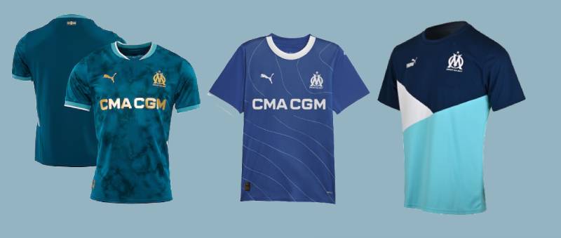
The OM monogram has become a civic emblem for Marseille as much as a sports badge. You’ll see it sprayed on walls, tattooed on arms, and stickered across car bumpers throughout the city. Few football logos have this level of street-level presence outside their stadiums.
The badge represents more than football results. It’s tied to local identity, community pride, and the culture of southern France. The ultras groups, especially the South Winners and Yankee Nord, have turned the logo into a symbol of resistance and solidarity that goes well beyond match days.
When OM won the Champions League in 1993, the star added to the crest became a permanent marker of that achievement. It’s the only French club that can display one. That single detail separates the OM badge from every other French football logo, and fans make sure you know it.
How Does the Olympique de Marseille Logo Fit Into the Overall Brand Identity?

The logo sits at the center of a broader identity system that includes the kit colors, the Stade Velodrome, the “DROIT AU BUT” motto, and the club’s partnership with Puma. Everything connects back to blue, white, and gold.
Official brand guidelines control how the badge appears across all touchpoints. The monogram can be used alone (without the motto) in specific contexts like social media profile pictures or app icons. Full lockups include the star, monogram, and motto together.
The club’s digital presence on its website, social media, and streaming platforms all use the same color palette drawn from the logo. Merchandise, from scarves to jackets, uses the monogram as the primary graphic anchor. The identity is consistent enough that you can spot OM branding from across a room, which is exactly the point.
How Should the Olympique de Marseille Logo Be Used?
Official Usage Guidelines: The logo must appear on a white or very light background whenever possible. Placing it on busy patterns or dark backgrounds without proper contrast adjustment is not allowed. The star must always appear above the monogram, and the motto must not be repositioned.
Do’s: Use the official color values listed in the club’s guidelines. Maintain the required clear space. Use vector files for print applications. Scale proportionally without stretching.
Don’ts: Don’t change the logo colors. Don’t rotate, distort, or add effects like shadows or gradients to the mark. Don’t separate the star from the monogram in contexts where the full logo is required. Don’t recreate the logo from scratch using approximate fonts or shapes.
Where to Access Official Logos: Official versions are available through the club’s media department and through Ligue 1’s brand portal for editorial use. Licensed partners receive logo files directly as part of their sponsorship or merchandise agreements.
Licensing and Trademark: The OM badge is a protected trademark. Unauthorized reproduction for commercial purposes is prohibited under French and EU intellectual property law. Fan-made merchandise using the badge without a license can face legal action. Editorial use (news coverage, commentary, educational content) falls under fair use provisions.
FAQ on The Olympique De Marseille Logo
What does the Olympique de Marseille logo look like?
The OM logo features a fused “O” and “M” monogram in sky blue, a gold star above it, and the motto “DROIT AU BUT” in gold text below. It sits on a white background. Clean, simple, and instantly recognizable on any football kit.
Who designed the current Olympique de Marseille badge?
The Marseille-based agency Encore Nous created the current version. They revealed it on February 17, 2004.
It replaced the centenary edition from 1999. The redesign fused the two letters into one solid shape, dropping the intertwined style used for decades.
What do the colors in the OM crest mean?
Blue and white were picked in 1899 as a reversed Greek flag. Marseille was founded by Greeks from Phocaea, so the color theory ties directly to the city’s ancient origins.
Gold came later, in 1993, marking the Champions League win.
Why is there a star on the Olympique de Marseille logo?
The gold star represents OM’s 1993 UEFA Champions League victory over AC Milan. Coach Raymond Goethals led the squad to a 1-0 win in Munich.
OM remains the only French club to carry that star. It’s been on the badge ever since.
What does “DROIT AU BUT” mean on the badge?
It translates to “Straight to the Goal.” The motto originally belonged to the club’s rugby section and was the personal motto of the founder’s wife, Marguerite Dubois.
It appeared on OM’s very first emblem in 1899 and has survived every redesign.
How many times has the Marseille football crest changed?
Roughly twelve times since 1899. The badge went from an ornate monogram to an Art Deco shield in 1935, back to intertwined letters in 1972, and through several color and layout shifts before landing on the current 2004 version.
What font is used in the OM logo?
The motto uses a custom bold sans-serif typeface. It’s not available commercially.
The monogram itself is a hand-drawn letterform, not a standard font. Earlier versions used more decorative lettering, but the 2004 redesign prioritized readability across digital and broadcast formats.
Can I use the Olympique de Marseille logo for my project?
Not without permission. The badge is a registered trademark under French and EU intellectual property law. Commercial use requires a license from the club.
Editorial use for news or educational content generally falls under fair use. Fan art sits in a gray area.
What is the history behind the OM monogram?
Founder Rene Dufaure de Montmirail adapted his personal seal. His initials “D” and “M” were intertwined, and designers simply swapped the “D” for an “O” to match the club name Olympique de Marseille.
That swap happened in 1899. The basic monogram structure has carried through every version since.
Is Olympique de Marseille getting a new logo?
Reports surfaced in late 2024 that club president Pablo Longoria was exploring a redesign. The current badge has been in use since 2004, over twenty years now.
No official replacement has been confirmed. The club has said any update would respect its Ligue 1 heritage while adapting to modern branding needs.
Conclusion
The Olympique de Marseille logo has held its ground for over 125 years. From Rene Dufaure de Montmirail’s personal seal to the flat monogram designed by Encore Nous in 2004, every version kept the same core pieces: the OM initials, the blue and white club colors, and the “Droit au But” motto.
That Champions League star still sets it apart from every other French football club badge. Whether on a Stade Velodrome scarf or a Puma jersey, the crest works.
With a possible redesign on the horizon, what comes next will need to respect that history. The fans won’t accept anything less.

Renowned for his expertise in logo design and visual branding, Bogdan has developed a multitude of logos for various clients.
His skills extend to creating posters, vector illustrations, business cards, and brochures. Additionally, Bogdan's UI kits were featured on marketplaces like Visual Hierarchy and UI8.
He also wrote in the past years on sites like Design Your Way, WebDesignerDepot, WPDean, Designmodo, Speckyboy, Slider Revolution, and more.
- Jujutsu Kaisen Font Generator - 12 October 2026
- The Windsurf Logo History, Colors, Font, And Meaning - 10 October 2026
- How to Remove Background From Product Photos (No Photoshop) - 10 October 2026

Bogdan Sandu is a seasoned designer who has been designing websites since 2008. Renowned for his expertise in logo design and visual branding, Bogdan has developed a multitude of logos for various clients. His skills extend to creating posters, vector illustrations, business cards, and brochures. Additionally, Bogdan's UI kits were featured on marketplaces like Visual Hierarchy and UI8. He also wrote in the past years on sites like Design Your Way, WebDesignerDepot, WPDean, Designmodo, Speckyboy, Slider Revolution, and more.
You Might Also Like


