


The Bristol City logo is one of the most recognizable club badges in English football’s second tier. It features a stylized robin perched on a football, set inside a red and white roundel with a black border. The current version was introduced in 2019 and designed by Bristol-based agency Mr B & Friends.
Bristol City Football Club was founded in 1894 as Bristol South End. The club has gone through roughly eight distinct badge designs since then. The present crest replaced a long-running coat of arms that belonged to the city of Bristol, not the football club itself. That distinction mattered. And it’s a big part of why the 2019 rebrand happened at all.
The club competes in the EFL Championship and plays at Ashton Gate Stadium, which holds around 27,000 fans. Their nickname, “The Robins,” dates back to the 1920s and directly shaped the logo you see on their shirts today.
What Is the Bristol City Logo?

The Bristol City logo is a combination mark featuring a flat, graphic robin with a red breast sitting on the outline of a football, enclosed within a circular red badge. It was officially introduced in May 2019 by design studio Mr B & Friends, and it represents the club’s identity as “The Robins” while marking the club’s 125th anniversary.
Here’s what defines the current crest:
- Design Type: Combination mark (roundel with mascot icon and wordmark)
- Primary Elements: A stylized robin bird, football outline, circular badge frame, the text “Bristol City,” and the year “1894”
- Official Introduction Date: May 2019
- Designer/Agency: Mr B & Friends (Senior Art Director: Chris Tozer, Executive Creative Director: Steve Richardson)
- Trademark Status: Registered trademark of Bristol City Football Club
- Color Palette: Bristol City Red (#E21A23), White (#FFFFFF), Black (#000000)
- Usage Context: Matchday kits, stadium signage at Ashton Gate, digital platforms, official merchandise, marketing materials, and club communications
The robin’s body outline and the ball beneath it can also be read as the initials “BC.” That kind of hidden detail is tricky to pull off without looking forced, but it works here.
How Has the Bristol City Logo Evolved Over Time?

Bristol City’s badge history stretches across more than 120 years. The crest has alternated between two core identities: the city of Bristol’s coat of arms and the robin motif tied to the club’s nickname.
Most of those changes came from practical reasons, not branding trends. Financial survival, fan sentiment, and the simple need to own something that was actually theirs.
Bristol Coat of Arms Era (1897-1949)
- Years Active: 1897-1949 (with long gaps of plain shirts)
- Design Description: The coat of arms of the City of Bristol, showing a golden ship leaving a silver castle on waves, flanked by unicorn supporters, with a crest of crossed arms holding scales and a serpent
- Color Scheme: Multi-colored heraldic design, primarily gold, red, silver, and blue
- Context: First used after the club turned professional in 1897. It appeared on shirts for the 1901/02 season to mark election to the Football League. Then it basically vanished from kits until 1950, with one notable exception: the 1909 FA Cup Final against Manchester United
- Cultural Significance: Represented Bristol’s maritime heritage and civic identity. The arms date back to the 15th century. But the problem was always that this belonged to the city, not the club
First Robin Badge (1949-1951)
- Years Active: 1949-1951
- Design Description: A robin standing on top of a football. Simple. Direct.
- Color Scheme: Red and white
- Context: This was the first time a robin appeared on a Bristol City shirt. It lasted just about two seasons before the coat of arms came back for the 1950/51 season
- Key Changes: The first shift away from civic heraldry toward club-specific identity
- Cultural Significance: Planted the seed for what would become the club’s most loved symbol. Fans in the 1930s had already been holding placards featuring robins at matches
Robin and Clifton Suspension Bridge Badge (1976-1983)
- Years Active: 1976-1983
- Design Description: A robin perched on a ball with the Clifton Suspension Bridge in the background, set within a shield
- Color Scheme: Red, white, and black
- Designer: The design evolved from a 1972 competition won by Harry Winn (a 57-year-old rugby fan who pocketed 50 pounds for his winning entry of a robin on a five-bar gate). His original design never made it onto shirts, but the robin concept stuck.
- Context: Introduced when the club returned to the First Division in 1976/77 after a 65-year absence from the top flight
- Key Changes from Previous: Combined the robin mascot with a local landmark (the Clifton Suspension Bridge), giving the badge both club and city identity
- Cultural Significance: This is the badge that many older fans remember most fondly. It coincided with Bristol City’s most successful period in the top division
BC82 Text Logo (1983-1986)
- Years Active: December 1983-1986
- Design Description: Pure text reading “BC82” in a clean, simple layout
- Color Scheme: Red and white
- Context: Represented the new company formed after the club’s financial crisis and near-collapse. The “82” referenced the year the reformed company was established
- Key Changes from Previous: Stripped away all imagery. No robin, no bridge, no heraldry. Just letters and numbers
- Cultural Significance: A survival badge, really. It marked one of the darkest periods in the club’s history, when Bristol City dropped through three divisions in three consecutive seasons
Simplified Robin Badge (1986-1994)
- Years Active: 1986-1994
- Design Description: A simplified robin on a ball with the Clifton Suspension Bridge, but without the shield frame
- Color Scheme: Red, white, and black
- Context: The robin returned as the club began climbing back through the divisions. Removing the shield gave the badge a cleaner, more open look
- Key Changes from Previous: Dropped the shield outline from the 1976 version while keeping the core robin-and-bridge imagery
Bristol Coat of Arms Return (1994-2019)
- Years Active: 1994-2019
- Design Description: A simplified version of Bristol’s civic coat of arms, featuring the ship and castle motif with the club name and founding year in a scroll
- Color Scheme: Red, white, gold, and blue elements
- Context: The coat of arms came back at the start of the 1994/95 season, a move that many fans never fully embraced. It was tweaked slightly over the years but remained the primary badge for 25 years
- Key Changes from Previous: A full return to civic heraldry, abandoning the club-specific robin identity
- Cultural Significance: Functional but never beloved. Fans launched campaigns to bring back the robin. Over three-quarters of supporters surveyed backed the bird’s return
Current Robin Roundel (2019-Present)
- Years Active: 2019-present
- Design Description: A flat, graphic robin with a red breast on a ball outline, inside a red and white roundel with black border. “Bristol City” appears in uppercase white text, with “1894” in red near the robin
- Color Scheme: Bristol City Red (#E21A23), White (#FFFFFF), Black (#000000)
- Designer: Mr B & Friends (Chris Tozer, Steve Richardson)
- Context: Launched to celebrate the club’s 125th anniversary. The agency ran large-scale fan surveys and focus groups before settling on the robin. The rebrand won Best Brand Evolution at the Transform Awards 2020
- Key Changes from Previous: Modern, flat graphic style. The robin outline doubles as the letters “BC.” Clean sans-serif lettering replaced ornate heraldic elements
- Cultural Significance: Membership sales jumped 40% in the first three months after launch. Home shirt sales increased 26%. The crest was unveiled at a supporters’ pub and projected onto Bristol landmarks
What Do the Design Elements of the Bristol City Logo Mean?
Every piece of the Bristol City badge serves a purpose. The robin is the obvious star, but the roundel shape, the date, and the color choices all carry specific meaning that connects back to the club’s history and identity.
Nothing in this crest is accidental. Well, almost nothing. The “BC” hidden in the robin’s outline was a happy discovery during the design process, at least from what the designers have discussed publicly.
Why Does the Badge Feature a Robin?
The robin connects to Bristol City’s nickname, “The Robins,” which fans adopted in the 1920s. The story goes that supporters at Ashton Gate latched onto the popular song “When the Red, Red Robin Comes Bob, Bob, Bobbin’ Along” by Harry Woods.
The red-breasted bird was a natural fit for a club that had always played in red shirts. Fans were holding robin placards at matches as early as the 1930s.
In the current logo, the robin is drawn in a flat, graphic style. Small but proud. The designers at Mr B & Friends described it as “small yet fierce,” which is a fair way to capture what the club wants the badge to say about its character. The bird also functions as an independent icon, separate from the full crest, for use on smaller applications and digital platforms.
Why Did Bristol City Choose These Specific Colors?
The Bristol City color palette has three components:
- Bristol City Red – Hex: #E21A23 | RGB: (226, 26, 35) | CMYK: (5, 100, 100, 1) | Pantone: PMS 485 C. Red has been the club’s primary color since 1897. Senior Art Director Chris Tozer called it “completely untouchable for the brand.” It represents energy, passion, and competitive drive. From a color psychology standpoint, red signals urgency and excitement, which fits a football context perfectly.
- White – Hex: #FFFFFF | RGB: (255, 255, 255) | CMYK: (0, 0, 0, 0). White acts as the backdrop inside the roundel, giving the robin and text clear space to stand out. It also ties back to the traditional red-and-white kits worn since the club’s earliest days.
- Black – Hex: #000000 | RGB: (0, 0, 0) | CMYK: (60, 40, 40, 100) | Pantone: PMS Black 6 C. Used for the outer border and the robin’s body outline. The designers actually used a dark grey rather than pure black for the robin’s outline to give the crest a “warmer” feel. That’s a subtle detail but it changes the tone of the badge quite a bit.
This three-color setup keeps things simple. It works across print, screen, and embroidery without losing clarity. A lot of red logos in football can blur together, but the robin gives Bristol City’s version a clear point of difference.
What Typography Style Is Used in the Bristol City Logo?

The crest uses Buenos Aires, a contemporary sans-serif font, for the words “Bristol” and “City” inside the roundel. The lettering is set in uppercase white, clean and rounded.
For broader brand materials (jerseys, marketing, merchandise), the club uses Directors Gothic, a condensed sans-serif typeface.
The choice of a rounded sans-serif for the badge itself was intentional. It balances the font’s modern feel against the traditional subject matter of the robin. No serif fonts here. No script lettering. Just straightforward, readable type that scales well from stadium signage down to a small badge on a phone screen.
What Are the Hidden Meanings in the Bristol City Logo?
The most talked-about hidden detail is the “BC” formed by the robin’s body outline and the ball beneath it. Look at the badge from a distance and you can see it. The outline of the bird’s torso becomes the “B,” while the ball forms the “C.”
The year “1894” sits near the robin in red type. The “18” is underlined, which separates it from the “94” visually. It’s a nod to the founding year without cluttering the main design.
The Clifton Suspension Bridge, which appeared on earlier badges, didn’t make it into the main crest this time. But it wasn’t abandoned. The bridge shows up on the back of match shirts, sitting on the collar area. Still present, just relocated.
How Does the Bristol City Logo Compare to Competitor Logos?
In the EFL Championship, most clubs lean on one of two approaches: heraldic shields or stylized mascot badges. Bristol City’s roundel format puts it somewhere in between, and that’s actually where it stands out.
Compare it to local rivals. The Leeds United logo uses a shield with their salute crest. Nottingham Forest’s badge features a tree inside a circular frame, similar in shape but more detailed.
Burnley’s crest keeps the traditional shield format with a complex heraldic layout. Hull City’s badge has a tiger in an angular shield. The Norwich City logo uses a canary on a ball inside a circular badge, which is the closest parallel to Bristol City’s approach.
Bristol City’s badge is flatter and more graphic than most of its Championship peers. It was designed for the digital age. At small sizes on a phone screen, you can still make out the robin. That’s not something you can say about every club crest with intricate heraldic details.
The roundel shape also echoes some of the bigger football brands globally. It reads quickly. And at Ashton Gate, printed large across the center circle or on the stadium exterior, it holds up without needing any extra visual support.
What Are the Technical Specifications of the Bristol City Logo?
Official Color Codes
- Primary Color: Bristol City Red – Hex: #E21A23 | RGB: (226, 26, 35) | CMYK: (5, 100, 100, 1) | Pantone: PMS 485 C
- Secondary Color: White – Hex: #FFFFFF | RGB: (255, 255, 255) | CMYK: (0, 0, 0, 0)
- Accent Color: Black – Hex: #000000 | RGB: (0, 0, 0) | CMYK: (60, 40, 40, 100) | Pantone: PMS Black 6 C
Dimensions and Proportions
The badge is a circle, so its aspect ratio is 1:1. The roundel format makes it naturally suited for digital use, social media avatars, and web design applications where square or circular profile images are standard.
The club’s brand guidelines specify clear space requirements around the crest. The robin icon can also be used independently as a standalone mark, particularly for smaller applications where the full roundel would lose readability.
The logo is distributed in vector graphics formats (SVG, EPS, AI) for professional use, making sure it scales cleanly from a small social media icon to a full stadium banner. Raster versions in PNG and JPEG are available for general digital use, with recommended DPI settings for print applications.
What Cultural Impact Has the Bristol City Logo Had?
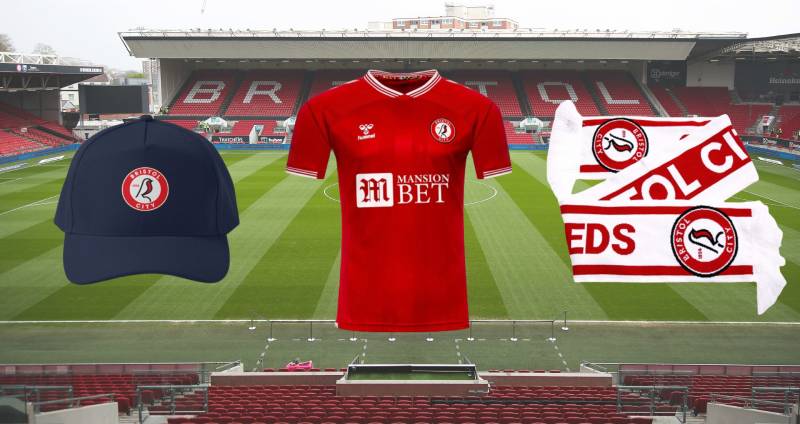
The 2019 rebrand did more than give the club a new badge. It gave fans something they had been asking for, loudly and persistently, since the mid-1990s.
Membership sales increased 40% in the first three months after launch. Home shirt sales were up 26% over the same period. Those aren’t just branding numbers. That’s fans putting money down because they finally had a badge they connected with.
The launch itself was handled well. Mr B & Friends unveiled the crest at a supporters’ pub first, not at some corporate press event. The robin was projected onto landmarks around Bristol. It showed up on outdoor hoardings across the city.
Winning Best Brand Evolution at the Transform Awards 2020 gave the project industry recognition too. But honestly, the fan response told the real story. After 25 years under a coat of arms that technically belonged to the whole city, Bristol City FC finally had a badge that was unmistakably theirs.
The robin has become a digital identity marker for fans on social media. It shows up on scarves, tattoos, and homemade match flags in the Wedlock Stand. That kind of adoption can’t be bought with a brief, it just happens when the design is right.
How Does the Bristol City Logo Fit Into the Overall Brand Identity?
The logo sits at the center of a wider brand system that Mr B & Friends built for the club. Bristol Sport, the umbrella company owned by Steve Lansdown, also oversees Bristol Bears rugby and Bristol Flyers basketball. Each has its own identity, but they share a family feel.
The robin crest connects to several surrounding brand elements. The Clifton Suspension Bridge appears on match shirt collars and supporting materials. The Directors Gothic typography carries through jerseys, programs, stadium signage, and digital channels. The red, white, and black color system is consistent across all touchpoints.
The club mascots, Red and Robyn (who replaced Scrumpy the robin in 2022), extend the bird theme into matchday entertainment. The training facility, the Robins High Performance Centre at Failand, carries the nickname into the infrastructure.
Everything ties back to that one bird. And the logo, being circular and adaptable, slots into every format the club needs, from the Ashton Gate exterior to an Instagram story. A good brand style guide makes that possible, and Bristol City’s post-2019 guidelines are thorough about how each element should be applied.
How Should the Bristol City Logo Be Used?
Bristol City FC maintains strict rules about how the badge can be used. Here’s what matters if you’re working with it or referencing it:
- Official usage: The logo should always appear on its designated red background within the roundel. Stretching, rotating, or altering the proportions is not permitted. The robin icon can be used alone in approved contexts, but the full crest is preferred for formal applications
- Where to access official logos: The club’s official website (bcfc.co.uk) and authorized brand asset portals provide approved files. Third-party sites offer vector downloads, but always verify they match the current, official version
- Licensing information: The Bristol City badge is a registered trademark. Commercial use requires permission from Bristol City Football Club or Bristol Sport. Fan-made merchandise sold for profit without a license is a trademark violation
- Trademark protection: The club actively protects its brand. Unauthorized reproduction on merchandise, digital products, or promotional material is subject to enforcement. This applies to the full crest, the standalone robin icon, and the “BCFC” text mark
If you’re a designer working on anything that features this badge, get the vector files from an official source. Don’t trace it from a screenshot. The curves on that robin are specific, and the rounded typography needs to match exactly. Your mileage may vary with third-party logo download sites, as some still host older versions of the crest.
FAQ on The Bristol City Logo
What does the Bristol City logo look like?
The current Bristol City FC badge features a stylized robin perched on a football inside a red and white roundel. “Bristol City” appears in uppercase white lettering, with “1894” in red. A black border frames the circular crest.
When was the current Bristol City crest introduced?
The club unveiled its current badge in May 2019. It was designed by Bristol-based agency Mr B & Friends to celebrate the club’s 125th anniversary.
The rebrand replaced a coat of arms that had been used since the 1994/95 season.
Why is there a robin on the Bristol City badge?
Bristol City’s nickname is “The Robins.” Fans adopted it in the 1920s, inspired by the song “When the Red, Red Robin Comes Bob, Bob, Bobbin’ Along.” The red-breasted bird matched the club’s red shirts perfectly. It first appeared on a shirt badge in 1949.
What are the official Bristol City logo colors?
Three colors make up the badge. Bristol City Red (#E21A23), white (#FFFFFF), and black (#000000).
The red carries a Pantone code of PMS 485 C. Chris Tozer, the senior art director on the project, called the red “completely untouchable for the brand.”
Who designed the current Bristol City FC emblem?
Mr B & Friends, a creative agency based near Bristol, handled the redesign. Chris Tozer served as senior art director and Steve Richardson as executive creative director. The project won Best Brand Evolution at the Transform Awards 2020.
What font is used in the Bristol City logo?
The crest uses Buenos Aires, a rounded sans-serif typeface, for the “Bristol City” text. The club’s wider brand materials use Directors Gothic, a condensed sans-serif used on jerseys, programs, and Ashton Gate Stadium signage.
What hidden details are in the Bristol City badge?
Look at the robin’s body outline and the ball beneath it. Together they form the initials “BC.” It’s subtle.
The Clifton Suspension Bridge, featured on older badges, now appears on the back collar of match shirts instead of the main crest.
How many times has Bristol City changed its logo?
The club has used roughly eight distinct badge designs since 1897. These alternate between Bristol’s civic coat of arms and the robin motif. The “BC82” text logo from 1983 stands as the most stripped-back version in the club’s history.
Can I use the Bristol City logo for personal projects?
The badge is a registered trademark of Bristol City Football Club. Personal, non-commercial use like fan art is generally tolerated. But selling merchandise or using the crest in commercial products without a license is not allowed.
How did fans react to the 2019 Bristol City rebrand?
Positively. Over three-quarters of surveyed season ticket holders backed the robin’s return. Membership sales jumped 40% in three months. Home shirt sales at Ashton Gate rose 26% over the same period. The EFL Championship club had clearly read the room.
Conclusion
The Bristol City logo tells the story of a club that spent decades searching for an identity it could fully own. The 2019 robin crest finally delivered that.
It works because the design respects what came before while looking forward. The flat graphic style, the clean red and white roundel, the hidden “BC” in the bird’s outline. These aren’t gimmicks. They’re smart decisions backed by fan consultation and a clear understanding of what Championship football branding demands.
Few English football club emblems have generated a 40% jump in membership sales within three months of launch. That says more than any design award.
The robin is back at Ashton Gate. And this time, it’s staying.

Renowned for his expertise in logo design and visual branding, Bogdan has developed a multitude of logos for various clients.
His skills extend to creating posters, vector illustrations, business cards, and brochures. Additionally, Bogdan's UI kits were featured on marketplaces like Visual Hierarchy and UI8.
He also wrote in the past years on sites like Design Your Way, WebDesignerDepot, WPDean, Designmodo, Speckyboy, Slider Revolution, and more.
- Canva vs PowerPoint: Which Is Better for Presentations? - 22 September 2026
- How to Install Fonts on Mac (Step-by-Step Guide) - 20 September 2026
- From Mockup to Code: How AI-Augmented Development Speeds Up the Design Handoff - 19 September 2026

Bogdan Sandu is a seasoned designer who has been designing websites since 2008. Renowned for his expertise in logo design and visual branding, Bogdan has developed a multitude of logos for various clients. His skills extend to creating posters, vector illustrations, business cards, and brochures. Additionally, Bogdan's UI kits were featured on marketplaces like Visual Hierarchy and UI8. He also wrote in the past years on sites like Design Your Way, WebDesignerDepot, WPDean, Designmodo, Speckyboy, Slider Revolution, and more.
You Might Also Like


